Earthling Studio updates UK’s fastest growing soft drinks brand, MOJU, with a new brand identity, iconic new bottle design and improved range navigation all delivering a powerful hit of fresh nutrition.
MOJU is taking the market by storm, helping customers build healthier habits and kick-starting their day with unrivalled power, quality, and flavour. With a 62% market share in the functional shots category and distribution in top UK retailers MOJU is unveiling a bold new brand identity, unique bottle design, and product range, introducing its health boosting shots to an even wider audience.
Brand Identity and Logo
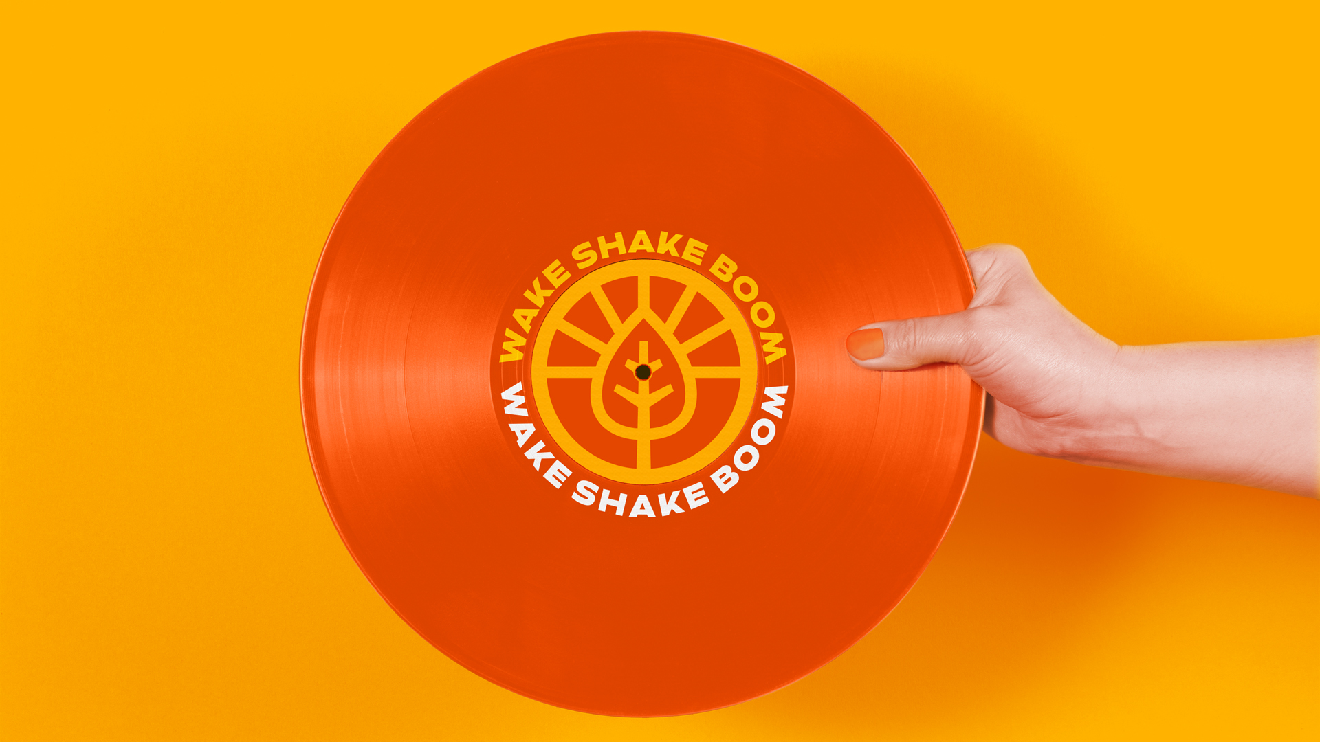
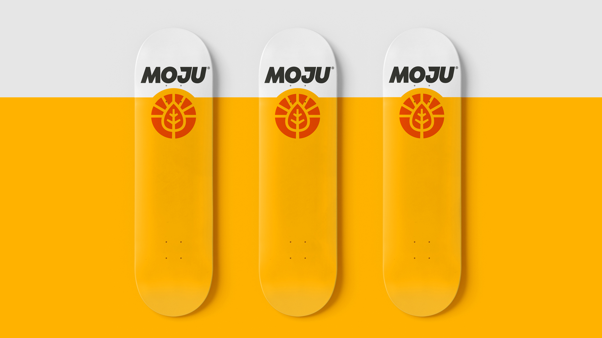
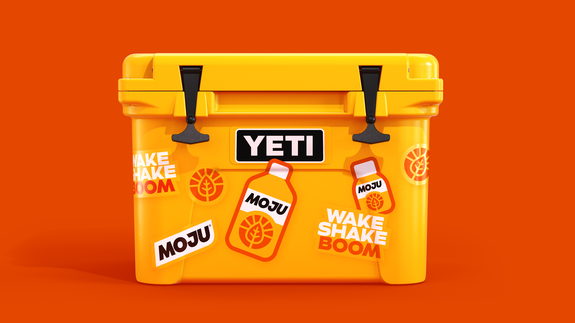
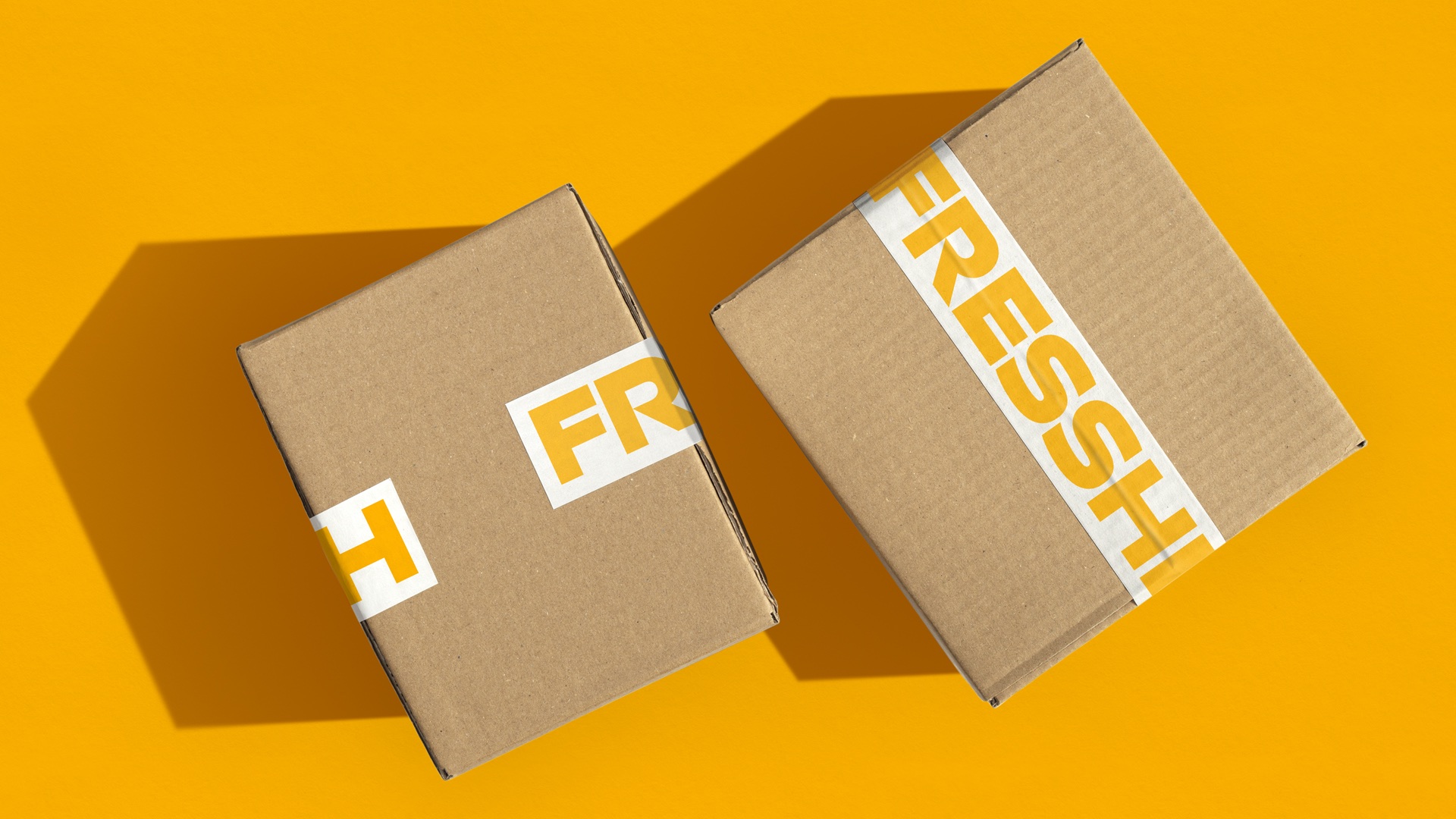
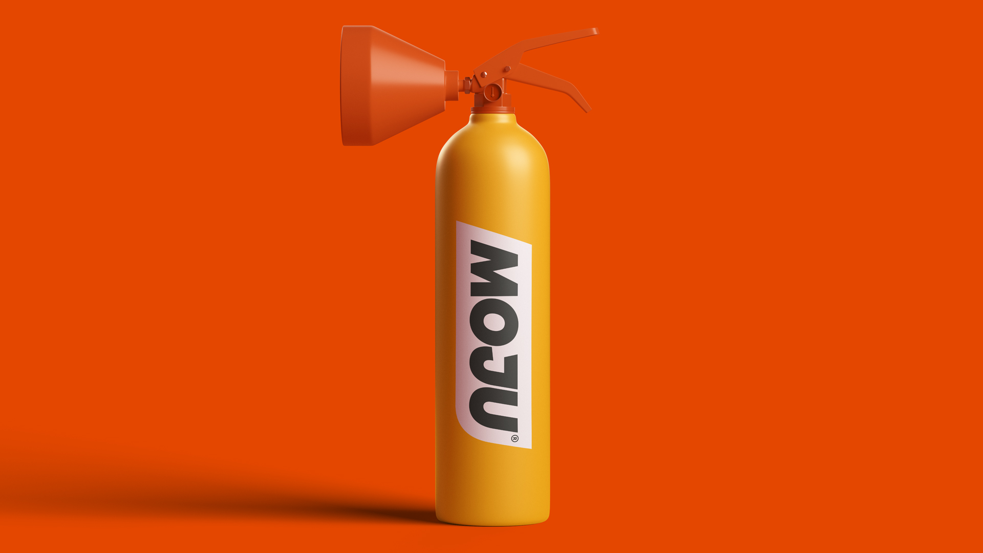
The iconic new identity injects even more energy into the brand. The logo has been redrawn to deliver a bold powerful boost, paired with a greater prominence of white within the brand palette to increase freshness and standout. Alongside this sits a custom typeface born from the logo, crafted in collaboration with international type foundry, Colophon. The assets come together in a new identity system packed with taste, power, and freshness.
Tom Bruce, Managing Partner at Earthling Studio said “Given MOJU’s success and popularity, we aimed to responsibly evolve the brand identity, creating the most distinctive and powerful version of itself. The new identity will help MOJU to show up consistently online and instore, owning its position as the category leader and next generation health & wellbeing brand.”
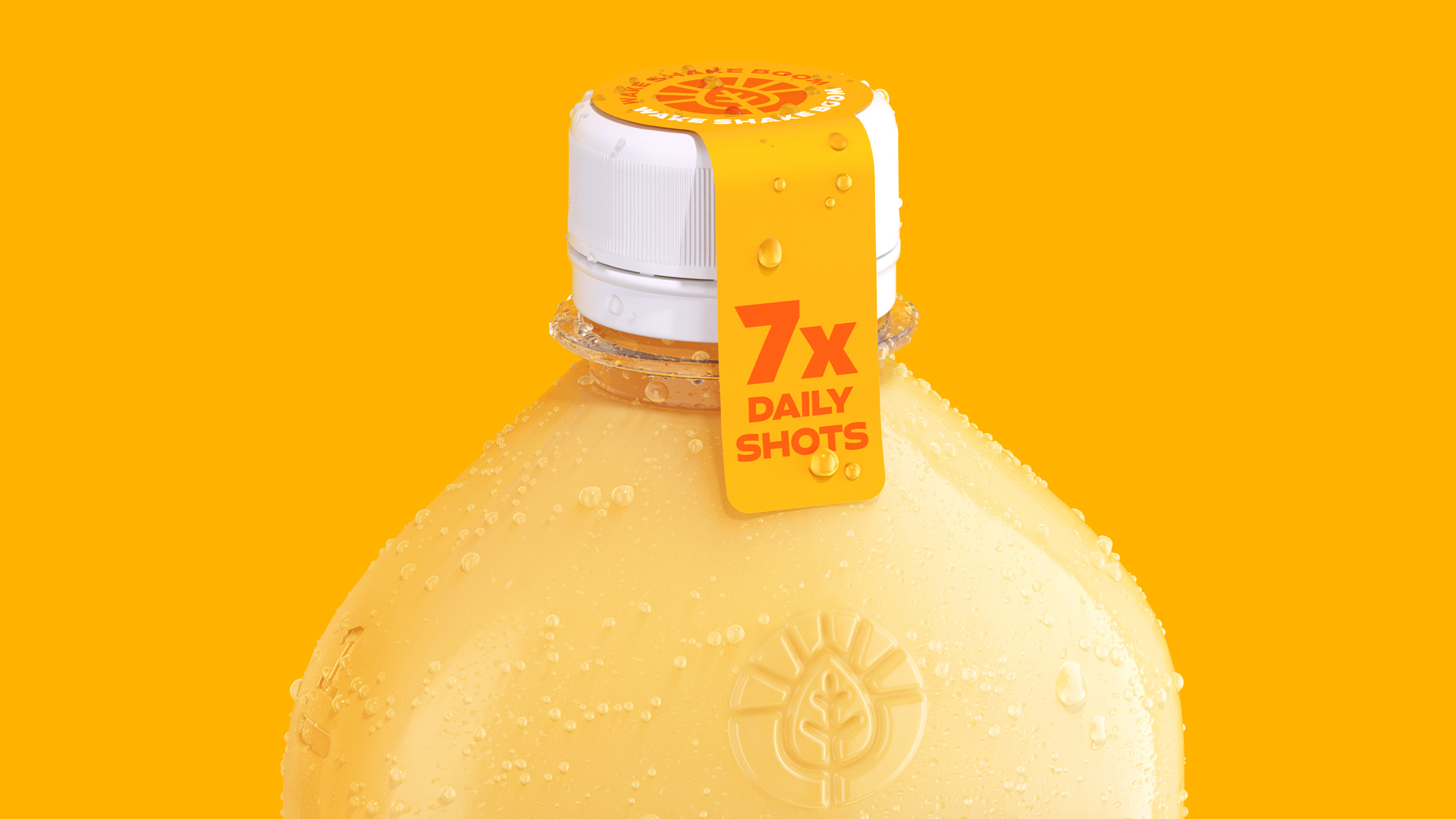
A new iconic dosing bottle.
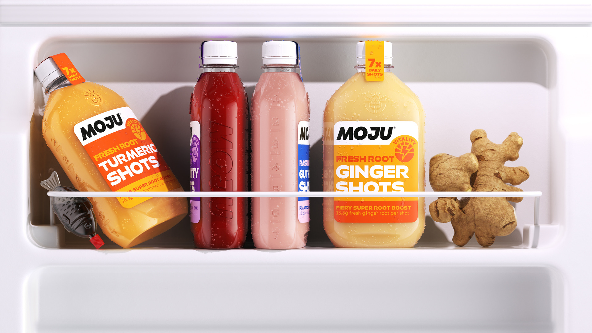
The brand had identified some consumers confusing MOJU with a regular juice. The dosing bottle redesign tackles this delivering a unique and memorable flask-style structure with debossed dosing lines to make measuring out seven doses easier than ever. Its space saving design makes it a perfect fit for any fridge and helps reduce each bottle’s carbon footprint in transport.
Improved Range Navigation
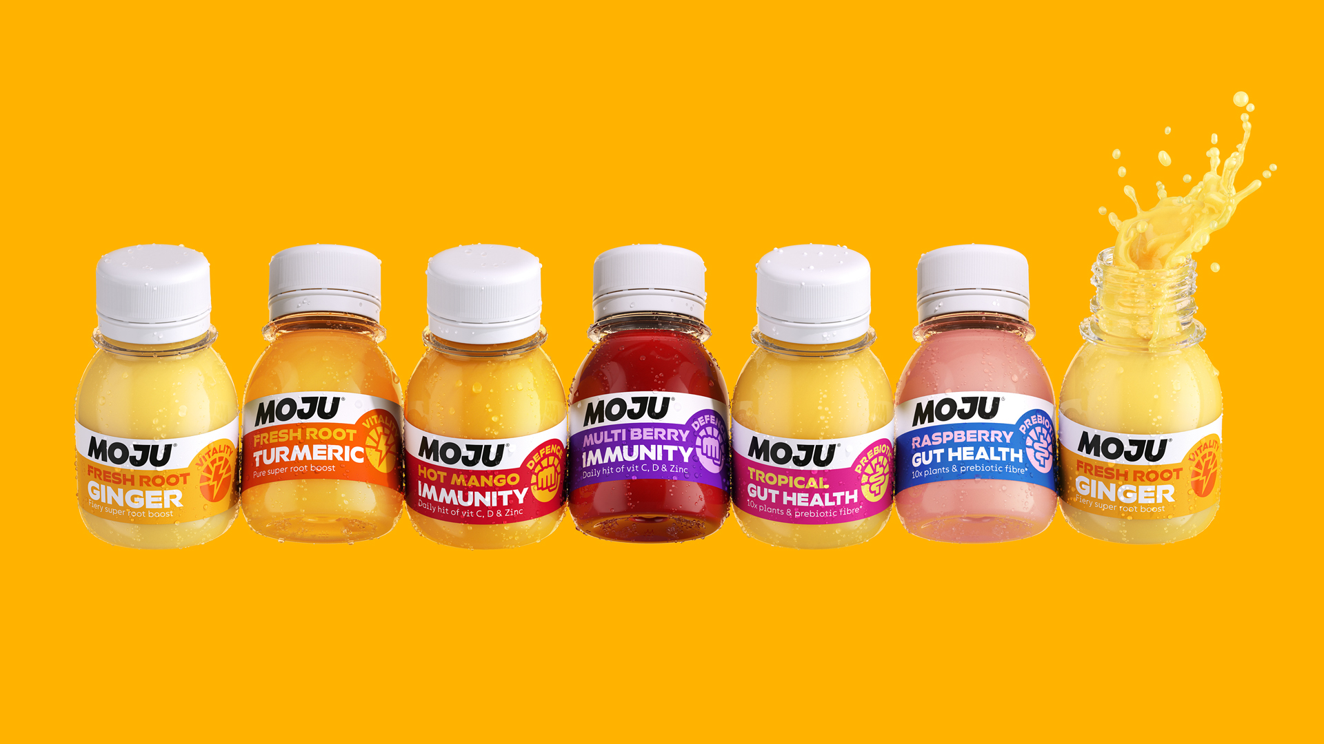
The portfolio is now organised into 3 easily understood benefit led pillars of Vitality, Immunity and Gut Health. Utilising fresh, bold and flavourful colours, clear messaging hierarchy and new iconography, MOJU has made it easy and more intuitive for consumers to choose the right shot for them to support their daily and long-term health and wellbeing goals.
CEO & Co-founder of MOJU, Rich Goldsmith, comments: “Our brand and portfolio refresh is a huge step forward in our ambition to make MOJU the nation’s favourite (and freshest) way to kick start their day. It’s important that we keep our messaging simple and easy to understand as the health and nutrition space is unnecessarily complex, confusing and is alienating for most consumers.”
CREDIT
- Agency/Creative: Earthling Studio Limited
- Article Title: Moju Brings the Boom With Bold New Brand Refresh
- Organisation/Entity: Agency
- Project Type: Identity
- Project Status: Published
- Agency/Creative Country: United Kingdom
- Agency/Creative City: London
- Market Region: Europe
- Project Deliverables: 3D Design, 3D Modelling, Brand Identity, Brand Redesign, Packaging Design, Type Design, Typography
- Industry: Food/Beverage
- Keywords: MOJU, Brand Identity, Brand Redesign, Typography, Animation, 3D
-
Credits:
Creative Partner: Stephen McDavid


