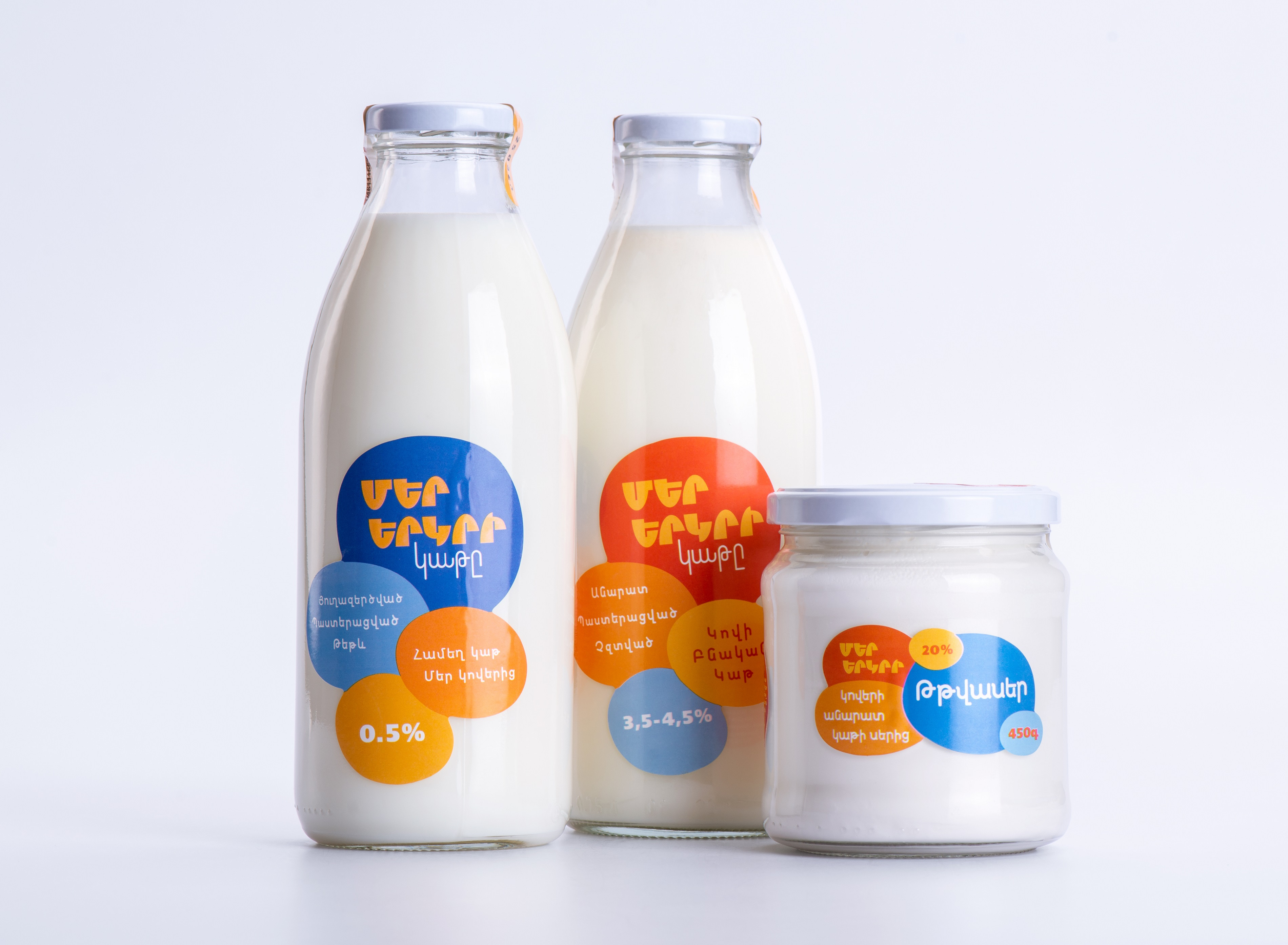
The brand “Mer Yerkir,” which translates to “Our Land” in Armenian, produces an array of dairy products. What sets it apart is its spirited and patriotic branding. The labels are adorned with a vibrant palette of colors, showcasing the distinctive hues of the Armenian flag – red, blue, and orangeThese colors hold deep meaning, reflecting the essence of the brand’s name and resonating with a sense of pride for the land.
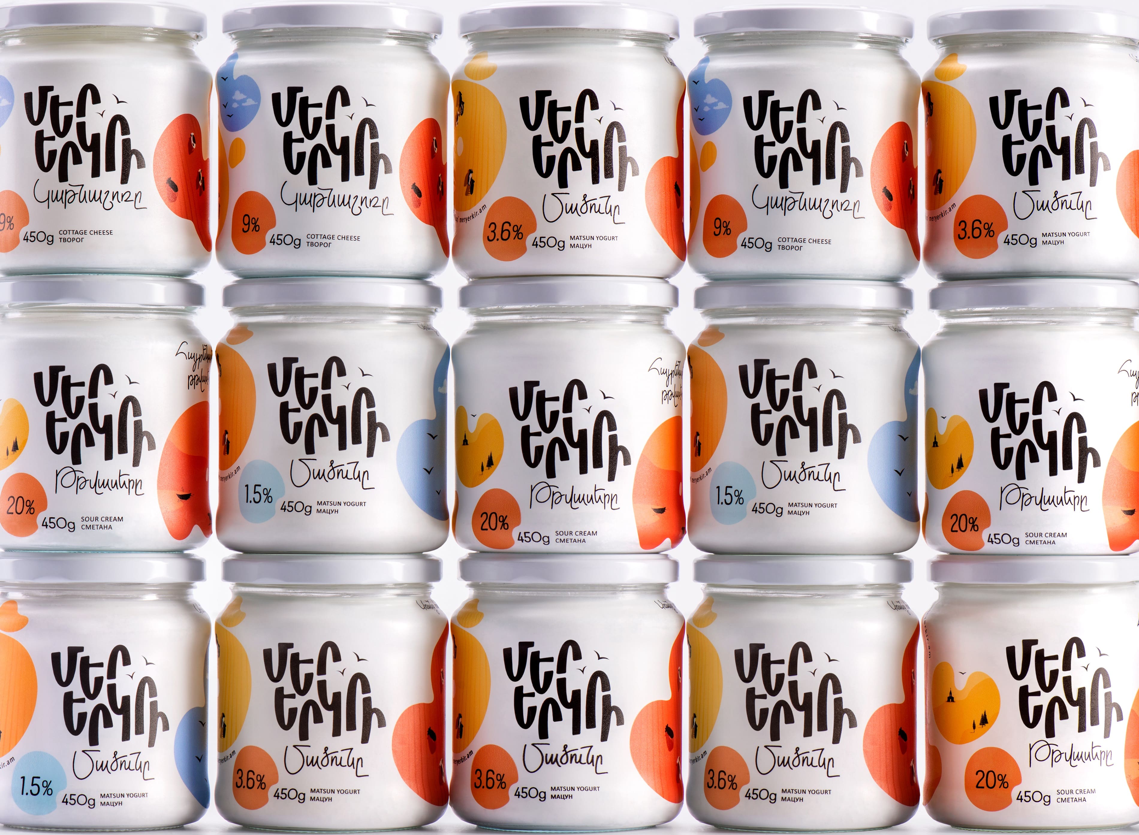
While the existing labels did catch attention, they lack a steady color scheme. This prompted us to redesign “Mer Yerkir” brand labels. The challenge was to enhance the visual appeal while retaining the vibrant and patriotic spirit they embodied. Another aspect on our list was the logo, which required a fresh design. The logo’s current form wasn’t consistent with the labels and didn’t grab attention amidst the vivid colors. Our mission involved crafting a unified look that maintained the brand’s colorful charm and its deeply rooted patriotic essence. The goal was to ensure that both the labels and logo worked harmoniously, creating a strong and memorable visual identity for “Mer Yerkir.”
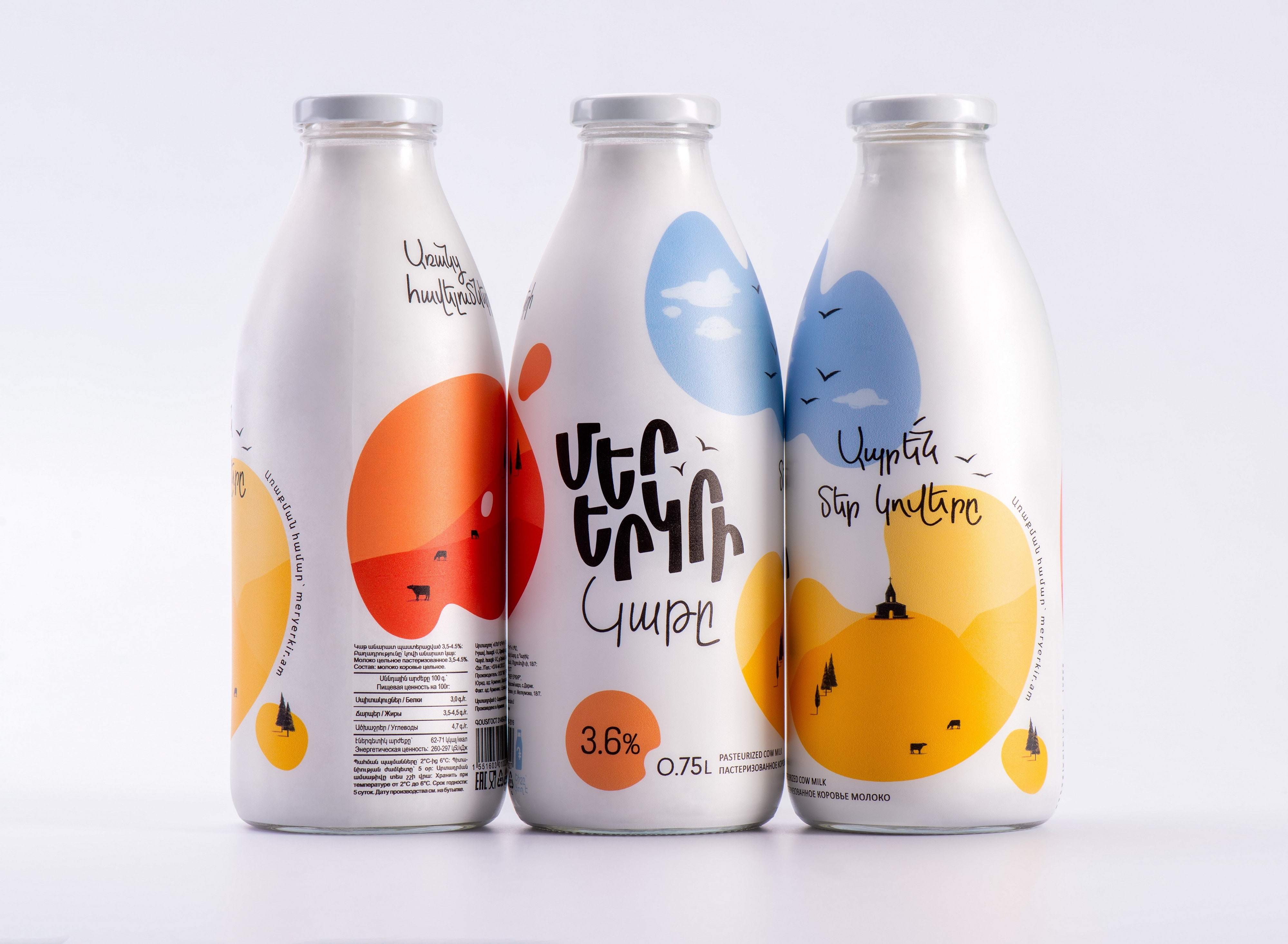
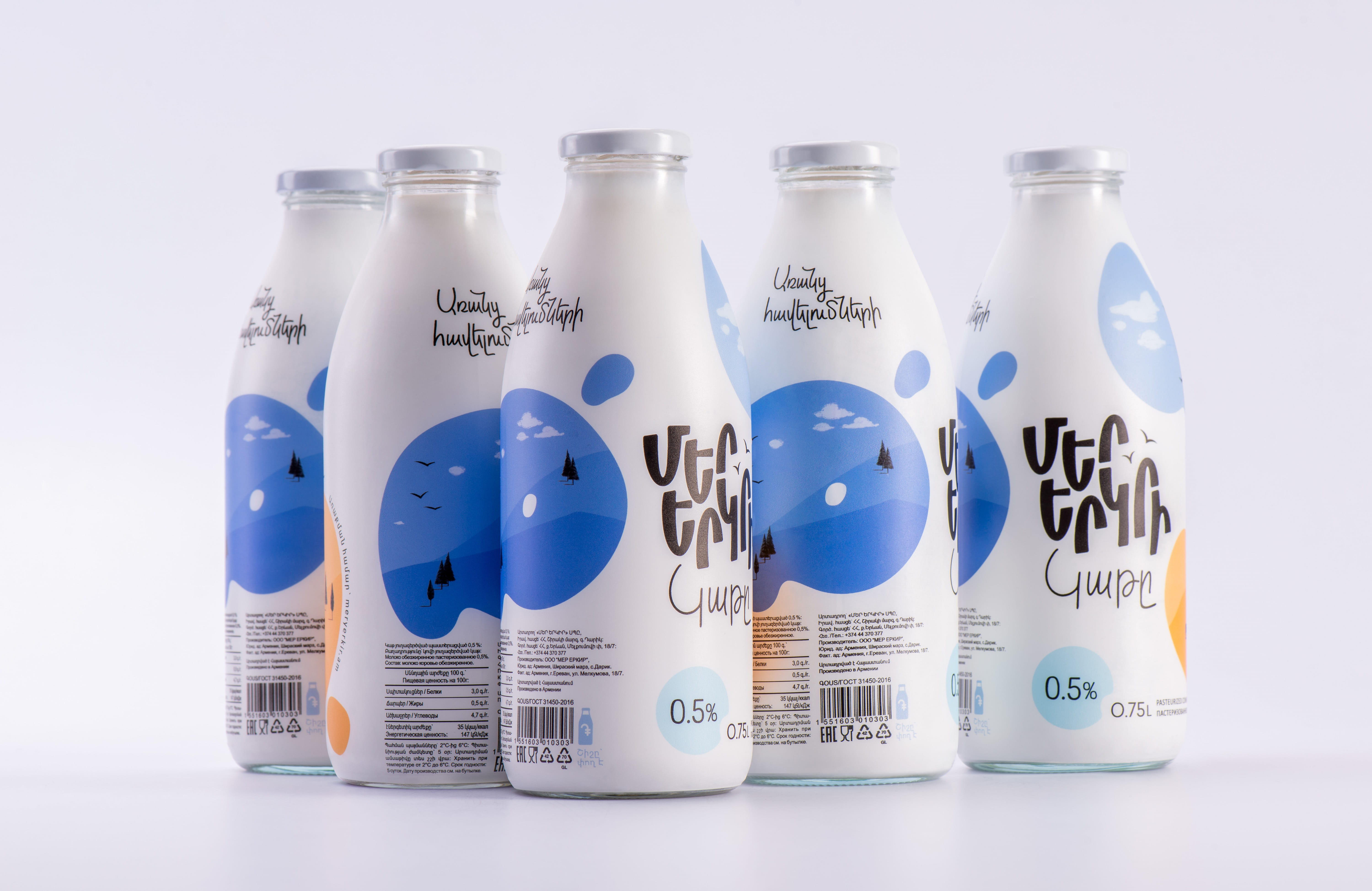
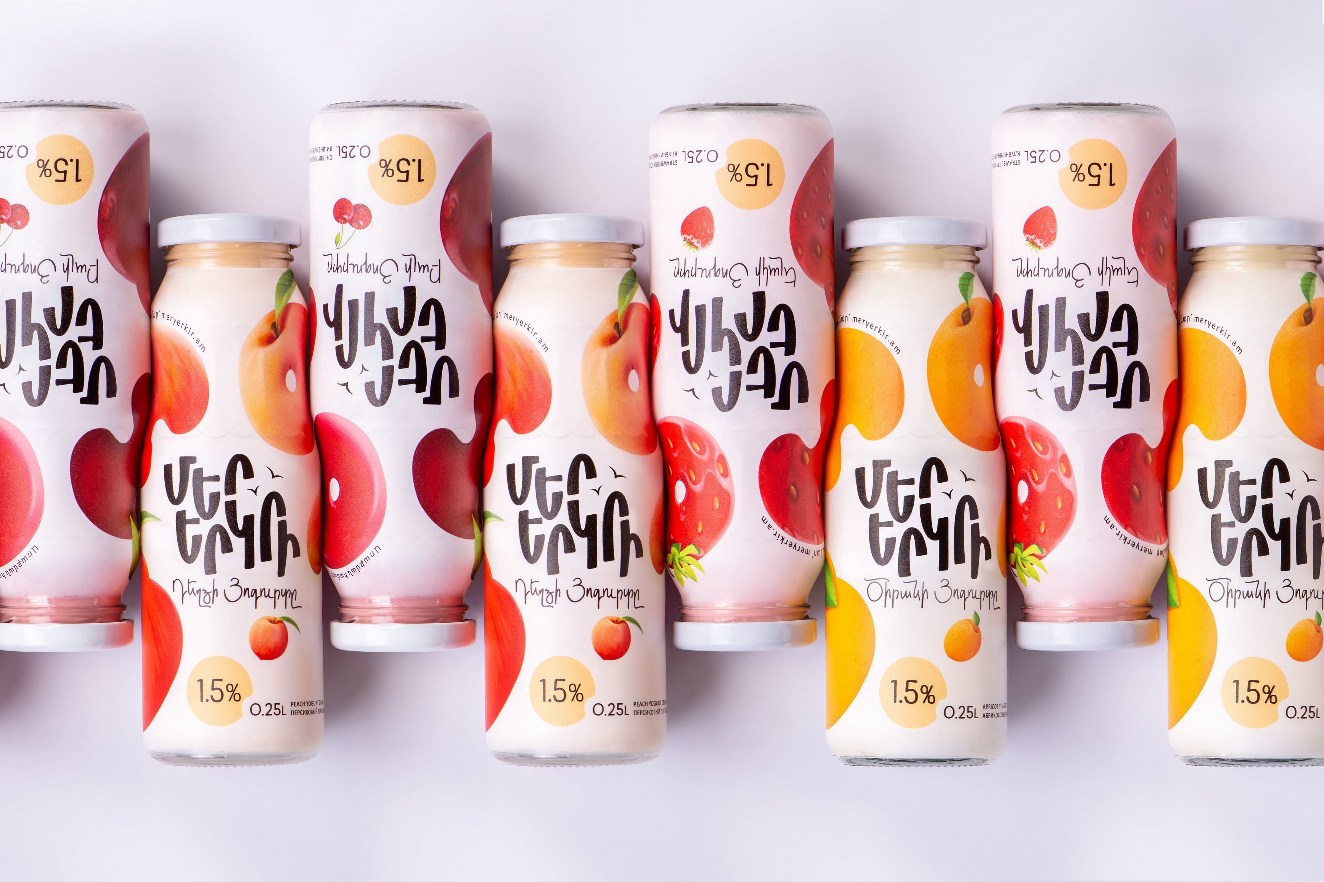
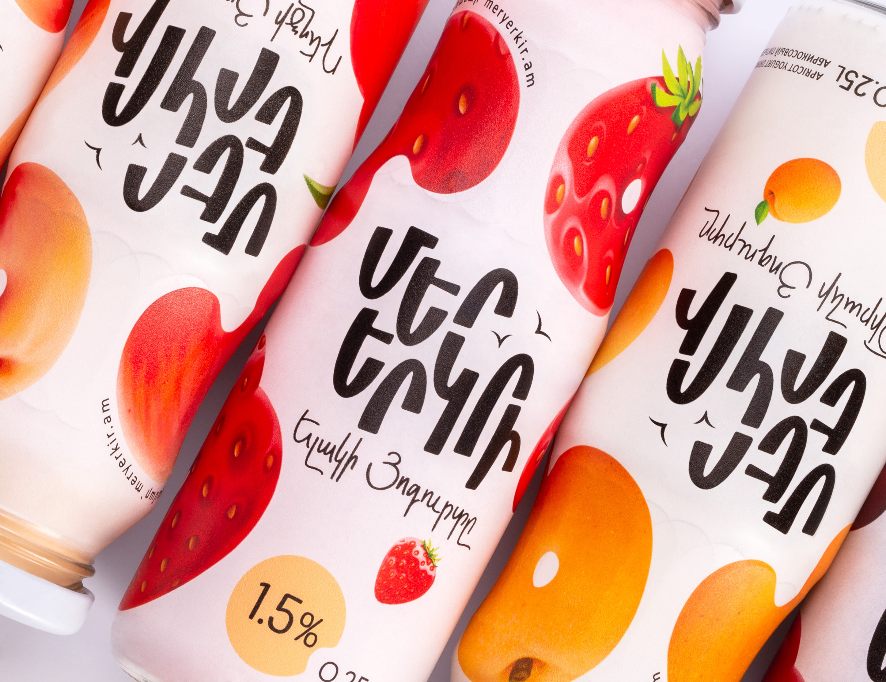
This logo was thoughtfully designed with letters intentionally uneven, mirroring the undulating contours of Armenia’s mountainous terrain. This artistic touch not only symbolizes the country’s landscape but also creates a unique visual identity for the brand. To ensure seamless coexistence with the vibrant labels, we made a strategic choice – the logo is entirely black, making it adaptable and easily recognizable on any label background.
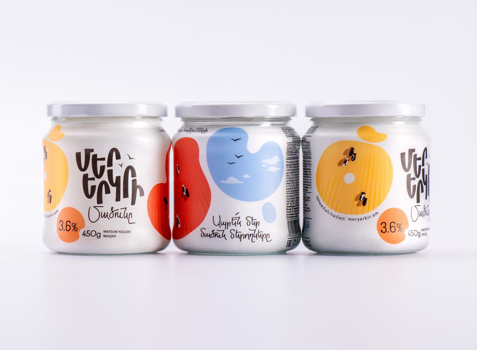
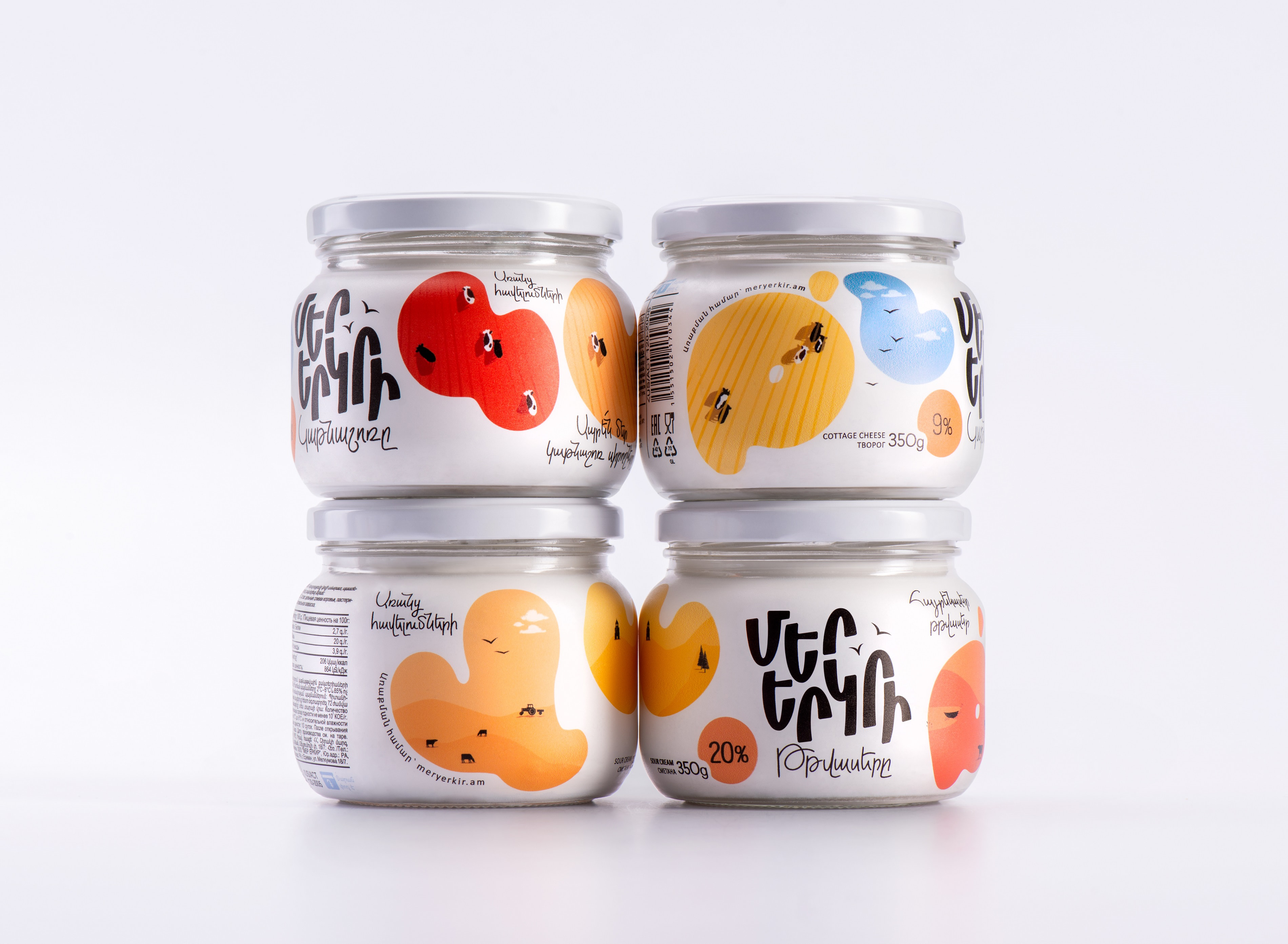
Also, we reimagined the colorful spots that adorned the previous design. These spots have now taken on a new role – they form vivid letters spelling out the names of the products. This transformation adds a layer of playful intrigue to the packaging.
The “letter-spots,” which are actually sticker labels, allowed us to expand the brand world of “Our Land.” We achieved this by including various illustrations that symbolize village life, including cows, crop fields, agricultural machinery, churches, birds, and blue skies. Unlike the previous design, the “letter-spots” are now evenly distributed around the surface of the bottle, making the product easily recognizable from any angle on a supermarket shelf or in a fridge.
Through this creative evolution, “Mer Yerkir” finds itself not only visually engaging but also deeply connected to its patriotic roots and the products it represents.
CREDIT
- Agency/Creative: Backbone Branding (''Artstep'' LLC)
- Article Title: Mer Yerkir Patriotic Redesign Unveiling the Soul of Armenian Dairy
- Organisation/Entity: Agency
- Project Type: Packaging
- Project Status: Published
- Agency/Creative Country: Armenia
- Agency/Creative City: Yerevan
- Market Region: Middle East
- Project Deliverables: Packaging Design
- Format: Bottle, Jar
- Industry: Food/Beverage
- Keywords: WBDS Agency Design Awards 2023/24
- Keywords: Packaging Design, Product Redesign , Sustainable Development
-
Credits:
Brand Strategist: Lusie Grigoryan
Creative Director: Stepan Azaryan
Art Director & Illustrator: Elina Barseghyan
Graphic Designer: Mane Budaghyan
Graphic Designer: Ashot Hayrapetyan


