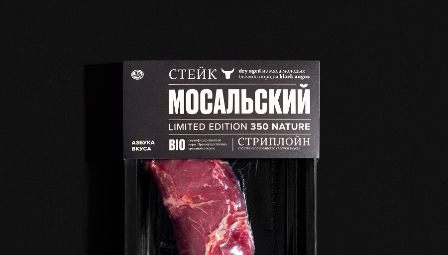
Objective To highlight the city of origin of the products where the farm is located — Mosalsk. The farm produces a limited number of products every year, which makes the product unique.
The first in the line of products were the flagship steaks, which we named “Mosalsky” to create a bond with this product. Our product is unique, we wanted to move away from solutions generally accepted in the local market — predominantly using black and photographs of the finished product.
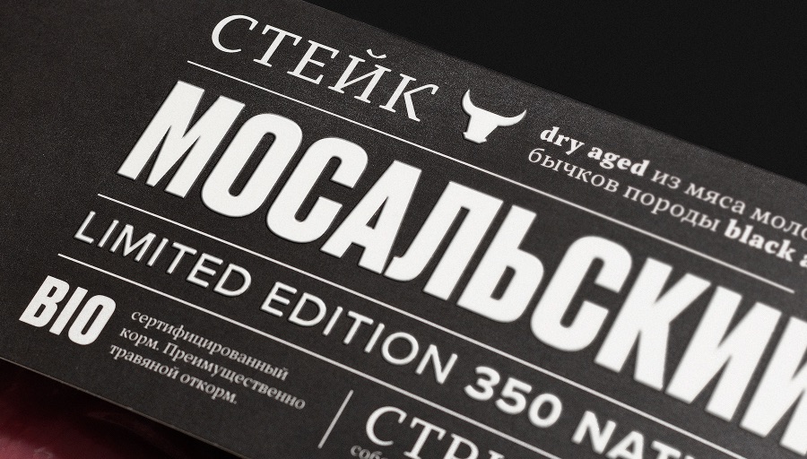
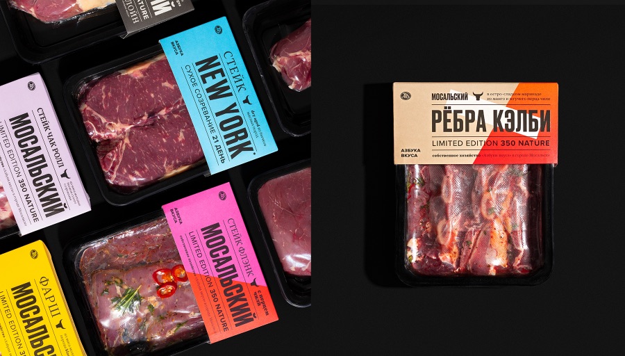
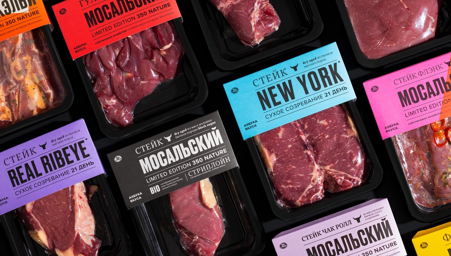
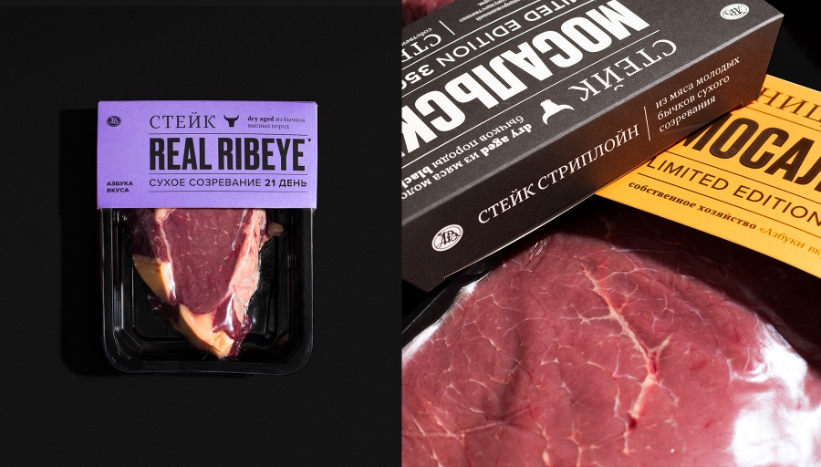
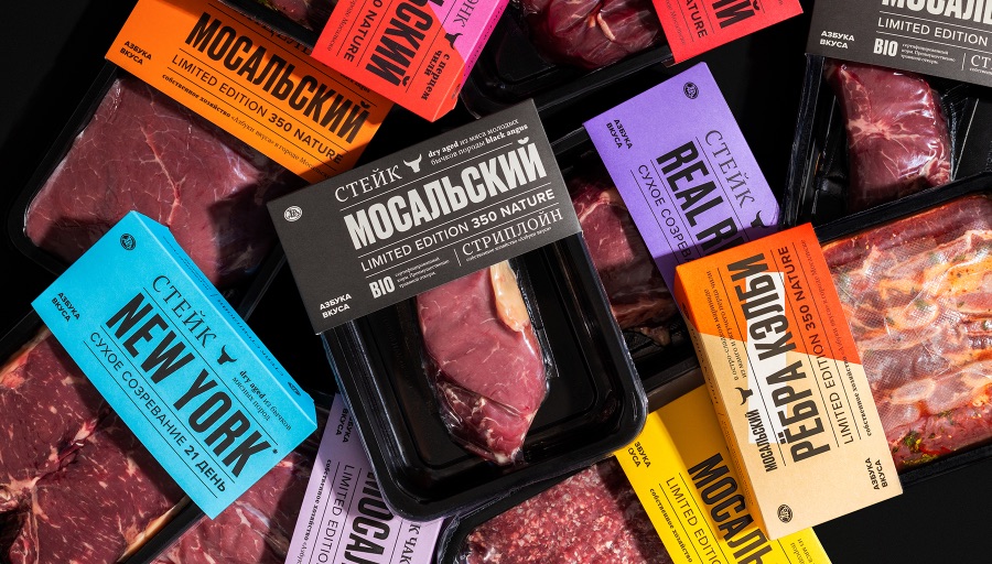
Solution We chose a different path — we created an exclusively typographic solution. The main idea is to make a loud statement from the shelf about a new product, as compared to how they write about the main news in the newspapers. At the heart of the design system is a solid typographic block that grabs attention and tells the consumer what the product is.
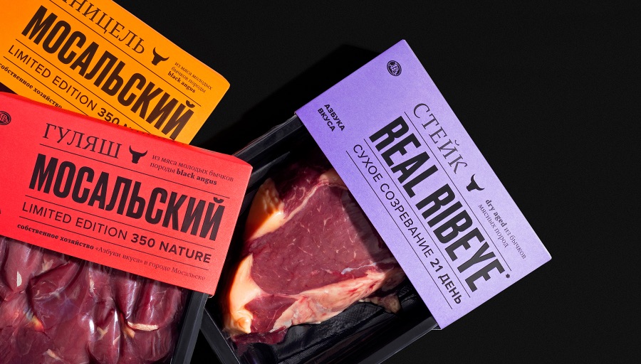
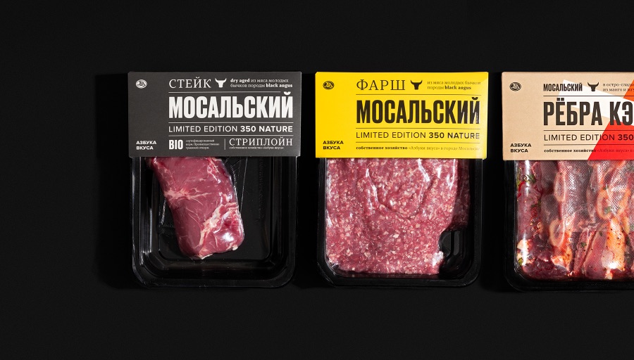
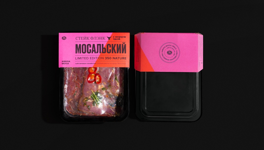
In using color, we also decided to go against the market, because most competitors in the Russian market do not use color in their designs when they work with meat. We make a product for the modern consumer in the modern world and we know how to work with color. Therefore, we have a bright color division of the product, which allows the consumer not to get confused in the products.
We also used abstract shapes in products that use additional ingredients. For example, a flank steak with chili is split in half and red is added to the main pink color of the steak. And in products on the bone, an abstract white rectangle is added to symbolize the bone. Simple shapes help the shopper quickly read product characteristics and easily distinguish from the shelf in minutes.
As a result, we got a fundamentally new approach for Russian retail in the field of meat products.
CREDIT
- Agency/Creative: Azbuka vkusa
- Article Title: Meet Mosalskiy Packaging Design
- Organisation/Entity: In-House
- Project Type: Packaging
- Project Status: Published
- Agency/Creative Country: Russia
- Agency/Creative City: Moscow
- Market Region: Europe
- Project Deliverables: Packaging Design
- Format: Tray
- Substrate: Plastic
- Industry: Food/Beverage
- Keywords: WBDS In-House Design Awards 2021/22
-
Credits:
In-House Team: Azbuka vkusa


