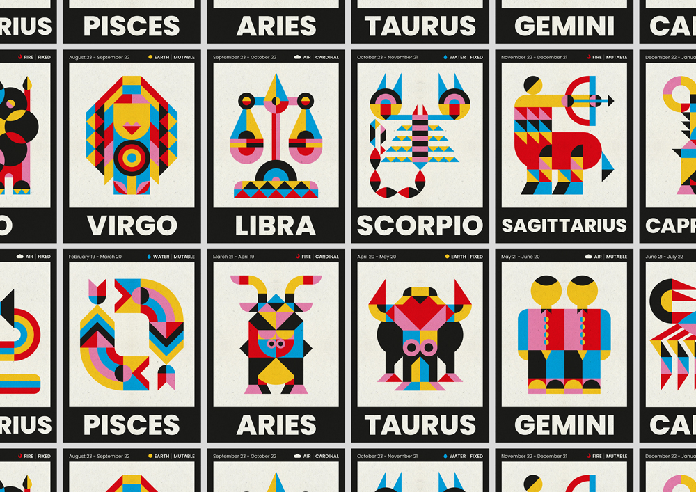
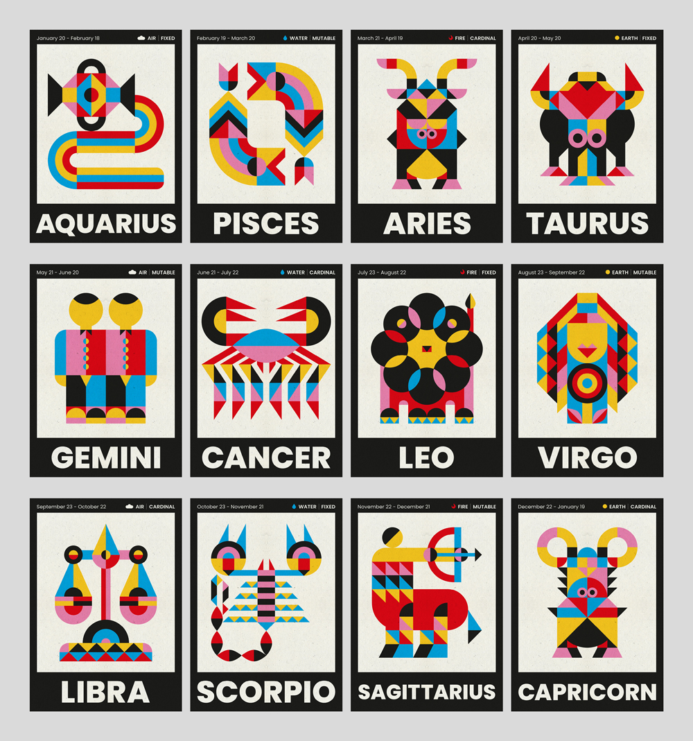
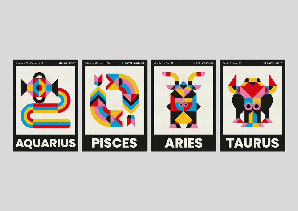
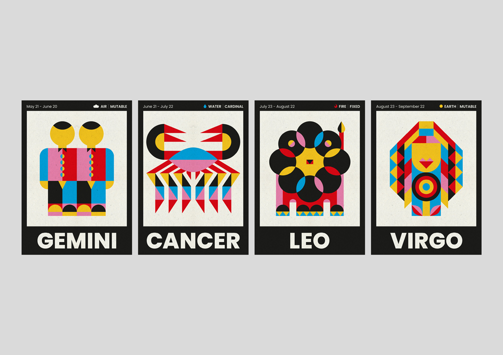
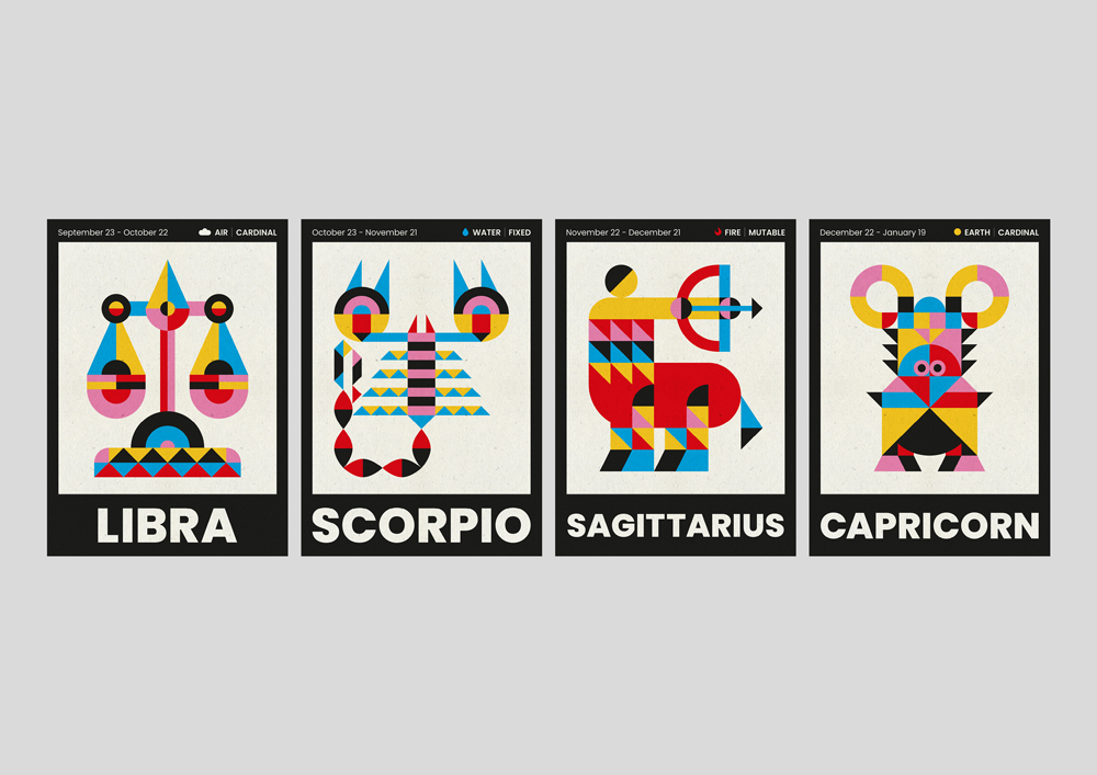
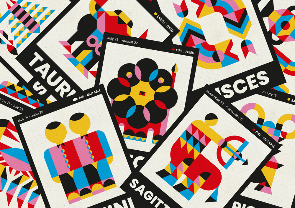
Graphic Designer Mario Carpe has just released a new print series based on the horoscope and its different zodiac signs. Each one includes dates, the kind of element (air, water, fire, earth), and quality (fixed, mutable, and cardinal).
“Although I am not a believer in the horoscope, I do find it very funny and curious to read the different characteristics and traits that a person can have depending on the date of the year they are born. The zodiac signs are something trendy and I wanted to give it a graphic rejuvenation, going a little beyond the traditional symbology or images with which it is related. I wanted to create a project in which each person was identified in some way, but this time from a more esoteric point of view and I thought that the zodiac was a good opportunity for it, since many people do believe and feel very identified with their respective sign.”
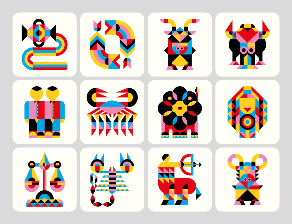
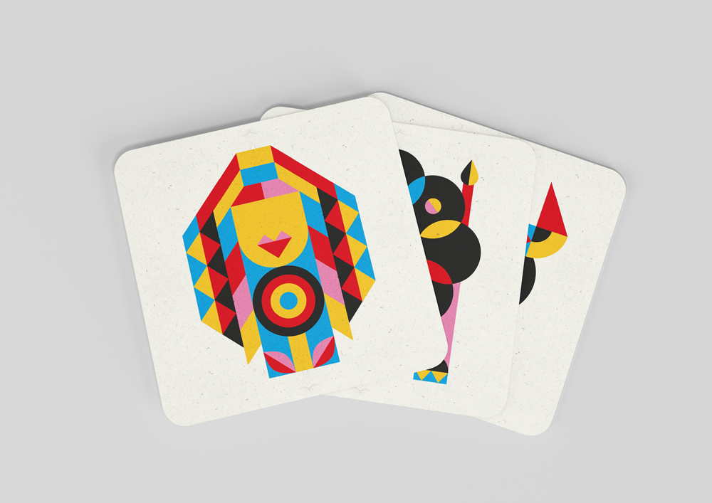
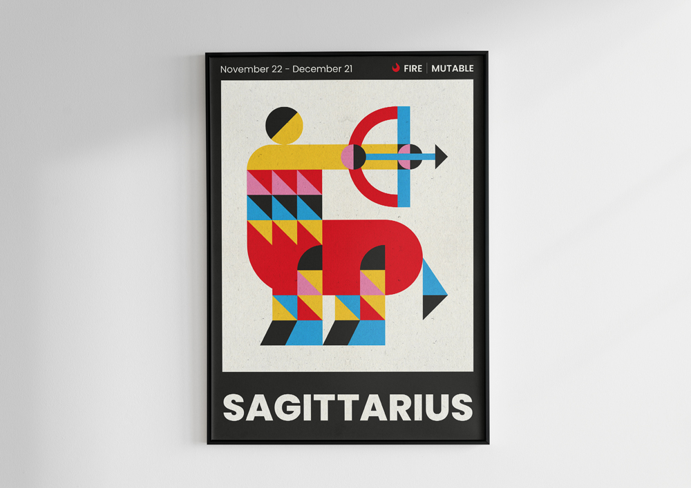
Mario has recreated each sign of the zodiac using simple, geometric shapes, with the same level of detail and a fixed color scheme in such a way that, although each illustration of each sign is different, the project has cohesion and coherence when viewed in full.
To create this series, the process of drawing on paper was important, as it saved him a lot of time later when it came to digital work. Mario tells us; “Perhaps the most important challenge was to give unity and the same level of detail to all the graphics, so that they all have the same identity when put together, and to simplify the sign to geometric shapes so that, despite its simplicity, it was easy to identify, no need to read the zodiac sign title.” Once he had the shape of the sign on paper, he moved on to digital work. Despite looking for a sense of visual coherence amongst all of the designs, Mario worked one by one and did not wait to have them all completed. Once each one of them was completed, the designer then had to rectify or polish some details. When creating the posters, he chose to create a frame that would highlight the illustration and a sans-serif typeface that would convey modernity to the theme.
CREDIT
- Agency/Creative: Mario Carpe
- Article Title: Mario Carpe’s Innovative Print Series Redefines Zodiac Symbols
- Organisation/Entity: Freelance
- Project Type: Graphic
- Project Status: Published
- Agency/Creative Country: Spain
- Agency/Creative City: Cádiz
- Market Region: Global
- Project Deliverables: Art, Art Direction, Character Design, Craft, Digital Art, Graphic Design, Illustration, Poster Design
- Industry: Entertainment
- Keywords: zodiac, horoscope, minimalism, zodiac signs,
-
Credits:
Graphic designer: Mario Carpe


