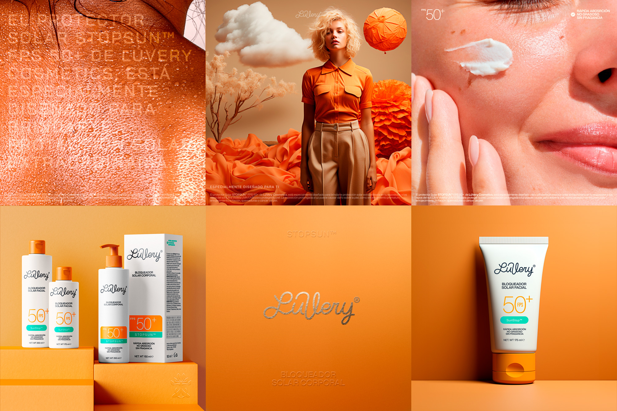
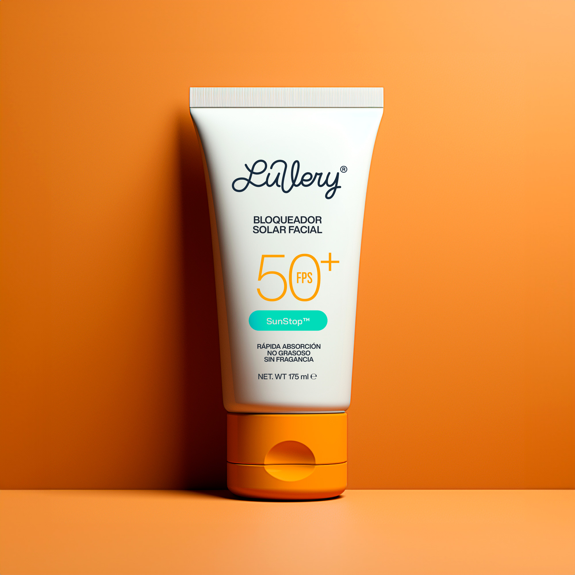
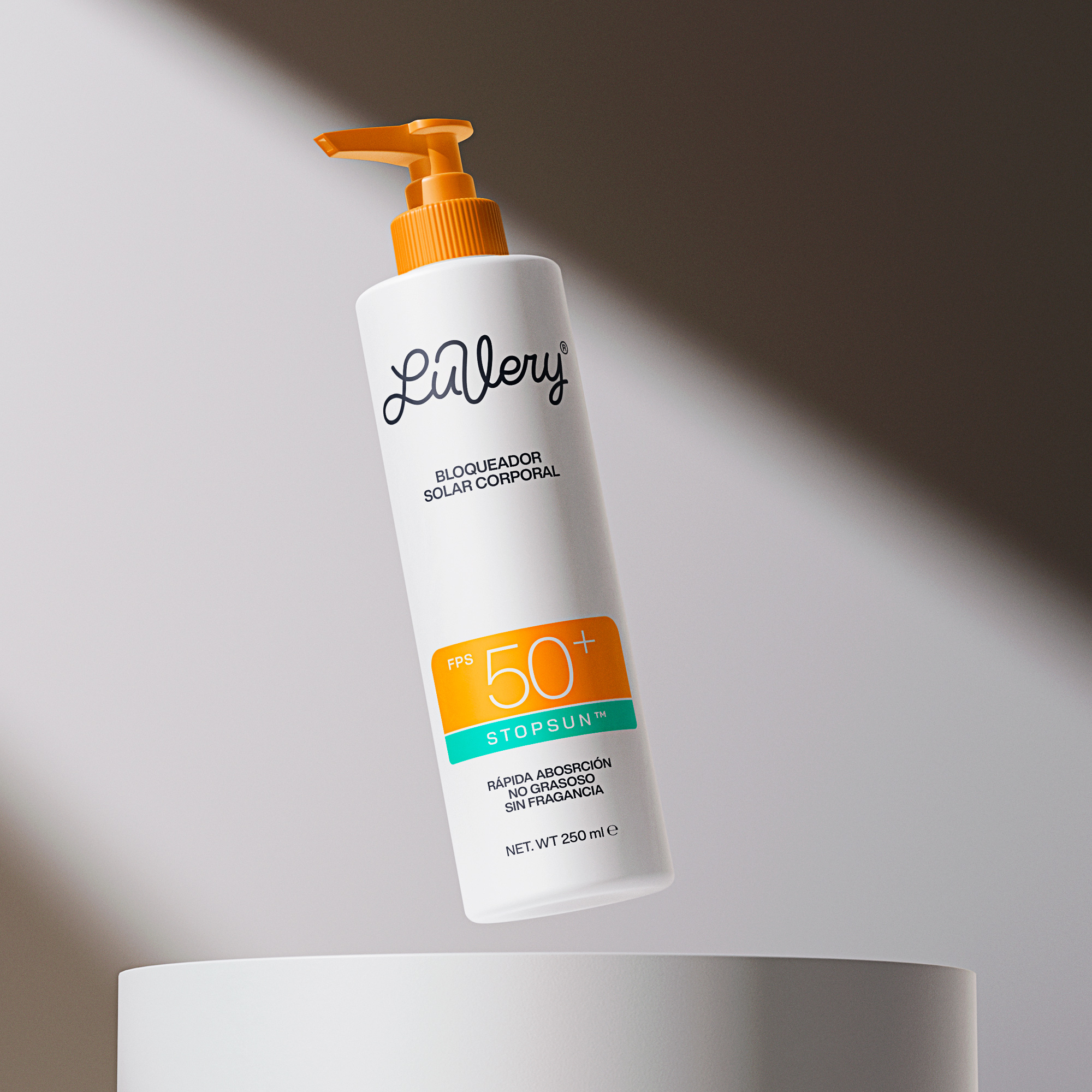
Luvery®️ the sunscreen that your skin needs, no more, no less and according to the brand, using only the necessary elements was a priority. The requirement was simple: “We want our brand on a simple line” and I believe this word can fully define this project: Simplicity.
When we talk about a simple line we talk about everything, a line that defines the brand, a simple color line and a clear communication line, nothing more.
The mission is about the importance of taking care of yourself and your natural beauty.
Being in harmony with your body is the starting point and simplicity in each element it’s next.
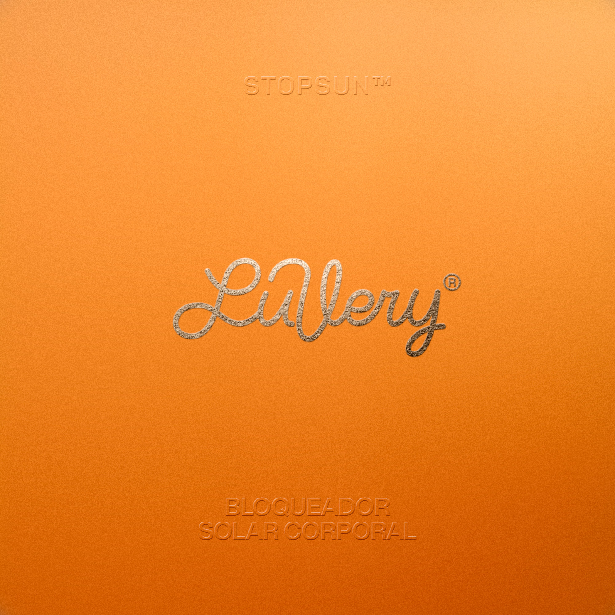
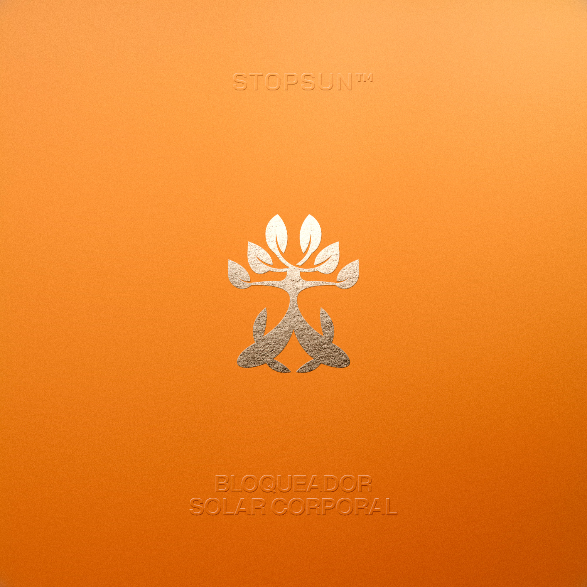
A logo created with a single line, that represents the movement when applying this product to the face and body, always in a circular shape. Our client also has a fascination with Japanese writing, especially with the movement of the hand, something particular about this writing is that the simplicity in the use of brushes makes this type of writing complex and we also want to represent this, the simplicity and complexity in a single package, so we try to do something organic and minimalist. We creating an icon that talk about Japanese fish and the duality in them, since originally this project was born from the union of a couple and the dream to start a project together, the icon expresses this main idea, two fish blooming together.
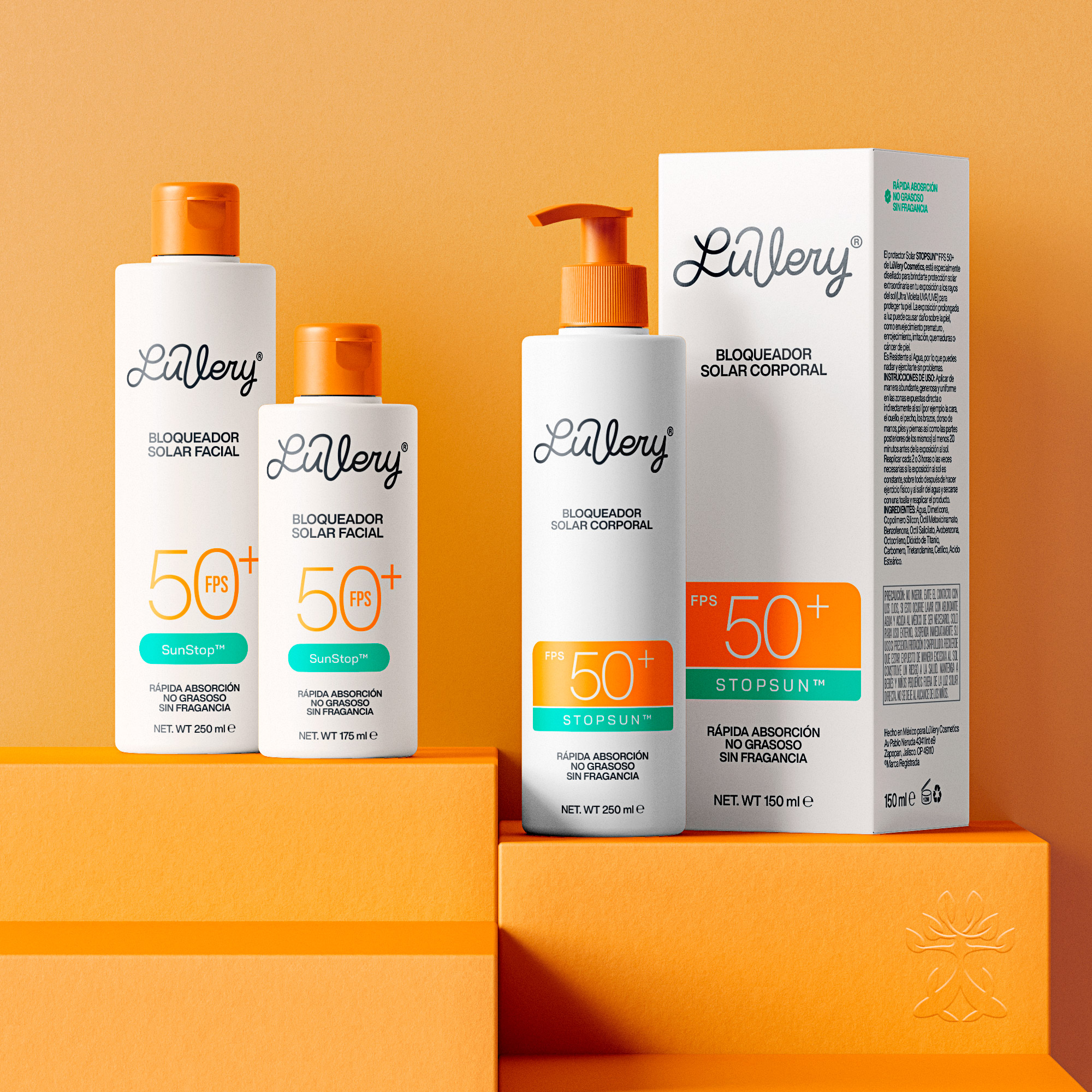
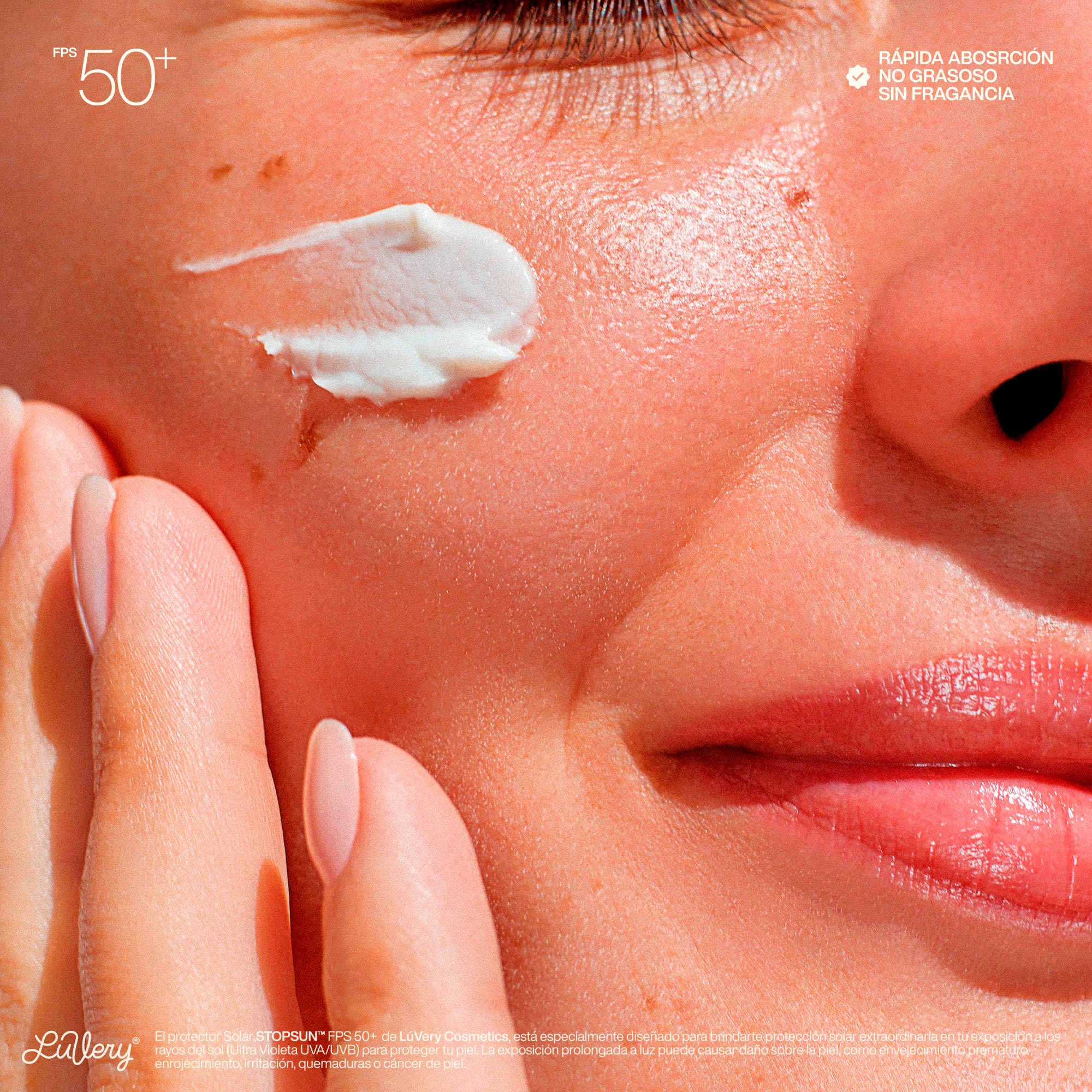
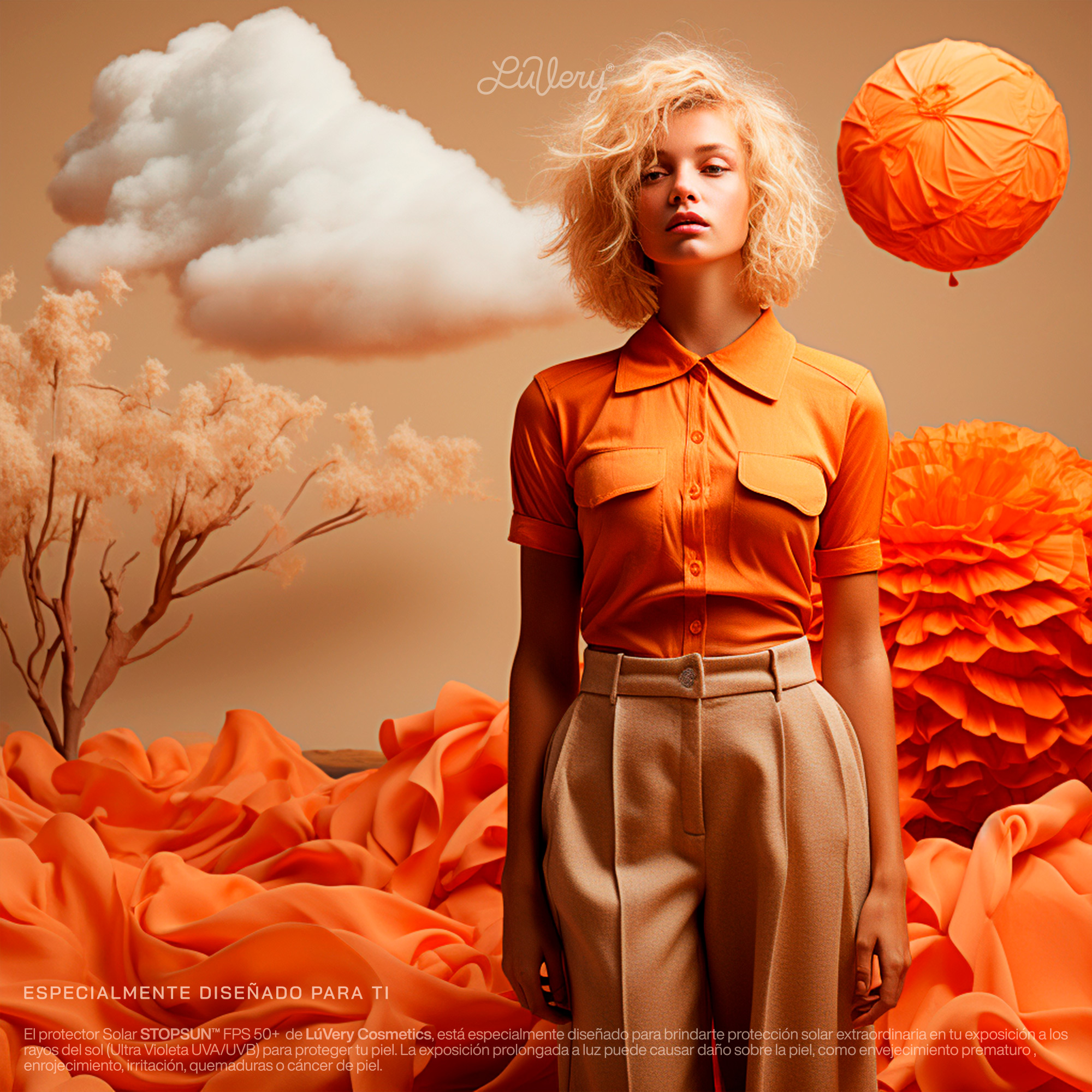
Within the communication we have two colors, orange as the main color and aqua blue as a secondary color, both referring to the sand and the sea.
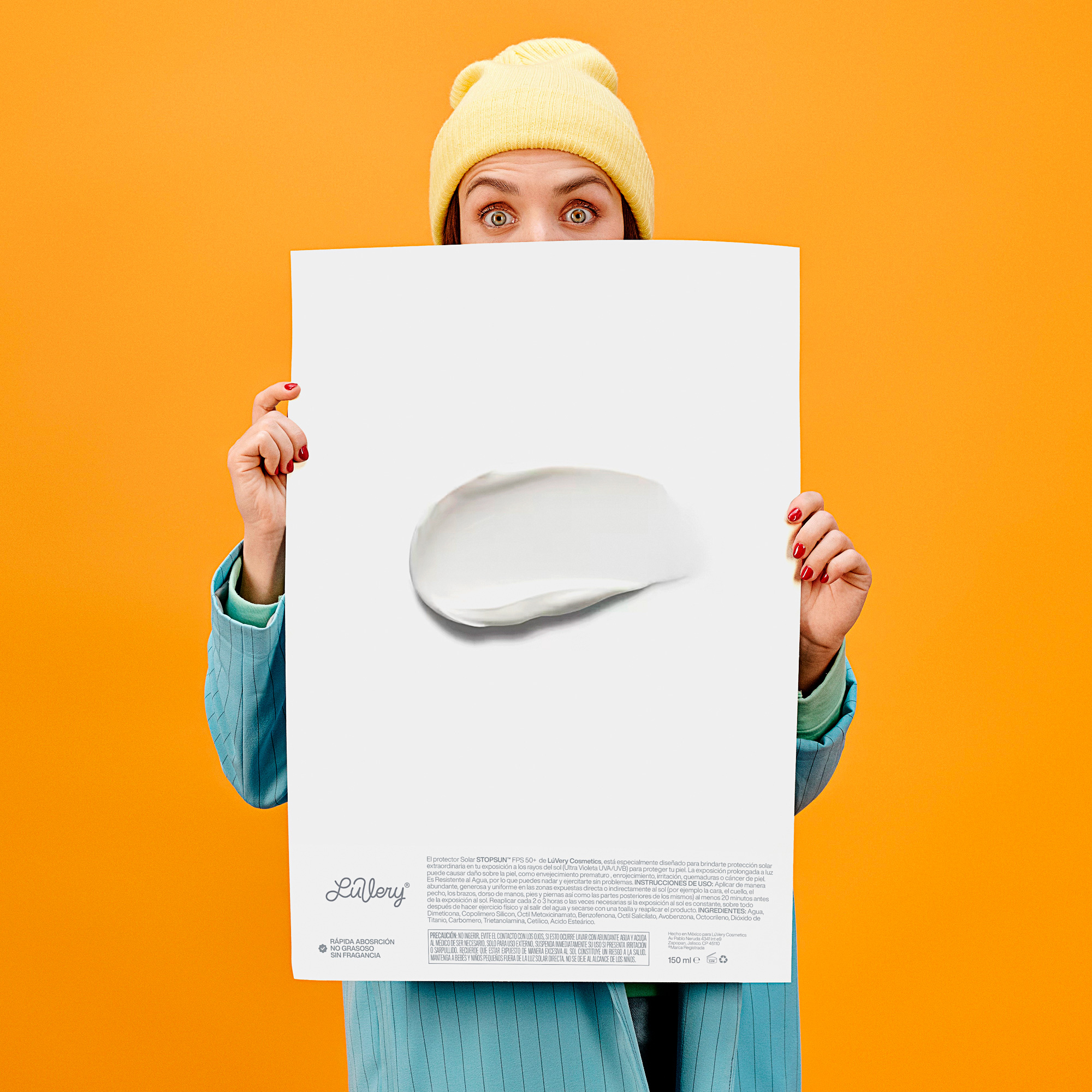
We think that to take a product off the shelf the information must be clear, especially when we talk about protection, mothers are the main consumers and always look for what is best for them and the family, we do not need more information, only what is necessary and clear.
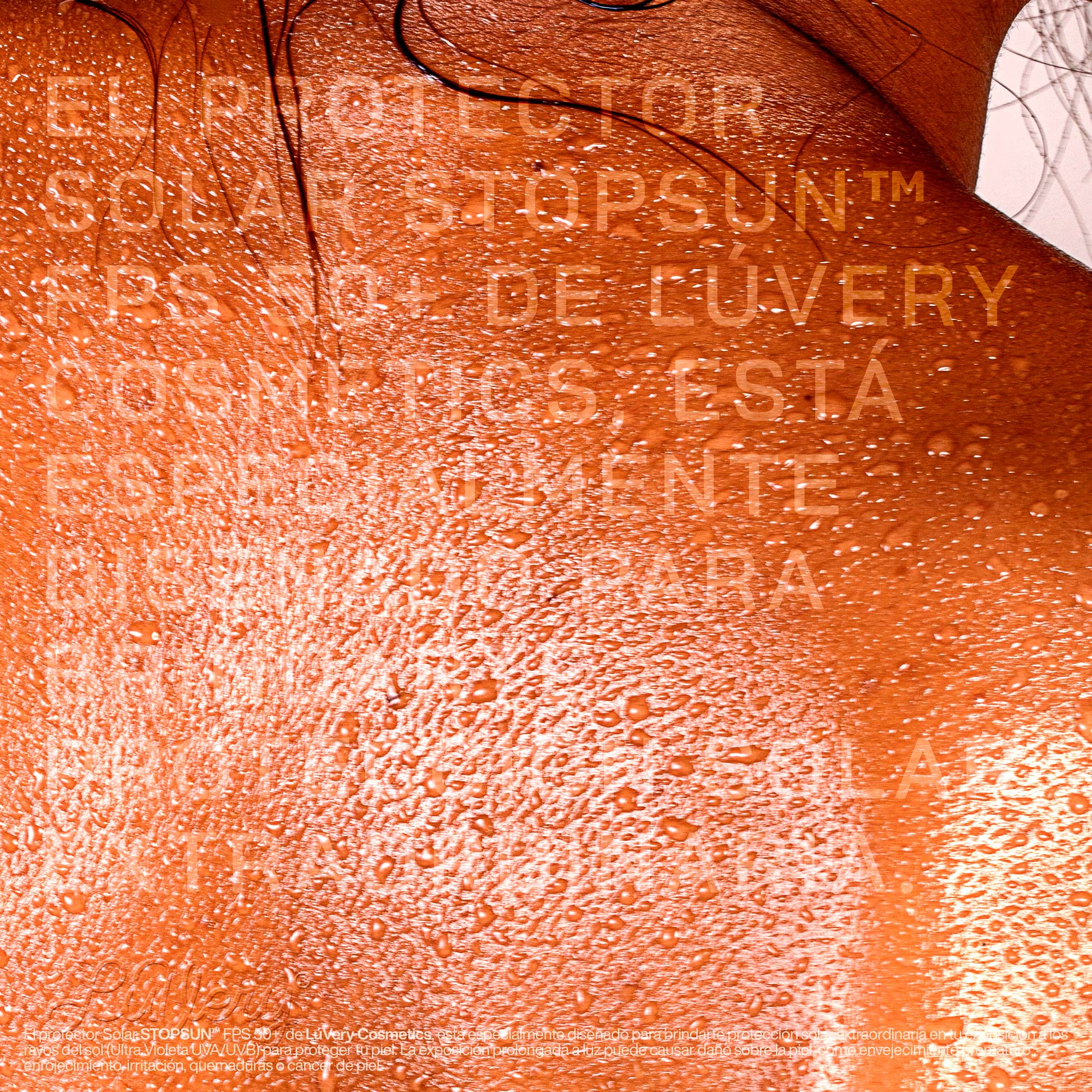
Communication in this brand is simple, no more, just what you need.
CREDIT
- Agency/Creative: Nacho Studio
- Article Title: Luvery Sunscreen Branding and Packaging Design
- Organisation/Entity: Agency
- Project Type: Product
- Project Status: Published
- Agency/Creative Country: Mexico
- Agency/Creative City: Jalisco
- Market Region: South America
- Project Deliverables: Branding, Packaging Design
- Industry: Beauty/Cosmetics
- Keywords: Beauty, Packaging, Design, Cosmetics
-
Credits:
Creative and Design: Nacho Huizar


