Background
It all started with a single drop.
In July 2021, the Ahr valley in Germany suffered its worst flood yet, which completely destroyed the Dernau village at the time (among others) and from which residents are still recovering.
This flood met Meike and Dörte Näkel, owners of one of Germany’s top leading wineries, when it swept away the 25 km stretch of vineyards covering the region, taking Meyer-Näkel’s 2020 vintage with it. They were left with nothing.
In the midst of the flood, the two sisters were able to free themselves from their flooded wine cellar and were immediately carried away by the large masses of water. After various attempts, they managed to hold on to a tree in order to stay afloat, and remained there for eight long hours before they were rescued. Over those eight hours however, amidst the catastrophe, they saw an opportunity to start from scratch, to create something new from this clean slate they were handed.
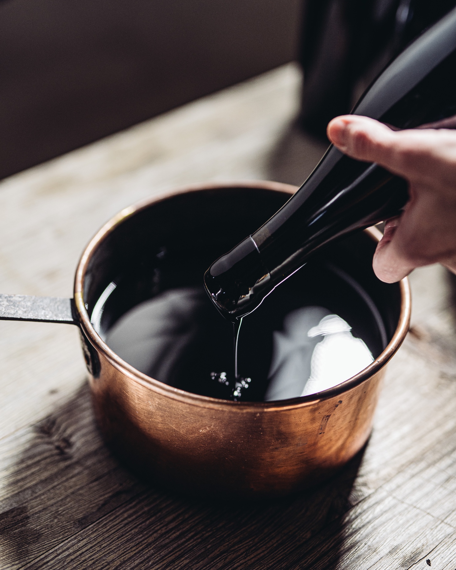
In the days following the flood, nine intact barrels were found in villages several miles away. These “Lost Barrels” represented nine out of the 380 originally produced, the only survivors left from their 2020 vintage. Almost like a precious gift, the Pinot Noir wine inside had remained intact.
The decision was to then bottle this miraculous wine, to later introduce it to wine lovers all around the globe as part of a larger strategy, integrating renowned chefs and Michelin star restaurants in a global wine tasting tour.
And so they approached us to help materialize this dream by designing the line of the last 2,520 bottles.
Brief
Thus, our task became to design a packaging that would pay homage to the story behind the wine, it being such a unique and touching one. And although the narrative was originally one of loss and disaster, Meike and Dörte’s only wish was to tell the story from a place of hope, emphasizing the fresh start it represented for the brand.
As they very touchingly expressed themselves, “These wines are a relic from the past and also a starting signal from what may come in the future.”
And so, with all the creative freedom offered, we set on to the task of creating a memorable design that would capture the preciousness of the wine´s nature, without forgetting its highly emotional side:
“We will remember the 2020 vintage forever, it is packed with emotion”.
Meike & Dörte Näkel
Strategy & Design Process
Throughout the design process, we aimed to transmit the luxurious and almost mystic character of the product, crafting each label with meticulous care with the hope of creating a user experience as unique as the wine itself.
Our strategy therefore was to create more than a wine label, but rather works of art. Sculptures that would be attractive to wine connoisseurs and collectors all around the world. Given that these wines were the last bottles available of the 2020 vintage, they needed to be sold at higher prices in order for the winery to survive. We thus aimed for a very premium yet, at the same time, a more unusual look that would reflect the two winemakers’ story at every step of the process.
As the story goes, the design concept began where it all started: the first drop. And just like the flood, the presence of the drops expands over the nine different bottle formats. Furthermore, the bottles are then placed in wooden boxes crafted from remaining pieces of the lost barrels.
Results
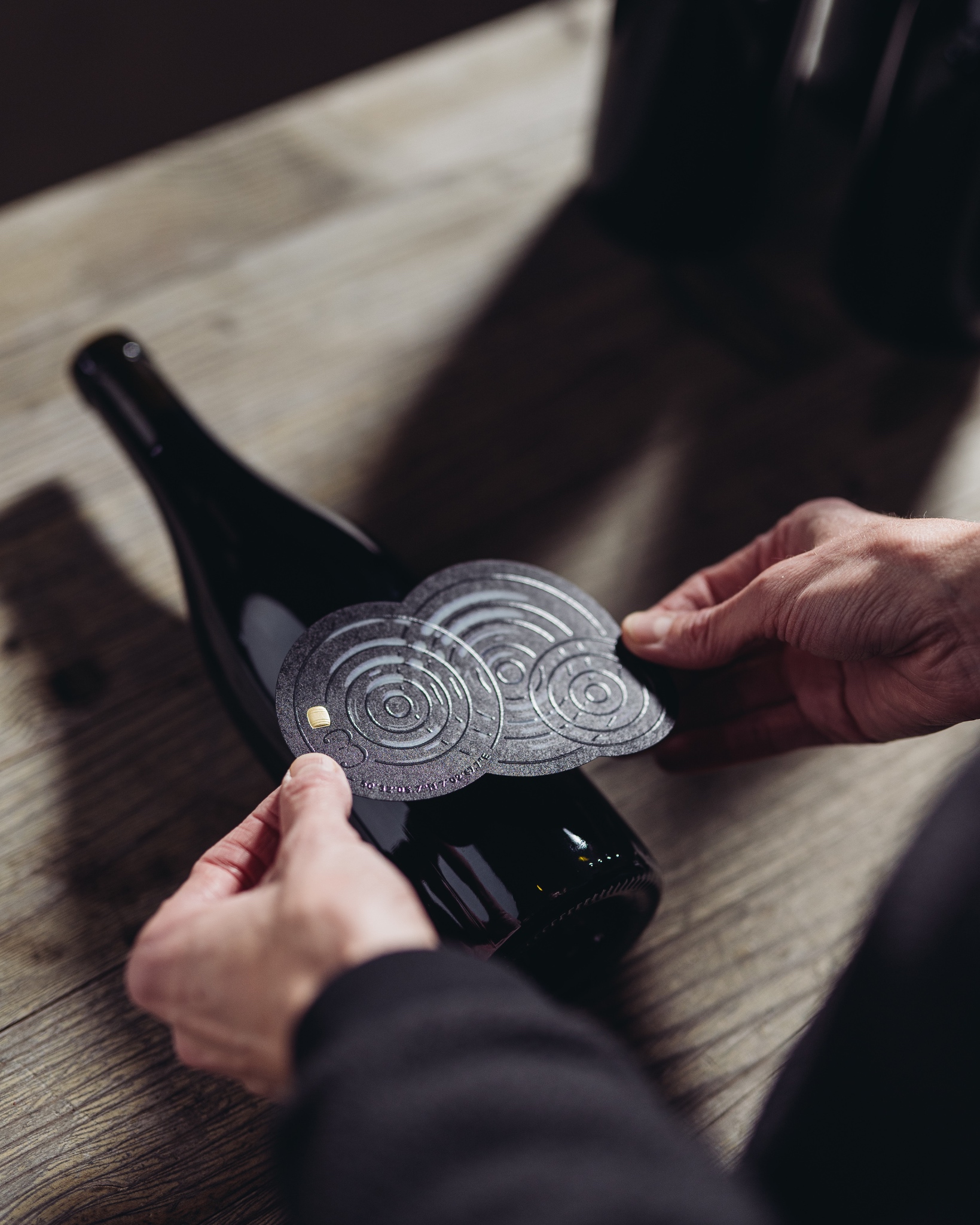
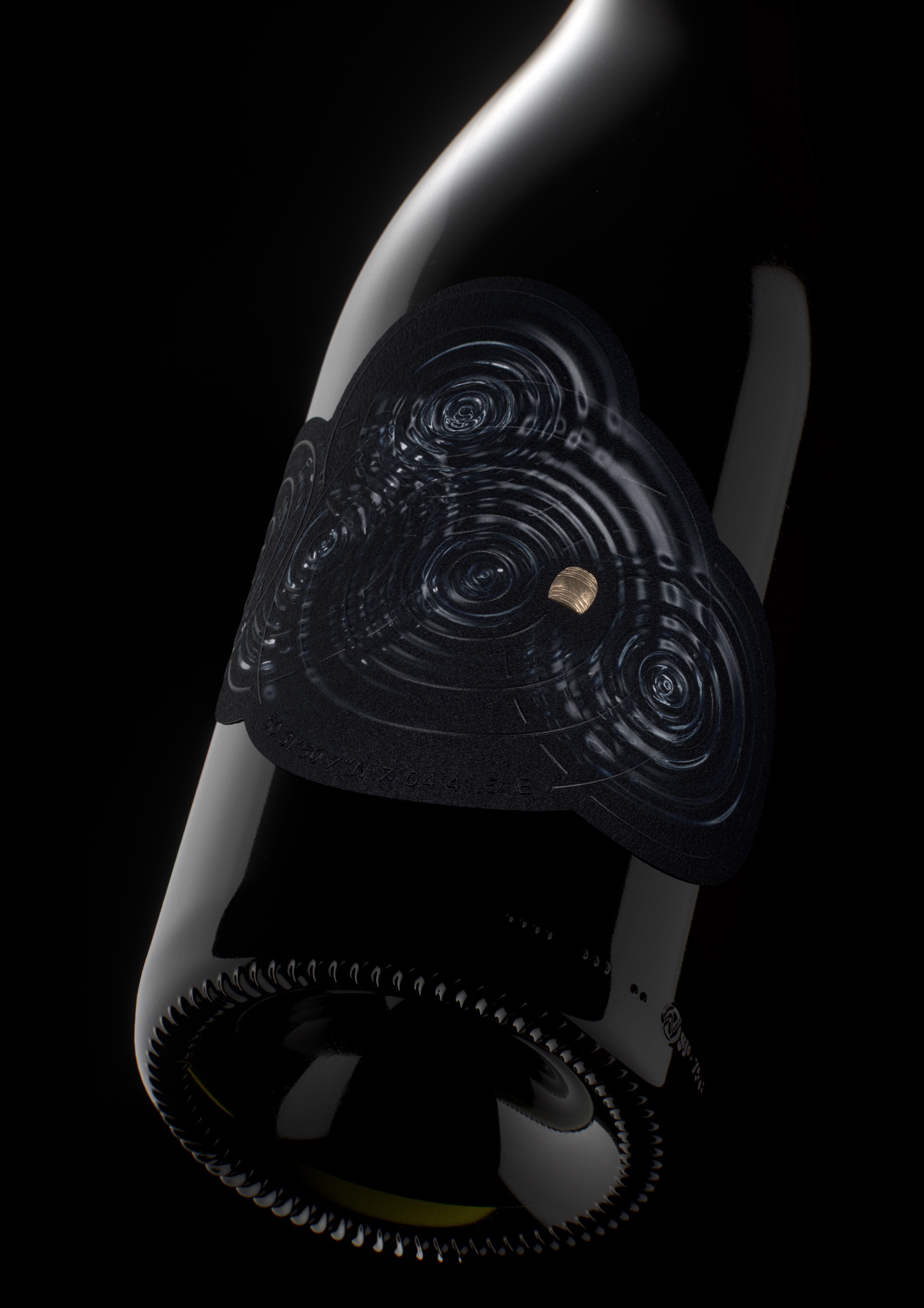
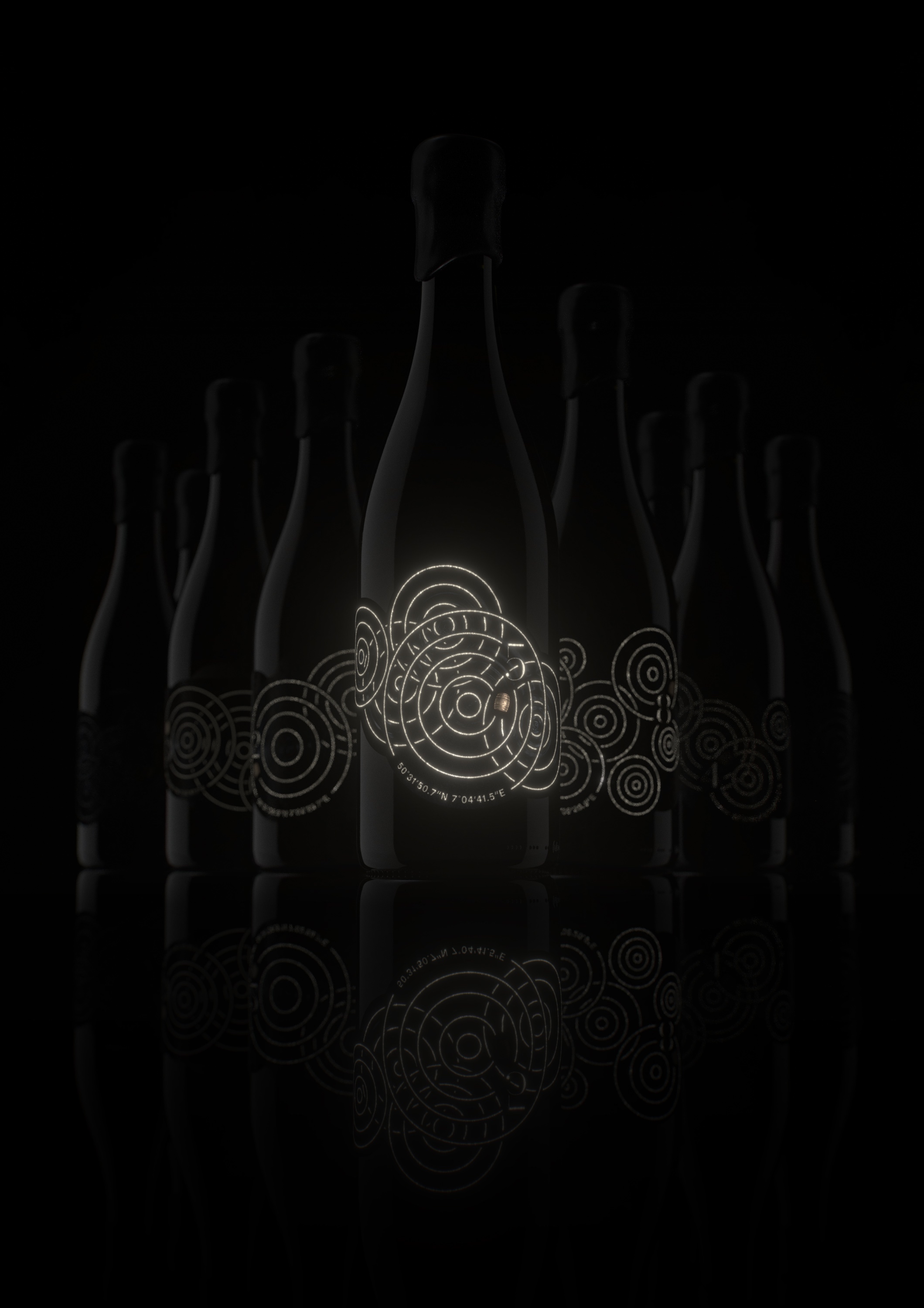
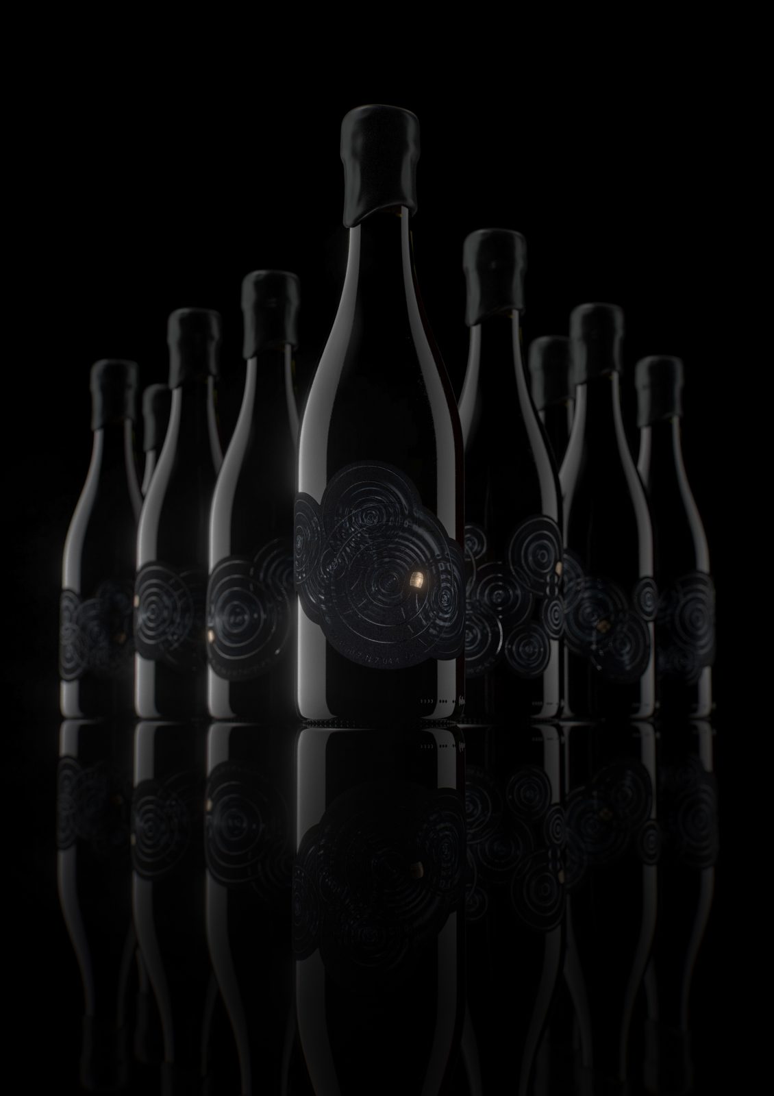
The series presents nine different labels, which progressively display a growing number of drops: from one to nine, a tribute to each of the nine barrels found.
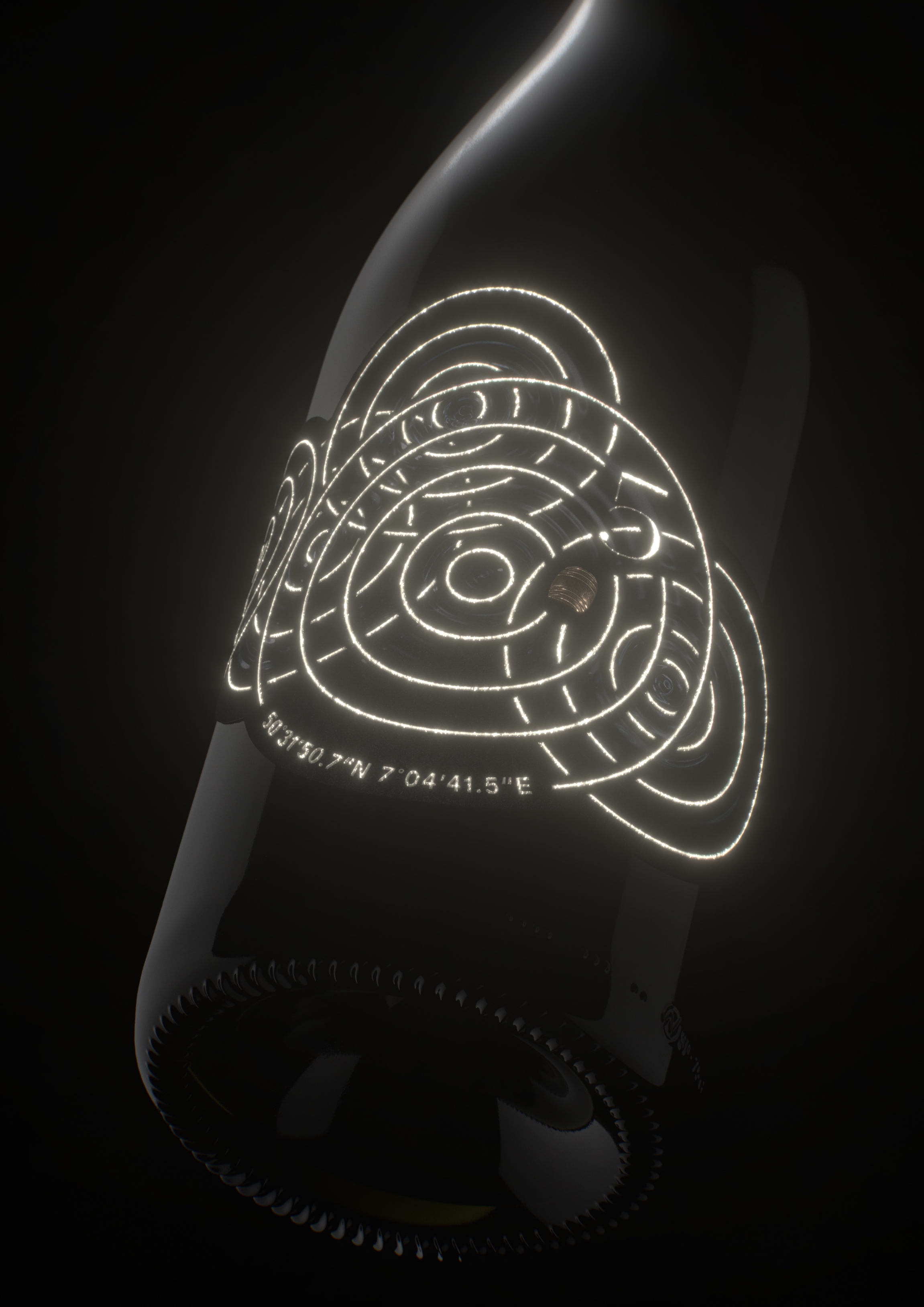
The golden barrels floating in the front label glisten among the dark waves, additionally positioned according to the exact locations where they were found.
The design was developed in dark tones over a black paper as a reference to the time of the flood, as it happened overnight. The elegance of the paper and monochromatic scale however adds seriousness to the product, resembling the gravity of the event that led to its creation.
Nonetheless, once placed in the dark, the bottles finally reveal their secret. Thanks to the use of a special phosphorescent ink, details such as the locations of the barrels emerge, alongside the coordinates where they were found. Other details of the design, such as the bottle number and the water drop waves, are enhanced. The result is an object that was born in the dark, yet that shone with hope once found.




CREDIT
- Agency/Creative: Ruska Martín Associates
- Article Title: Lost Barrels Packaging Design
- Organisation/Entity: Agency
- Project Type: Packaging
- Project Status: Published
- Agency/Creative Country: Germany
- Agency/Creative City: Berlin
- Market Region: Europe
- Project Deliverables: Packaging Design
- Format: Bottle
- Industry: Food/Beverage
- Keywords: WBDS Agency Design Awards 2023/24
- Keywords: Packaging Design, Product Creation,
-
Credits:
Rendering: Thomas Werle
Photography: (C) Sandra Fehr / Heroes of Riesling


