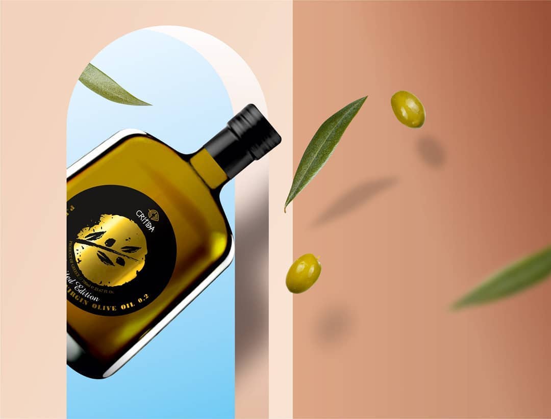
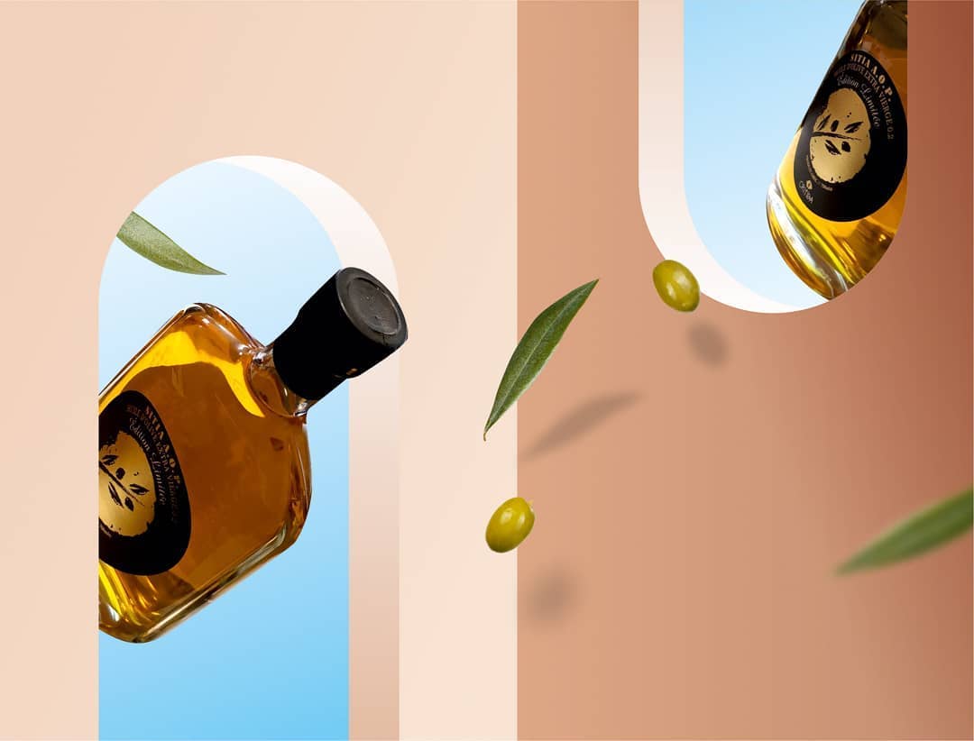
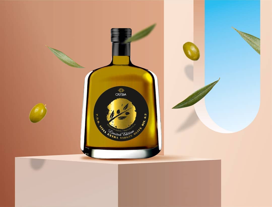
Critida’s limited edition olive oil packaging aim goal was to be simple, luxury, and unique. In order to follow and achieve the guidelines, we created a minimal design of an olive branch and used black and gold colours. A strong color combination with contrast which comes in harmony with the special bottle.


CREDIT
- Agency/Creative: Leftgpaphic - Lefteris Panagoulopoulos
- Article Title: Limited Edition for Critida’s Extra Virgin Olive Oil by Leftgpaphic
- Organisation/Entity: Agency, Published Commercial Design
- Project Type: Packaging
- Agency/Creative Country: Greece
- Market Region: Global
- Project Deliverables: Packaging Design, Product Architecture
- Format: Bottle
- Substrate: Glass Bottle
FEEDBACK
Relevance: Solution/idea in relation to brand, product or service
Implementation: Attention, detailing and finishing of final solution
Presentation: Text, visualisation and quality of the presentation


