The Project
Sarva wines appear for the first time on Labelmaker’s website though the brand history dates back to 2008 or 2009. This is probably the most affordable one among all Dragomir’s wine brands and on my opinion it is one of the best for small wine country like Bulgaria. Sarva comes from Sanskrit, meaning all or everything and whole, complete.
Short, but very meaningful brand name when it comes to new wine label design ideas.
The Challenge
Like in many other projects I did in the past, and some of them were for Dragomir Estate Winery too, Sarva was one of those challenges where I had to redesign my own work. I was really wondering whether to put or not this new story in Before and After category, but the new result was so different than the old one, that I was pretty much convinced it should have been treated as brand new project.
Starting with the Sarva meaning my very first idea was about something related with circle, spiral, even In and Yan. I wanted somehow to visualize what Sarva really was and show it to the audience in a memorable design.
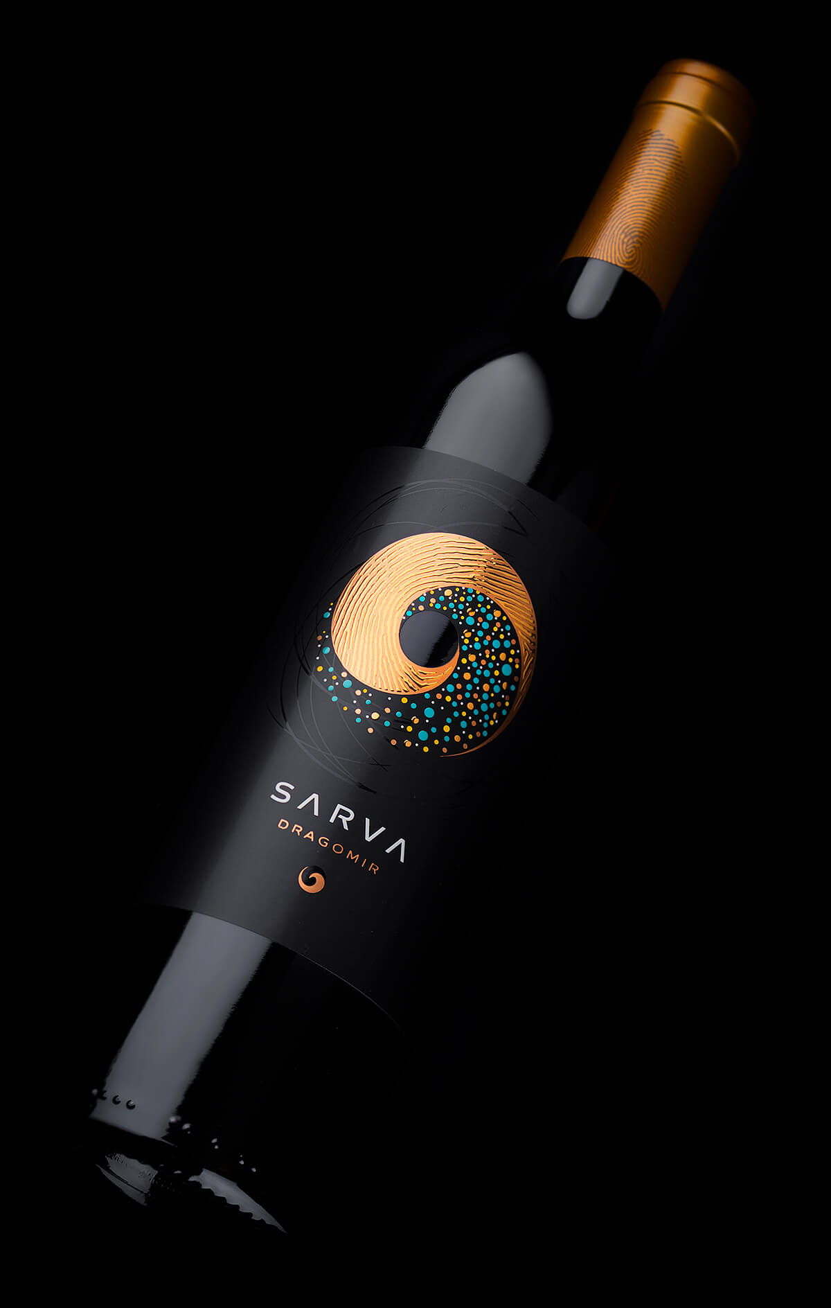
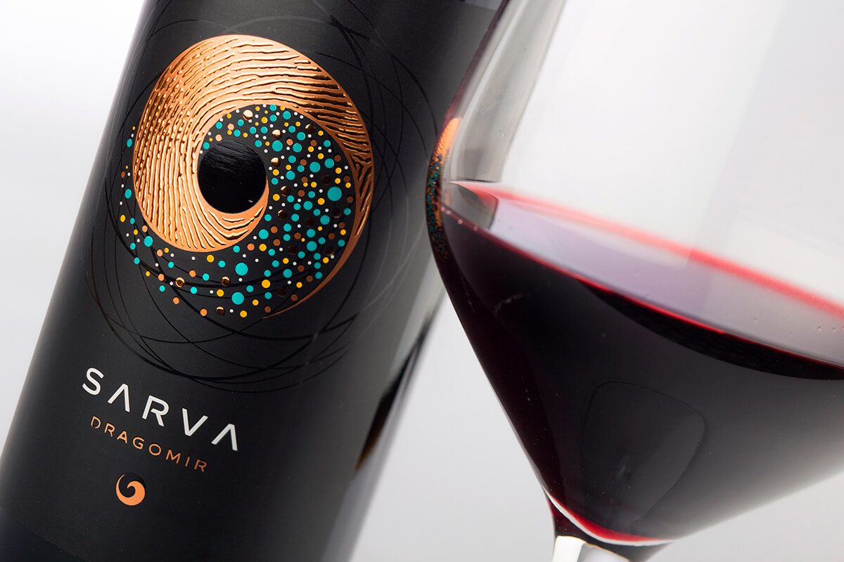
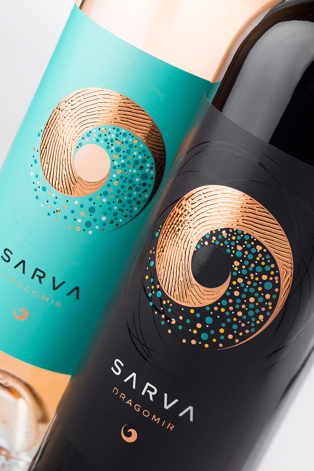
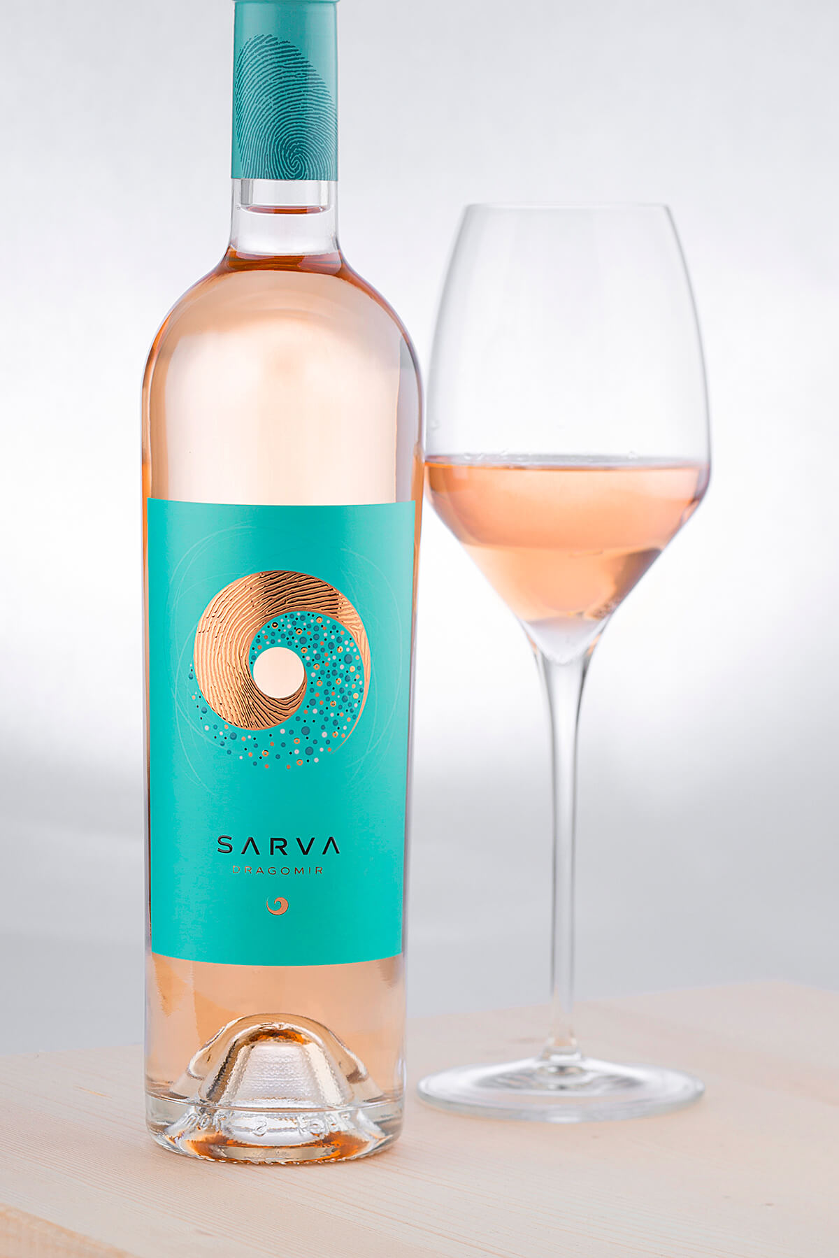
There is a hole in my label. This is the beginning – you could see the wine through this hole. Then swirling around it I designed two complementary symbols flowing into one another but representing two different aspects of winemaking. The top element was symbol of human knowledge and craftsmanship and that’s why I created a fingerprint texture on it to mark the human presence and activity in this process. The bottom element was symbol of all that Nature gives into wine, vineyards, and winemaking. I used many different dots to indicate how diverse and complex this second process was.
Like in the old Srava label it was another huge challenge to create appealing design on one hand and on the other to have new intricate print technology that makes the label shine on the shelf.
The Execution
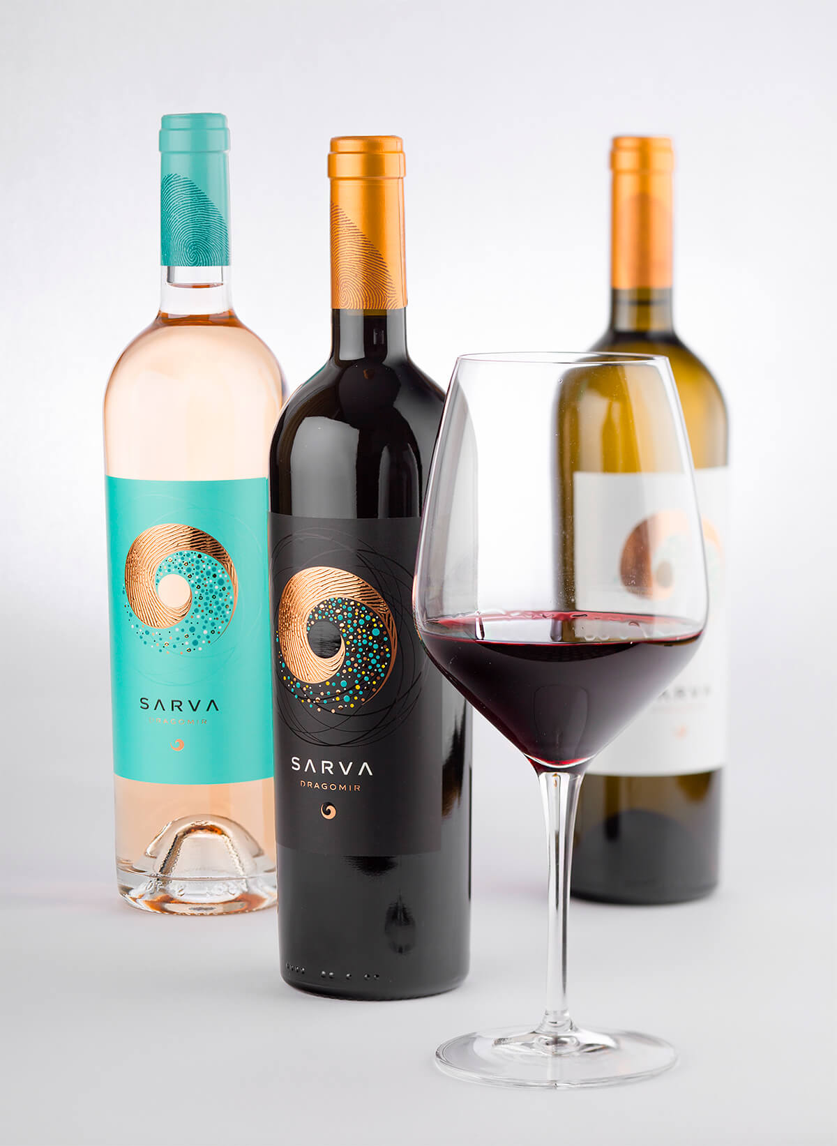
Bottle – we preserved the taller Bordeaux bottle from old Sarva design as it had really strong presence on the shelf looking classy and modern at the same time.
Sealing – We used classic cork sealing with tin capsules in different colors branded with a large fingerprint to repeat the theme from the new labels.
Paper – We used special foil here to enhance the contemporary feeling we were looking for in this design and to get maximum water resistant of the packaging in ice bucket.
Print – printing this new design was a hassle first because of the opening in the center of the label and second because I really wanted to use in very close distance 3 different print techniques like hot foil, silk foil and raised varnish. All these surrounded by custom made UV matt varnish which main goal was to transform the finish of the foil from glossy to matt.
The Result
The result I was looking for was very colorful, stylish and intricate wine label design that really grabs your attention. All these special print techniques incorporated in one image enhance the appealing look I was aiming at. They work for amazing complexity and detail of the final image so that everyone would grab the bottle only to see what is so special and so different with this label.
Credits:
Client: Dragomir Estate Winery
Wine Label Designer: the Labelmaker
Printer: Rotoprint
Paper: Arconvert
Photo: Jordan Jelev
CREDIT
- Agency/Creative: the Labelmaker
- Article Title: Life Philosophy Revealed in a Contemporary Wine Label Design
- Organisation/Entity: Agency, Published Commercial Design
- Project Type: Packaging
- Agency/Creative Country: United States
- Market Region: Europe
- Project Deliverables: Brand Rejuvenation, Brand Strategy, Brand World, Branding, Graphic Design, Packaging Design, Photography
- Format: Bottle
- Substrate: Glass Bottle


