La Señorita is a Mexican restaurant capable of bringing together fun, sophistication, and quality. The idea is to transport to a light and culturally rich environment through truly Mexican cuisine. Its greatest desire is to win over the heart of anyone seeking good food and willing to embark on a caliente journey through the senses.
We were challenged to create the brand strategies, communication, and positioning for the Mexican restaurant La Señorita, capturing its distinctive perspective on the gastronomic, sensory, and cultural universe. In order to do this, the project needed to address two questions: How to find an intriguing balance between the vibrant and spicy culture of Mexico and the sophistication necessary to stand out among its competitors? And how to transport people to a cultural extension of Mexico in Brasília?
In the desire to build a real connection between the restaurant and Mexican roots, we found inspiration in the art of José Guadalupe Posada (1852-1923) and his constant reinforcement of a Memento Mori. Famous for his lithographs, Guadalupe presents “La Catrina” — the representation of the skeleton of a high-society lady with her floral adornments and ornaments.
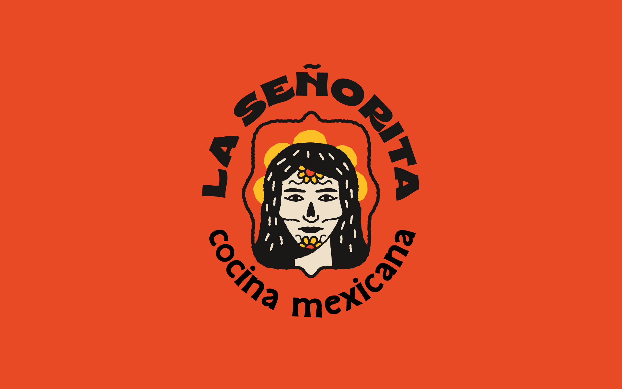
Understanding death as an inherent condition of life, and encouraged by this contrast, our research led us to Frida Kahlo — a historically significant figure for female representation, highlighting the fact that the restaurant’s team is composed of women. Motivated by her paintings, we bring the illustration of a woman from a frontal perspective to represent the brand La Señorita.
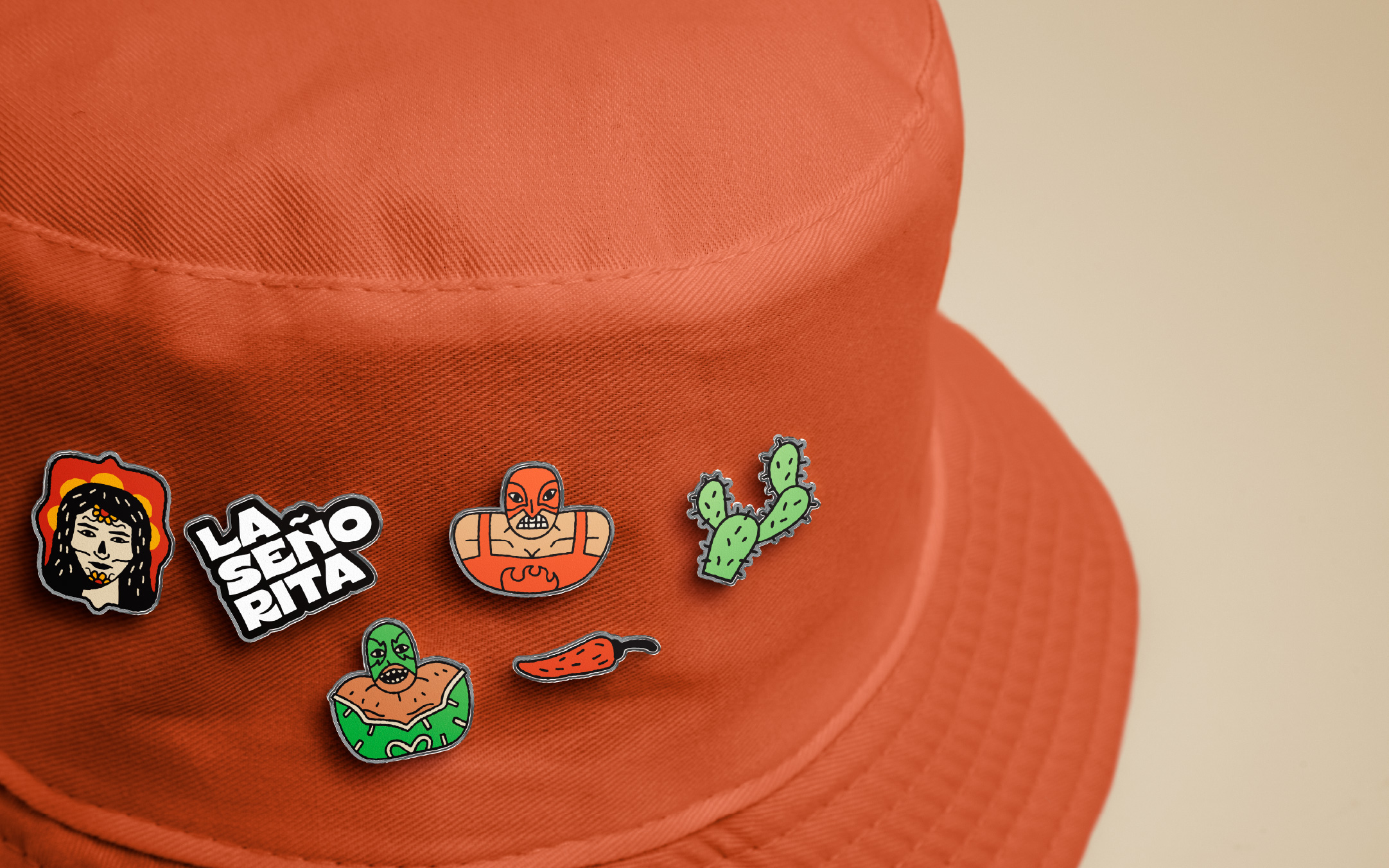
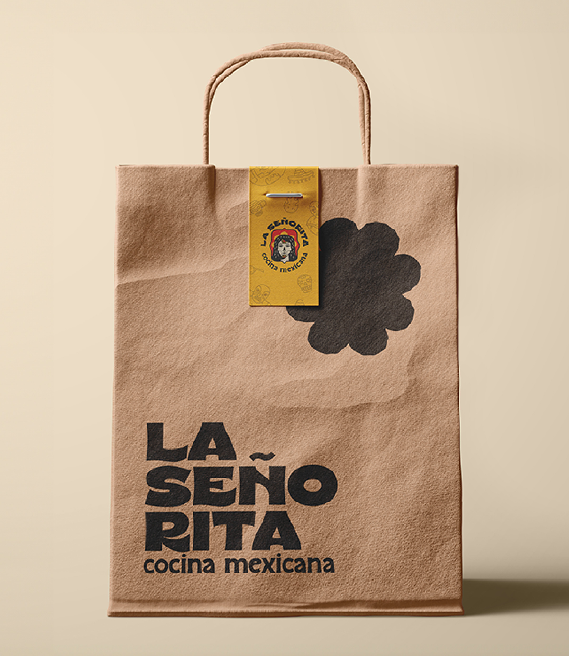
The construction of this symbol contains flowers on the face as a symbol of a festive moment; a flower behind the head that brings an almost sacred air to the composition; lines that mimic the structure of a skeleton; and vibrant colors found simultaneously in historical weaving pieces and the bold spices of Mexican cuisine.
To decipher the role of Mexican cuisine applied in the context of the restaurant is fundamental when we need to build a brand rooted in the history, culture, and customs of another country.
We perceive meals as moments of celebration and exchange of experiences, especially within the family setting. To achieve this, we seek the convergence point between art, entertainment, and sophistication that La Señorita aims to deliver to its customers, and we find it in the language and balanced use of colors.
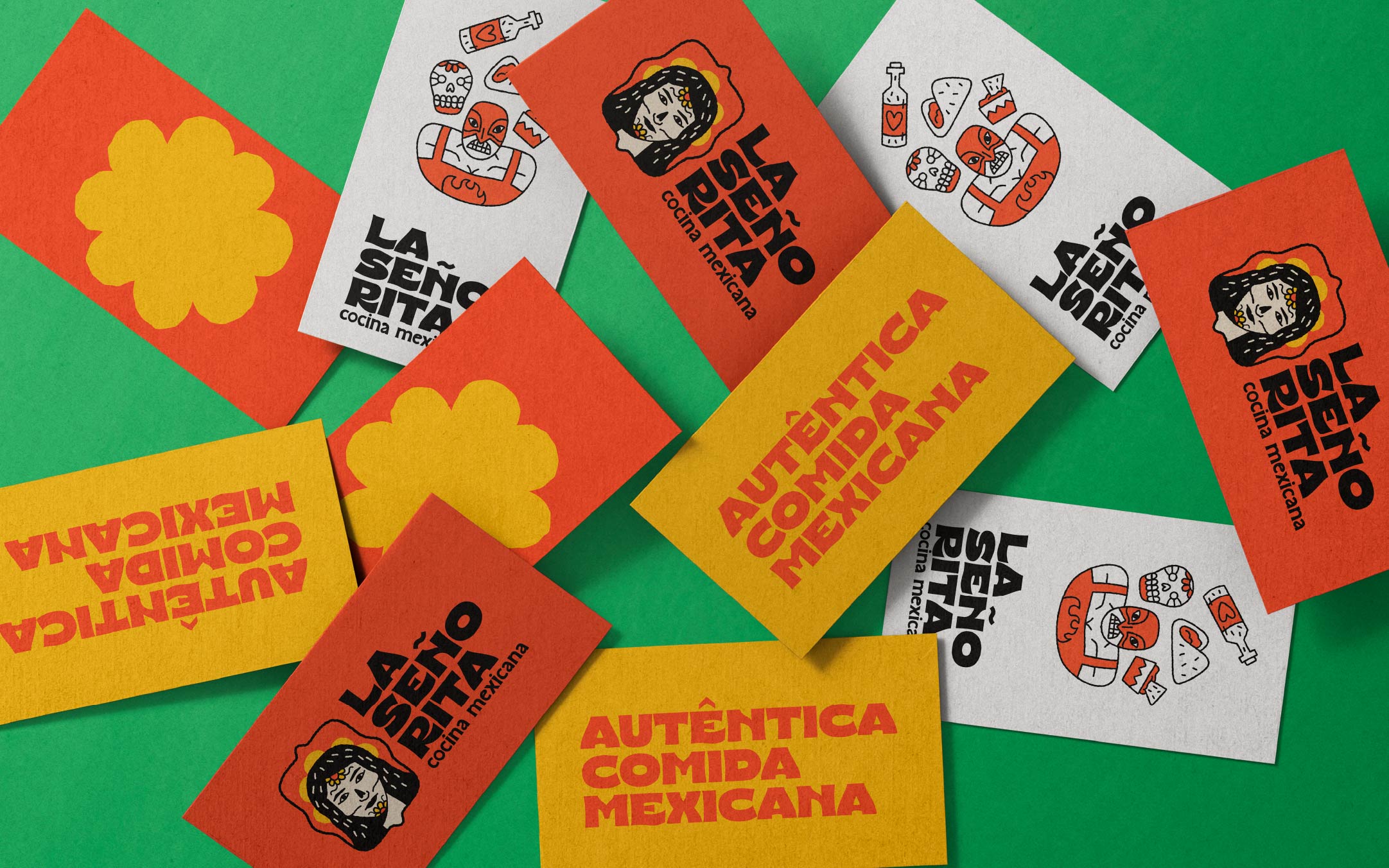
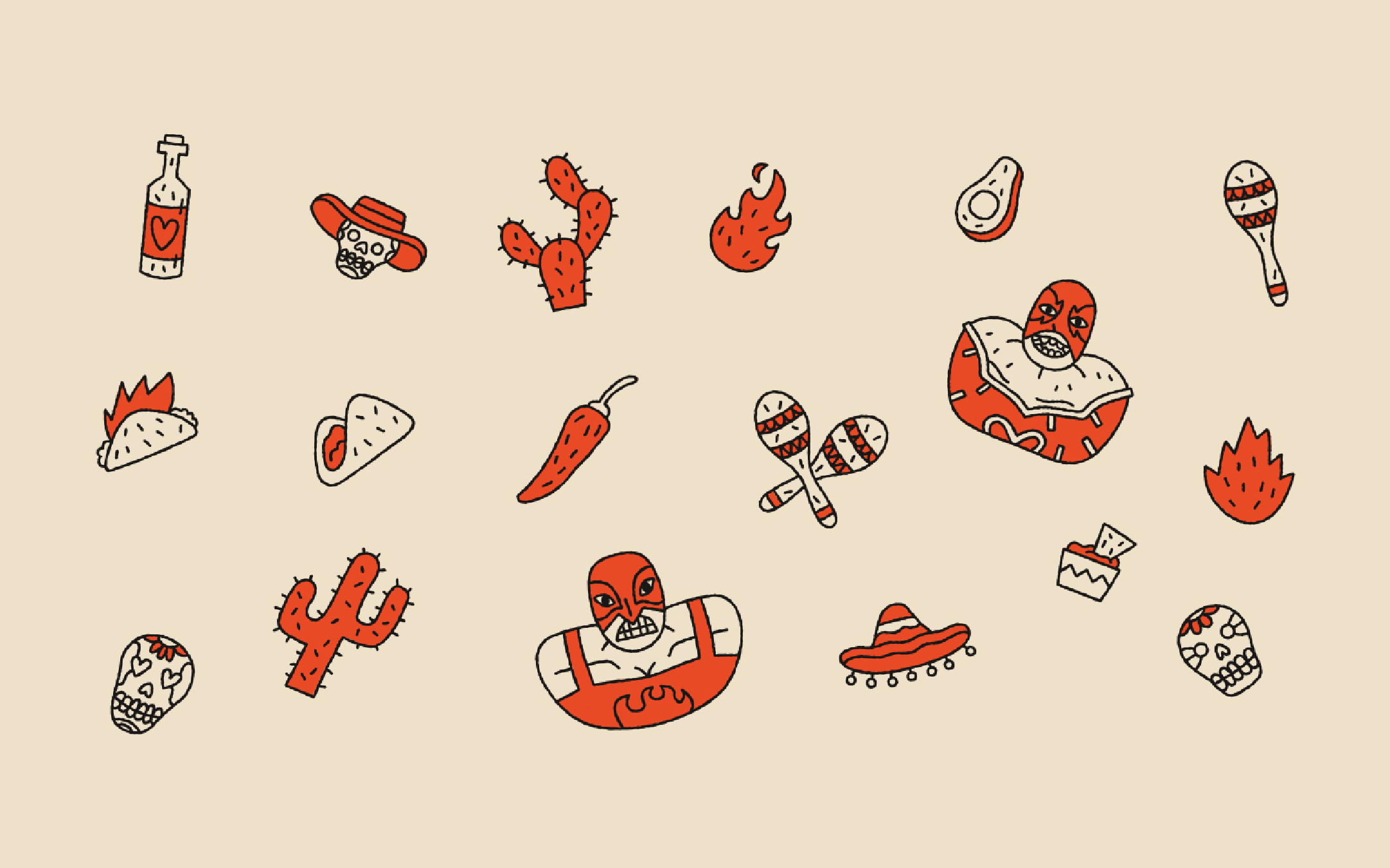
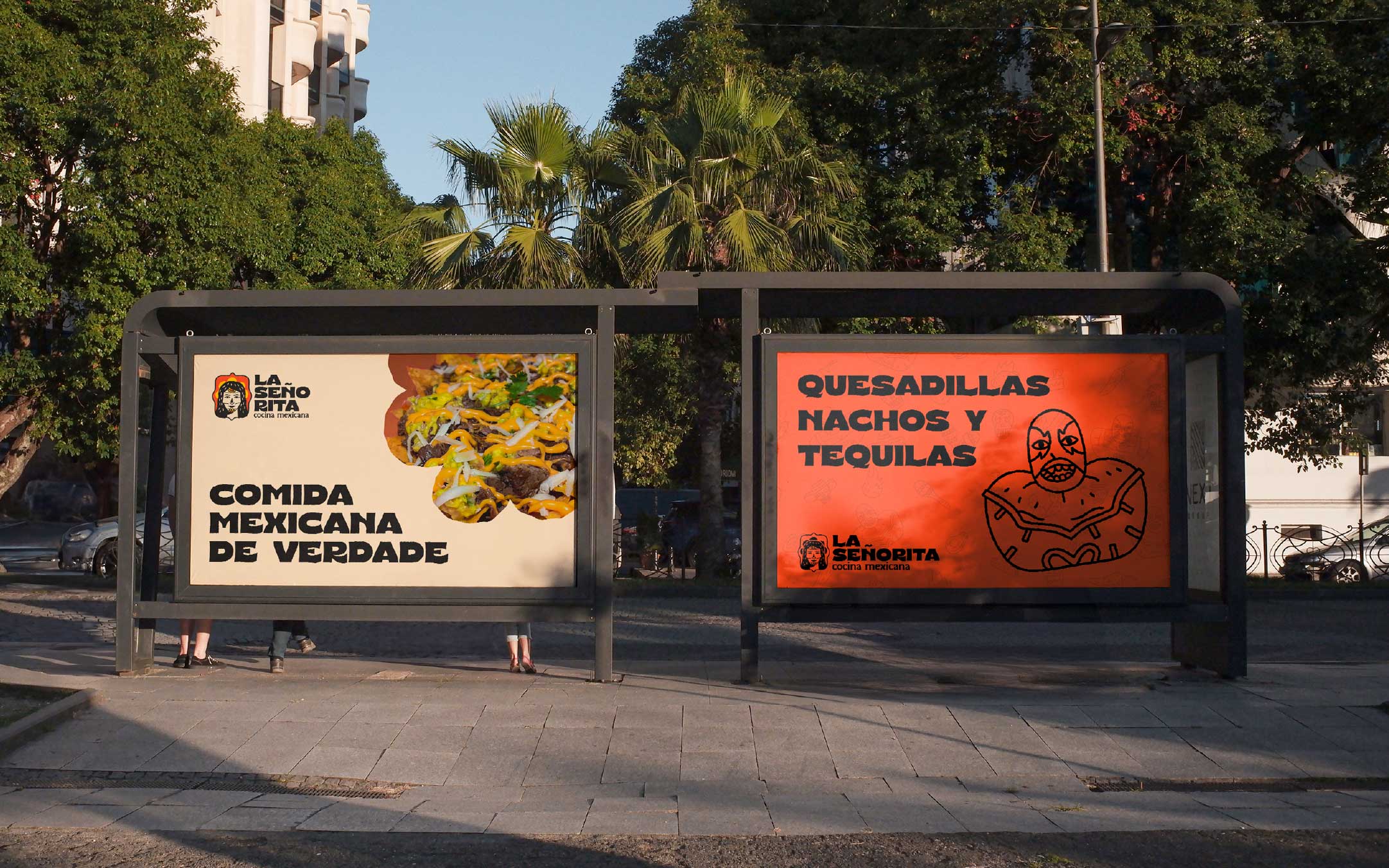
To bring to life the entire expression of La Señorita, we work with colors that range from the light green of avocado, the rich yellow of turmeric, to the spicy orange of chili. And to heat things up, we create a mixed language that combines regional expressions of our dear Hermanos (how Brazilians refers to Latin Americans) with Portuguese words, representing the true Tupiniquim behavioral aspect of adding a Brazilian touch to things.
In this way, we find a perfect balance between a light brand with a path open to quality and sophistication.

CREDIT
- Agency/Creative: Távola Design
- Article Title: La Señorita Cocina Mexicana Restaurant Branding by Távola Design
- Organisation/Entity: Agency
- Project Type: Identity
- Project Status: Published
- Agency/Creative Country: Brazil
- Agency/Creative City: Brasília
- Market Region: South America
- Project Deliverables: Art Direction, Brand Design, Brand Strategy, Brand Tone of Voice, Branding, Design, Identity System, Illustration, Logo Design
- Industry: Food/Beverage
- Keywords: food, mexico, brand, caliente, cocina, ilustration, luchador, taco
-
Credits:
Art Director / Motion Designer: Pedro Gabriel Souza Oliveira
Art Director / Ilustrator: Mateus Vieira Moitinho


