Though travel plans were put on hold during a pandemic, people found themselves with plenty of time for self-improvement. We’ve seen significant growth in language learning and the development of new apps, and in this cluttered market, Kleo strives to offer something unique.
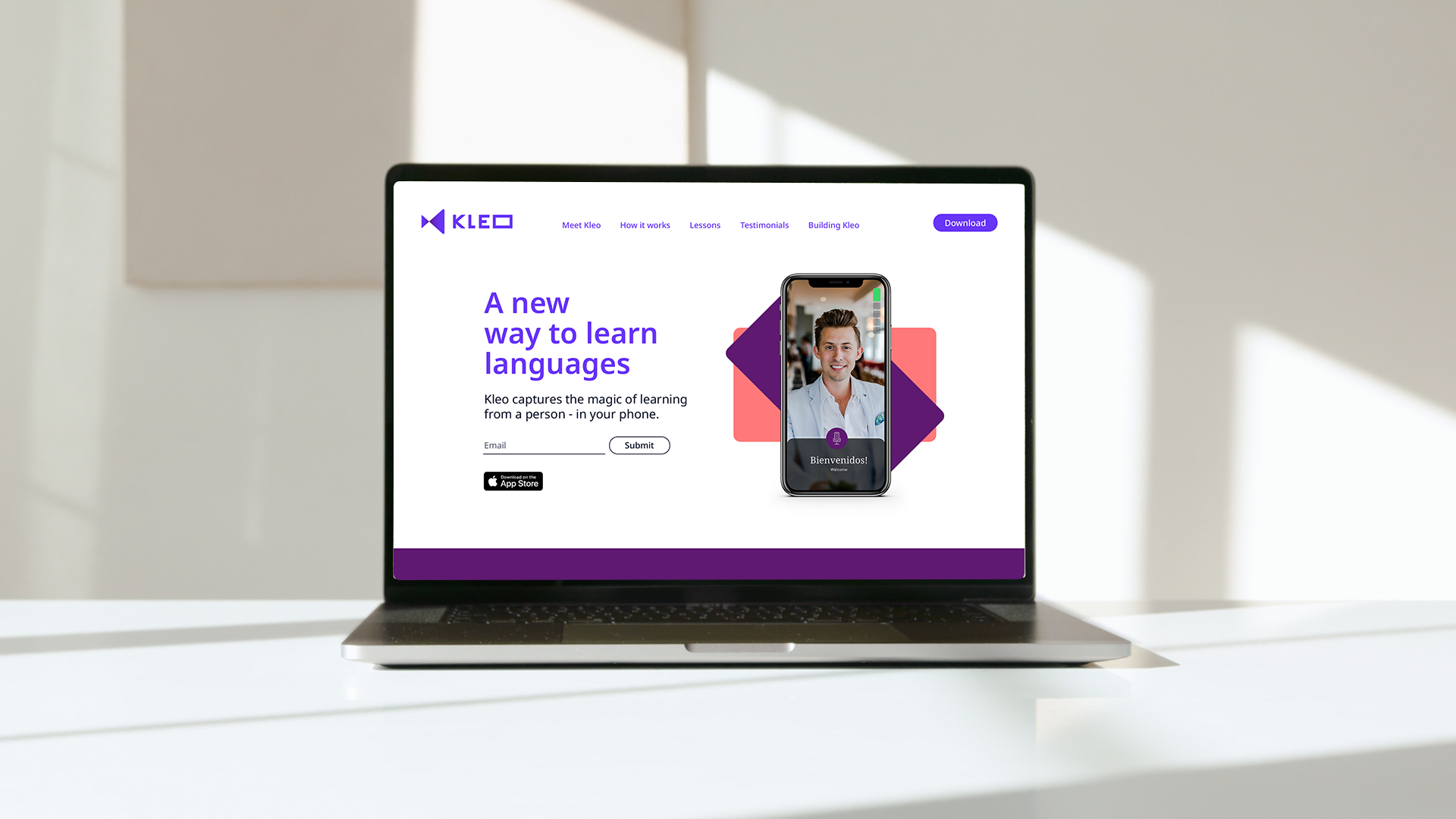
Kleo takes the advice of experts and provides it in a conversational and personable format for the user – hosting real-life video tutorials, in real-world settings like a marketplace. This engaging approach captures the feeling of being immersed in a new country and learning truly conversational skills with locals. Fellow was approached to create a brand that was compelling and inspired audiences to ‘be anywhere’ when they learn with Kleo.
Research
Kleo conducted insights research to clearly understand their audiences. The target market is fairly evenly made up of males and females, aged predominantly between 25-44, with top locations being within California, Florida, and New York. Up to 69% of respondents were willing to pay for app experiences, as they expect better user experience and quality. Users are seeking confidence, accomplishment, excitement, and empowerment. Reasons for learning include the ability to speak to locals when travelling, personal development, and the ability to understand more people and cultures. Our strategy was to entice and engage audiences with immersion, so they can fit in and feel like a local.
Exploration
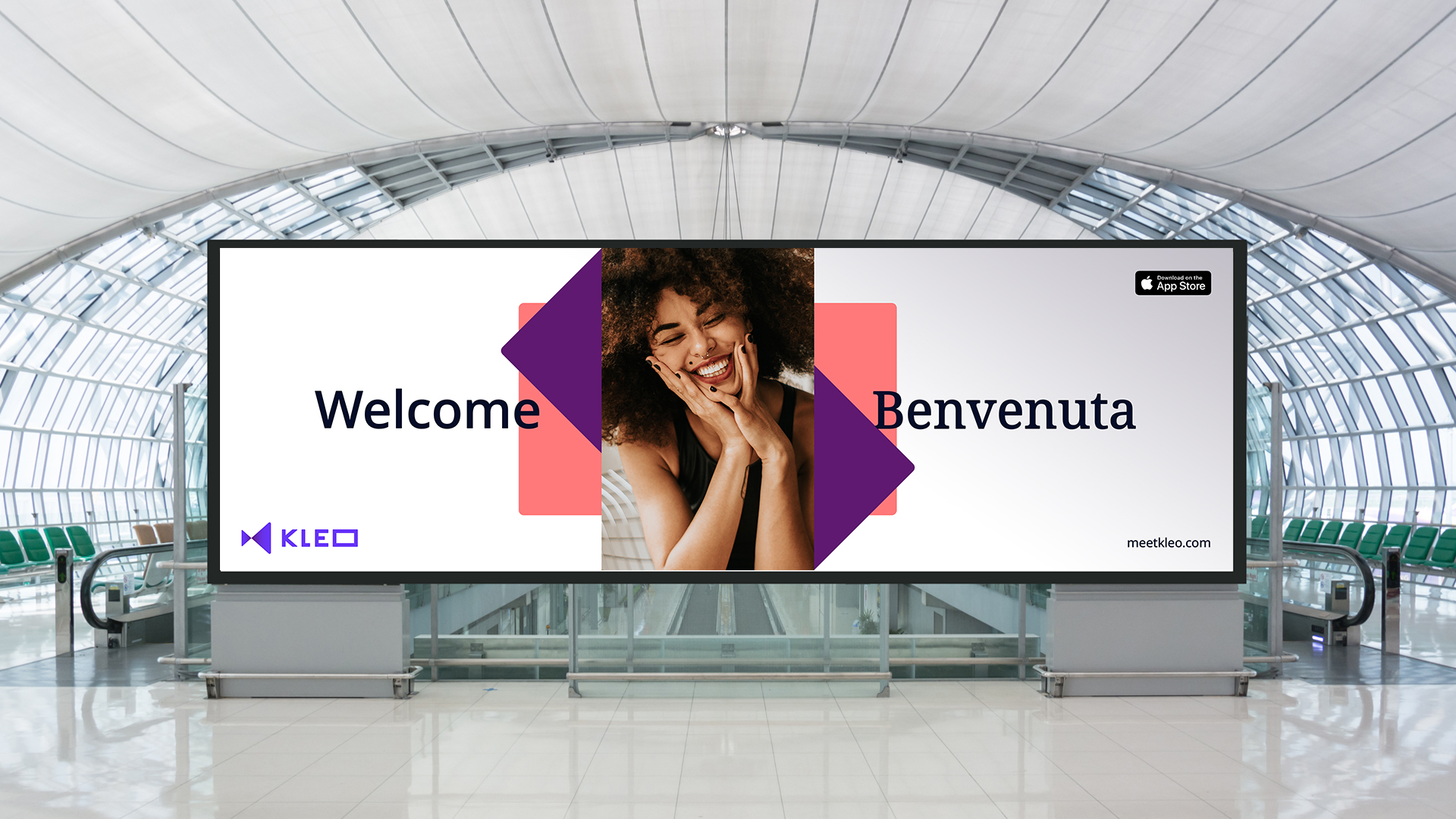
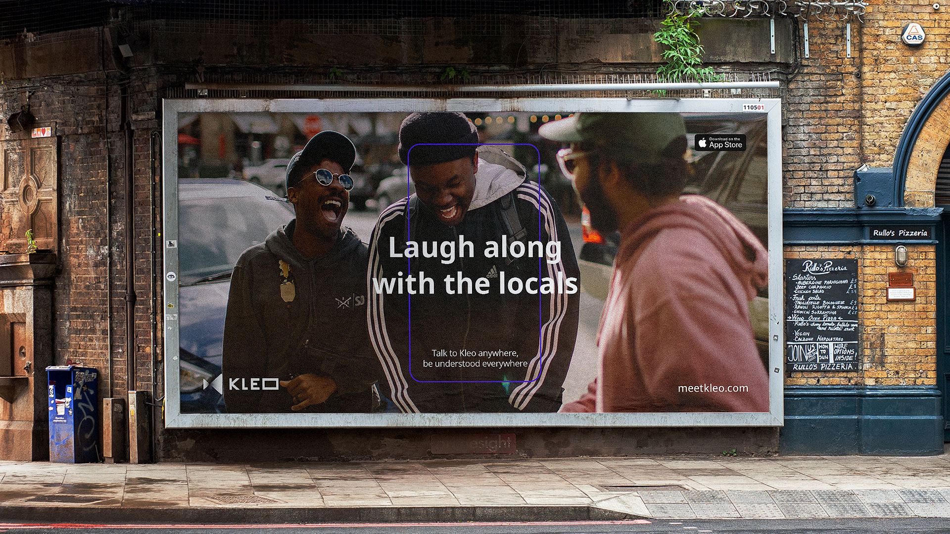
Taking cues from the app experience, as well as the idea of transporting users, the ‘portal’ concept started to take shape. The idea of the portal was to transport the viewer to the countries and locations that speak the language they wish to learn–emulating the experience of mingling with locals. We looked at ways to take the viewer into the Kleo world, developing a visual language that is used to signify opportunities and experiences that learning a new language can bring to our lives.
The portal device became a visual representation of transporting the user to a new exciting location, symbolising the engagement with locals whilst still highlighting a strong reference to the product UX. By utilising the device in a variety of ways such as a frame, container, or focal point, the brand can show how learning a new language can open up a world of possibilities.
Development
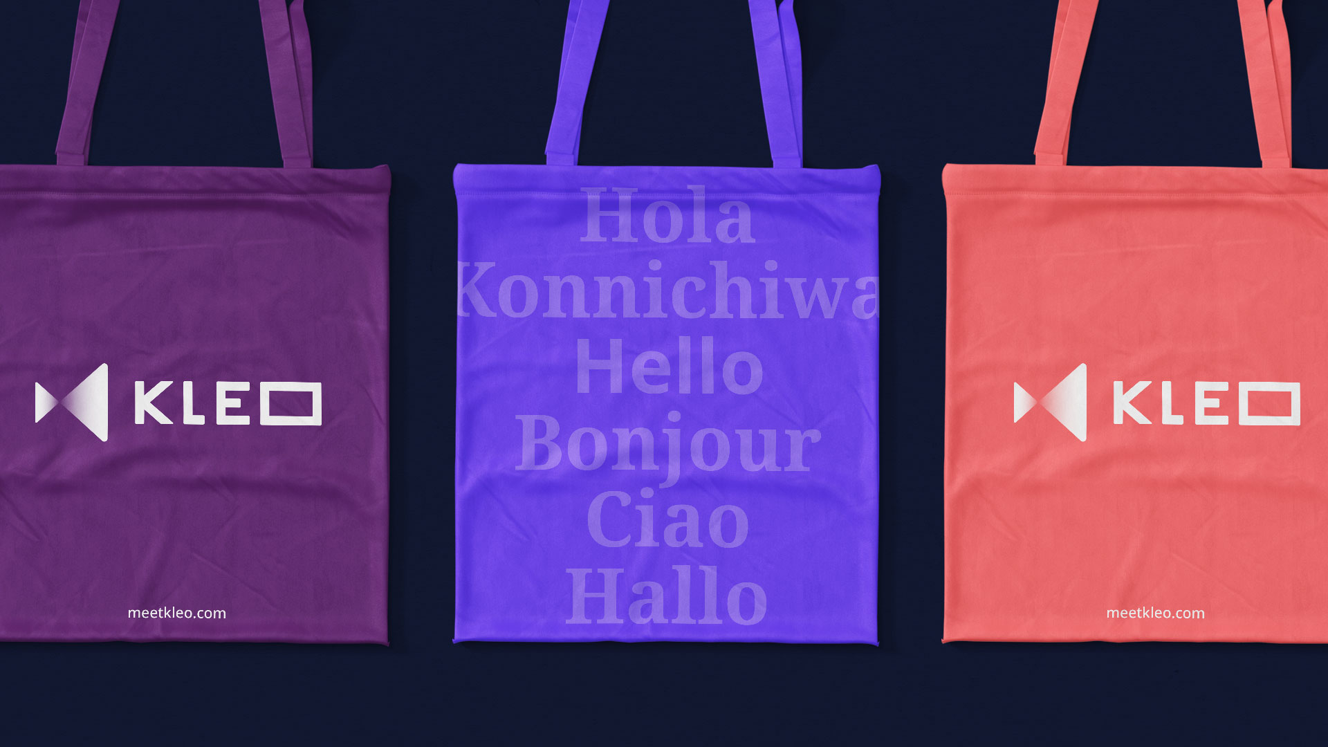
Fellow saw purple as an area of opportunity when it came to colour. Purple was not used by direct competitors within the industry, allowing for originality and ownership. Being aware of the tech space, purple also gave Kleo a warmth that other associated colours did not– and created a sense of intelligence and expertise.
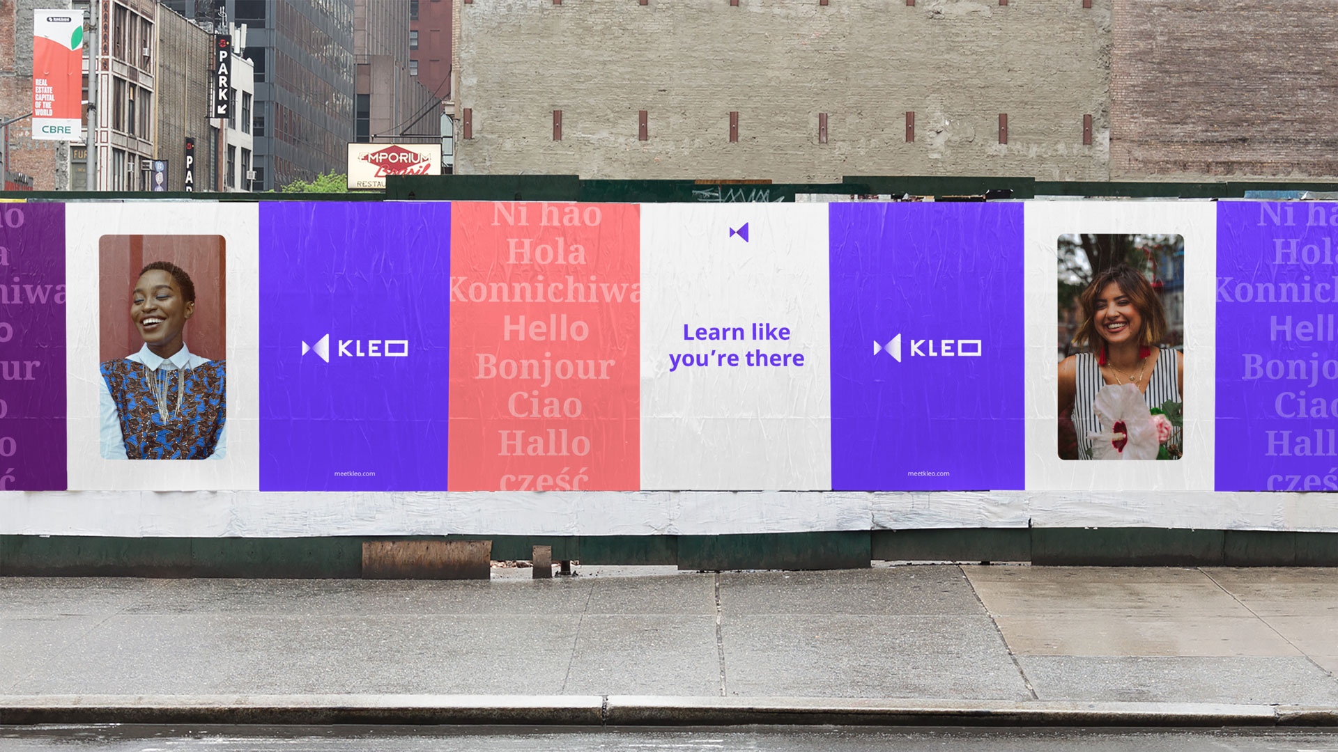
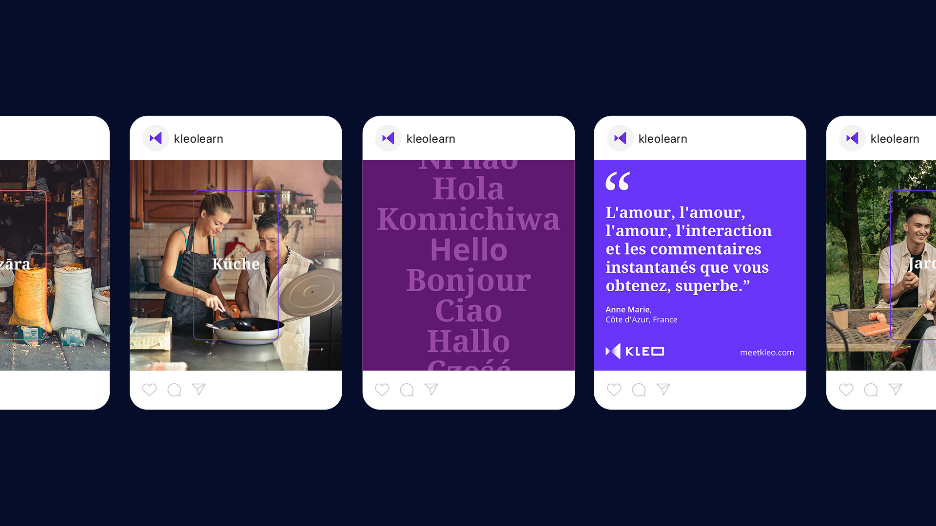
There is a duality in language learning. Fellow brought two type styles into the brand to show the English term and the translation. A sans and a serif font were used respectively within the app UX, as well as through marketing communications.
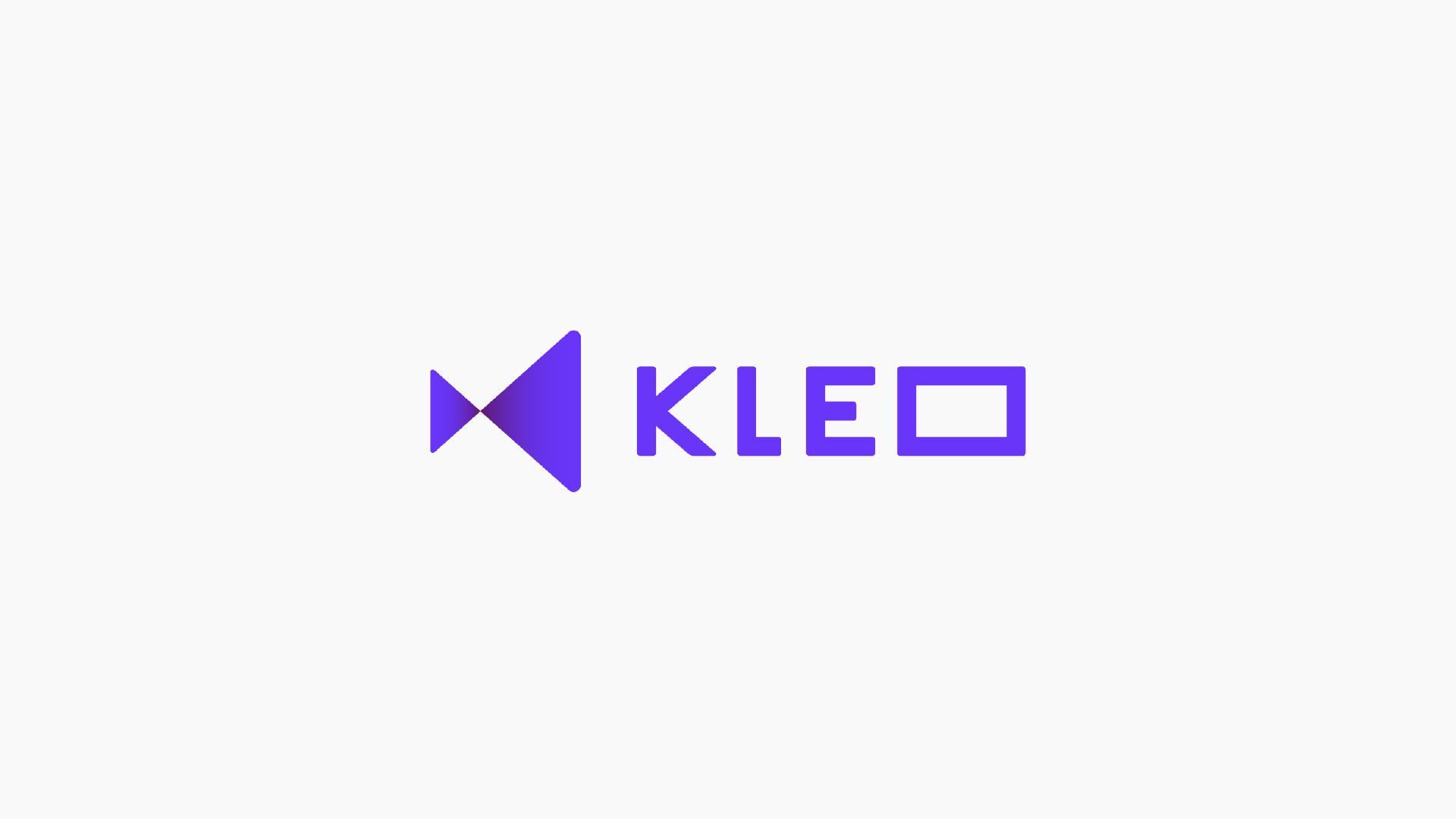
Fellow collaborated with the client to refine the brand world. A symbol was created as part of the logo, taking cues from the ‘K’ in Kleo and camera iconography inspired by the product’s USP of learning through real-life video conversations. Kleo engaged Fellow as a brand guardian to oversee the app UI to ensure continuity and consistency into the product. Through this, Fellow created a secondary colour palette for functional use within the app experience, highlighting the level of success and performance of the user as they explored the chapter in the app.
Implementation
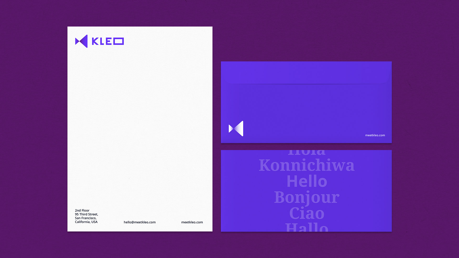
To support the launch of the app Fellow developed key brand collateral. A bespoke iconography set was created, focusing on being simple and functional. Taking notes from the keyline portal frame, iconography was drawn in a 3D perspective–maintaining the idea of being transported to another location. Fellow also developed social media assets and motion graphics templates. The brand was wrapped up into a cohesive brand guidelines document, to ensure consistency of the brand into its next phase. The Kleo app is currently in Beta and available for download in the Apple store.
![]()
CREDIT
- Agency/Creative: Fellow Studio
- Article Title: Fellow Studio Brand Refresh for Language Learning and Development App Kleo
- Organisation/Entity: Agency
- Project Type: Identity
- Project Status: Published
- Agency/Creative Country: United Kingdom
- Agency/Creative City: London
- Market Region: Global
- Project Deliverables: Brand Design, Brand Identity, Design, Graphic Design, Logo Design, User Experience, User Interaction
- Industry: Education
- Keywords: Brand identity, Visual Identity, Product brand, Brand assets, Brand guidelines, Education, App, Technology, UX/UI Design
-
Credits:
Co founder | Creative Director: Paul Crump
Co founder | Strategic Director: Anthony Chapman
Senior Design: Dan Mortley
Design Intern: Alex Vetter
Senior Project Manager: Nadine Thiedeke


