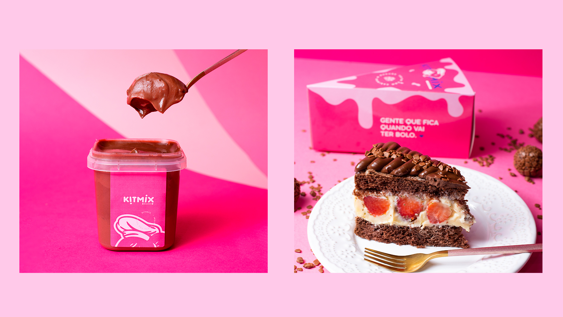
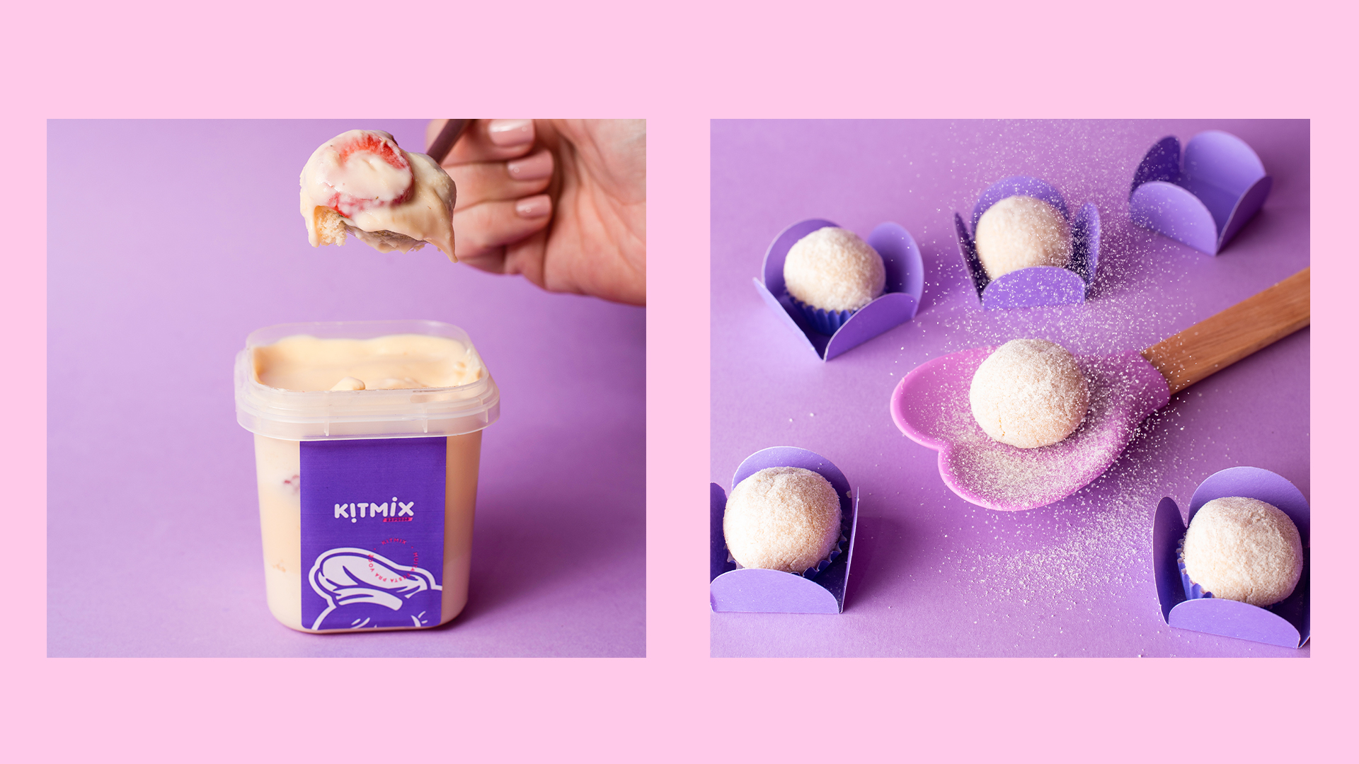
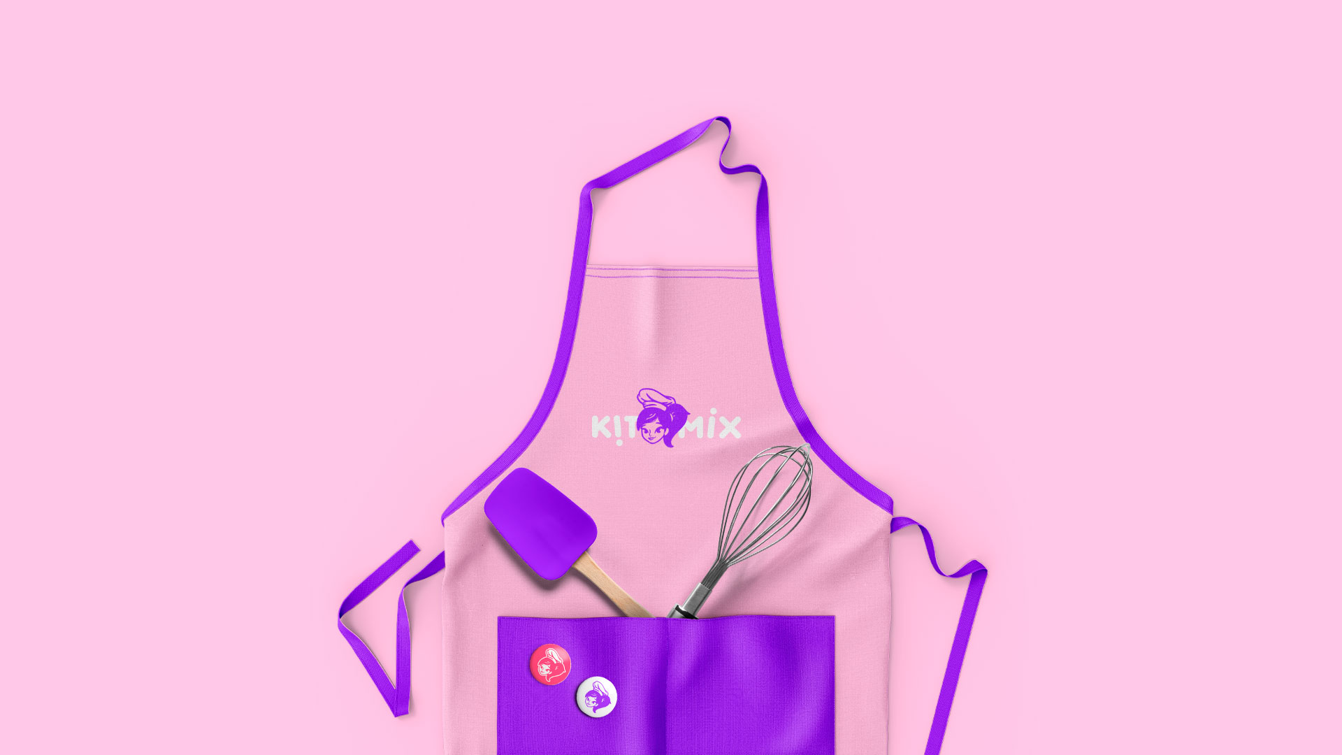
Kitmix is a company from Campinas / São Paulo that completes 10 years of existence in 2021. It produces party kits for different tastes. The idea of the project was to redesign, aiming at a previous mascot, in addition to updating the typography, making it more moving and friendlier.
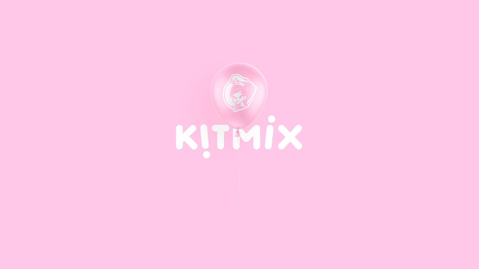
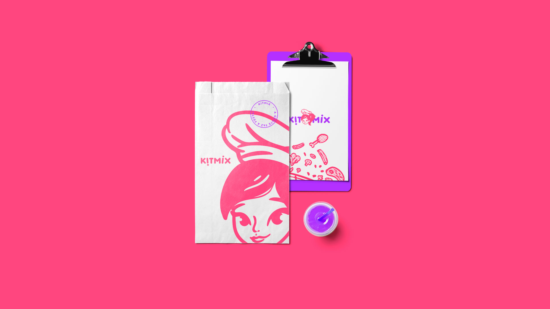
The relaxed and friendly typography follows the symbol line. The letters “i” set the tone of animation, joy, dance and party, which are in the brand’s DNA. Nobody is here!
The entire construction of the brand was aimed at a fun, friendly and joyful communication.
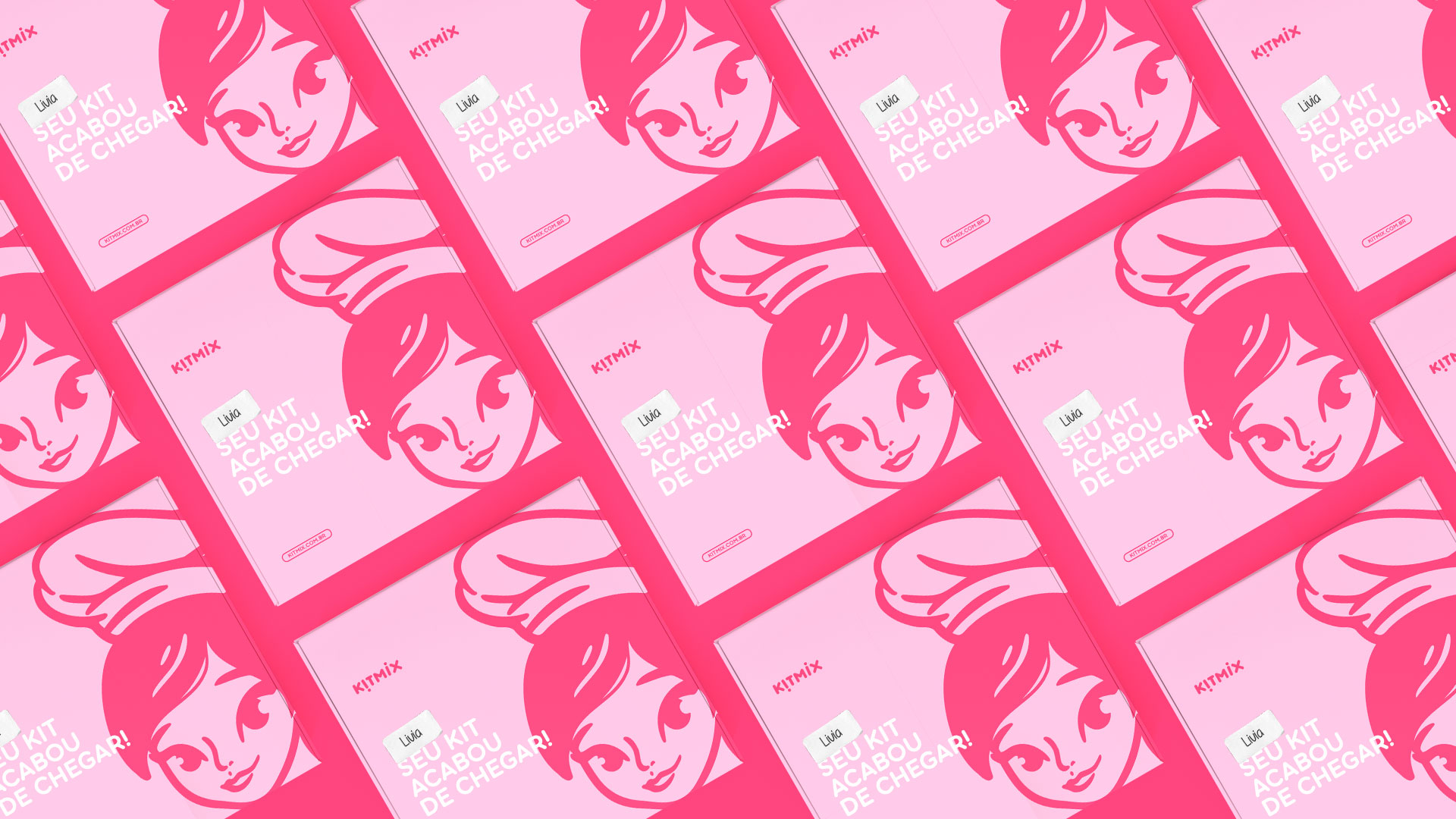
The character shows the “face” of the brand and is the customer’s first impact. A brand that celebrates and is present at the best moments of its consumers, with a mix of products that make the party.
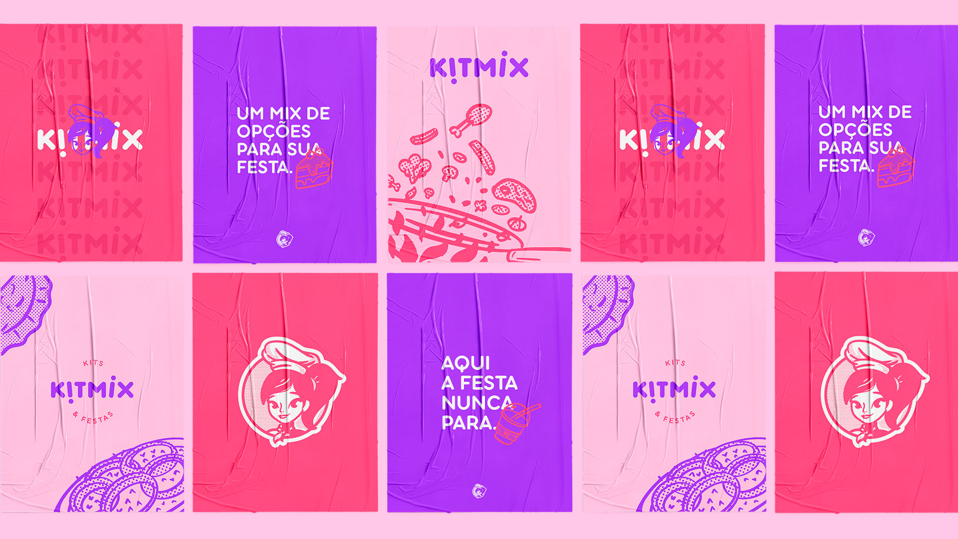
The colors are contrasting, typical of a brand that doesn’t want to hide, that isn’t afraid to be happy, totally loving.
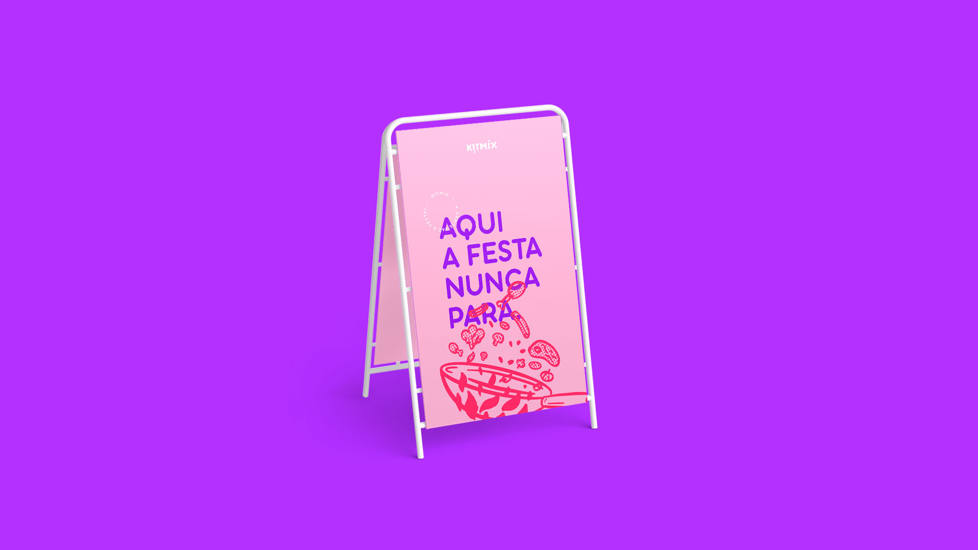
Finally, the Kitmix brand also has exclusive icons that make your mouth water. All of them were designed taking into account raw materials that the company sells or uses in the preparation of its products.
They were primarily developed to participate in communication on social media and printed graphic materials.
The company started as a simple family project and today it is already in the center of São Paulo/Brazil, satisfying the hunger of several customers, leaving others with water in their mouths and partying throughout that region, always with a friendly smile of someone who loves to help and expect to always be present and rememberable.

CREDIT
- Agency/Creative: Fixgu
- Article Title: Kitmix Branding Designed by Fixgu
- Organisation/Entity: Freelance
- Project Type: Identity
- Project Status: Published
- Agency/Creative Country: Brazil
- Agency/Creative City: São Paulo
- Market Region: North America, Global
- Project Deliverables: Brand Design
- Industry: Food/Beverage
- Keywords: Candy, Party, Food, Girl, Delivery, Cake
-
Credits:
Graphic Design: Fixgu


