Kinder bakery products have always been with us through morning and snack times.
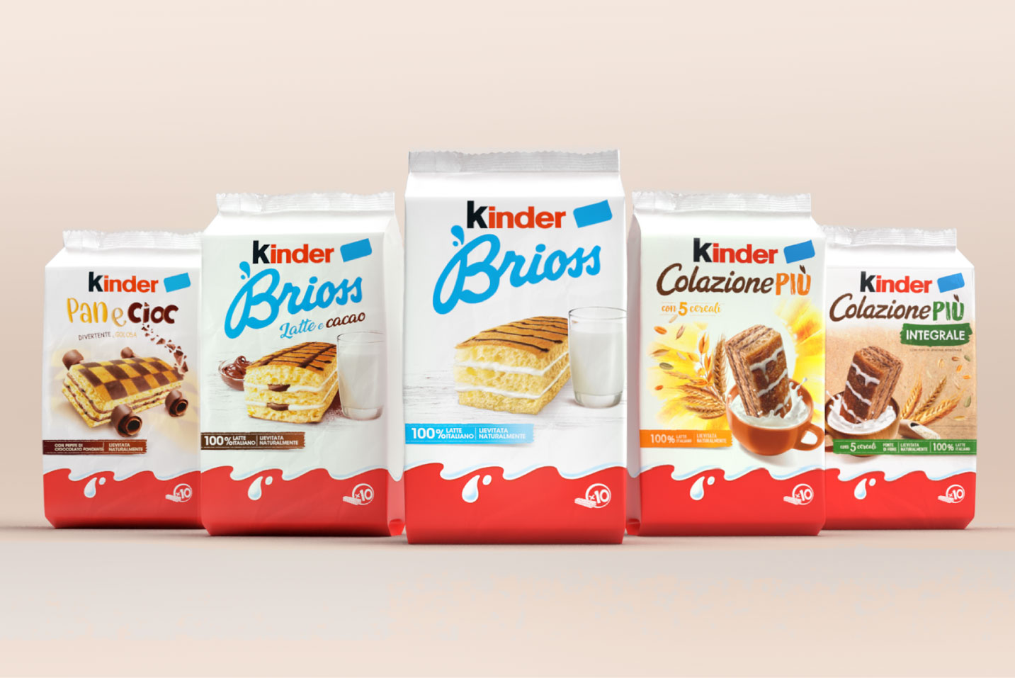
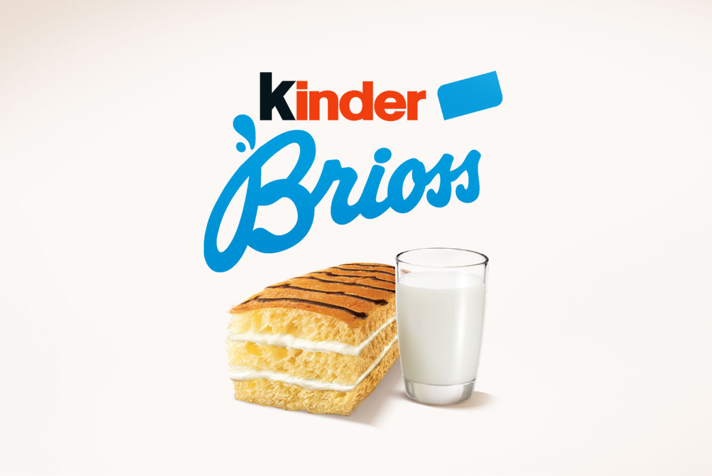
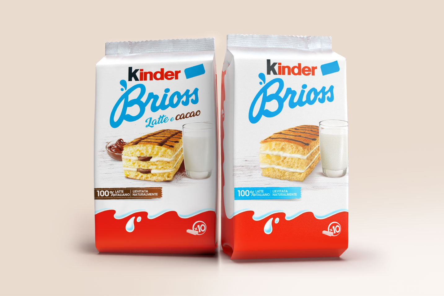
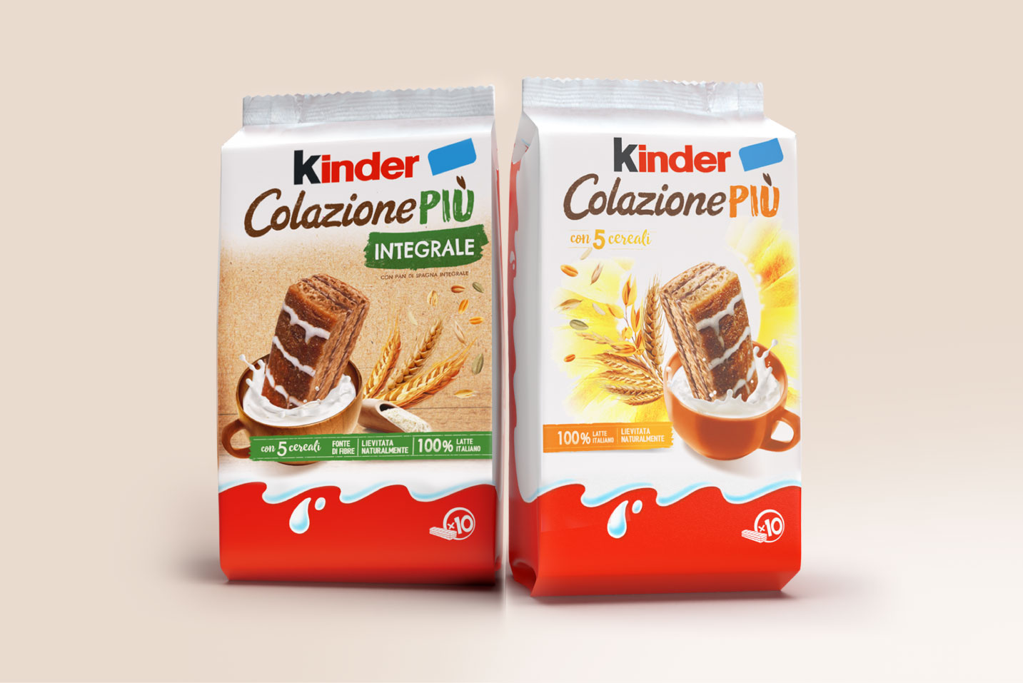
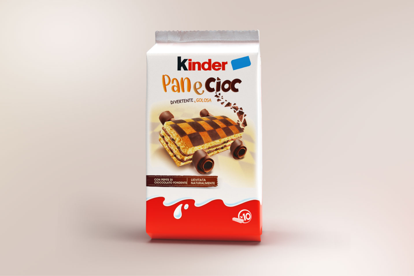
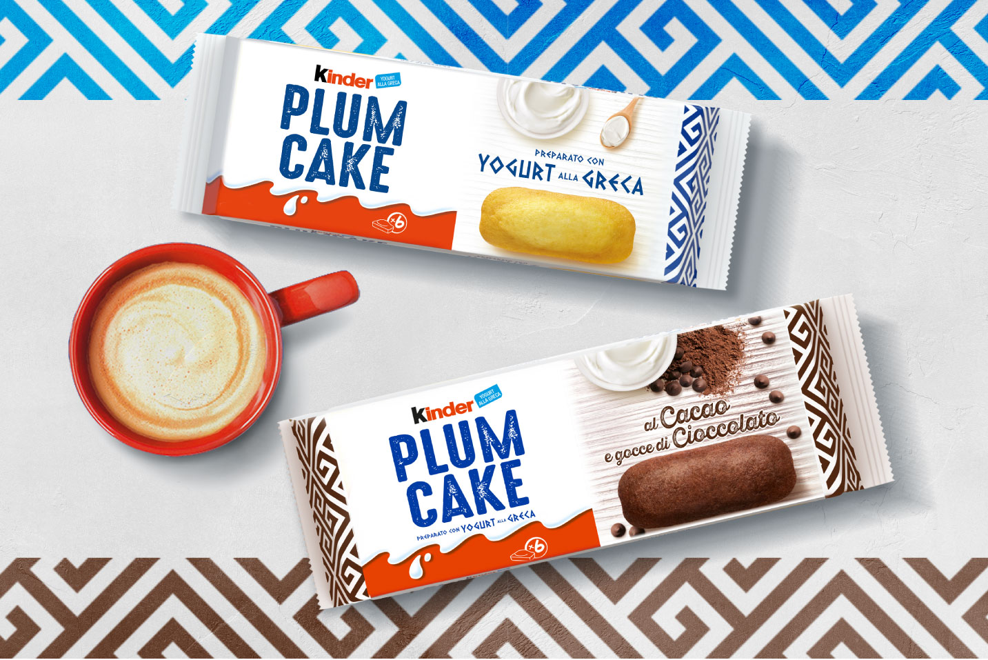
In the beginning it was Kinder Brioss until other products (such as Kinder Colazione Più and PlumCakes), joined a line that has evolved over time while retaining the brand’s original values: tradition, simplicity, authenticity – topped by a constant innovation.
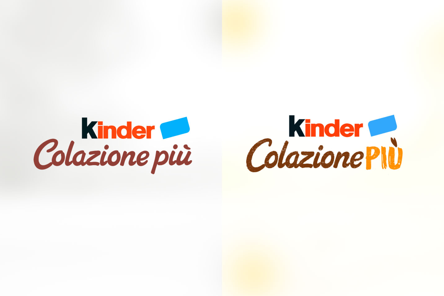
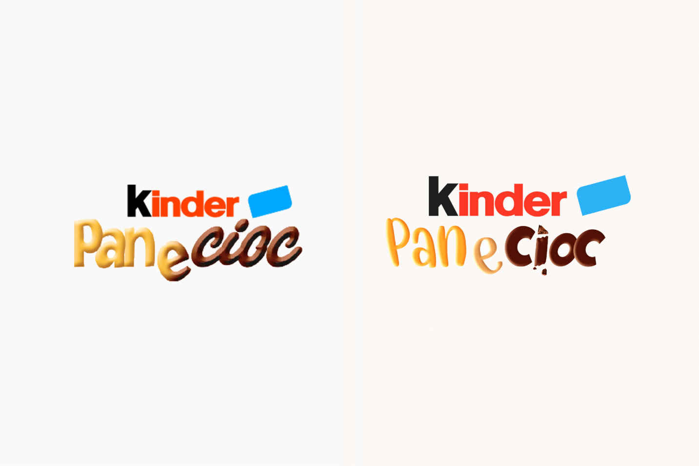
On the graphical side, the evolution of the line has recently seen Break and Ferrero collaborate to revise some of its key elements (from the guide-image to the sub-brand).
While staying true to the core brand values, the result restores an authentic, fresh and genuine feel to the historic brand and brings the classic cornerstones of Kinder’s guiding image up to date, ready to stand the test of time ahead.
CREDIT
- Agency/Creative: Break Design
- Article Title: Kinder Bakery Packaging Design
- Organisation/Entity: Agency
- Project Type: Packaging
- Project Status: Published
- Agency/Creative Country: Italy
- Agency/Creative City: Milano
- Market Region: Europe
- Project Deliverables: Packaging Design
- Format: Pouch
- Substrate: Plastic
- Industry: Food/Beverage
- Keywords: kinder, breakdesign, italiandesign
-
Credits:
marketing: Olga Manoilenko


