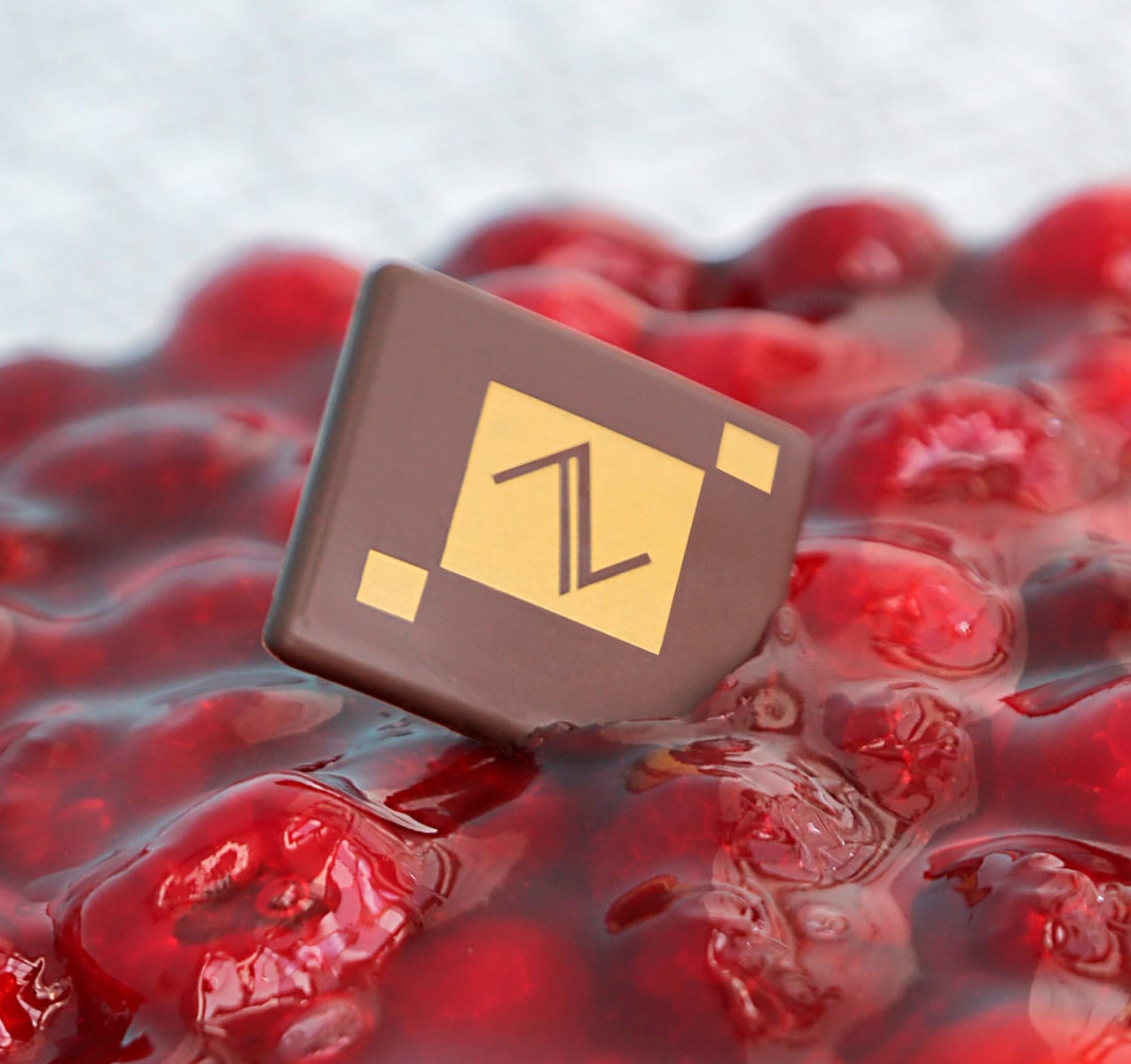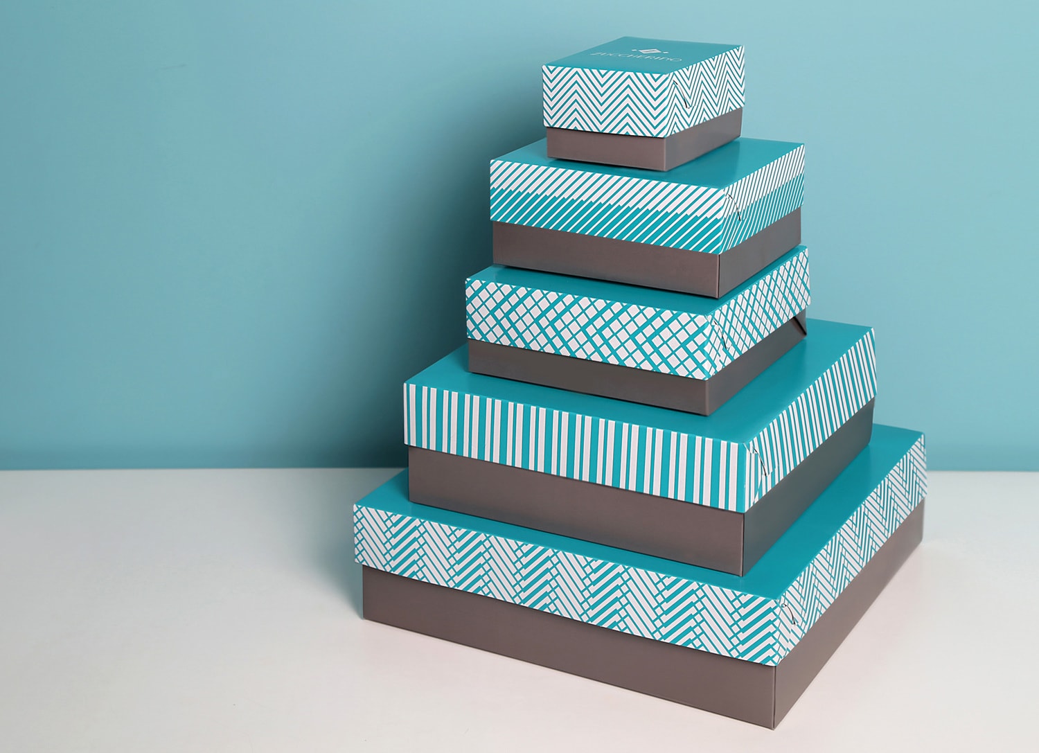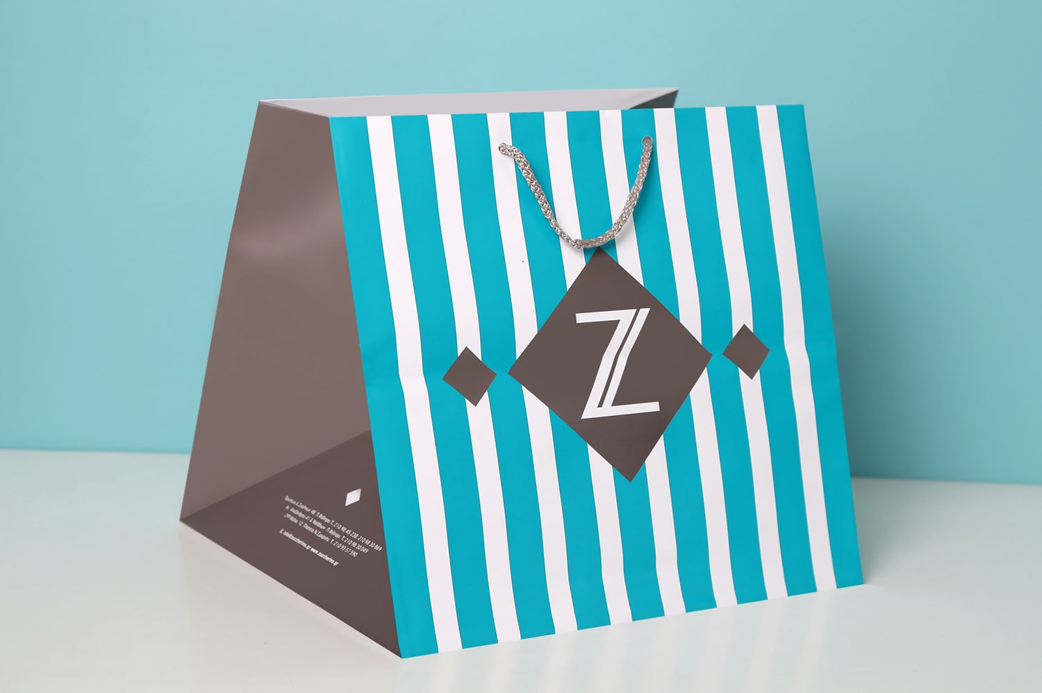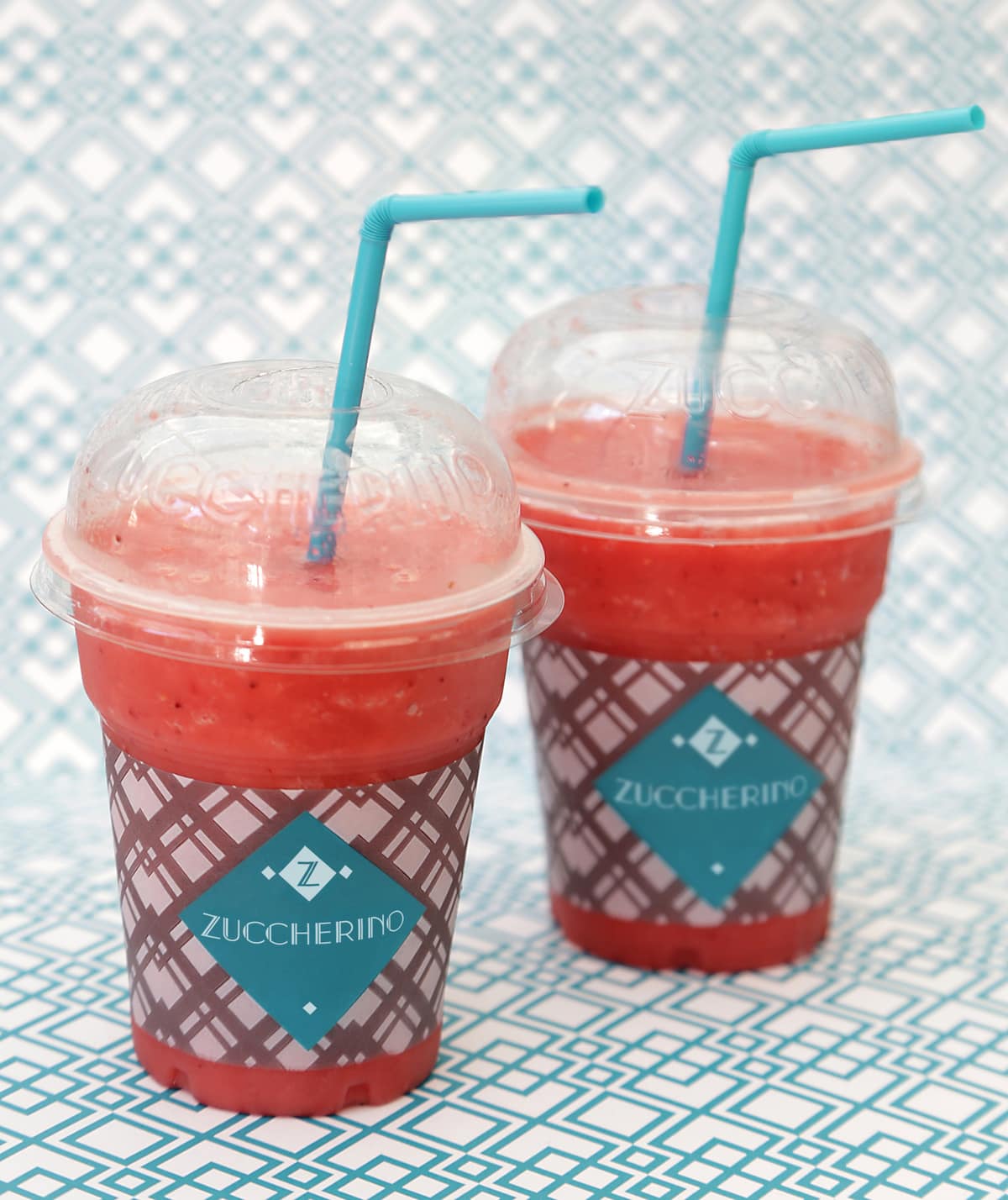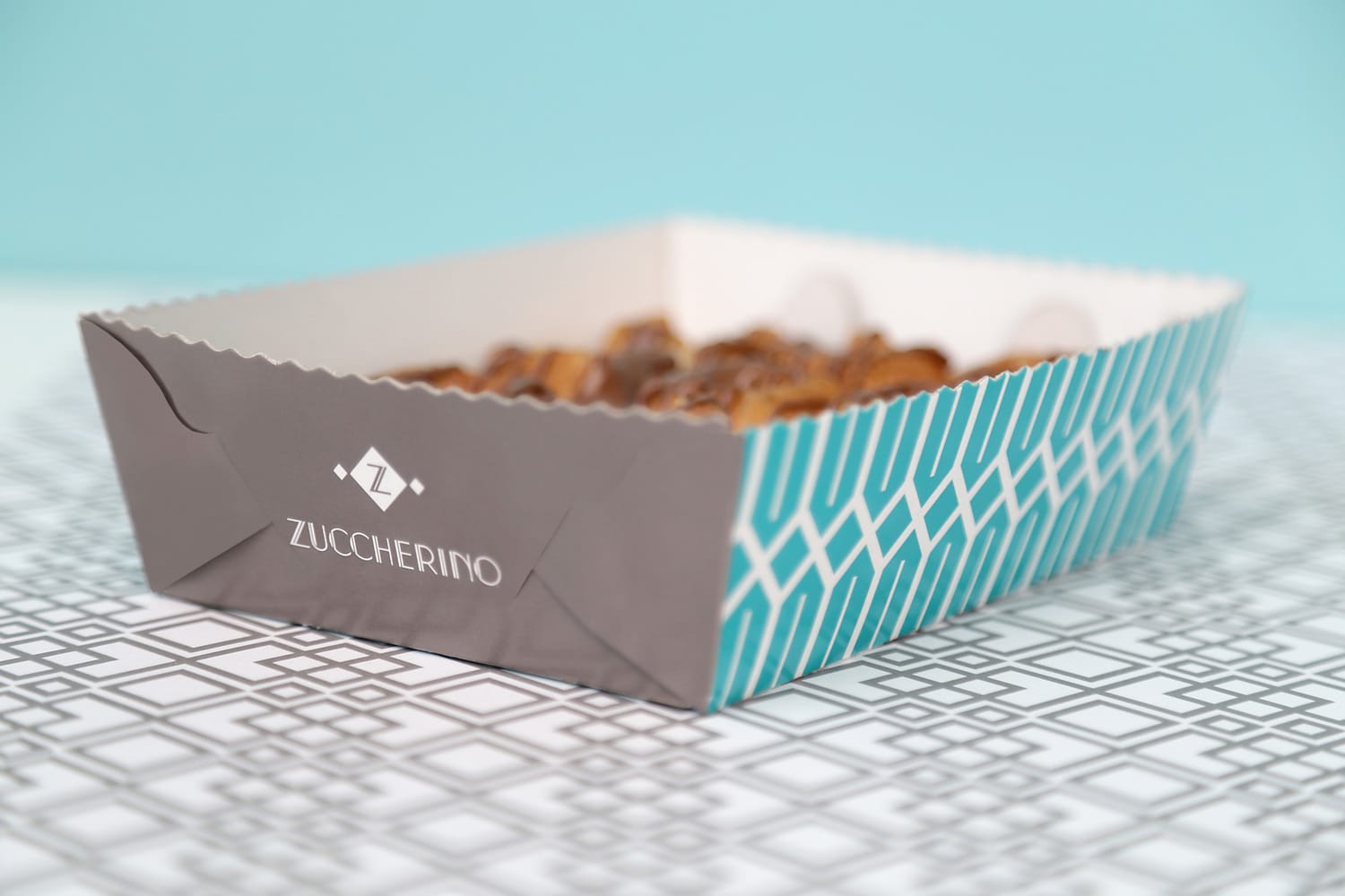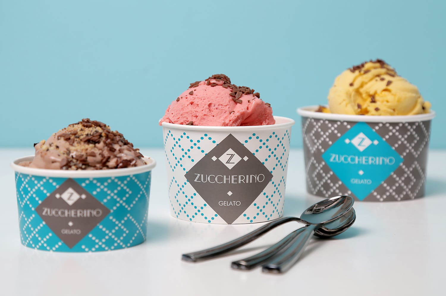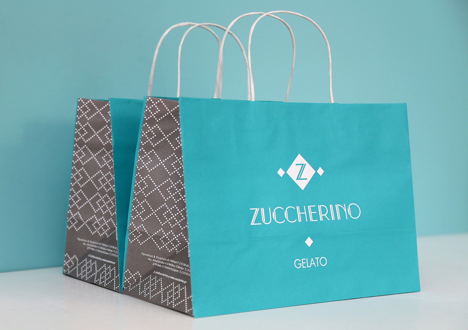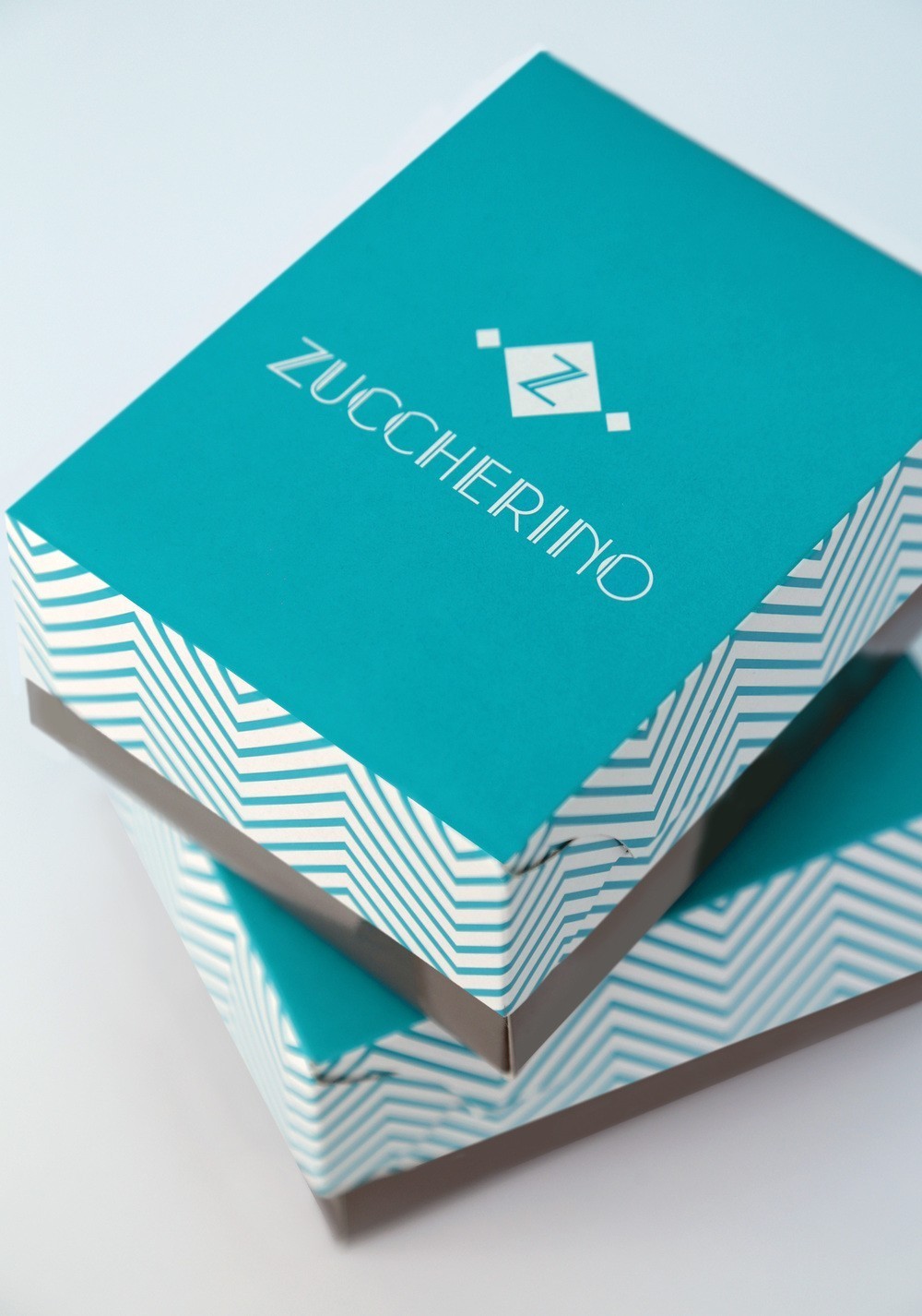
“Zuccherino is an Athenian patisserie founded almost three decades ago. The revamped logo stays true to Zuccherino’s esteemed history and reputation. The monogram keeps its role yet it takes on a more symbolic one as the company’s crest. The geometrical aspect of the brand is prevalent in the packaging design. All pastry boxes are decorated with different patterns of vertical lines, inspired by the rhombus motif, as well as horizontal lines. The assortment of pattern variations creates a harmonious collection. The daring color palette enhances Zuccherino’s fresh and forward-looking identity. Turquoise represents a less mainstream choice in the food service business. The addition of cool gray elevates its image and evokes loyalty. Geometrical patterns, influenced by the logo’s rhombuses, complement and strengthen the overall look.
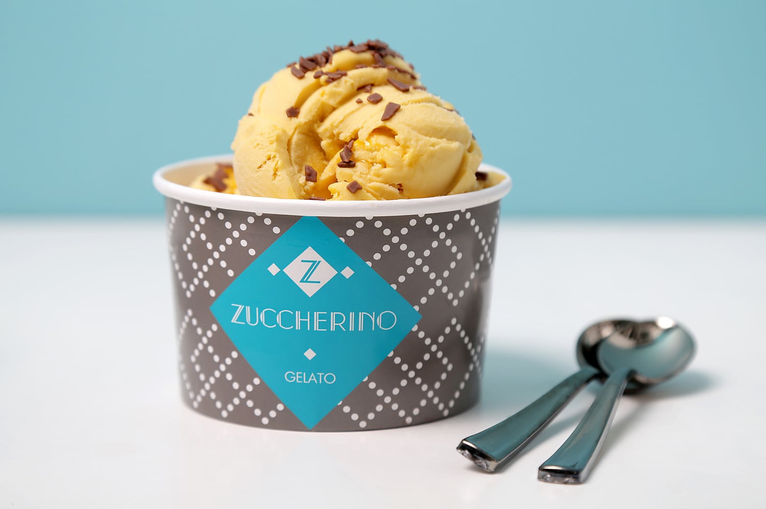
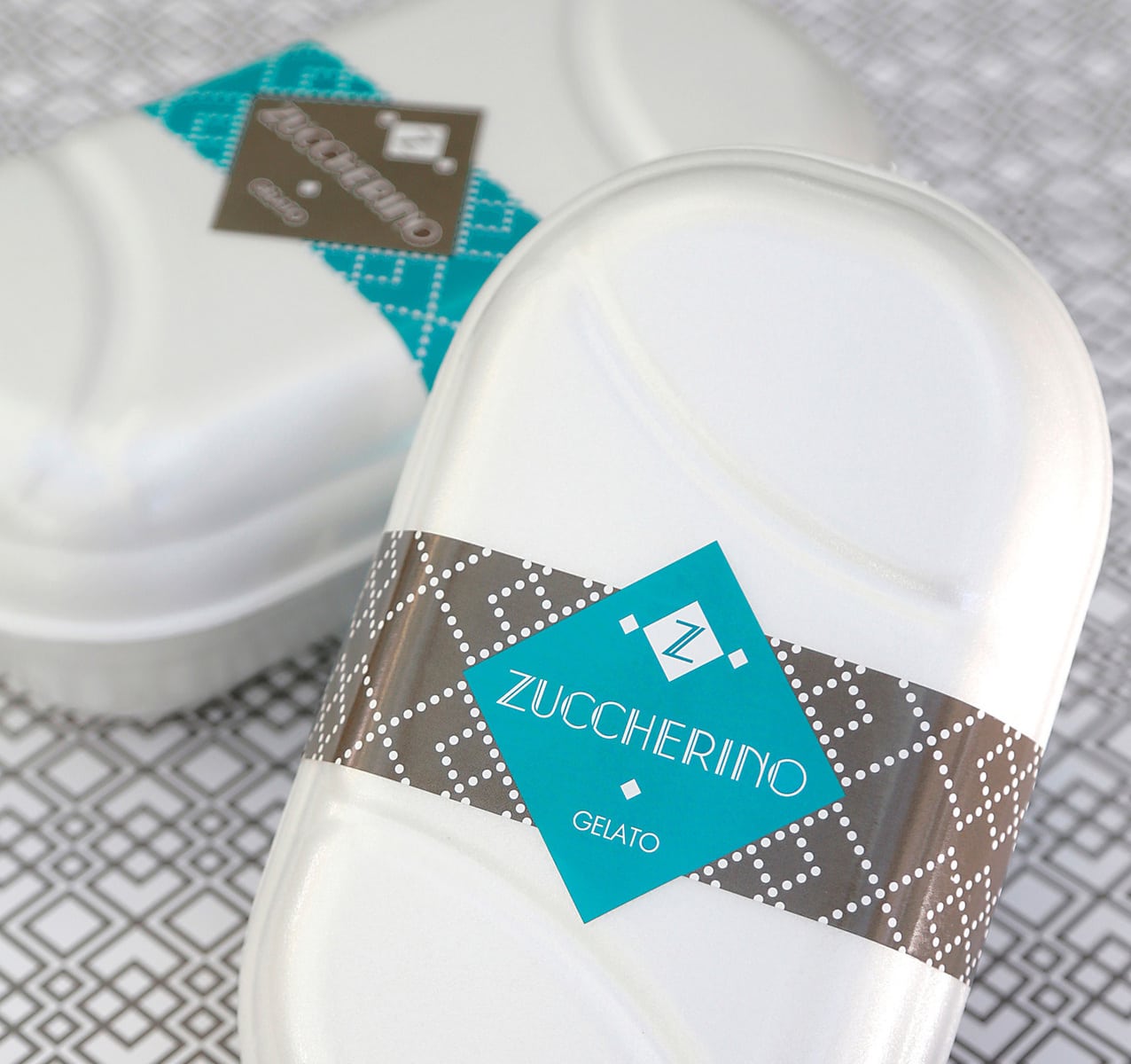
Ice cream is Zuccherino’s most popular dessert. The packaging design highlights its significance without deviating from the rest of the brand identity. This is accomplished by using a rhombus pattern with dotted lines for all ice cream packaging and with continuous lines for everything else. Attention to detail and consistency in the branding are key elements.
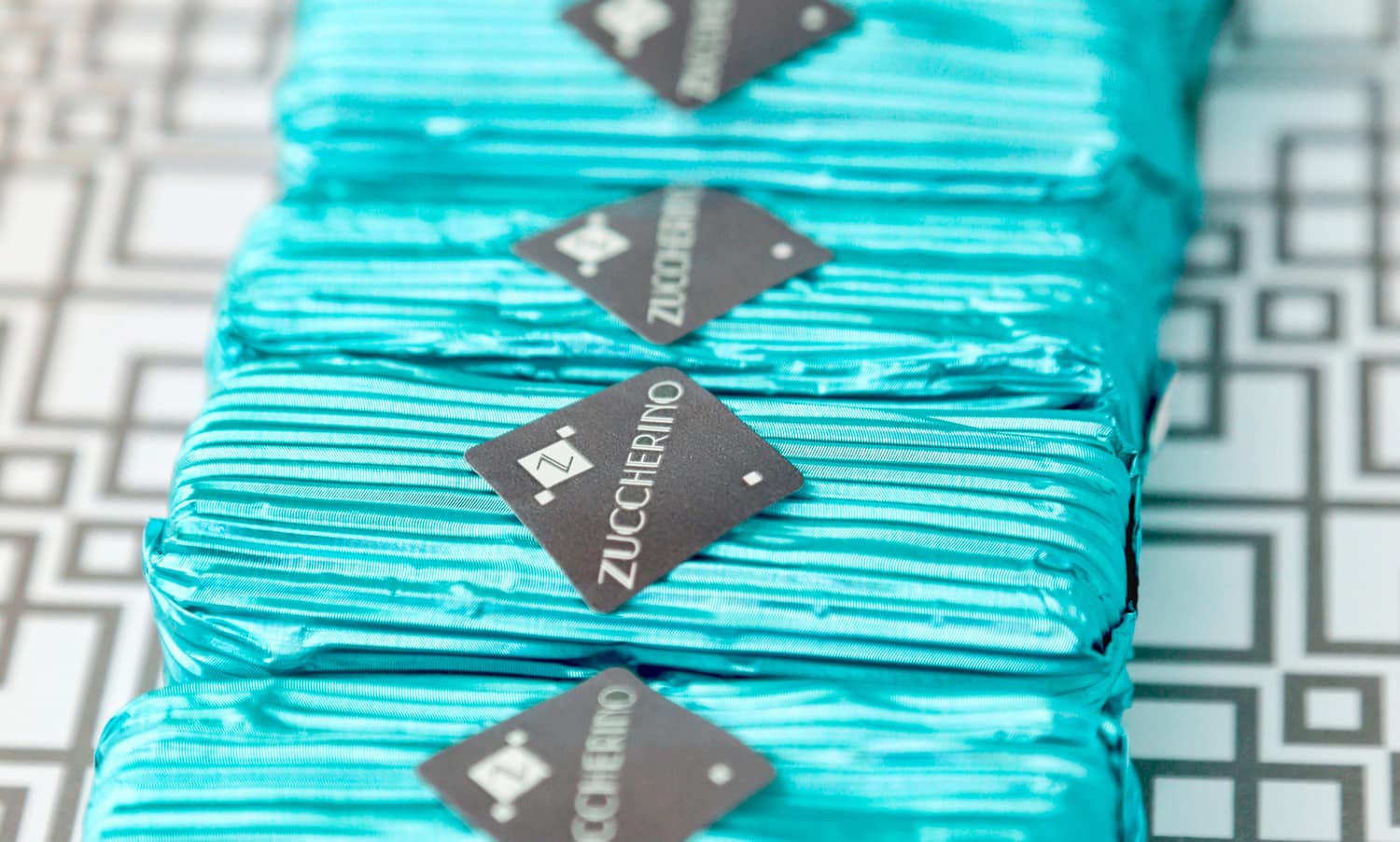
From its store interior and exterior to the smallest applications, such as napkins, baking cups and ice-cream labels, all are carefully designed to match and promote Zuccherino’s identity and reputation.
