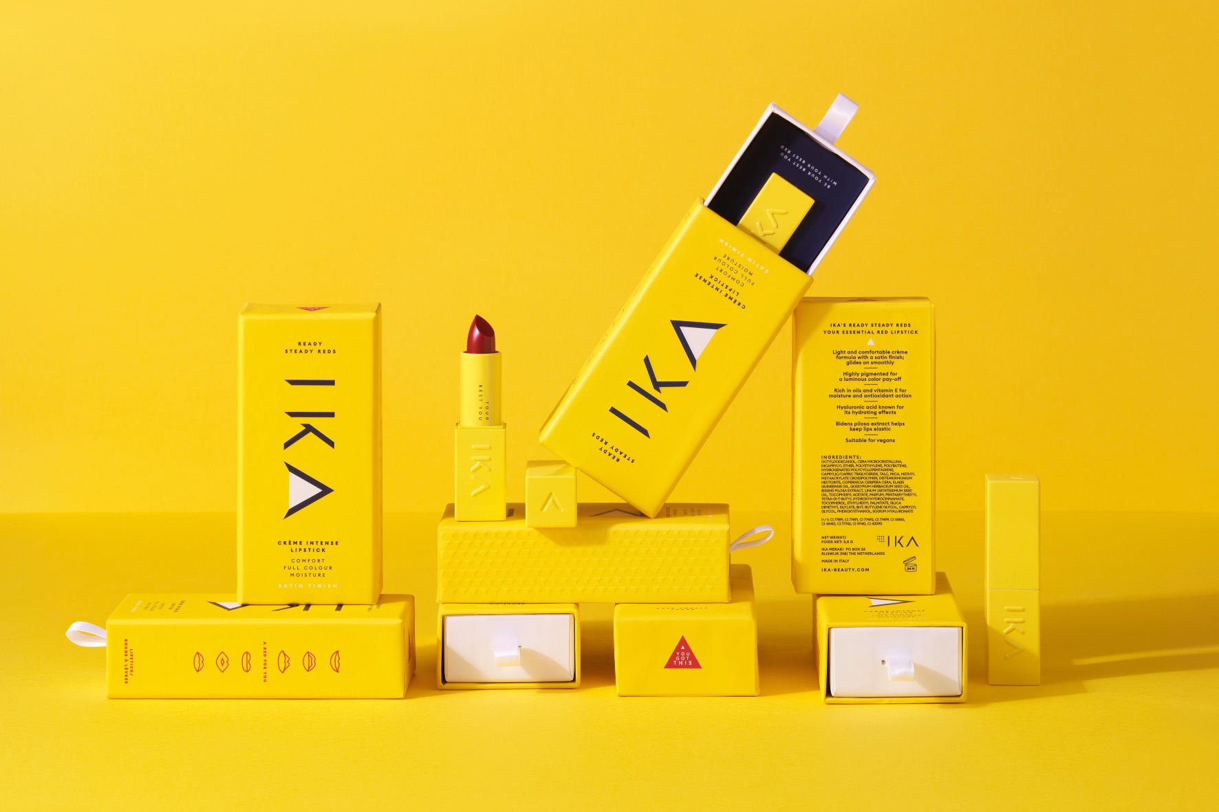
Empowerment!: IKA represents the strength you already possess to be your best self. Carve your own path, armed with IKA.
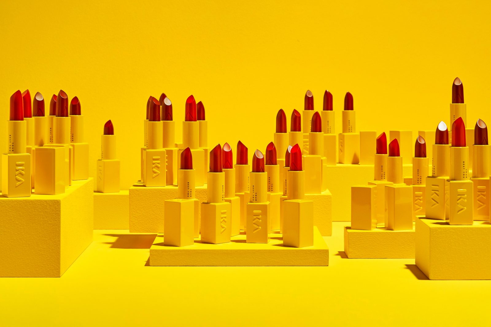
IKA Beauty. Your best you. “IKA” translating to “you” in the founders dialects is a product line consists of three shades of high performing red lipstick. The color cosmetics industry and especially the lipsticks market is mature and saturated with many brands and products that sell a dream, an ideal, or perfection.
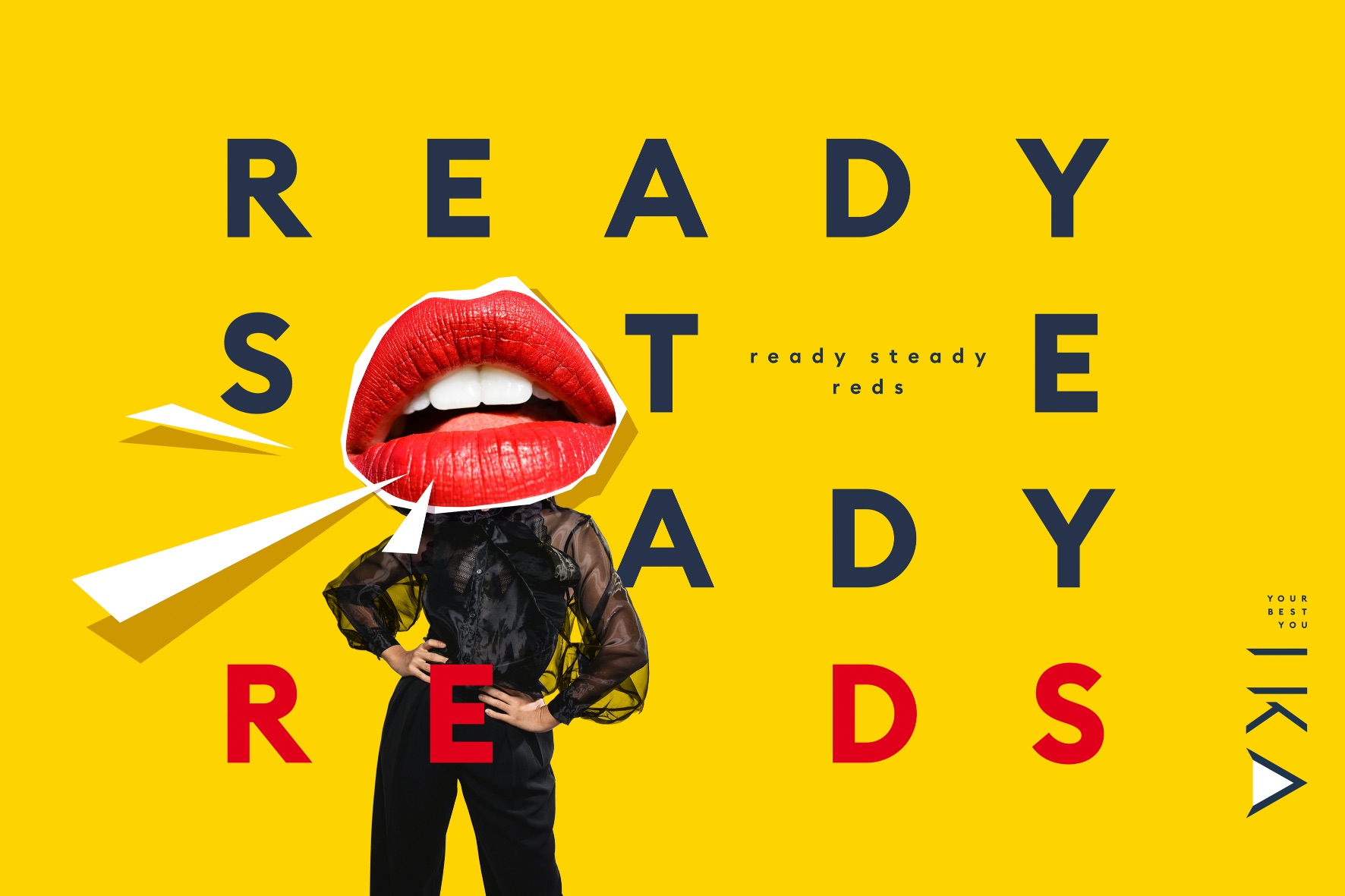
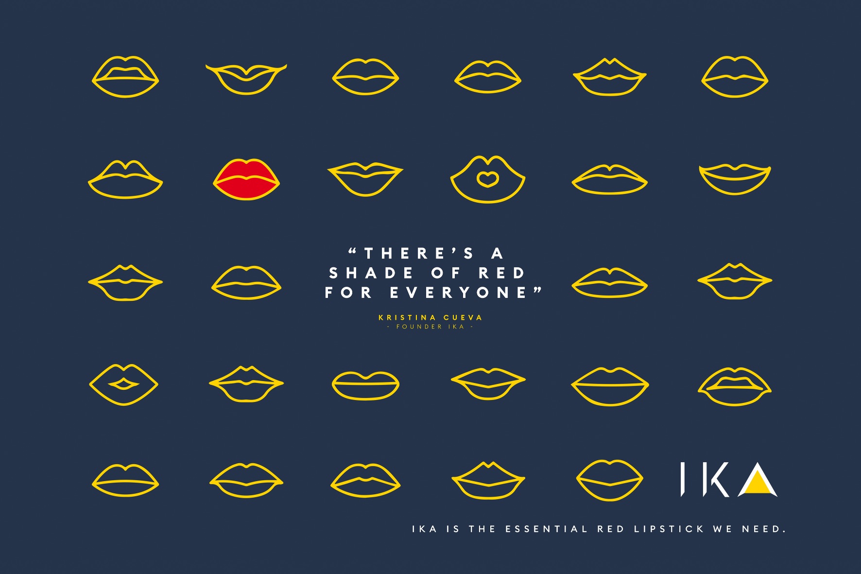
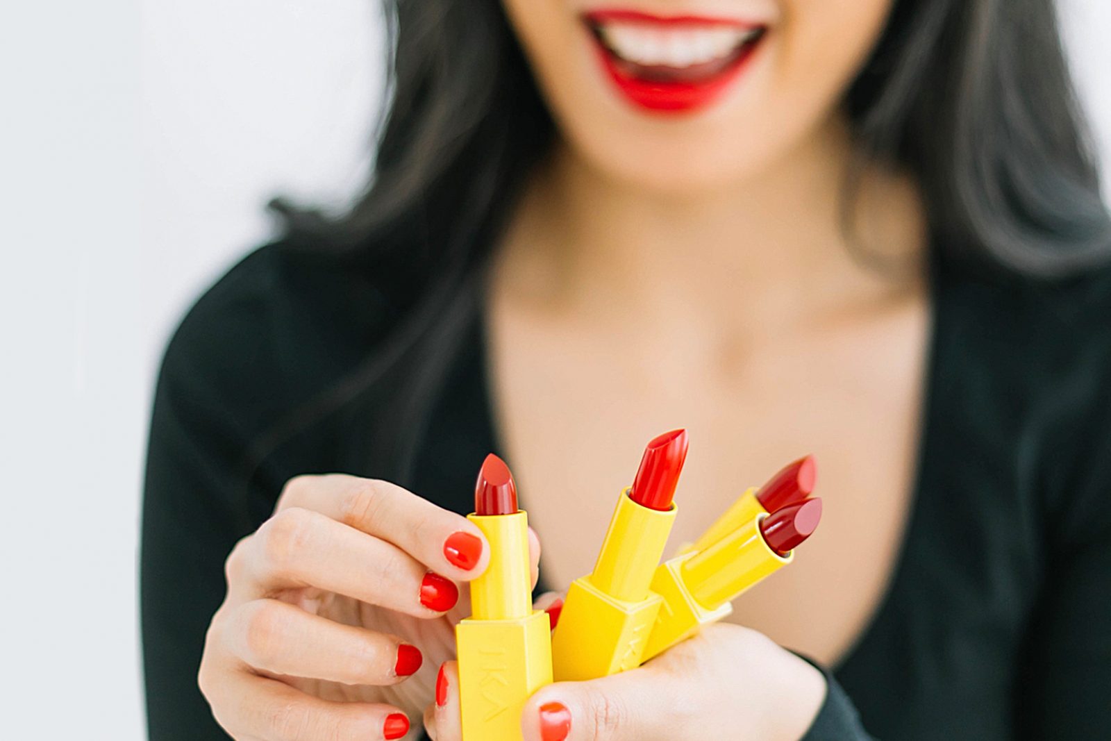
IKA Beauty does things differently: instead of focusing on the dream of becoming the ‘ideal woman’ by using cosmetics, the brand focuses on how its products boost the wearer’s own identity, confidence and creativity, as reflected by its tagline ‘Your Best You’. IKA is here to help women find their voice and proclaim that beauty is up to them. Gone are the days where women look for external validation but instead IKA wants women to look within and love what they see. IKA wants to be inspirational as well as aspirational.
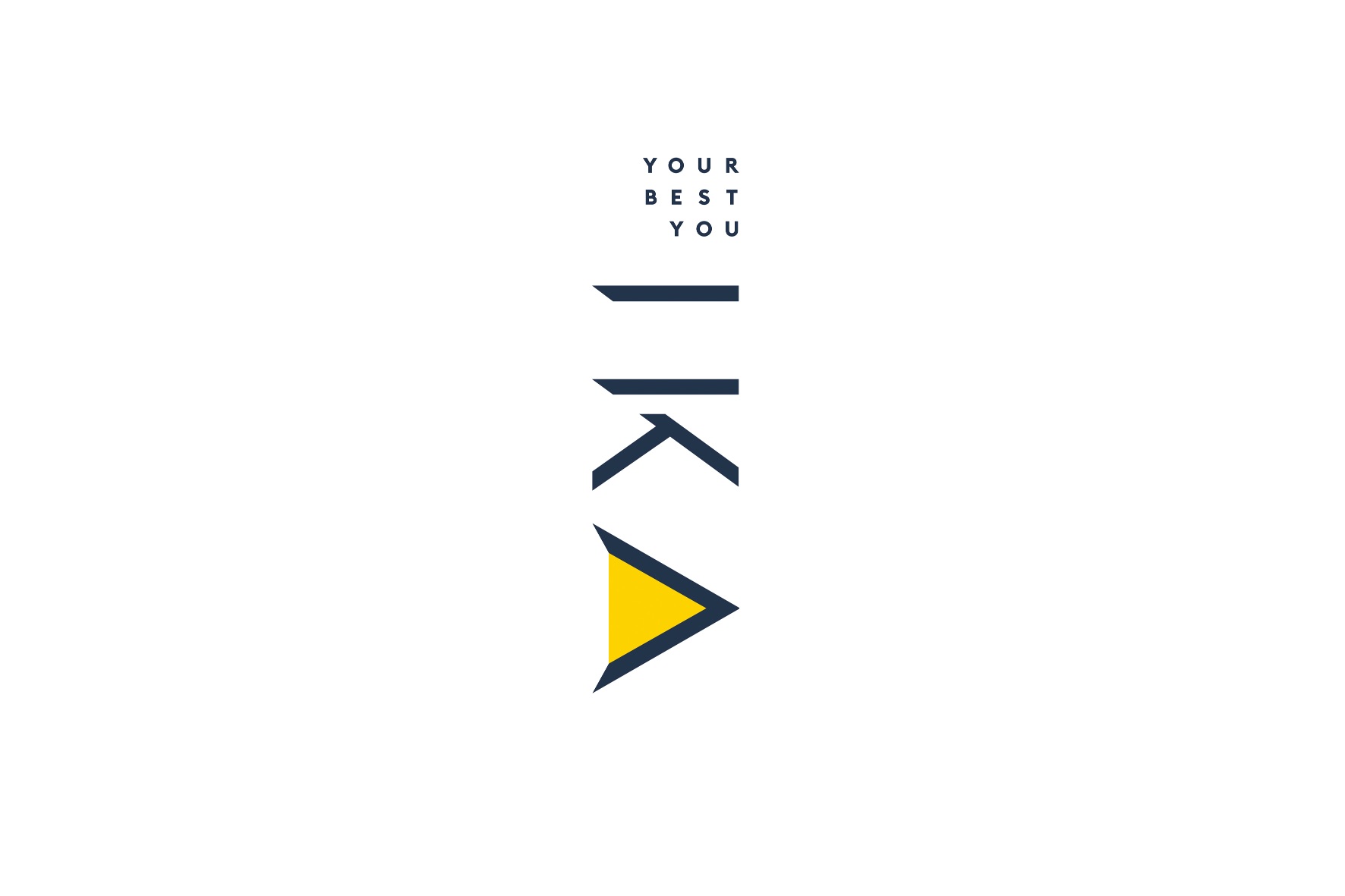
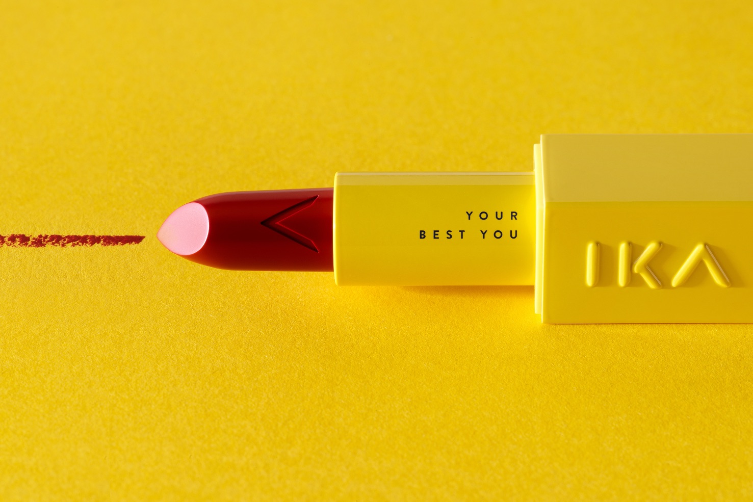
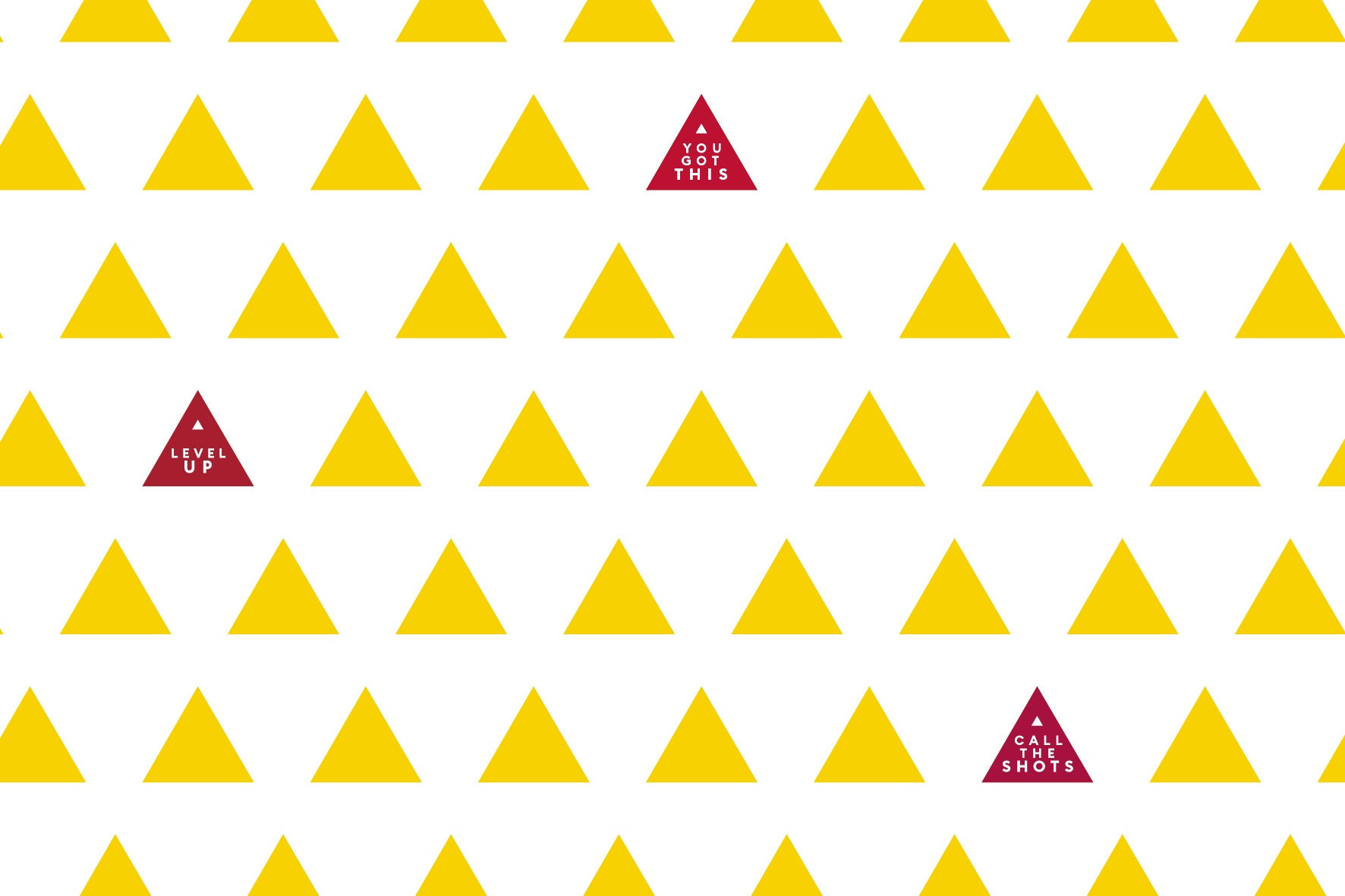
Logo Identity: IKA’s edgy logo is a unique feature in the lipstick field. No elegant circles or flowy lines but rather solid and enticing. The name itself calls for strong lines. There are also sharp corners, a broken K yet still legible and an A, that lends itself to the upward “Level up” direction as part of its mission to activate your best you.
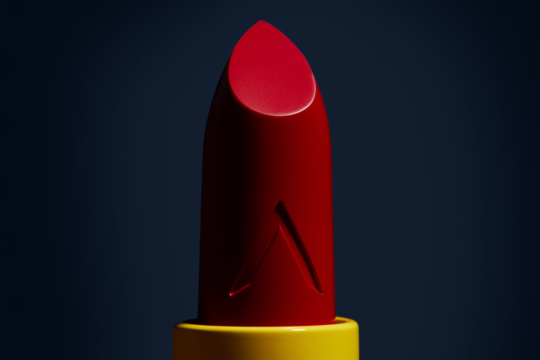
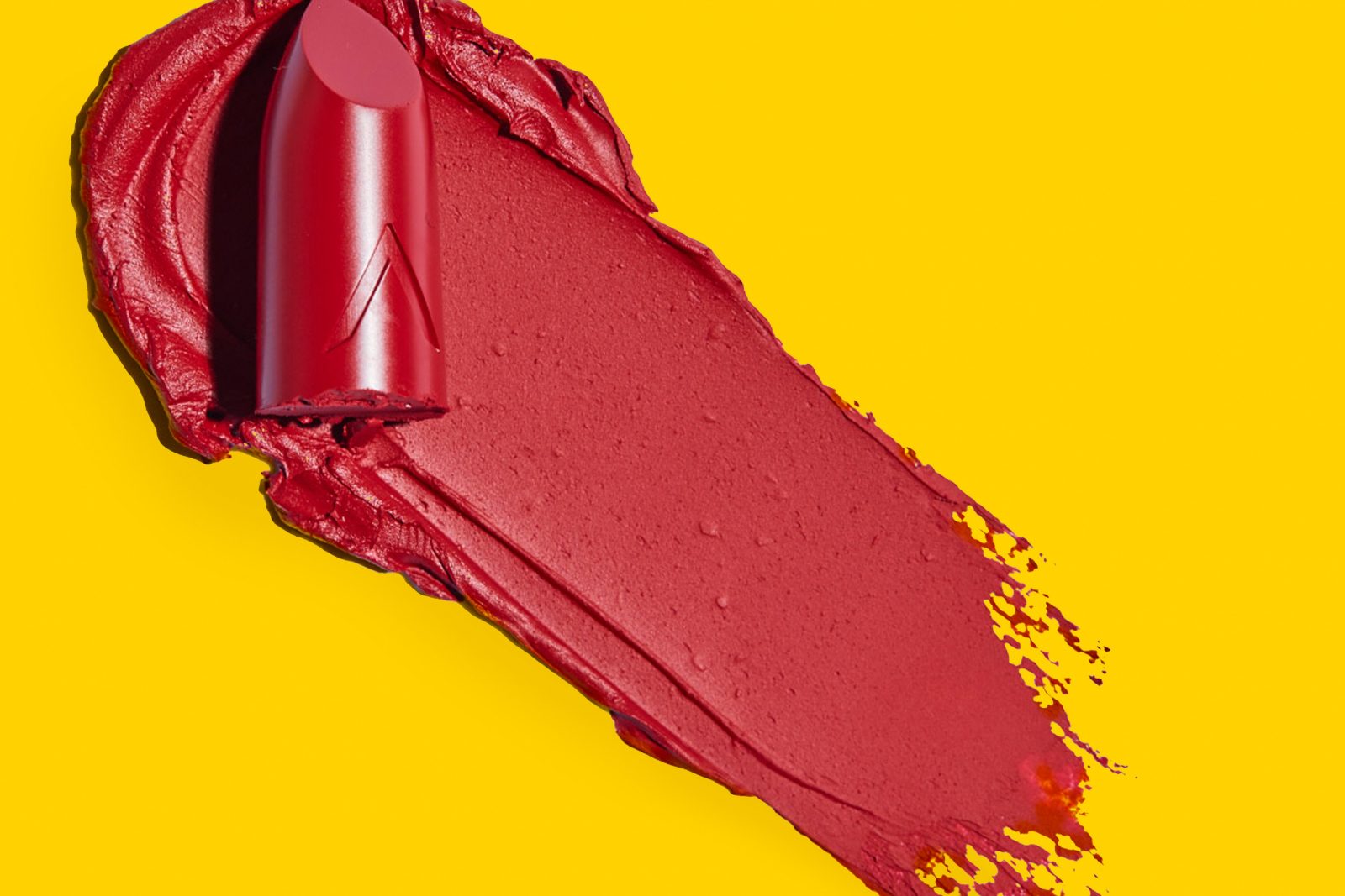
Packaging Bullet: In line with the edgy branding, the bullet packaging is square, not the most common lipstick packaging bullet. The bullet is weighted, representing the brand’s lipstick authority as you firmly hold it. The closure is magnetic, a feature mostly seen on prestige brands. But not only is this functional and adds to that luxury feel, but it also represents the strength you already possess to be your best self.
Color: The iconic disrupting yellow packaging, a color that’s rarely seen in the lipstick market, is easy to spot among the industry code of mostly black, gold and silver packaging. The bold and uplifting warm yellow color mirrors the brand’s positivity, joy, and creativity, as well as its mission to stimulate its customers to be ‘Your Best You.’
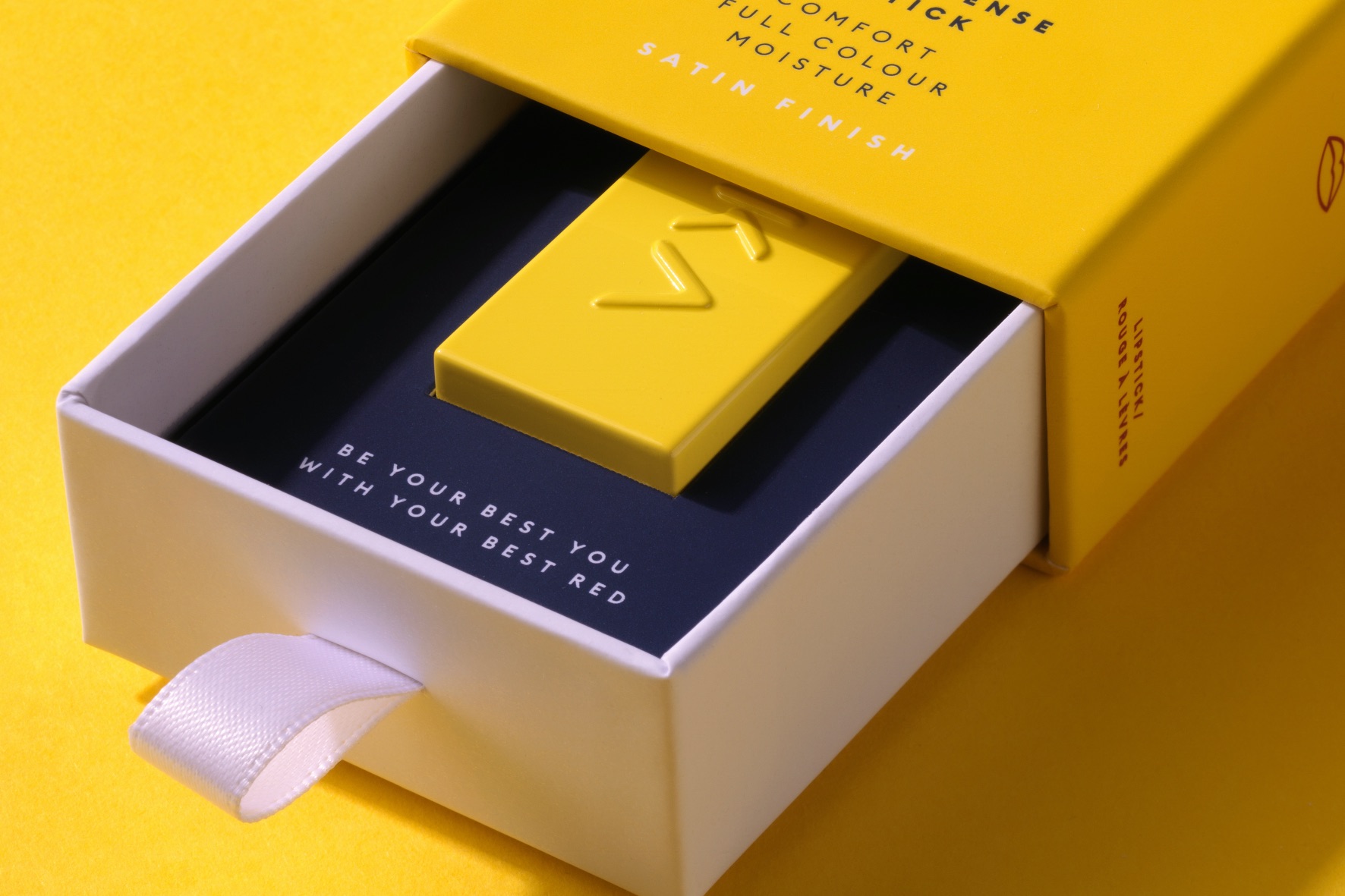
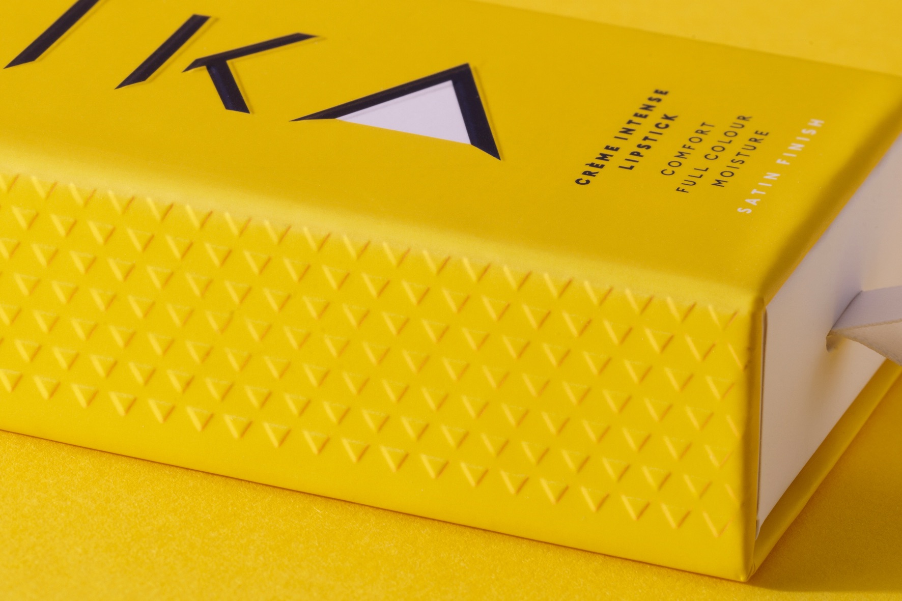
Packaging Drawer box: IKA’s bullet is packed in a pull-out drawer box, something to keep in your collection. The finish is soft touch, exuding luxury and stimulating embossed sensory touch, mirroring the creamy formula and satin to cream finish of the lipsticks. IKA wants the lipstick wearing ritual to also be a reminder to those wearing it, that she has her own back.
CREDIT
- Agency/Creative: Joost Identities
- Article Title: IKA Beauty Ready Steady Reds Collection
- Organisation/Entity: Freelance
- Project Type: Packaging
- Project Status: Published
- Agency/Creative Country: Netherlands
- Agency/Creative City: Haarlem
- Market Region: Global
- Project Deliverables: Packaging Design
- Format: Box
- Substrate: Pulp Carton
- Industry: Fashion
- Keywords: WBDS Creative Design Awards 2021/22
-
Credits:
Strategy & Creative Direction & Design: Joost la Housse
Copy: Emendo Editing
Photography: Michiel Spijkers
Photography: Studio_M Memorable Photography
Client: IKA Beauty
Strategy: In The Branding


