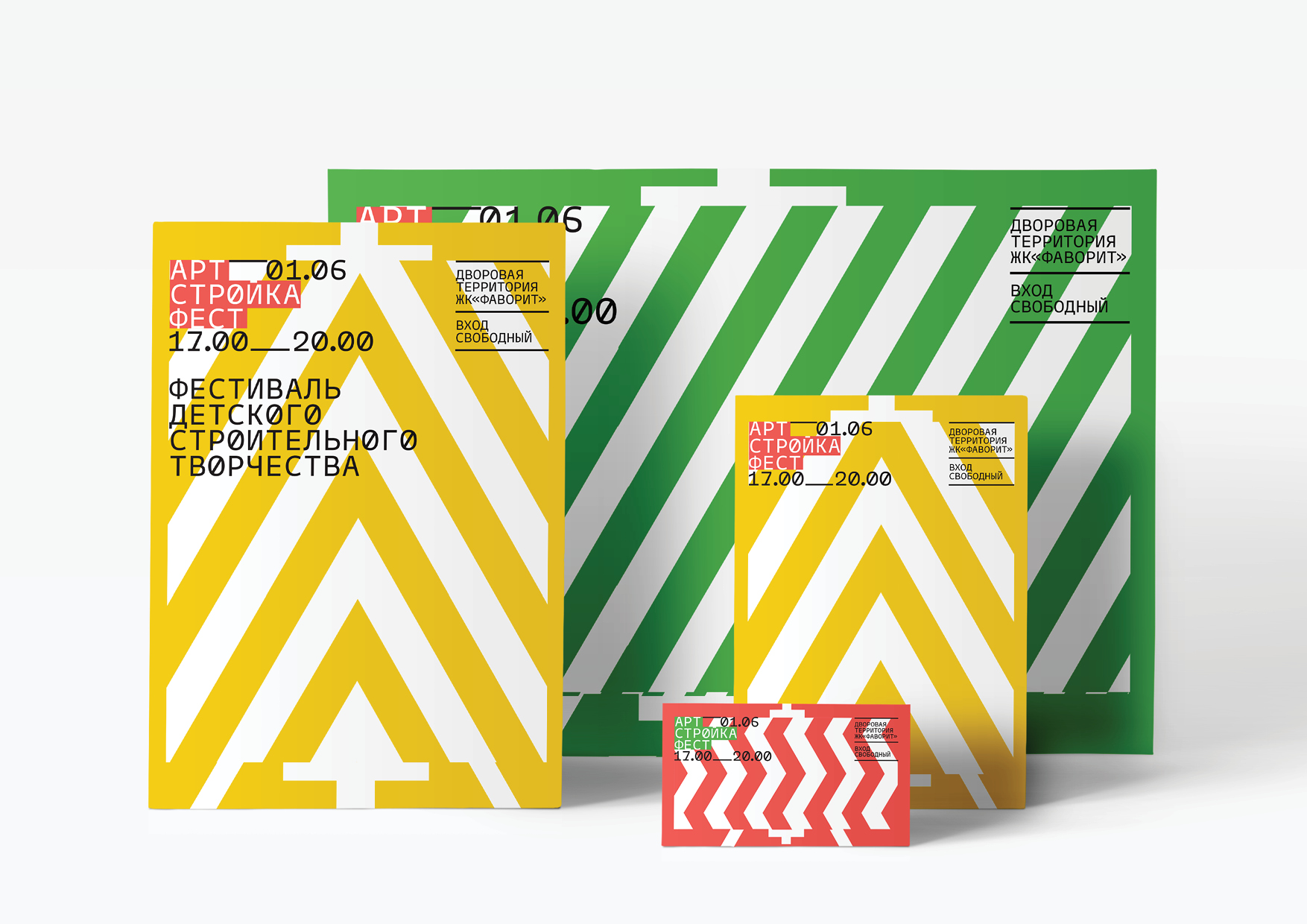
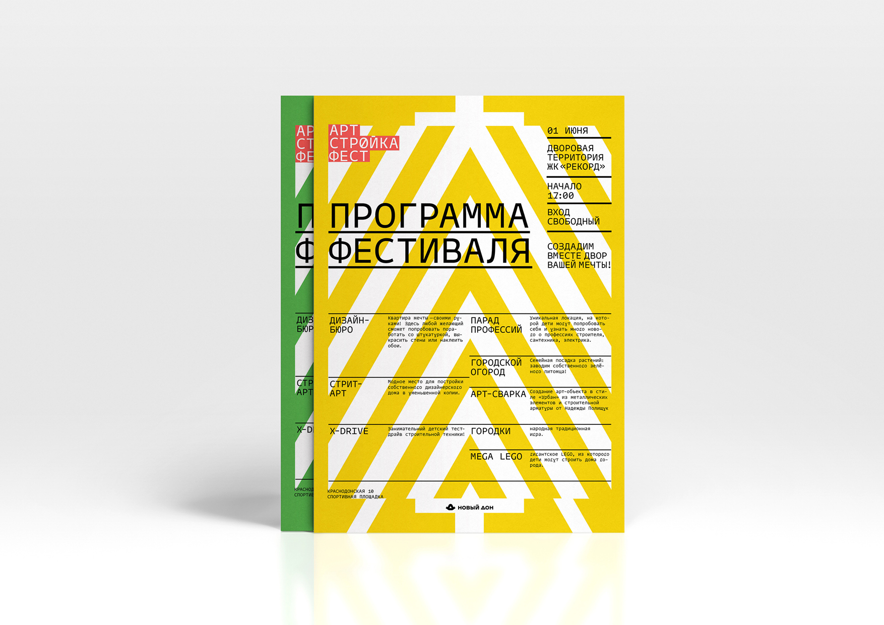
“ArtStroykaFest” is a large family festival that was held in Samara as part of the celebration of the International Children’s Day on June 1, 2021. The festival took place at three sites of residential complexes of the “New Don” Group of Companies. Children and their parents could take part in more than 10 thematic events: try themselves in various construction professions (bricklayer, painter, electrician, etc.), they tried to design houses, lay down a lawn or improve flower beds on the building territory. In addition, as part of the entertainment program of the festival, there was a test drive of construction equipment for children and various games for the whole family: from “gorodki” to the assembly of a giant LEGO constructor. Residents were able to participate in the creation of land- and street-art objects, which were later used as decoration. The purpose of the festival was to create a healthy and aesthetically attractive environment for raising children and forming strong good-neighborly relations. The house does not end beyond the threshold of the apartment, so it is necessary to constantly work on improving the communal and adjacent territories, independently form a comfortable living environment – this is the main message of the last festival.
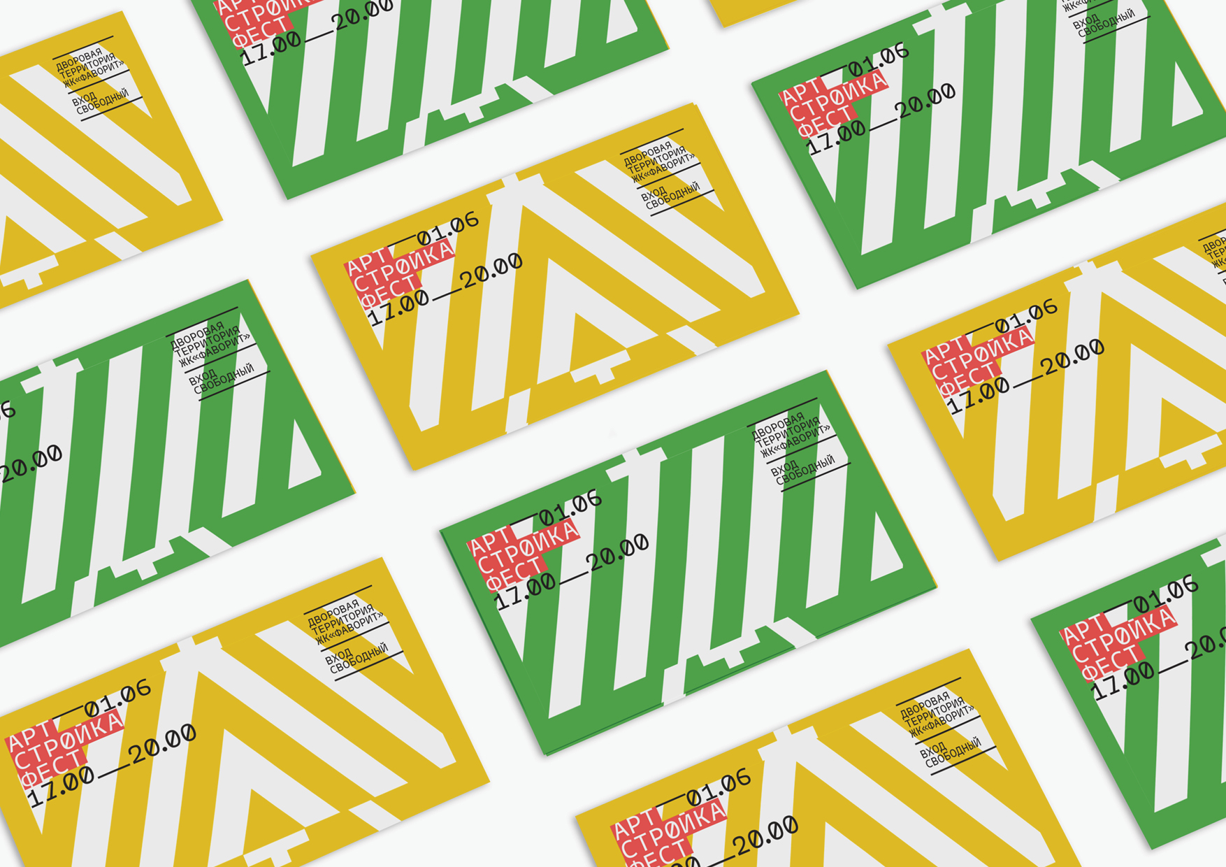
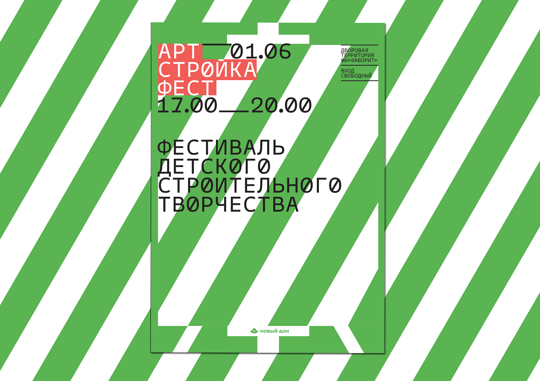
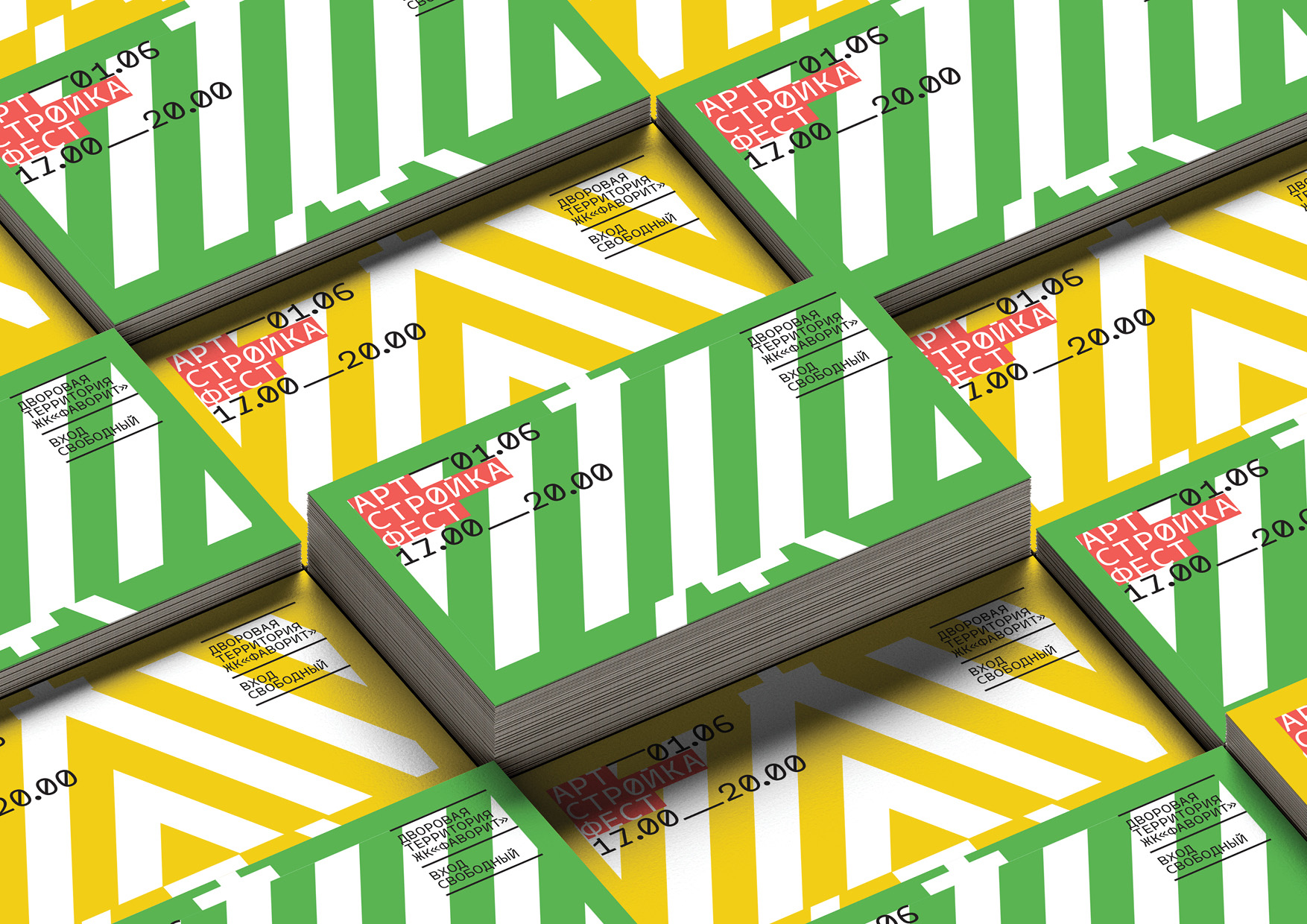
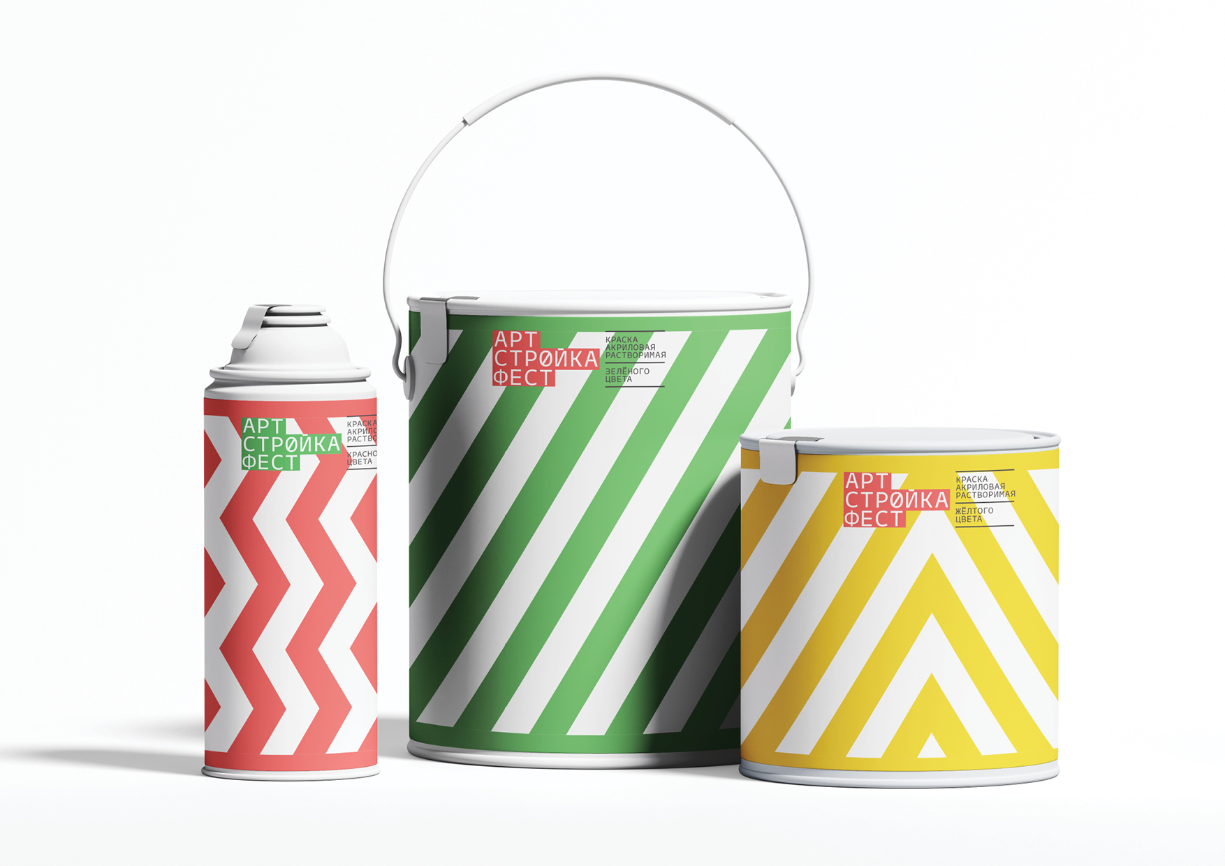
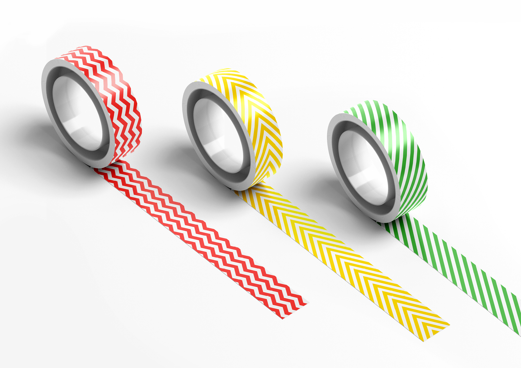
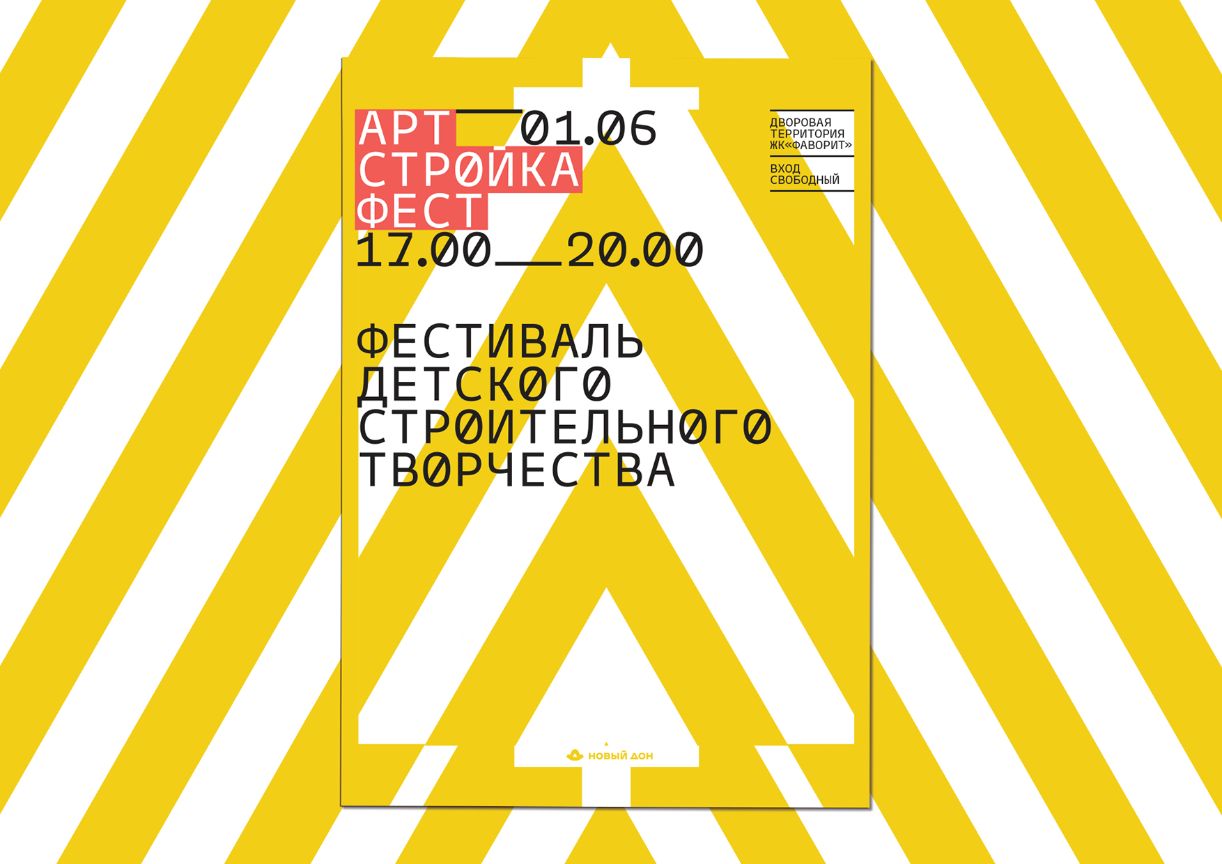
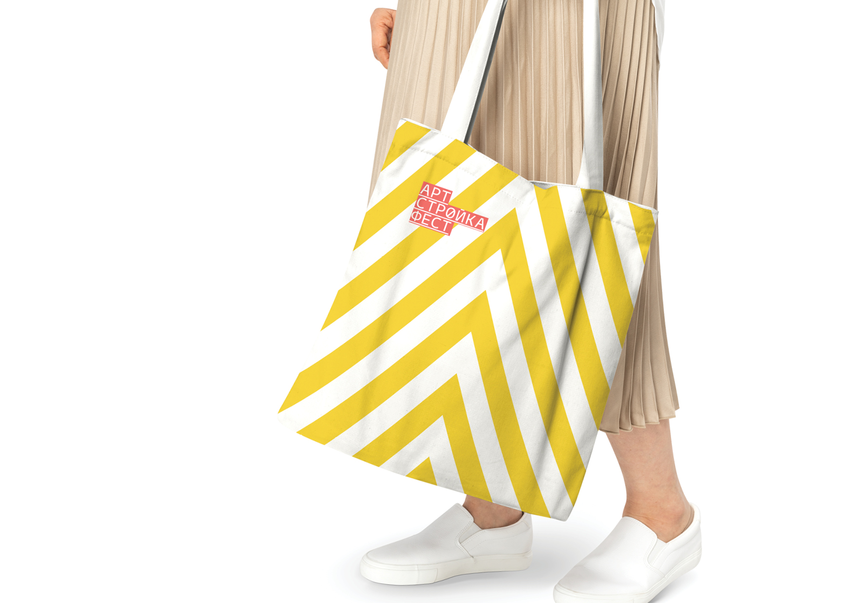
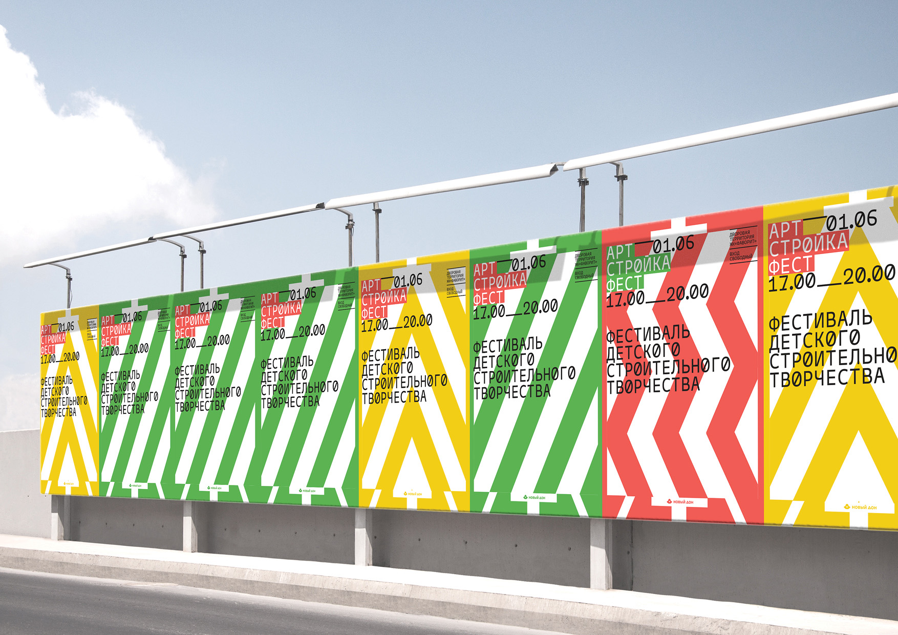
The festival’s corporate identity is based on the signal markings used during construction work. Its main colours: red, yellow and green correspond to the corporate colours of the three residential complexes that housed the festival. The lines of construction markings are applied to an art easel — a symbol of creativity, combining both the theme of construction and the theme of art in one image. The typographic solution is designed in a strict and slightly dry style, reminiscent of signatures on architectural blueprints, which are always more important than the underlaying image. The typography overlaps the active graphics with the top layer, drawing the viewer’s attention to itself. The strictness of the design of the festival, was consciously made as close to the real appearance of the construction site as possible. It is compensated by the abundance of various activities within the site and emphasises the idea that there is always a place for creativity even in such serious professions as construction.
CREDIT
- Agency/Creative: The Klën
- Article Title: Identity of Children’s Construction Creativity Festival by The Klën Bureau
- Organisation/Entity: Agency
- Project Type: Graphic
- Project Status: Published
- Agency/Creative Country: Russia
- Agency/Creative City: Moscow
- Market Region: Global
- Project Deliverables: Art Direction, Exhibition Design, Graphic Design, Motion Graphics
- Industry: Construction
- Keywords: Festival, Exhibition, The KLЁN, graphic design
-
Credits:
Producer: Dmitry Krasnov
Art Director: Tanya Dunaeva
Designer: Tanya Kazakova
Project Manager: Tatiana Kormina
Motion-designer: Kate Pletneva
Client: «New Don» Group


