


Building the Brand Foundation
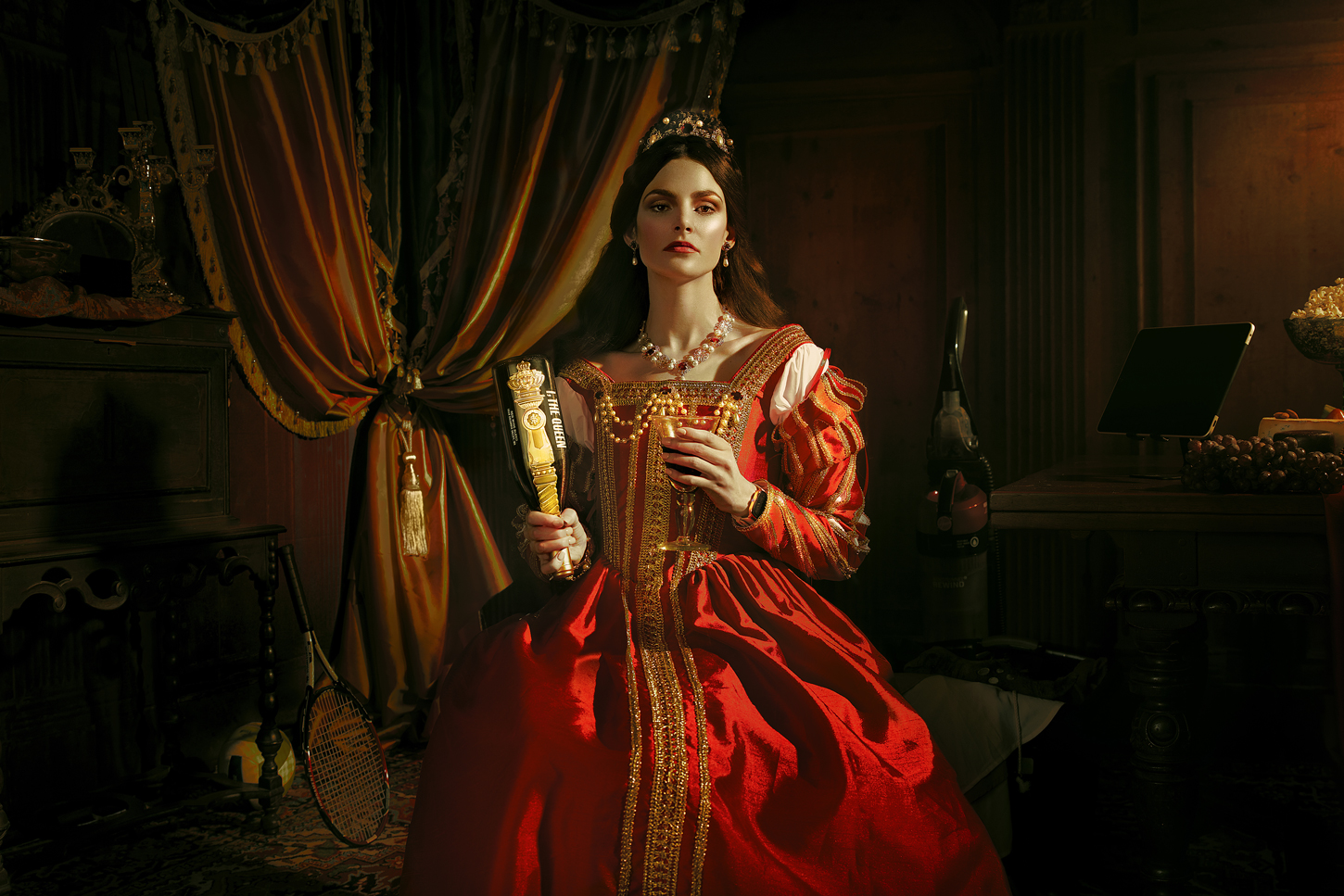
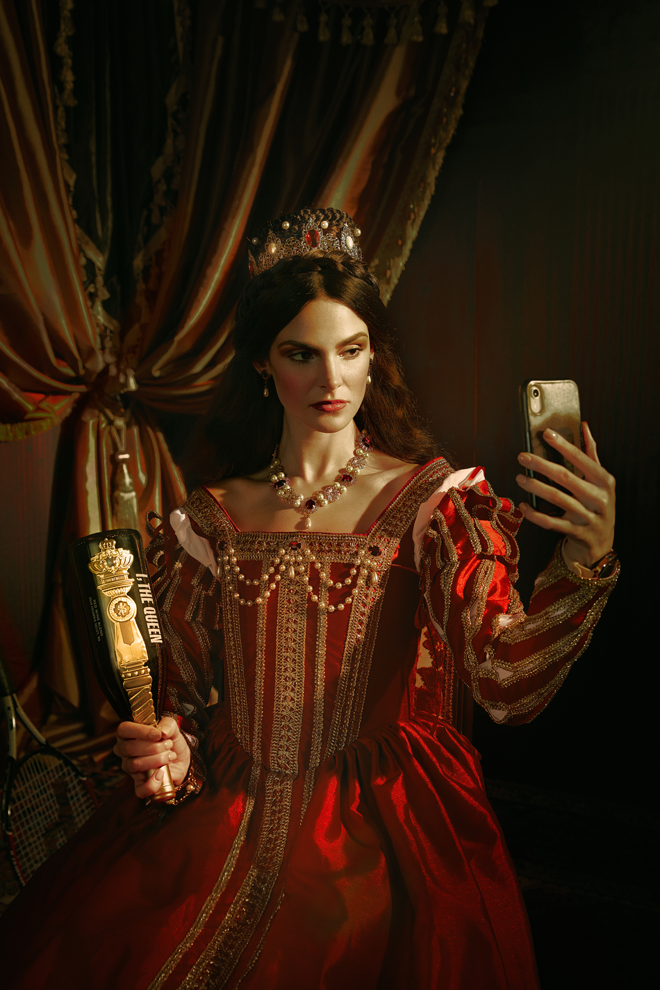
We uncovered the values and propositions that define and motivate the brand essence. At the core of the brand is the desire to motivate social change by challenging perceptions that are formed by misguided social conventions. The idea of provoking critical thinking through a simple experience fascinated us. Is it history or herstory? Why are the stories of brave female monarchs less told than those of their male counterparts? Shouldn’t at least some of history be written by the Victorias?
A fine wine, it can be argued, is the ultimate device to spark discussion, tell stories and yes, celebrate female empowerment.
Concept:
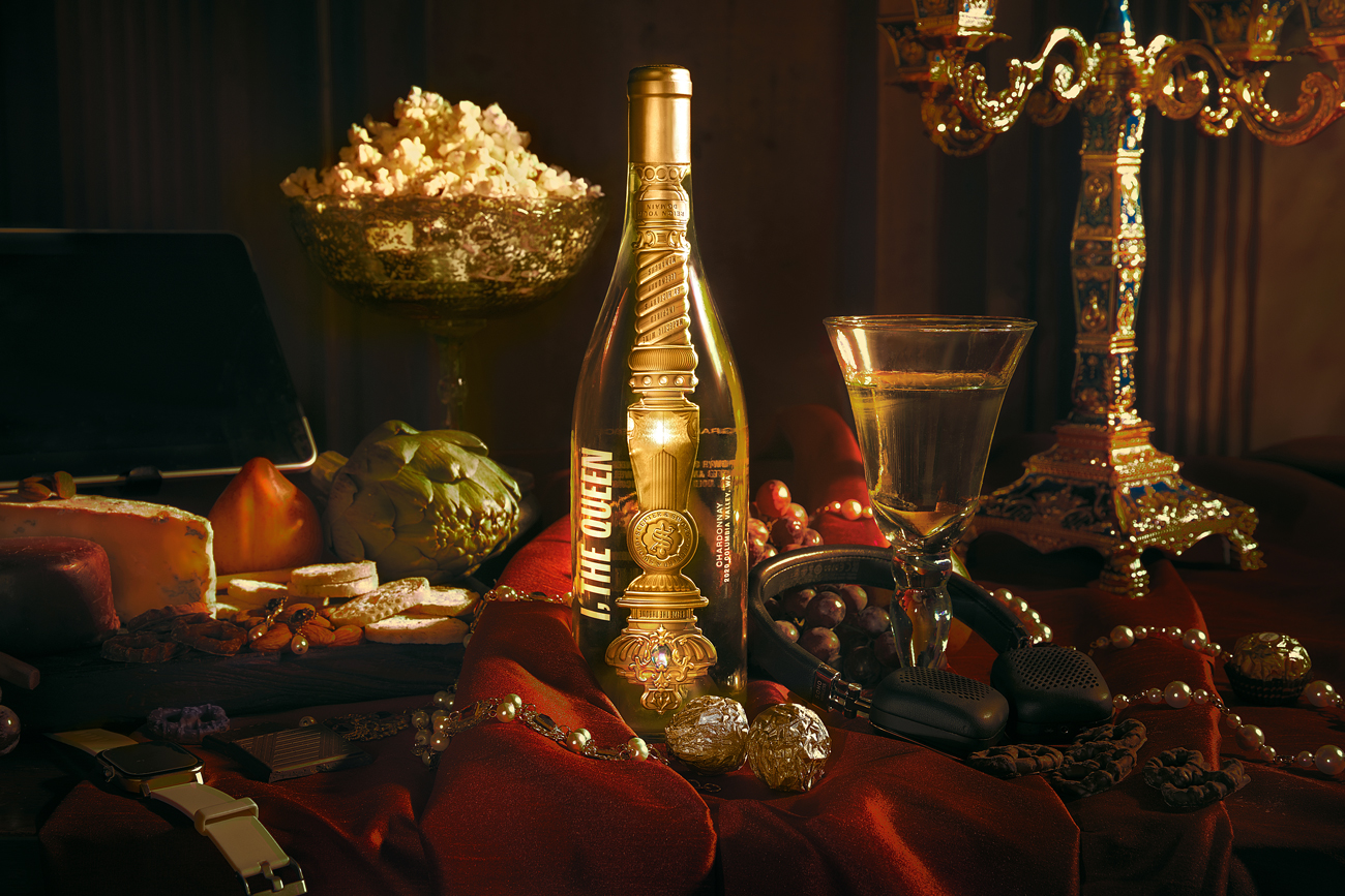
Our team reviewed art museums, books and archives to learn more about the role of Queens through history. The imagery of the scepter became a point of interest as it appears in different shapes and sizes and is present in many cultures throughout history. We also believed that the visual interest of the scepter was bound to inspire curiosity since it is not an object commonly seen or referred to today. With its ornamental design details, sparkling pearls, gleaming gems and gold bling, who wouldn’t do a double-take when encountering one of these?
While we designed the entire packaging experience around the historic scepter, we wanted to play freely with the concept of time to produce a relevant brand that makes you think and really question your perception. The packaging reflects this approach, shunning old wine traditions and embracing new ideas:
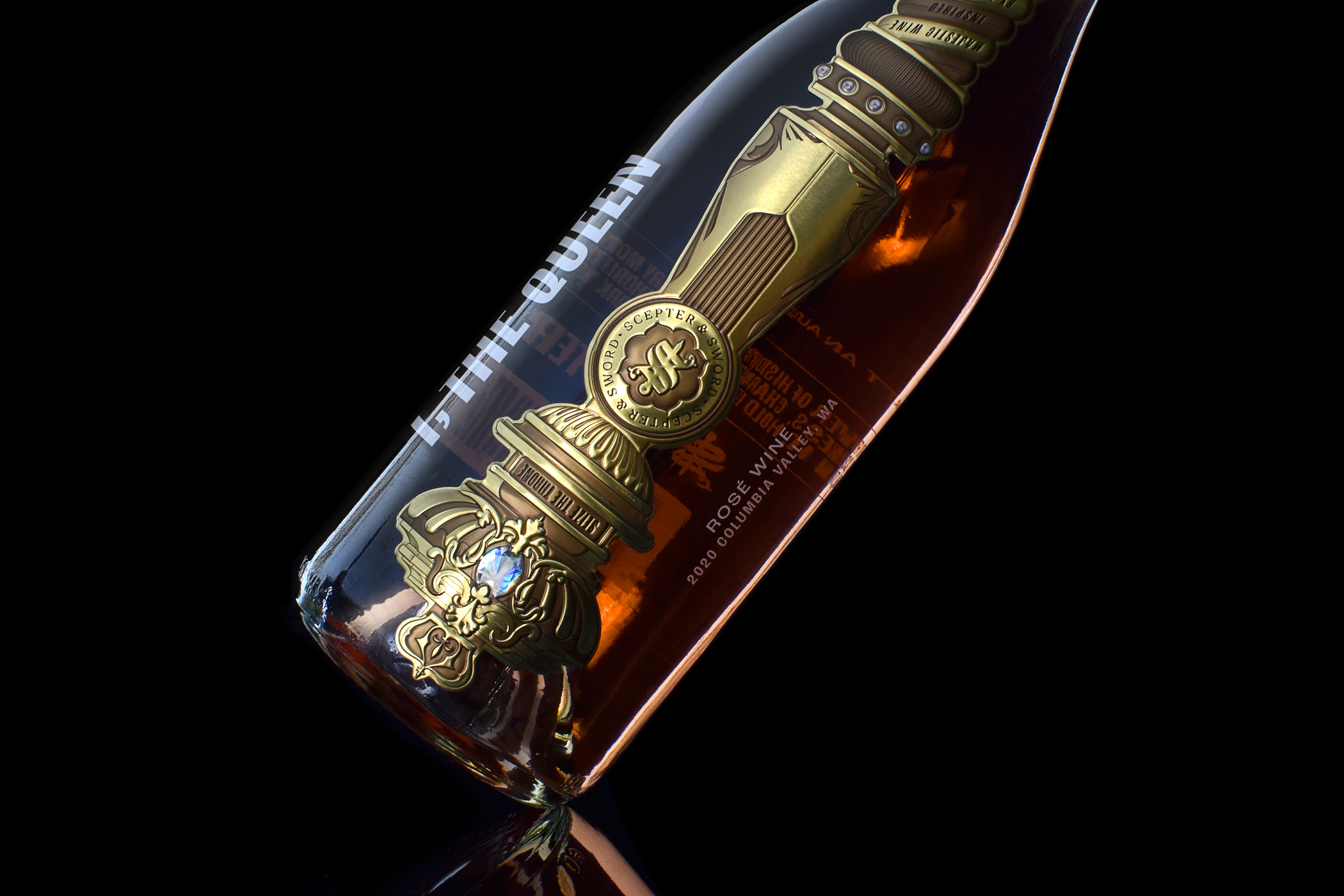
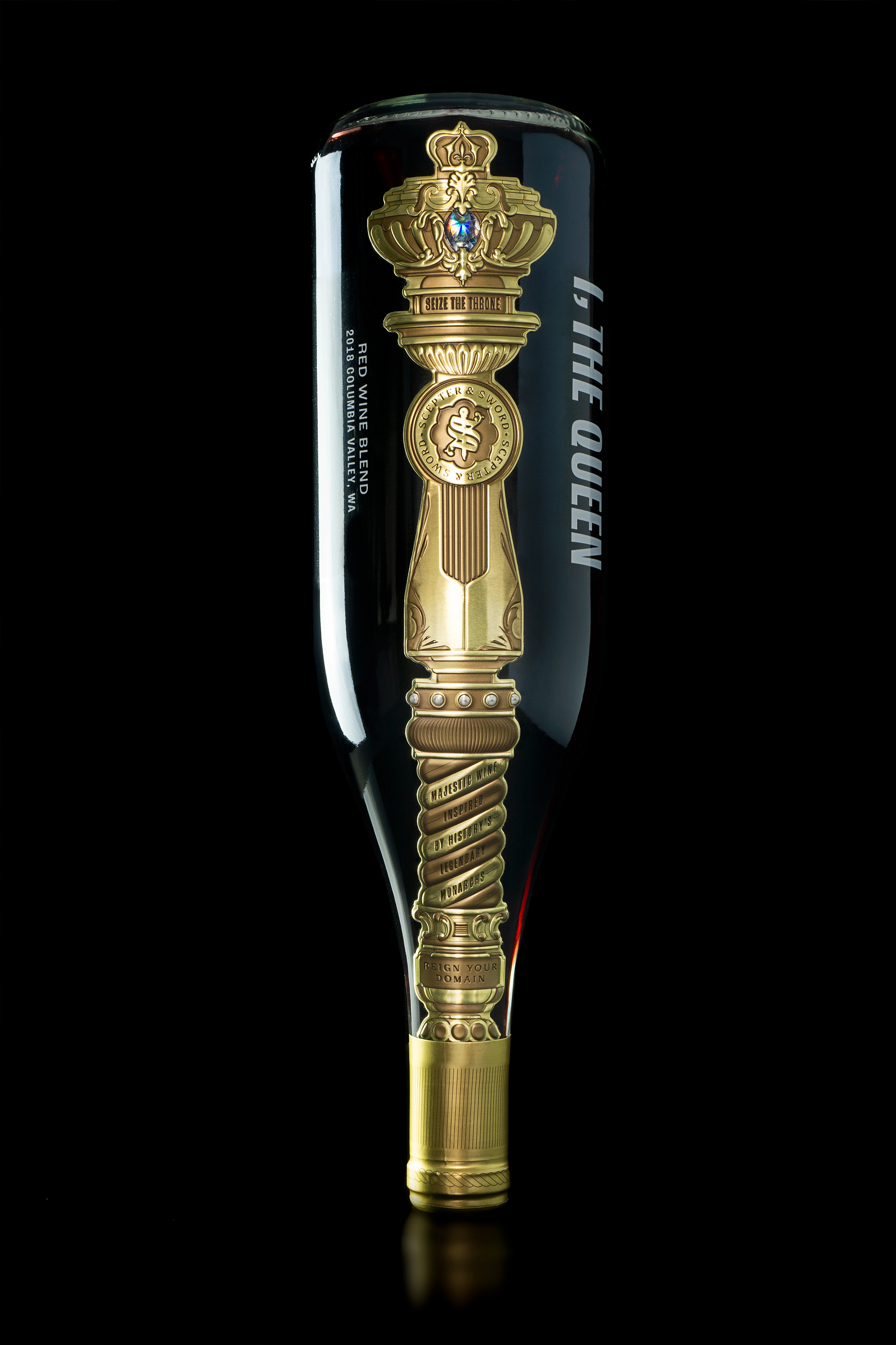
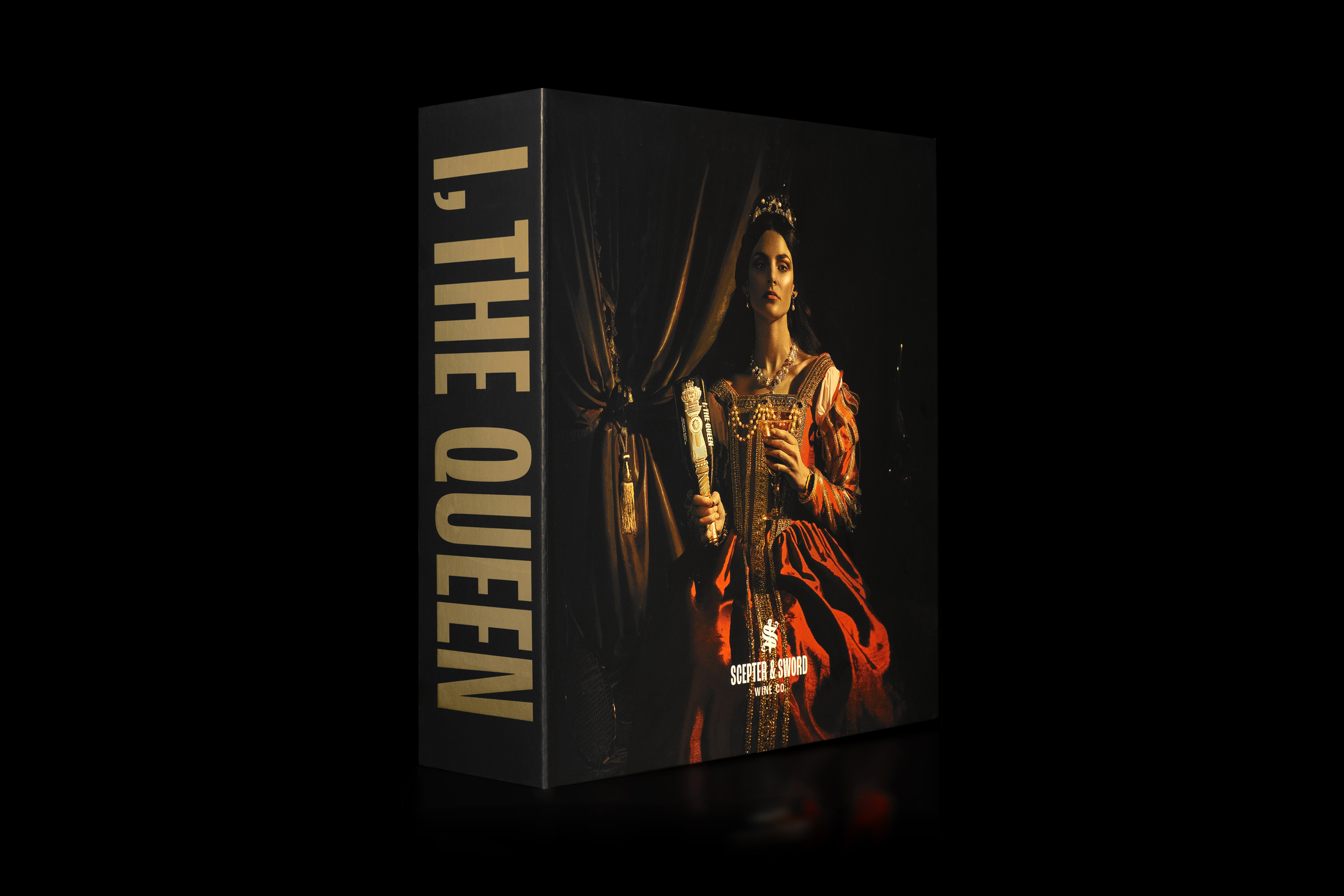
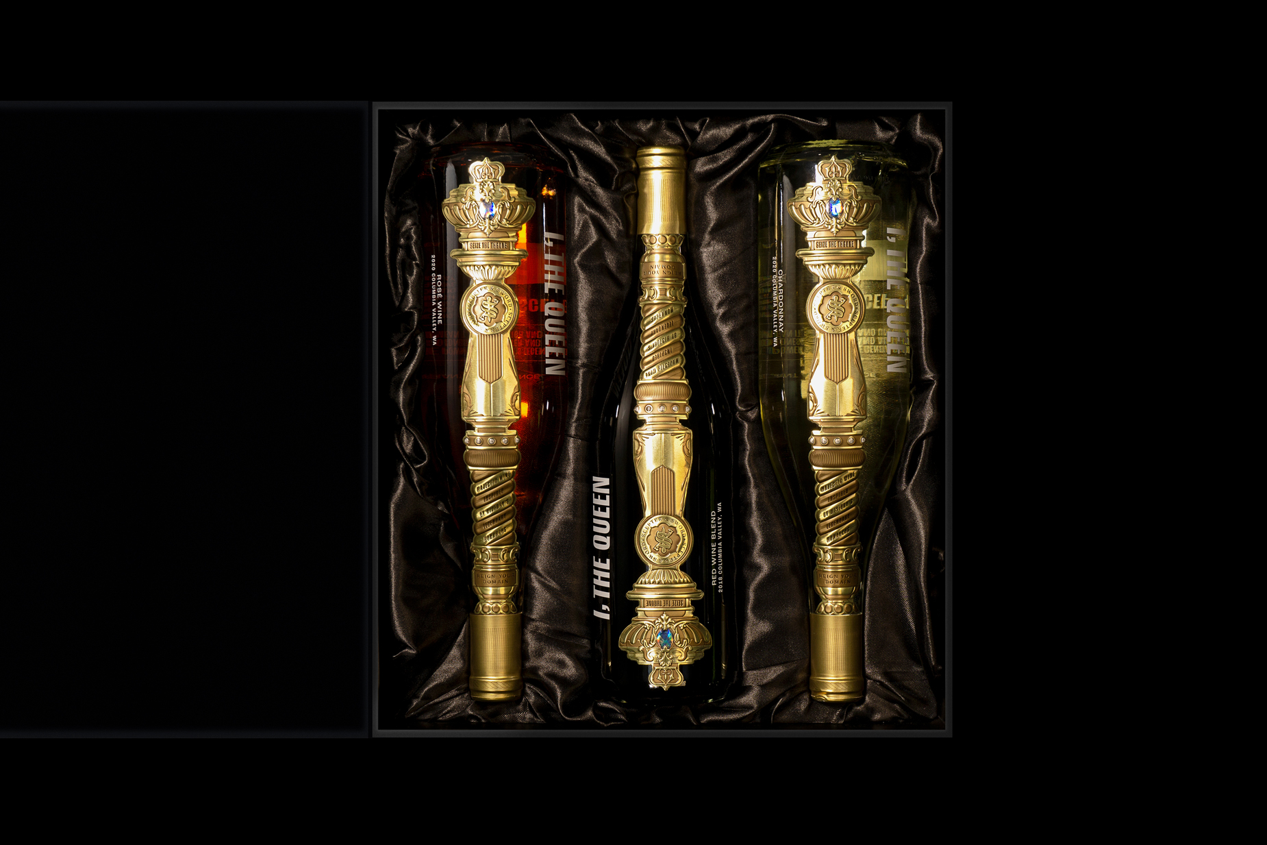
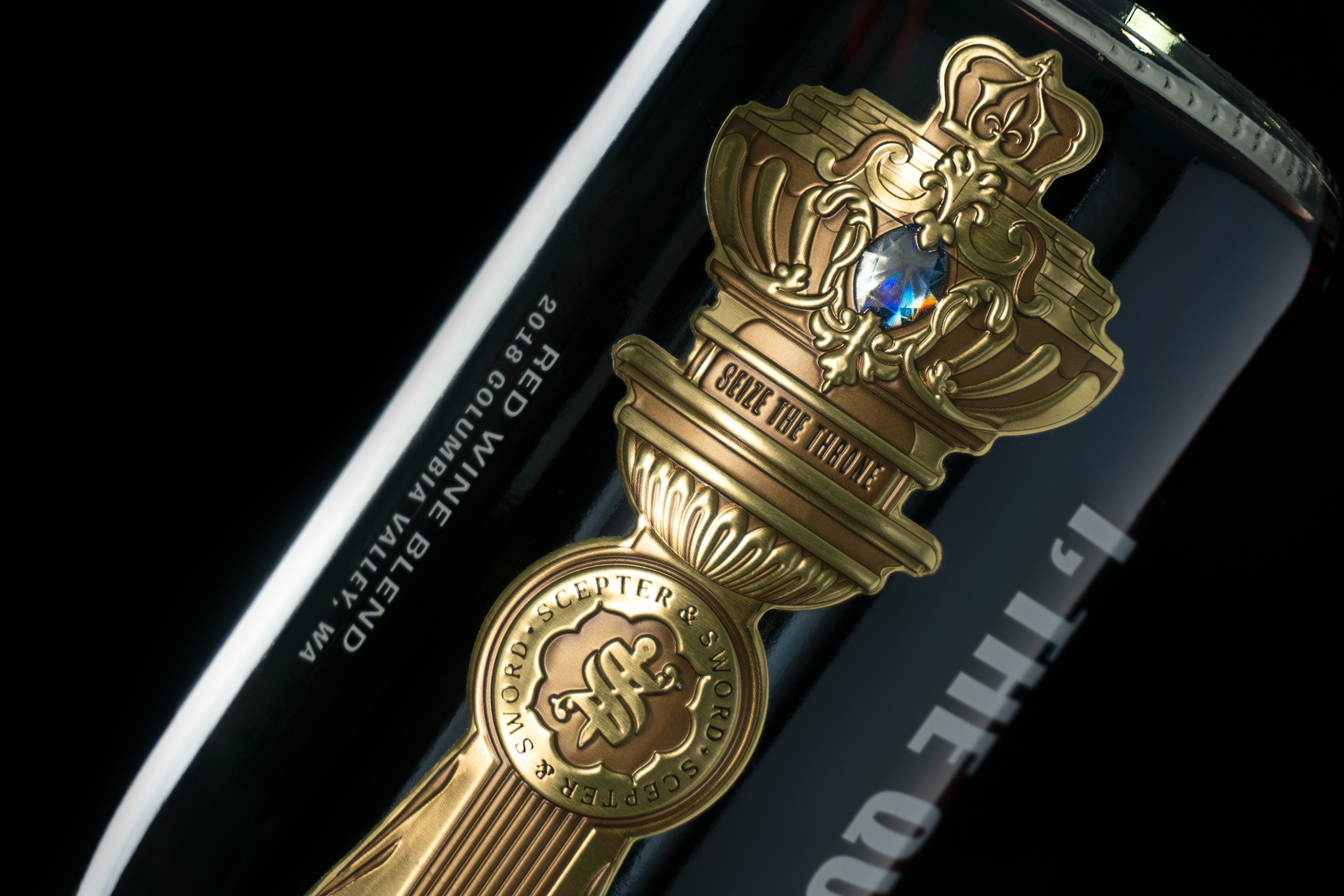
– A label that demands to be turned upside down where it becomes a scepter, the symbol of her authority and empowerment.
– Clear glass bottles promote the concept of transparency while allowing customers to see the beautiful colors and hues of the quality wine inside.
– Finally we designed a distinctive metallic label application that runs vertically through the entire face of the bottle, from neck to the base.
Naming and Brand Architecture
We were tasked with creating the wine company name, a branded product architecture and the product naming conventions.
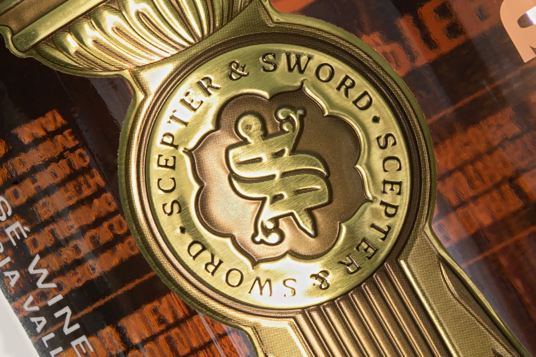
For the company name, Scepter & Sword immediately resonated because, in addition to being a sweet alliteration, it sounds strong while looking and feeling historic yet interesting to modern audiences.
Because the company wanted to grow and diversify its wine products, we devised a brand hierarchy to help facilitate the company’s strategy.
Our approach to naming the wine I, The Queen was inspired by discovering that this statement appeared directly above her signed name on her most important orders, edicts and proclamations… this effectively reflected the symbolism of the scepter while connecting the concept of the queen with a modern day colloquialism.
Visual Direction
We wanted to seize the opportunity to define our scepter concept through supporting collateral and as a visually-oriented brand, our approach was to use the opportunity to create something that would be eye-catching while respecting the brand’s mission. We were set on recreating a painterly-style photographic application that would challenge the viewer’s perception of our conceptual queen.
CREDIT
- Agency/Creative: Mubien Brands and Workshop Built
- Article Title: I, The Queen Wine Range Designed by Mubien Brands and Workshop Built
- Organisation/Entity: Agency
- Project Type: Packaging
- Project Status: Published
- Agency/Creative Country: United States
- Agency/Creative City: San Diego
- Market Region: Europe, North America, Global
- Project Deliverables: Art Direction, Brand Architecture, Brand Creation, Brand Design, Brand Identity, Brand Naming, Brand Strategy, Branding, Copywriting, Creative Direction, Graphic Design, Motion Graphics, Product Naming, Product Photography, Web Design
- Format: Bottle, Box
- Substrate: Glass Bottle
- Industry: Food/Beverage
- Keywords: WBDS Agency Design Awards 2021/22
- Keywords: bottle, graphic design, golden, woman, queen, female, wine, empowerment, female, Label, medieval, model, Packaging, scepter
-
Credits:
Agency: Mubien Brands
Agency: Workshop Built


