Summary
Our rebranding of Cocobella was anchored in creating a brand story. Despite the brand’s solid reputation, we recognised the need for a fresher, stronger brand identity – one that was anchored in the brand truth around achieving paradise. The new branding we created not only resulted in cohesive, distinct assets for Cocobella but also achieved a more powerful on-shelf presence, increasing sales by 19.9% and market share by 8%.
Brief
Everyone knows Cocobella. The brand had a strong name and a faithful following. Yet despite being Australia’s favourite coconut water and yoghurt, market analysis revealed that the brand was getting lost on the shelf due to an increase in direct competitors. Our task was to elevate the brand – to create a more impactful shelf presence and to drive brand growth.
Insight
Eating plant-based food gives you a good feeling. You know you’re eating something that’s healthy and good for the planet. And nothing gives you that feeling of natural positivity more than your own kind of paradise.
Solution
In order to bring the new brand to life, there had to be an overarching story that was faithful to the brand, and serve as the anchor to the design strategy.
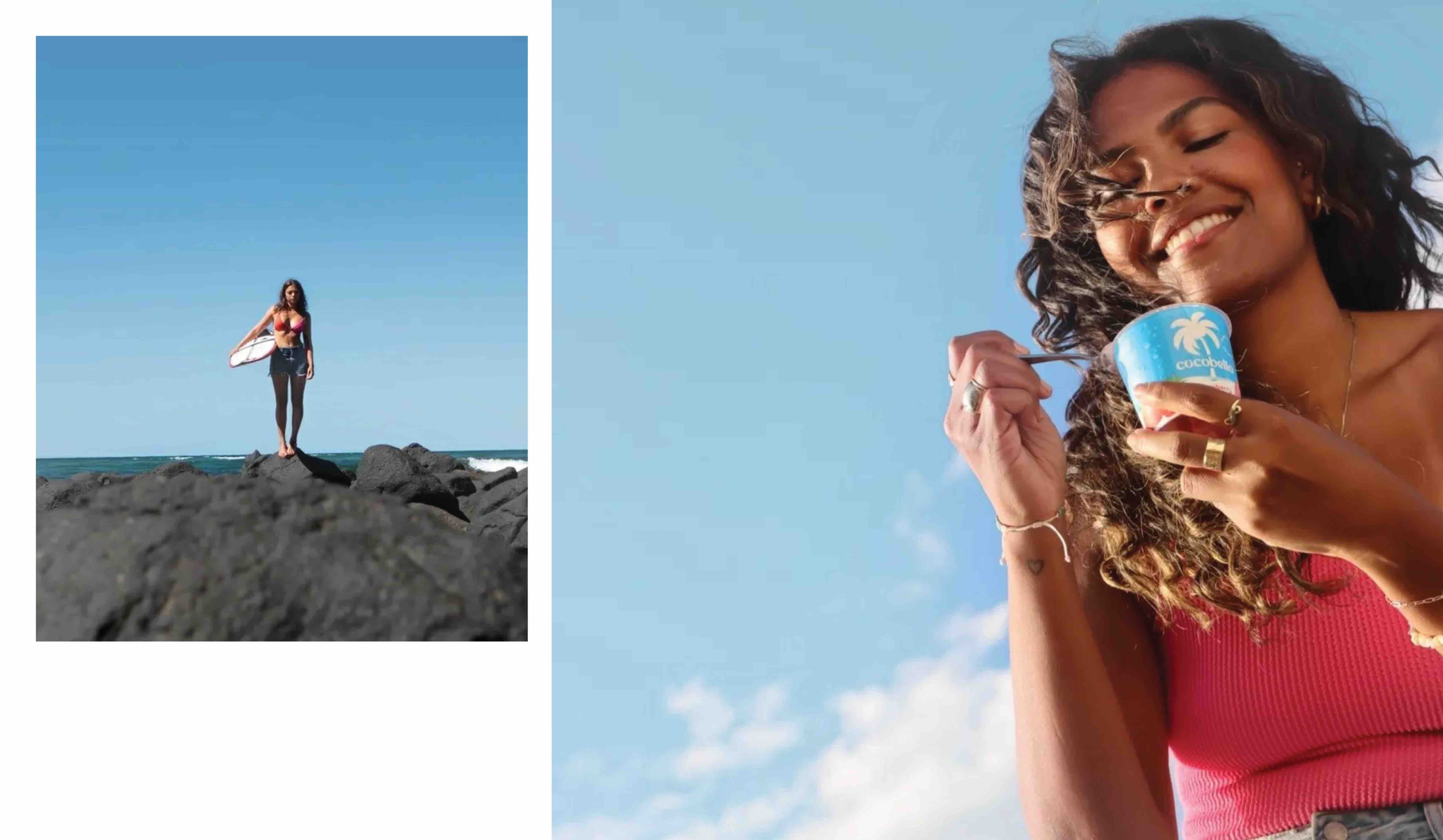
We crafted a beautiful narrative designed to transport you to your own natural paradise. A paradise with pure blue skies, sparkling water and a palm tree full of deliciously refreshing coconuts.
After all, this is where it all started for Cocobella – the founders were on a paradise beach when they came up with the name for the beautiful coconuts that surrounded them, aka Cocobella.
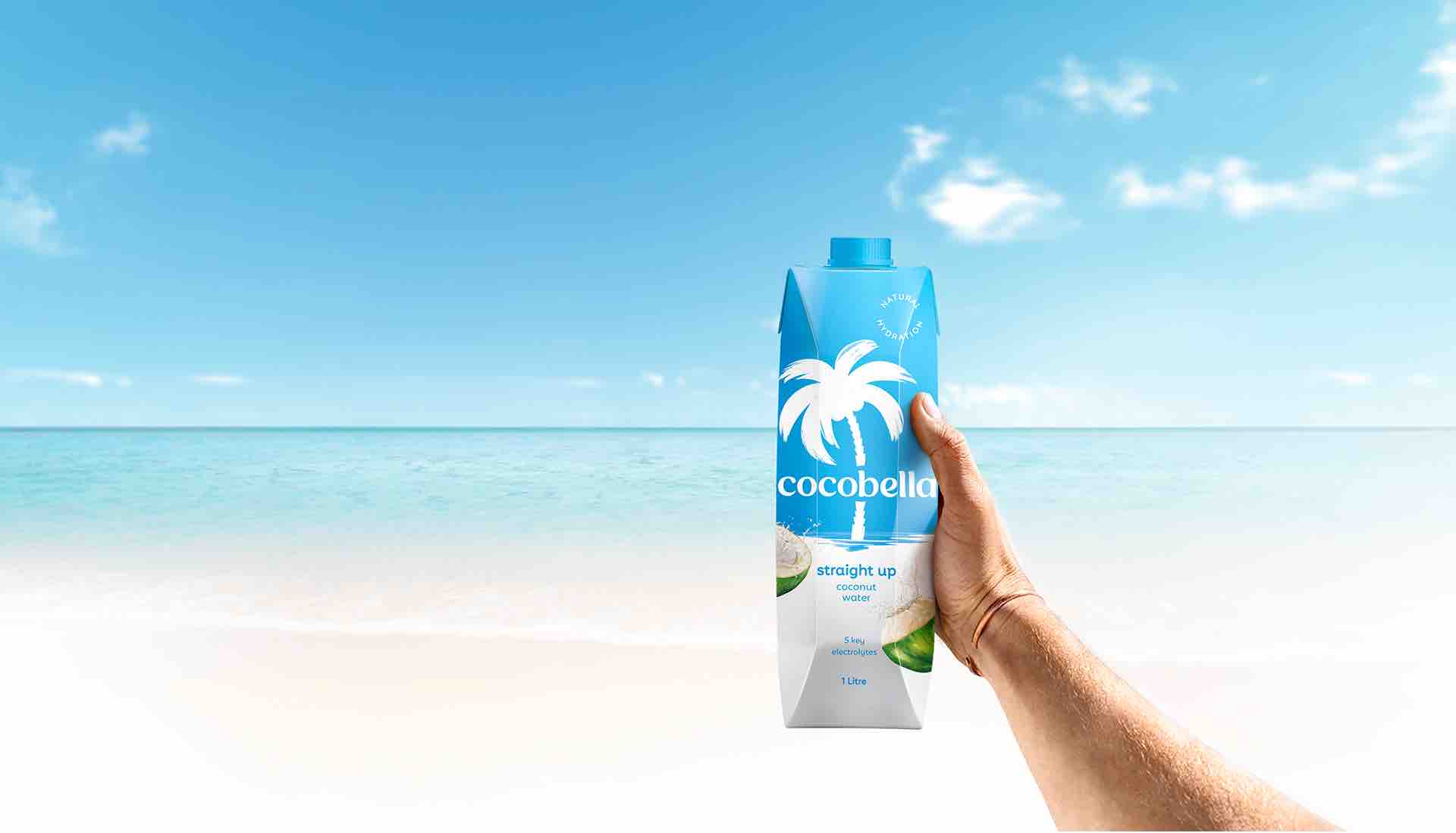
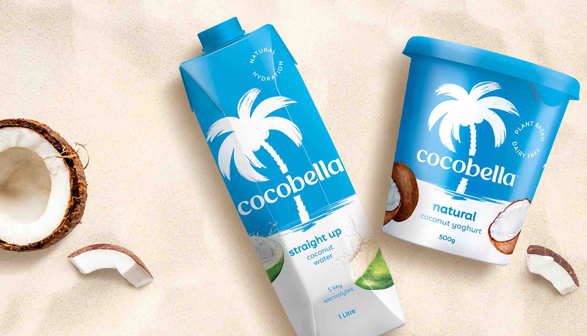
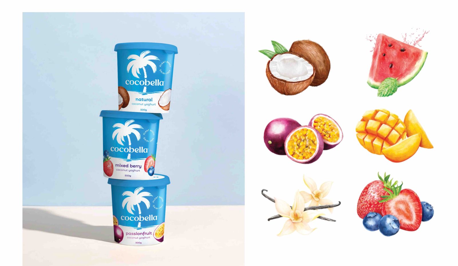
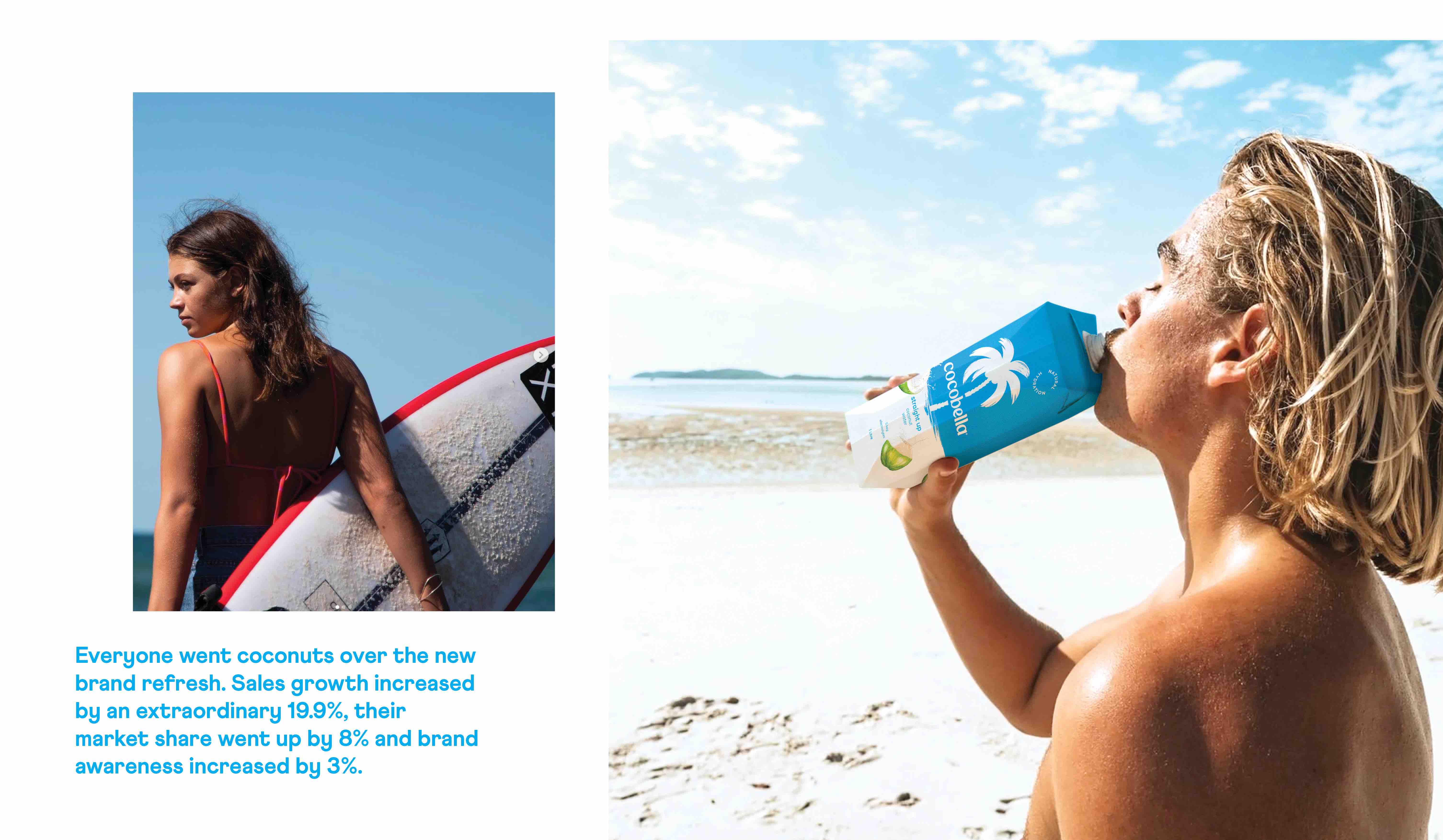
We identified the palm tree as Cocobella’s most recognizable asset. We strategically seized the opportunity to capitalize on the brand’s reputation and create a more iconic, fresh, and timeless image.
Behind the palm tree is a vibrant sky-blue background. We made the bold strategic decision to flip the colour scheme and hero this colour to bring our story of paradise to life in a compelling and eye-catching way. In a sea of competitor brands dominated by white, this move dramatically increased brand visibility to new and existing customers.
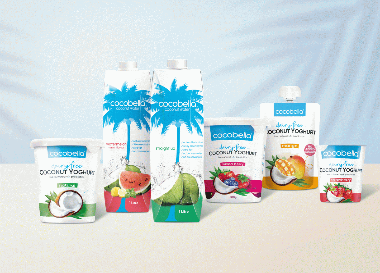
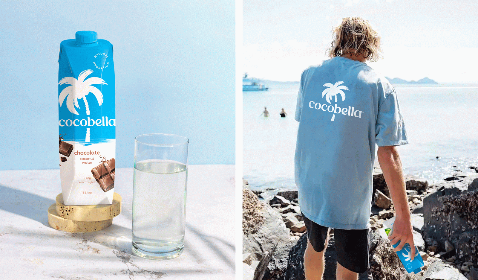
We also introduced a water reflection element to continue the paradise narrative and create a clear pack architecture to make varianting easy – both within the existing range and for any future additions.
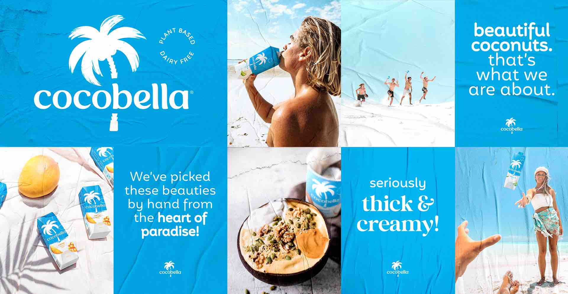
The logotype and language transformations were carefully considered to ensure the brand’s words would carry the feeling of paradise just as well as the visuals. Refreshingly modern, the new typeface includes wavy curves, flicks and licks, droplet shapes and the roundness of a coconut. The tone of voice we established is more playful and approachable than before, and it definitely packs a punch.
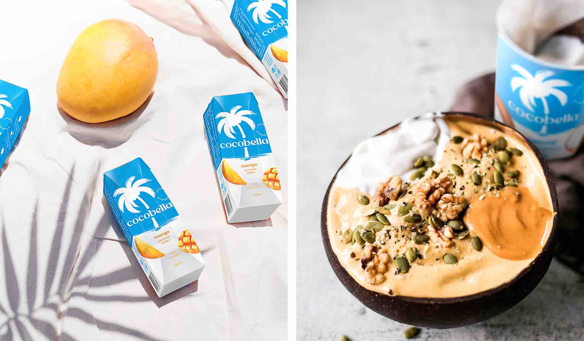
To deliver a taste of paradise and enhance appetite appeal, we created a new collection of irresistible fruit illustrations. By combining real photography (the category standard) with a crafted illustrative touch, we established yet another point of difference for Cocobella.
Our new identity elevates the brand, making it a beacon for premium purity and a clear opportunity for shoppers to escape their everyday. With claims on pack tweaked to enhance every reason to believe, new consumers are inevitably allured to paradise. And existing brand lovers are reminded why they went there with Cocobella in the first place.
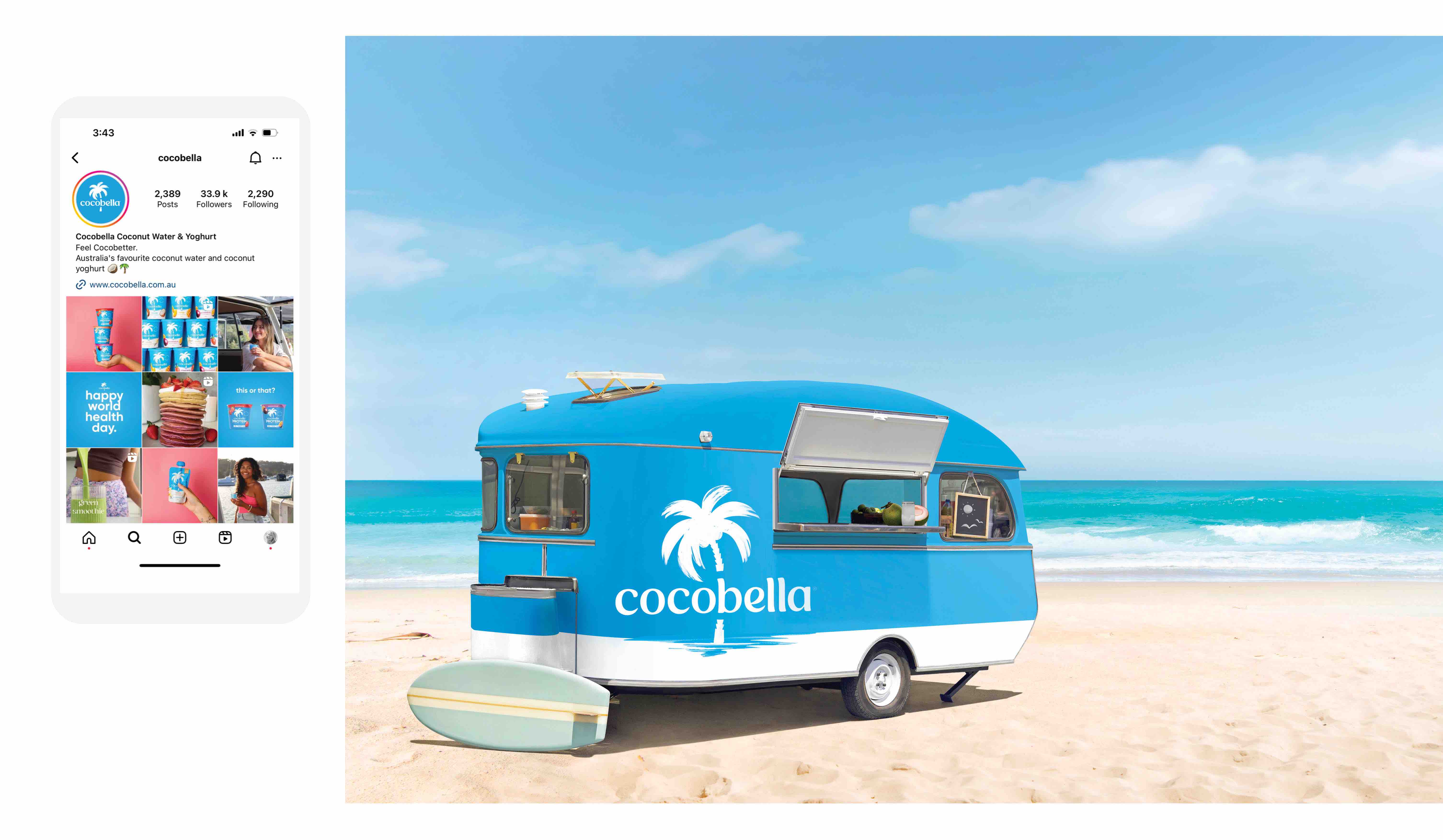
Cocobella’s full rebrand meant that we achieved cohesion and strong recall across all touch points.
Everyone went coconuts over the new brand refresh. Sales growth increased by an extraordinary 19.9%, their market share went up by 8% and brand awareness increased by 3%.
CREDIT
- Agency/Creative: the thrills™
- Article Title: Go Coconuts for Cocobella’s Beautiful Brand Refresh
- Organisation/Entity: Agency
- Project Type: Packaging
- Project Status: Published
- Agency/Creative Country: Australia
- Agency/Creative City: Richmond
- Market Region: Oceania
- Project Deliverables: Packaging Design
- Format: Box
- Industry: Food/Beverage
- Keywords: WBDS Agency Design Awards 2023/24


