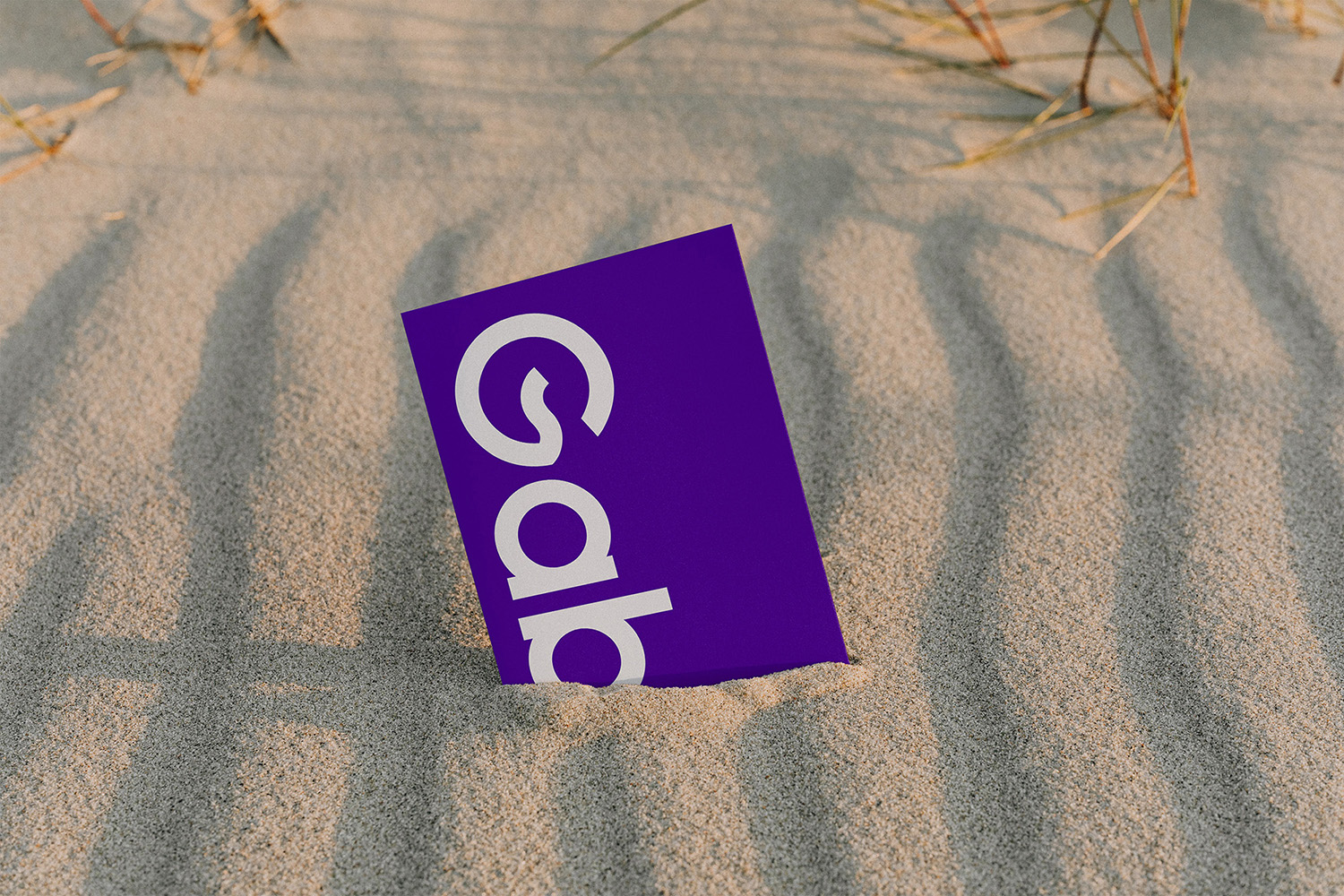
Gabi Cruz is a physical education professional and personal trainer, who helps her students to take care of their health in a light way, most of the time she even uses dance as an escape valve from the monotony of traditional training.
Our challenge was to develop a visual identity that deviated a little from the market standard, aimed at people with a young spirit, regardless of age, with the objective of improving health and well-being, always with focus and a lot of laughter.
Mission: Add health to the lives of people of all ages in a light way. Eyesight: May the company inspire other companies that can expand this way of working. Values: Commitment, respect, dedication, joy, altruism.
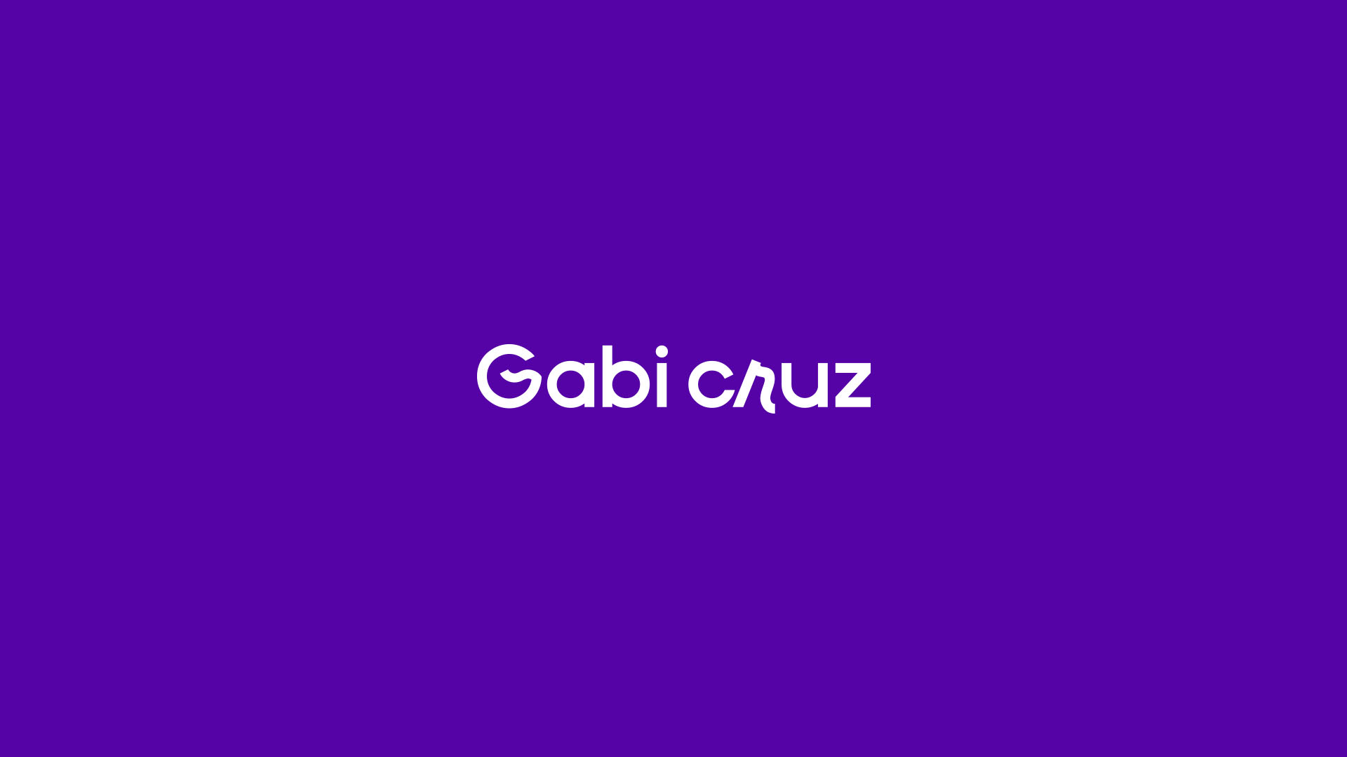
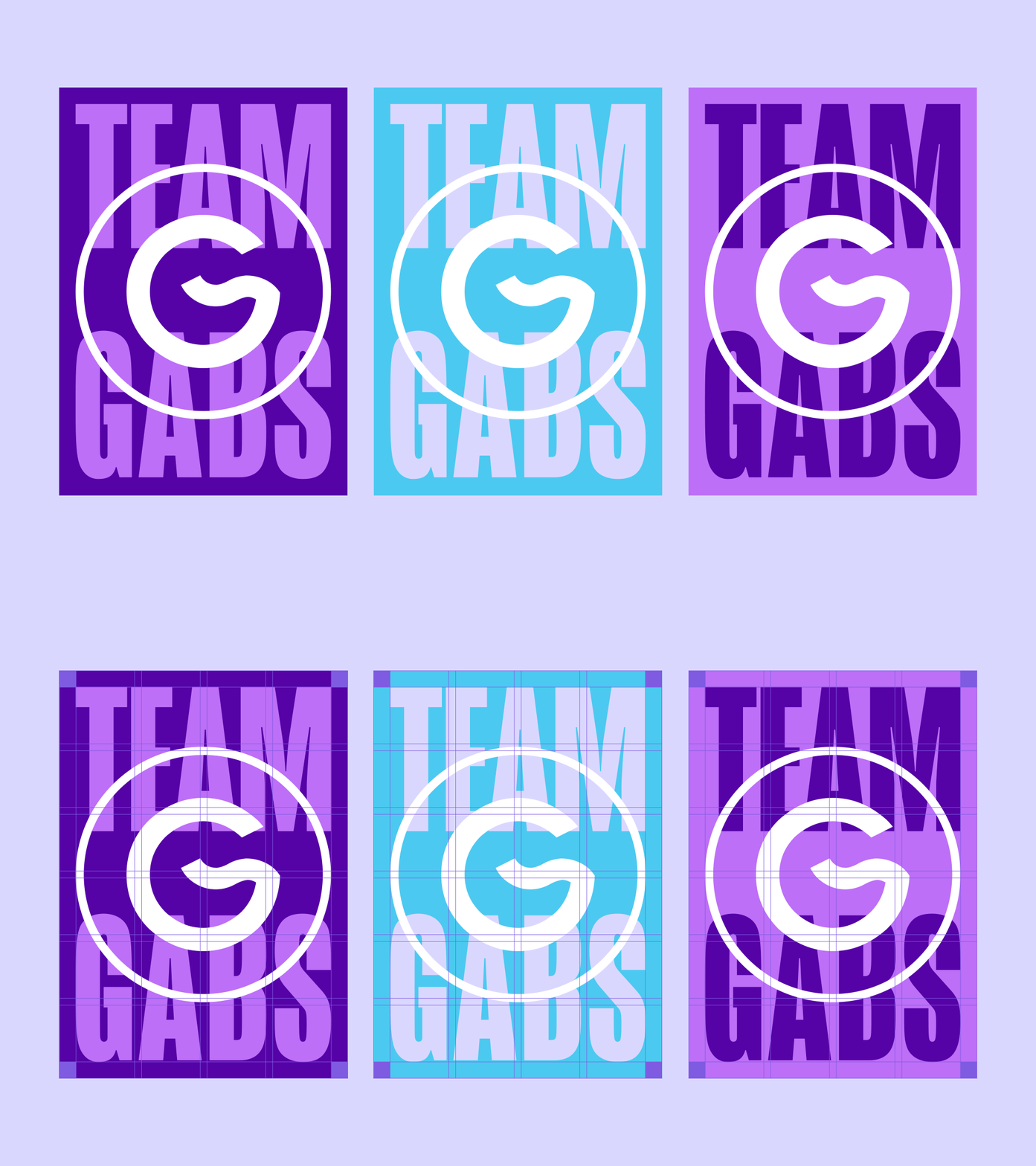
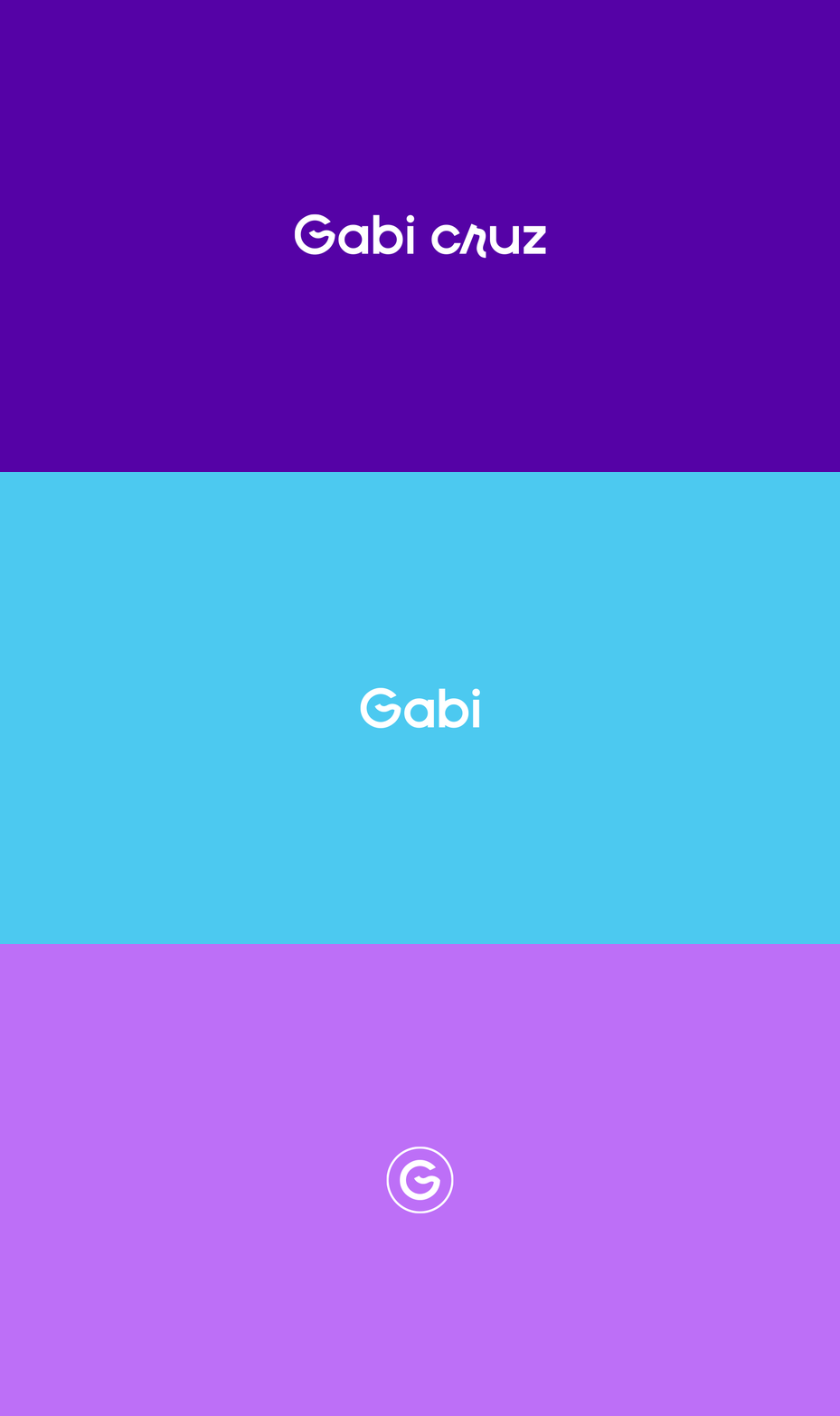
About the symbol: The wave was used together with the letter G (Gabi). The wave symbolizes the potency of nature, power and change. The wave also symbolises renewal due to a rupture and change in ideas, behaviours and attitudes. The wave is formed by one of the four essential elements of nature: water. The sea wave is generated when, due to some kind of physical disturbance, there is an imbalance on the surface of the oceans, causing the water to move. For this reason, the wave symbolizes the uncontrollable force of nature, which causes upheaval and changes, and can be associated with both negative and positive changes.


CREDIT
- Agency/Creative: Kaiko Oliveira
- Article Title: Gabi Cruz Physical Education Professional and Personal Trainer Branding
- Organisation/Entity: Freelance
- Project Type: Identity
- Project Status: Published
- Agency/Creative Country: Brazil
- Agency/Creative City: Aracaju
- Market Region: South America
- Project Deliverables: Art Direction, Brand Creation, Brand Design, Brand Identity, Brand Mark, Creative Direction, Logo Design
- Industry: Health Care
- Keywords: sport, exercise, fitness, gym, Health, personal trainer, physical activity, training, wave, identity
-
Credits:
Photo: Mary Markevich
Photo: Karolina Grabowska


