The Leeds-based strategic branding agency positions Masons as the ‘definitive gin brand’ with full rebrand and distinctive bottle design.
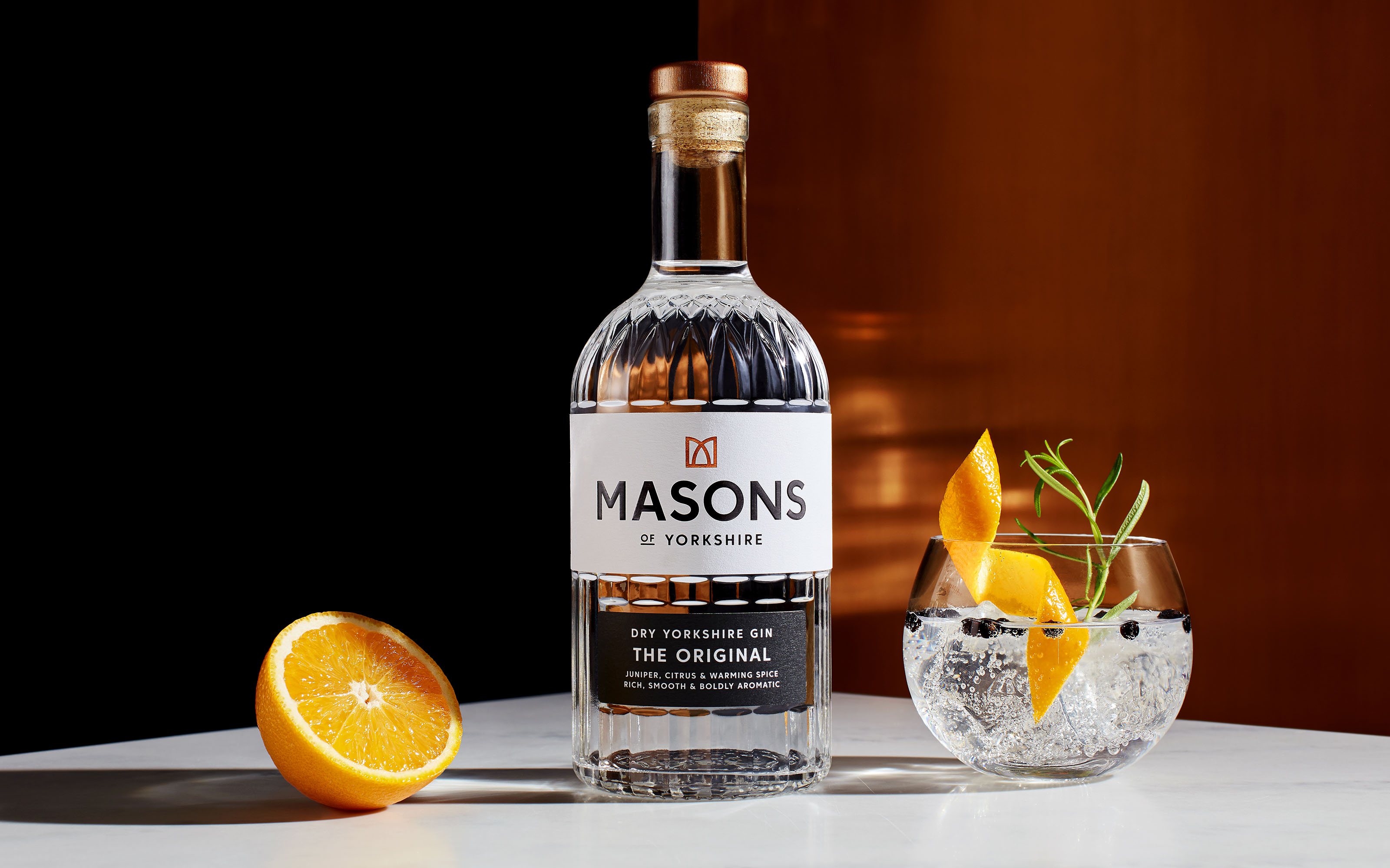
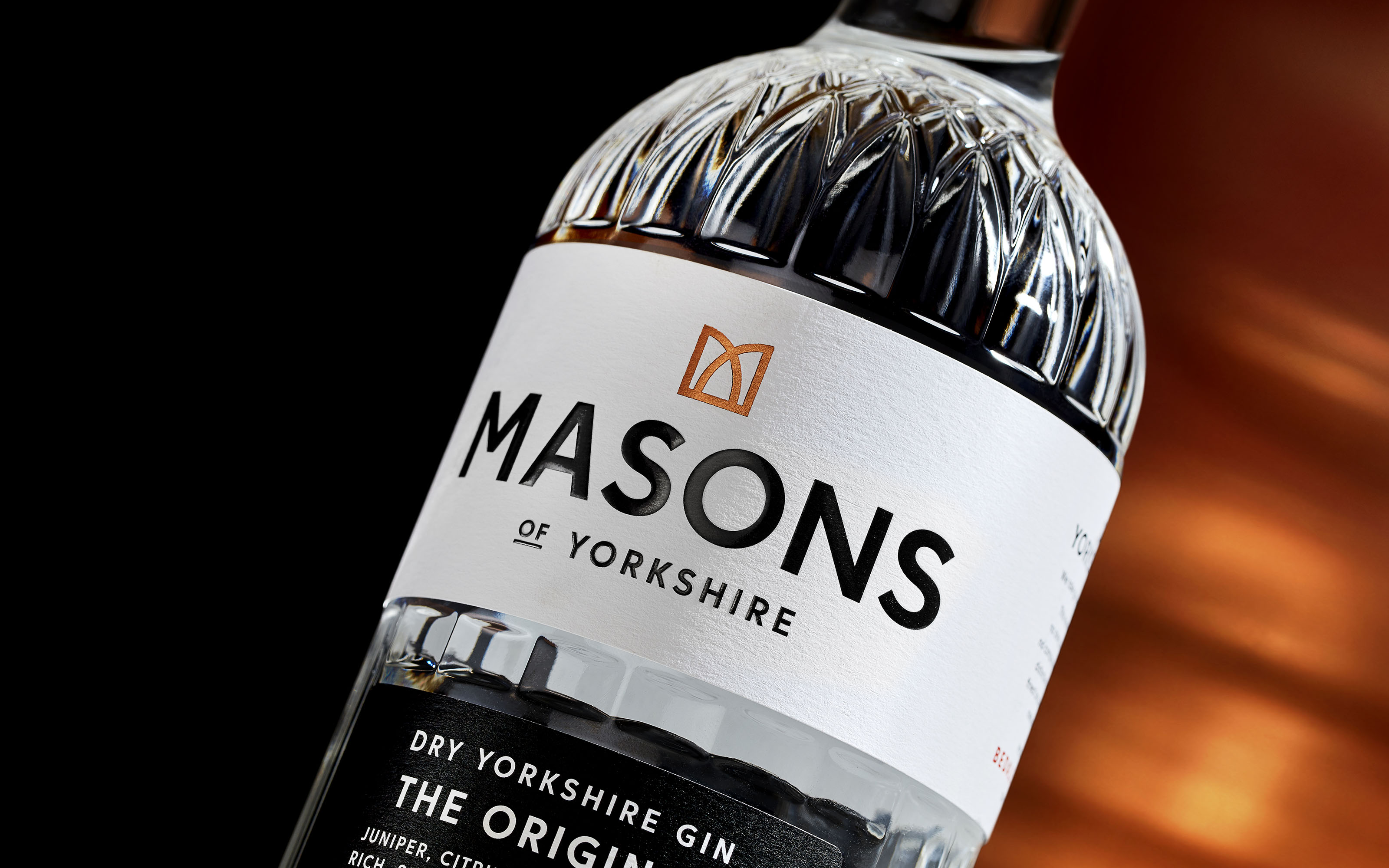
Following a fire in 2019 that destroyed their distillery, founders Karl and Cathy Mason seized the opportunity to come back stronger with a brand as distinctive as their gin. The Yorkshire-based company approached Robot Food to help distil their values into one compelling purpose: to be ‘the definitive gin brand’, one that people would ask for by name. With the brief set, a full rebrand followed, including brand identity, tone of voice, brand world and, at the heart of the project, the structural design of a new bespoke bottle.
After a change in legislation, Masons became one of the first speciality gin distillers in the UK, and the first in Yorkshire, to produce high quality, small batch gin. Since then, thousands of gin brands have emerged with many competitors relying on gimmicks and flavoured syrups to pique interest. To cement their position as the genuine article in a saturated market, Masons needed a brand that would stand the test of time and allow room for future growth.
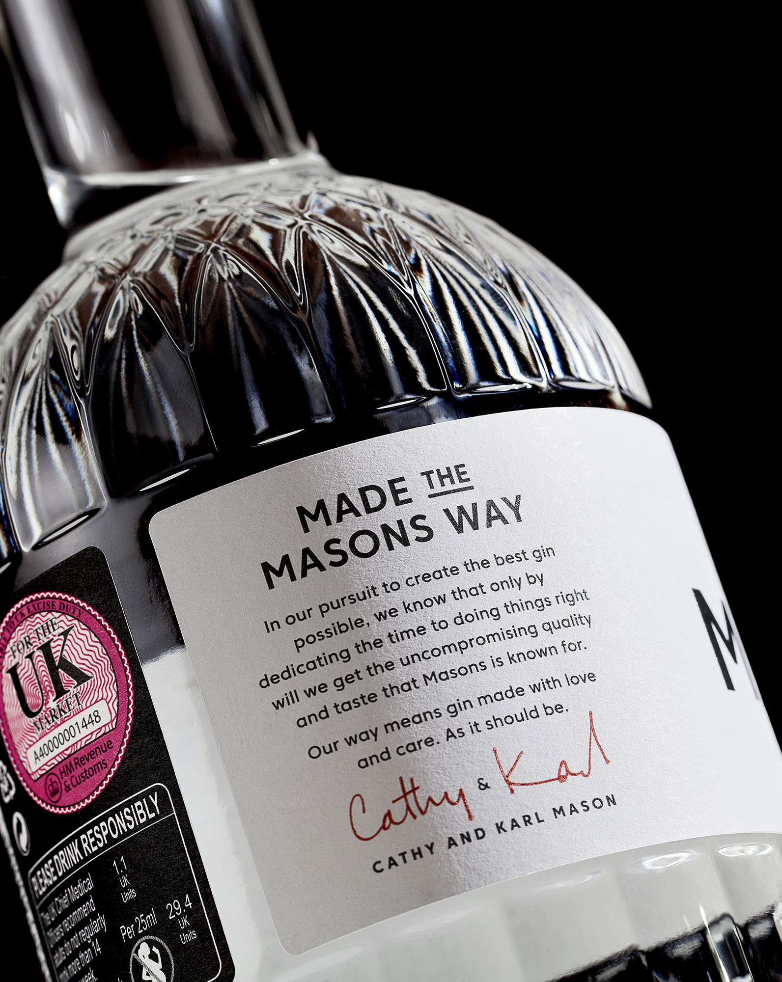
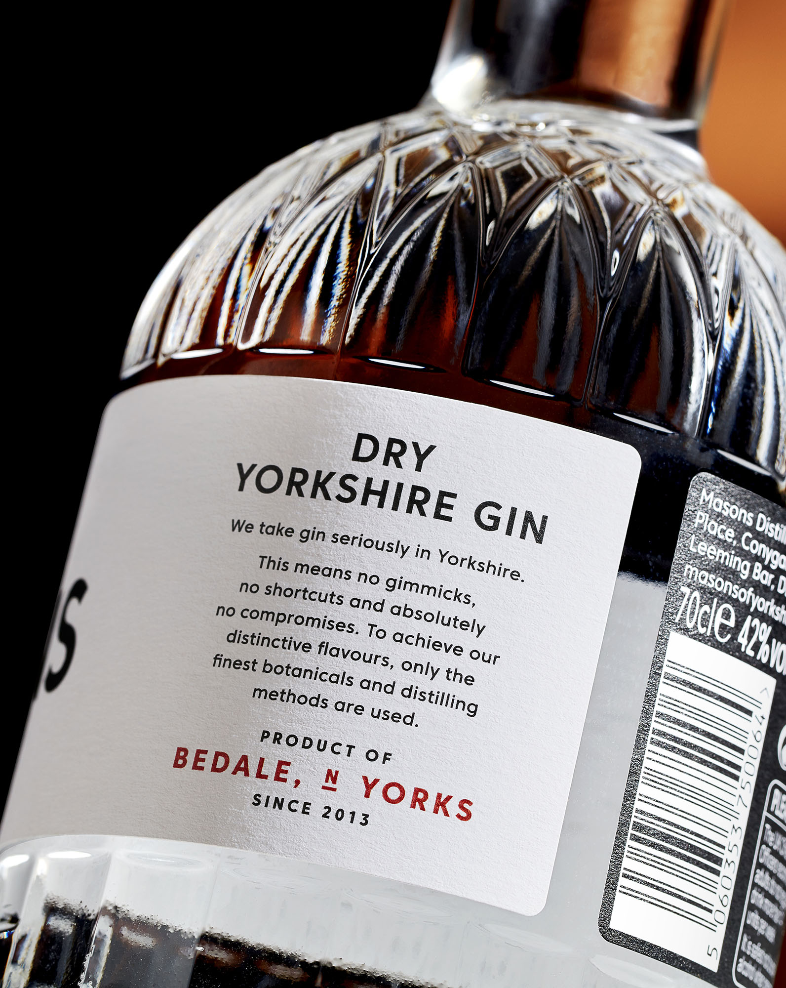
Robot Food’s strategy was to create a visual and verbal identity that was a true reflection of the company’s purist ethos and tenacious Yorkshire attitude. The team were inspired by Masons’ dedication to their distilling process, developing a passionate, no-nonsense tone of voice that celebrates their commitment to making gin the right way – no gimmicks, not shortcuts and absolutely no compromises.
Masons make classic gin, but are a thoroughly modern brand. So, for the visual identity, it was essential that they steered clear of the contrived, faux heritage approach that so many gin brands adopt. Instead, they needed a look and feel that would convey a timeless modernity. One that would communicate the care and attention that goes into every drop of Masons gin and provide a benchmark for others to live up to.
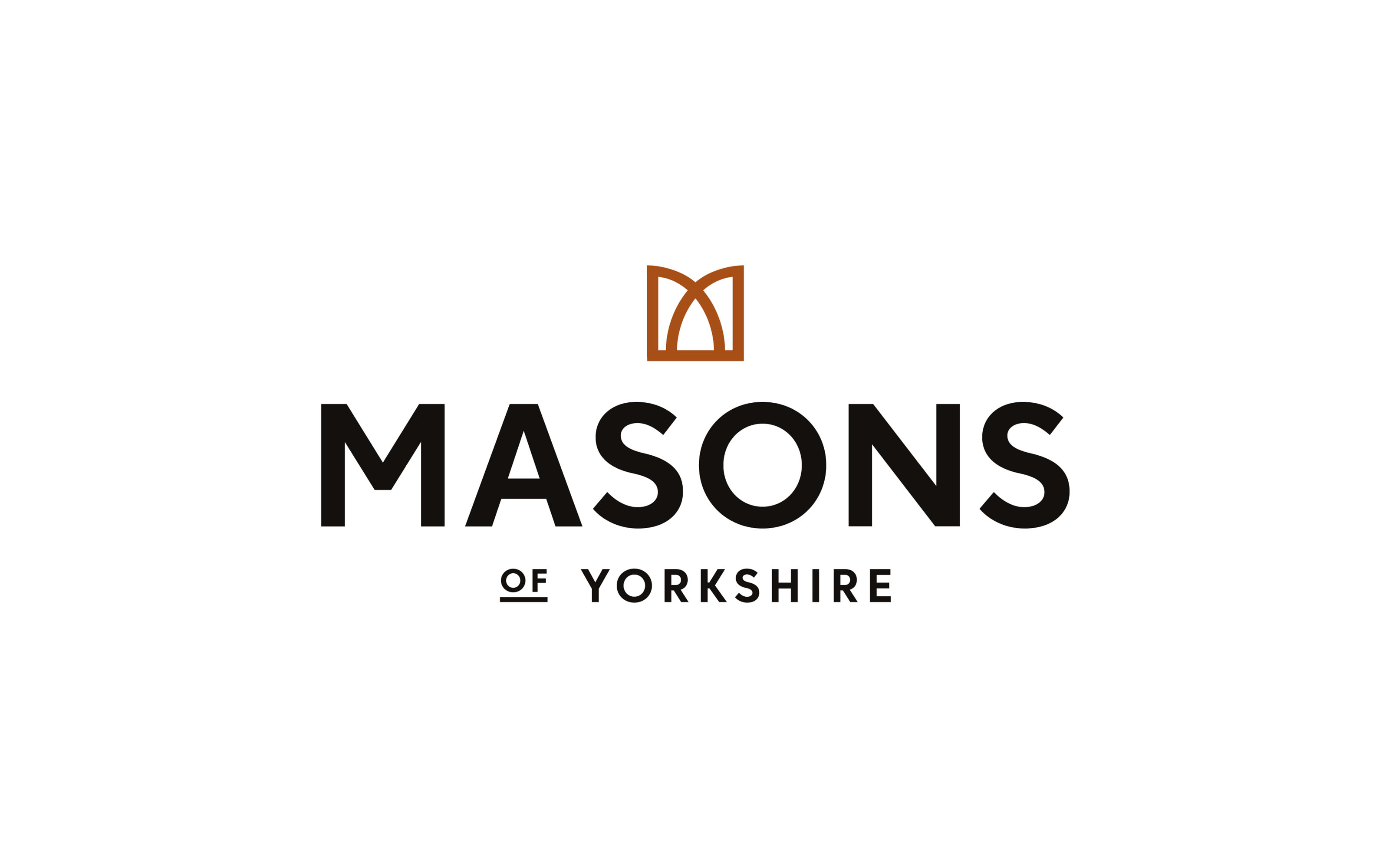
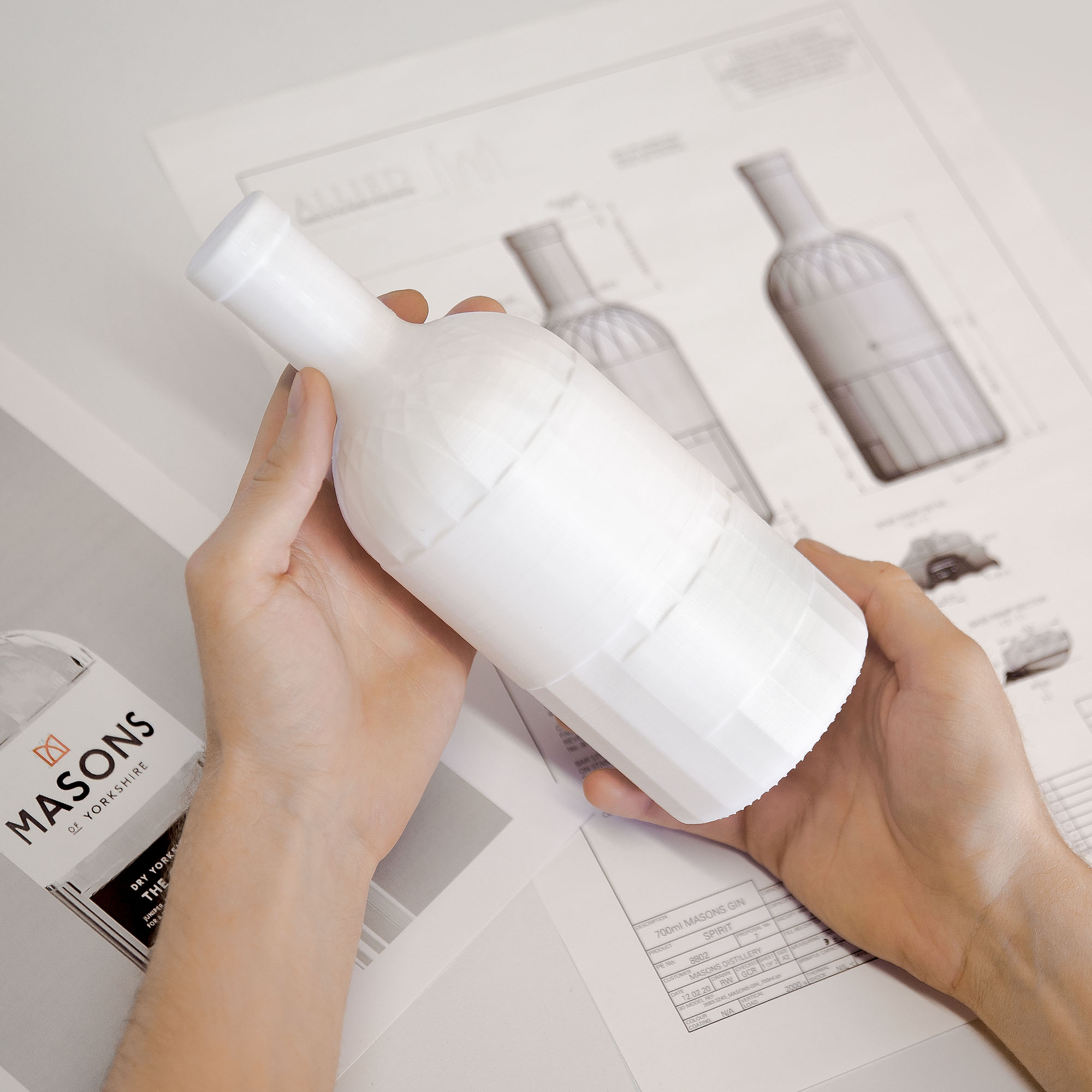
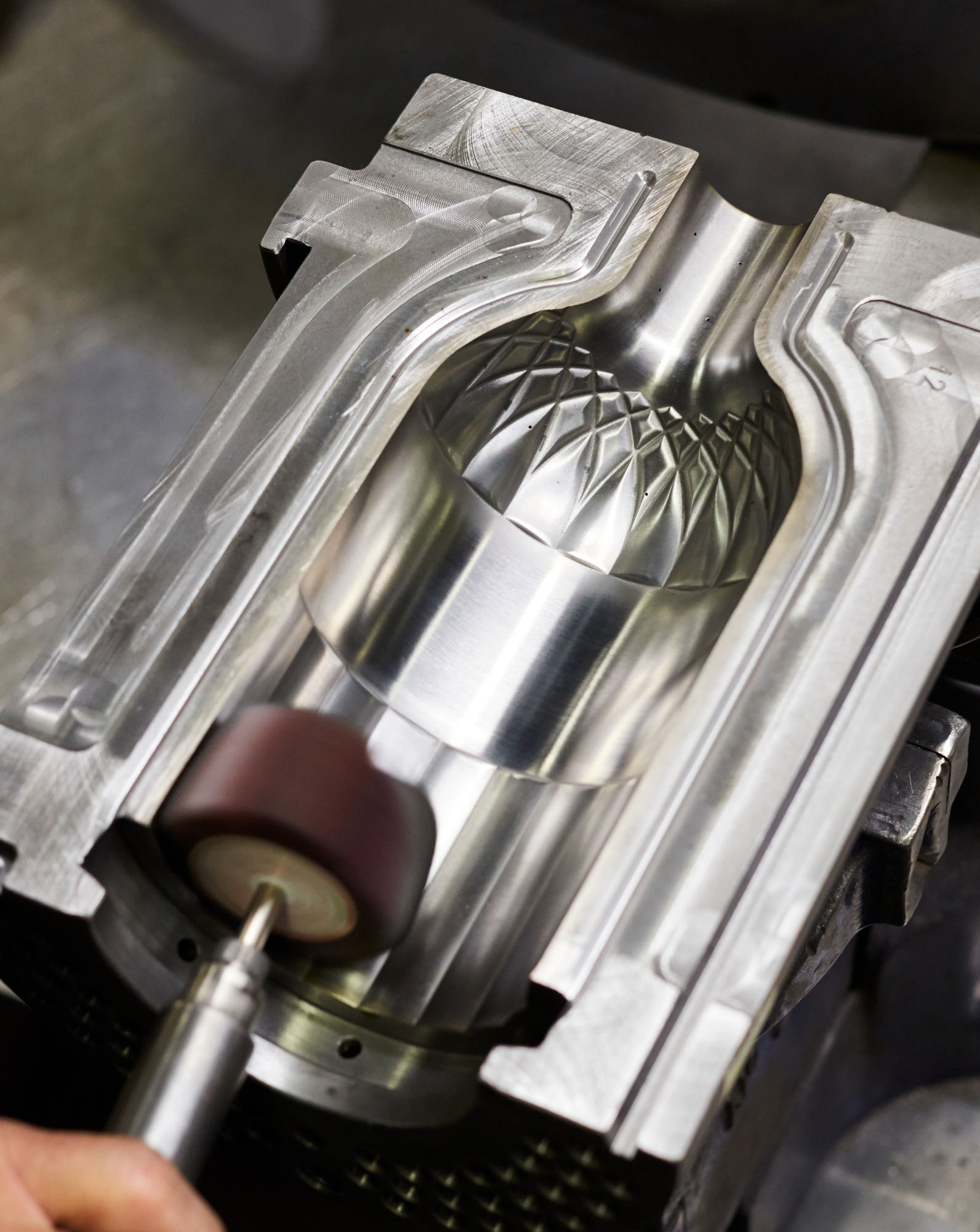
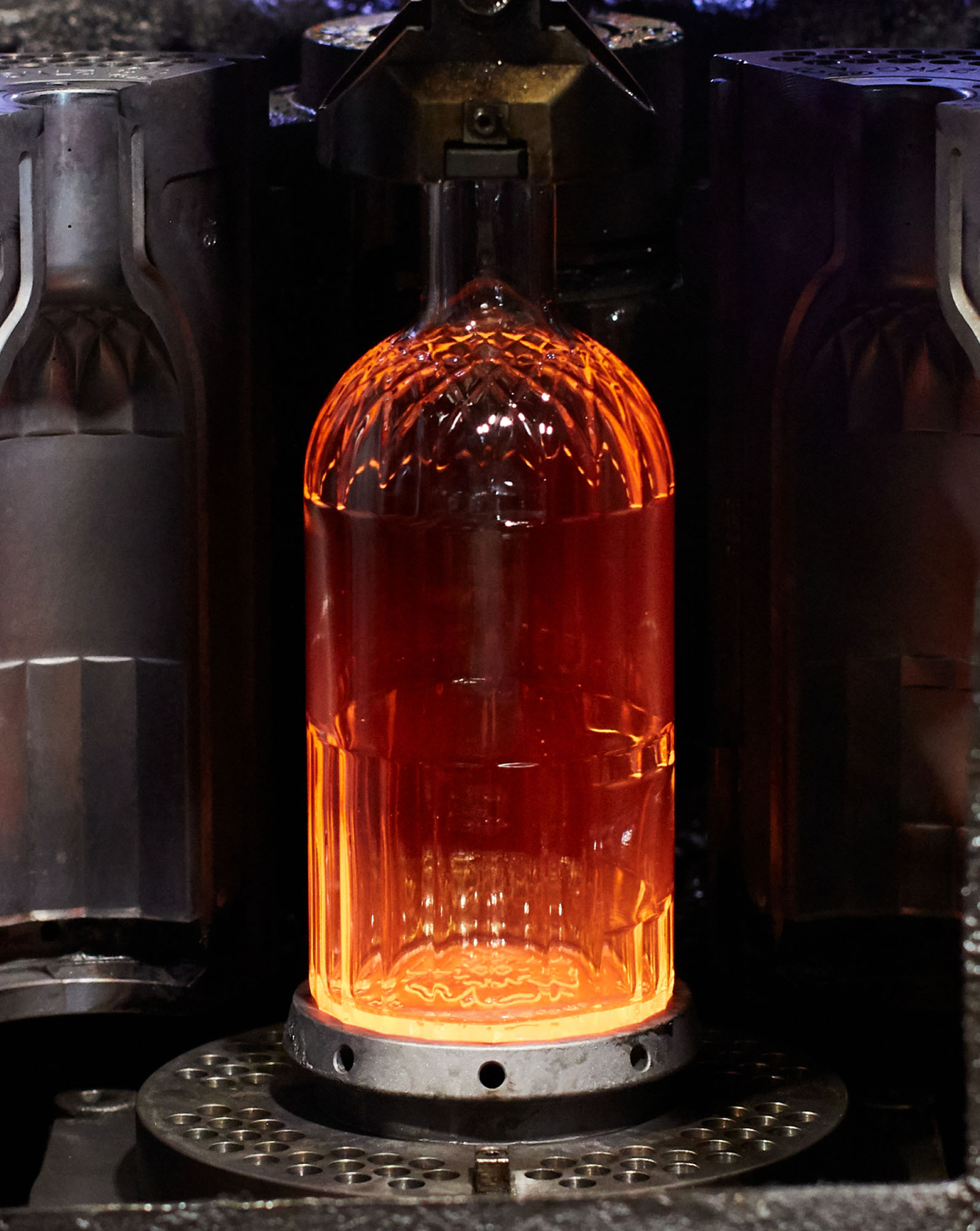
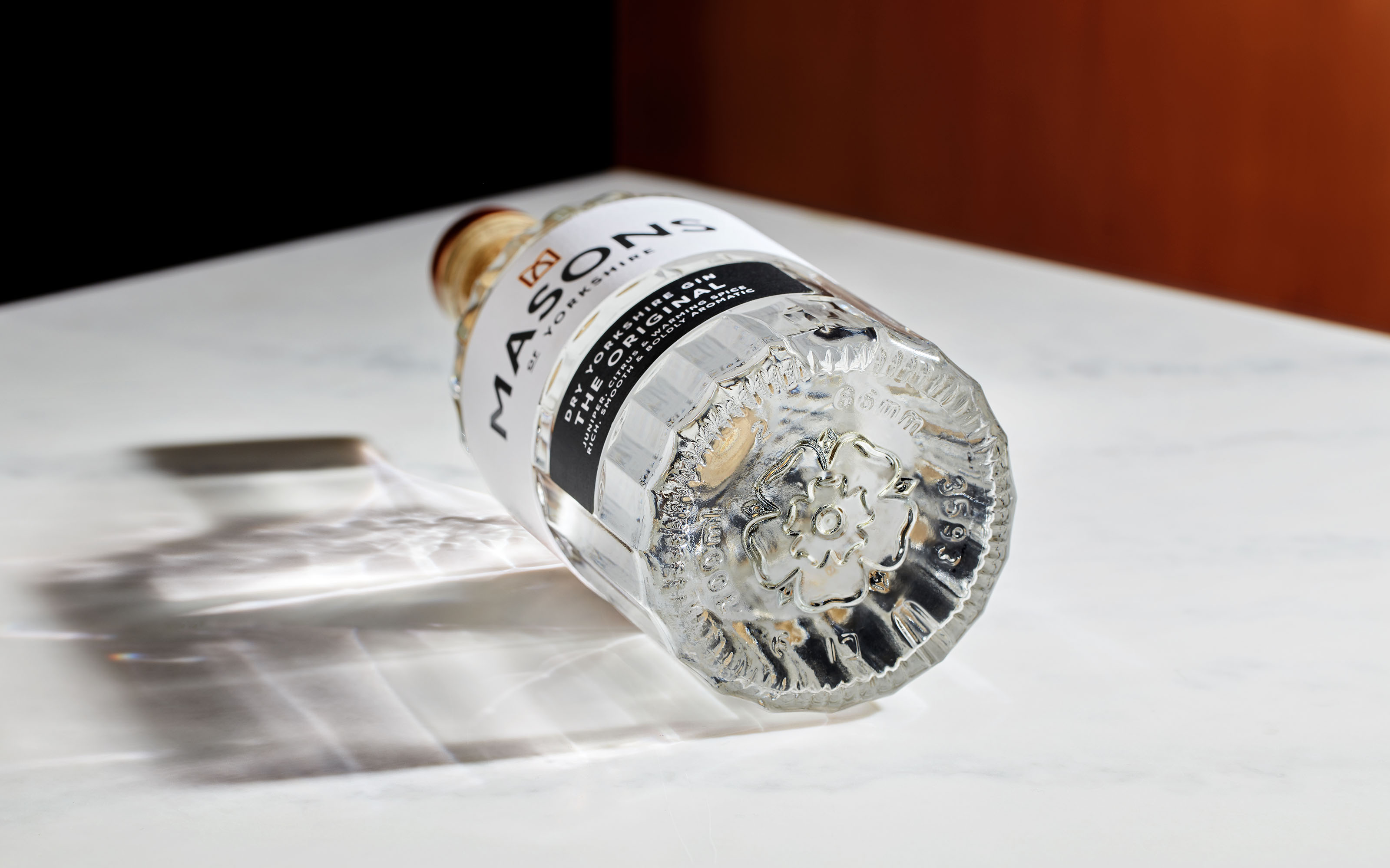
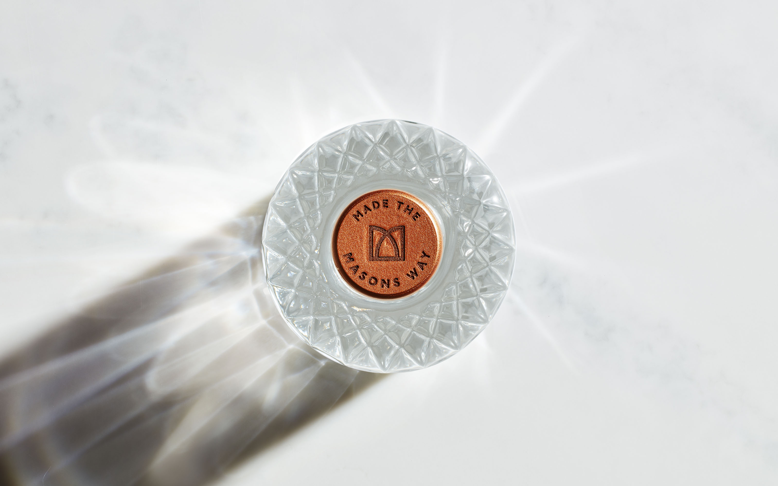
Robot Food developed an elegant new brandmark – a copper ‘M’ crown logo that represents the essential presence of the two founders, that sits atop a refined yet recognisable Masons wordmark. This copper crown is at the heart of the identity, influencing every facet of the brand, including the intricate pattern on the new bespoke bottle that showcases and celebrates the purity of Masons gins.
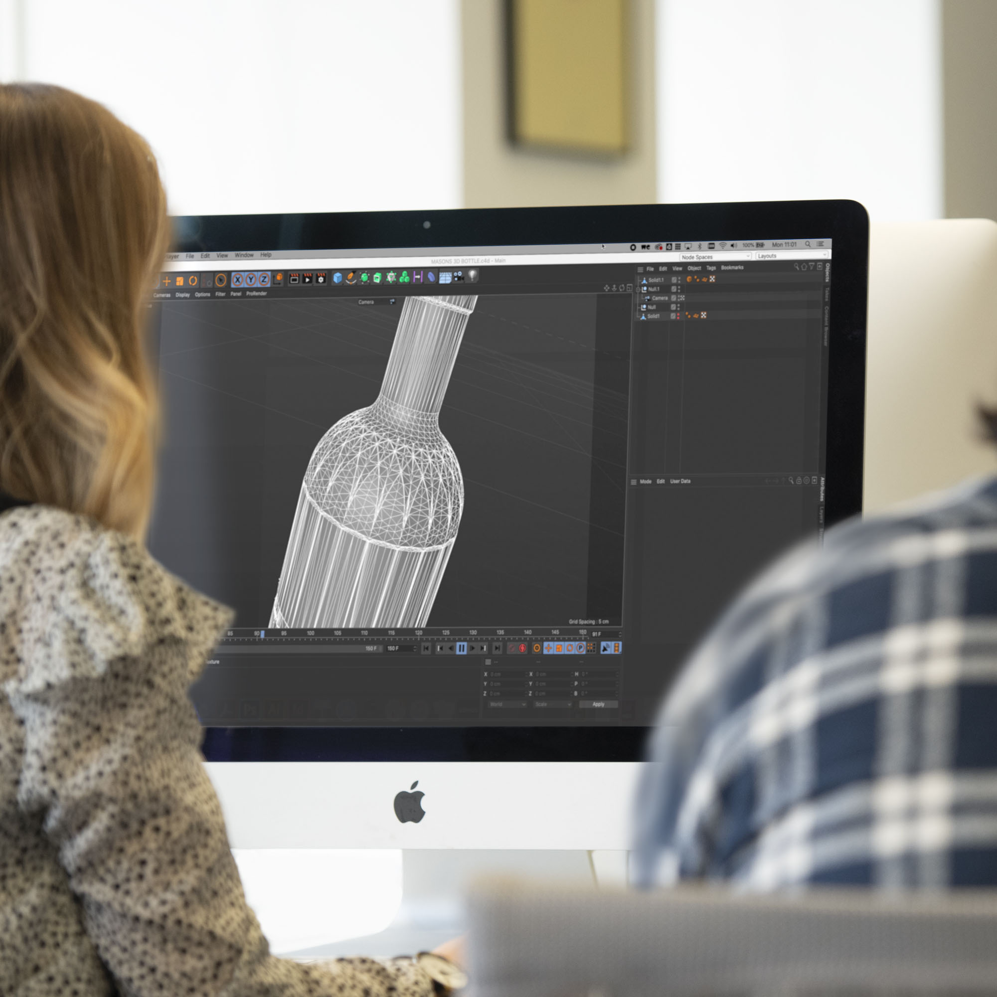
To achieve the distinctive bottle design, Robot Food worked closely with premium glass bottle manufacturer Allied Glass from concept through to production to help bring their vision to life.
Richard Robinson, Senior Designer at Robot Food said:
“We wanted to create something that felt so distinctly Masons, it couldn’t be replicated or mistaken. Each element on the bottle and beyond embodies the Masons’ story, from the founders themselves to their Yorkshire roots. Every detail makes an impact – even something as nuanced as splitting the label and adding ‘of Yorkshire’ to the word mark. It anchors the brand to its heartland, makes it prouder, and opens Masons up to a breadth of opportunity.”
Co-founder of Masons of Yorkshire, Karl Mason said:
“The team at Robot Food worked with us closely to consider every aspect of the brand experience, right down to the smallest detail. There are a lot of parallels between us and them – we both started and are still based in Yorkshire – but Robot Food understood our global ambition and how that would influence every decision we made as a brand.”
CREDIT
- Agency/Creative: Robot Food
- Article Title: Full Rebrand Including Bespoke Bottle Design for Masons of Yorkshire
- Organisation/Entity: Agency, Published Commercial Design
- Project Type: Packaging
- Agency/Creative Country: United Kingdom
- Market Region: Europe
- Project Deliverables: Brand Architecture, Brand Creation, Brand Experience, Brand Guidelines, Brand Identity, Brand Naming, Brand Redesign, Brand Strategy, Brand World, Branding, Packaging Design, Product Architecture, Product Naming, Rebranding, Research, Structural Design, Tone of Voice
- Format: Bottle
- Substrate: Glass, Glass Bottle


