Full Circle Coffee Roasters is a Dublin-based speciality roaster actively building sustainable practice and adopting a humanist approach within the coffee industry. In collaborating with Belfast neighbours and creative studio Angel and Anchor, Full Circle’s visual identity leans into their ethos, pairing Swiss-inspired design with connection and wisdom.
Full Circle place their values at the centre of everything they do. As speciality roasters who are acutely aware of their role in the social justice of the coffee industry, they are thoughtful in ethos and practice. Full Circle have embraced an innovative approach to their business by investing in several small-scale Brazilian farms. With the perspective of the long-term future of the Brazilian coffee industry (which produces 40% – 50% of the world’s beans), Full Circle see the challenging influence of climate change on the whole coffee industry. In their approach, committing to up-front purchasing several lots regardless of environmental factors that could affect the bean harvest protects the farmers from losing their livelihood. In creating social justice, Full Circle help to uphold quality in their production and practice. Standing on their sensitive awareness of how they play their part in the coffee industry, they are the epitome of “what goes around, comes around”.
Full Circle’s brand expression leans on wise messaging and minimalism dosed with vibrant colours. They are full of verve for good coffee and doing good by people. Brand elements bring the roaster’s values to life, leaning on the brand name as a theme throughout the brand’s expressions, from beginning to end. Their main slogan, ‘What Goes Around,’ serves as a wise reminder to fight the good fight in life and industry. The invisible second half of the phrase naturally echos in the customer’s mind and allows for connection and understanding of Full Circle’s personality and values.
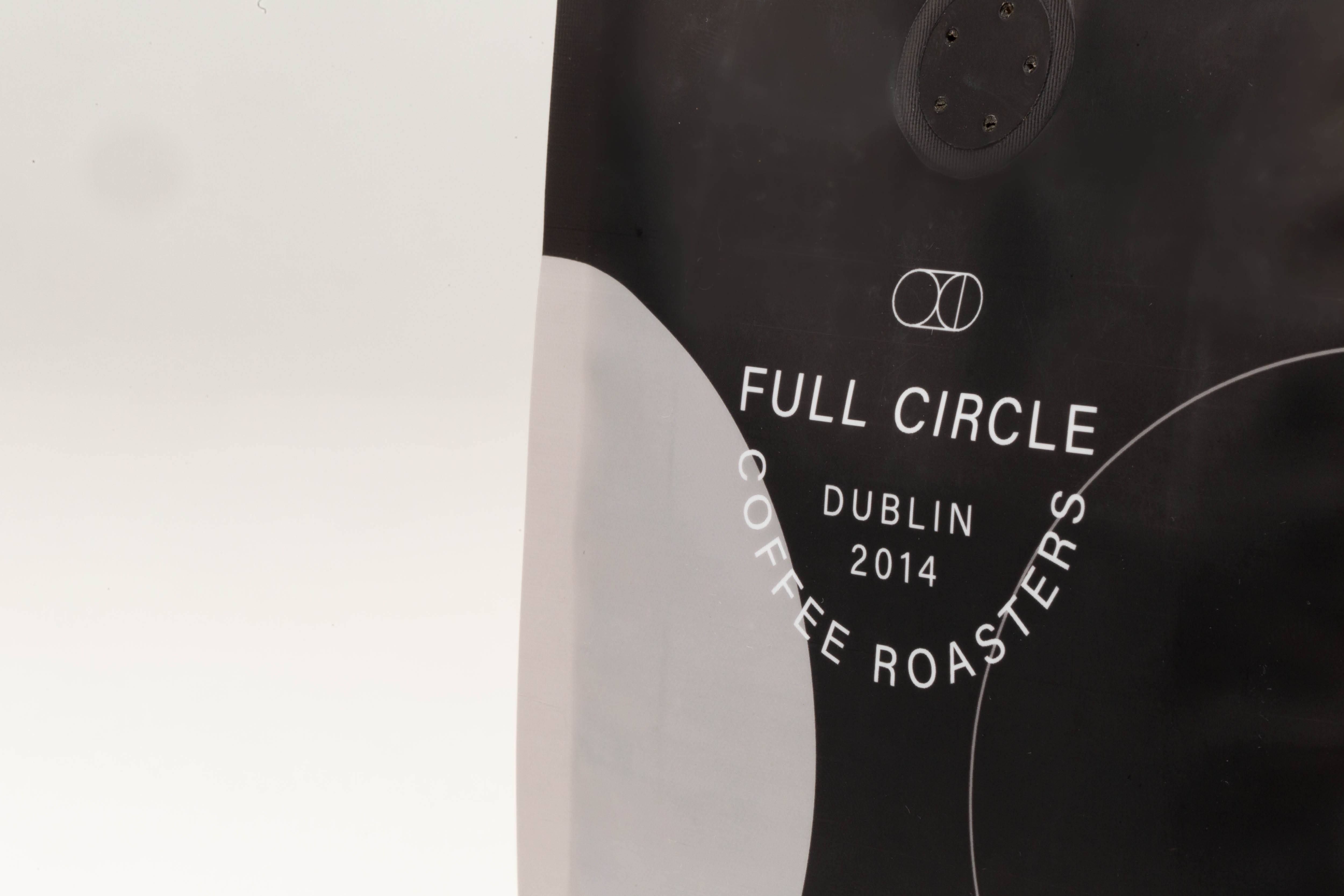
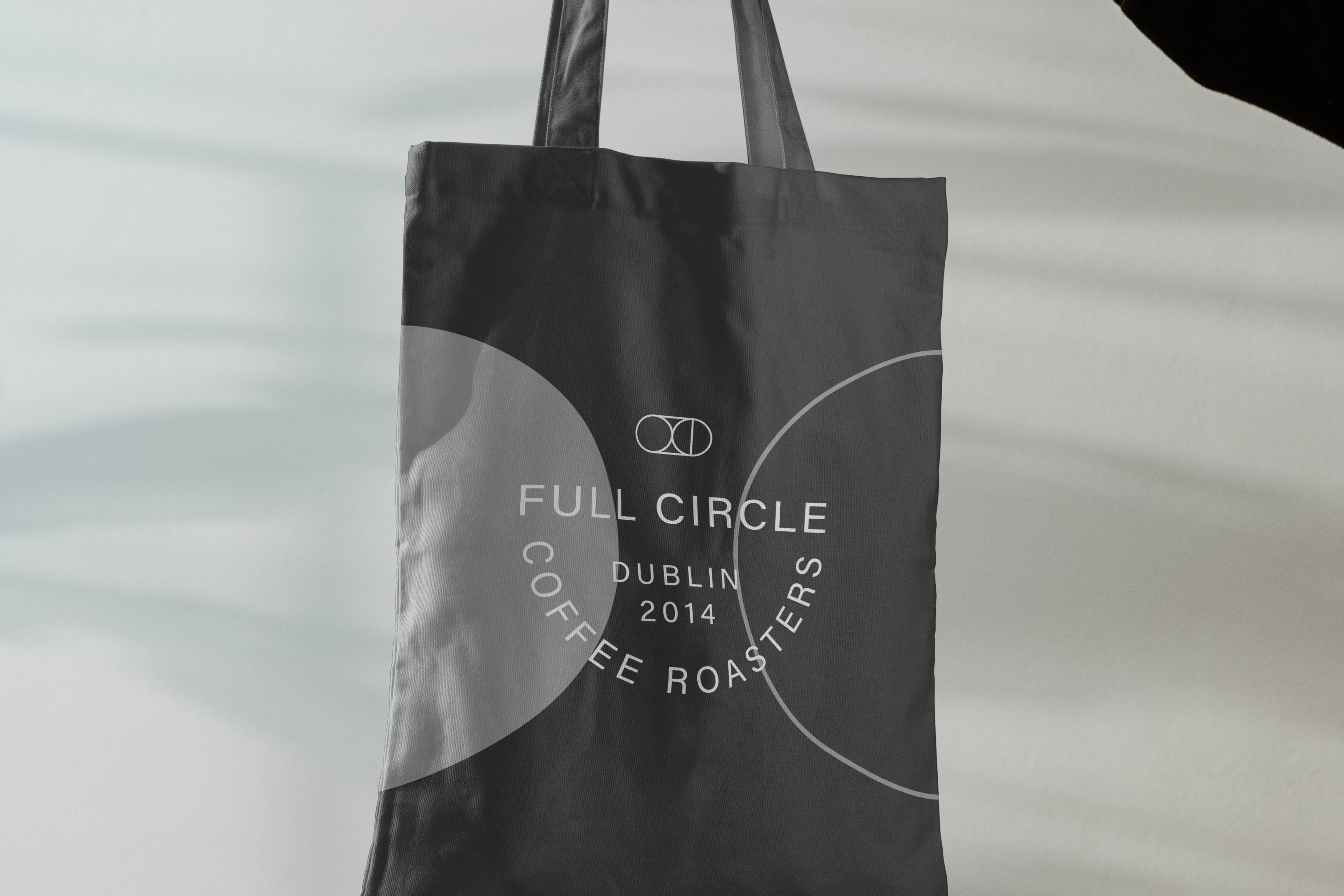
Rooted in simplicity, the sans serif typeface ‘Acumin Variable Concept’ used across the brand works with the brand’s minimalism to echo modesty derived from the brand’s sustainability values. Lock-ups of the logotype are set in a semi-circle to hint back to the brand name and create a desire for completion, as their main slogan similarly hints. Using circles throughout the brand brings about the associations of completion and how everything is connected, reflecting the root of their being.
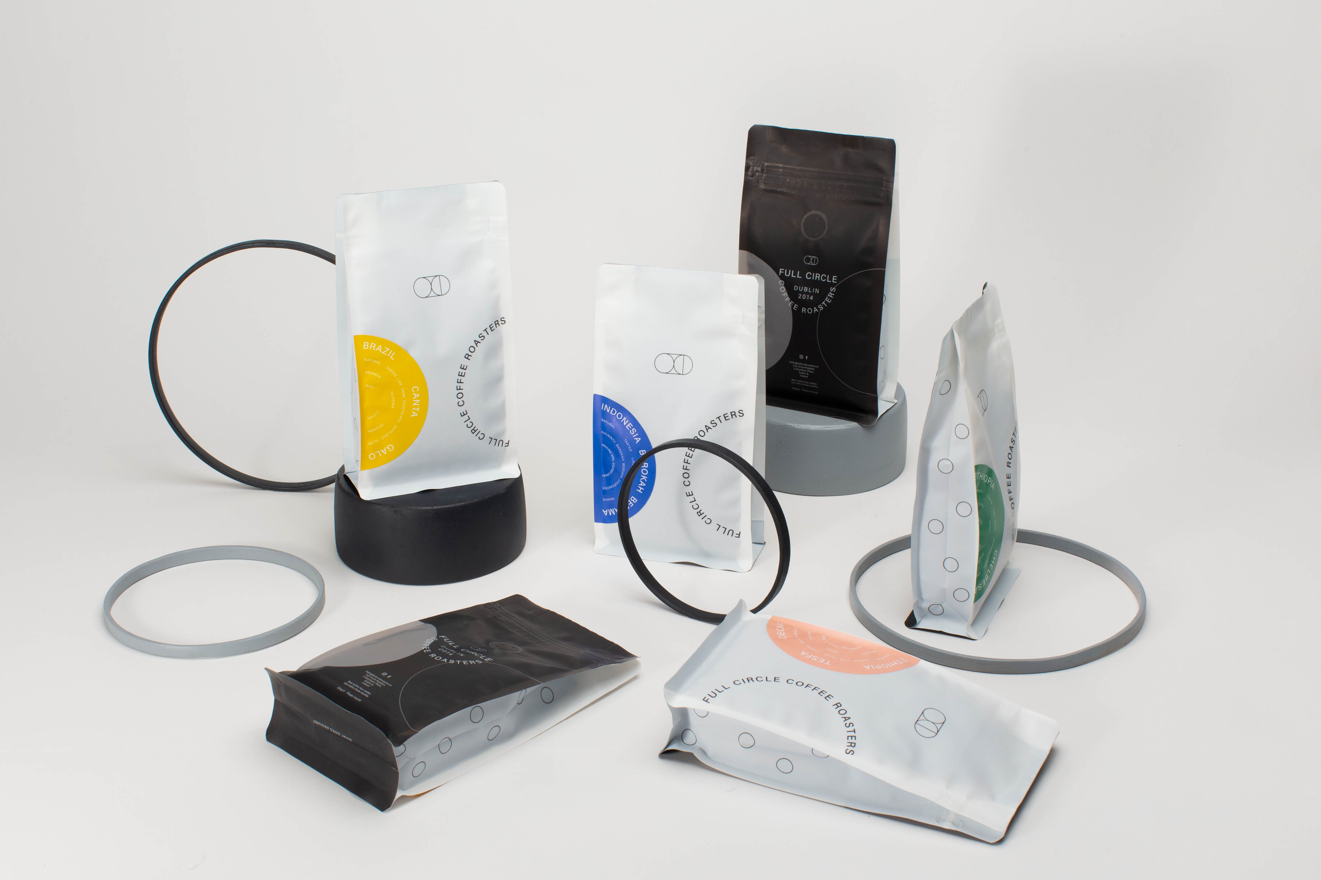
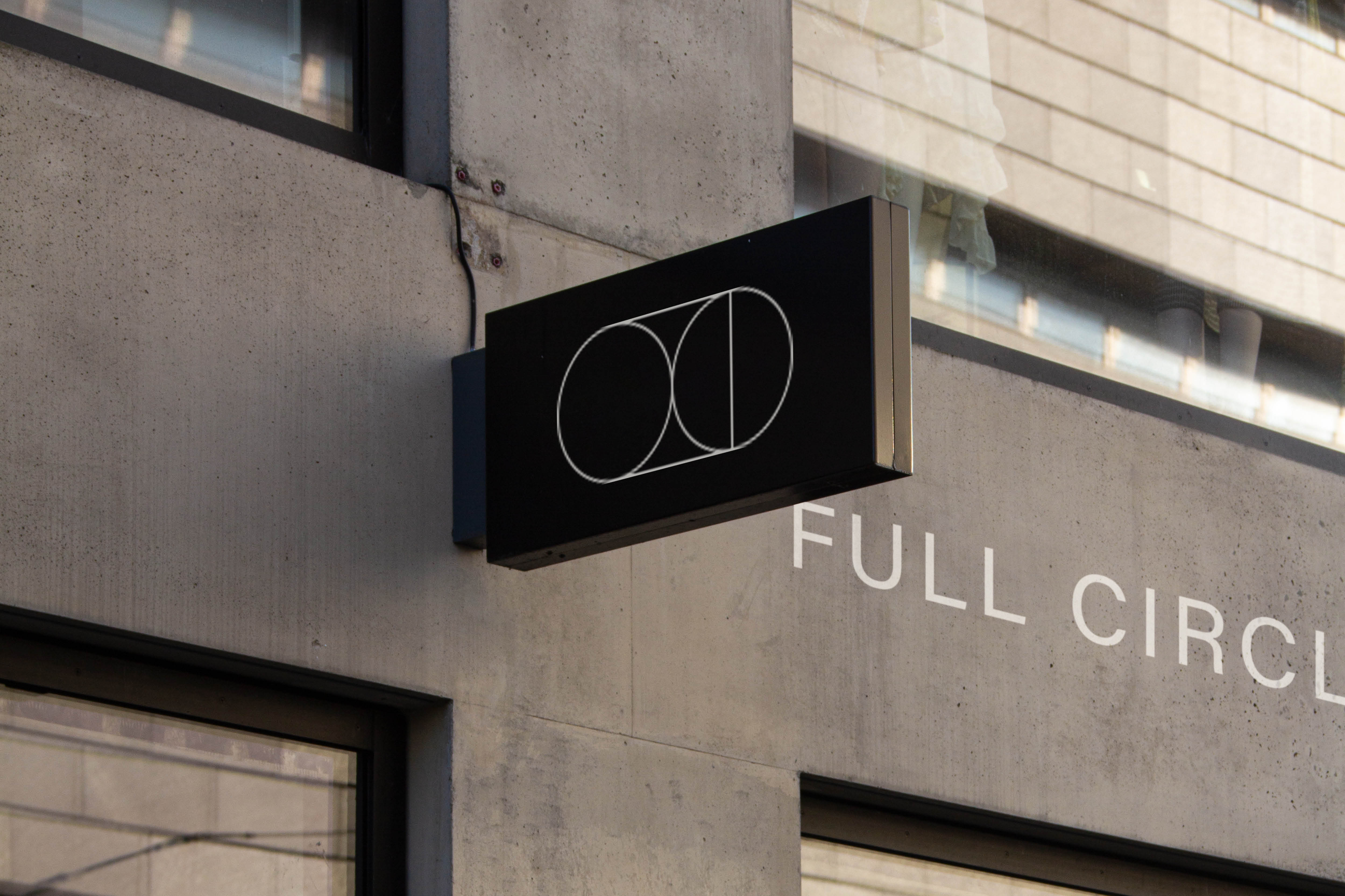
A fine line geometric mark pairs with the lightweight type to create the Full Circle logo, using circles that interact with a rectangle representing a coffee bag. The logomark appears in different arrangements across the brand, adding a touch of playfulness to the delicate shapes which shift and act like building blocks.
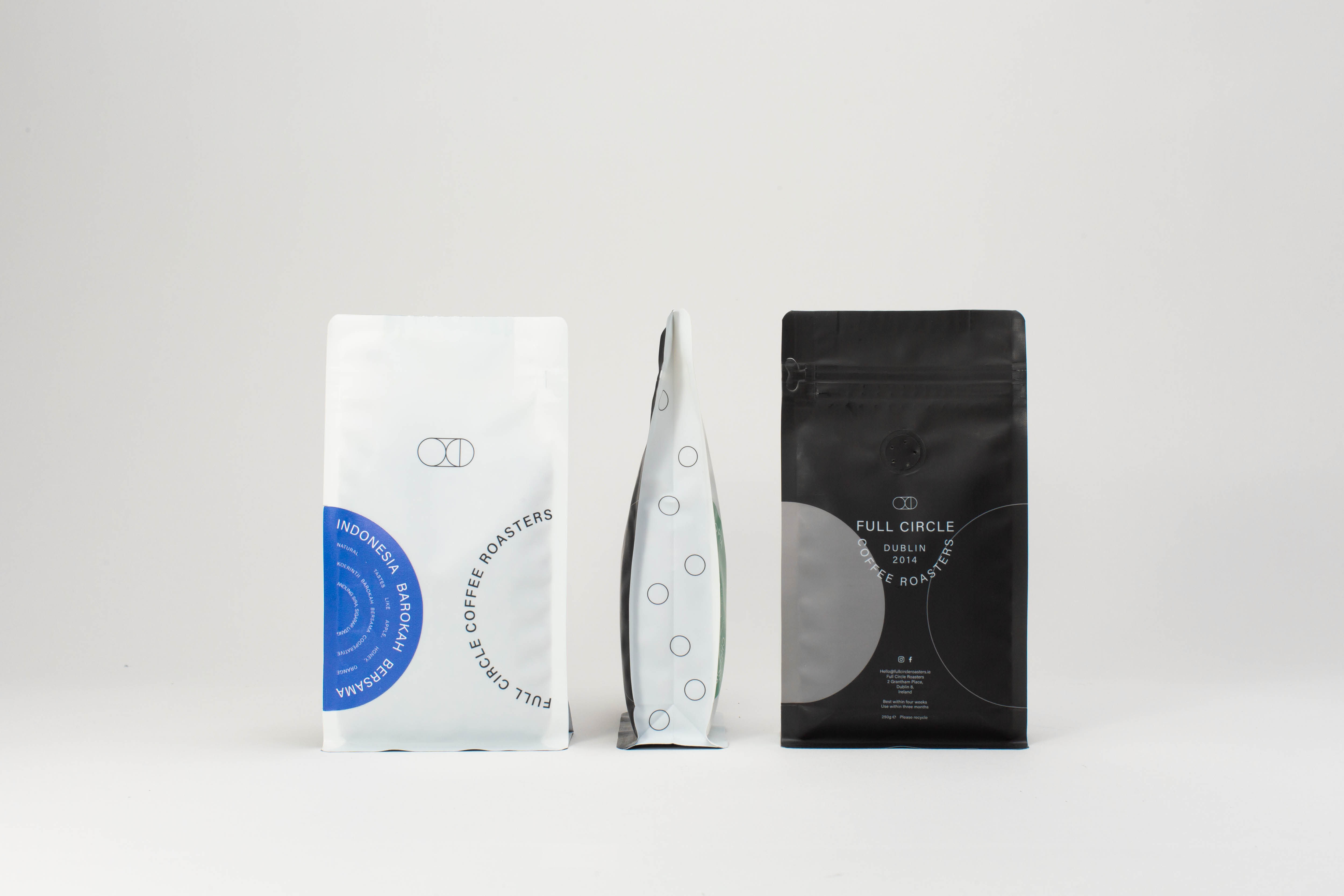
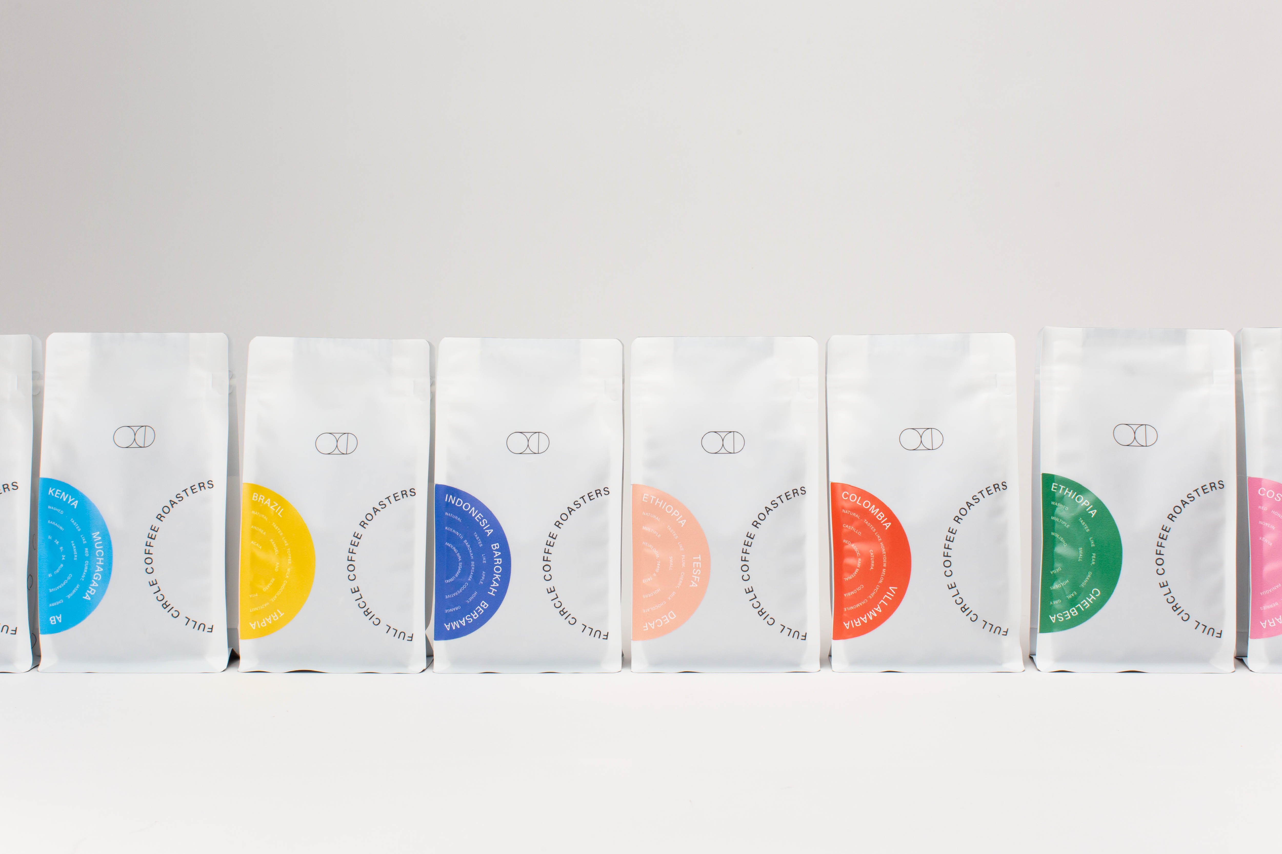
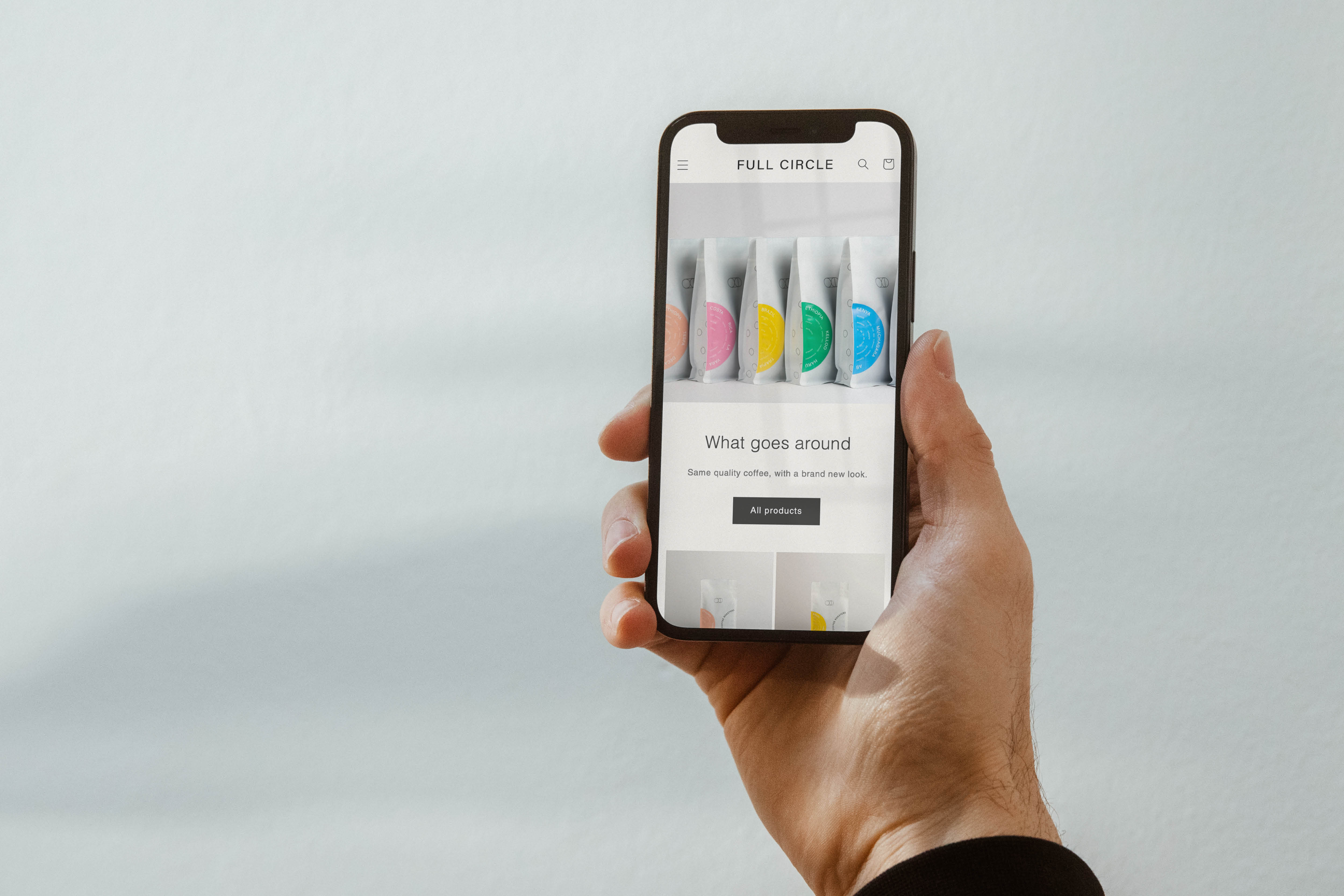
Each coffee roast is identified with a different coloured label, framing the roast details in a semi-circle lock-up. The labels use a selection of a bright rainbow palette, adding an upbeat tone to the gentle openness of the brand. Coffee bags placed side by side creates images of completed circles, like puzzle pieces. The off-white bag with delicate typography flowing along circle paths and fine lines creates an open, serene brand feeling. The collection creates satisfaction in connection together. Their eco-consciousness is materialised in their fully recyclable carbon-neutral bags, delivering on their self-aware values.
Together, Full Circle’s use of negative space, splashes of colours, ironic semi-circles and a motif of connection speak to the idea of realisation. Geometry plays among the brand elements and builds on a Swiss design influence rooted in simplicity, reflecting Full Circle’s approach to life and coffee. What goes around…

CREDIT
- Agency/Creative: Angel & Anchor
- Article Title: Full Circle Coffee Packaging Design by Angel & Anchor
- Organisation/Entity: Agency
- Project Type: Packaging
- Project Status: Published
- Agency/Creative Country: United Kingdom
- Agency/Creative City: Belfast
- Market Region: Europe, North America
- Project Deliverables: Brand Identity, Branding, Copywriting, Identity System, Logo Design, Packaging Design
- Format: Bag
- Substrate: Plastic
- Industry: Food/Beverage
- Keywords: speciality coffee, Dublin, packaging design, coffee branding, coffee packaging,
-
Credits:
Creative Director: Ben Connolly
Designer: Ben Connolly
Designer: Kellyn Bowler
Copywriting: Kellyn Bowler
Photography: Ben Connolly
Client: Full Circle Coffee Roasters


