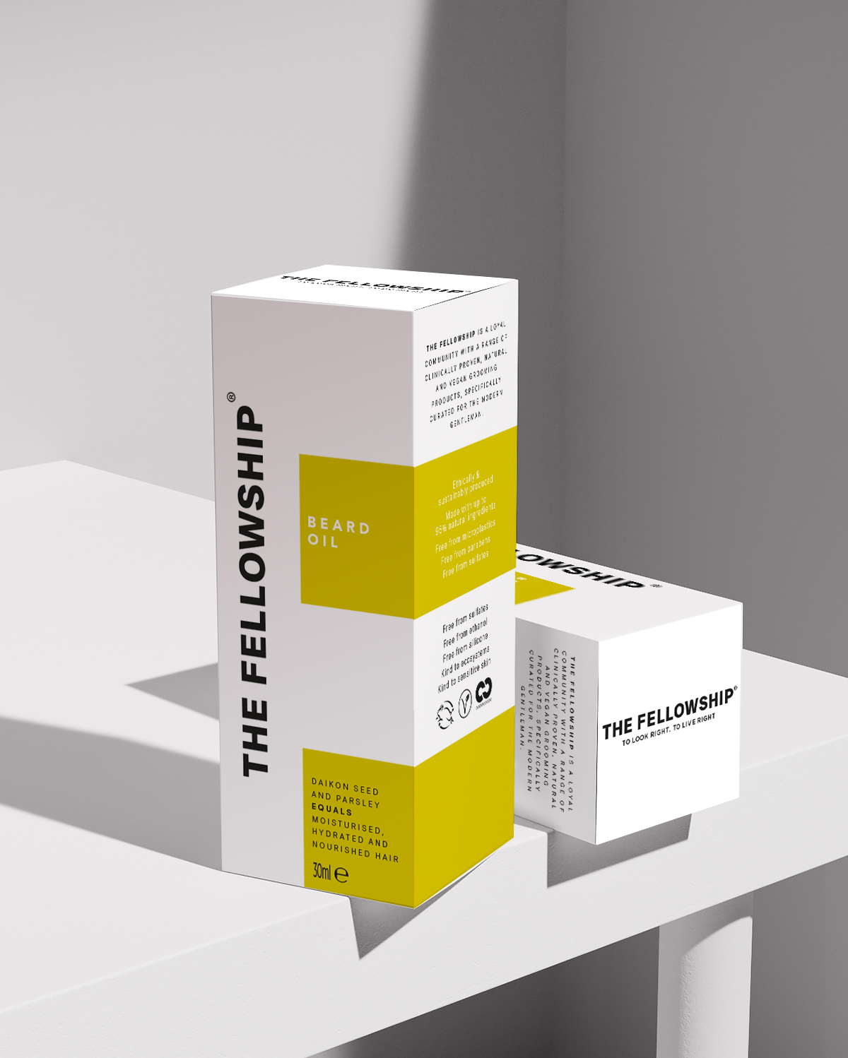
Creative agency Free The Birds has revealed its latest work for brand-new, inclusive men’s grooming brand, The Fellowship, from model and entrepreneur Andrew Cooper, and award-winning marketeer, Duncan Morris. The disruptive brand identity brings packaging design, typography and tone of voice together to communicate The Fellowships’ core values of community and equality – what the brand describes as the “ethos of the modern gentleman”.
In order to reflect The Fellowship’s ambitions to disrupt more traditional notions around masculinity, and also ensure the new brand stands out from its peers on the shelf, Free The Birds deliberately opted for an eye-catching chartreuse colour palette – a significant departure from the rich, heavy tones that are typical of the category.
Nick Vaus, Creative Director and Partner at Free The Birds added: “The tradition with men’s grooming products is to opt for greys, blacks and browns. But notions of masculinity are changing, and with that, our gendered preconceptions of colour. The bright, accented colour palette we’ve chosen conveys just the sense of modernism that The Fellowship and its target customers embody, and also ensures the products catch the eye of the customer straight away, which is particularly important for new brands entering this competitive category.”
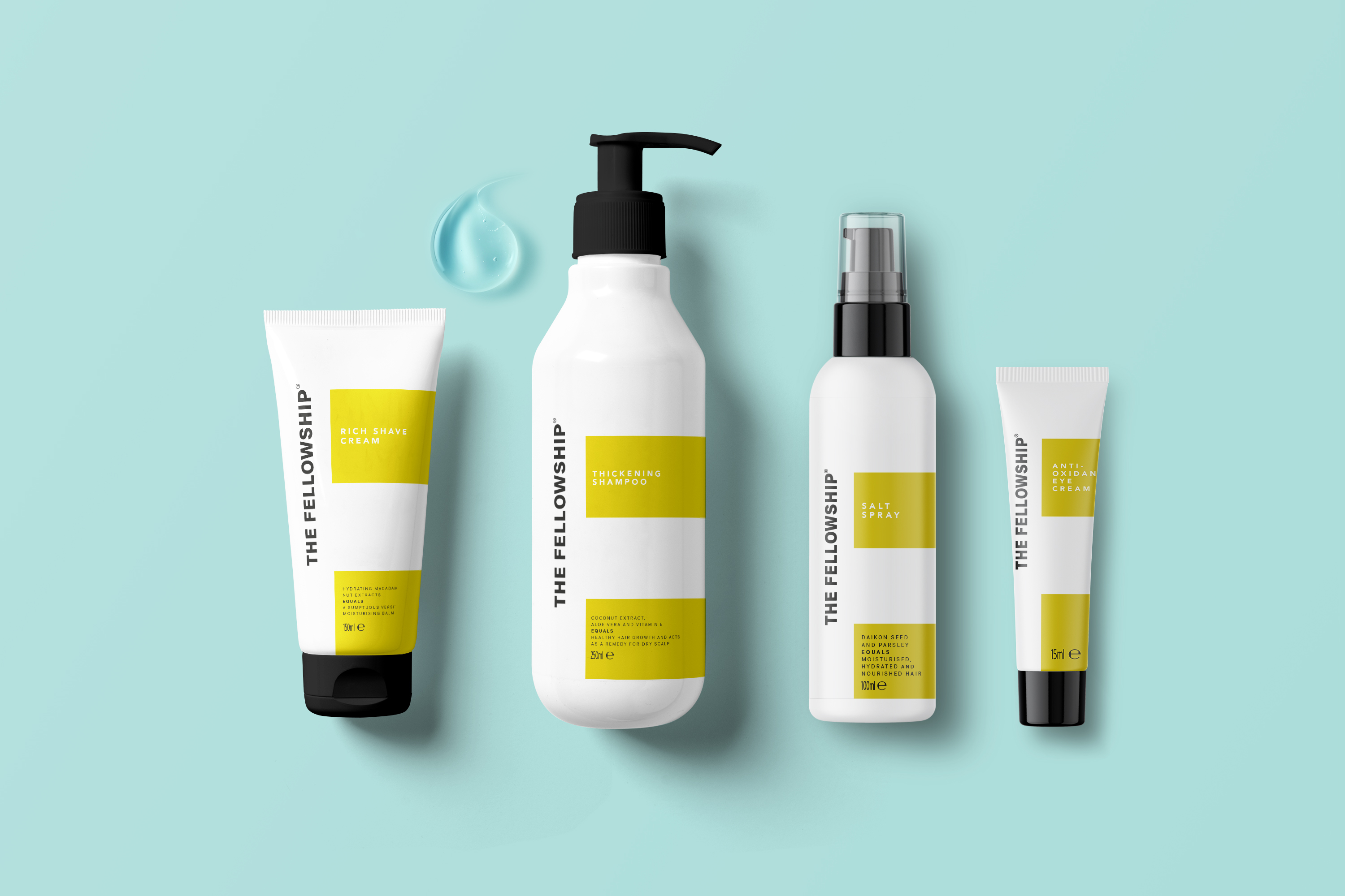
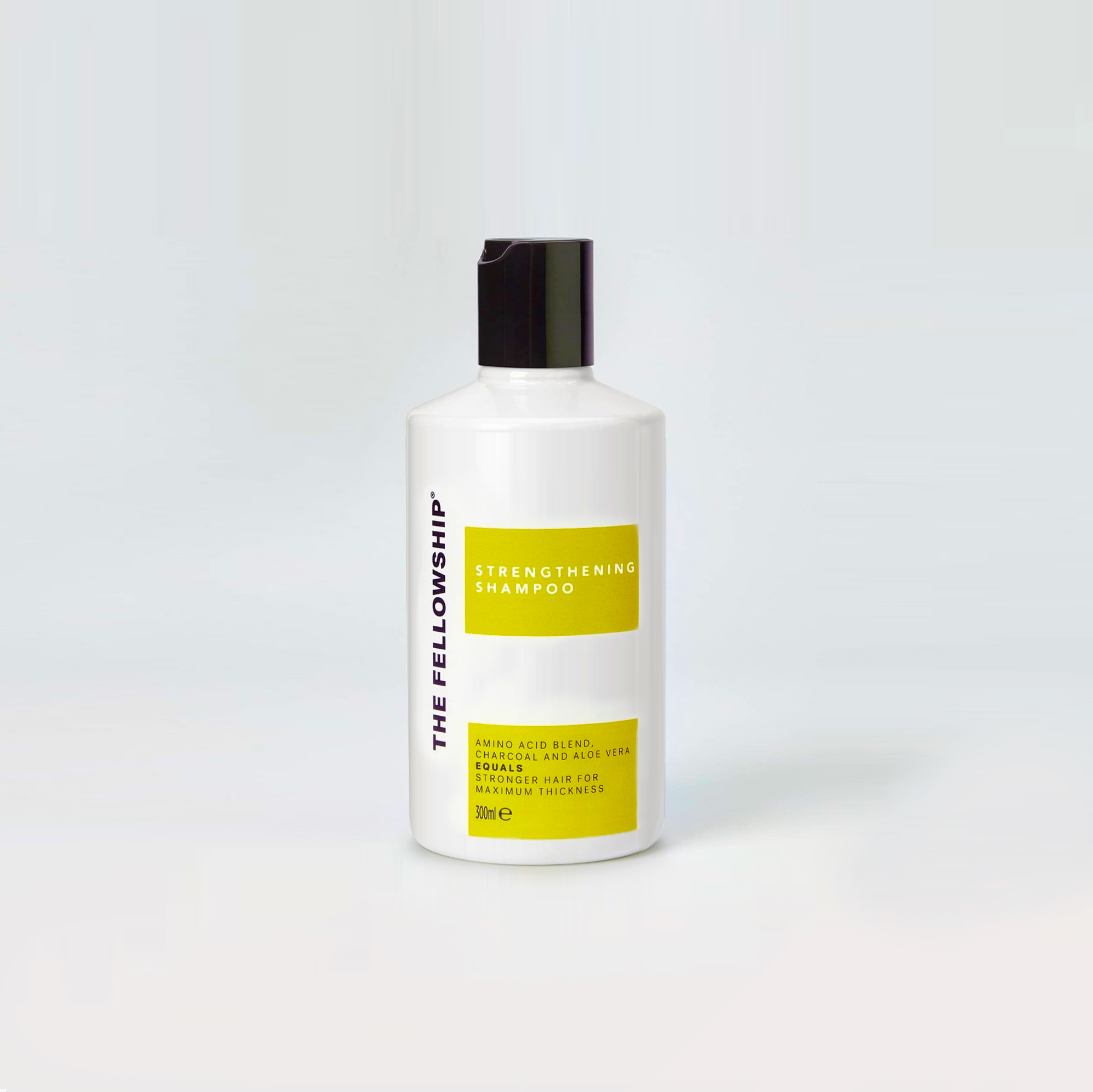
On each product, the bold information labels are arranged over a plain white background in the shape of an equals (=) sign – a striking motif that artistically encapsulates and communicates The Fellowship’s core values. Simple jet-black lids, pumps, and text, meanwhile, create an industrial feel, and inject a level of maturity and quality to the design.
For the information labels, simple sans-serif typography facilitates clear and direct messaging around each product’s benefits, while the “equals” motif appears again in each description (“coconut extract…equals healthy hair growth’) to help communicate a sense of “no-frills” simplicity about self-grooming, that the brand also wanted to champion.
The Fellowship’s name and logo, meanwhile, is proudly printed in bold black typeface along the side of each pack in the negative white space – a deliberate decision that speaks to the attitude of pride and shamelessness around self-care and self identity that The Fellowship hopes to foster within its customer community.
Andrew Cooper, Co-Founder, The Fellowship said: “We are delighted to be finally launching The Fellowship and starting our journey of helping men feel like the best versions of themselves. Free The Birds has done a fantastic job of clearly and effectively encapsulating our brand values into our packaging whilst also ensuring our products are attractive to the consumer. This is particularly important for us, given that we, like so many self-care brands now, are launching first on social media and via our website.”
Duncan Morris, Co-Founder, The Fellowship commented: “The men’s grooming market is increasingly busy and choosing the right brand can be daunting given the choice and limited spare time that modern men possess. We needed our brand to stand out to people, and quickly communicate who we are, in a way that didn’t feel fussy or overly-designed. We’re so pleased with the new identity that we have replicated the chartreuse equals motif across our other channels, including our Instagram account and website.”
The bold brand identity will first appear on The Fellowship’s “Essential Founders’ Kit”, which launched this week, including a body wash, body cream, moisturiser, shampoo, and conditioner, before being rolled out to more products later in the year.
CREDIT
- Agency/Creative: Free The Birds
- Article Title: Free The Birds Launches Disruptive Brand Identity for Inclusive Men’s Grooming Brand, The Fellowship
- Organisation/Entity: Agency
- Project Type: Packaging
- Project Status: Published
- Agency/Creative Country: United Kingdom
- Agency/Creative City: London
- Market Region: Europe
- Project Deliverables: 2D Design, Art Direction, Brand Design, Brand Identity, Brand Tone of Voice, Packaging Design, Typography
- Format: Bottle
- Substrate: Metal
- Industry: Health Care
- Keywords: WBDS Agency Design Awards 2021/22
-
Credits:
Creative agency: Free The Birds


