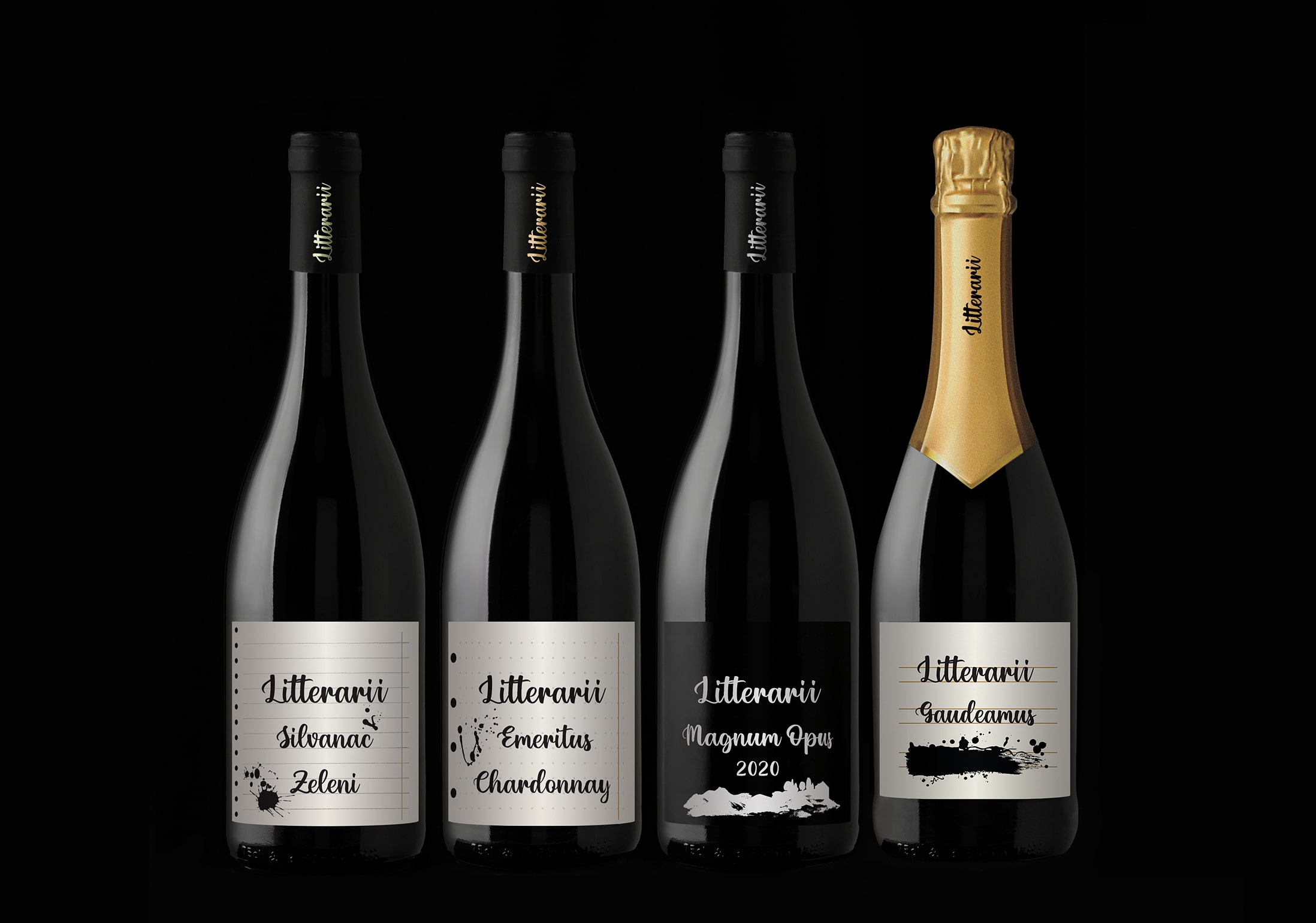
We created a brand strategy, new name and visual identity for the brand of top wines produced on the Nespeš Manor estate in the green hills of Zelina Prigorje, Croatia.
Zelina Prigorje lies on the 45.56 ° parallel, as do many of the most respected wine-growing regions in the world – Piedmont, Val du Rhone, Bordeaux, Oregon and others.
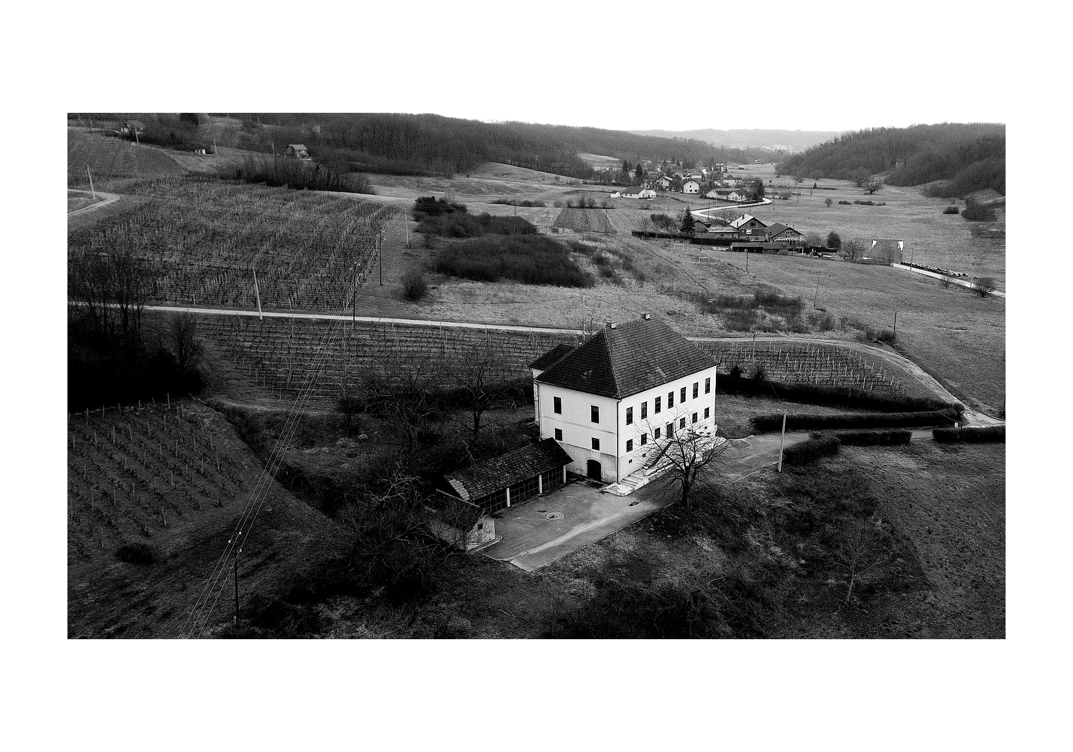
The castles and country estates in this wine-growing region were once owned by nobility, who loved this area for its peace and grace. One of these mansions is the Nespeš Manor, built in 1794 as a country estate. Wine has been produced in the cellar of the Nespeš Manor for centuries— the manor has changed owners many times, but wine production has never stopped, even when the manor building was converted into a primary school.
Today, the Nespeš Manor combines its dual heritage in a unique way, the wine and the school, it teaches us about a life in which we can live better, happier and more fulfilled.
Our school today is a school whose lessons come from the area’s nature, and we are taught lessons about a more fulfilled life, one in which there is not so much stress: a life in which there is more satisfaction and gratitude with what has been gained, acquired and experienced.
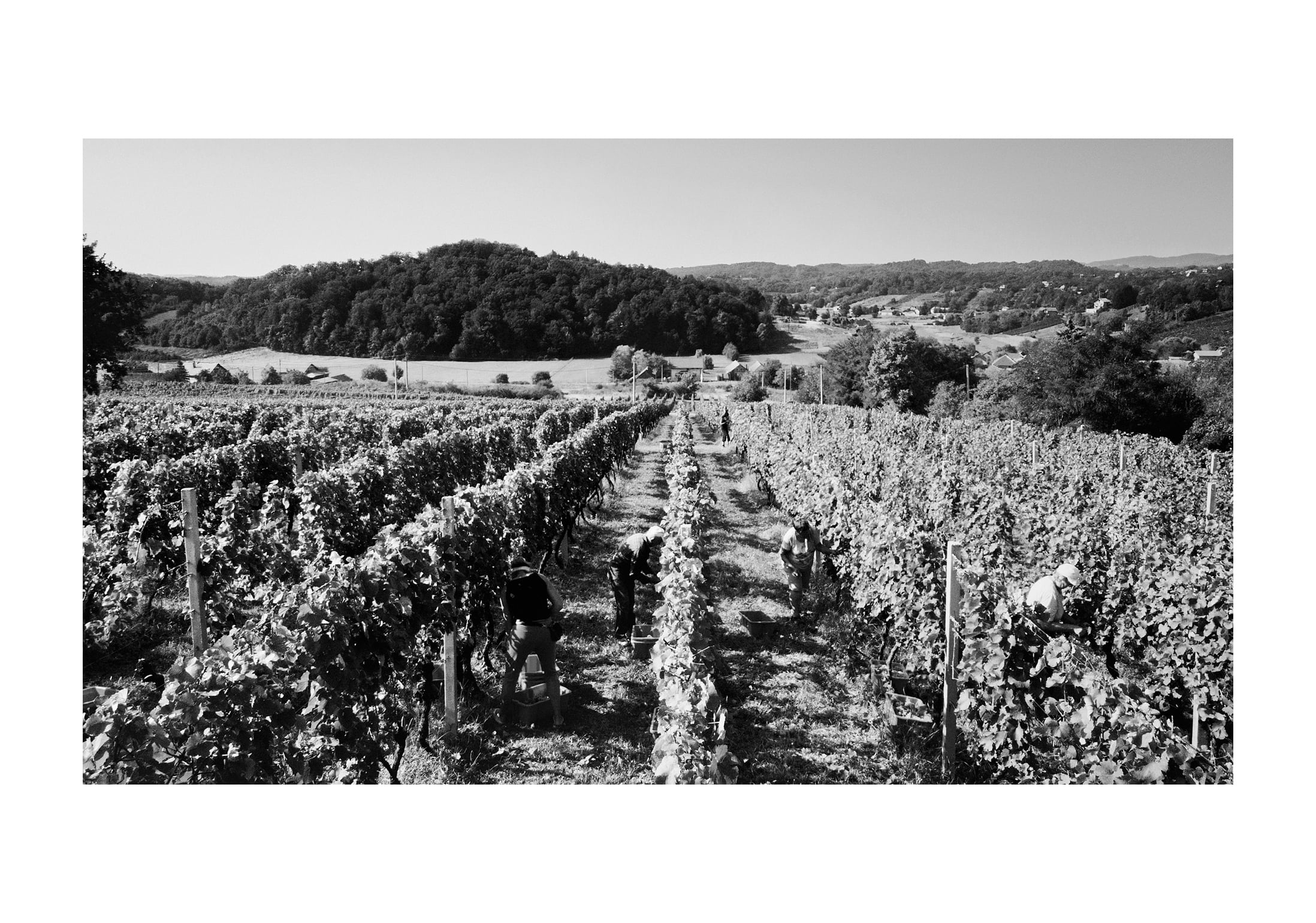
The excellent wines produced here reflect the richness of taste and aroma of this hilly region — every glass, drunk while walking through a quiet vineyard or with a superbly prepared dinner will teach us a new type of pleasure. The lush, green impression of the landscape, the peace and quiet, the aromas, the tastes and smells of the land will remain with us forever, as a nice lesson from a better, more fulfilled life.
We named the new wines Litterarii, which is a derivative of the Latin name for primary school (ludus litterarius), and the new slogan “School for a more fulfilled life” connects the wine with the manor’s school heritage.
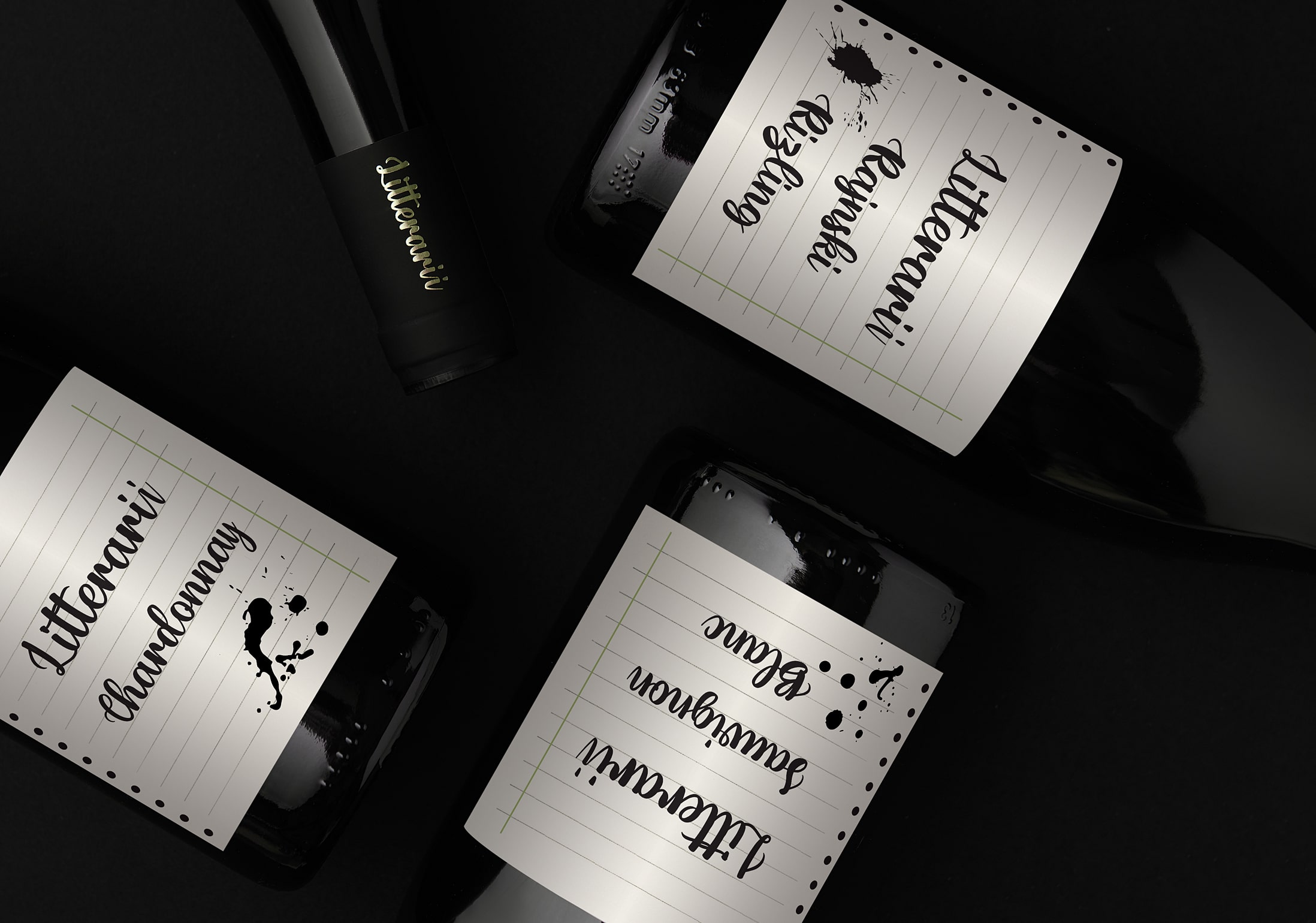
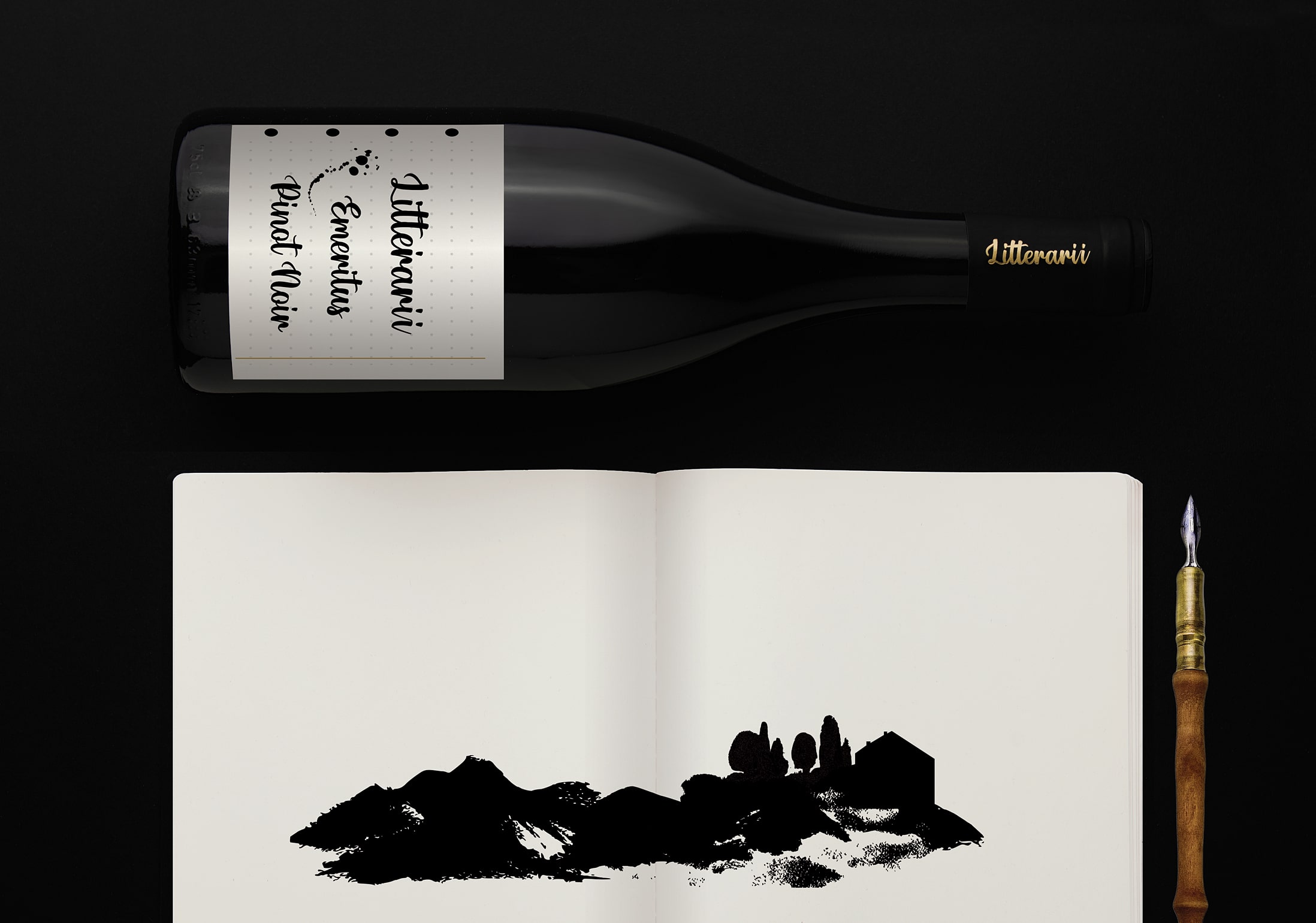
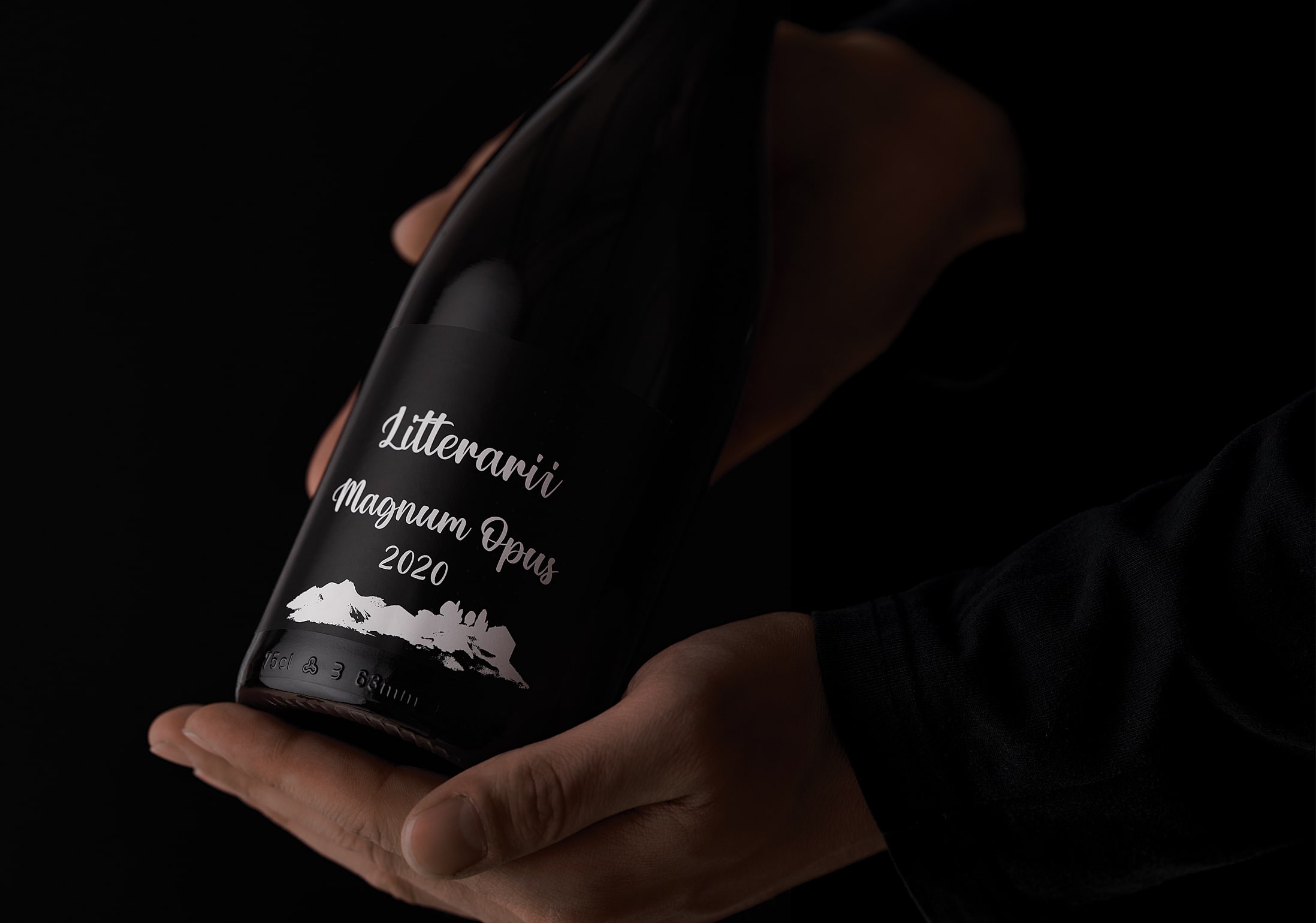
The inspiration for the design came from the preserved documents of the school in which the information written down with a fountain pen stands out. The backgrounds of the wine labels are reminiscent of old notebooks, and the names of the wines are written in a font created from handwritten letters. Spontaneous spots of ink on the labels represent a visual play that gives an artistic impression of one creating.
CREDIT
- Agency/Creative: Fabular branding
- Article Title: Fabular Agency Creates Brand Strategy, Name and Visual Identity for Litterarii Wines
- Organisation/Entity: Agency
- Project Type: Identity
- Project Status: Published
- Agency/Creative Country: Croatia
- Agency/Creative City: Zagreb
- Market Region: Europe
- Project Deliverables: Art Direction, Brand Creation, Brand Design, Brand Identity, Brand Naming, Design
- Industry: Food/Beverage
- Keywords: premium wine, wine branding, brand strategy, brand naming, brand design
-
Credits:
Brand Strategy & Creative Director: Anja Bauer
Naming Consultant, Copywriter: Anja Bauer
Art Director / Designer: Maja Bagic Baric
Senior Brand Consultant: Petra Despot Domljanovic
Senior Brand Implementor: Jelena Mezga
Brand Consultant: Stipan Rimac
Photography: Nikola Zelmanovic


