Monica Lovati Studio – Silene
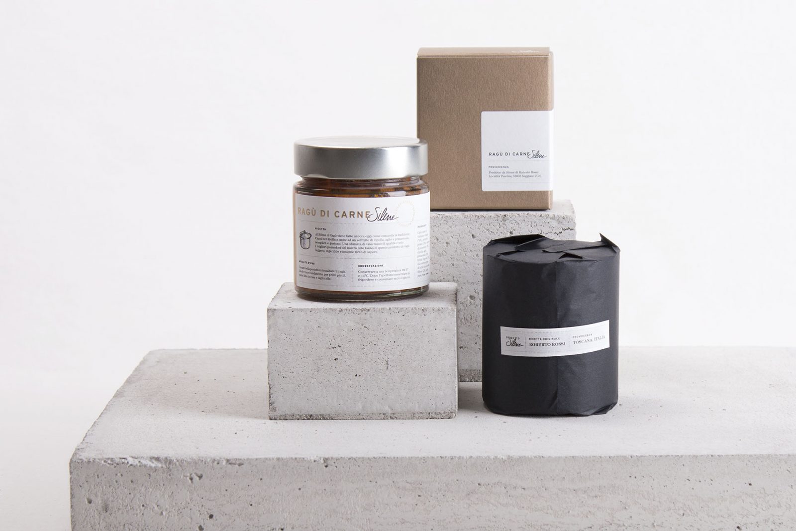
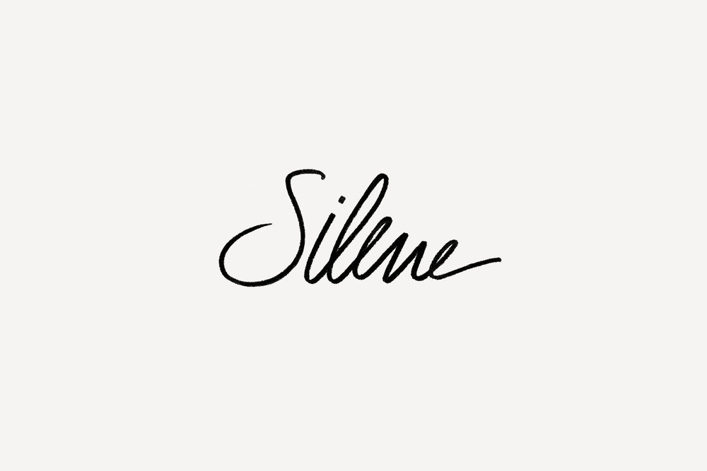
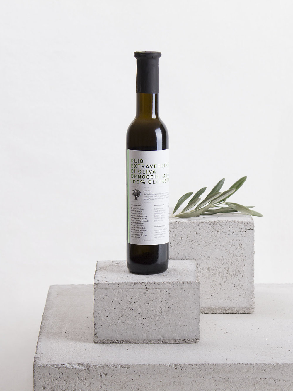
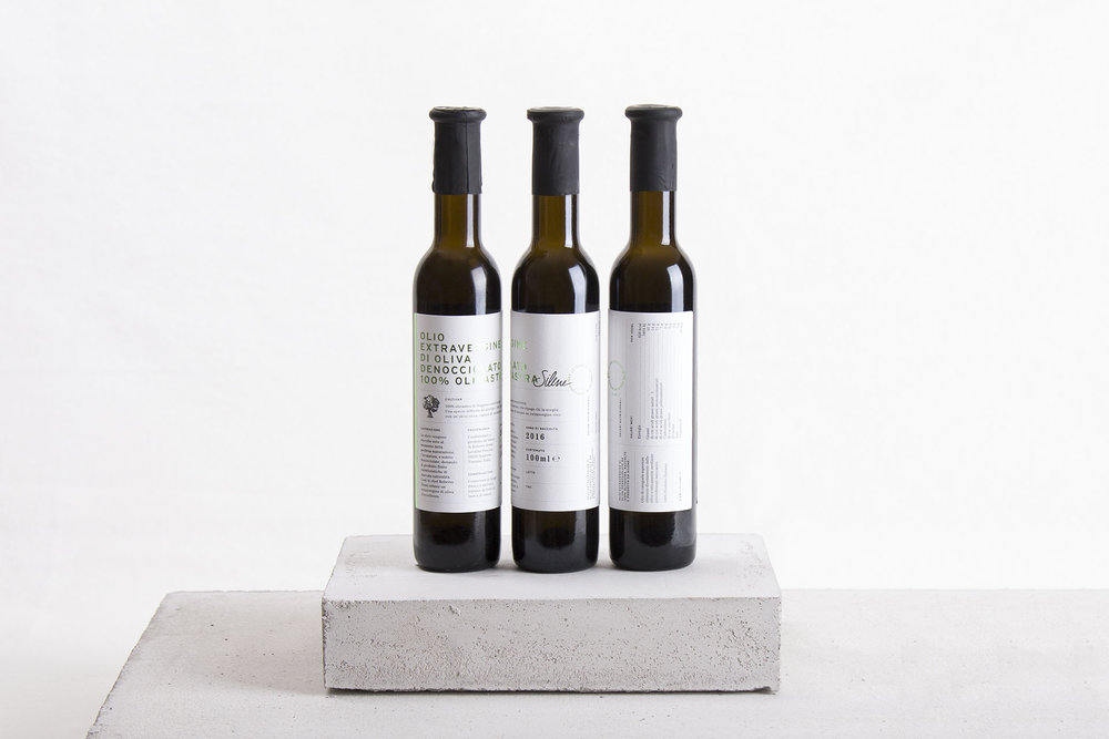
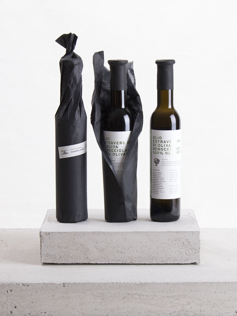
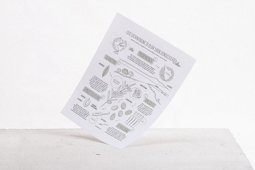
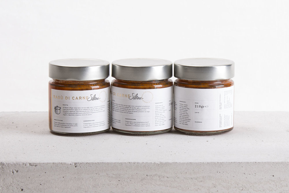
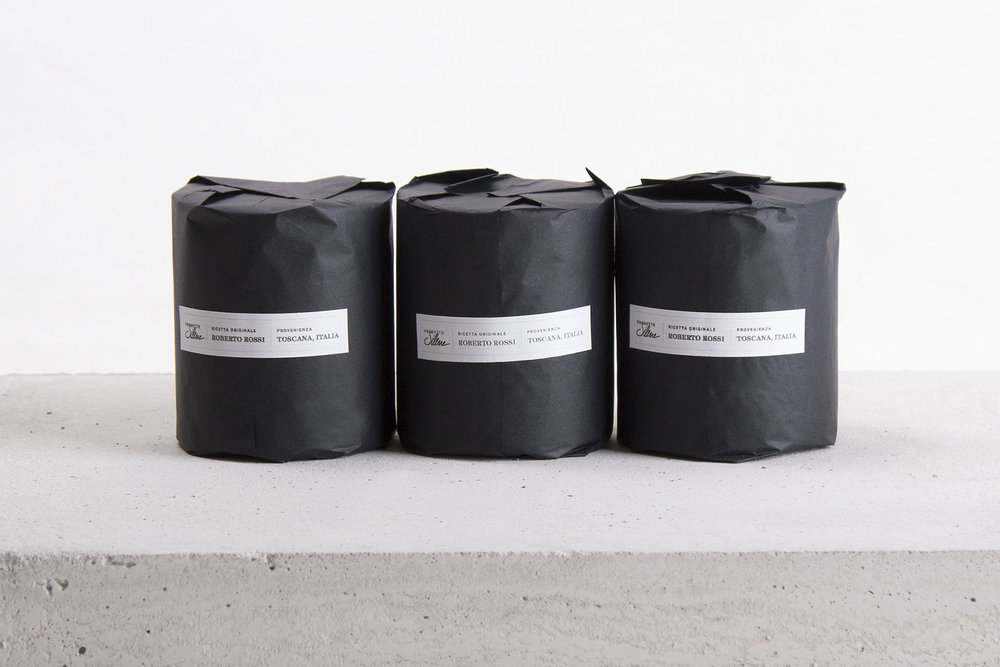
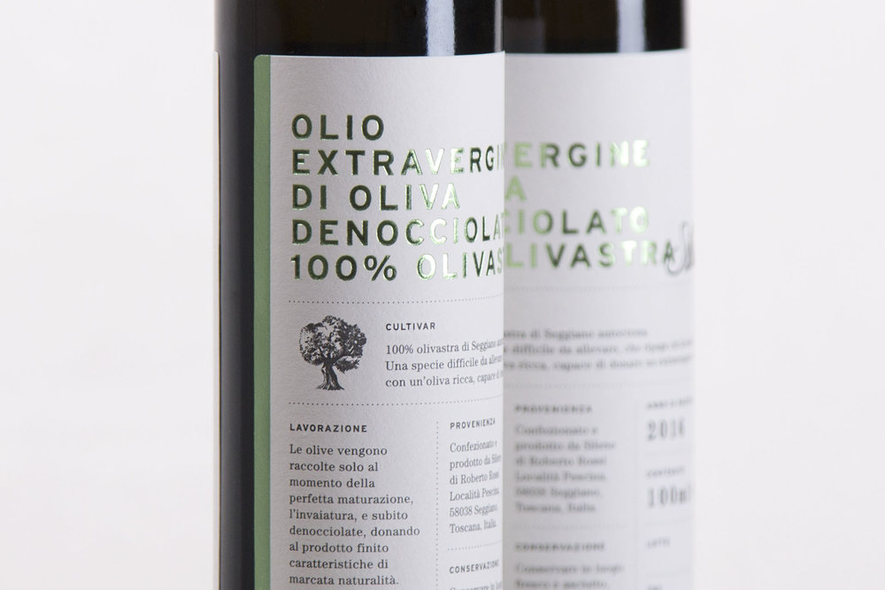
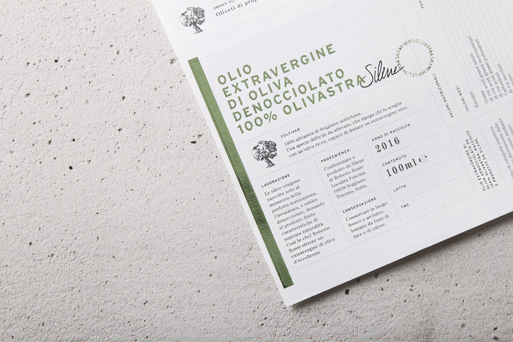
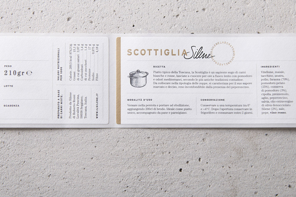
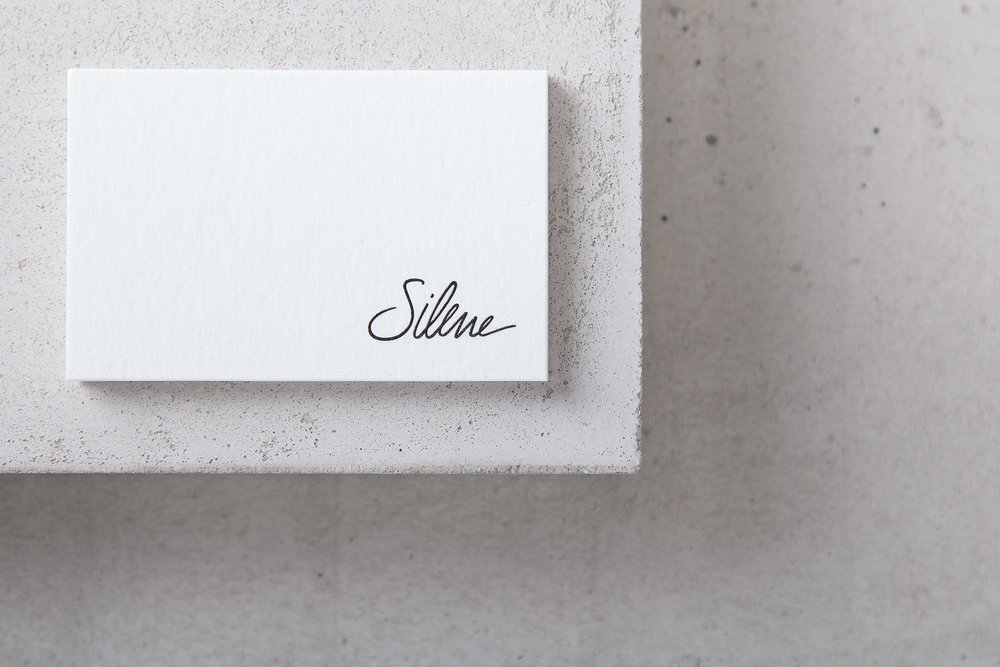
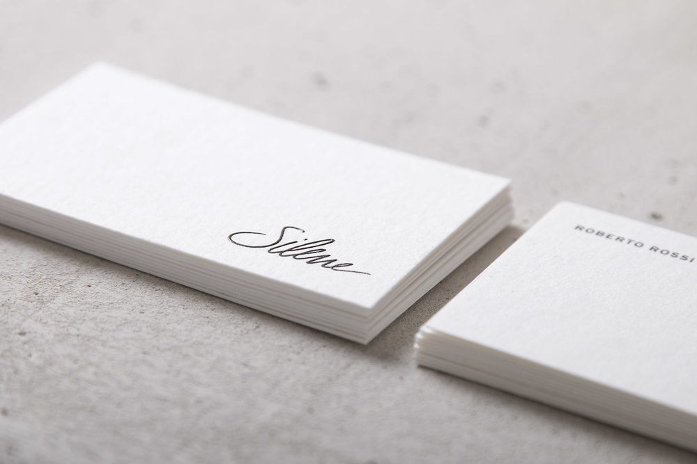
“In the heart of the real Tuscany where once the post inn refreshed the travellers, now stands the Silene, a place of excellence, capable of collecting the old knowledge of the good food to create a dynamic and charming cuisine which is a perfect bond between the vital energy of innovation and the elegance of tradition. The Silene identity has been restyled, origins and tradition come out in a contemporary approach. The logo become a signature, a unique and delicate sign that reflects the great care of the chef for his cuisine. Silene is not only a inn and a kitchen but also extra virgin oil and laboratory. For each area has been designed the respective brand, keeping a stylistic cohesion between past and innovation. The entire line of Silene products has been essentially designed.Native cultivation and pitting process make the extra virgin olive oil a product of excellence. The label has been created to tell this distinctiveness, that very few can boast. Every element has been studied in great detail from the choice of a greaseproof special paper to the foil that exalt the preciousness of the product. The hand-wrapped bottle is contained in an ad hoc box with a courtesy cork holder. To complement the packaging, a leaflet about the origin and the story of Silene extra virgin oil. The Silene laboratory products has been designed with the same purpose.”




CREDIT
- Agency/Creative: Monica Lovati Studio
- Article Title: Extra Virgin Olive Oil a Product of Excellence Visual Identity and Packaging Design
- Organisation/Entity: Agency Commercial / Published
- Project Type: Packaging
- Agency/Creative Country: Italy
- Market Region: Europe
- Format: Bottle, Jar
- Substrate: Glass
- Industry: Food/Beverage


