Equiori is a Colombian brand that has been working since 2012 to change the way cocoa and chocolate are produced. Its purpose is to contribute to the construction of a fairer, more equitable and sustainable world through organic products.
They have a wide portfolio such as chocolate bars with different percentages of cocoa, chocolate with cocoa nibs and nuts, and dehydrated fruits covered with bitter chocolate. All its products are organic, which means that its manufacturing processes are free of chemical residues and protect ecosystems.
In addition, the brand works directly with Colombian farmers to impact and generate value from the origin. This is achieved through education and technical assistance processes and with fair payments to the farmers in different rural areas of the country.
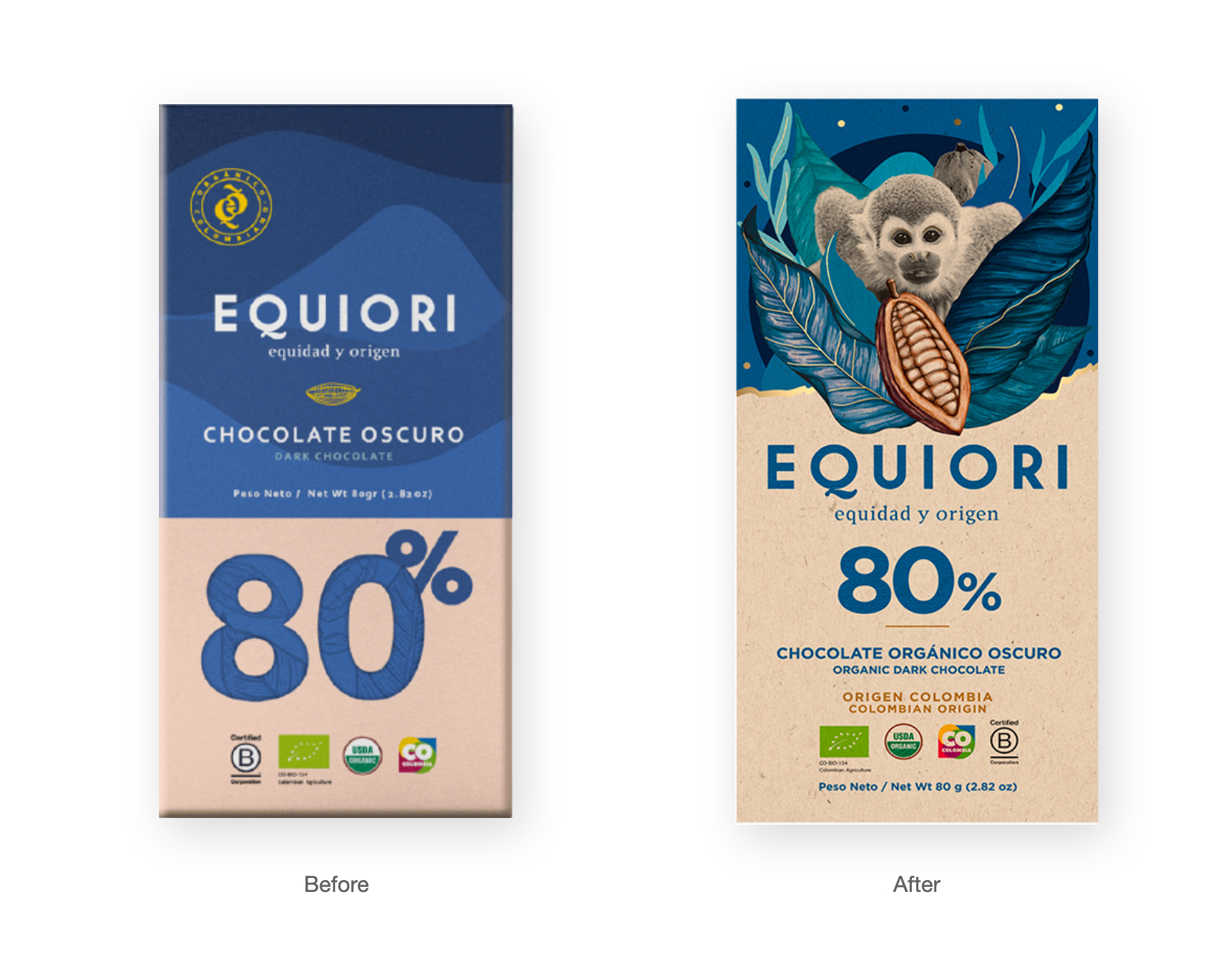
With the growth of the chocolate category in the country, Equiori is motivated to make a change in its packaging system to express in a differentiated way its purpose through design. This is the moment in which a co-creation process begins with ImasD’s research and design team to analyze the opportunities to evolve the brand’s graphic system and to generate its own new visual languages that will transmit its essence in an impactful and coherent way.
The design process begins with a stage of inspiration and understanding of the category. We analyzed local and global chocolate brands in order to deepen our understanding of the key elements of the category and identify opportunities for differentiation.
In this process, it was essential to get inspiration from other categories that differ from chocolate, such as coffee or liquors, in which the origin of ingredients is frequently highlighted. This is how we came to the idea of taking the biodiversity of Colombia as the base element of the design system.
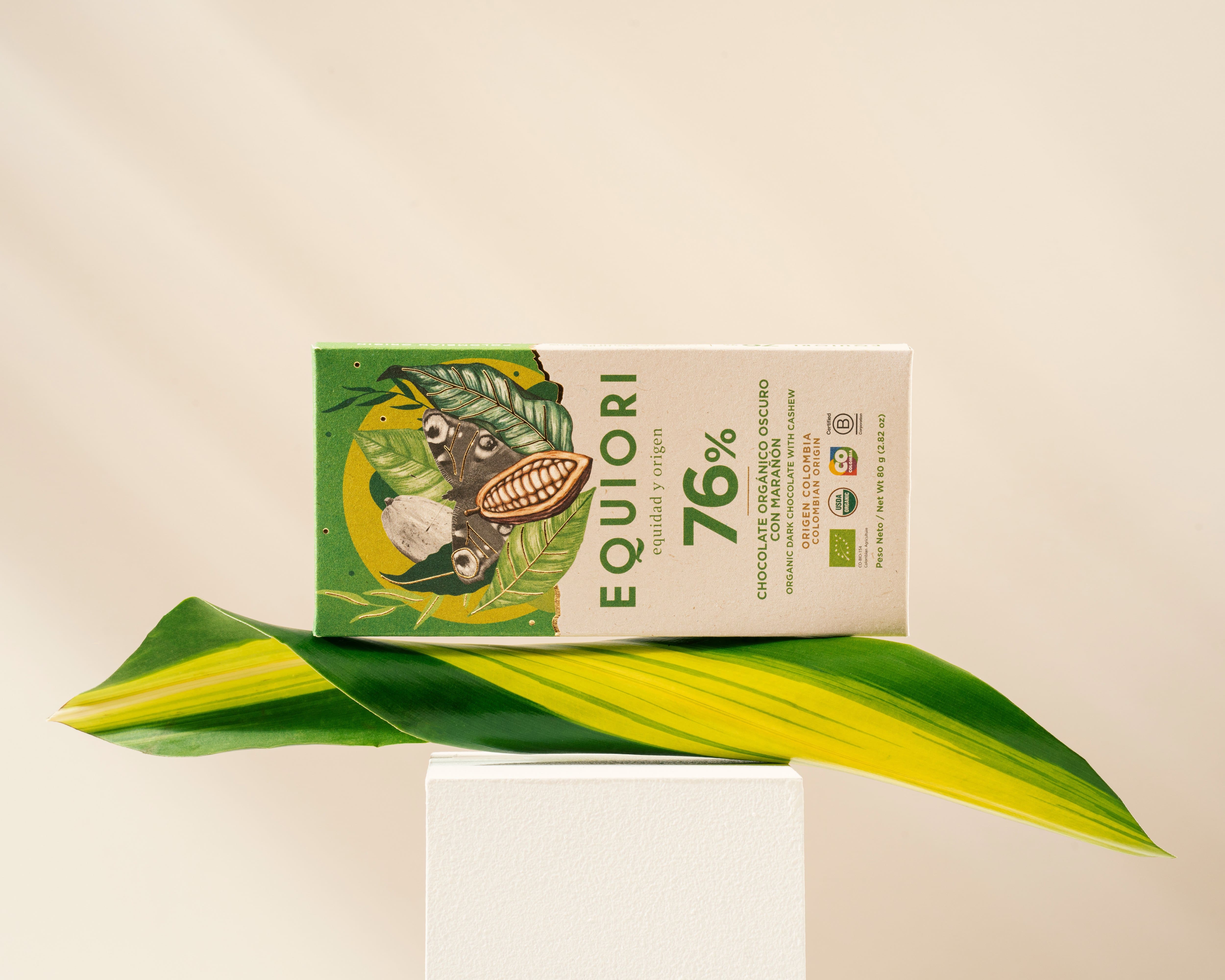
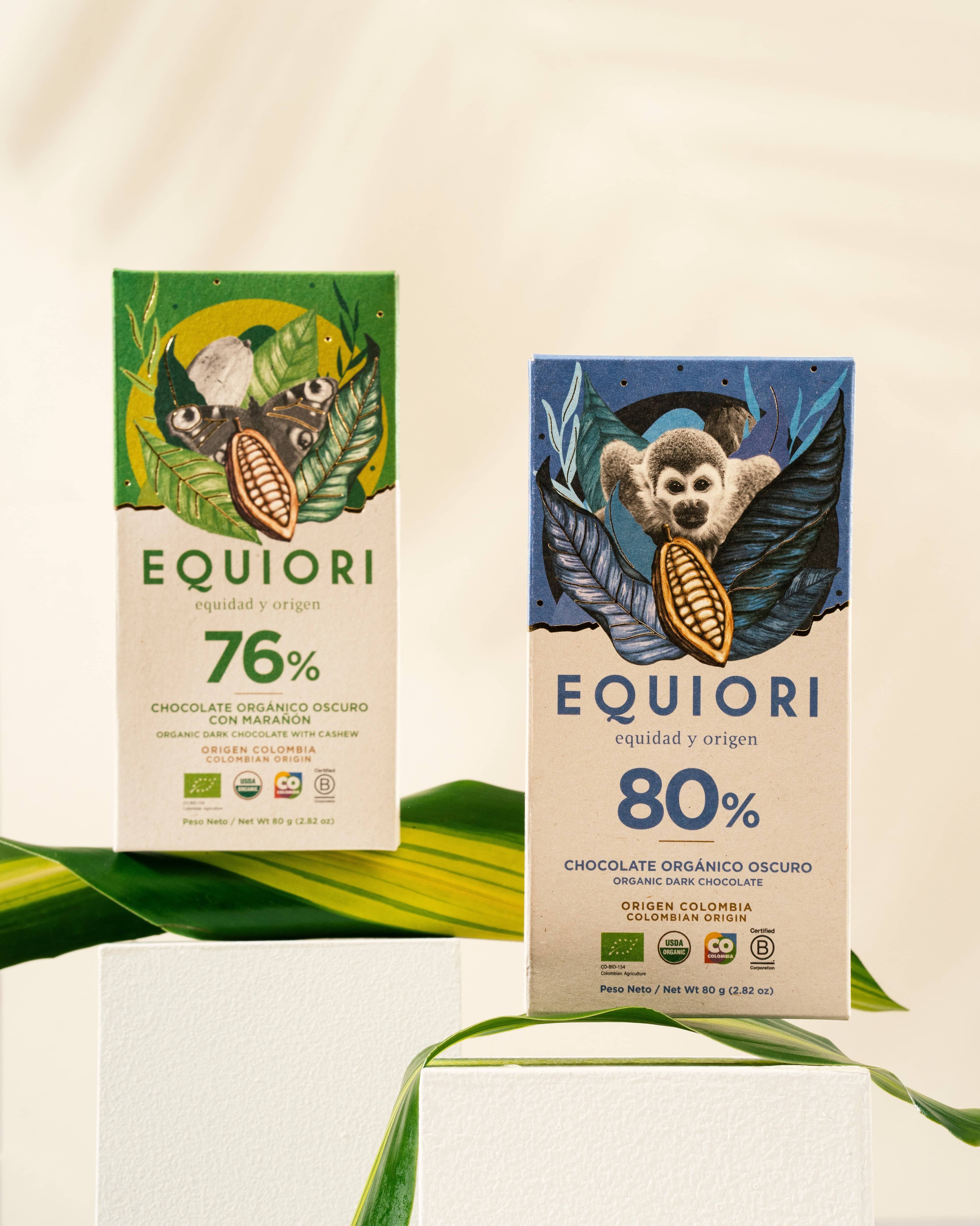
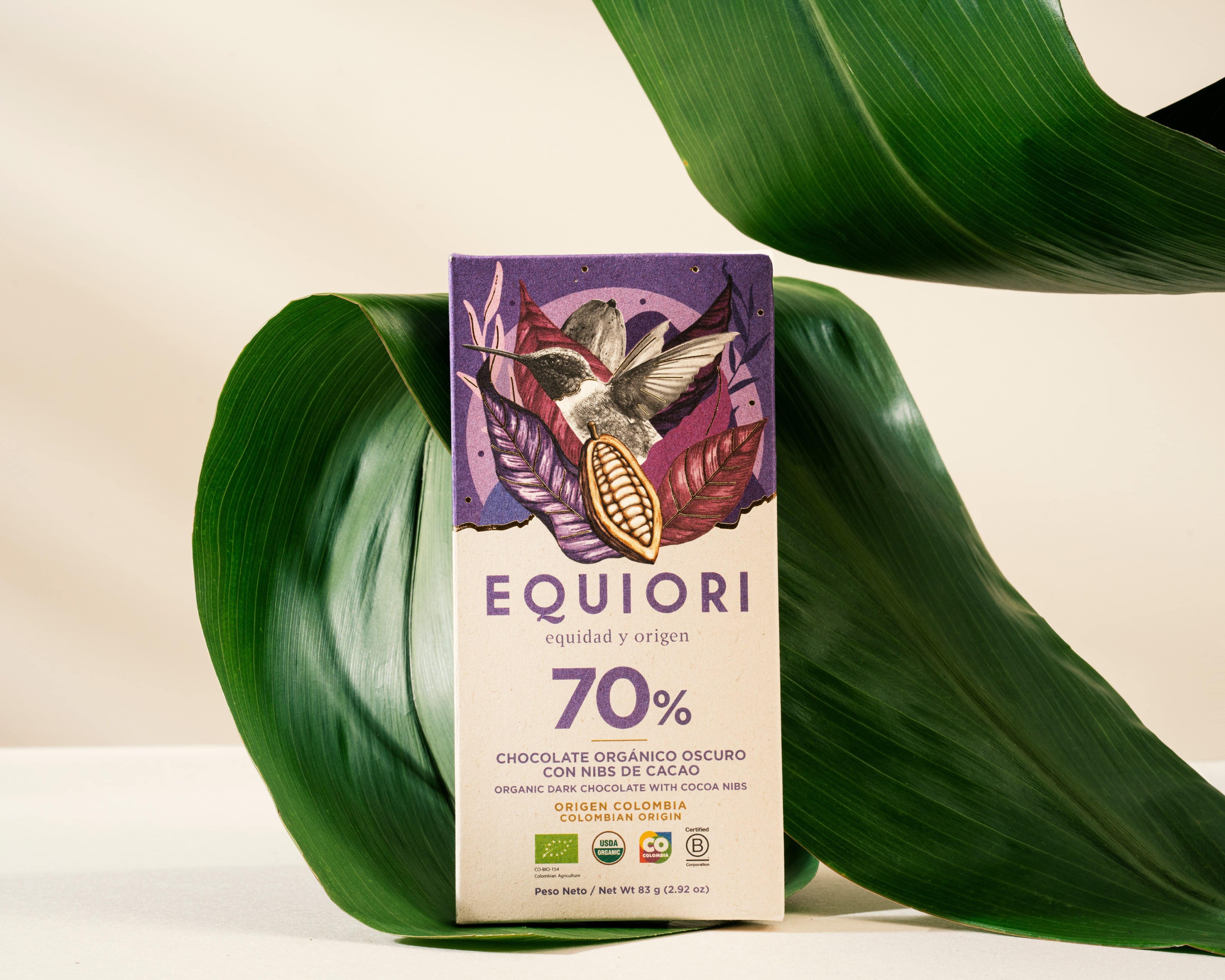
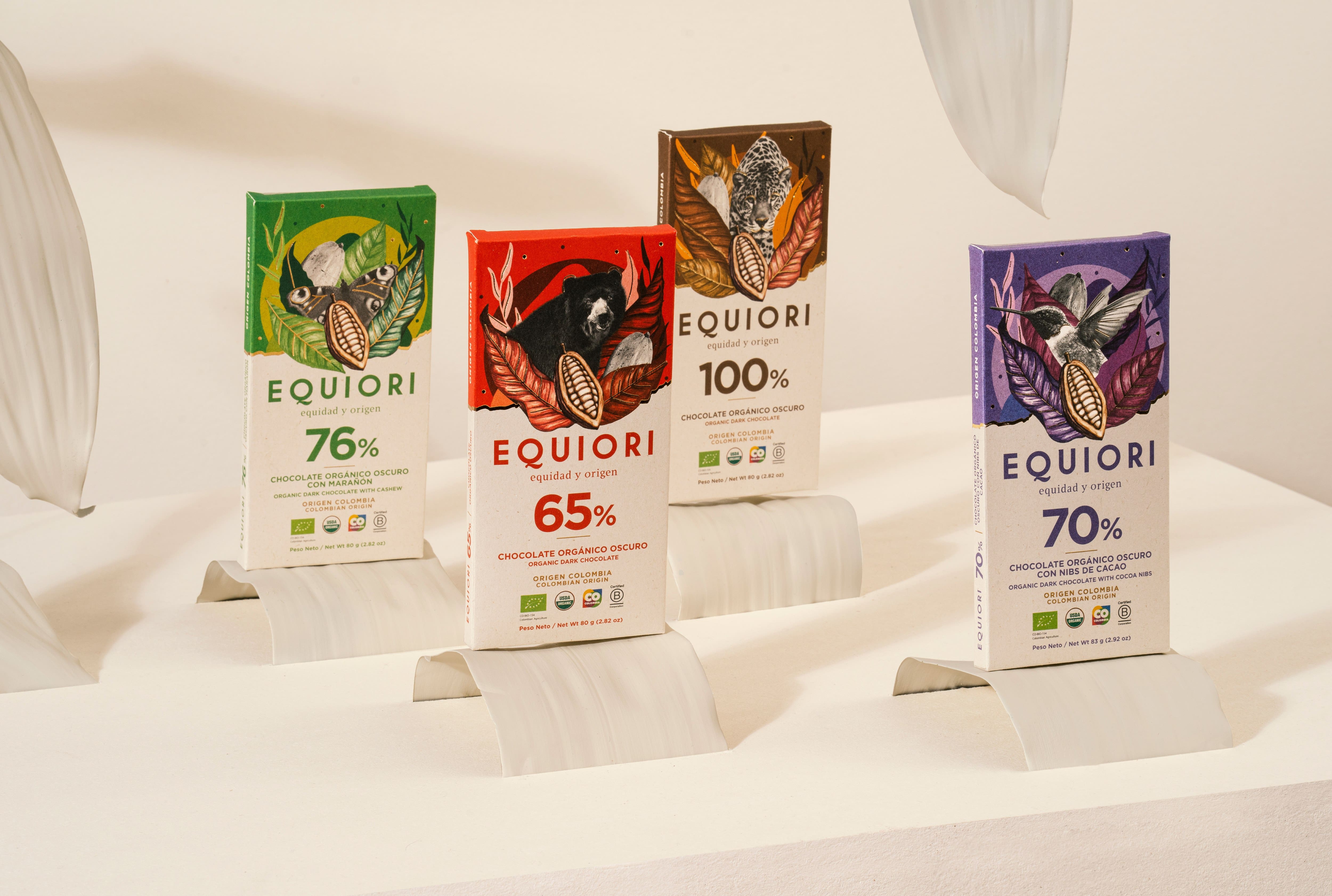
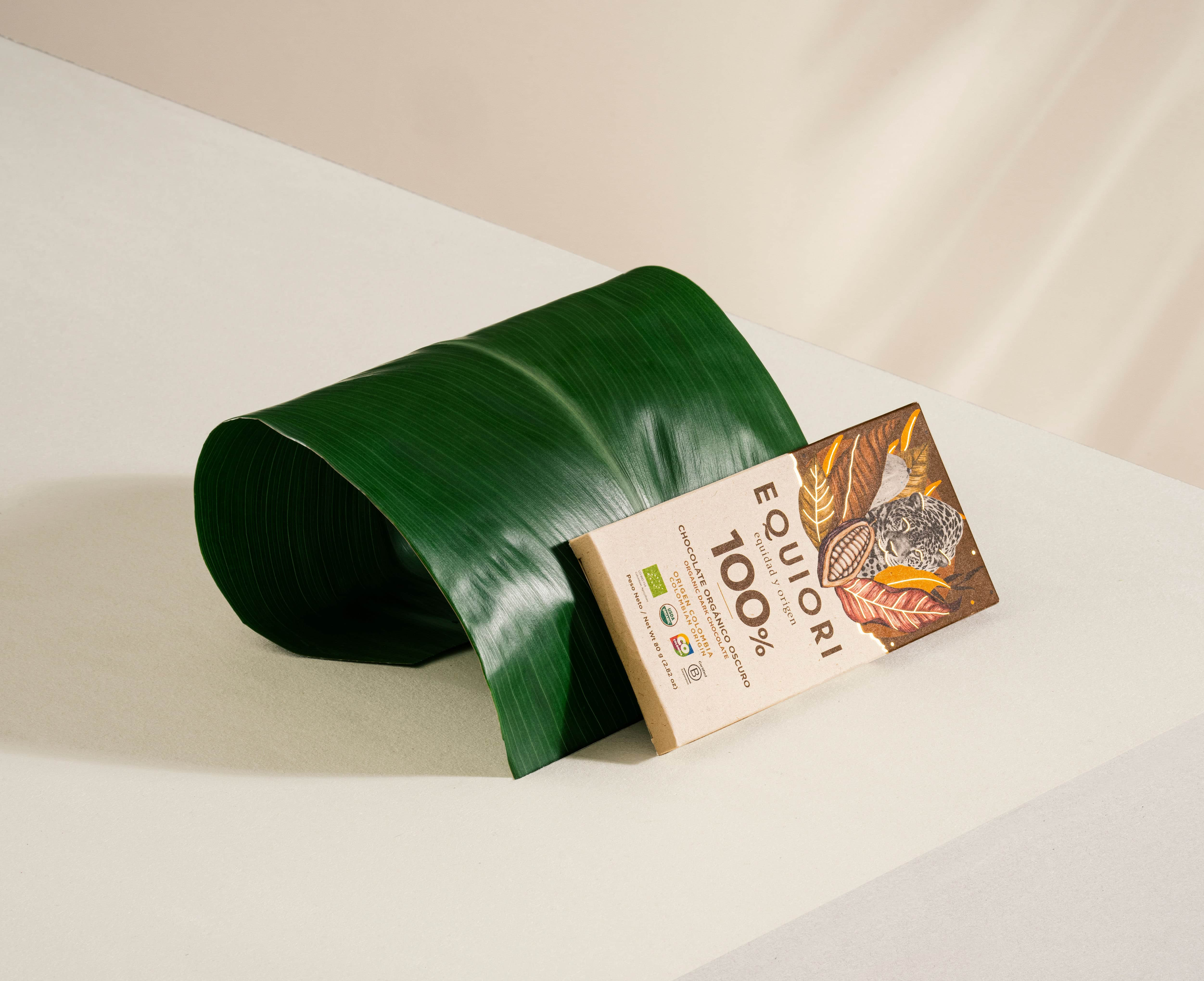
The packaging design proposal that was developed has a series of photographs of representative fauna of Colombia as the main focus. It is accompanied by illustrations that evoke the countryside, such as plants, cocoa and mountains, and collage compositions are made for each of the chocolate bars.
The use of the variety of colors that the brand had been using was kept as it is a good resource for people to navigate easily in the portfolio. As well as the packaging material, which is cardboard made from sugar cane waste, reflecting the coherence towards the brand’s sustainability component.
The graphic architecture designed allows the brand to be maintained in a consistent manner when developing new products or entering categories other than chocolate.
Other positive aspects that the development of this packaging system has brought is that it has allowed the brand to have more powerful graphic resources to communicate its identity and to generate closeness with people. It has also given them the opportunity to expand the message and highlight the biodiversity, not only natural, but also gastronomic, that characterizes a country like Colombia, which is gaining more and more recognition in the production of sustainable cocoa.
CREDIT
- Agency/Creative: ImasD
- Article Title: Equiori Chocolate Packaging Design
- Organisation/Entity: Agency
- Project Type: Packaging
- Project Status: Published
- Agency/Creative Country: Colombia
- Agency/Creative City: Medellin
- Market Region: South America
- Project Deliverables: Packaging Design
- Format: Wrap
- Substrate: Pulp Paper
- Industry: Food/Beverage
- Keywords: WBDS Agency Design Awards 2023/24
- Keywords: Packaging Design, Product Redesign
-
Credits:
Lead Designer: Sandra Mora
Photography: Espacio Crudo


