the Labelmaker – Gaetan Wines
“Gaetan wines are something I have started from the scrap sometime in 2014. I did a unique design but after a while in 2018 I decided to change it radically into a fancy wine label design.
I somehow wanted to touch wider audience and especially younger people. The original Gaetan design was very classy yet looking strong and serious. I wanted to break this initial look and created something more fashionable.
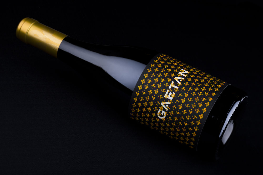
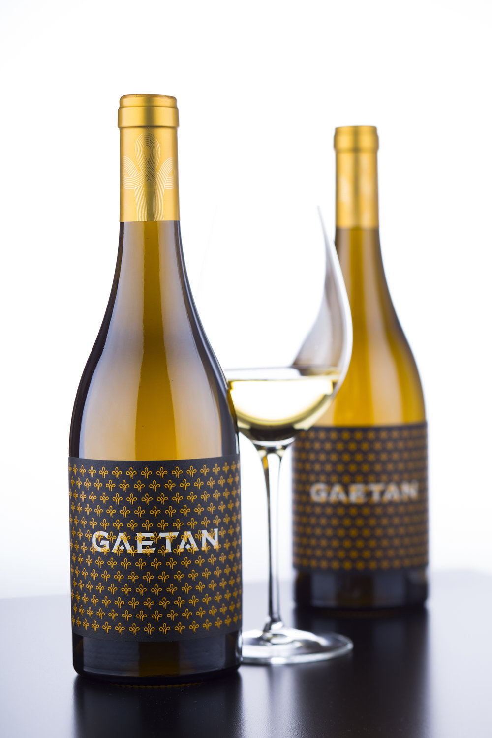
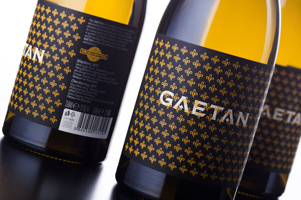
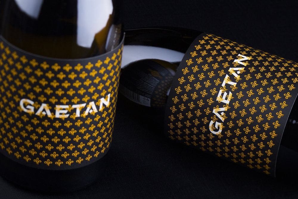
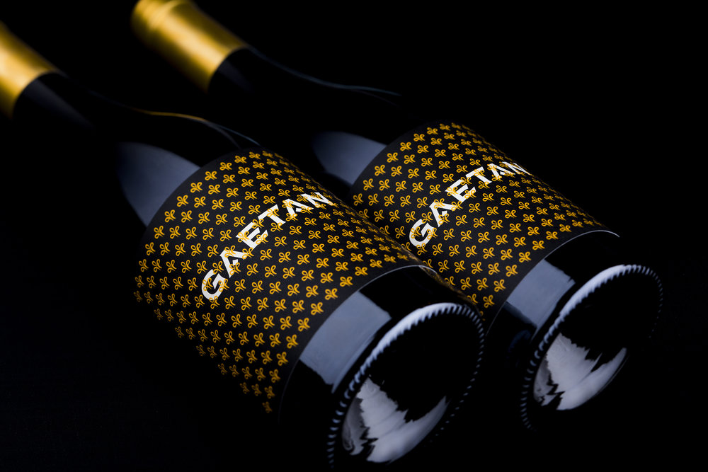
The new design is entirely based on my impressions from different pattern seen on wall tiles, paper covers etc. My key element was the gaetan I took from my Gaetan rose label which I repeated in a fancy pattern in high contrast colors. I used Pantone 116U to print my pattern against solid black background. The result was amazing – an incredible fancy wine label design for my label applied on a classic burgundy bottle by Saverglass. Multiple use of same element number of times is usually mesmerizing yet very memorable to the audience so for me the job was done with one click of my mouse. A very distinguished pattern turned my work into a fancy wine label design that shines among the other on the shelf. Behind this amazing pattern I put the Gaetan brand done with one of my favorite typefaces – the Bolyar Pro by the Fontmaker.
I did not put the brand to front of the pattern – I somehow wanted to look as if it was seen behind a wrought iron fence
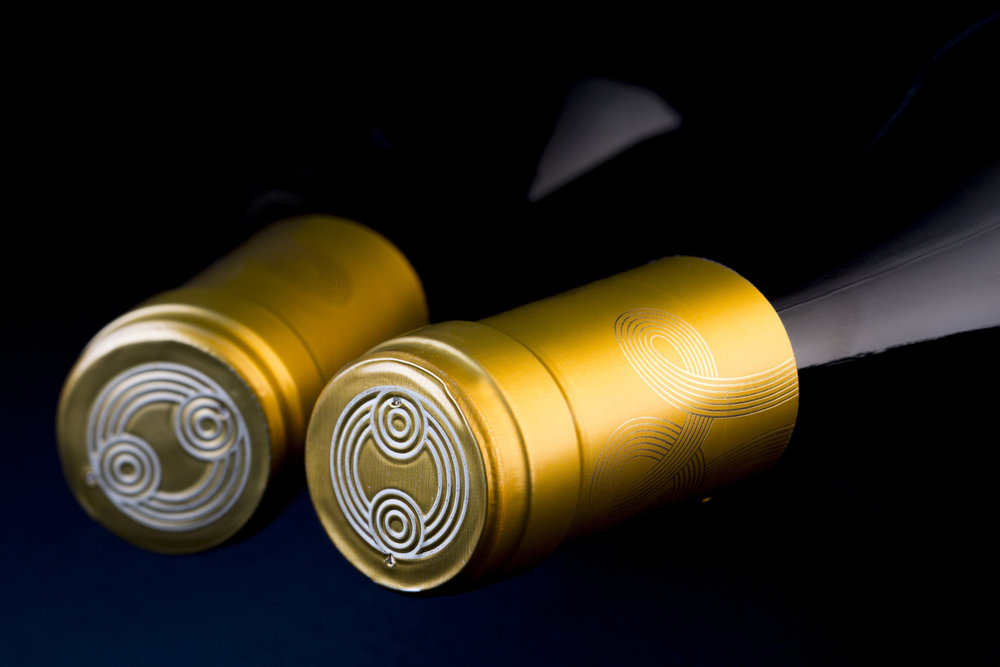
of balcony or a garden. I also payed special attention to the gold capsule – we did very special rich saturated gold with my friends from Lineapack. Additionally, I wanted deep black on my label and I did double black print on my favorite Constellation Snow Country paper by Arconvert. The Gaetan pattern was overprinted with high build varnish which is originally looking gloss. I did not want to have too much shine on my label, so I requested the printer to overprint it with solid matt UV varnish.
It is really incredible how this final procedure changed the overall look of my new fancy wine label design – the paper became calmer, the raised varnished looked more classy and finally with few more efforts I received very original and refreshed fancy wine label design for my old Gaetan wines.”
CREDIT
- Agency/Creative: the Labelmaker
- Article Title: Elegant Wine Label with Distinguished Pattern Design for Gaetan Wines
- Organisation/Entity: Agency Commercial / Published
- Project Type: Packaging
- Agency/Creative Country: Bulgaria
- Market Region: Europe
- Format: Bottle
- Substrate: Glass, Pulp Paper


