Mousegraphics – DUO (Beiersdorf)
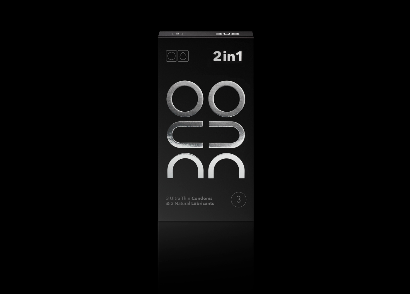
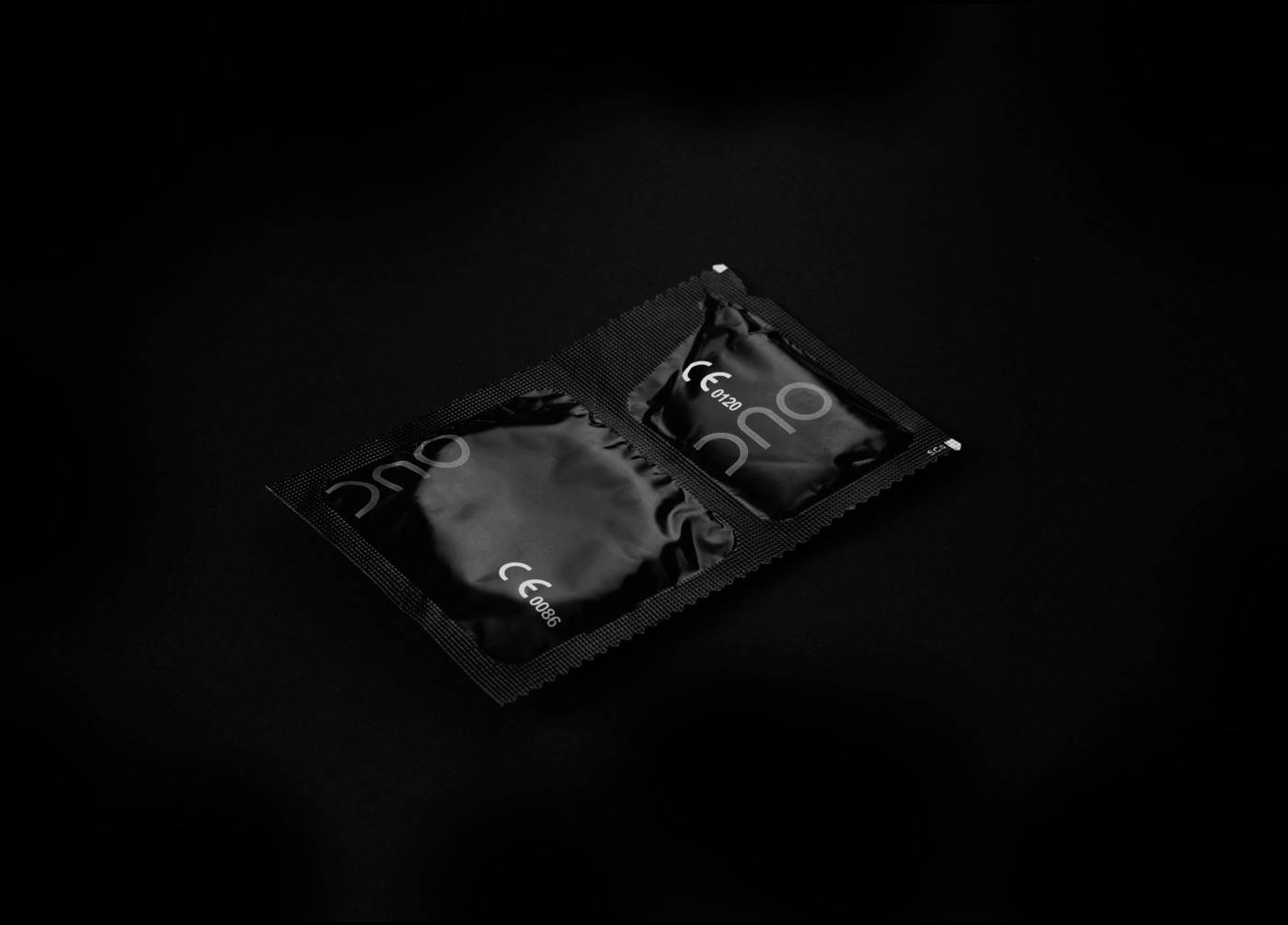
The briefing : “DUO brand identity has been successfully revised. We need to develop new products and place them within this identity range”.The target consumer: Existing consumers of all ages and sexes as well as new audiences of younger people, web natives and design conscious buyersThe design: After redesigning the DUO logo, packaging and identity, mousegraphics was asked to extend the applied graphic approach to new related products. This is the very challenge that tests the strength and potential of a design language. We were commissioned to design a new packaging for three condoms and three lubricants. The logo provided the raw design material: when rotating it in vertical position the letters comprising the word DUO emerge distinctly as three shapes. In this position they together allude to a human figure with hands reaching out for an embrace. Coupled by its reflection, this anthropomorphic design, shape-shifts into a human couple. This also applies to the combination of materials in the package (condom plus lubricant). We made a gif in order to reveal the game of wisdom that design is and also in order to share the joy it gives us.


CREDIT
- Agency/Creative: Mousegraphics
- Article Title: DUO 2 in 1
- Organisation/Entity: Agency, Published Commercial Design
- Project Type: Packaging
- Agency/Creative Country: Greece
- Market Region: Europe
- Format: Box
- Substrate: Pulp Carton


