Galychyna is a national brand with such an honorable history and practically the only producer on a yogurt shelf that managed to get revived three years ago and proved that any association with traditions and demand for naturalness is a youth-led and modern trend. To keep up with the young TA, one needs to rush—rather than walk—through the market because young people’s hearts march in lockstep with the motto “we expect changes.”
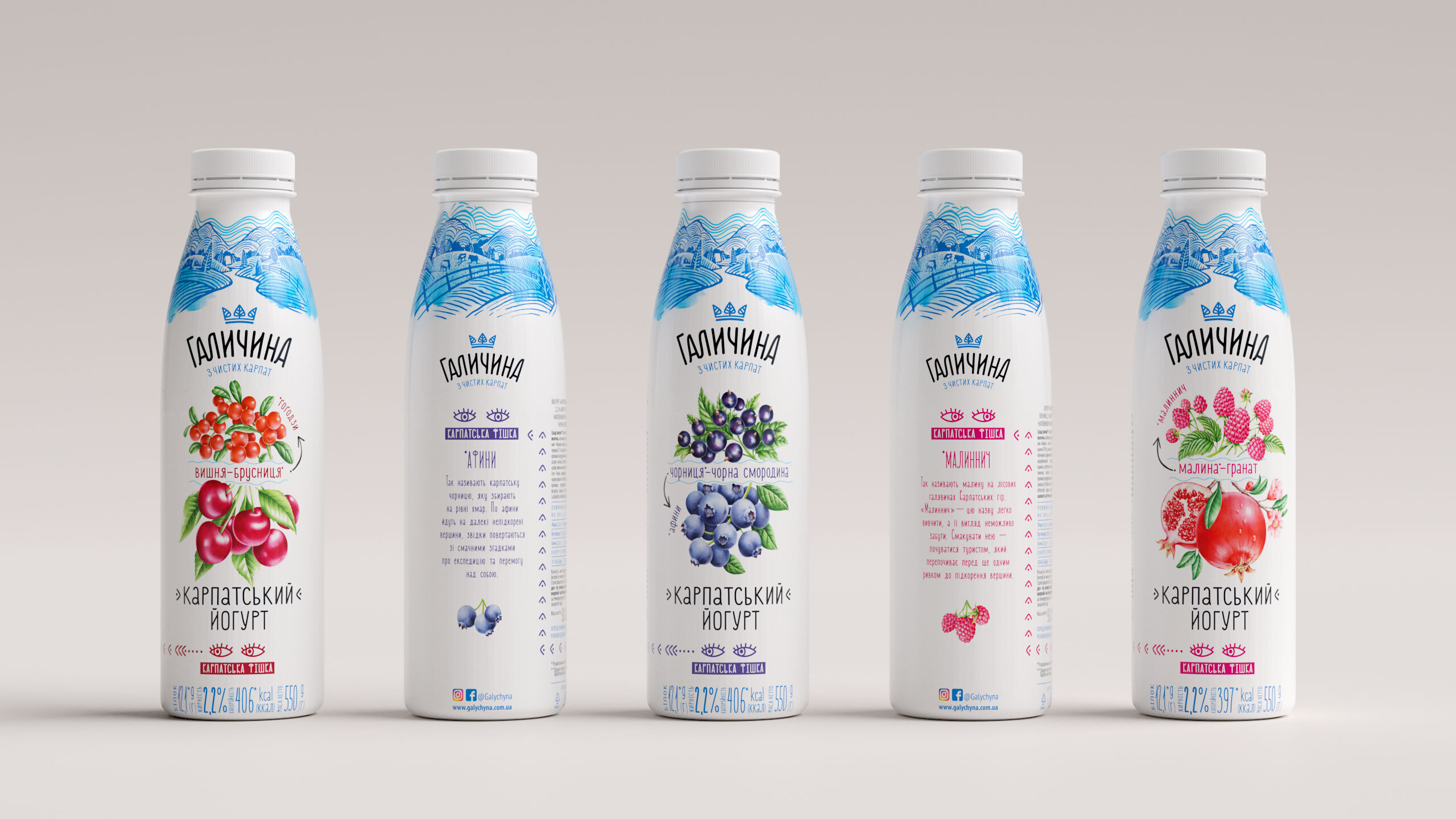
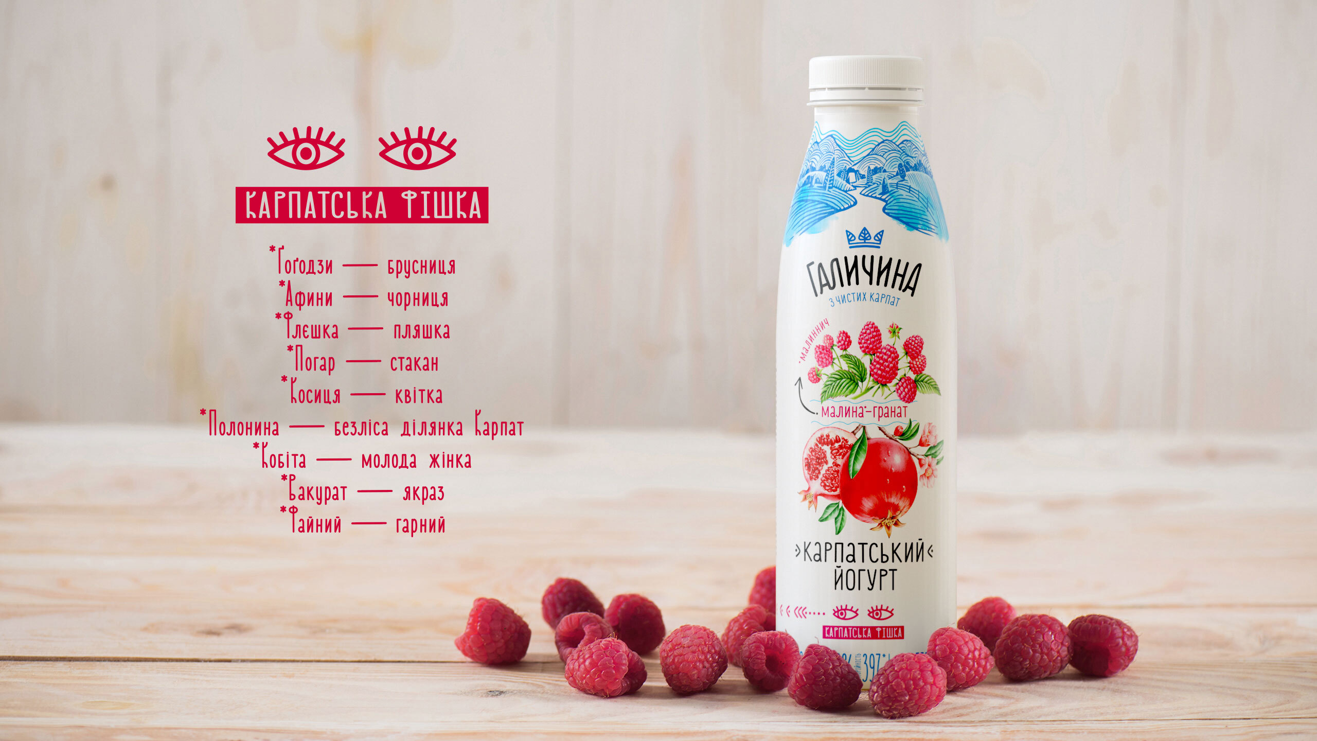
While Looking for a thing, the client’s team traveled the Carpathians high and low. The highlight for customers is both new original flavors and linguistic discoveries. The Carpathian dialect inspired us to take a fresh look at popular flavors. We mentioned such rare local names for berries as gogodzy*, afyny*, etc. and thereby added more flavor to unique products. The new line that features six SKUs (three flieshkas* and three pohars*) offers a short historical overview of the Galician dialect.
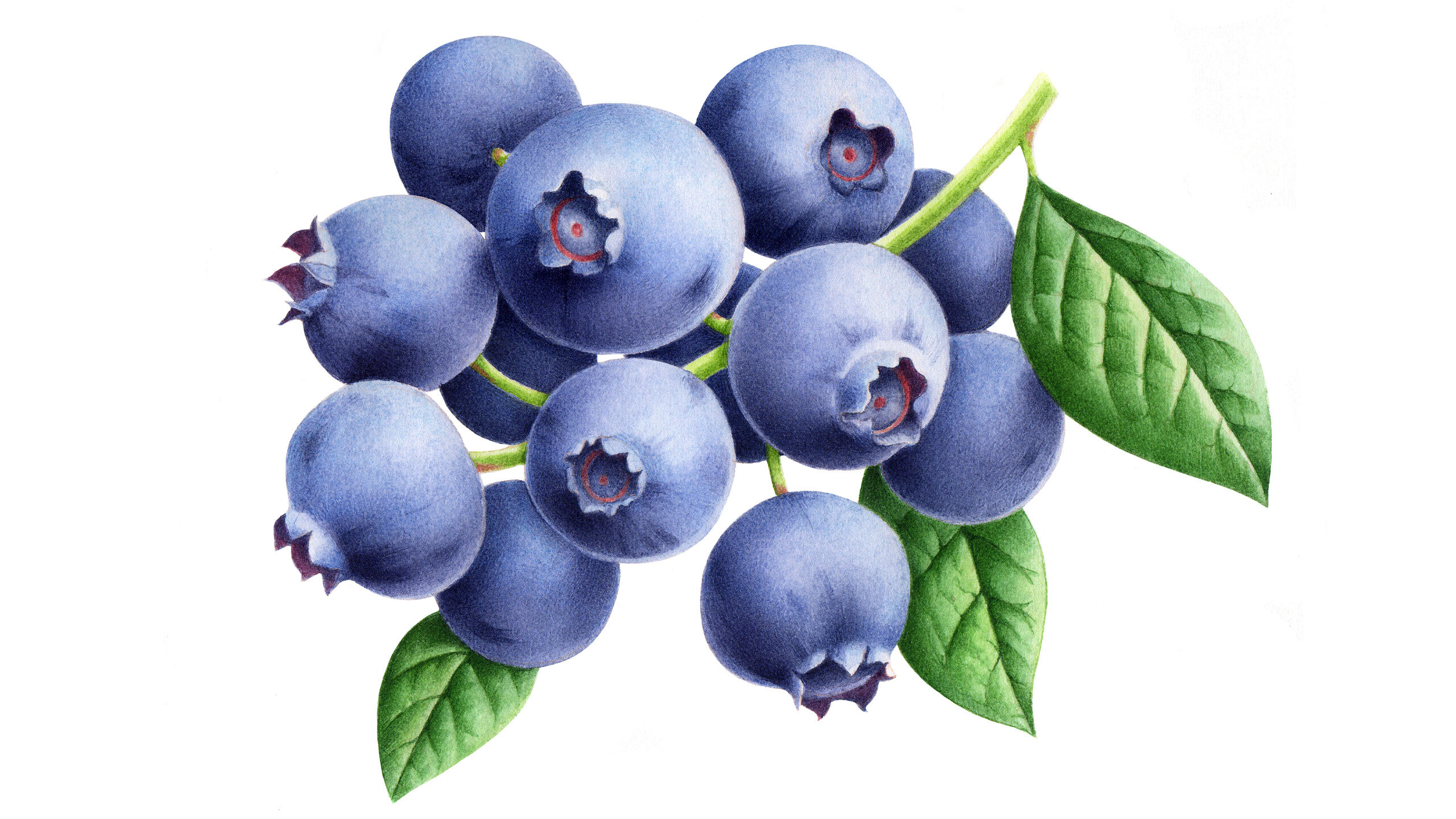
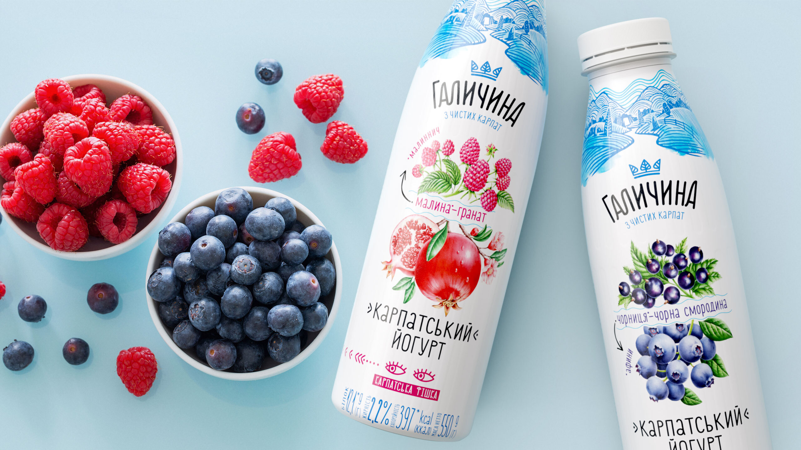
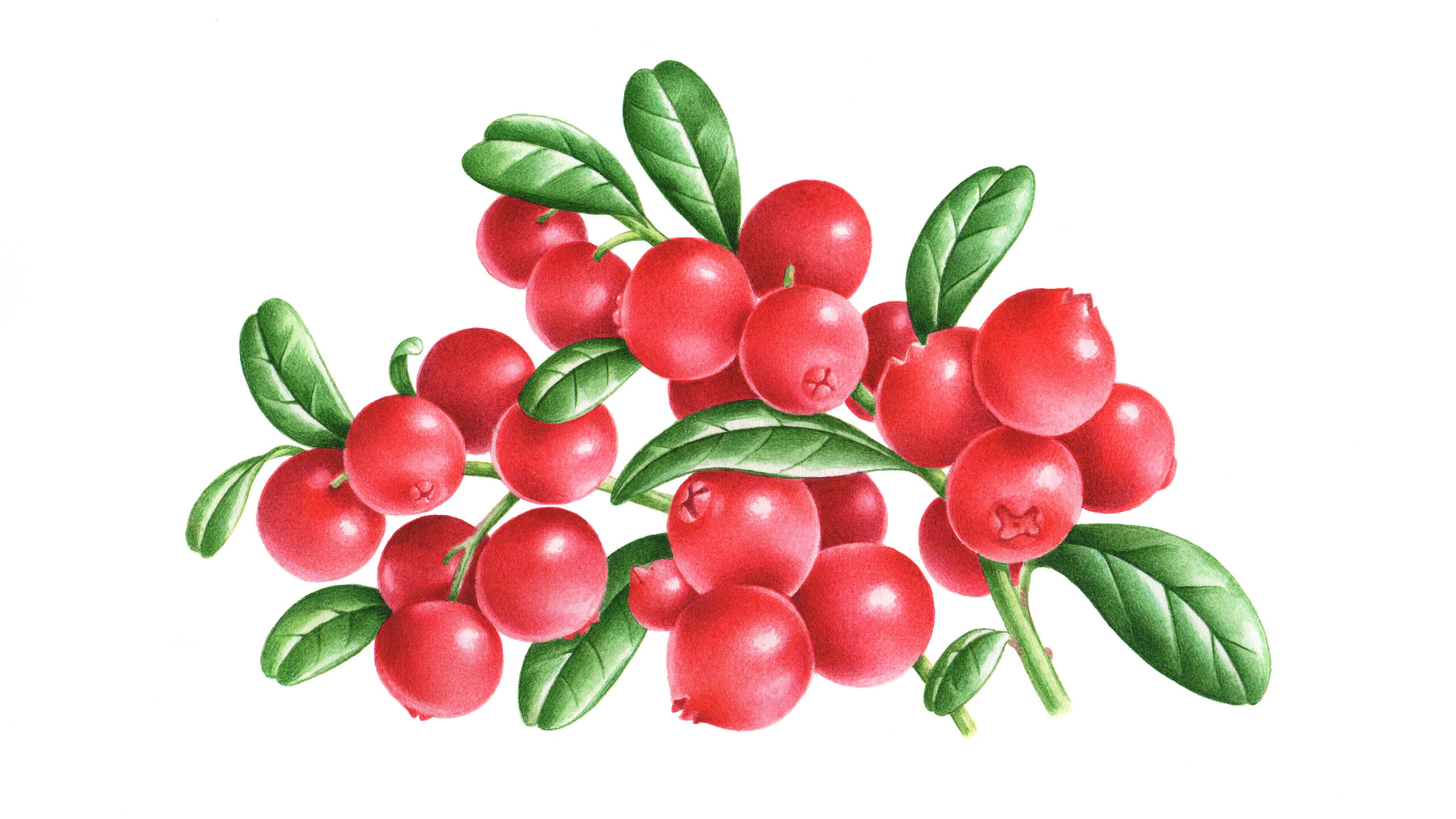
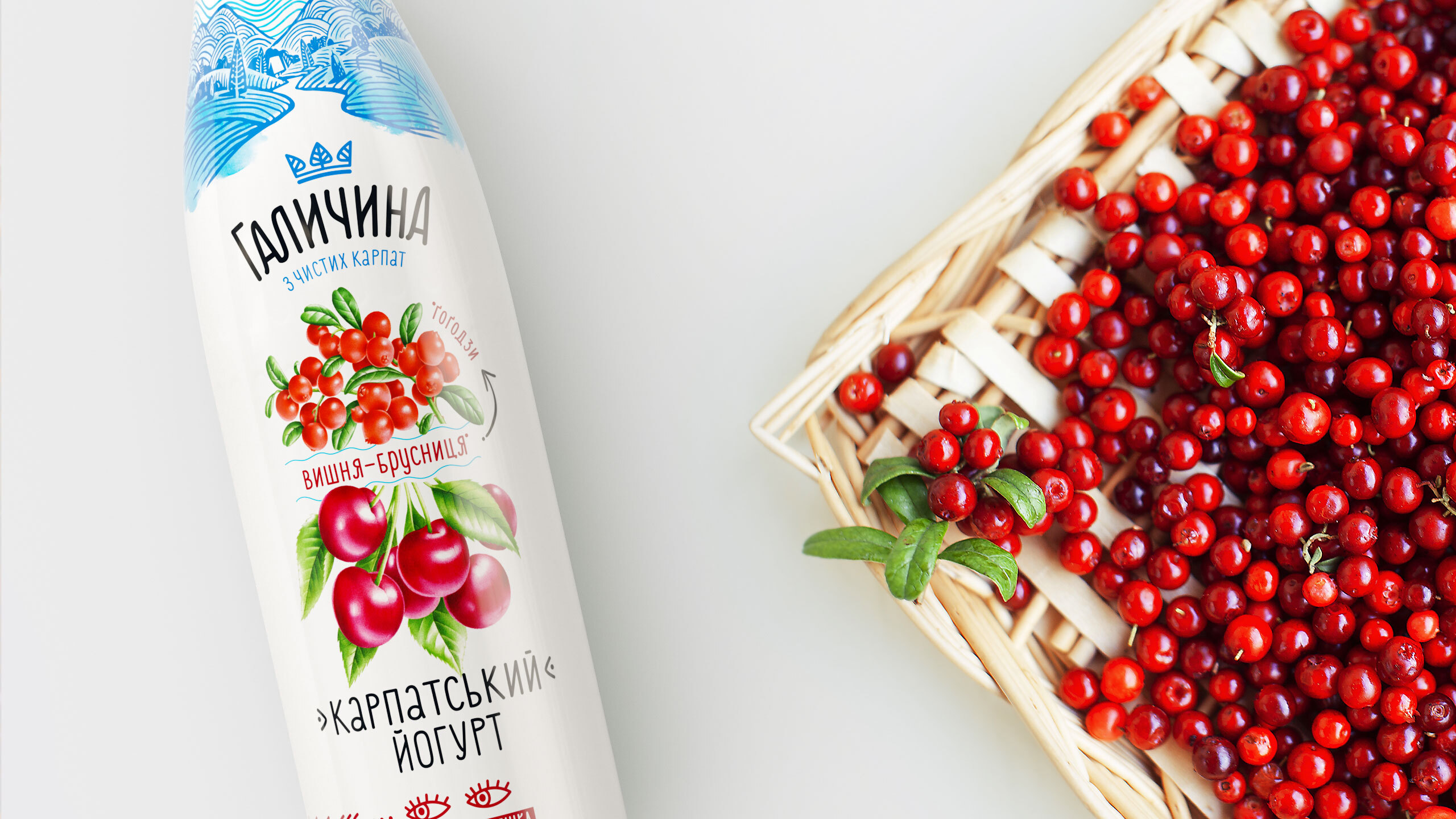
Kosytsias did not bloom, but bouquets of aromatic and juicy berries did as if they were just picked at a green Carpathian polonyna*. While creating a design, it was vital for us to keep a craft concept of Galychyna’s illustrative style and at the same time add something new to the approach to the new line. By having a well-balanced composition with the focus on a food zone and plant illustration skillfully created by Yevheniia Ivanova, we added a unique flavor and naturalness. Packaging has become more bright and artistic to make sure it complies with the Galician ethnics.
When we say “take a fresh look,” we exactly mean looking. We had to attract interest to a “Carpathian Thing.” The best option ever was to use a graphic image of the eyes. An eye stopper in all its glory. The eyes seem to be telling you how to move from the word on the front of the packaging to a legend on the back. Moreover, we can successfully digitalise and use this image for brand communication purposes.
Like a Kobita, the new product line by Galychyna came down from the pure Carpathians in a festive attire just before the summer to astonish its amazing fans.
CREDIT
- Agency/Creative: Dozen Agency
- Article Title: Dozen Agency Create Packaging Design for Galychyna Yogurt Brand
- Organisation/Entity: Agency
- Project Type: Packaging
- Project Status: Published
- Agency/Creative Country: Ukraine
- Agency/Creative City: Kyiv
- Market Region: Europe
- Project Deliverables: 3D Modelling, Illustration, Packaging Design
- Format: Bottle
- Substrate: Plastic
- Industry: Food/Beverage
- Keywords: Yougurt Kyiv Design Dozen Agency
-
Credits:
Illustrator: Evgeniya Ivanova
Art director: Elena Gavriluk


