Widya Widya – Apostrophe
“A fictional brand packaging design for tea.
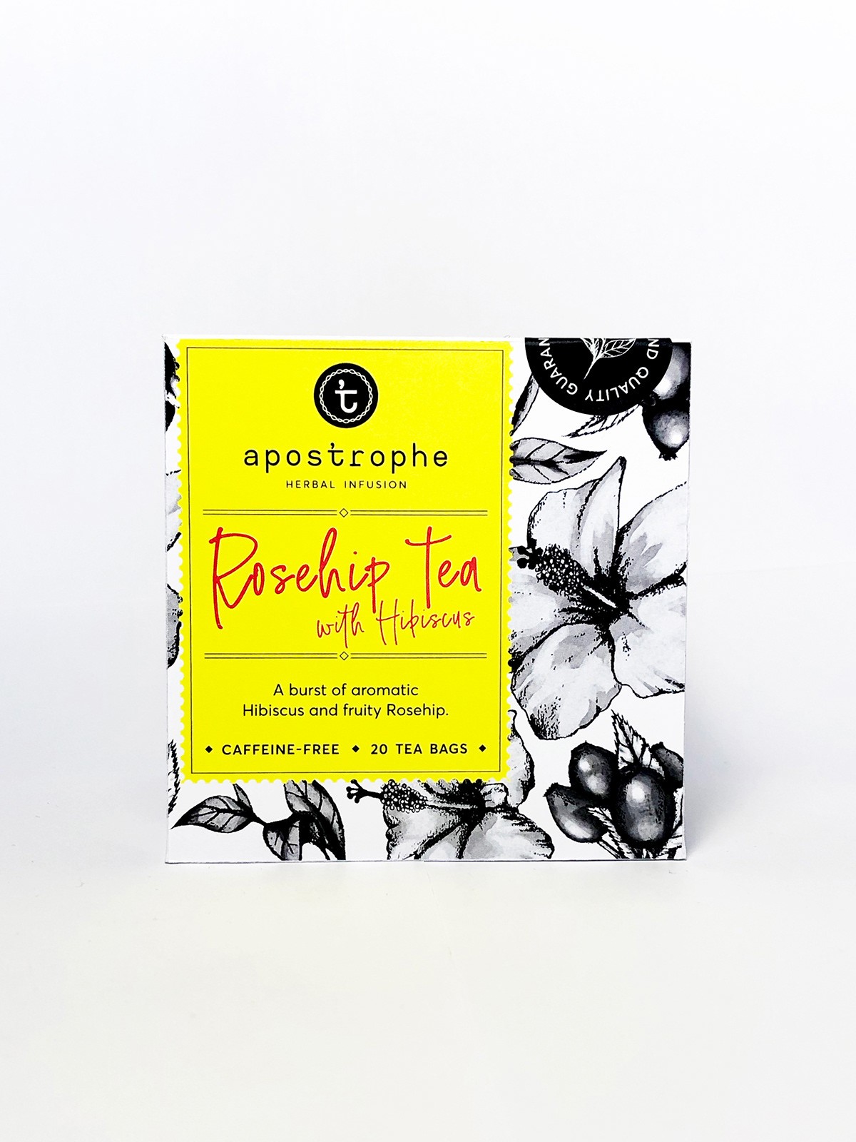
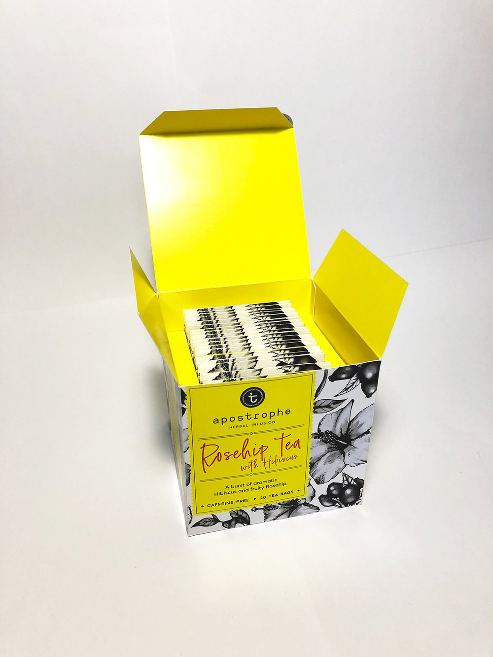
APOSTROPHE is a fictional tea brand created as an assignment for packaging design. Our task was to design a packaging for fast moving consumer goods, in this case; tea. The goal is to differentiate our products against the competitors when placed next to each other in supermarket shelves.
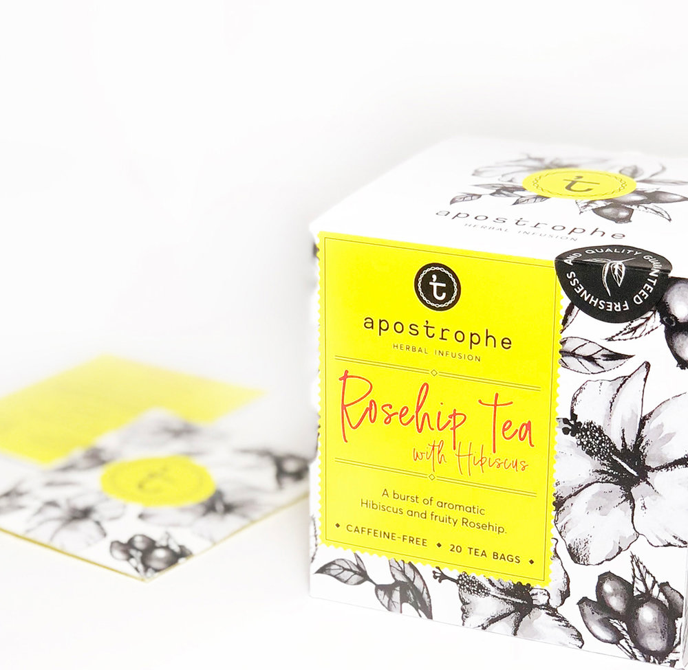
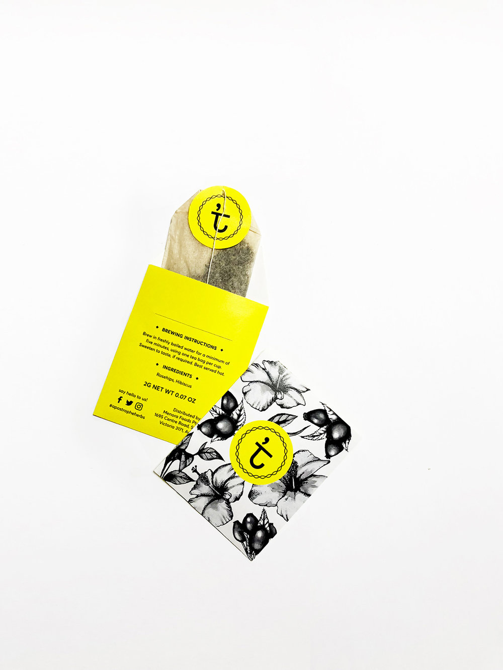
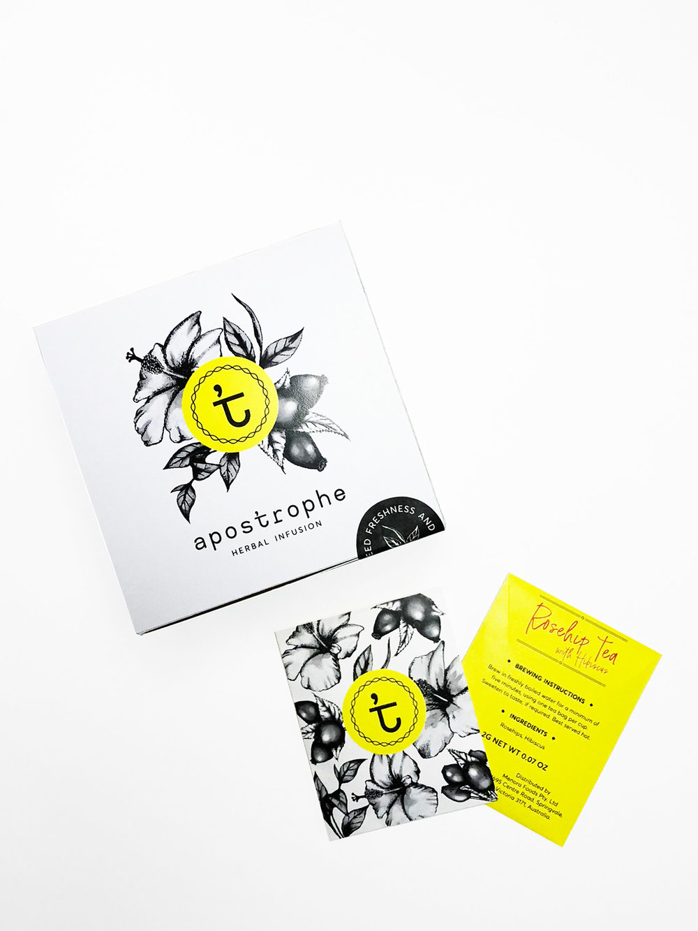
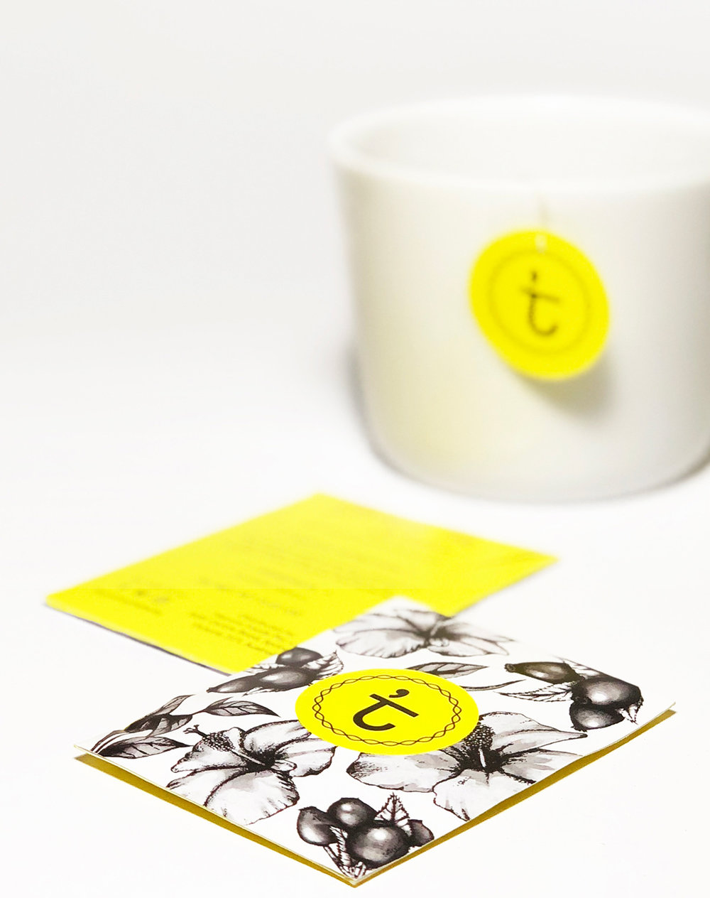
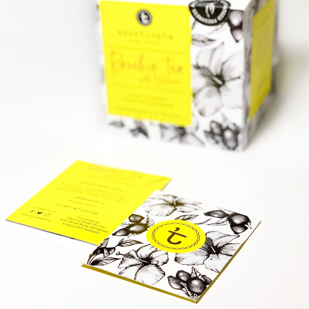
Through analyzing the different competitors, I noticed that all of the products were designed in full color. Hence, I decided to go with something different, I used black and white and spot yellow as the three colors for my brand identity. The different flavors of the tea then will be indicated through the background drawings and the color of the font. Overall, the color and design speaks out for the product itself; refreshing and energizing.
I’ve always found it quite irritating when you open a tea box and the bags were scattered everywhere! Therefore, I created the box to fit 20 tea bags perfectly so they would align neatly (isn’t it satisfying?!), besides this little detail will speaks about the brand!
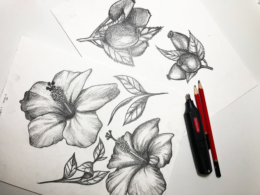
All the drawings were hand-drawn by me which I digitally manipulated and turn into patterns for the packaging background.”
CREDIT
- Agency/Creative: Widya Widya
- Article Title: Designers Concept for Tea Brand and Packaging Design
- Project Type: Packaging
- Agency/Creative Country: Australia
- Format: Bag, Box, Sachet
- Substrate: Pulp Carton, Pulp Paper


