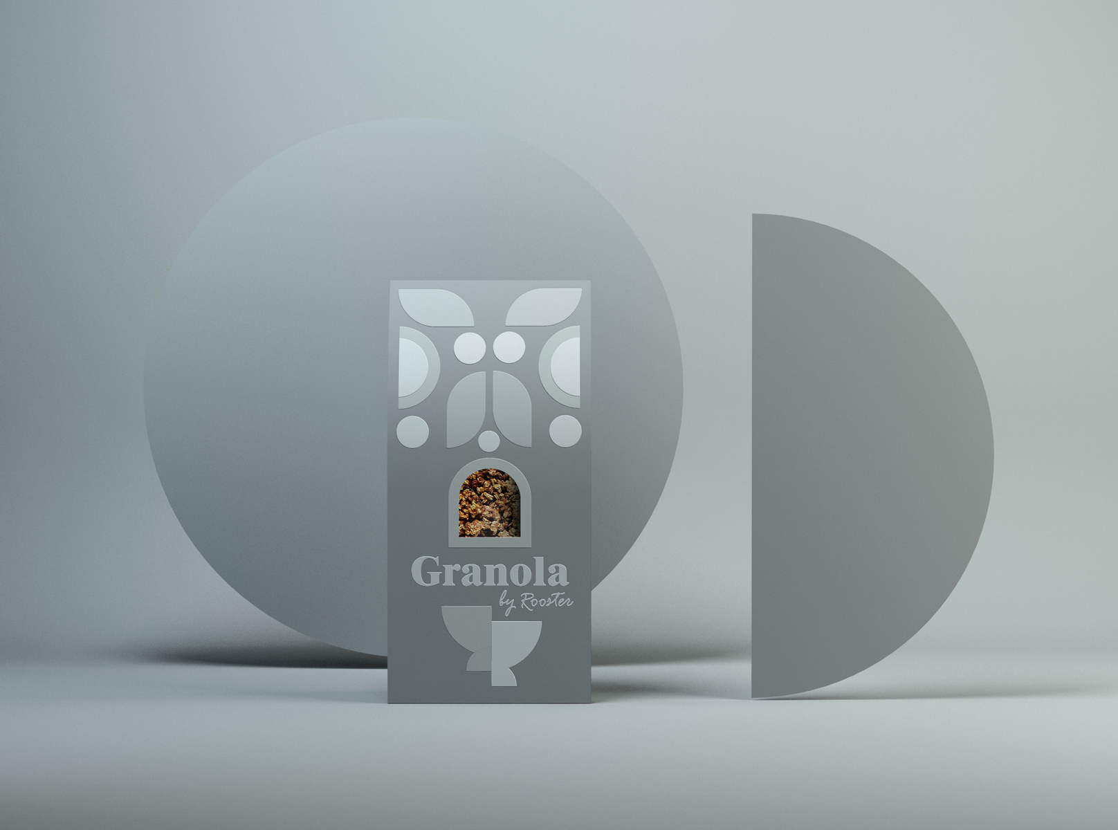
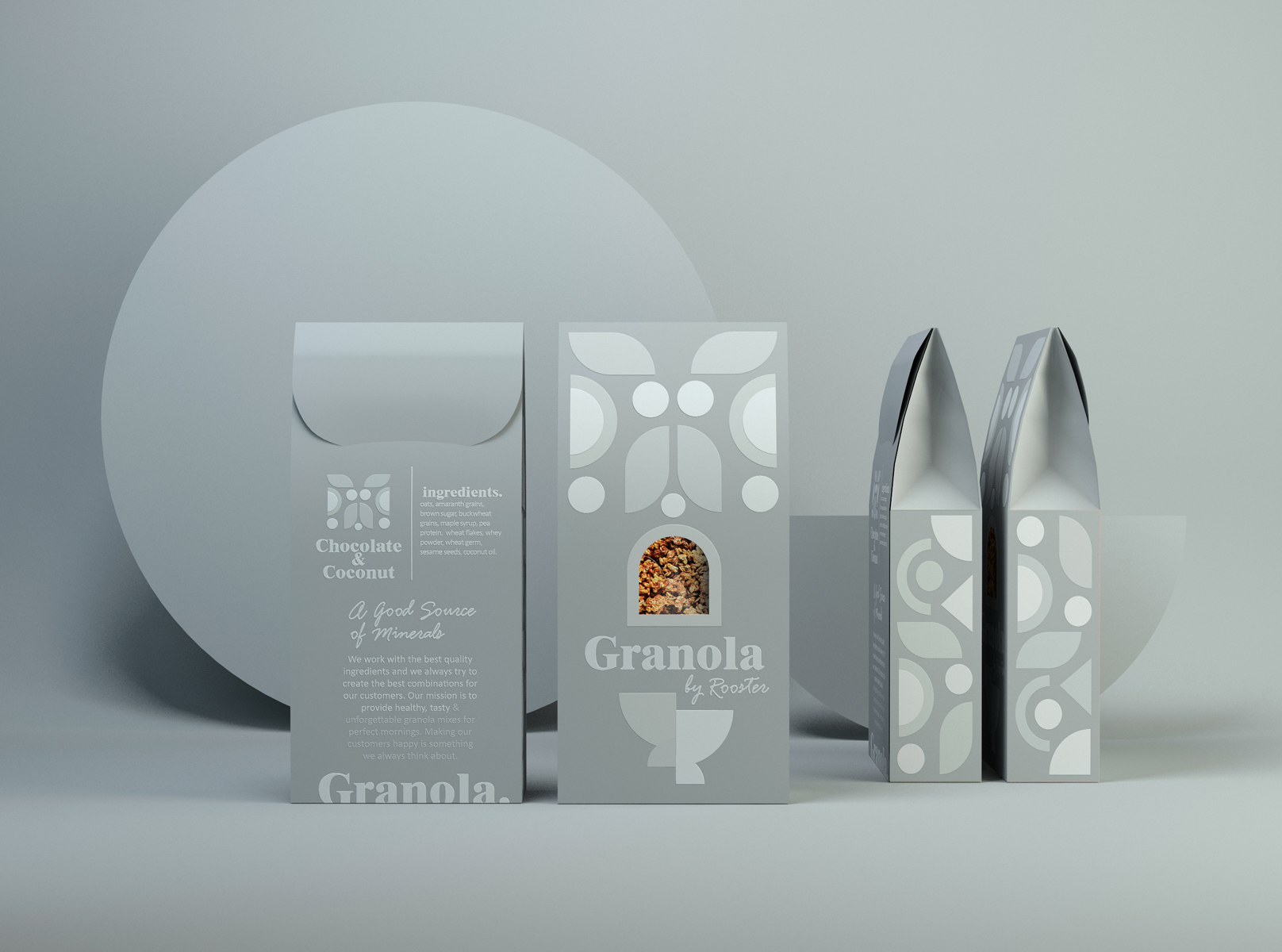
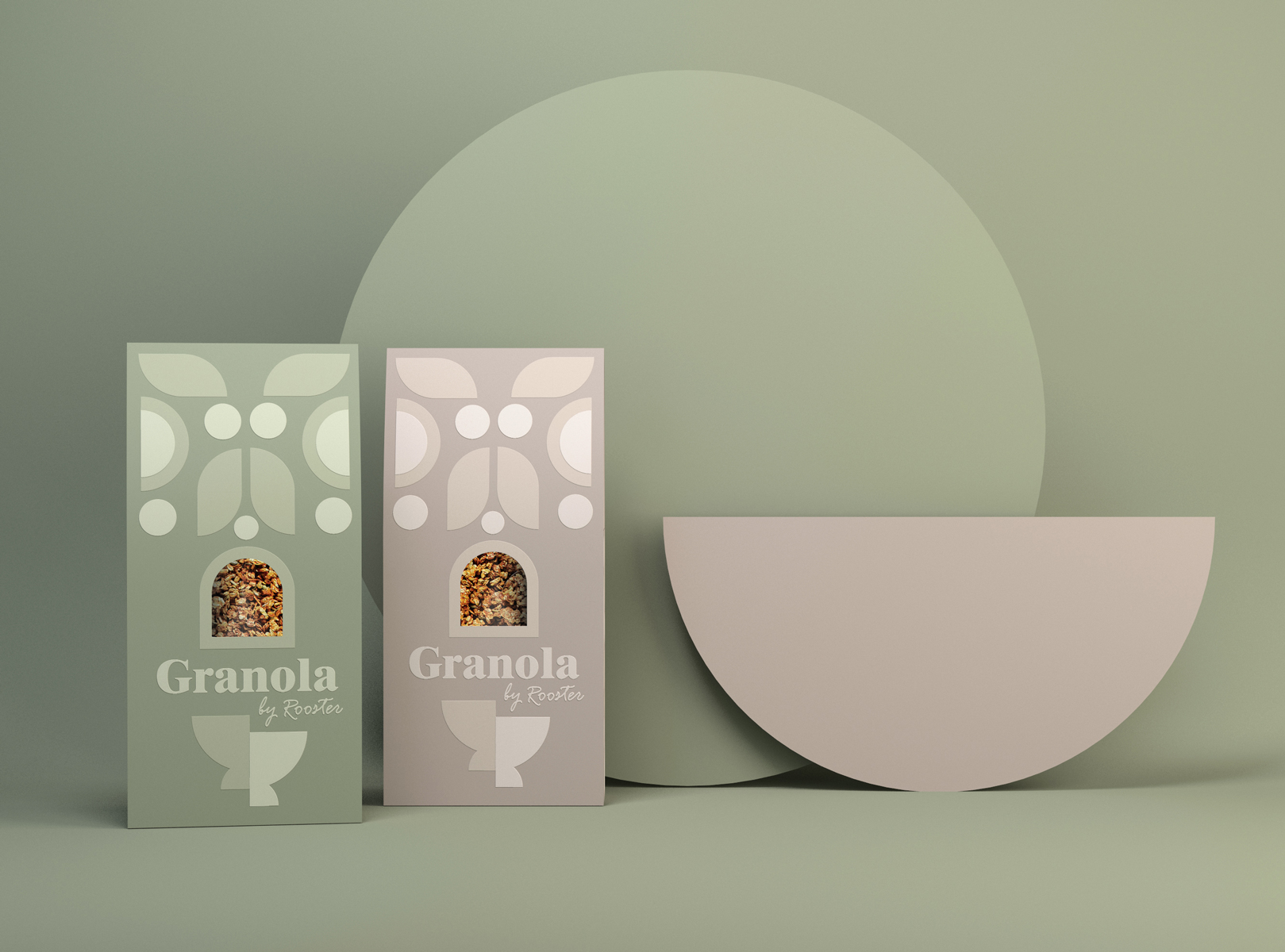
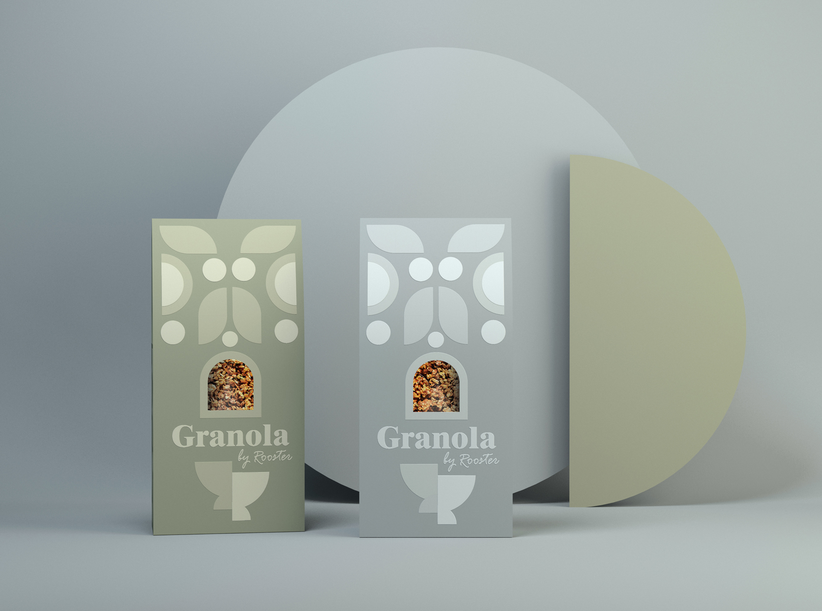
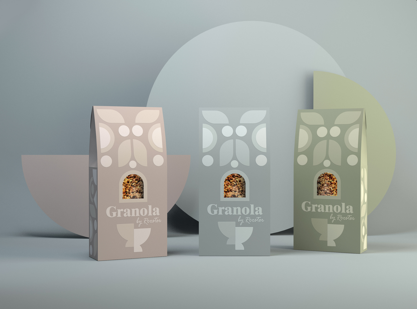
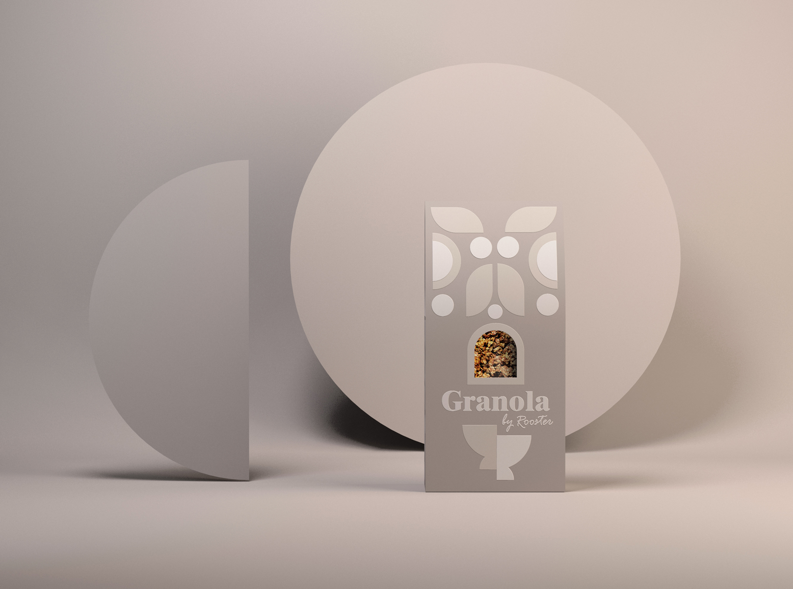
Our approach for the Granola packaging is all about a playful, modern crafted solution that visually speaks to the customer about peaceful, balanced mornings. The sophisticated & clean branding design of the Granola describes a high-quality product. In the existing cereals & granola breakfast busy market, the proposed cereal packaging aims to bring a disruptive insertion.
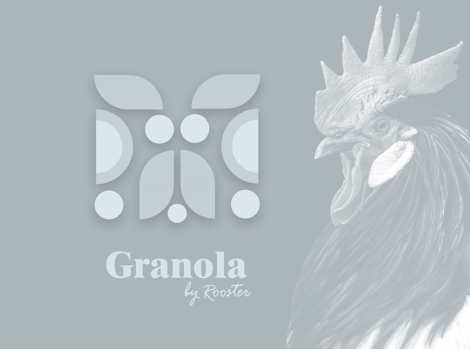
The name itself becomes a clear statement of the product and the best time when it should be consumed. When creating the name for this cereal packaging we also liked the playful letter similarity between Rooster and Roasted. The rooster symbolises happy mornings & new beginnings. In some cultures, the Rooster is even considered to be a symbol of good luck and prosperity.
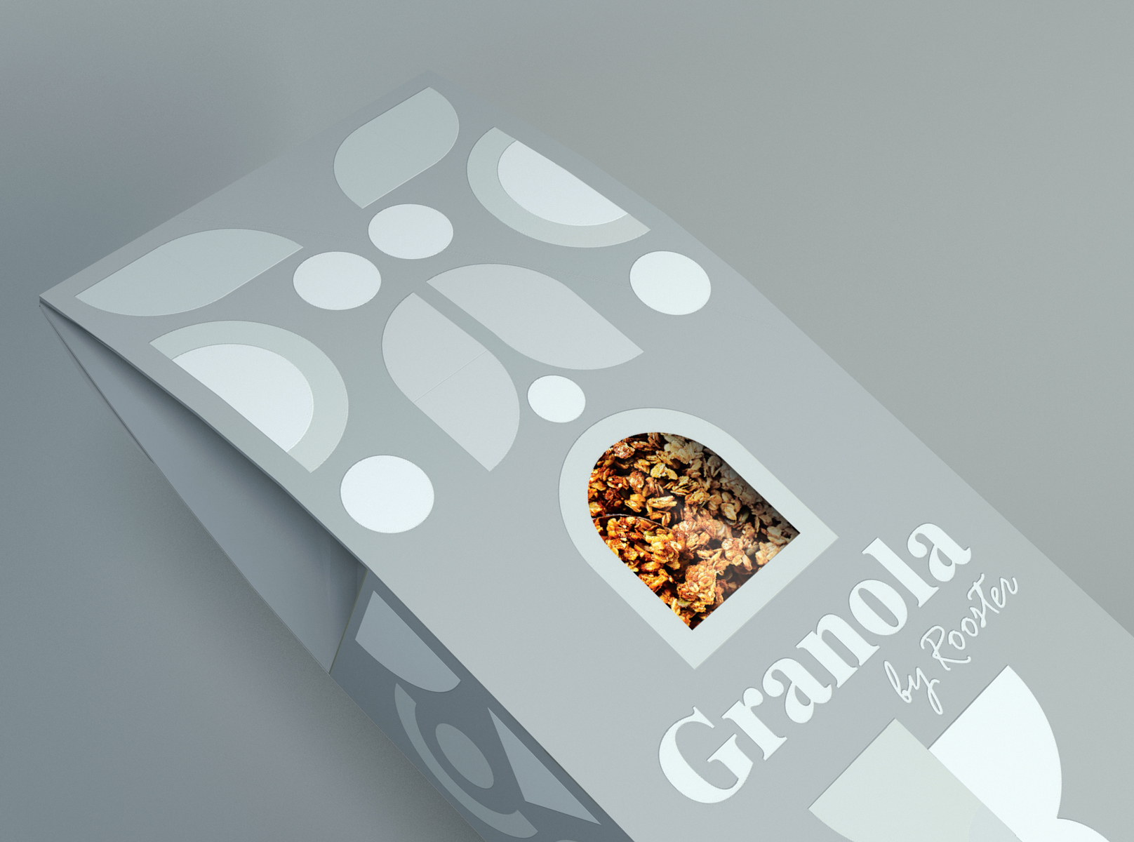
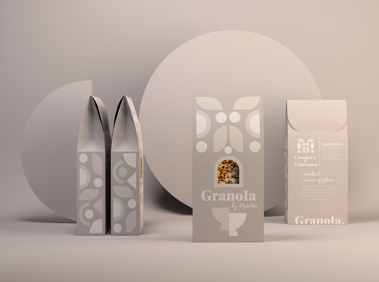
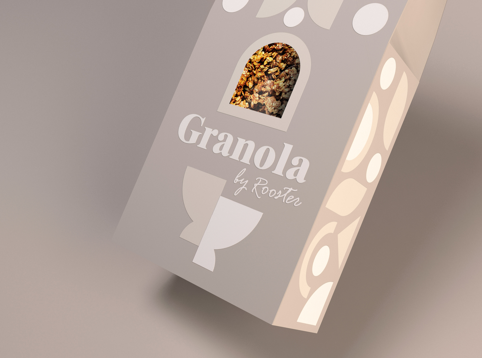
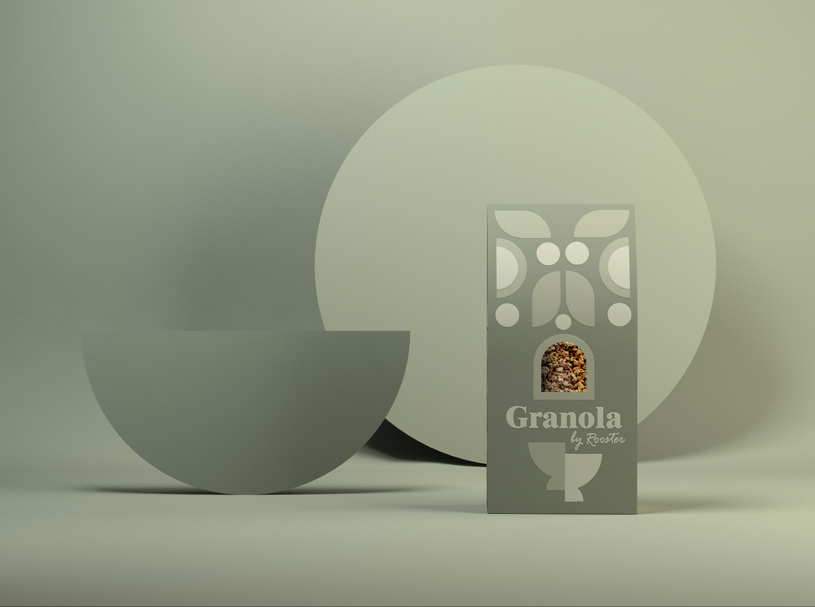
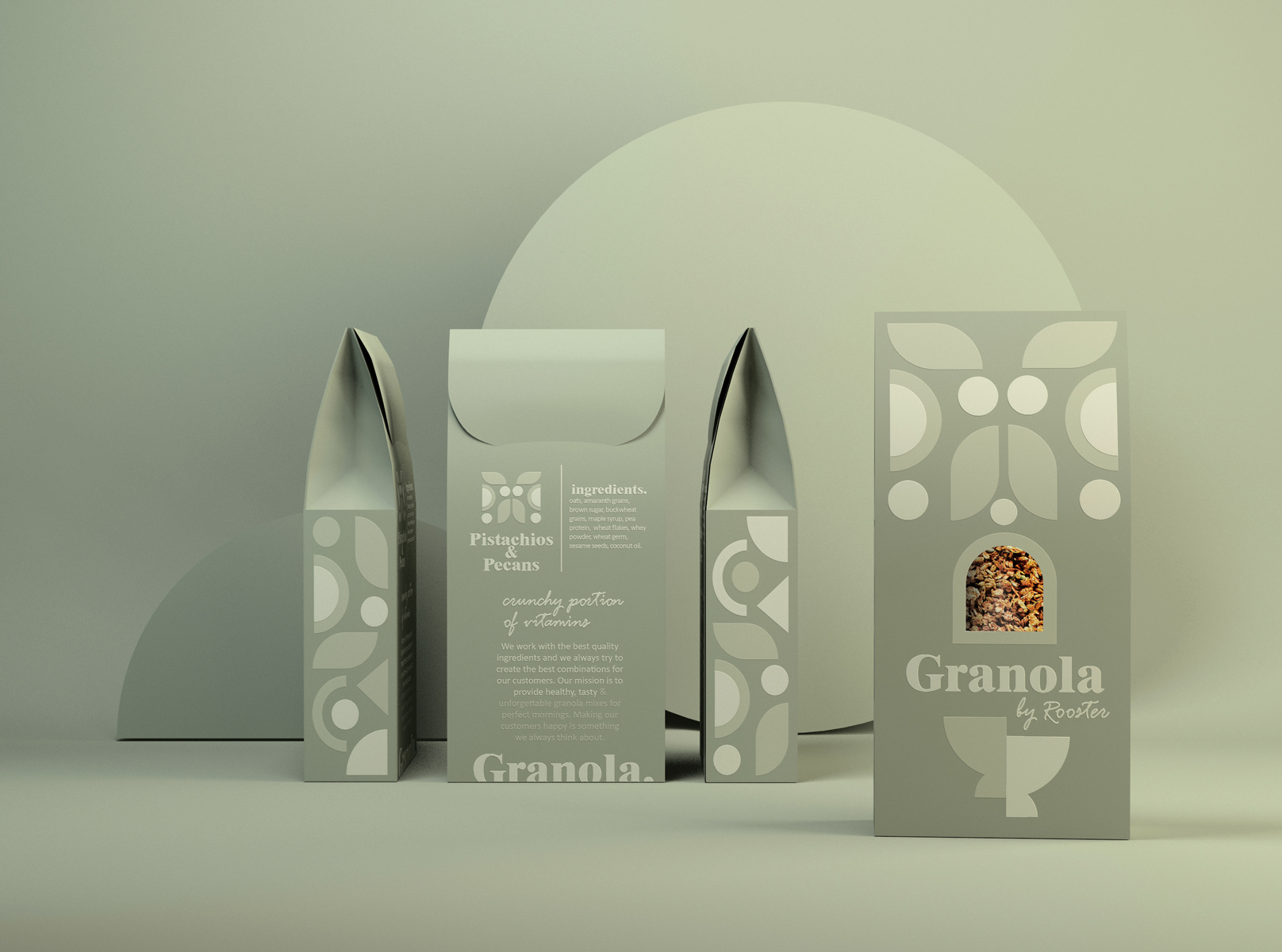
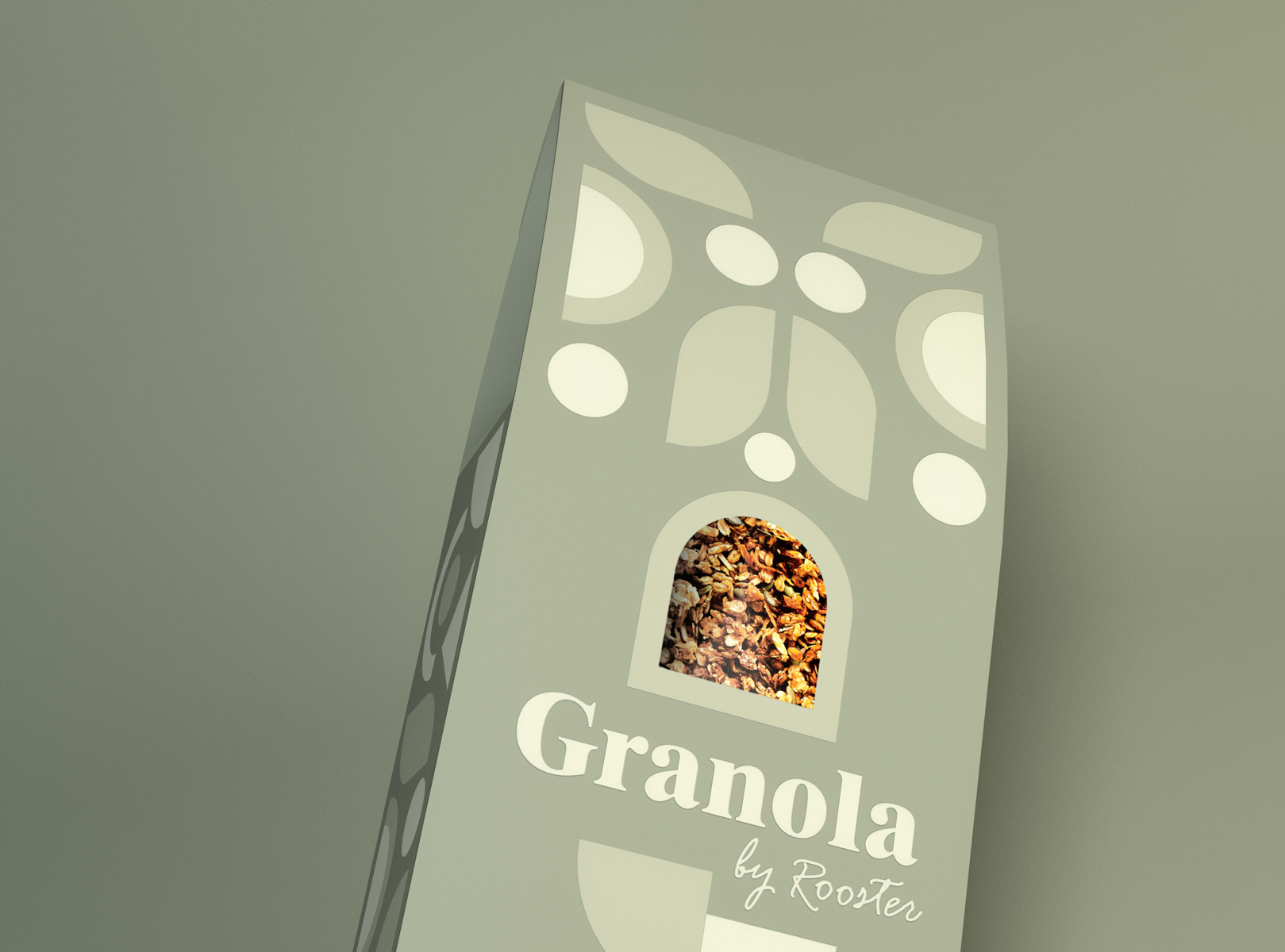
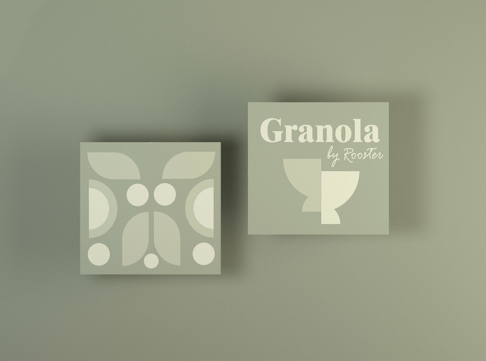
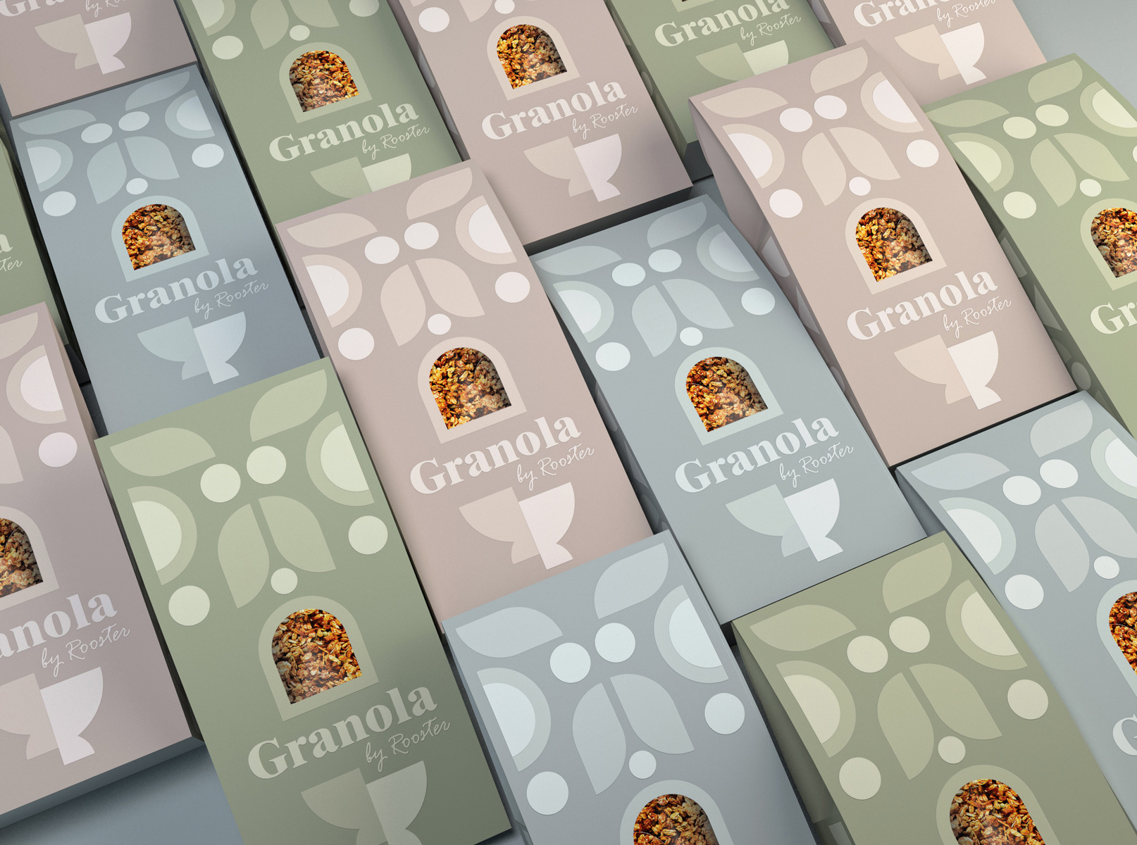
The range of slightly different colour moods embodied in this package adds a premium feel to the composition. The branding design is using a contemporary earthy colour pallet that is both fun & engaging with a touch of refinement. Granola is a product mostly dedicated to a feminine audience, however, the proposed cereal packaging keeps a slightly neutral visual style. The minimalist aesthetic of earthly tones achieves coherence and harmony in this Granola packaging. The modern image of the Rooster is composed using a fun display of geometric shapes. A related geometric pattern was created for both the right & left sides of the Granola packaging. The idea of the branding design was to stimulate the customer’s mind while bringing a little bit of joy and creativity by using this playful geometric game that creates different illustrative elements. The bold & more feminine typography adds an elegant note to the composition. Easily adapted to different flavours, the Granola packaging brings a clean design solution that reflects the high-quality product inside. A rounded window lets the customer have a pick inside. The Roasted, tasty Granola becomes the focal point of the composition. On the back of the packaging, the customer can find the nutritional benefits of Granola. The delicate embossed elements on the cereal packaging, are creating an engaging and pleasant retail experience. Like a tactile invitation, the customers are curious to smell and taste the product inside.
CREDIT
- Agency/Creative: creativebydefinition
- Article Title: Design Studio CreativeByDefinition Creates New Packaging for Granola by Rooster
- Organisation/Entity: Agency, Non Published Concept Design
- Project Type: Packaging
- Project Status: Published
- Agency/Creative Country: Romania
- Market Region: Global
- Project Deliverables: Branding, Packaging Design, Product Naming, Tone of Voice
- Format: Box
- Substrate: Pulp Board


