Dietary supplements have entered the mainstream, but are far too often used in a one-dimensional way. The startup Fevana has launched a product with the aim of optimally supporting the female body with the most important nutrients in all four phases of her menstrual cycle and balancing her hormones in a natural way. It combines the latest findings from dermatology, gynecology, orthomolecular medicine, galenics and naturopathy. The resulting product contains pure and exclusively natural ingredients that are coordinated to enhance their effects. Dominika Dobrzalski designed the overall appearance for the young startup.
Charlotte and Anton, the founders of the start-up Fevana, were still in the middle of the product development phase when they commissioned Dominika to develop their brand identity and packaging design from scratch in order to give the high-quality product a suitable face.
Before the actual concept for the brand identity, Dominika carried out a competition analysis and carried out a brand workshop together with the customer in order to position the brand in the best possible way, identify gaps in the market and act in a customer-oriented manner. On this basis, the brand was strategically positioned on the threshold of the medical sector and is aimed at an exclusive, female target group. With this positioning and the high standards of the product and its natural and pure ingredients, a brand identity and packaging design were developed.
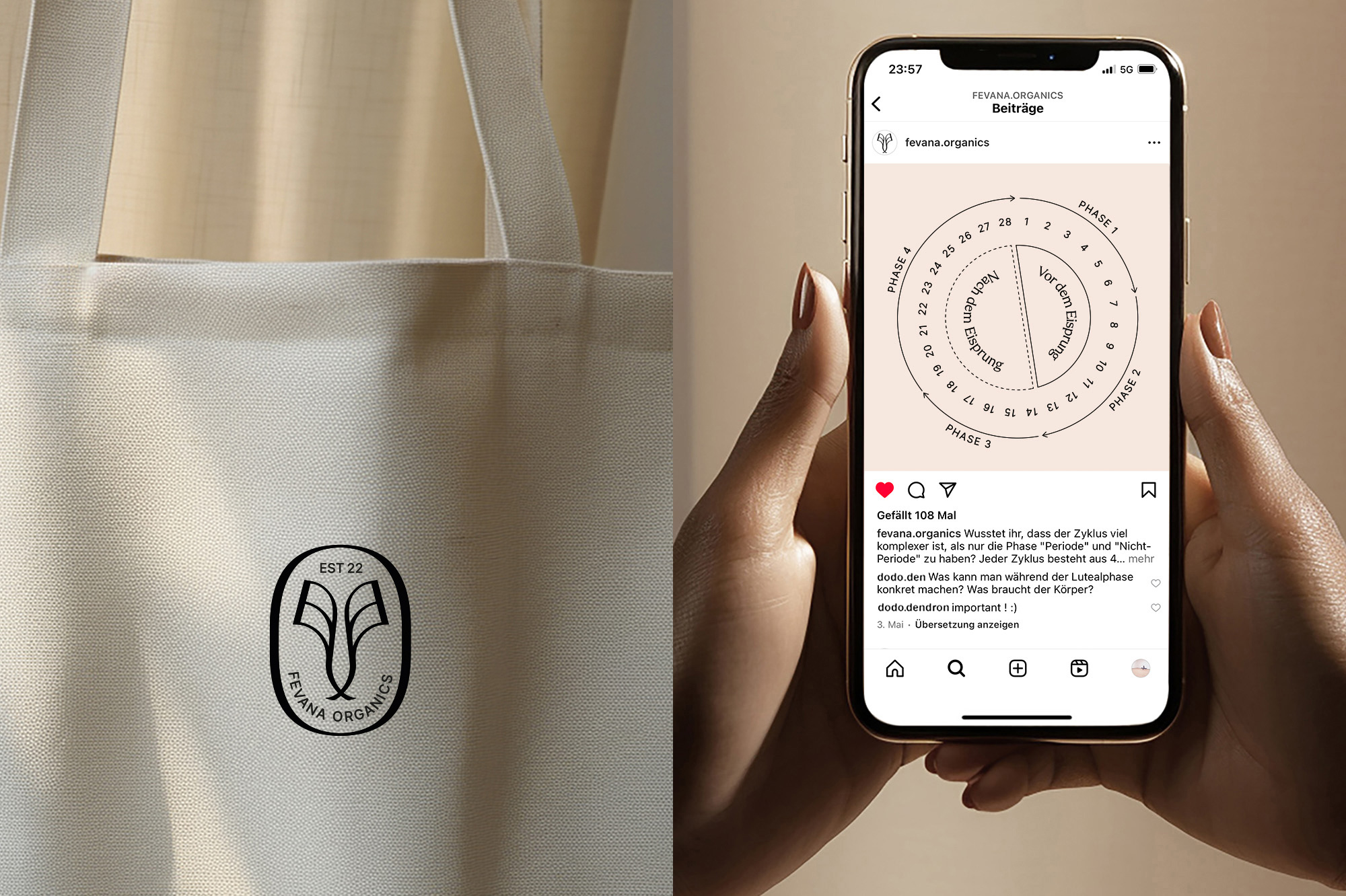
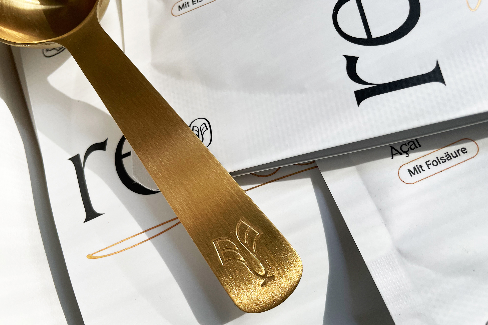
A visual mark was developed for the logo design of the New-to-World brand that reflects the brand’s closeness to nature and femininity. In a protective, oval shape, two stylized leaves stand in balance with each other and unfold outwards. With their different line widths, they adapt to the wordmark, which is set in stable serifs – the confident counterpoint that points to the rational and scientific basis of Fevana.
The striking, self-confident use of the distinctive serif font as a headline font significantly shapes the brand’s corporate identity. With its concave serifs, it is both sophisticated and scientific – at the same time, it complements the brand’s rational and high-quality approach.
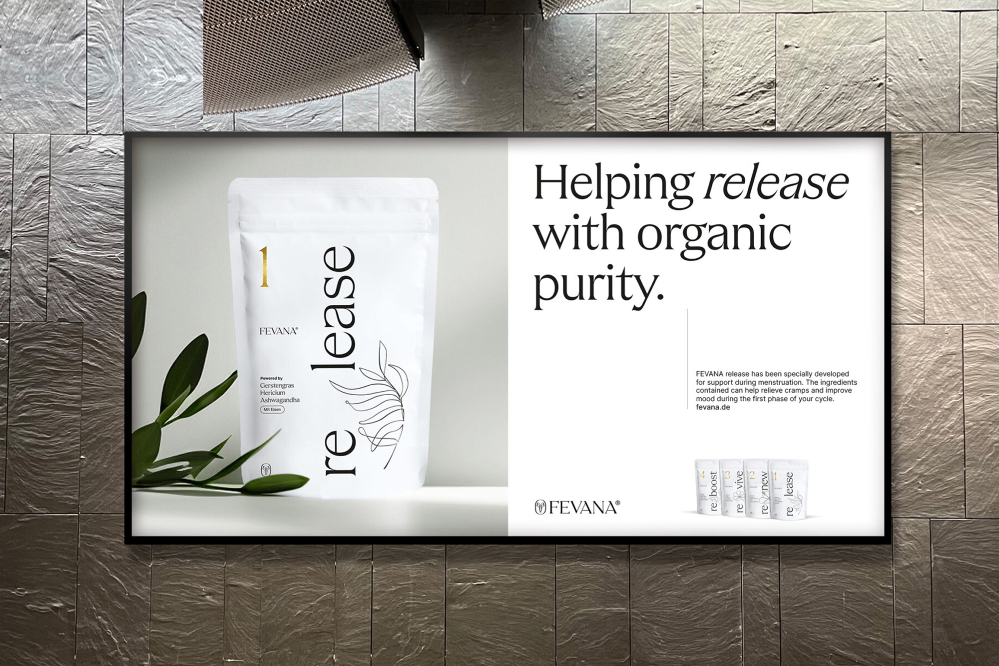
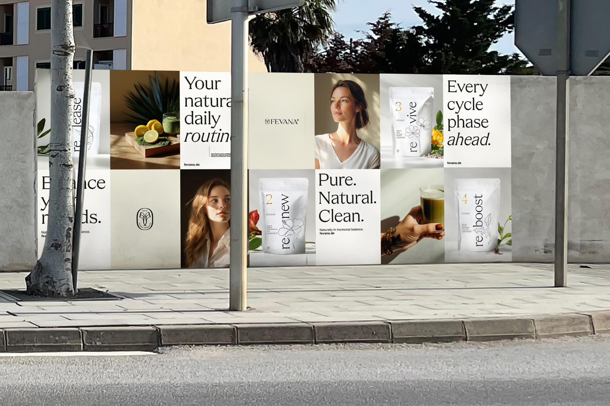
The generous use of white – the carrier surface of the typography – is intended to give the brand clarity and elegance and visually represent the pure, unadulterated nature of the brand and the product.
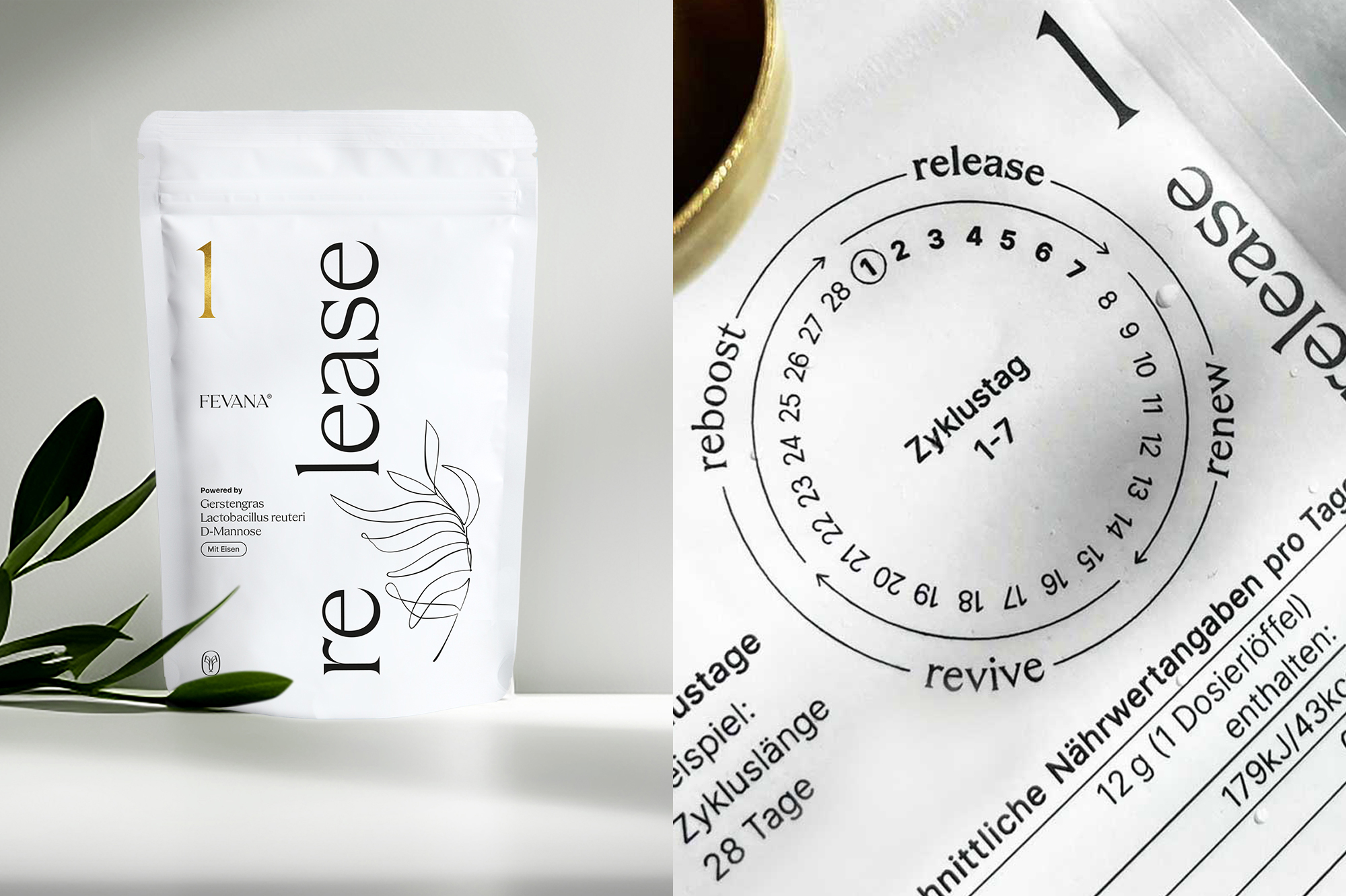
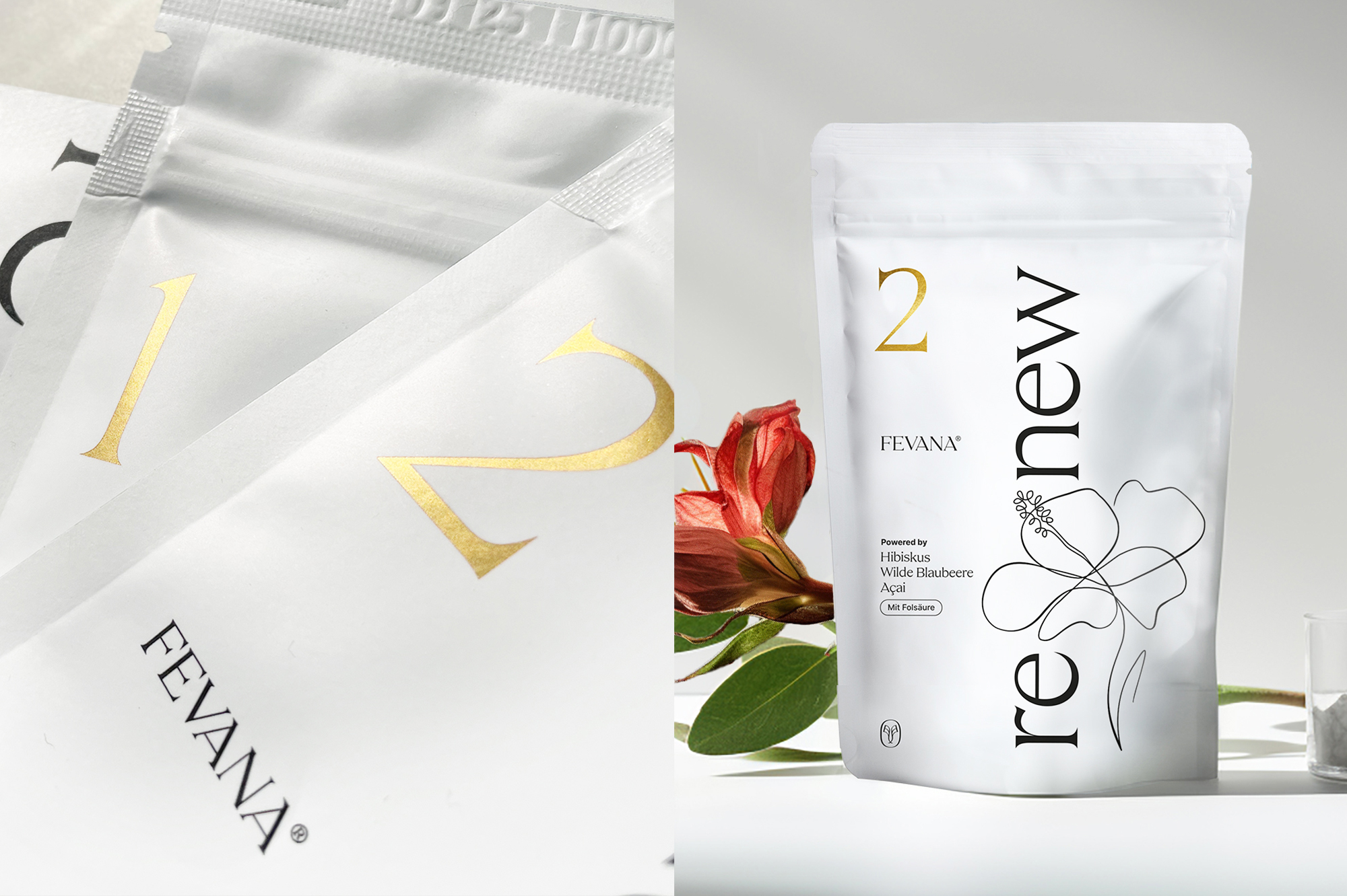
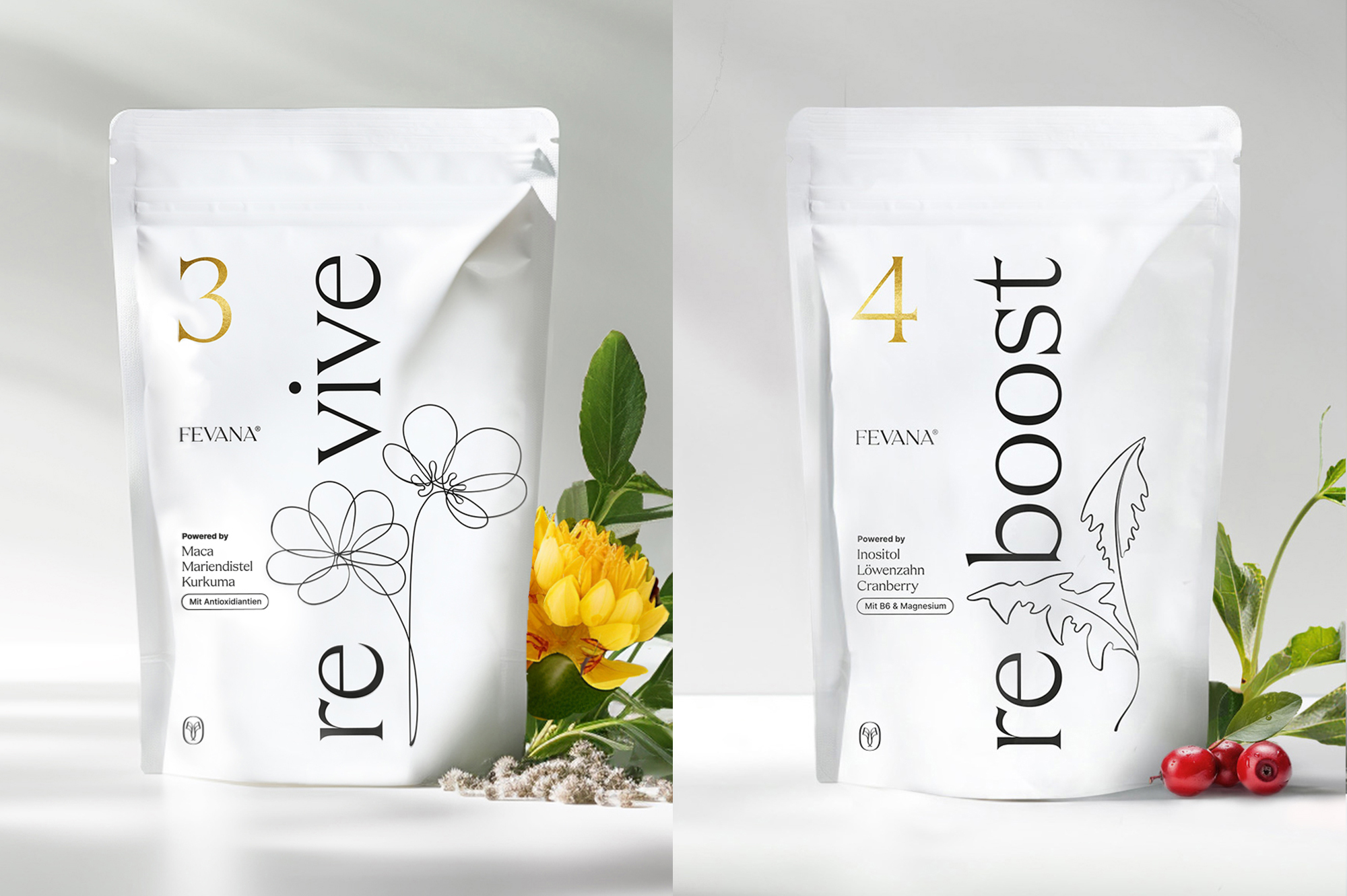
The packaging design is also kept in pure white and black, with a clear, minimalist design language in which a striking use of the elegant corporate font focuses on the naming of the four products, complemented by curved line illustrations and small gold details.
The illustration style was developed together with the client, who contributed a variety of single-line drawings of the plant world. The sweeping lines with subtle differences in line thickness break up the product names on the packaging designs. The resulting break within the hyphenation highlights the syllable “re”, which appears in each product name of the four carefully coordinated nutritional supplements and refers to the recurrence and predictability of the menstrual cycle, which in turn is the product’s focus.
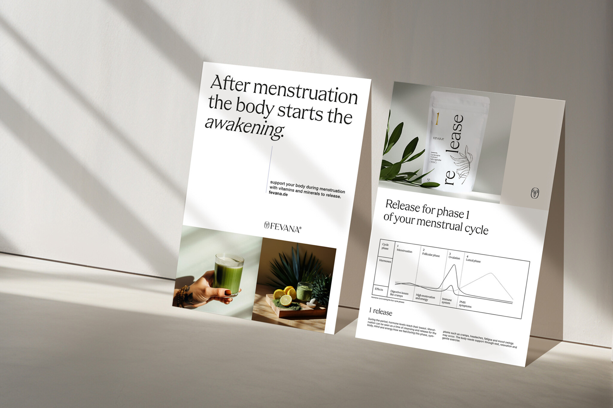
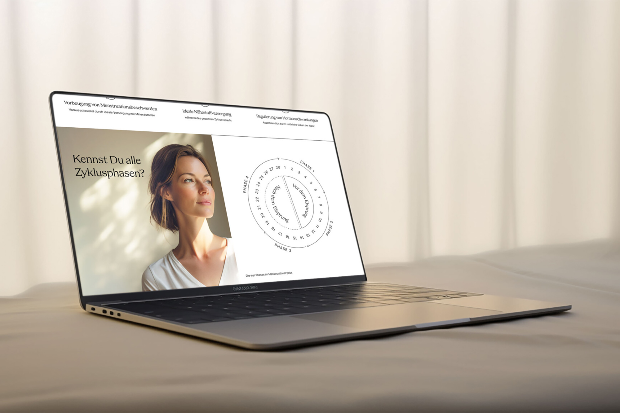
The website and social media infographics are designed to be rational and informative. The focus here is on the competent transfer of knowledge; Fevana takes its target group and the topic very seriously; the storytelling places emphasis and shows sincerity.
The pictures also fill their space here. In addition to the curved shapes in the illustrations and the fine typography, the warm, light-filled imagery breathes warmth into the brand.
CREDIT
- Agency/Creative: Dominika Dobrzalski
- Article Title: Cyclical Supplementation in a Minimalist Design: Branding and Packaging Design for Fevana by Dominika.studio
- Organisation/Entity: Freelance
- Project Type: Packaging
- Project Status: Published
- Agency/Creative Country: Germany
- Agency/Creative City: Hamburg
- Market Region: Europe
- Project Deliverables: Brand Design, Brand Guidelines, Brand Identity, Brand Strategy, Identity System, Illustration, Logo Design, Packaging Design, Web Design
- Format: Pouch
- Industry: Health Care
- Keywords: WBDS Agency Design Awards 2024/25 , Packaging Design, Natural Supplement, female healthcare, Periods, Black&White. , WBDS Creative Design Awards 2024/25
-
Credits:
Creative Direction & Brand Design: Dominika Dobrzalski


