Santa Maria is renowned across Europe for its spices and seasonings – exploring tastes and flavours from around the world. To take advantage of commercial opportunities across the Nordics and Europe, the brand wanted to break into, and disrupt, the well-established, and somewhat dormant, snacking category.
Initially launching with a core range of savoury products on which to build its snacking NPD innovation platform, Brandon’s role was to leverage Santa Maria’s brand equity and shake up the category, bringing excitement and amplified flavour, thereby creating a new growth platform for the business.
Santa Maria is renowned as being the taste and flavour expert, it created Sweden’s Tex-Mex ‘Taco Friday’ cultural phenomenon and so wanted to leverage its unique expertise into snacking.
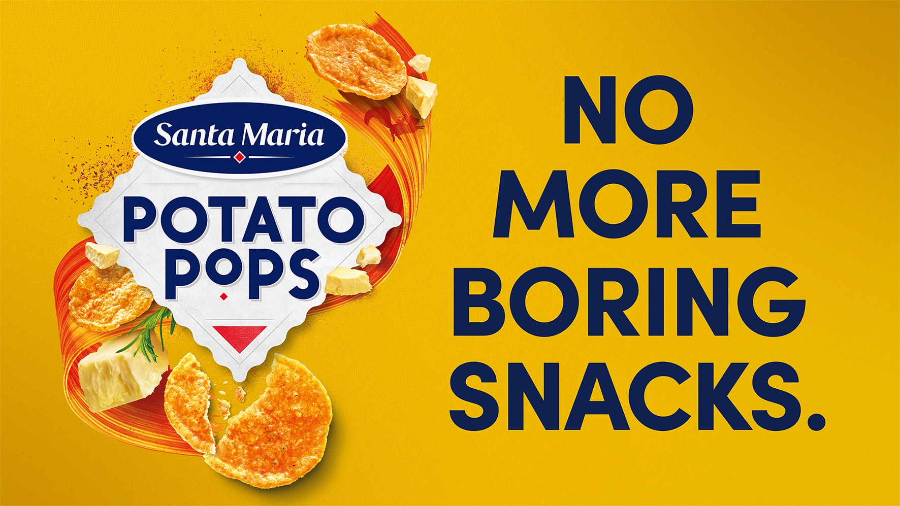
‘Snacks out of this world’ brings together this unique strength with a hint of playfulness to stand out, while also providing limitless opportunities for further NPD growth.
“We travel far and wide to bring you the most colourful, rich and exciting snacks: Say hello to Santa Maria Pops! Made from potato or lentils that are popped in hot air and pressed to thin and crispy chips instead of fried in oil. Generously seasoned and available in a range of different flavours for 100% great taste, but with 60% less fat”
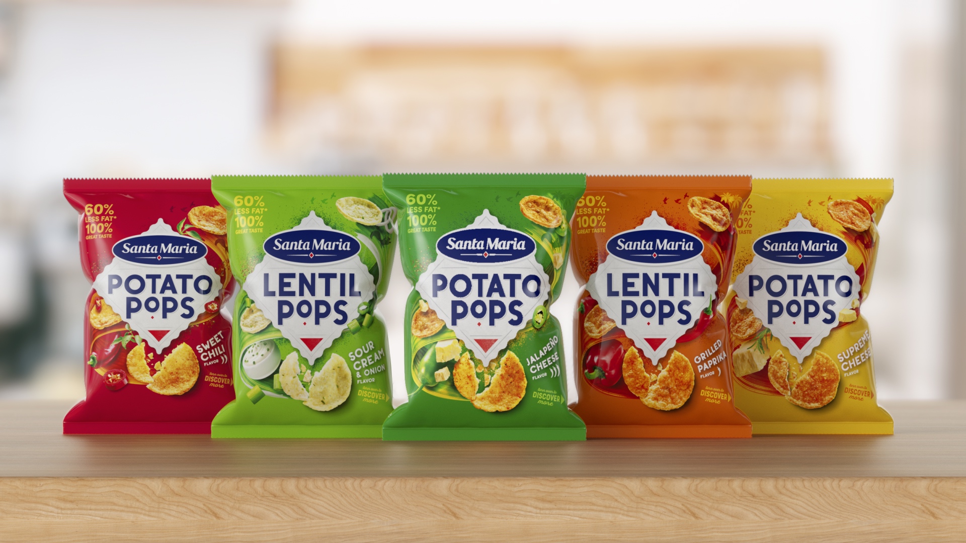
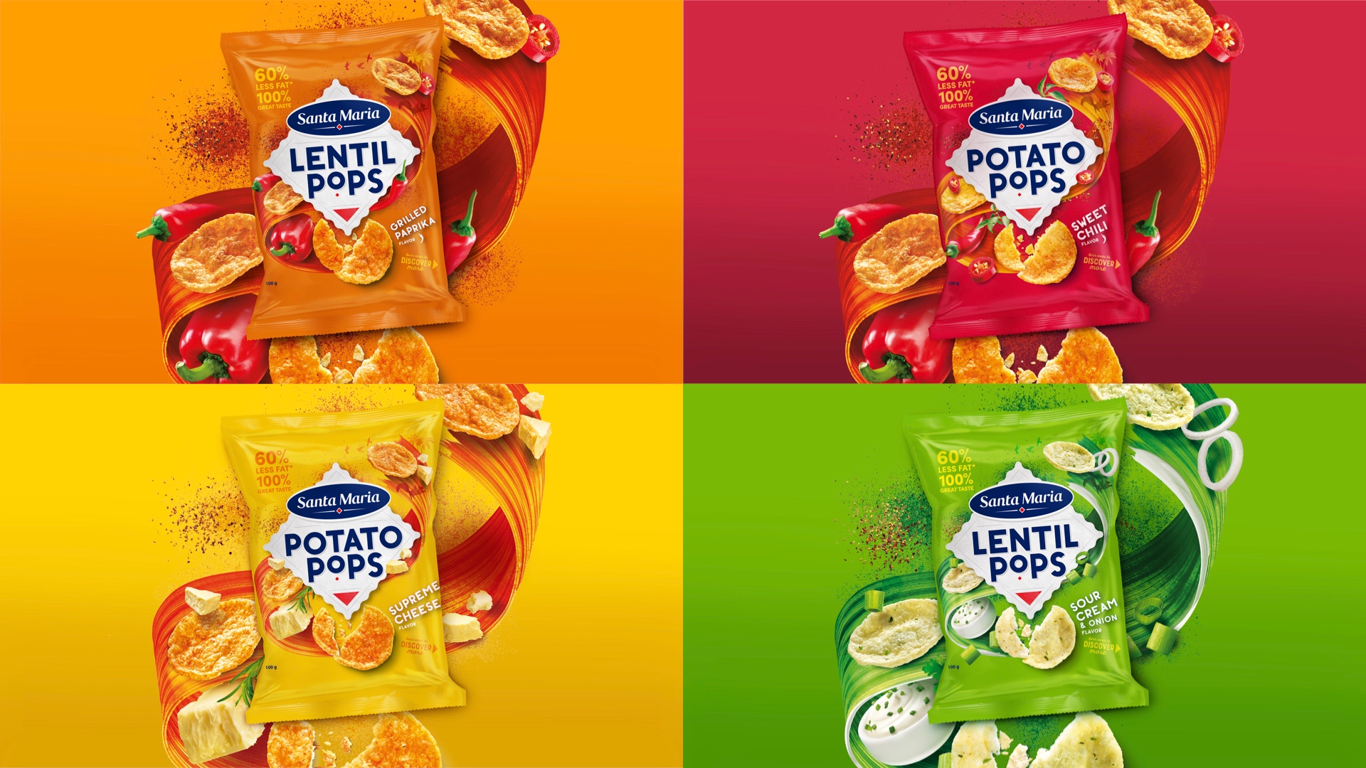
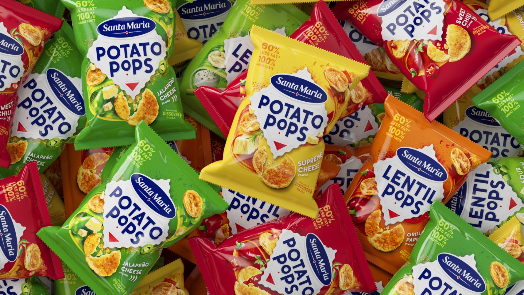
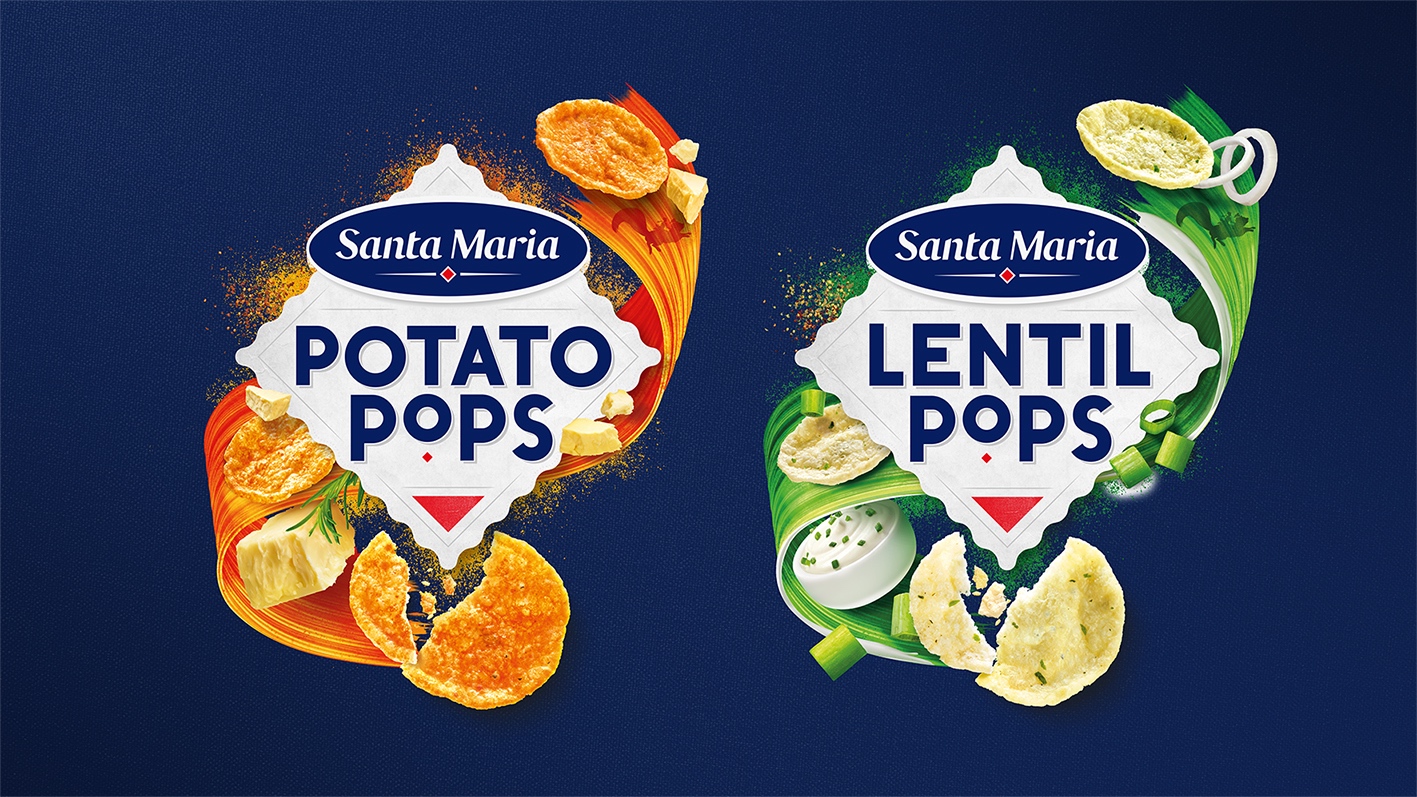
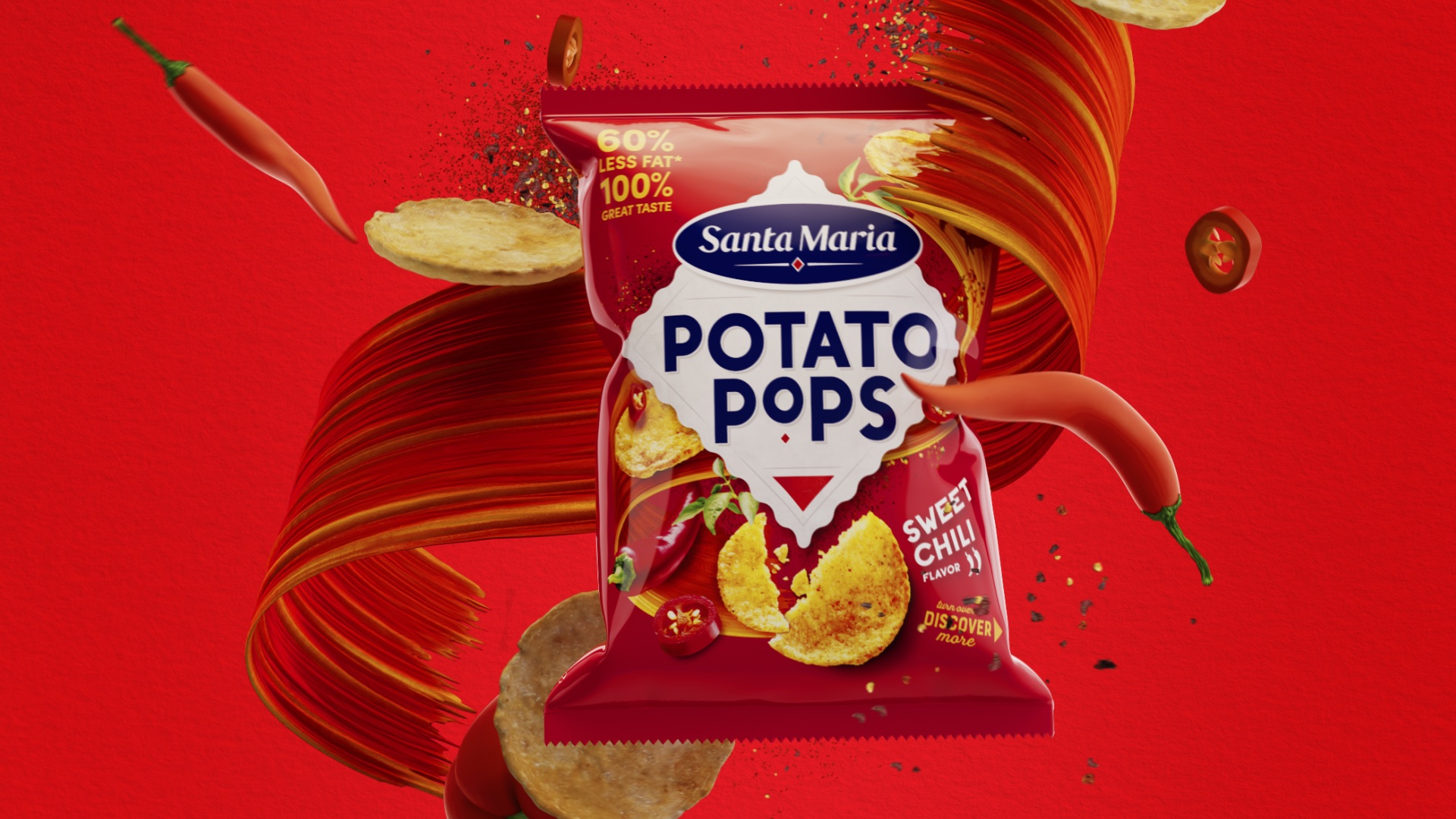
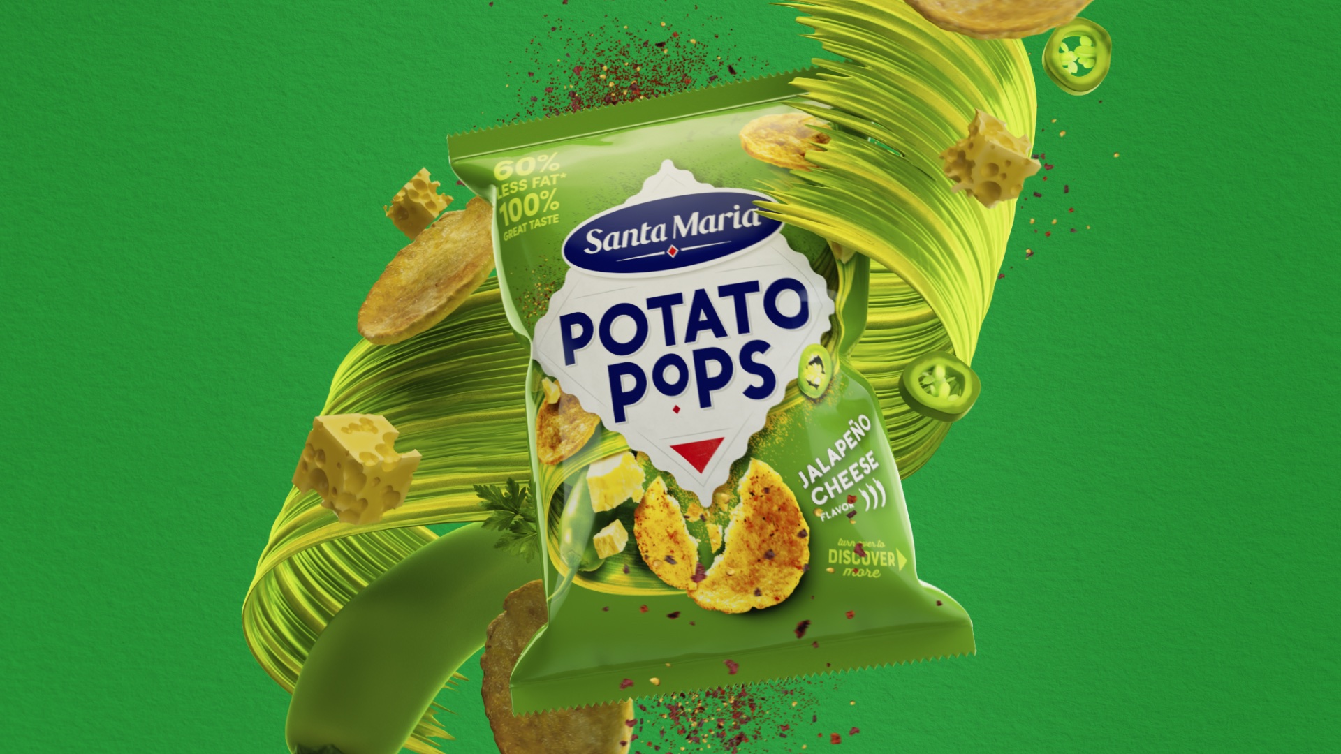
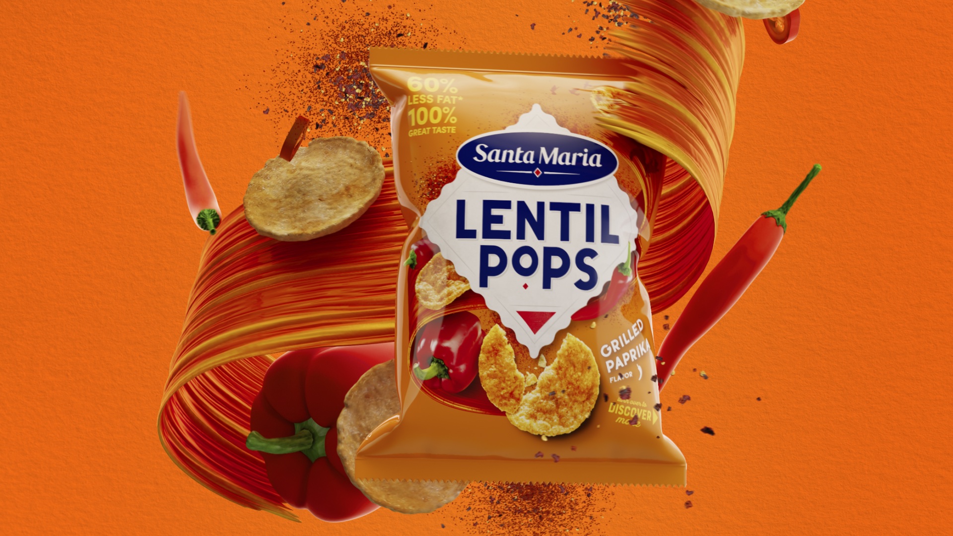
Visually, the design centres on the four corners of the world diamond born from the brand’s logotype. This is then coupled with the flavour vortex taking you on a taste adventure. Whether it’s North, East, South or West, Santa Maria brings you exciting flavours from around the world: Flaming Jalapeno Cheese, Spicy Chilli Paprika, Dreamy Sour Cream & Onion, Fiery Sweet Chilli and Supreme Cheese. Taste fusions that tickle make your tastebuds dance, from Mexico to Mumbai.
The white diamond portal provides the brand and product standout, with the flavour vortex and flavour colour make it easy to find brand, product and flavour that suits individual snacking tastes.
CREDIT
- Agency/Creative: Brandon
- Article Title: Crispy Colorful and Vibrant Packaging Design for Santa Maria Pops
- Organisation/Entity: Agency
- Project Type: Packaging
- Project Status: Published
- Agency/Creative Country: United Kingdom
- Agency/Creative City: Manchester
- Market Region: Europe
- Project Deliverables: Branding, Design, Identity System, Packaging Design, Retail Design
- Format: Bag
- Industry: Food/Beverage
- Keywords: WBDS Agency Design Awards 2023/24
- Keywords: Packaging Design, Product Extension
-
Credits:
Design Agency: Brandon
Creative Director: Jonathan Rogers
Design Director: Joe Bembridge
Senior Designer: Joe Wise
Account Director: Beth Johnson
Visualisation and Motion Design: Stu Humphrey
Design Director: Katie Rowley
Creative Director: Ian Watts
Client Partner: Kate Zilio


