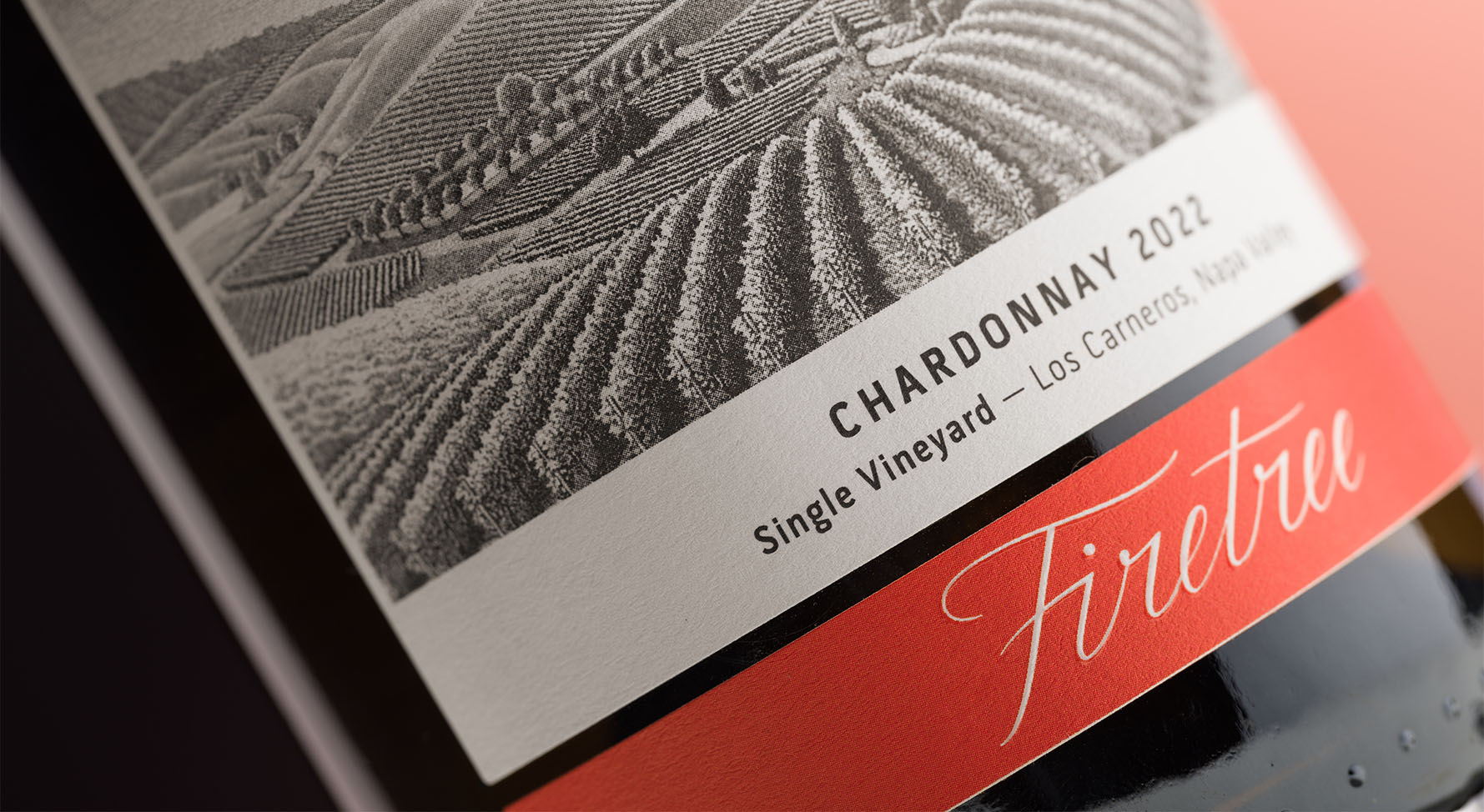
For Firetree, a new winemaker out of Napa, DAf crafted a brand identity, crafted a tagline, made a logo with bespoke lettering and designed packaging for two different Chardonnay wines, each with a different target audience.
The Jimenez family fell in love with the idea of owning a vineyard and making wine, and when they found the perfect spot in Napa they knew it was time to make the dream reality. They called on DAf to help develop a brand identity for their new venture, including storytelling, logos and brand guidelines, and to design the packaging for its first two wines, from illustrations to copy.
DAf got to know the client in order to craft a brand identity rooted in their personal story as well as the location they chose for their vineyard. This strong foundation allowed us to develop the tagline, create storytelling and write copy for the wine labels as well as designing visuals from the logo itself to the brand guidelines.
We took inspiration from the Jimenez family to create the tagline Fidem et futurum, faith and future. We used Latin as a nod to Catholicism, which is important to the family, and played with the dual meaning of faith as both religion and trust, in this case trust that their dream of the perfect Napa Valley vineyard would materialize. The word future refers to the future that is to come with this new project, not only for the current family but also as a legacy for future generations. The storytelling is related to the vineyard itself, sharing the sensation of its Los Carneros location as well as what it represents.
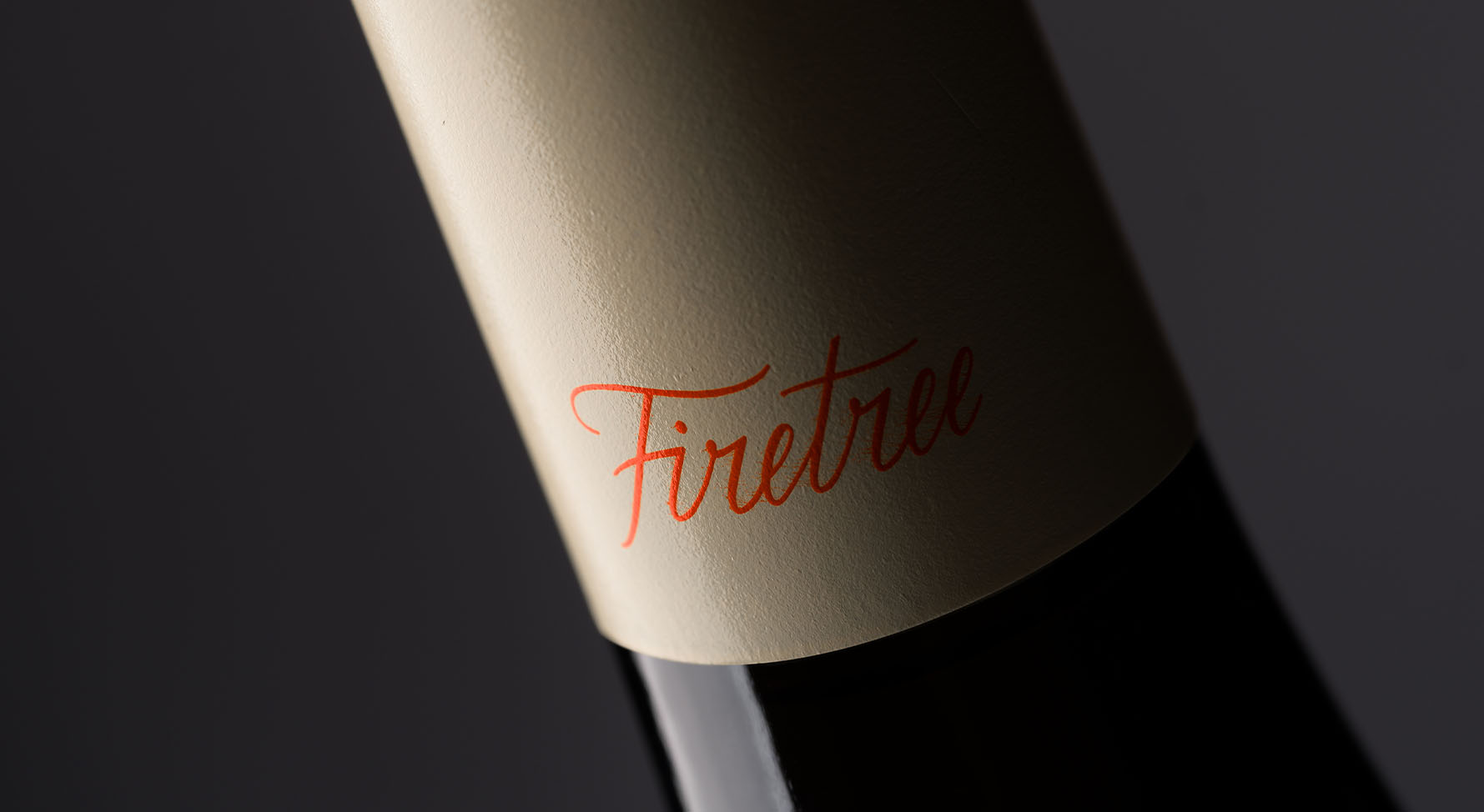
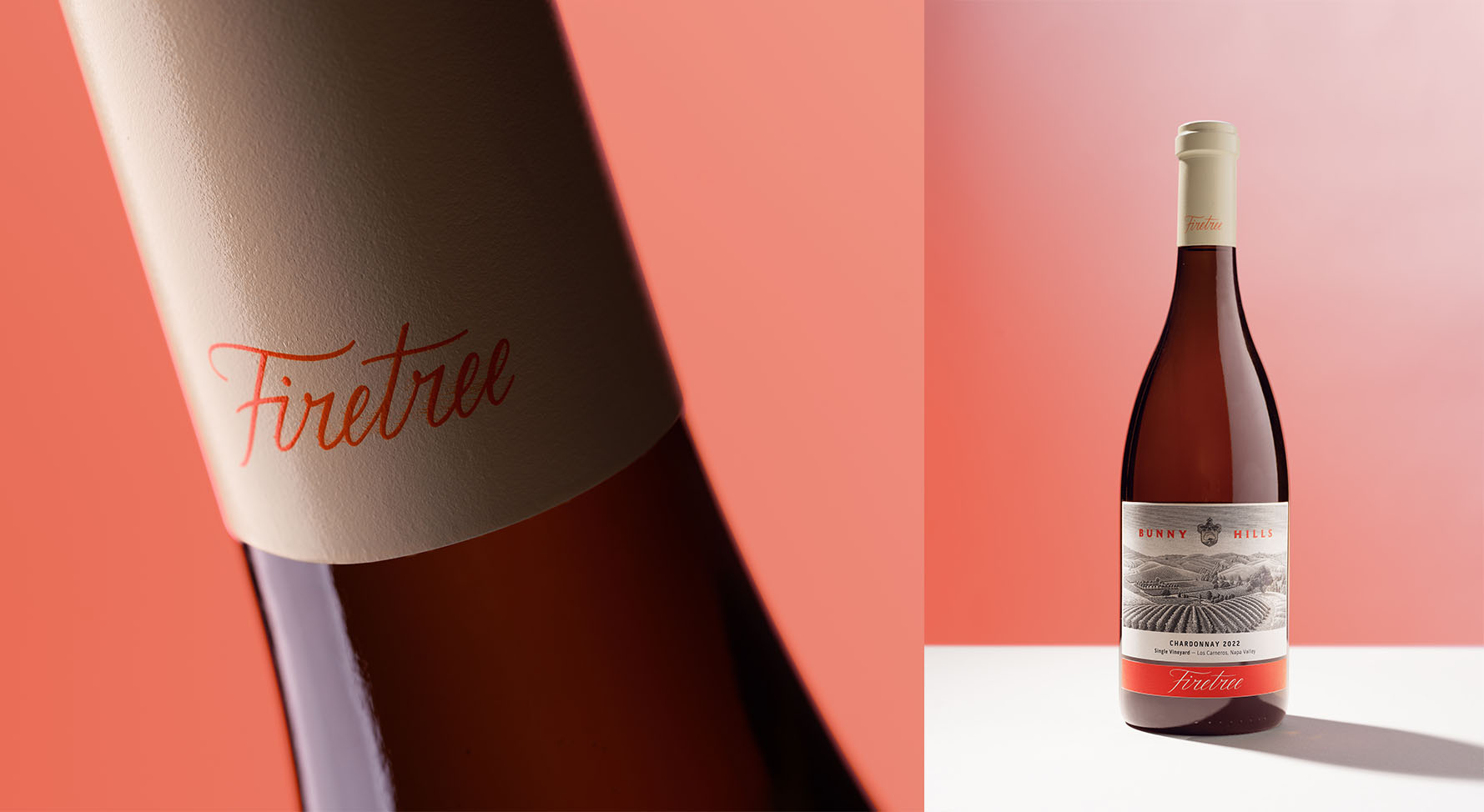
For the logo design, DAf worked with a family crest that the clients already had. We streamlined it, making the overall shape more harmonious and the individual elements clearer. This, combined with easy-to-read fonts – an elegant script text for the name and a more simple one for the tagline – and a black, cream and red color palette lends the brand a traditional identity that still manages to feel modern.
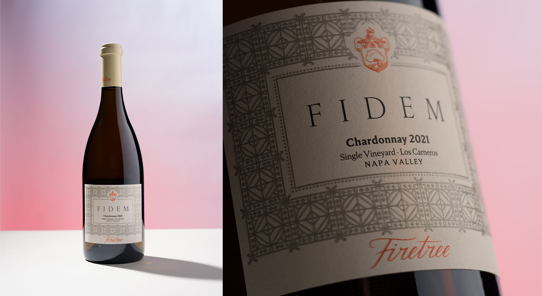
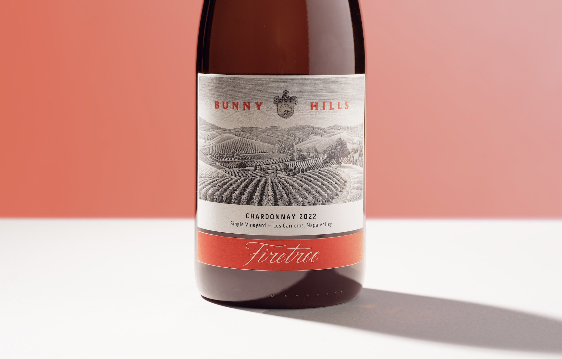
We then designed packaging for the client’s two initial wines. While both are Chardonnays, they have different targets, making it crucial to differentiate them. The label Bunny Hills features a black-line illustration of the vineyard, where wild rabbits are found. The name gives a light-hearted feeling to this less formal wine. Fidem, made from older vines, has a label that is noticeably more elegant, featuring repeated geometric shapes in an embossed pattern. Both the name and the design reference the Catholic influences in the brand identity.
CREDIT
- Agency/Creative: DAf Agency
- Article Title: Crafting a Vineyard’s Brand Identity and Wine Packaging: The Jimenez Family Project
- Organisation/Entity: Agency
- Project Type: Packaging
- Project Status: Published
- Agency/Creative Country: Chile
- Agency/Creative City: Santiago
- Market Region: North America
- Project Deliverables: Packaging Design
- Format: Bottle
- Industry: Food/Beverage
- Keywords: wine, creative agency, Chile, Napa Valley
-
Credits:
Head of Design: Enzo Morales Quiroz


