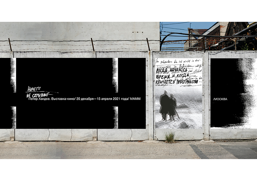
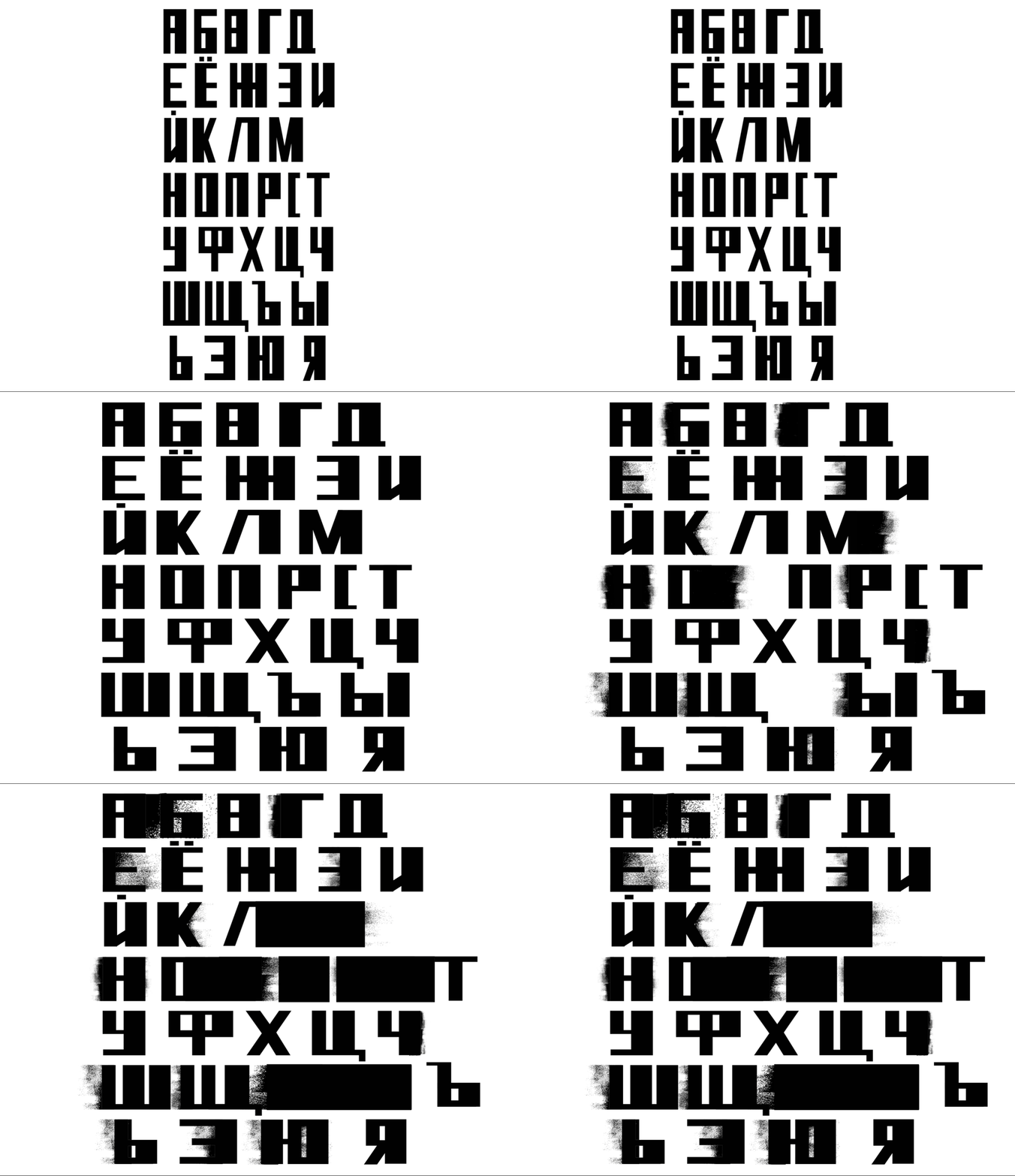
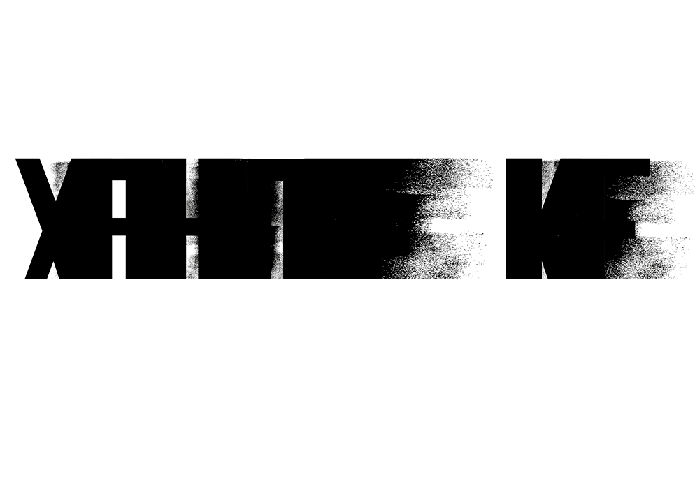
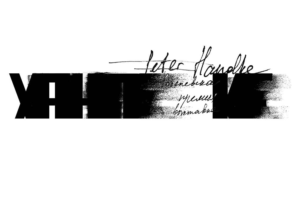
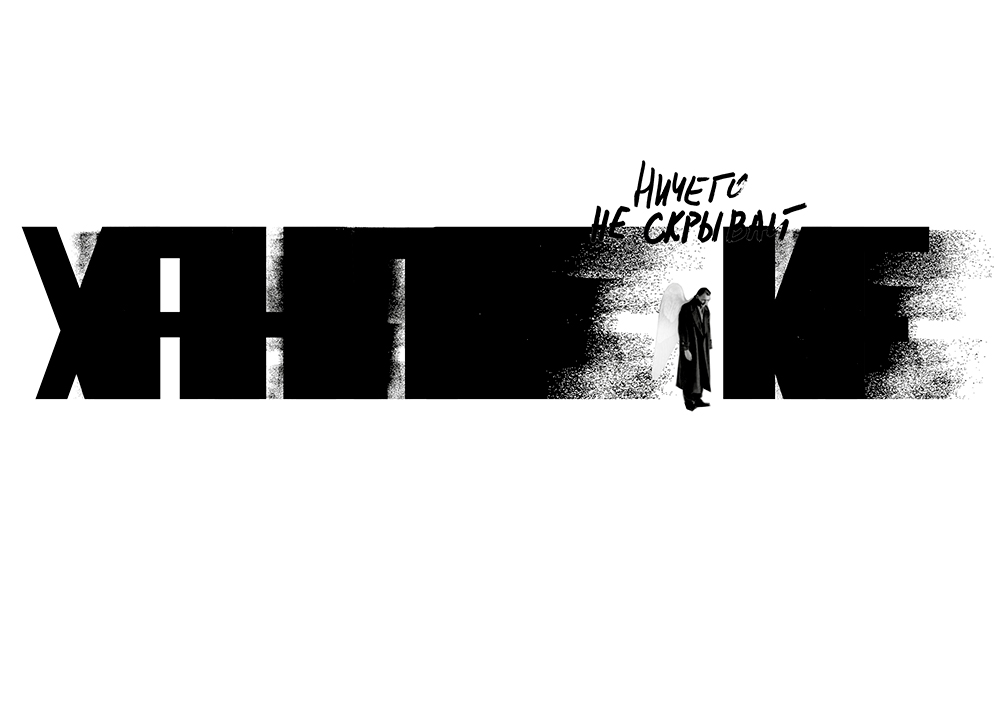
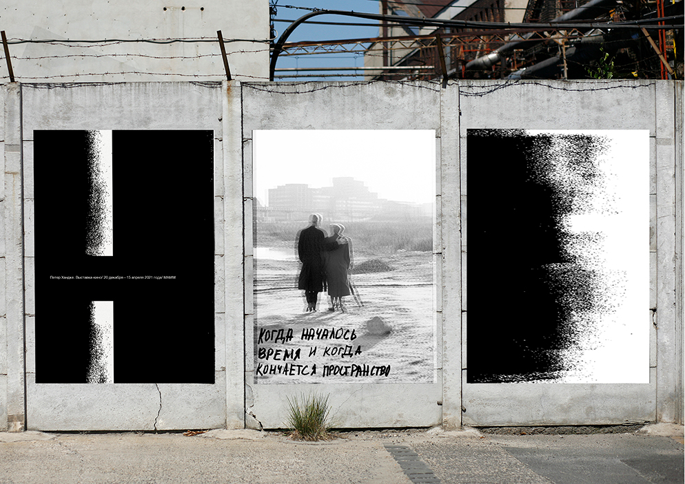
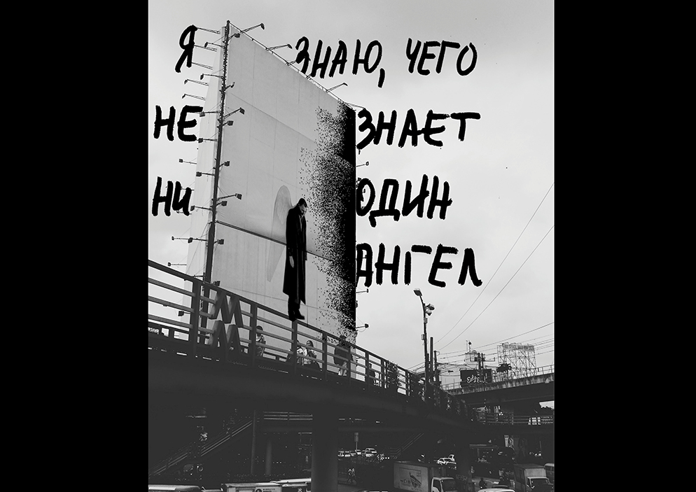
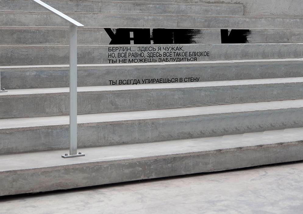
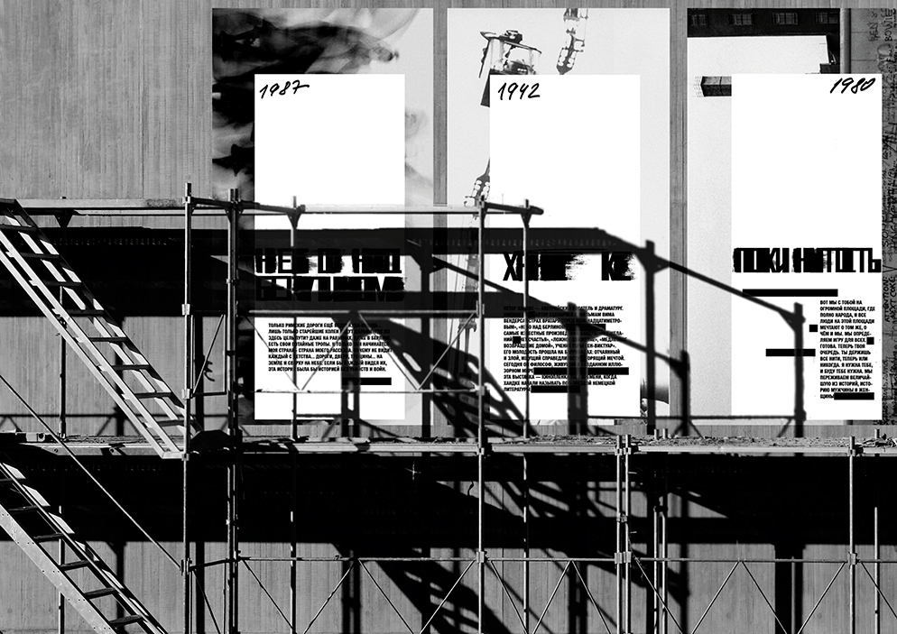
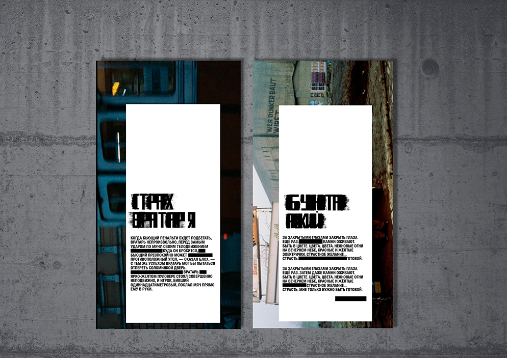
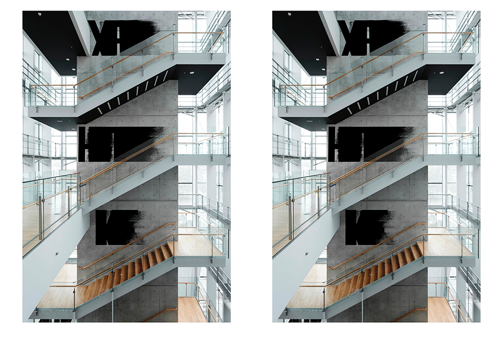
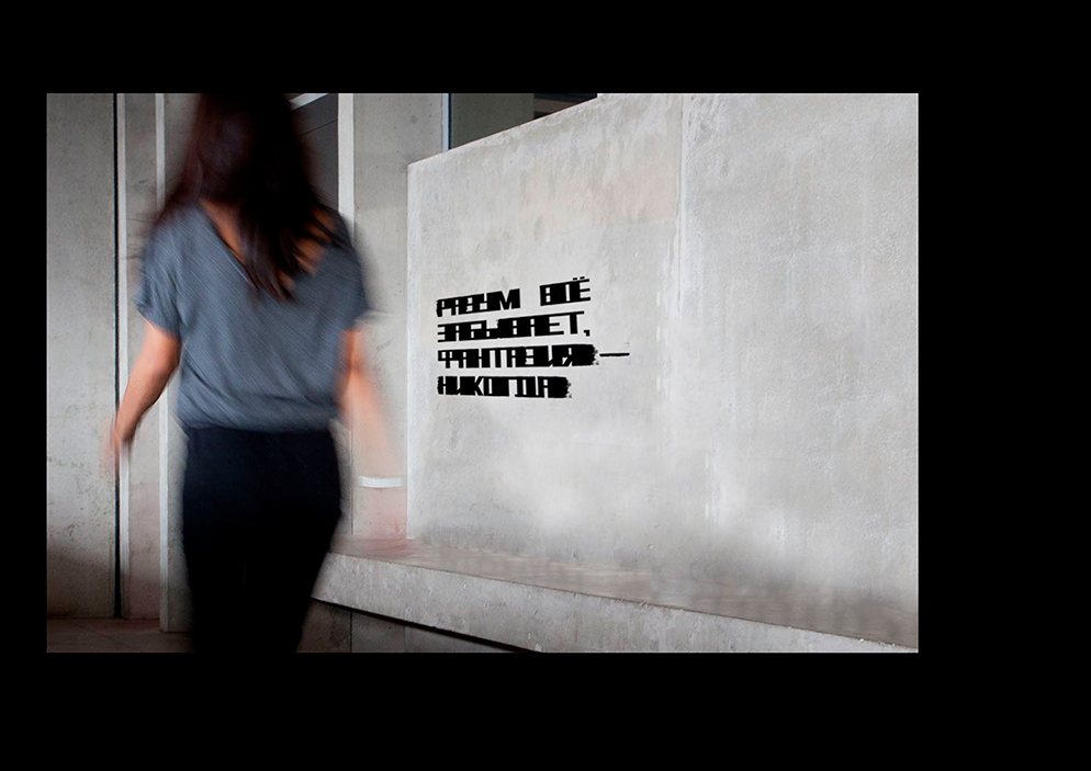
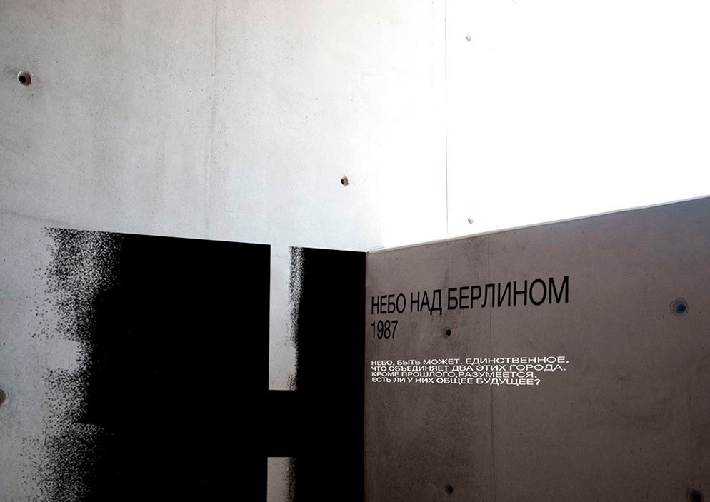
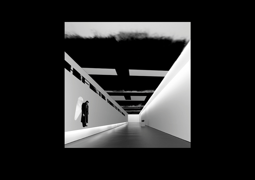
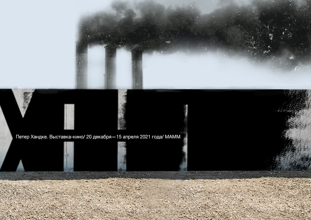
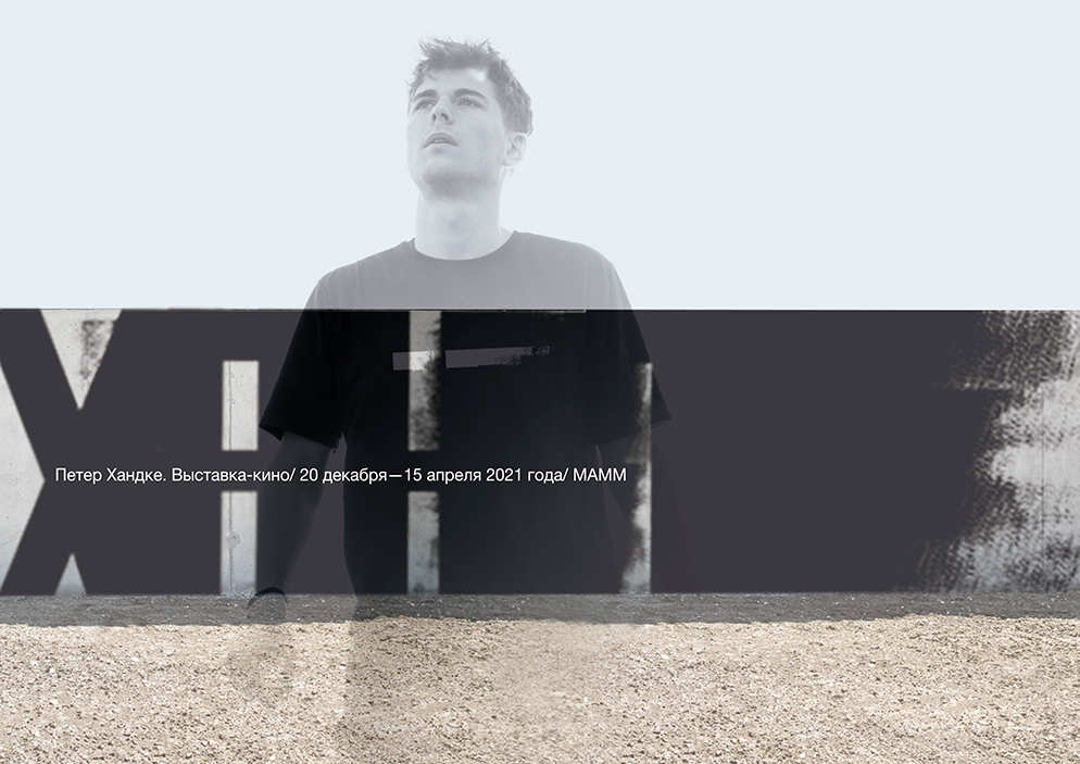
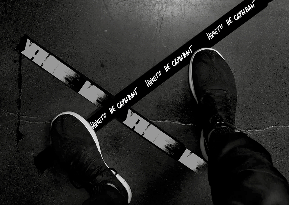
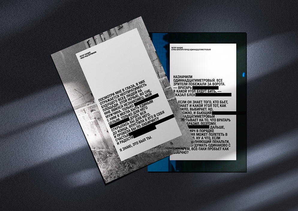
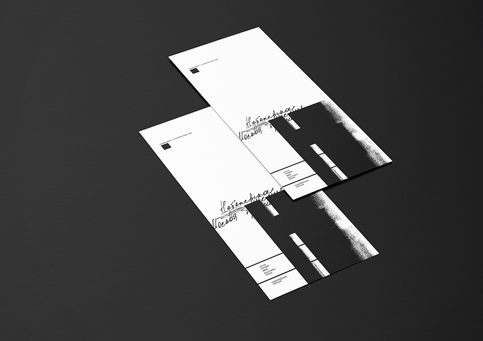
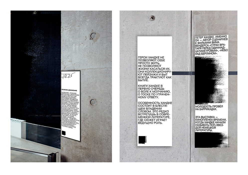
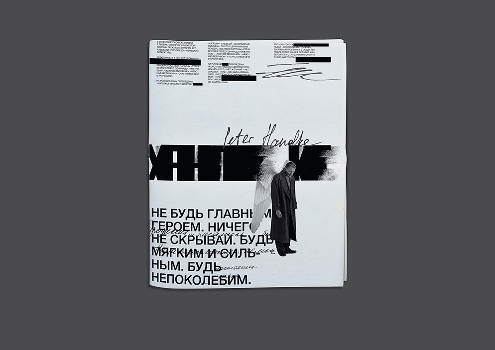
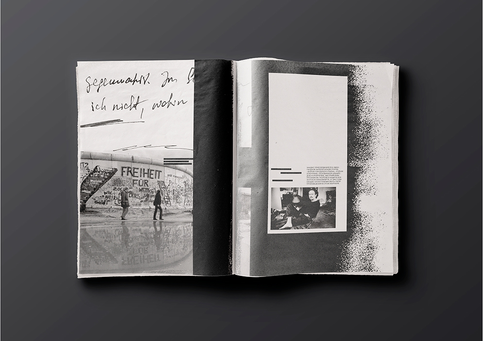
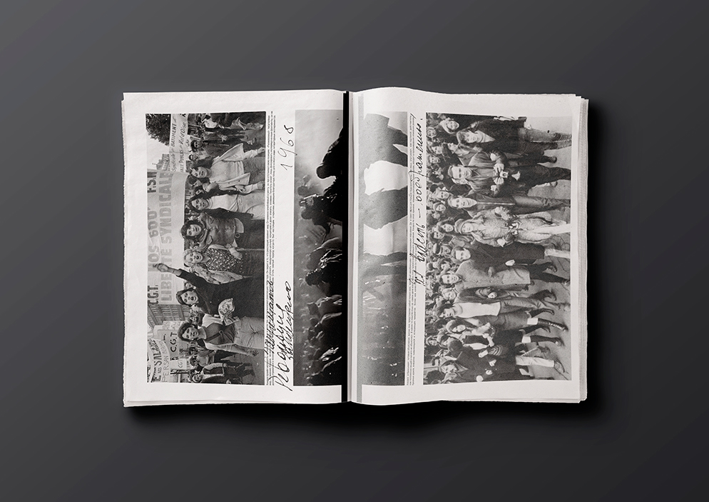
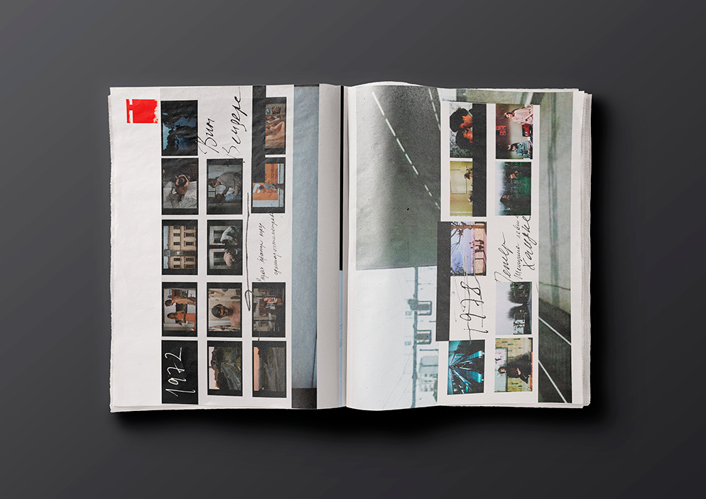
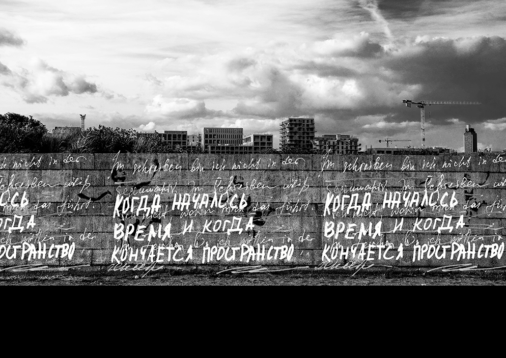
Peter Handke — “pop star of German literature”. Wim Wenders — film’s director for which Handke wrote the scripts — knows everything about him. Appeal to the means of Wenders’s screen expressiveness, the composition of the shots and the spirit of the films helped me to create an accent font. Additional accent font groups are based on the manuscripts of the writer and historical references to the student revolution (1960, Paris) and the Fall of the Berlin Wall (1989).

CREDIT
- Agency/Creative: Maria Vishnyakova
- Article Title: Concept for Peter Handke Exhibition Identity
- Organisation/Entity: Freelance, Non Published Concept Design
- Project Type: Identity
- Agency/Creative Country: Russia
- Market Region: Europe
- Project Deliverables: Brand Experience, Brand Identity, Brand Strategy, Graphic Design, Research, Tone of Voice
- Industry: Public Utility
- Keywords: Identity, Graphic design, Handke, Nobel, Exhibition, Font, Typography, Literature, Art
FEEDBACK
Relevance: Solution/idea in relation to brand, product or service
Implementation: Attention, detailing and finishing of final solution
Presentation: Text, visualisation and quality of the presentation


