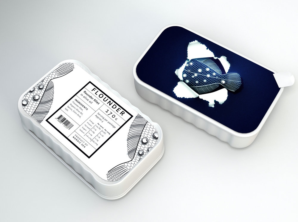
CreativeByDefinition – The Nordic Tail
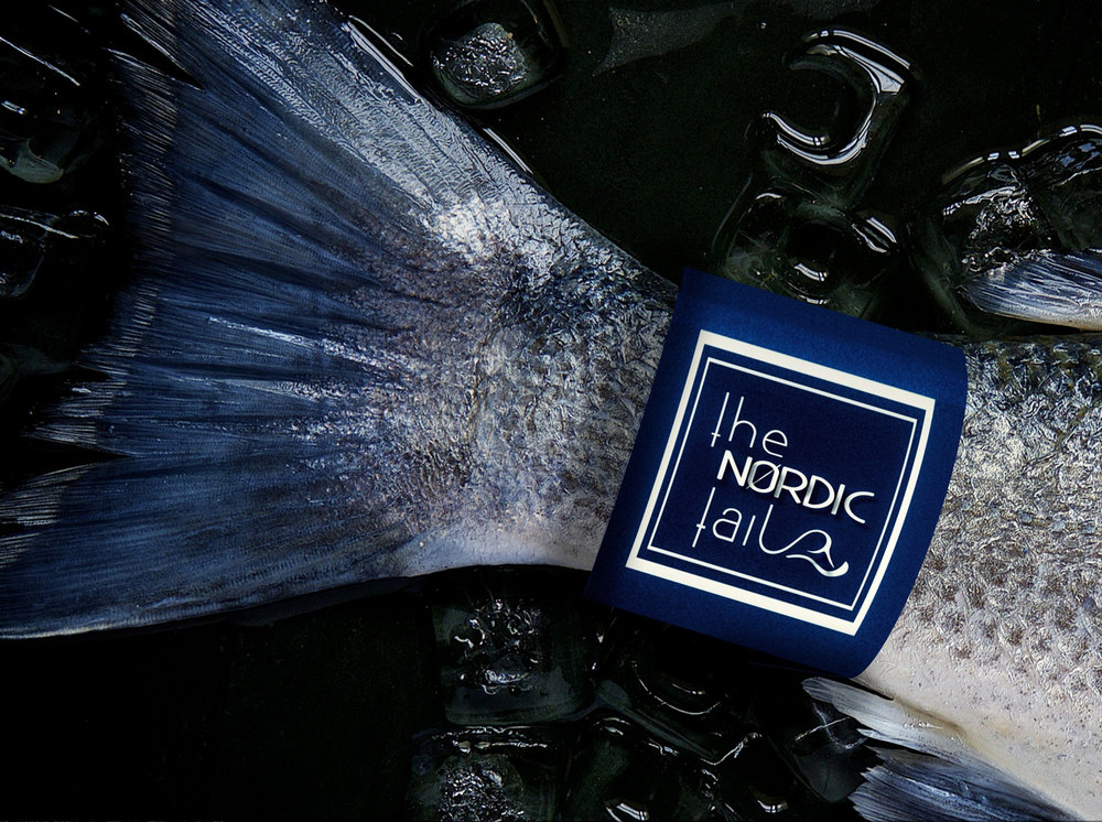
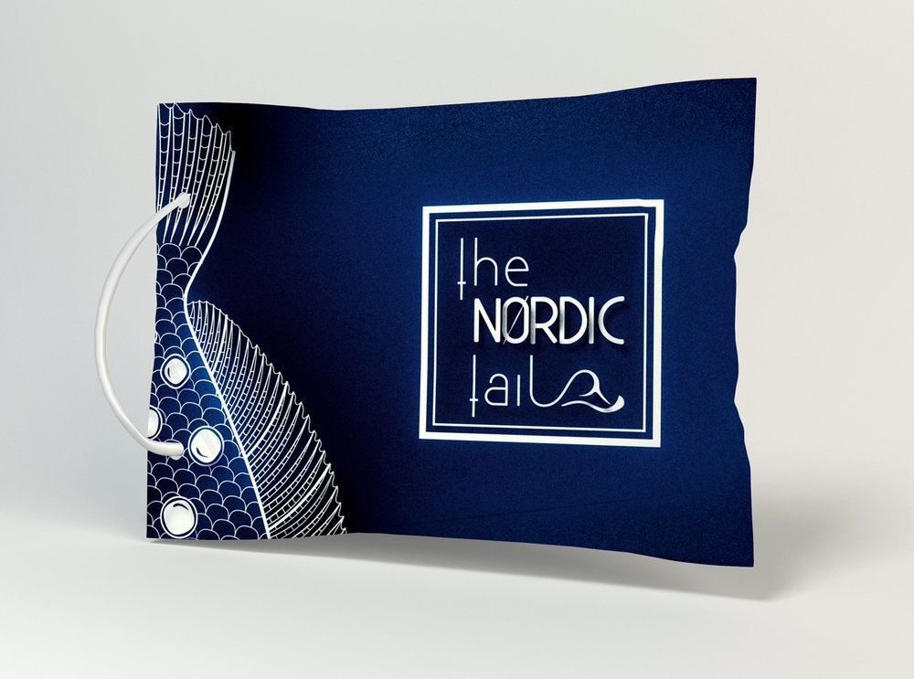
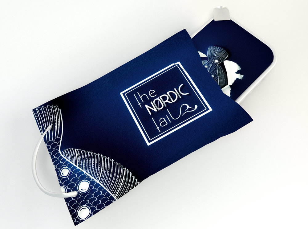
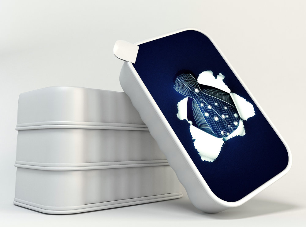
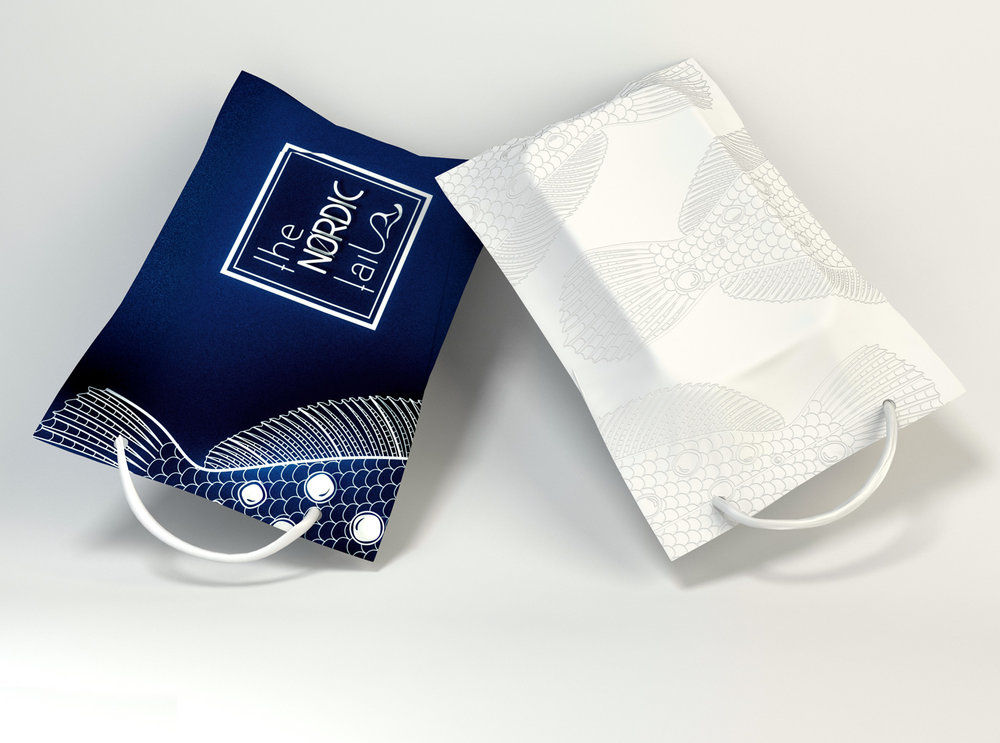
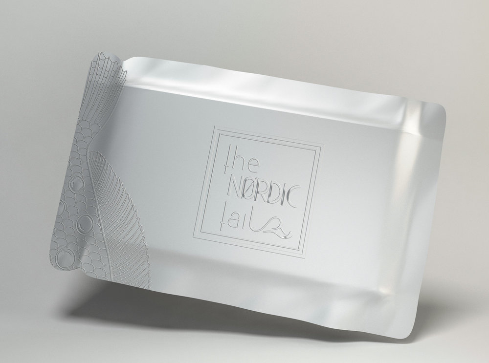
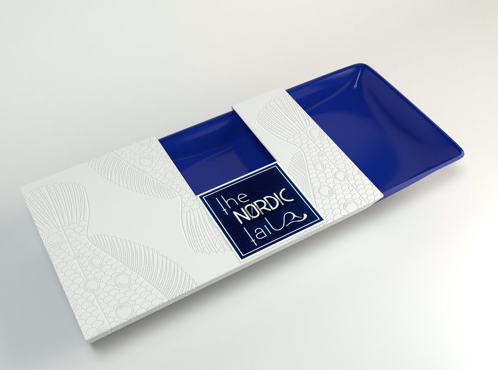
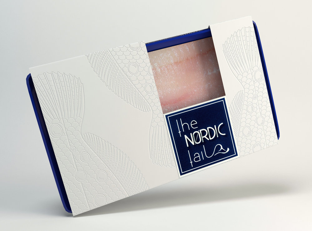
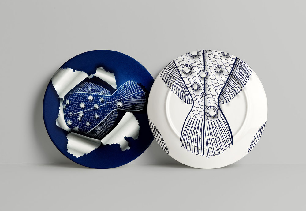
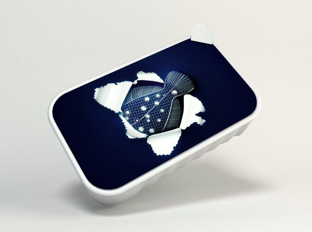
“The challenge was to create an utterly unique package that would celebrate the fish in all it’s delicious forms – fresh, frozen or in a can. The project uses a exquisite combination of Nordic color tones based on the deep blue ocean combined with the minimalistic white. The set wants to emphasize the tail of the fish, that becomes almost like a symbol code around fisherman’s and fish lovers. The fish tail illustration that visually breaks the can is a symbol of the fish that swims in these clear, deep, cold waters.”
CREDIT
- Agency/Creative: CreativeByDefinition
- Article Title: Concept for Nordic Packaging Design for Fish Products
- Organisation/Entity: Agency Promotional / Self Published
- Project Type: Packaging
- Agency/Creative Country: Romania
- Market Region: Global
- Format: Bag, Blister-Pack, Box, Can
- Substrate: Metal, Pulp Carton, Pulp Paper
FEEDBACK
Relevance: Solution/idea in relation to brand, product or service
Implementation: Attention, detailing and finishing of final solution
Presentation: Text, visualisation and quality of the presentation


