CHIA was born not simply as a bakery. Moreover, CHIA is also a place to help people realize that we should spend time for ourselves, relatives, and family in addition to work.
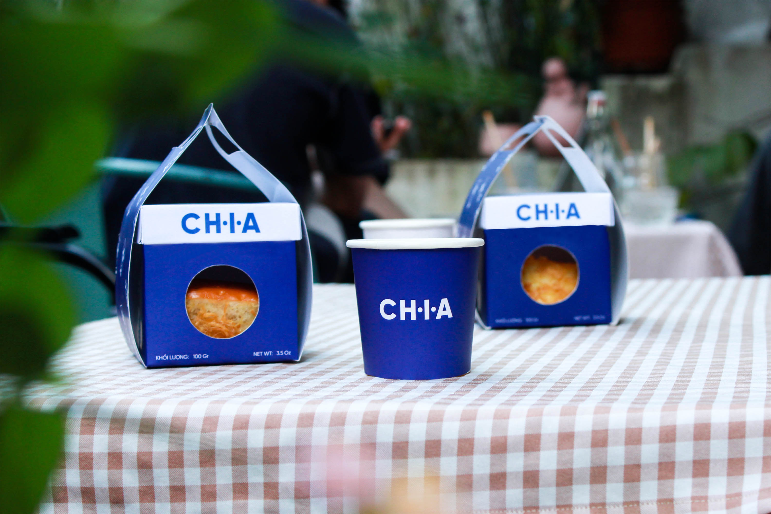
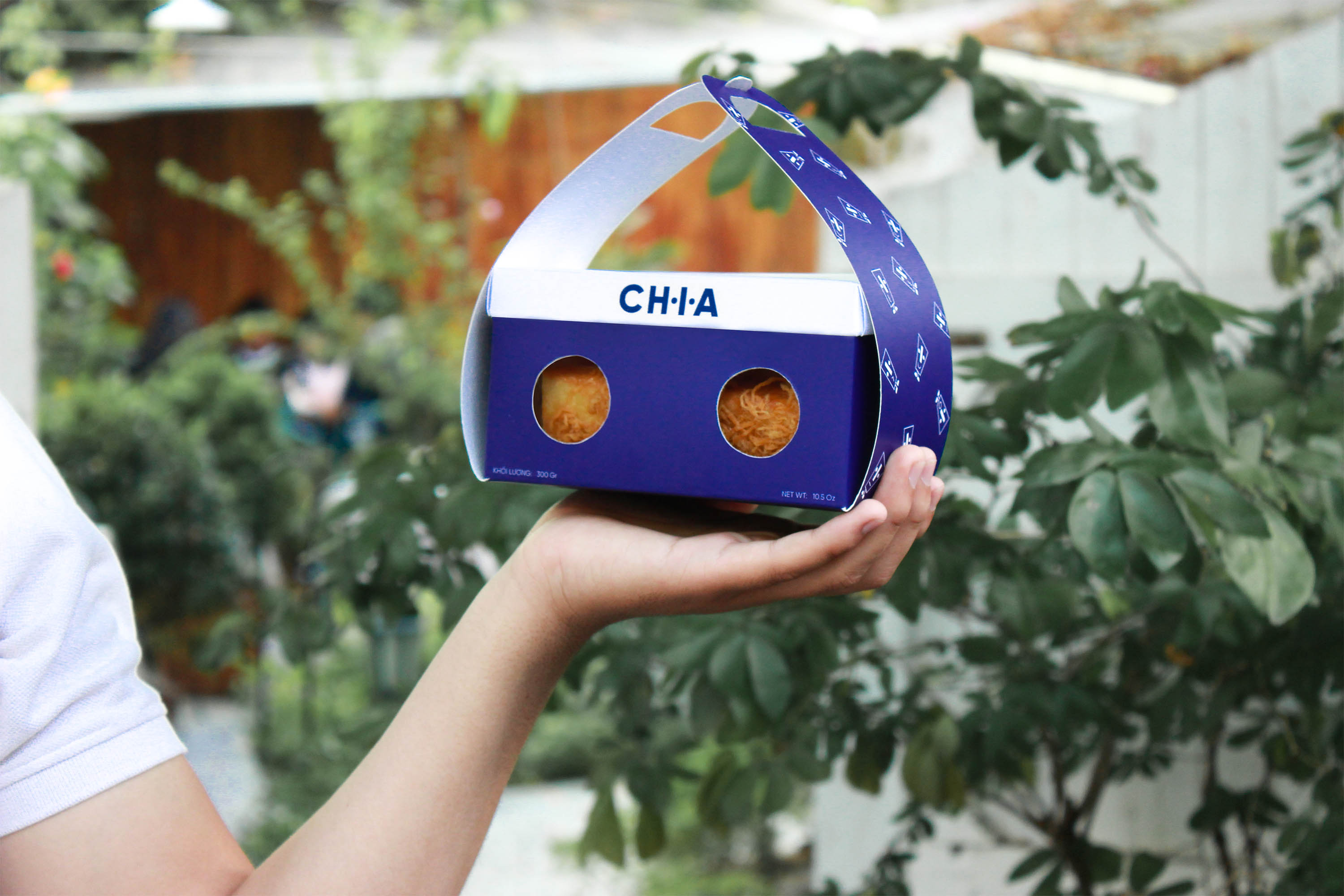
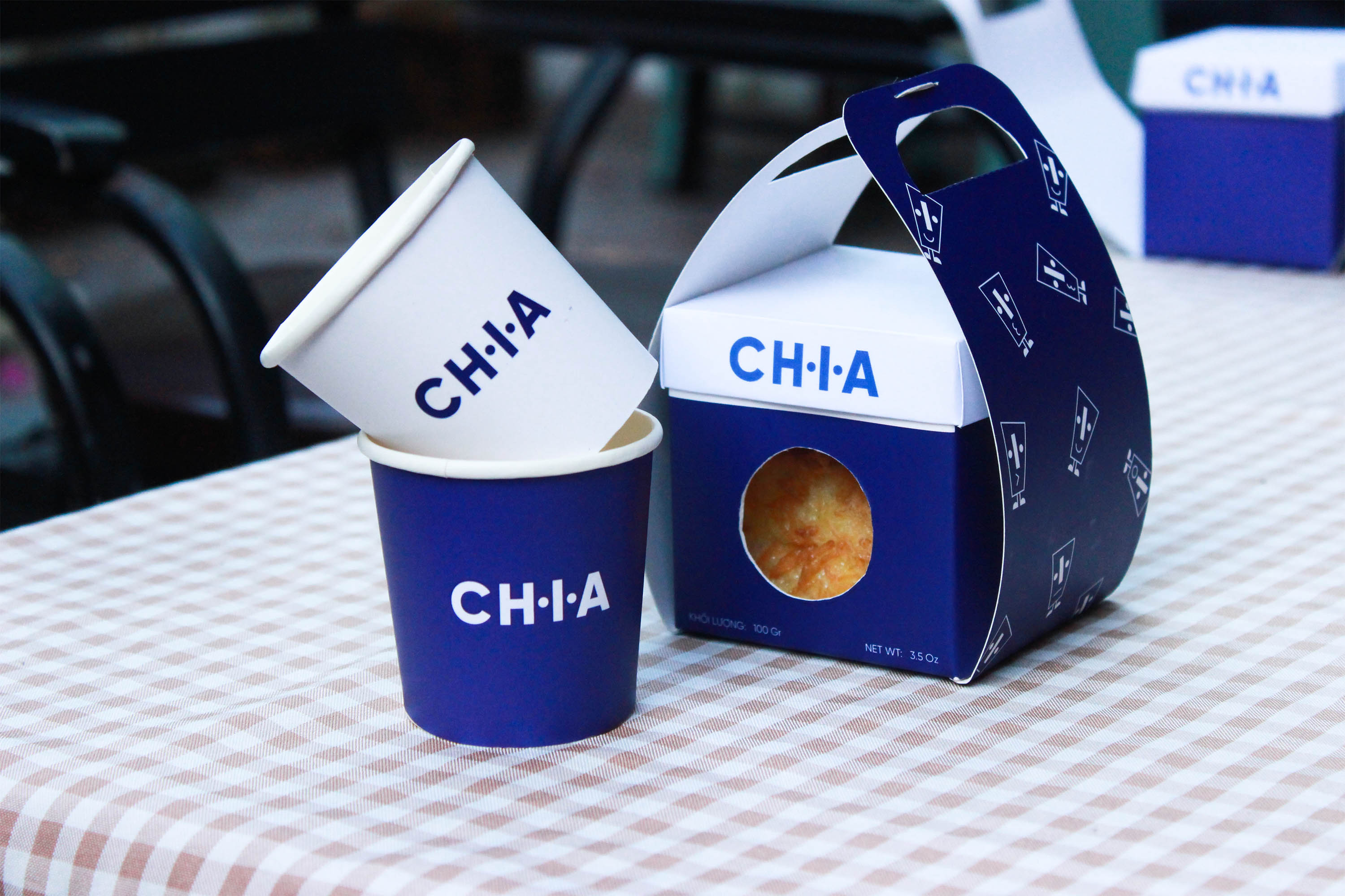
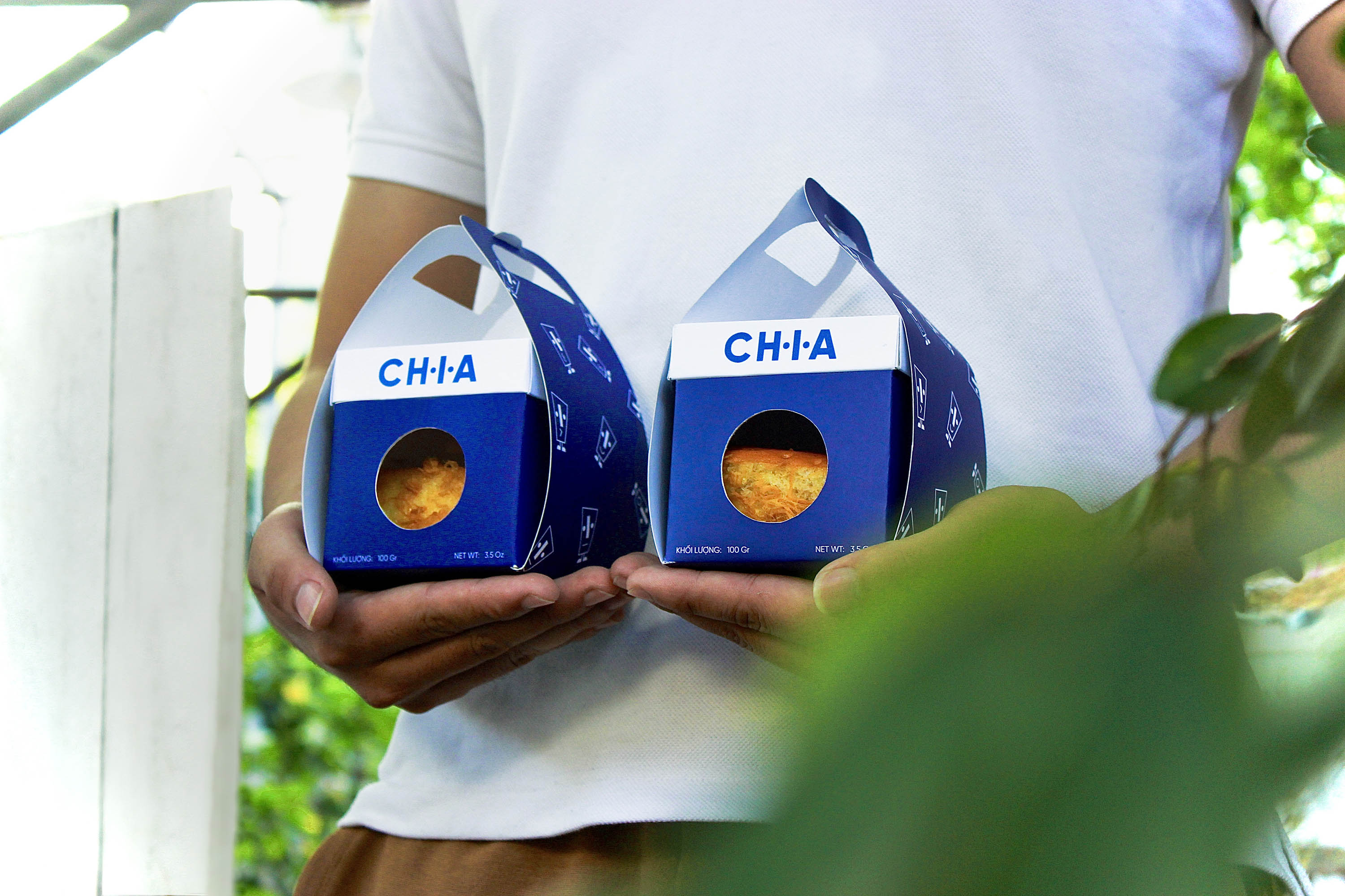
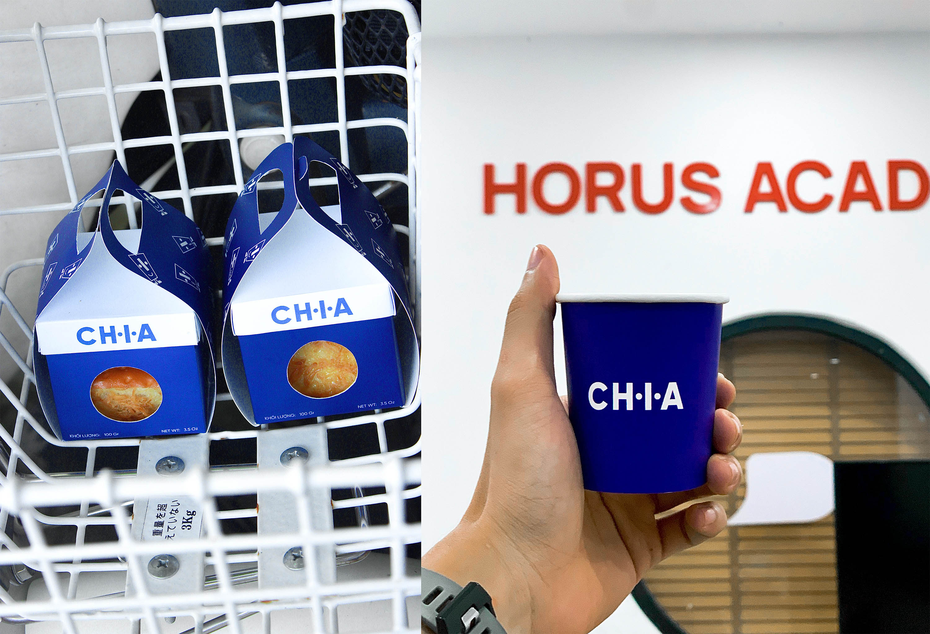
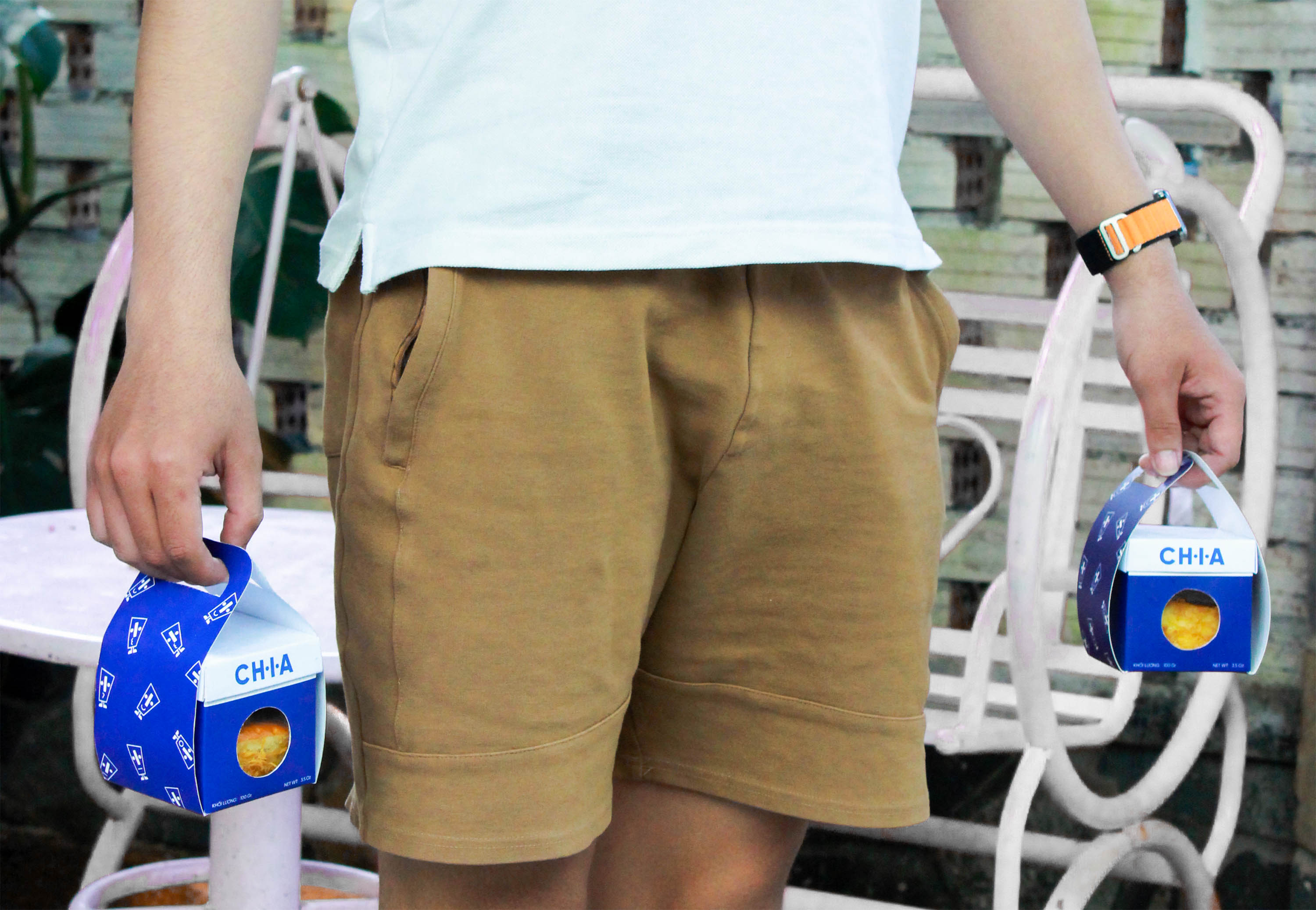
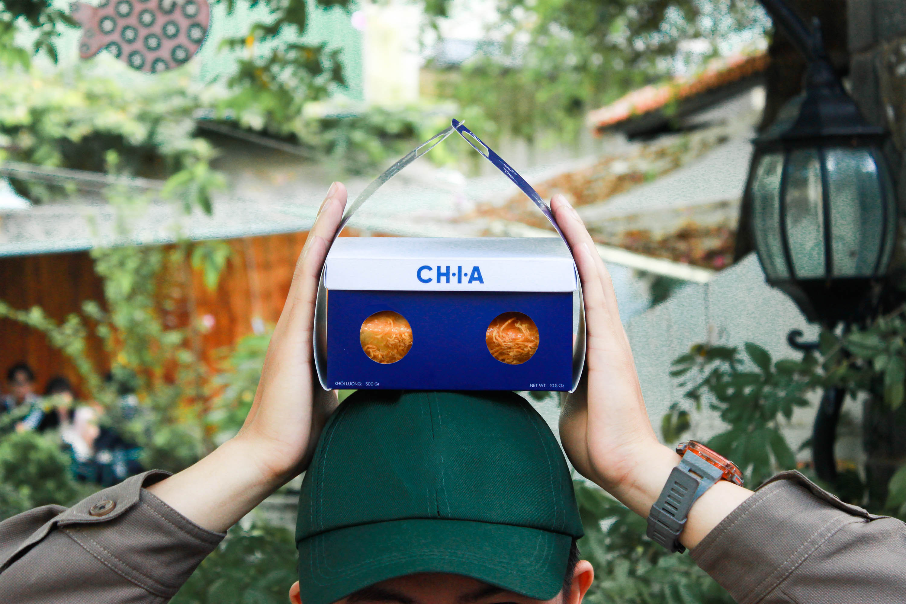
Temporarily say goodbye to the pressures of life and sit back and share the joy and happiness that the rush of life has made us forget about those good things. Cool blue is also the brand’s main color, inspired by the blue sky. Through that, CHIA hopes to bring a cool, relaxing atmosphere for quality conversations here.
CHIA in this case is understood as a noun, meaning sharing, a spirit of willingness to share, wanting to spread the spirit of sharing among people in all aspects of life.
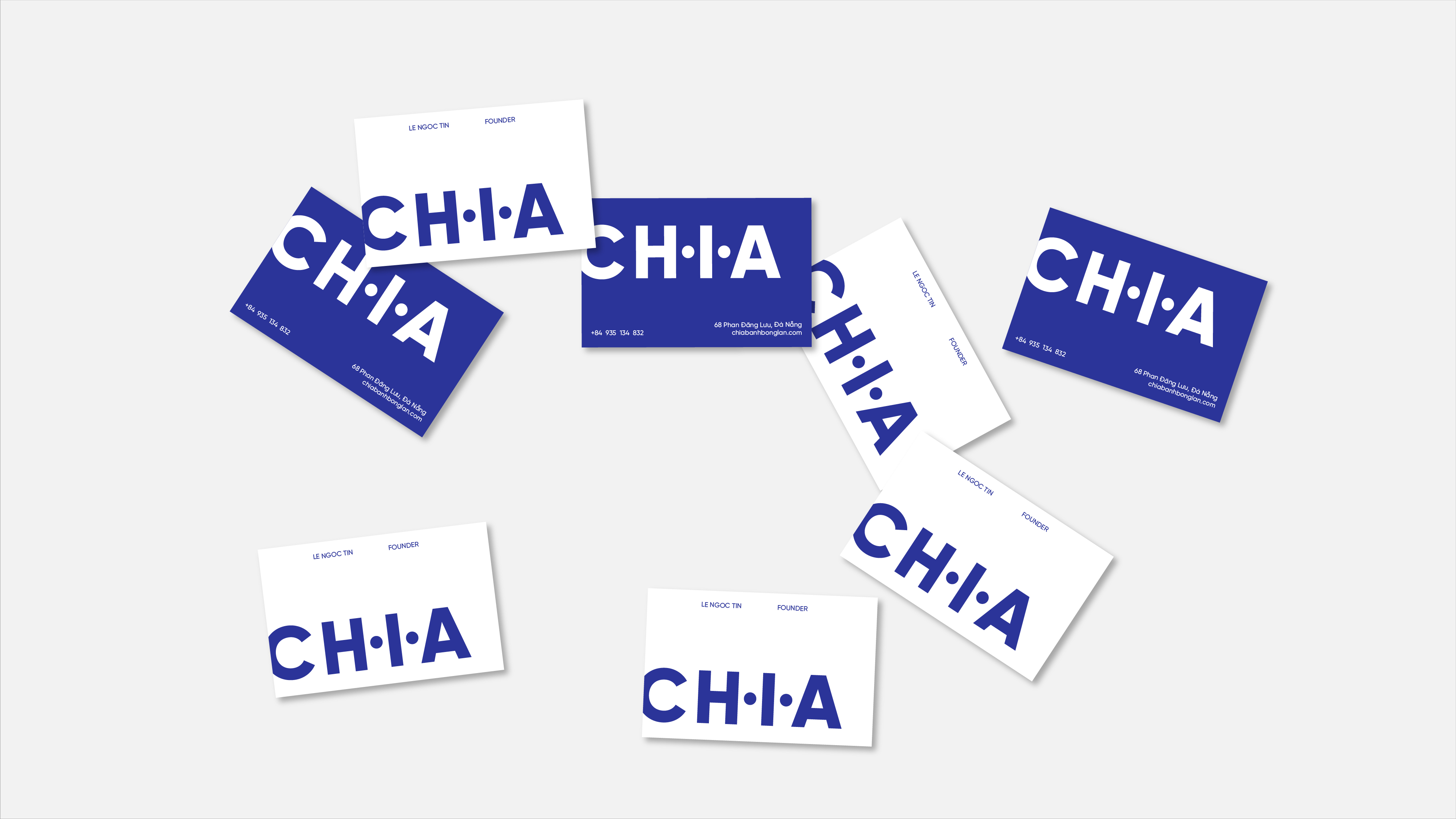
Combining it with the mathematical division symbol makes the logo look more interesting when these two elements are linked.
At the same time, rotating the division sign 90 degrees and adding the negative space of the word ”CHIA” will create an image of a face with different emotions depending on each person’s feelings.
The identification system I choose as the main visual for this brand, inspired by the image of the division sign in mathematics combined with the nuances of human happiness and sadness, will help to more clearly portray the messages that the brand wants to convey.
Along with that, I also use the word “Chia” which is taken from the brand name to use as a thorough communication campaign for the brand.
Regarding the colors used for the brand, I chose blue as the main color to represent relaxation, peace, maturity and trust.

CREDIT
- Agency/Creative: Horus Academy
- Article Title: Chia Visual Identity
- Organisation/Entity: Student
- Project Type: Identity
- Project Status: Published
- Agency/Creative Country: Vietnam
- Agency/Creative City: Da Nang
- Market Region: Asia
- Project Deliverables: Brand Identity, Packaging Design
- Industry: Food/Beverage
- Keywords: Horus Academy, Chia, Brand Identity, Packaging, Bakery
-
Credits:
Made at: Horus Academy
Designer: Ngoc Tin
Motion, Photographer: Ngoc Tin
Instructors: Phuoc Thien, Minh Tuan, To Quyen


