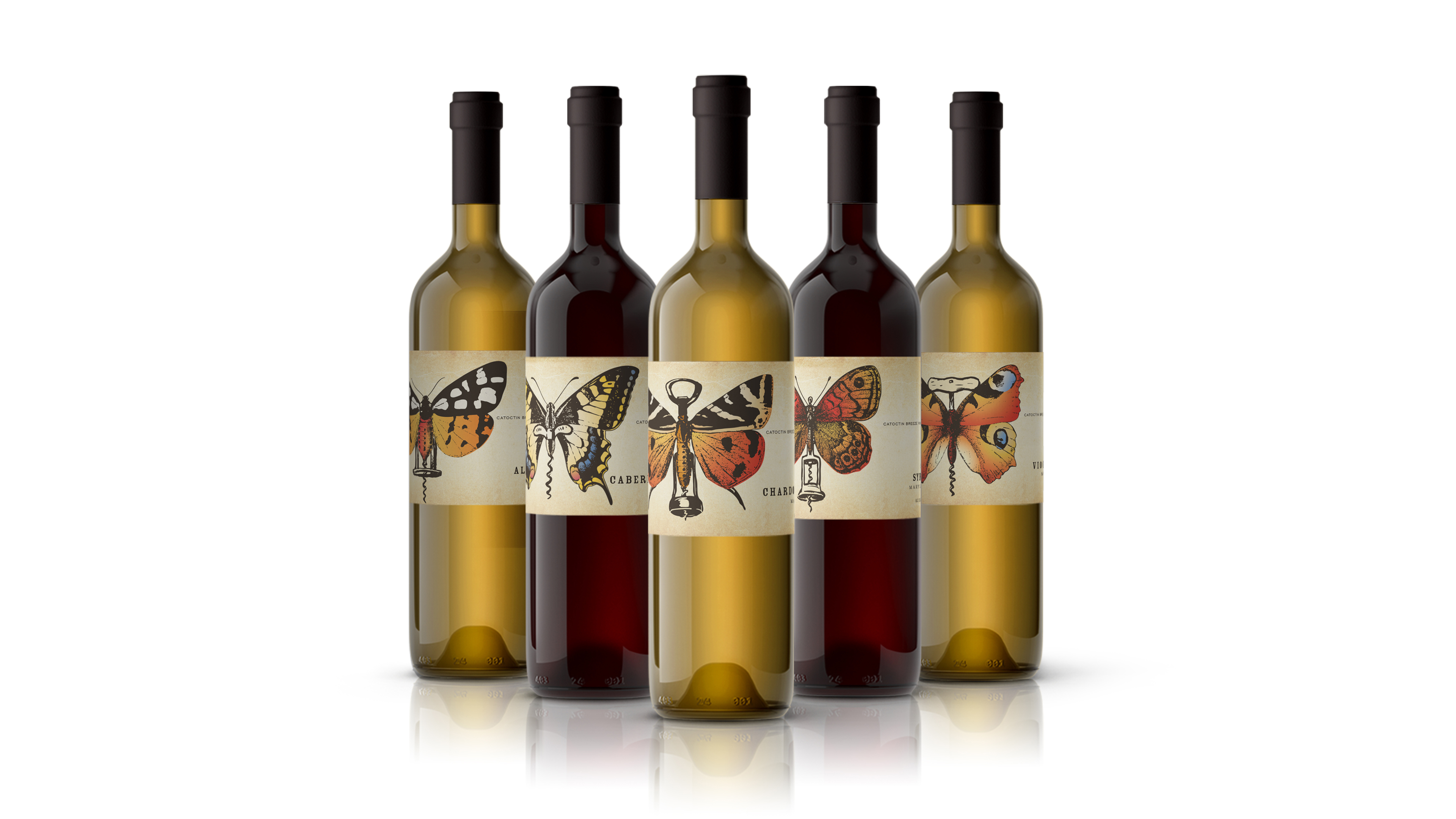
From the moment the Fizyta family laid claim to the land that would one day become Catoctin Breeze Vineyard, they knew they had something special. The mountains. The soil. The picturesque surroundings. What they didn’t realize was that they would have to share this special place with other occupants—Catoctin Mountain butterflies. Silently flitting here and there. Sometimes just a few. Often in droves. Always beautiful.
After a few years of preparing the land for future crops, and with the first vintages aging, it was time for these winemakers to turn their attention to packaging design. After sitting down with the client, it was clear that they were looking for something truly special. They wanted their inaugural fleet of wines to feature a label design that captured the Catoctin Breeze experience in a unique way. And they knew that the fluttering beauties that they shared the land with, just had to be the stars of the show. The Catoctin Mountain butterflies are as much a part of the vineyard as the Fizyta family and everyone who works there. As such, simply featuring butterflies across this debut series wasn’t going to cut it. We needed to make a visual connection between the delicate creatures and the wine itself. It was also essential to embody the Catoctin Breeze brand and the vineyard’s classic aesthetic. After exploring numerous concepts based around this objective, we landed on a direction that fit perfectly. We brought it all together—literally.
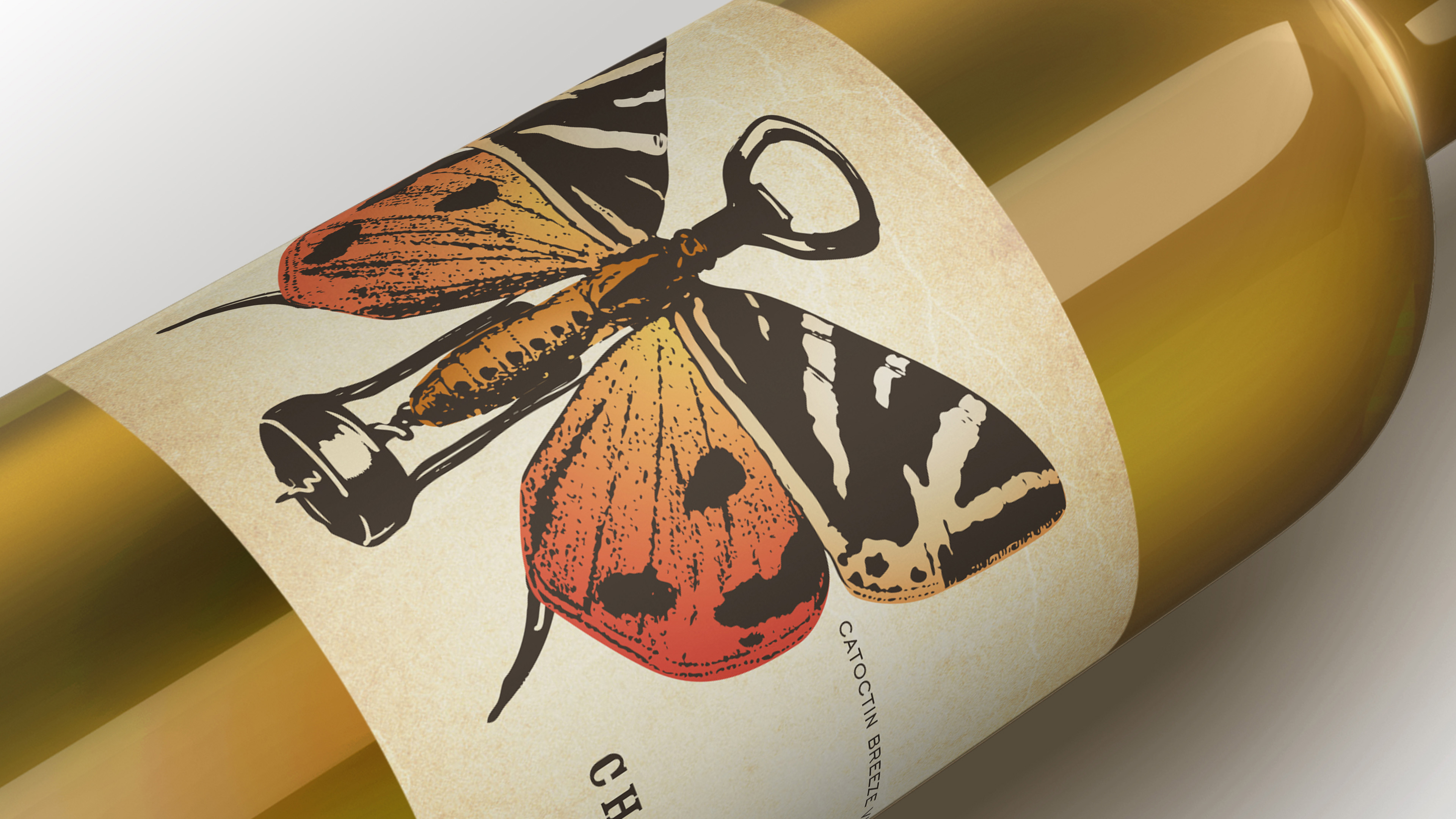
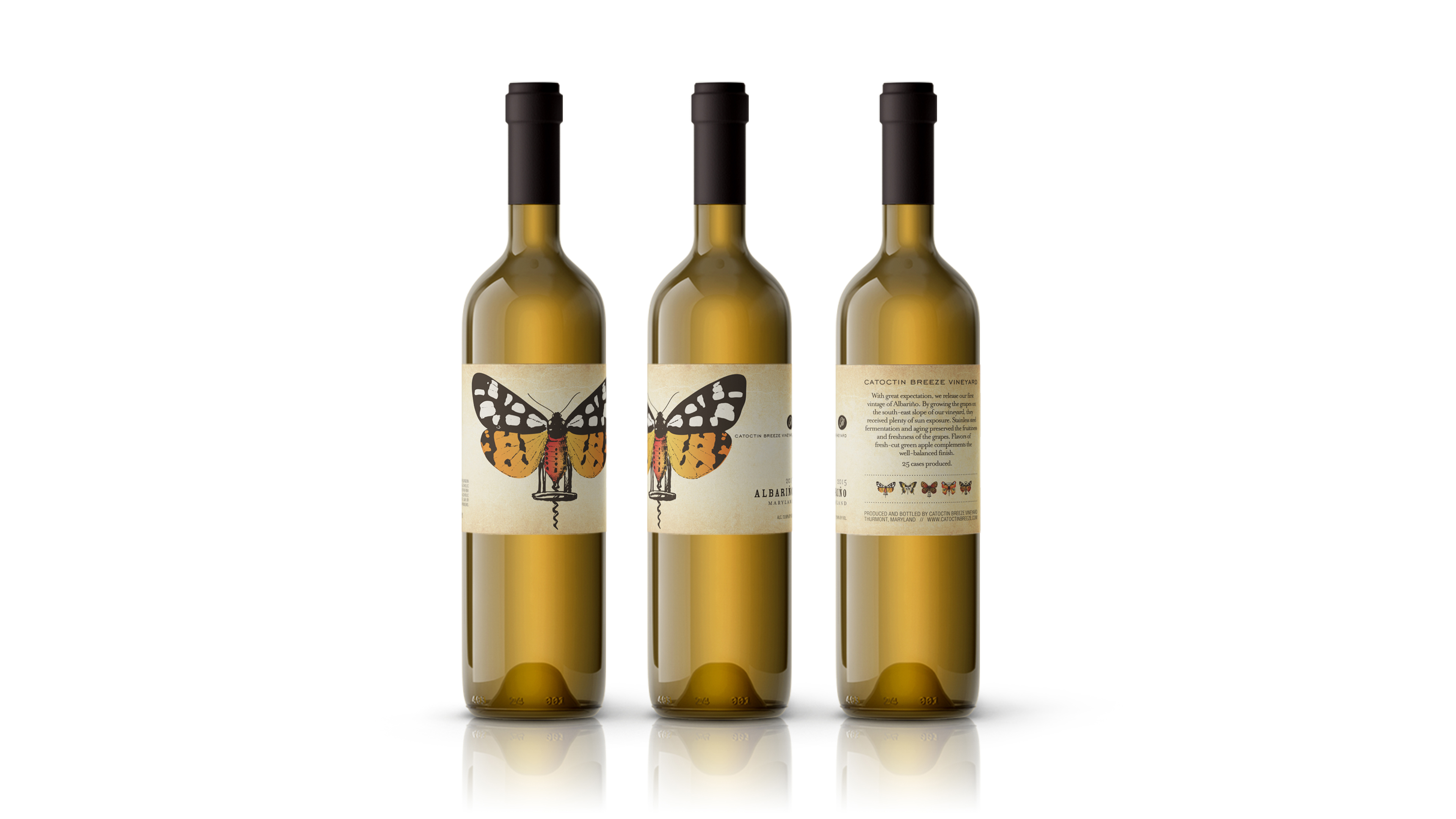
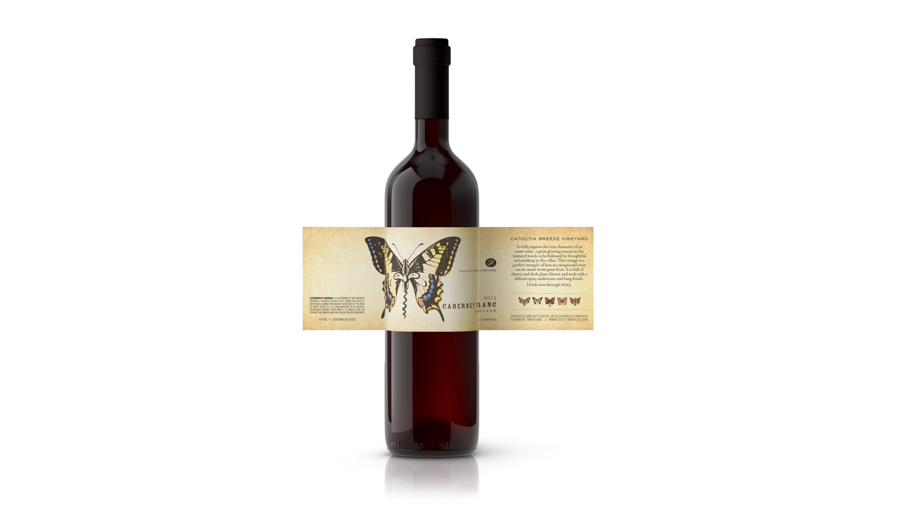
Working closely with the client, we developed a packaging design that’s both classic and creative, with a vintage, handcrafted feel. The labels, and the varietals they represent, are distinguished by unique hybrid illustrations. Each showcases a distinct butterfly specimen carefully unified with a companion corkscrew. Inspired by old insect specimen boxes, aged parchment paper serves as the label’s backdrop, putting these whimsical creatures on display, front and center. A total of five wines make up Catoctin Breeze Vineyard’s Butterfly Series. Together, they give a whole new meaning to “a flight of wine.”

CREDIT
- Agency/Creative: Lisa Gorham Creative
- Article Title: Catoctin Breeze Vineyard Packaging Design By Lisa Gorham Creative
- Organisation/Entity: Agency, Published Commercial Design
- Project Type: Packaging
- Agency/Creative Country: United States
- Market Region: North America
- Project Deliverables: Graphic Design, Illustration, Packaging Design, Research
- Format: Bottle
- Substrate: Glass Bottle, Pulp Paper


