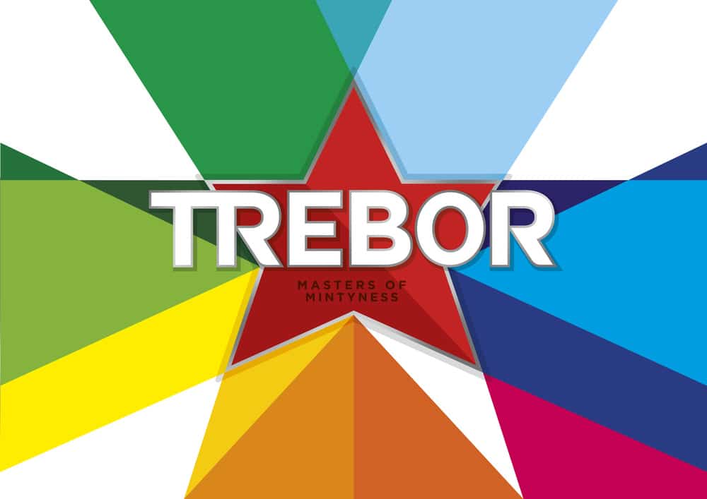
“Rejuvenated pack design and branding by Bulletproof leverages Trebor’s mastery of the mint category and range of explosive flavours”
“Trebor, the famed Mondelez International owned brand, unleashes its rejuvenated brand identity and packaging today. The brand, which has been making Britain’s favourite mints for over a hundred years including Extra Strong Mints, Softmints and Soft Fruits, tasked brand and packaging design agency Bulletproof with creating a design that would celebrate Trebor’s rich heritage while packing a visual punch on shelf.”
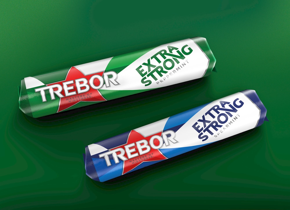
“Proud of its British roots, the simple, straight talking brand balances irreverence with a cheery ‘salt of the earth’ honesty that inspires its consumers to live boldly, unapologetically and with fun. Bulletproof needed to take this brand essence and translate it into a visual language that would be both striking and believable to its core target market who are rediscovering the joy of simple pleasures.
As part of the strategic process, the creative platform “The unapologetic minty mint” was developed to capture and convey the intense ‘zing!’ and ‘huzzahh!’ sensations of Trebor’s refreshing flavours. This thinking informed and inspired the design – an arty interpretation of a flavour punch that is vibrant, awakening and impactful.”
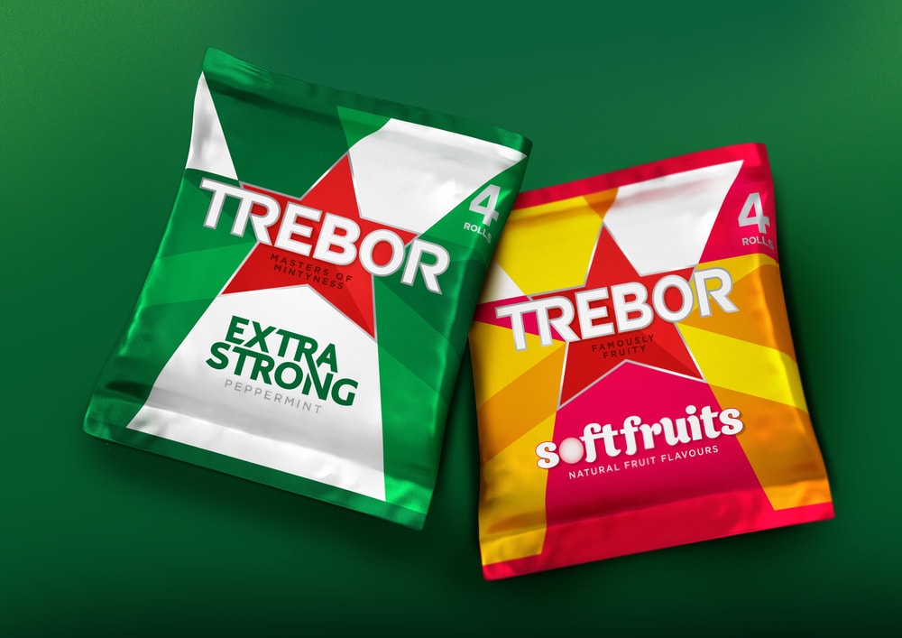
“Bulletproof comments: “We reworked Trebor’s red star brandmark ensuring it became the ‘heart’ of the identity. The dynamic shape works on two levels – firstly, to hero the Trebor logo and, secondly, as a vehicle for communicating the dazzling flavour dimensions of the products: a kaleidoscope of intense taste and texture sensations that are smooth and hard, soft and chewy, minty and fruity. The new design exudes energy, alluding to the intense and explosive flavours within. From the star itself, tonal plays on colour are emitted from the shape, enhancing the illusion of movement with these ‘shards of freshness’ echoing the depths of flavour.””
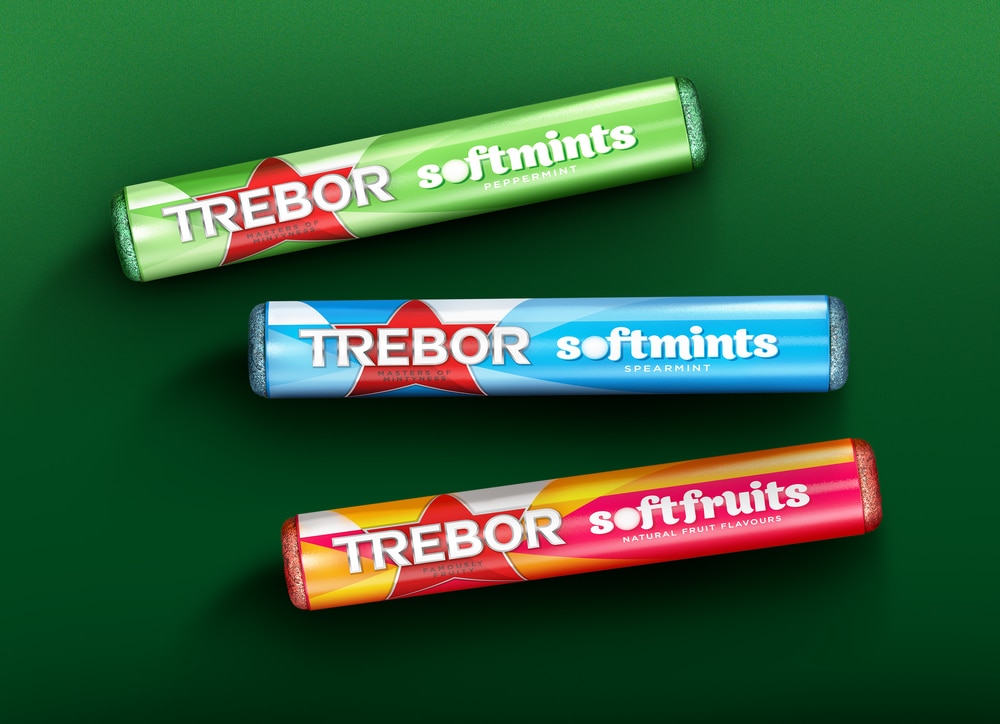
“Colour also plays a central role in the overall design. While the composition was designed to be malleable, it was crucial that the red Trebor star remained intact and that the colours associated with the flavours – Peppermint Green & Spearmint Blue – also remained untouched. The incorporation of white was important in creating a feeling of light minty freshness alongside visual inferences to flavour, while the addition of a silver border around the star provides subtle accents of luxury and class to a vibrant and otherwise adult-centric design.”
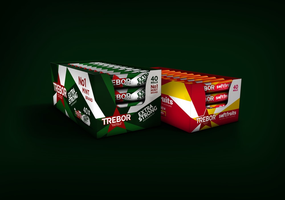
“Elena Mallo, Trebor senior brand manager at Mondelez International comments: “We produce sweets that have attitude and pack punch. These aren’t flavour sensations for the retiring wallflowers, but for pleasure seekers that relish intensity, refreshment and tang. It was clear we needed to rejuvenate our look to bring our products and our brand spirit to life and Bulletproof have created a design that will work well across all our current products as well as future innovations. It is striking, visually impactful on shelf and reinforces our identity – a boldly British brand that is simple, unfussy and loves to have fun.””

CREDIT
- Agency/Creative: Bulletproof
- Article Title: Bulletproof – Trebor’s ‘unapologetic minty mint’
- Project Type: Packaging


