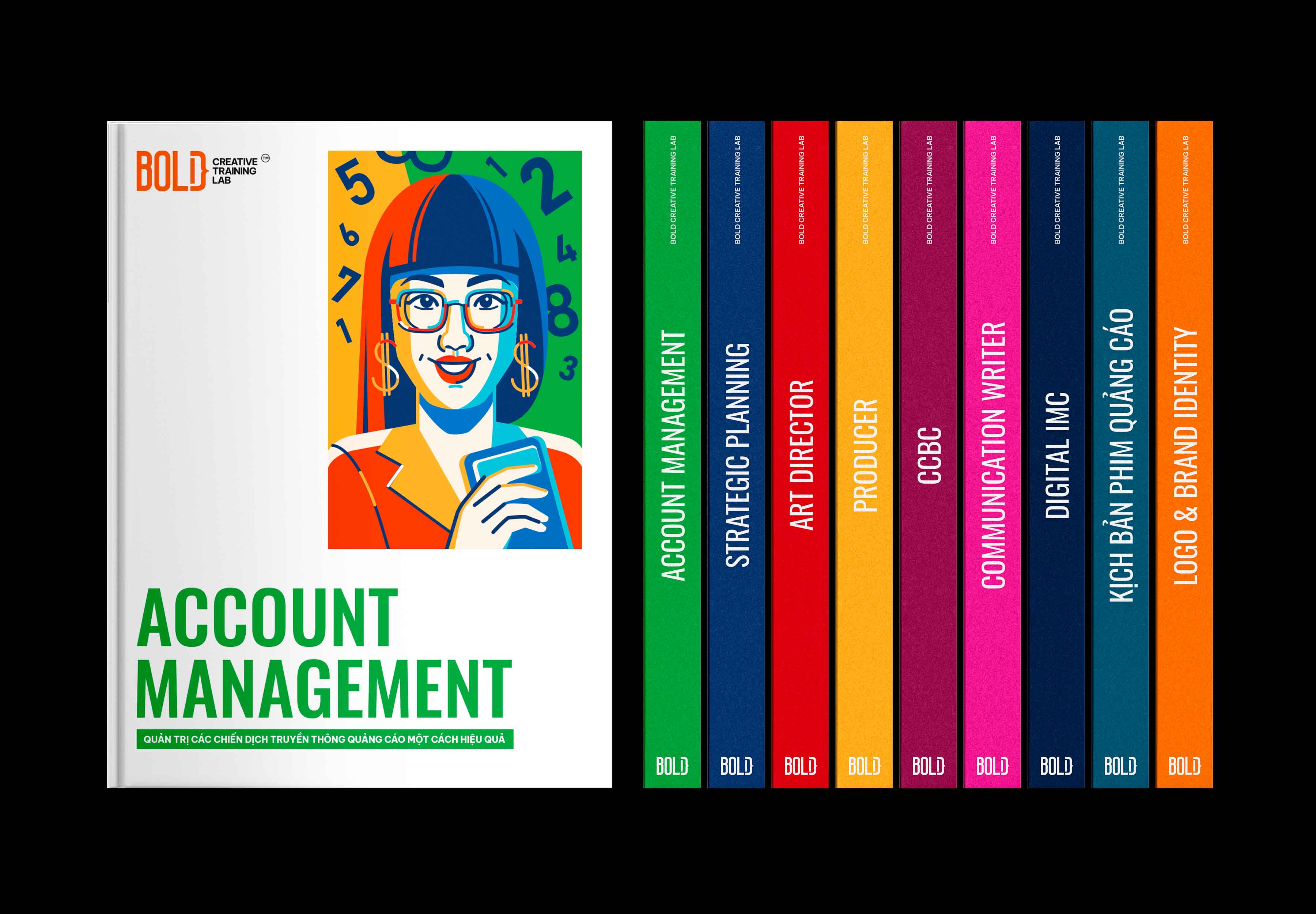
Overview: Founded in 2020, Bold Creative Training Lab aims to cultivate and refine the professional skills of new entrants in the Creative & Communications industry. Bold facilitates theoretical learning and hands-on experience with real-world projects, helping participants understand industry intricacies. The curriculum encompasses a comprehensive look at agency dynamics, including Account, Planning, Creative, Media, and Production. Bold Creative Training Lab’s core subjects focus on “strategic thinking,” “critical thinking,” “creativity,” “art direction,” and “copywriting,” foundational skills for developing advertising campaigns and innovative concepts.
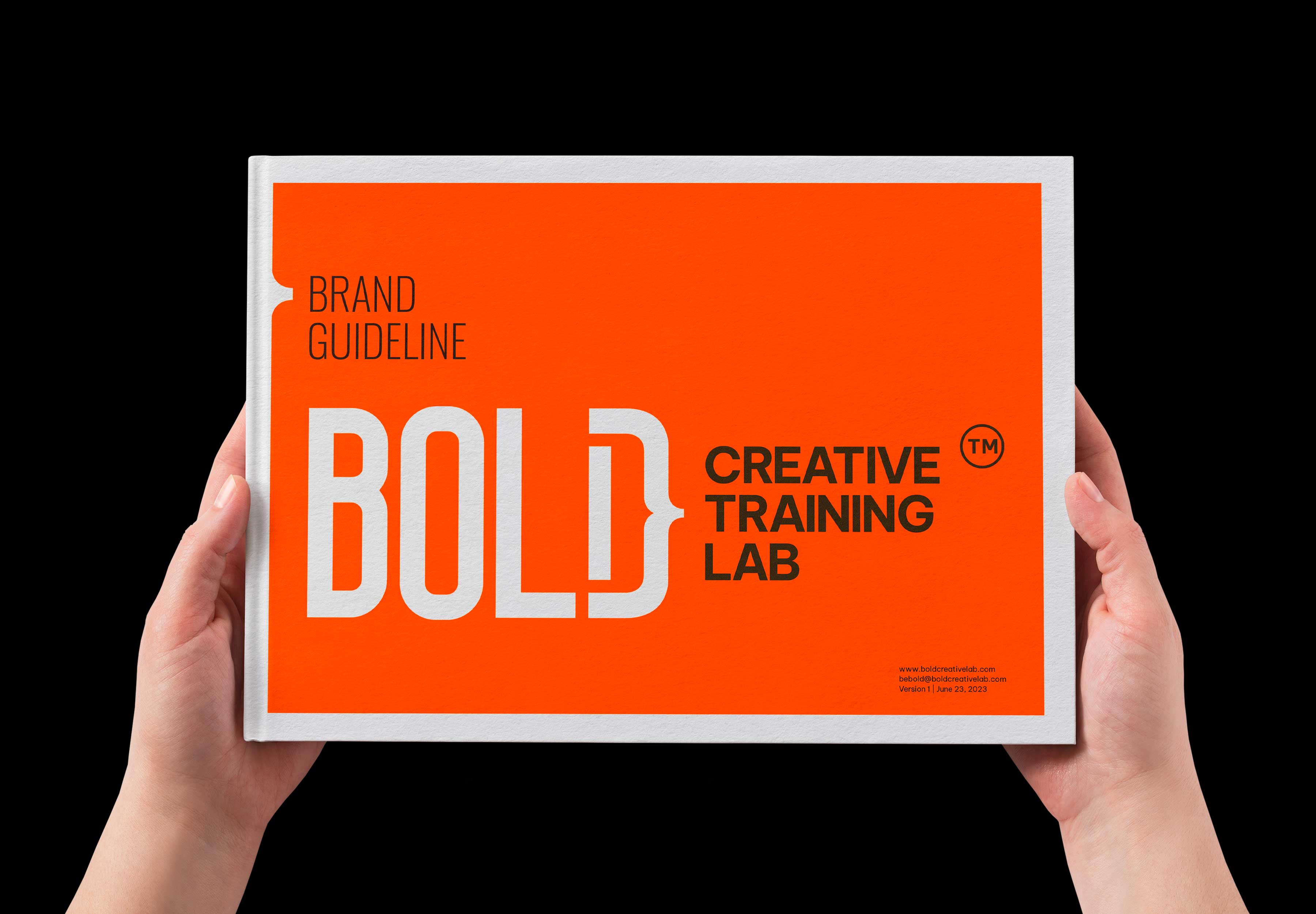
Logo Redesign: The logo was updated to create a balanced and modern appearance. To improve readability, the height of the word “Bold” was shortened to better align with the phrase “Creative Training Lab.” The color was adjusted from dark gray to black for enhanced contrast. Additionally, the overall thickness of the lines was increased to maintain clarity at smaller sizes.
Challenge: As Bold expanded rapidly, its brand identity system became inconsistent and vulnerable to imitation. This prompted a comprehensive brand refresh to restore order and uniqueness.
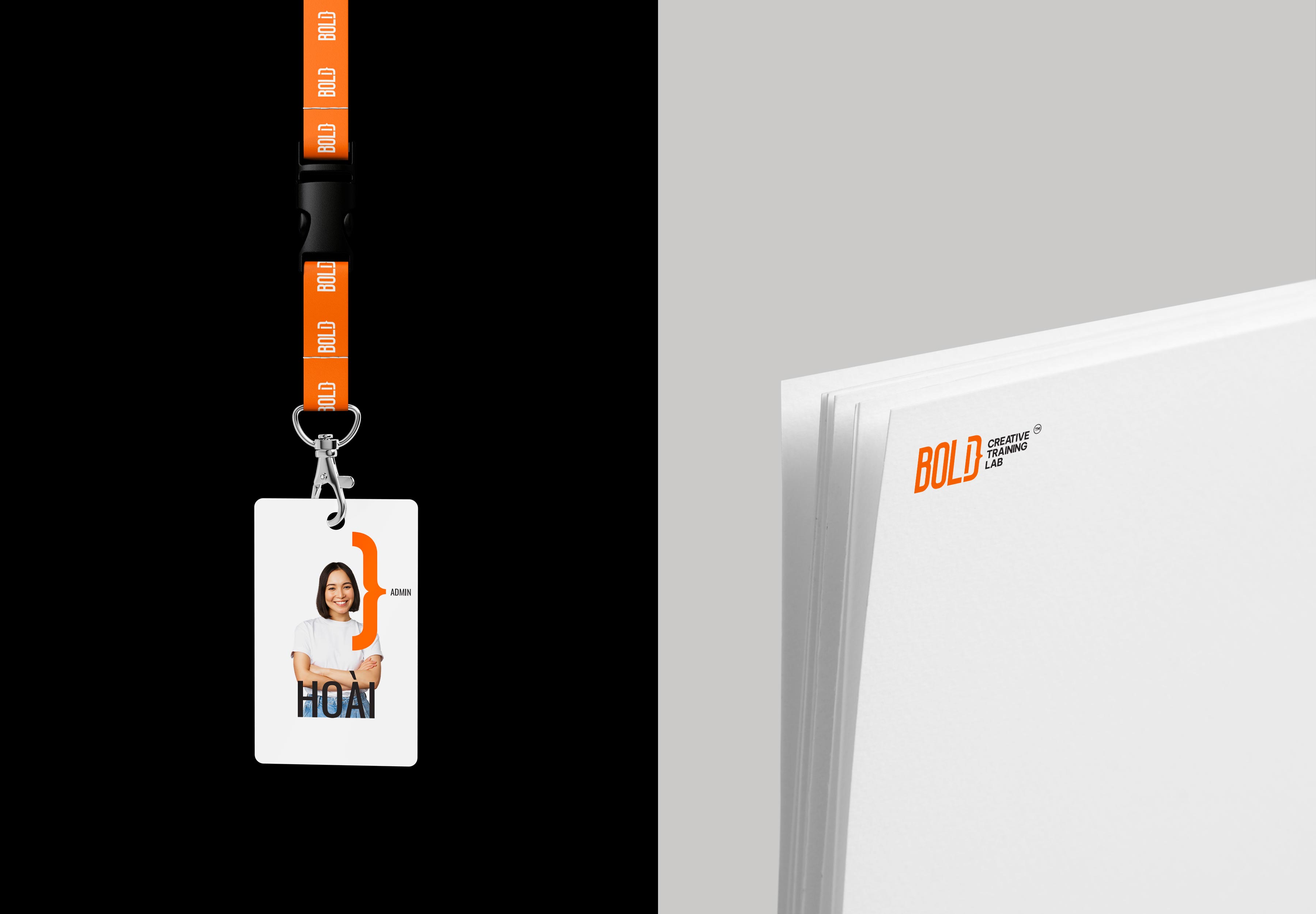
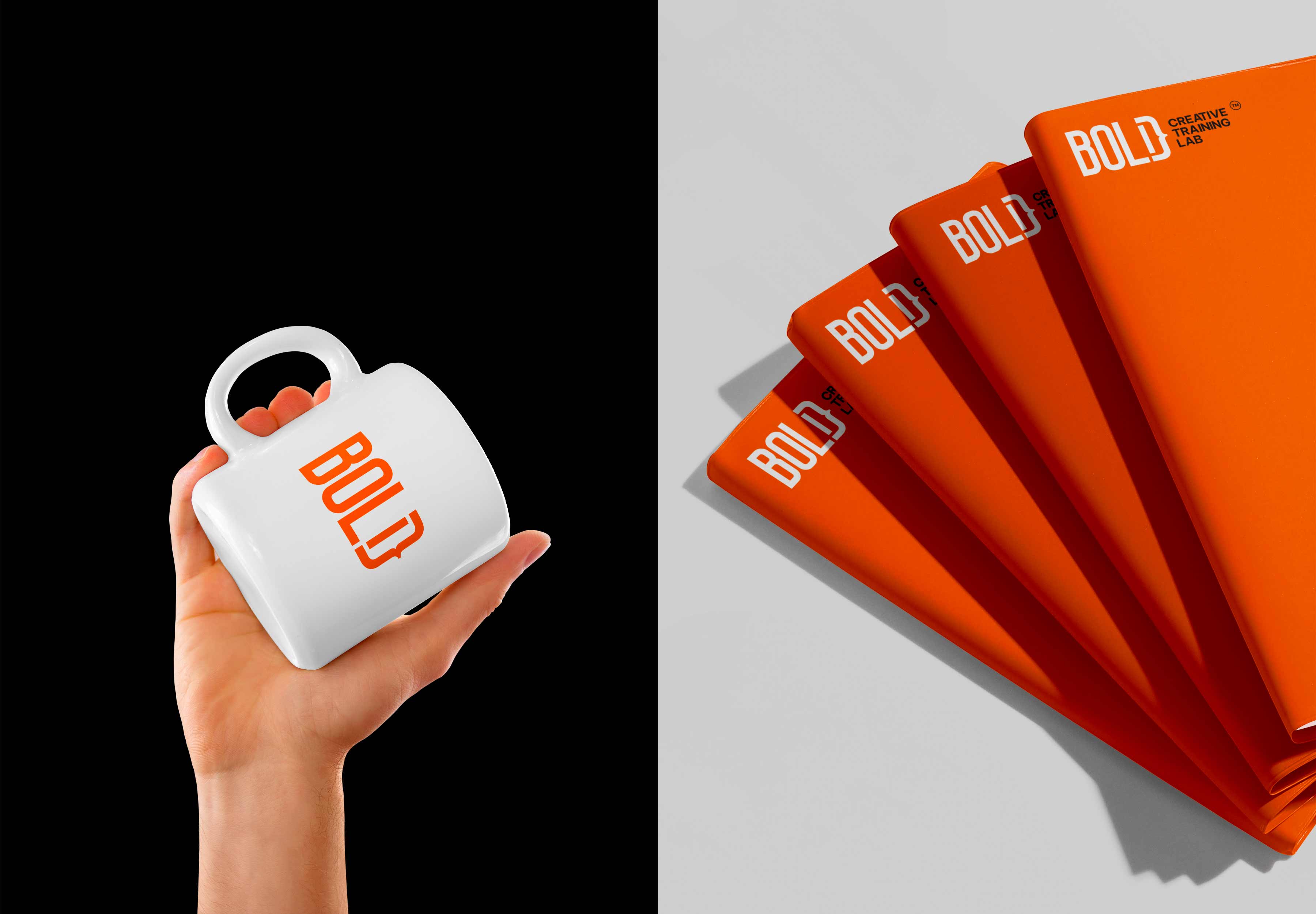
Solution: The revamped identity system is characterised by boldness, youthfulness, and modernity. It has helped increase brand awareness and ensure consistency across visual and verbal communication.
Colour Scheme: The new logo’s vibrant orange hue symbolises Bold’s energetic and creative spirit. This deeper shade enhances contrast and communicates the school’s dedication to delivering high-quality education to its students.
Design Elements: The addition of the “}” symbol brings a narrative element to the brand, suggesting storytelling and inspiration. All educational materials, from basic to advanced, are carefully curated to ensure students acquire mandatory skills for successful careers in advertising. These are provided in easy-to-digest handouts, supporting a seamless learning experience.


CREDIT
- Agency/Creative: Leo Dang
- Article Title: Brining a Youthfulness and Modernity to Bold Creative Training Lab’s New Identity
- Organisation/Entity: In-House
- Project Type: Identity
- Project Status: Published
- Agency/Creative Country: Vietnam
- Agency/Creative City: Ho Chi Minh City
- Market Region: Asia
- Project Deliverables: Brand Identity, Branding, Editorial Design, Web Design
- Industry: Education
- Keywords: Vietnam, Branding Identiy, Education, Logo Design
-
Credits:
Creative Director: Leo Phan
Managing Director: Linh Sam
Art Direction/ Sr. Designer: Leo Dang
Lead Content: Giang Nguyen
Graphic Designer: Nhu Nguyen
Illustration: Dinh Nguyen Hoang
Showcase: Leo Dang
Website: Van Tay Media


