Roketo is a real time financial platform on the NEAR blockchain protocol. Basically, it’s a set of products and tools that help crypto projects to handle their incomes, paydays, investments, token airdrops and boost token utility through persistent.
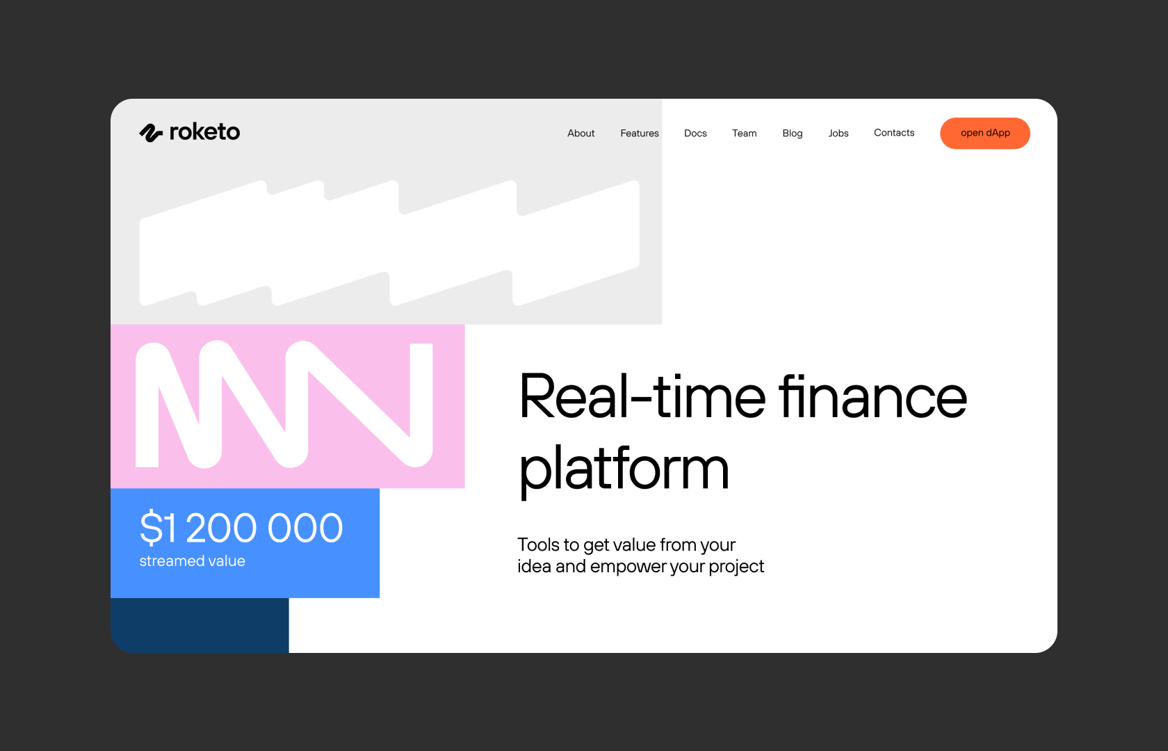
Web 3.0 has a lack of explicit and businesslike communication, so we had to give up the graphic stamps & clichés and refined the project identity. We aimed to create a true b2b brand that would stand out among a bunch of crypto projects.
Roketo’s mission is to help projects develop and give convenient and transparent tools for handling cash flows and monetization. Moreover, they strive to engage web 2.0 projects and bring the mass adoption closer.
Roketo used the letter “R” early on in the project where the rocket nozzle reflected the idea of boost and speed. After the strategy session we came up with an idea that there’s much more. The key goal is to show the modularity of universal solutions for any project and payment flows.
Palette.
That’s how the mature b2b project in web 3.0 has to be like: fresh and bright colors. with no usual cliches like neon colors, dark backgrounds and “space” pics. We chose a broader palette of colors to reflect variety of product’s utilities and outlook for new services.
Shapes.
These elements have the same design principle, unique shapes and flexibility in the use, so all these objects can be stretched without losing the recognizable shape.
Font.
We chose this simple and concise font that has its unique plastic letters. It matches with the flowing shapes and the main graphic elements.
Tools.
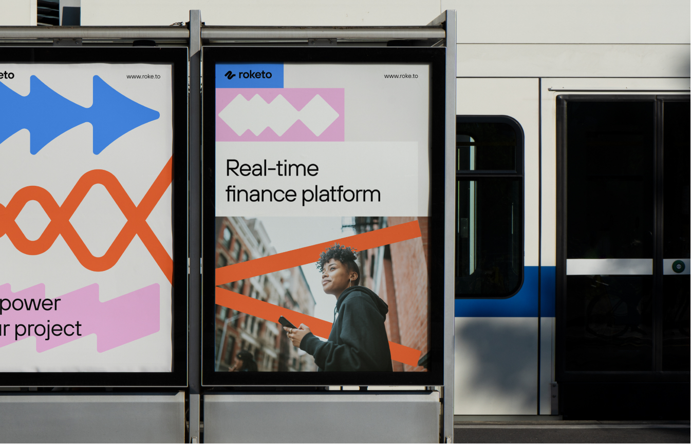
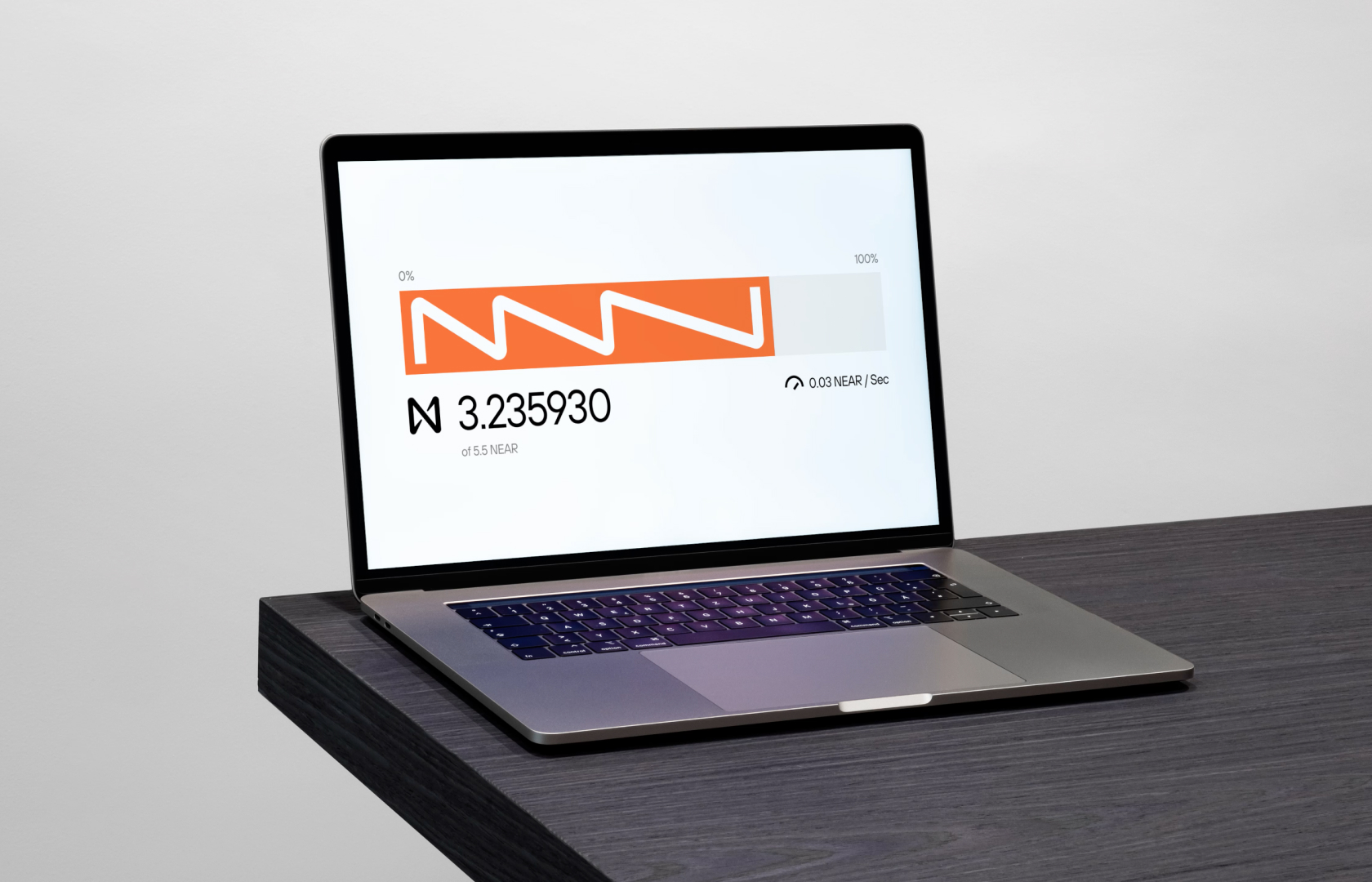
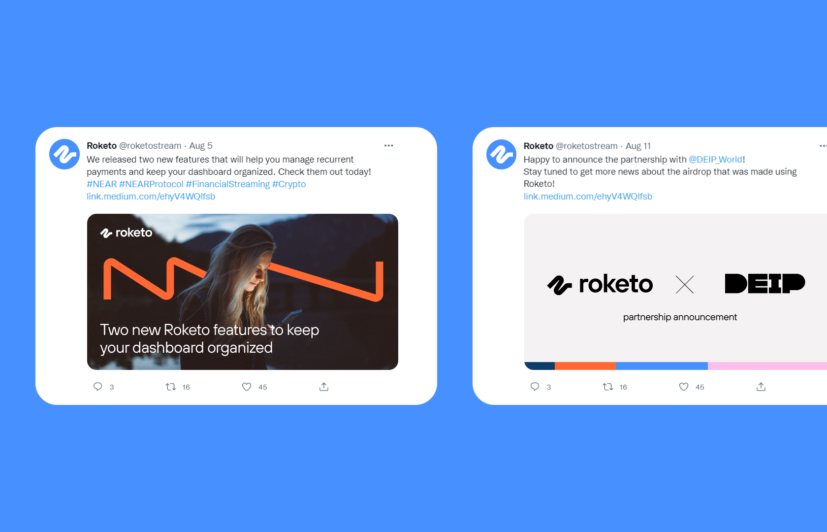
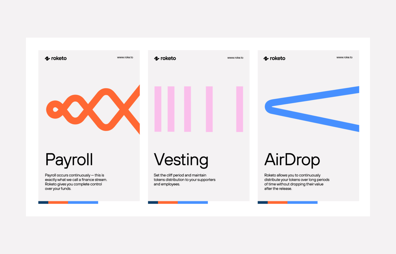
Now there’re 3 key products, each has its own color and its own branded graphics. This design system allows you to easily embed new unique products in a growing ecosystem.
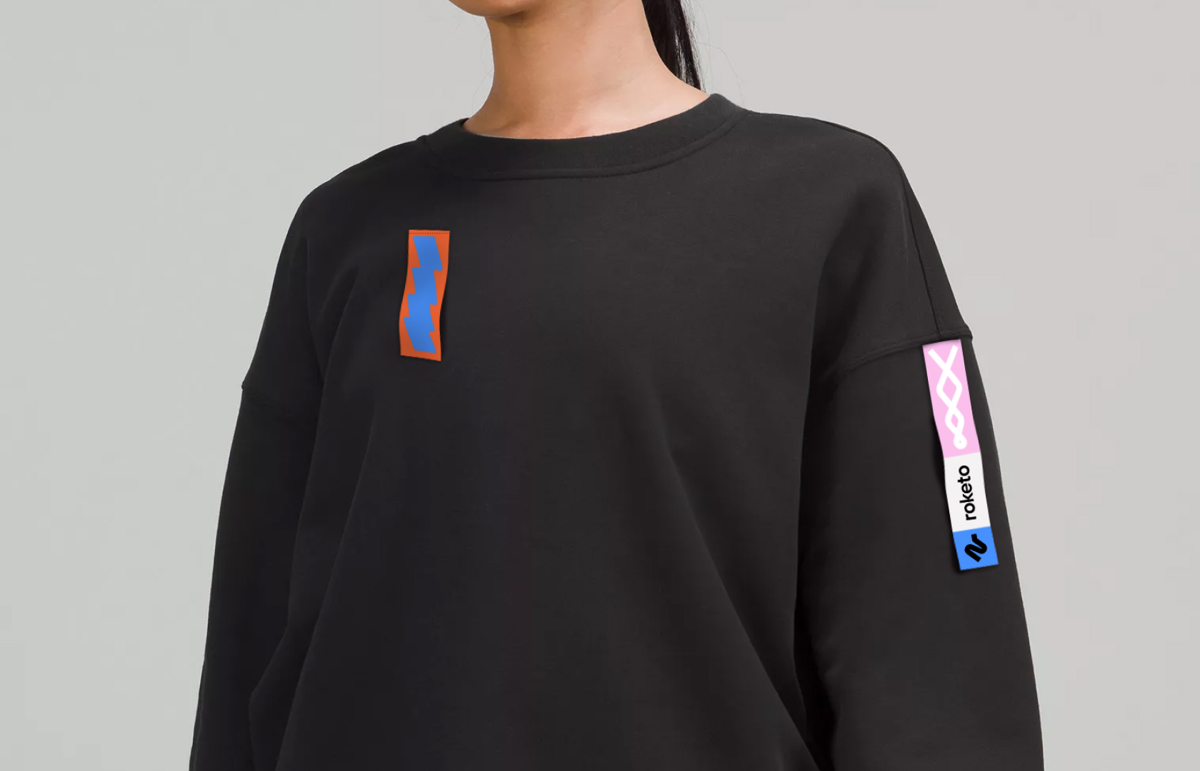
It’s ubiquitous for web 3.0 projects to speak abstractly. Therefore, these images show that the product is used by people in everyday working life.
CREDIT
- Agency/Creative: Kidults
- Article Title: Branding for Financial Platform Roketo
- Organisation/Entity: Agency
- Project Type: Identity
- Project Status: Published
- Agency/Creative Country: Spain
- Agency/Creative City: Barcelona
- Market Region: Global
- Project Deliverables: Animation, Art Direction, Identity System, Logo Design, Rebranding
- Industry: Technology
- Keywords: web3, fintech, crypto, identity, branding, logo design
-
Credits:
Creative direction, Business design: Mike Shishkin
Brand Design: Anna Kipot
Project management: Sasha Stepanova
Strategist: Mikey Khudyakov


