Atikus is a real estate developer’s brand in which the art of design and implementation are embedded in its DNA. The founders of the brand are two enthusiasts of architecture and construction, and they try to implement their passions effectively in the scope of subsequent investments. Their motto: “Live comfortably” indicates commitment and attention to every detail, because they know how important it is for the final comfort of the apartment.
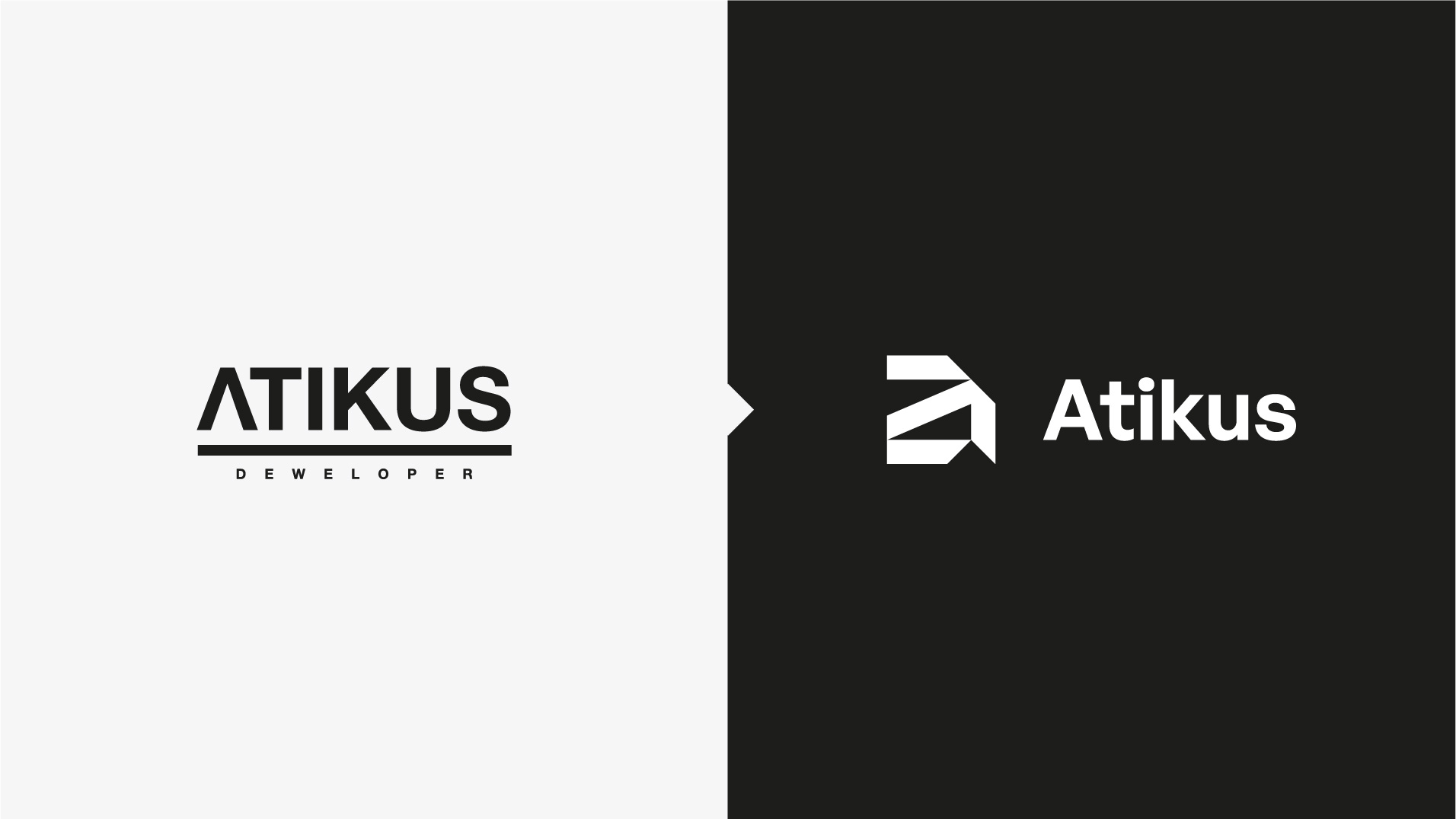
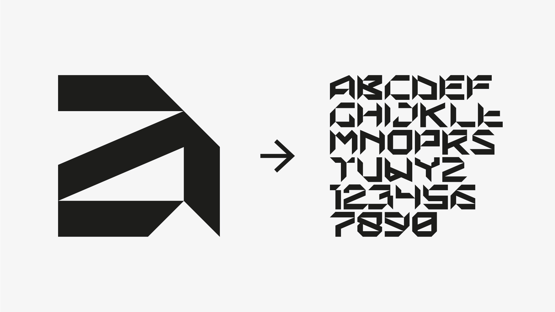
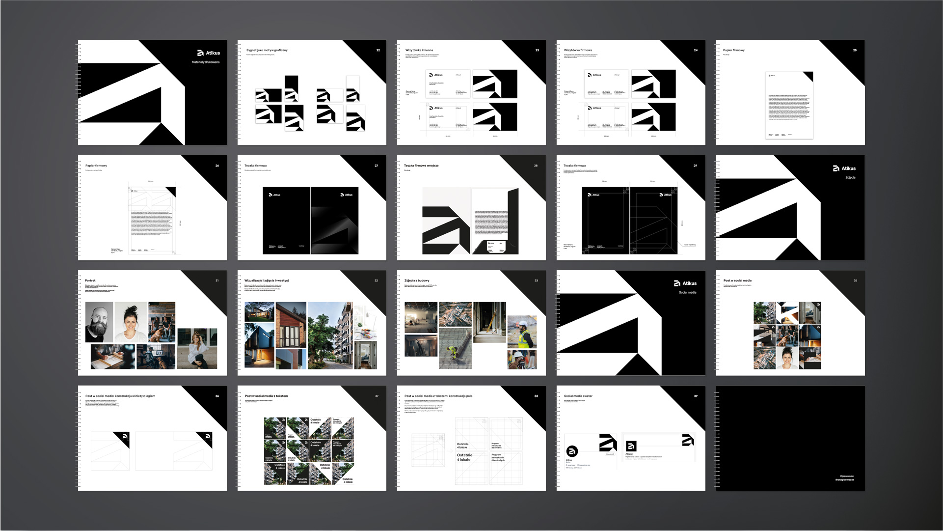
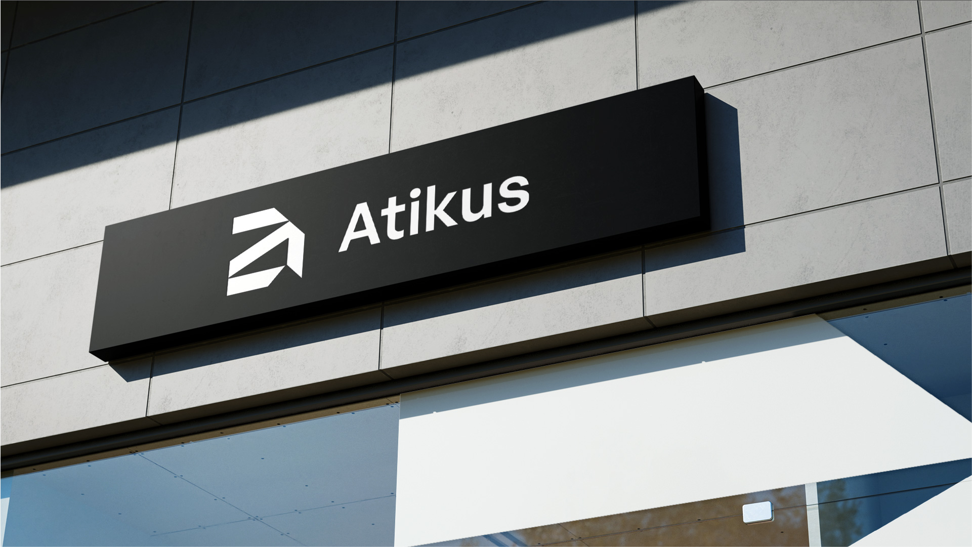
The Atikus brand mark could not be prepared otherwise than on the basis of a solid concept and structure. The concept includes the letter “a”, resembling the structure of the building.
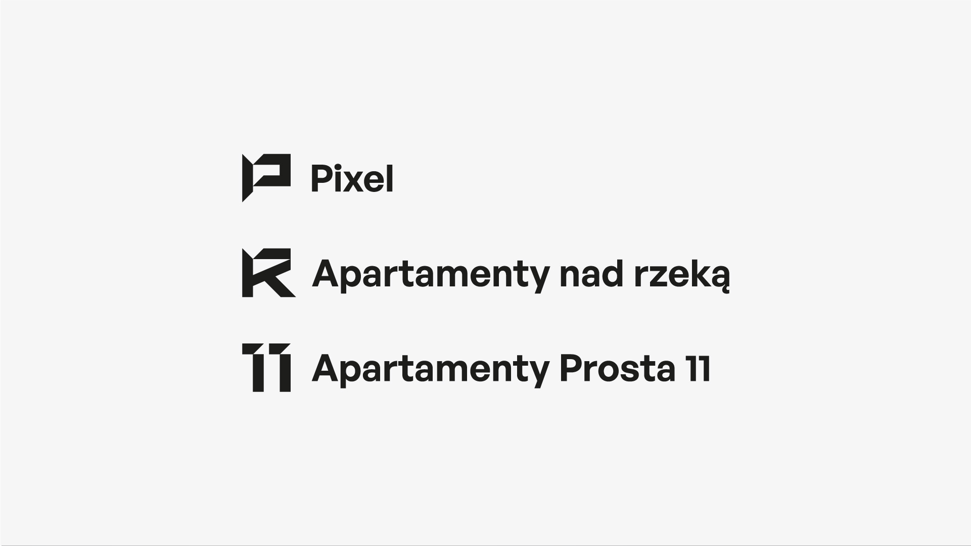
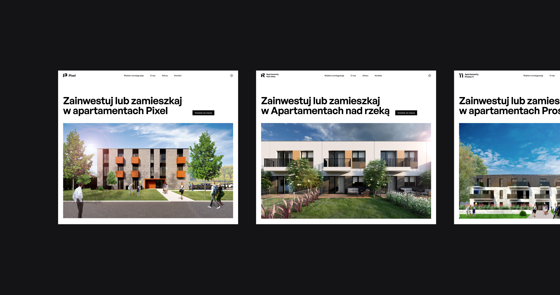
In the brand architecture, Atikus appears as an umbrella, parent brand. We decided to unify the image of individual investments by building the Atikus brand alphabet. Subsequent projects receive their mark: a letter or a number (or a combination of both) based on a developed, unique typeface that we provided to the Atikus brand in the form of a ready-to-use font.
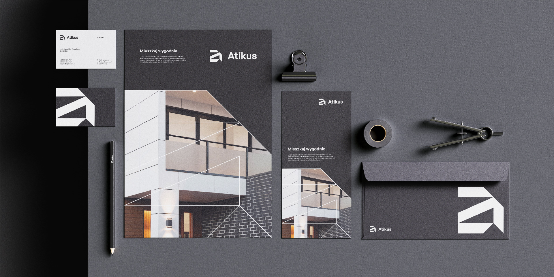
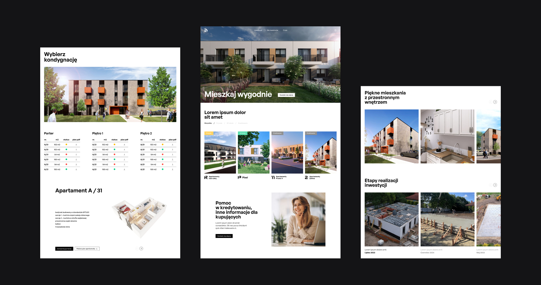
The visual identity based on simple but effective elements such as black and white brand colour palette and sans serif typograpfy. That helps to present investments details which comes in full colour photography.
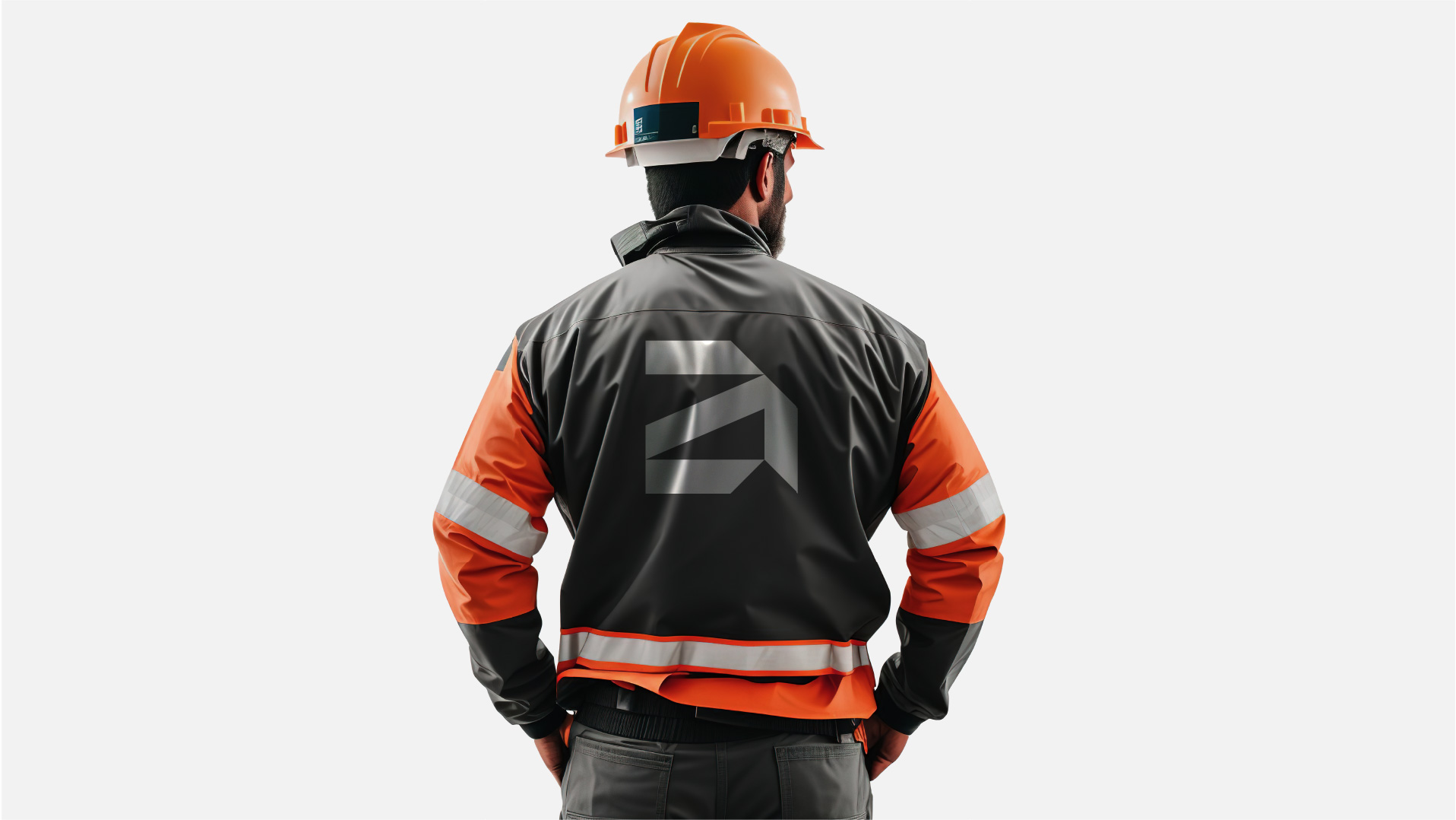
The brand mark and other characters from custom typography are used as a key visual ex. to crop investments photos and show the details in brand visual communication.
The comprehensive rebranding project included: new logo, key visual, investments logo system with custom typography, print and digital materials design, website design. The principles of using and constructing key communication elements are described in an extensive brand visual identification system (guidelines).
CREDIT
- Agency/Creative: Brandglow branding agency
- Article Title: Brandglow’s Rebrand of Atikus to Show a Real Estate Developer Brand DNA
- Organisation/Entity: Agency
- Project Type: Identity
- Project Status: Published
- Agency/Creative Country: Poland
- Agency/Creative City: OPOLE
- Market Region: Europe
- Project Deliverables: Brand Architecture, Brand Design, Brand Guidelines, Brand Identity, Brand Mark, Brand Redesign
- Industry: Real Estate
- Keywords: Rebranding Branding Typography Brand Guidelines
-
Credits:
Brand / typography designer: Łukasz Rożański
Digital designer: Anna Molokanova
Project manager: Marcin Gajos


