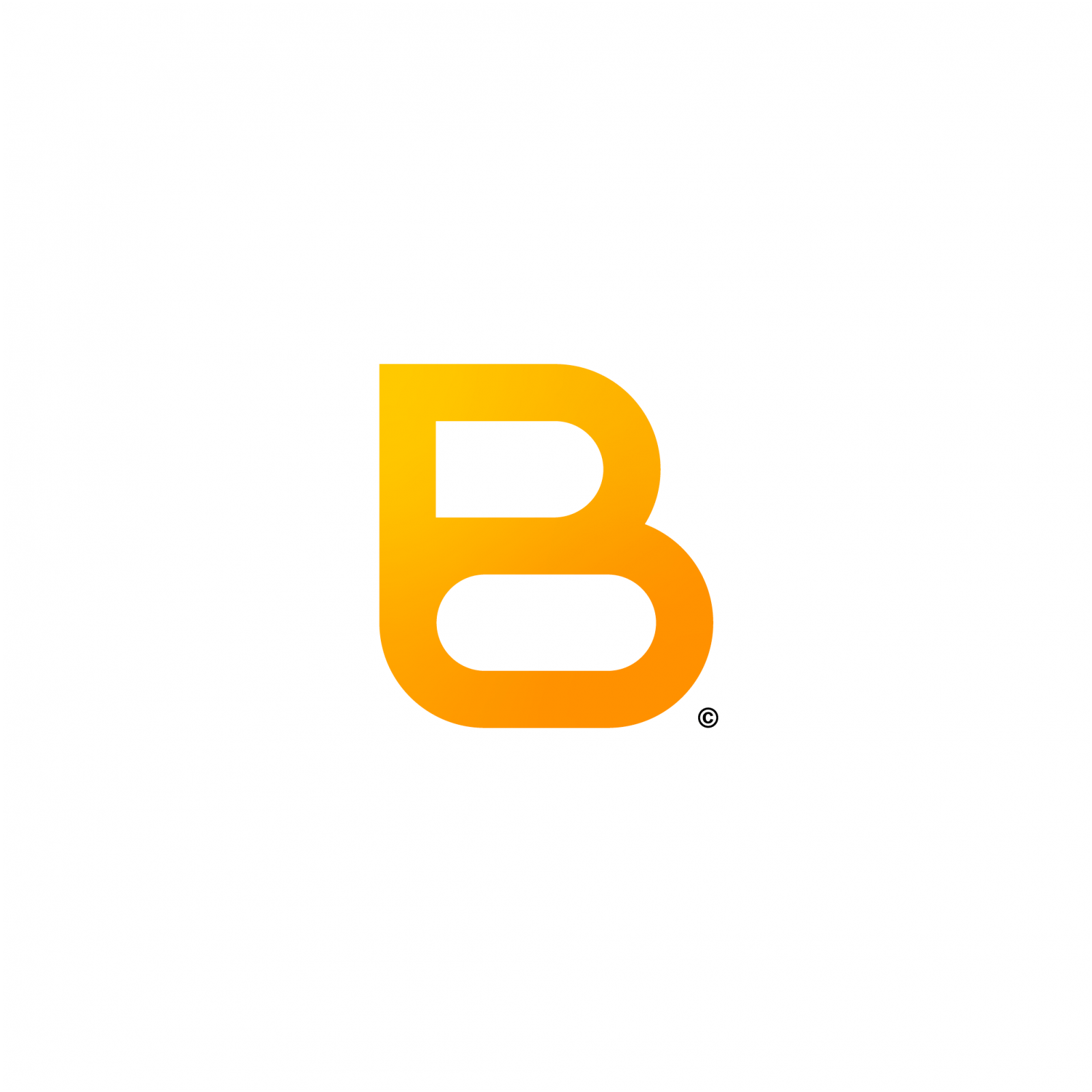
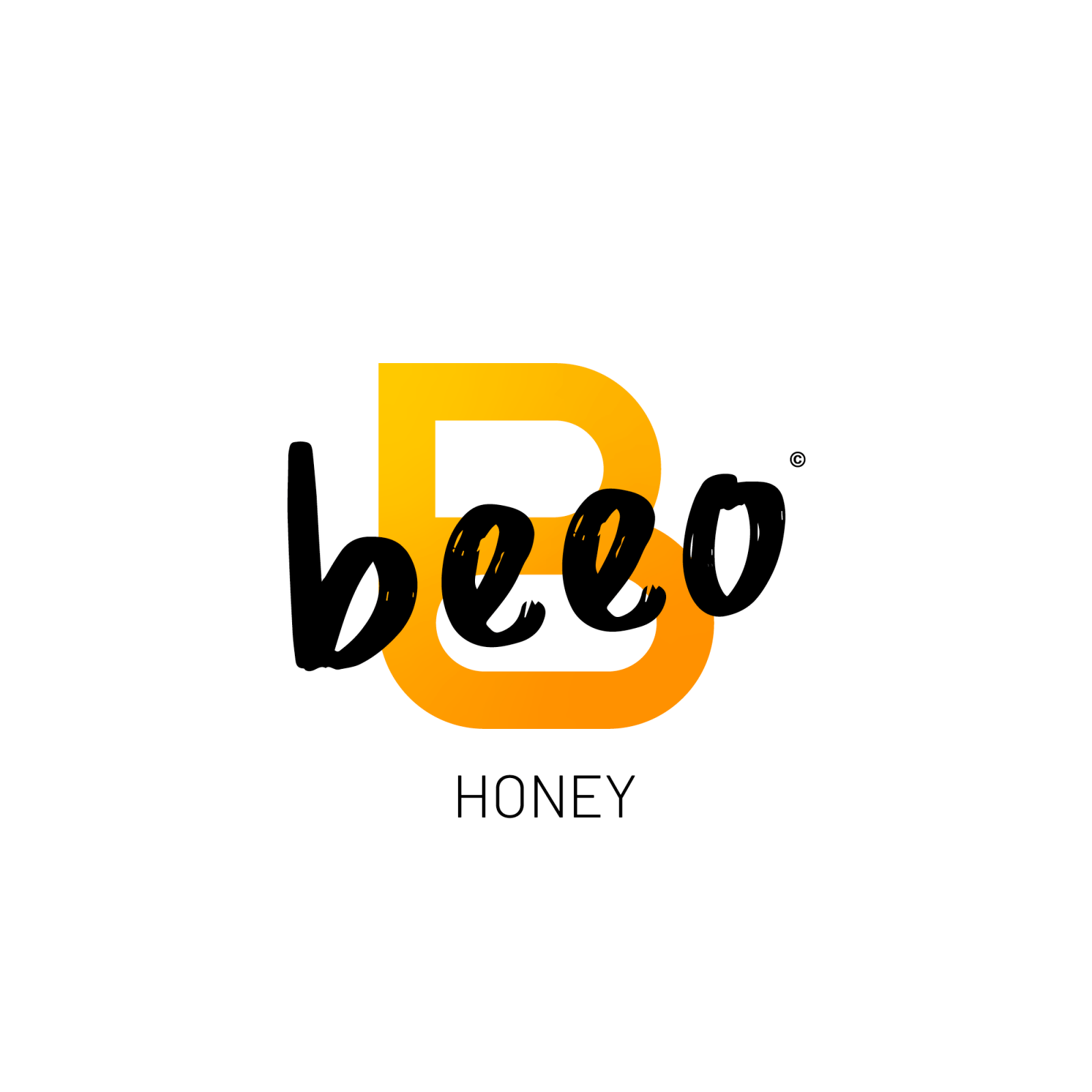
Beeo is a new brand of honey that strictly adheres to the criteria of organic farming and especially the good remuneration of the beekeepers affiliés. Modern in its way of producing honey, it is also modern in its graphic identity. Beeo is the contraction of “bee” and “organic”, this gives a name that is striking, thoughtful and effectively evokes honey. I then thought that the logo should evoke both the field of activity and the first letter of Beeo. So I realised that if you take a part of a stylised beehive design, you can see the letter “B” appear. I also realised that it suggests the wings of bees (only if we duplicate it and put it facing each other). To denote with this very modern pictogram and raffiné, I added this rather striking typeface, as it reflects the organic aspect. I chose to superimpose the typography on the pictogram, because in my opinion it shows that the organic aspect takes over the brand in a positive way. The colours make it even easier to guide us afin to know what we are in, since this orange gradient echoes the product on offer, which is honey. It is perfectly readable from near and far and also works perfectly on a black or white background.
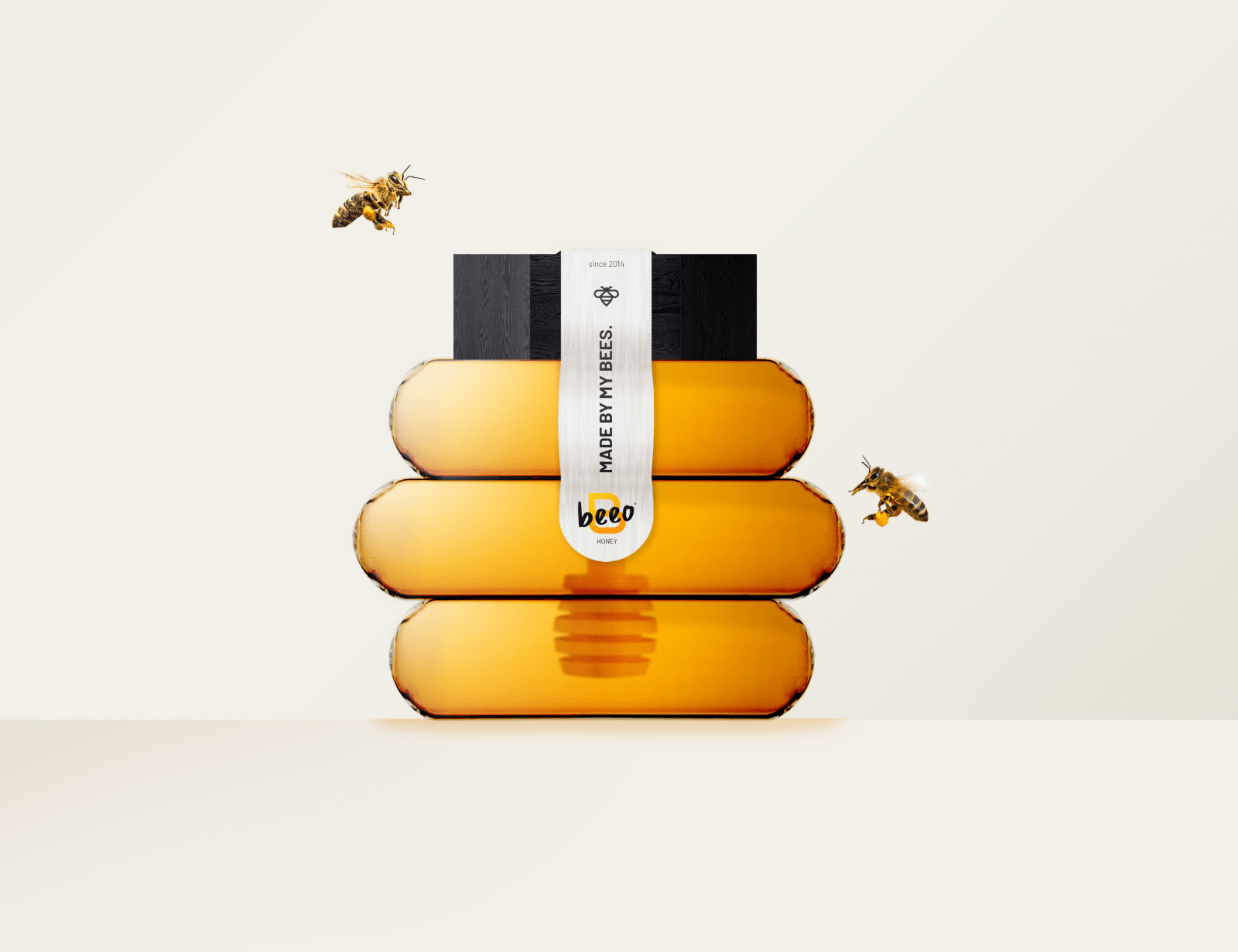
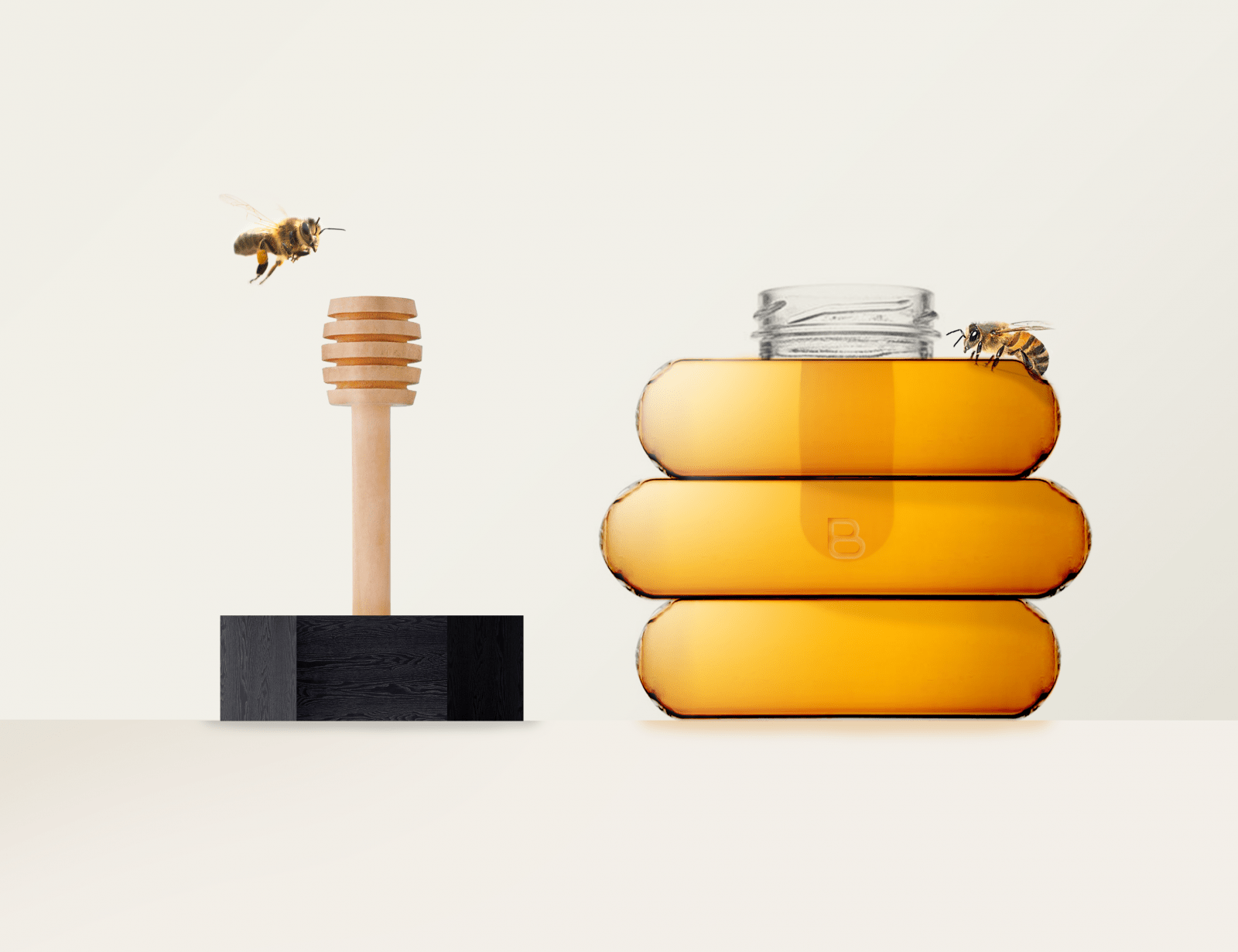
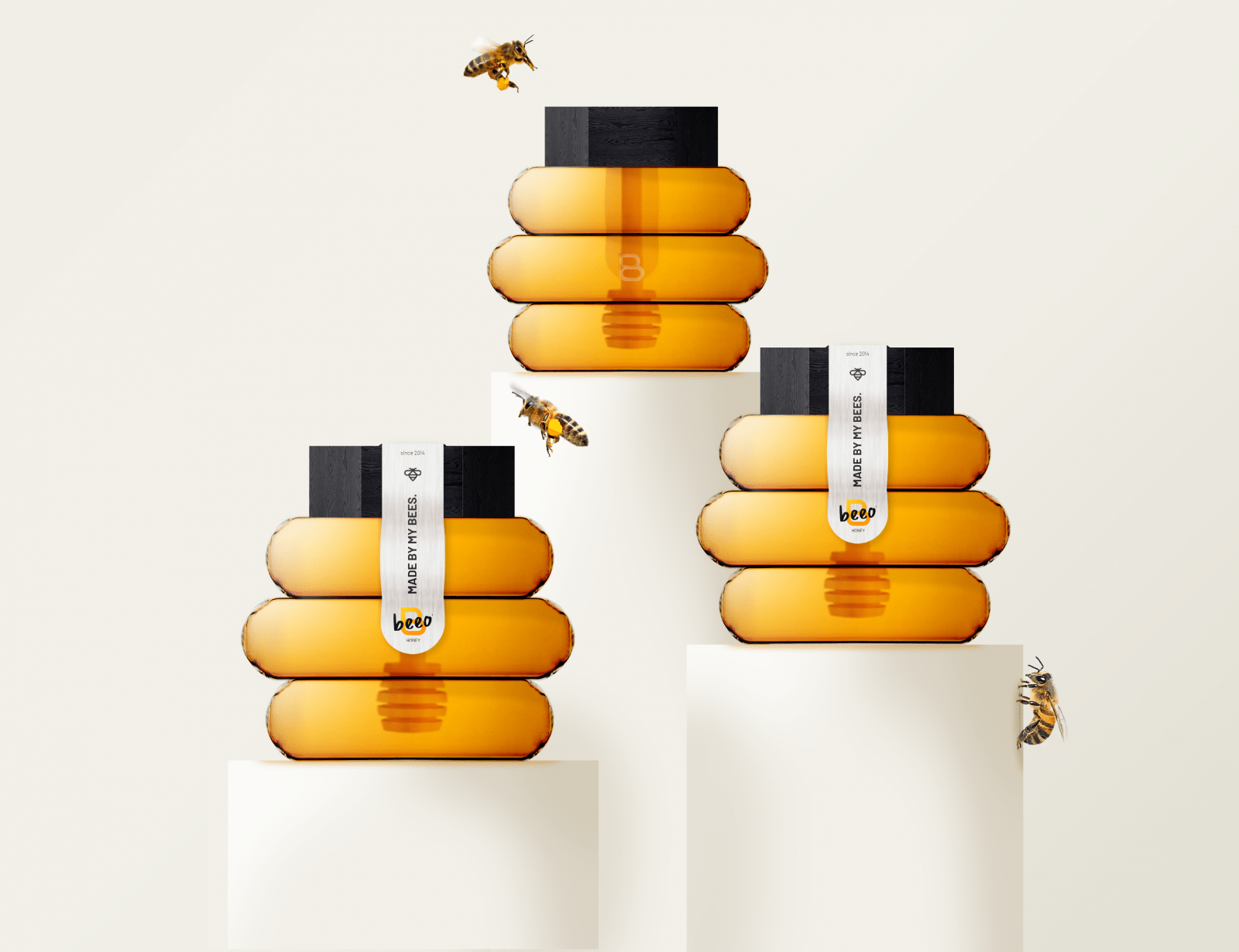
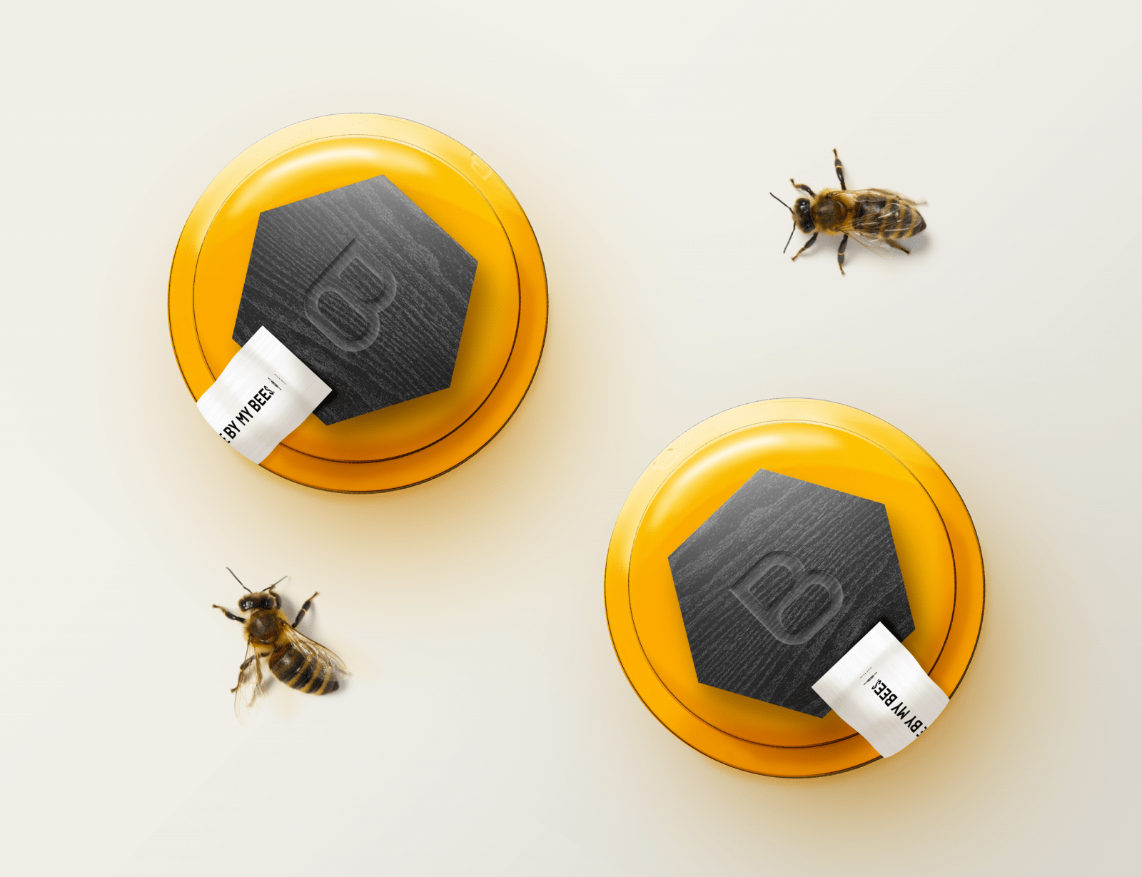
Beeo’s packaging is a perfect reflection of the brand itself. Modernity associated with authenticity are the 2 keywords of this packaging. Modernity due in particular to its atypical and new shape. It stands out from other traditional brands that always have the same thing, which repeats itself without any subtlety. Beeo wishes to transmit the taste of excellence and this is already done by an innovative packaging. The shape therefore reminds us of a simplified hive that served as the basis for building my logo. In fact, there is an analogical link between the logo and the packaging, because by tracing an axis in the middle and retaining only the first two floors, it forms the letter B of Beeo. This link implicitly makes it possible to recognise the brand thanks only to this honey pot. Exceptionality and excellence rhyme with authenticity thanks to this shape giving birth to this elixir appreciated by all. Authenticity can also be felt through
noble materials such as wood, which evokes nature and echoes the attention Beeo pays to the environment. Glass is recyclable, which reinforces this responsible and environmentally friendly aspect. The packaging is as unique as the honey it contains.
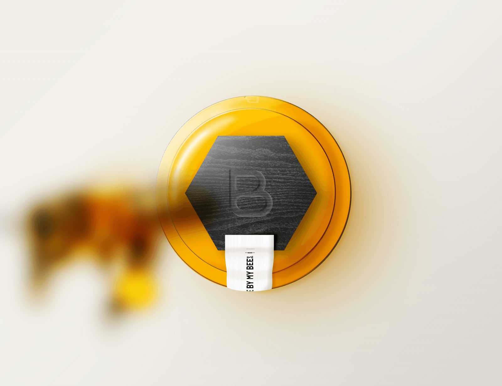
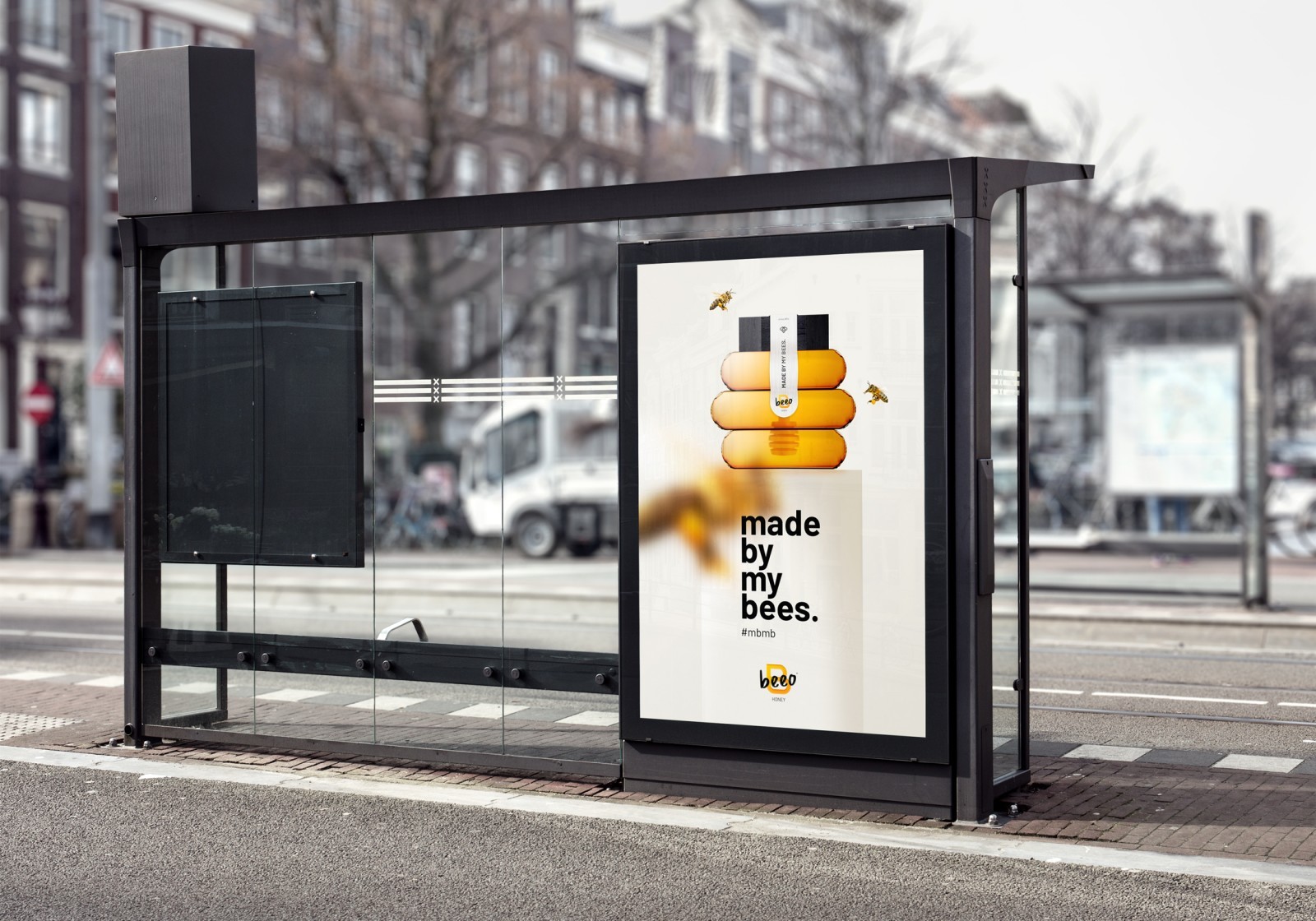
Beeo’s advertisements are sober and highlight the special and beautiful colour of honey. This amber-tinged orange has a unique strength, brilliance and above all a unique texture. The arrangement of the bees sets up a dynamic and allows the spectators to project themselves easily and to have a quick and efficient understanding. The close-up on blurred bees surprises and appeals, which is the aim of an advertisement. In addition, the purity of the off-white is pleasant and soft, it lets the poster breathe. The thick slogan in black adds strength and character to this advertisement. It is therefore a mixture of purity, dynamism and character, just like the product Beeo honey. The animated advertisement featuring bees flying around the honey pot refers to the bees circling around the hive to protect the queen and the precious honey. This symbol of protection is reused to make the inlay of the product in nature more realistic. As the brand is in harmony with the environment, it is an additional asset to highlight.
CREDIT
- Agency/Creative: hurtikonn
- Article Title: Brand Refinement of Beeo Honey Designed by Hurtikonn
- Organisation/Entity: Student, Non Published Concept Design
- Project Type: Packaging
- Agency/Creative Country: France
- Market Region: Europe
- Project Deliverables: Brand Creation, Brand Strategy, Packaging Design
- Format: Pot
- Substrate: Glass, Wood


