Branding seaweed from a world chef champion
Kind has developed the name and complete branding for Flyt Seaweed, based on Austevoll, Norway. Flyt creates gourmet Norwegian seaweed products of the finest quality, all sustainably sourced and responsibly harvested.
The Name. ‘Flyt’ is Norwegian for ‘float’ or ‘flow’. Norwegians say that if you have ‘god flyt’ – ‘good flow’ – you have good fortune in life. Flyt believe that nothing brings good fortune like good health. Seaweed, packed with goodness, is a great place to start.
The Origin. Flyt is based on the small island of Austevoll, Norway. Located off the west coast, it is deeply cold in winter and pleasantly warm in summer. The sea is clean, unspoilt and very cold. In short, perfect conditions for cultivating the finest seaweed products in the world.
An extraordinary chef. An extraordinary seaweed. World-renowned Norwegian Chef Ørjan Johannessen uses Flyt seaweed in his remarkable, award-winning dishes. In fact, such is his passion for seaweed, that Chef Ørjan is leading Flyt’s product development. He gained the Bocuse d’Or Gold Medal in 2015, an international event seen by many as the culinary equivalent of the Olympics. His win demanded passion, talent and unwavering commitment. Chef Ørjan demands only the finest, natural ingredients.
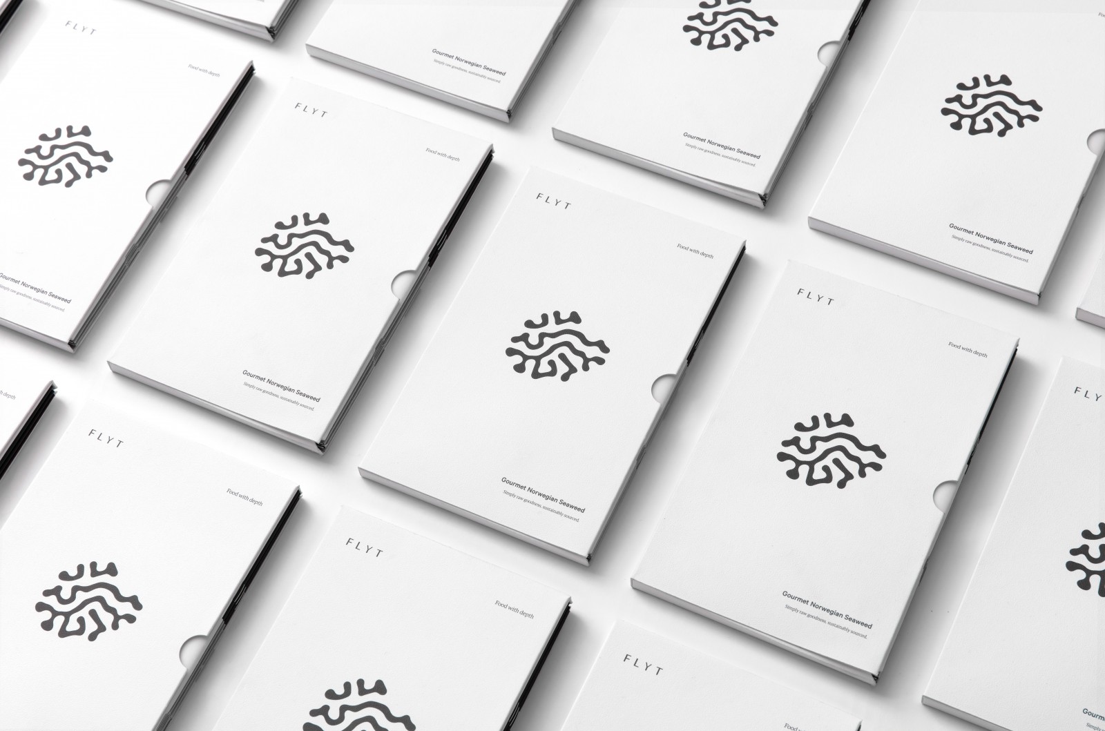
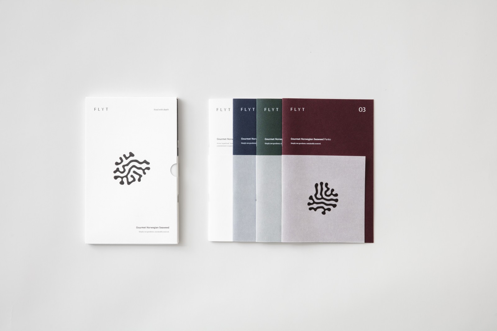
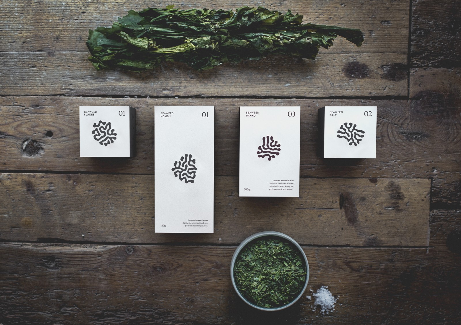
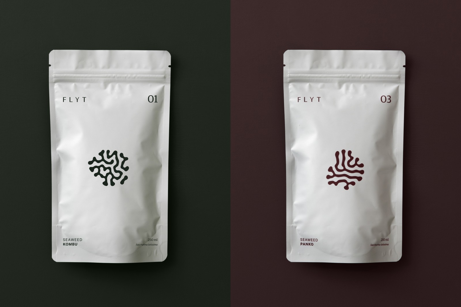
The language with hidden depths. Nature is the ultimate artist. Her works are beyond measure. Each and every one is unique. To reflect the organic beauty and exceptional qualities of seaweed, Kind has developed a unique generator to create the ‘visual language’ of different symbols, each having a meaning that can be read and identified. Like Flyt’s premium seaweed products, this language has hidden depths.
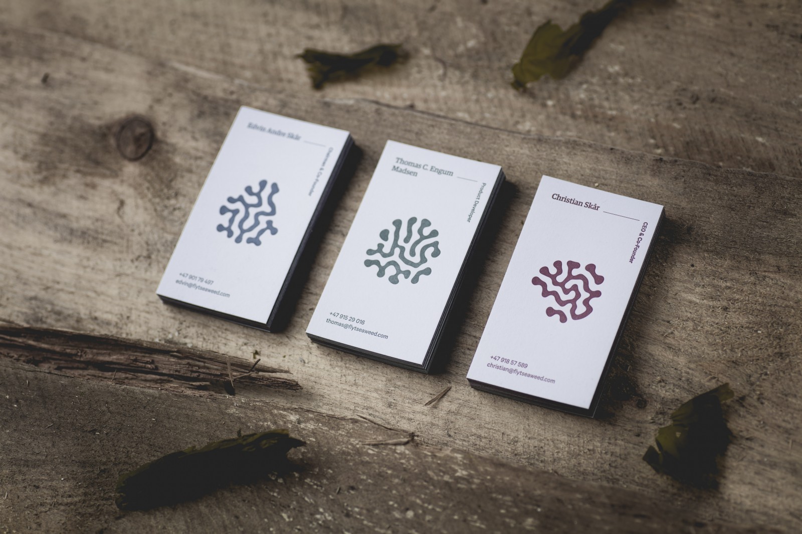
By scanning the unique ‘tang’ symbols on the front of the packaging, business cards, work uniforms and brochures, with the Flyt app, you will find out more about when the seaweed were harvested, the production and the people behind. You will also discover more about the commitment to sustainability and best practices throughout the entire process. By giving the brand this extra communicative dimension, we give the Flyt’s target group a way to strengthen their commitment to the product and enrich their user experience.
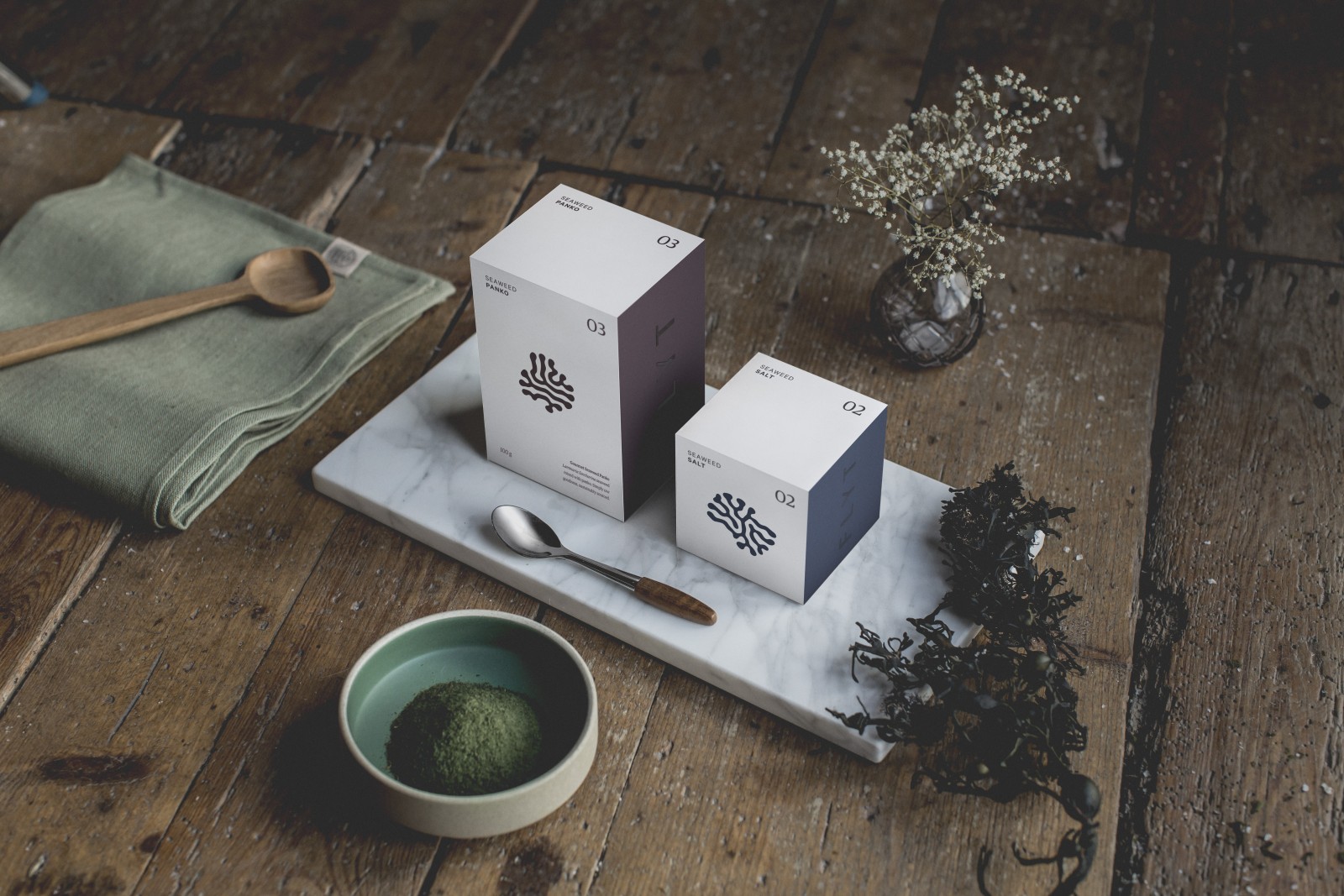
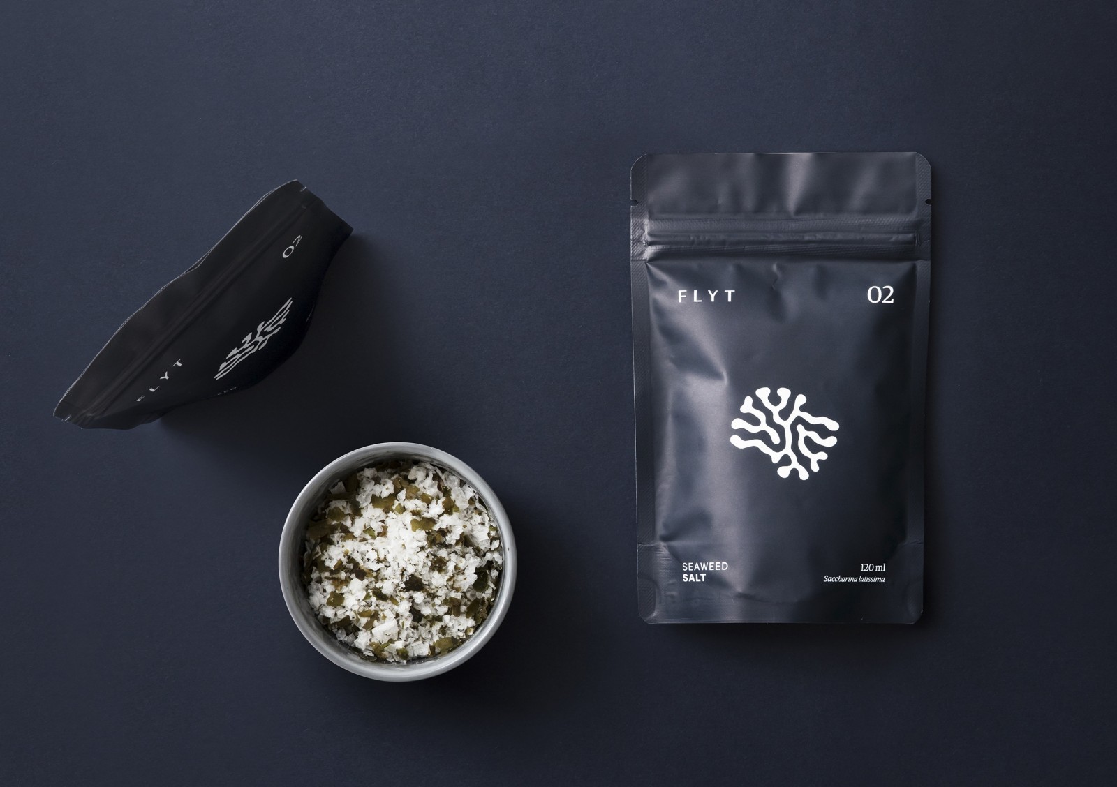
The packaging itself, in it’s paper form, with a interpretation of the range of symbols embossed in the actual paper fabric, further gives the packaging the premium qualities it deserves, complimented by the -quantity bags in its matte finish.
“This project has been a perfect combination of creativity, design, emotions and innovative applications. It is not every day we meet such open-minded people as the people behind Flyt, who let us explore linguistics, generative design, natural growth patterns, app design and to dig into what traceability really means. We are very pleased with the end result and are looking forward to the continuation of a fruitful collaboration with Flyt.” says Kind’s Design Director, Knut Harald Longva.


