
Design Activity – Daily Cultures Brand Identity and Packaging Design
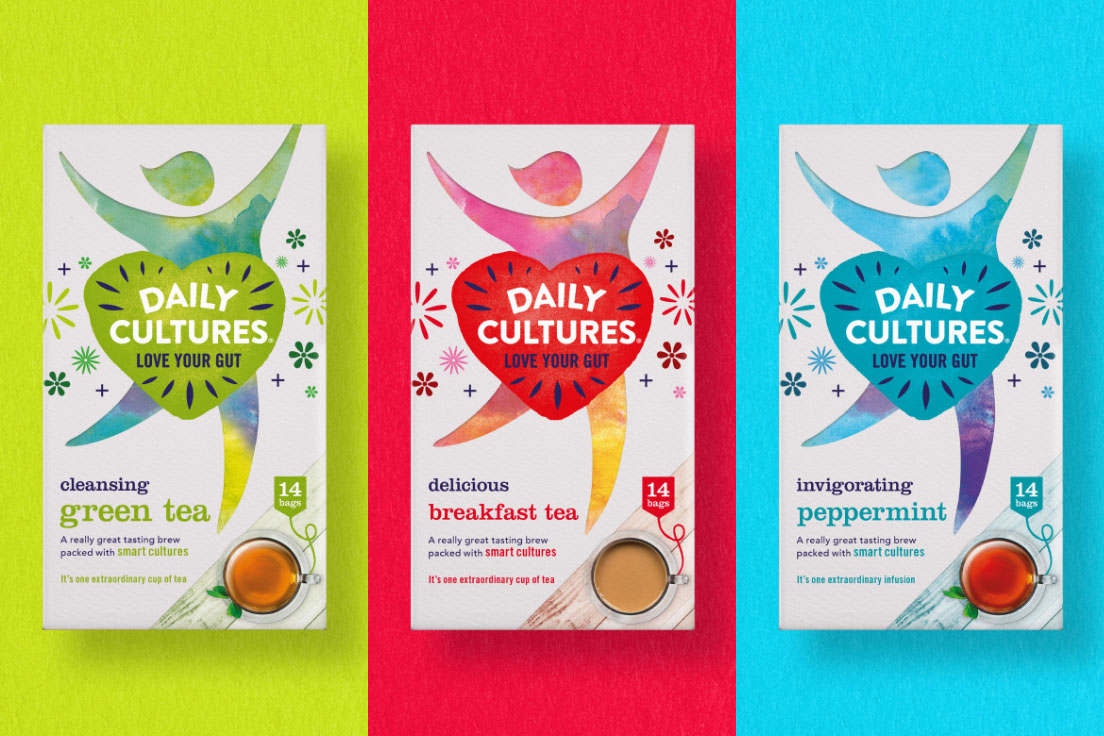
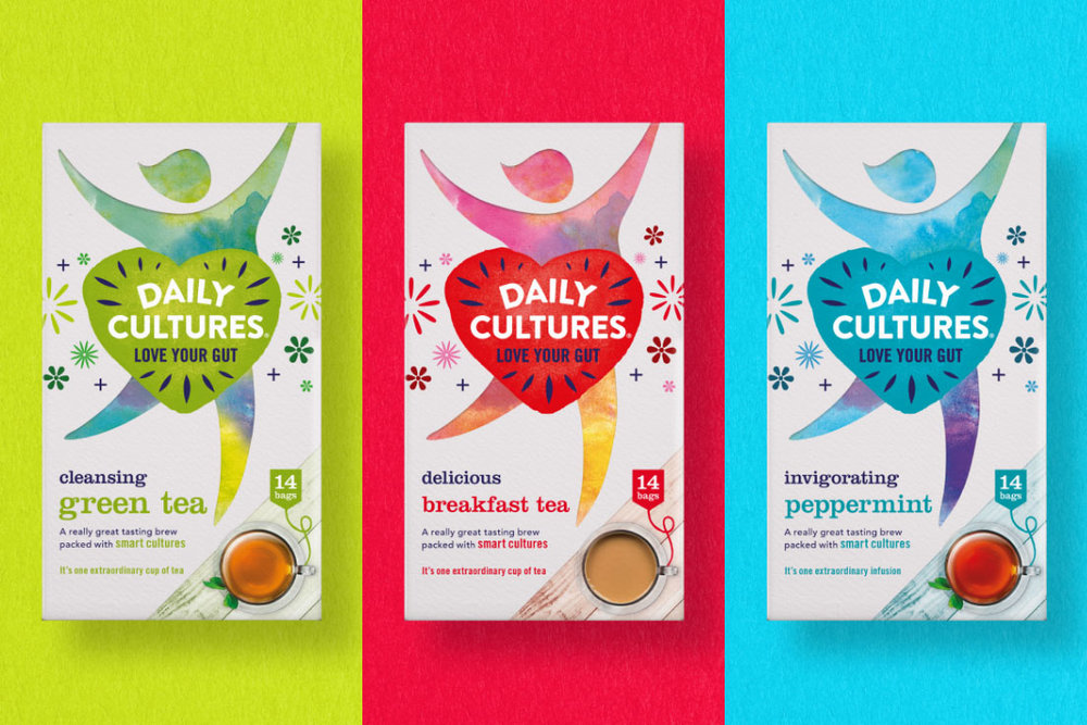
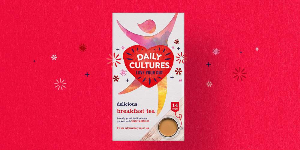
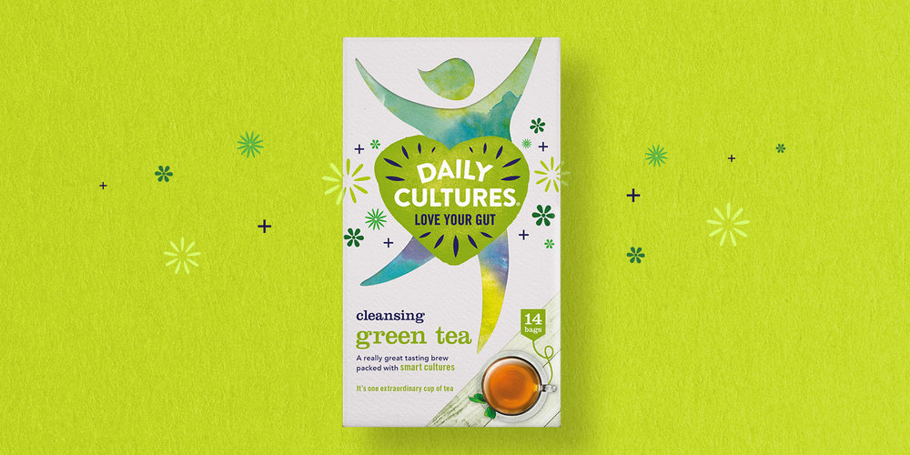
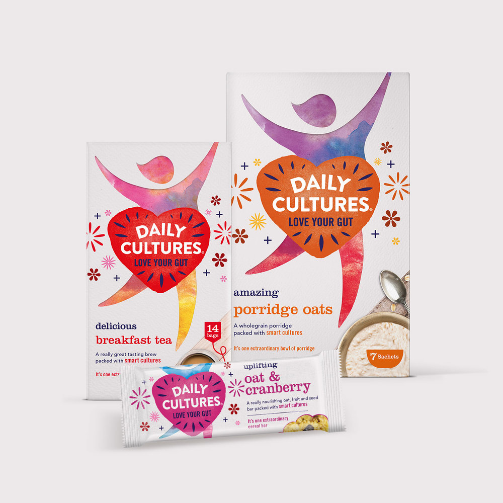
Daily Cultures is a brand on a mission. Committed to delivering everyday food and drink products that contain their unique smart cultures to aid good gut health. They believe adamantly that good gut health is the key to improving many health issues developed through poor diet and processed foods. They trust in plants. All of their products are 100% natural, convenient and delicious with their special Bacillus Coagulans cultures to help maintain and support a healthy gut. Powerful stuff.
With a small range already in the market we were tasked to future-proof the current brand and packaging with a radical redesign. Daily Culture’s aim was to engage target consumers with a brand that wasn’t like any other food and drink brand. Their products treads the line carefully between a health based product and a foodie one. Our main challenge was to create the right balance for a variety of consumers all looking for the perfect solution to a common problem. A tasty brand with health benefits that actually work.
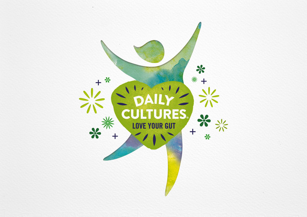
How does healthy food and drink that tastes great make you feel? That’s the emotive feeling we captured for the brand, the uplifting feeling you get when you’re at your happiest and healthiest. The branding is encapsulated in a heart, the universal symbol for health, over the gut area of a figure jumping for joy. The sparkles and twinkles surrounding the heart represent the cultures as an extra sprinkle of magic on the pack and in the product.

Design Agency Name: Design Activity
Organisation/Project Type: Agency, Published Commercial Design
Article Title: Reinvigorating Gut Health Brand Daily Cultures
Brand / Project Name: Daily Cultures Brand Identity and Packaging Design
Project Type: Consumer Brand Redesign, Consumer Brand Rejuvenation
Strategic Deliverables: Consumer Brand Strategy, Consumer Brand World, Consumer Product Brand Architecture
Design Deliverables: Consumer Rebranding, Consumer Brand Identity, Consumer Graphic Packaging Design
Location: United Kingdom
Market Country: United Kingdom
Market Region: Europe
Project Category: Cupboard Food
Consumer Packaging Format: Box, Flow-Pack

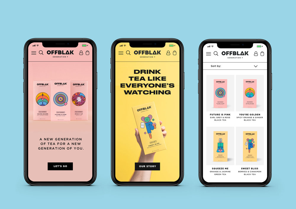
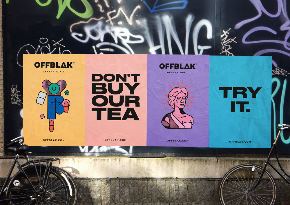
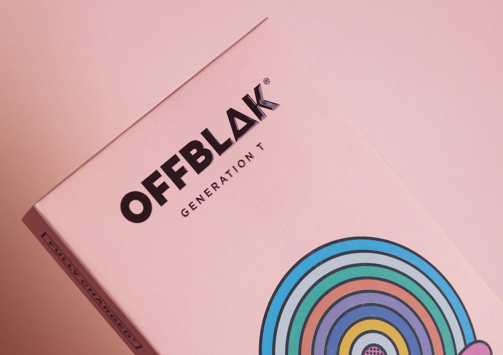
& SMITH – OFFBLAK
OFFBLAK, a new direct-to-consumer lifestyle tea brand delivering blends that taste as good as they make you feel, has today launched in the UK, with branding by London-based branding agency & SMITH. Looking to redefine the tea category, OFFBLAK targets Gen Z and Millennials driven by beauty, status and experience with an identity that encourages the consumer to ‘Drink tea like everybody’s watching’.
OFFBLAK founder, Dmitry Klochkov aims to shake up the drinks industry and set an exciting new course for tea with a brand that appeals to a more health-conscious consumer unafraid to experiment with new brands and flavours. To meet this brief, & SMITH created an identity for tea industry challenger OFFBLAK that brings a premium feel to a highly discerning Gen Z and Millennial market, which & SMITH has playfully named ‘Generation T’.
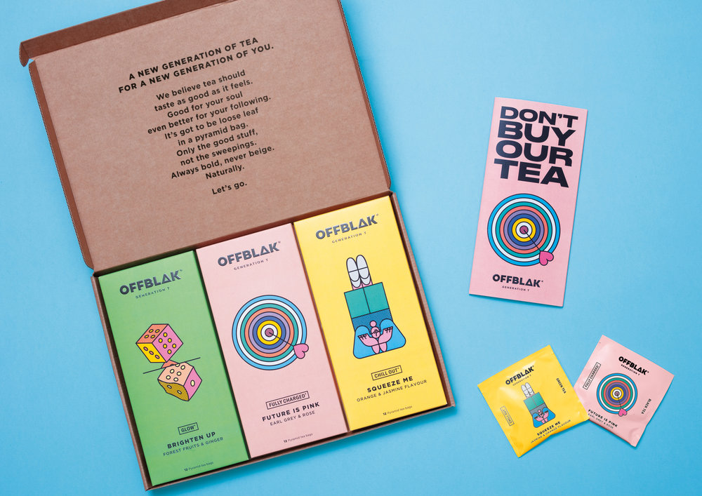
Good for your soul; even better for your following
“We want to be more than tea – much more. Today, natural ingredients are a given but often, good-for-you teas miss the mark when it comes to taste. Our identity needed to redefine the category and capture OFFBLAK’s zero-compromise on taste and excitement, while being brave and direct. We’re rule-breakers and the identity & SMITH has created really embodies that”, says Dmitry Klochkov.
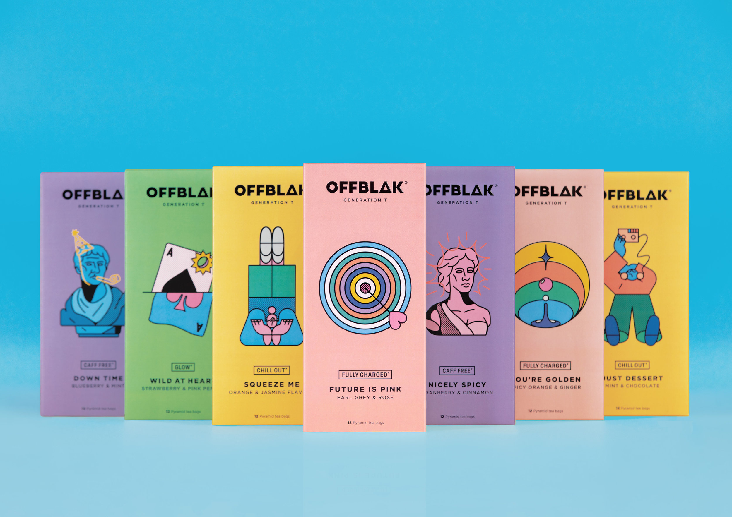
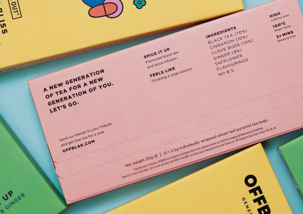
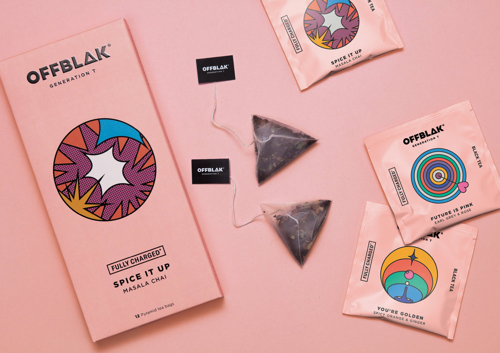
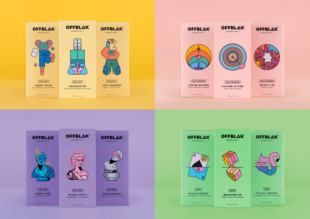
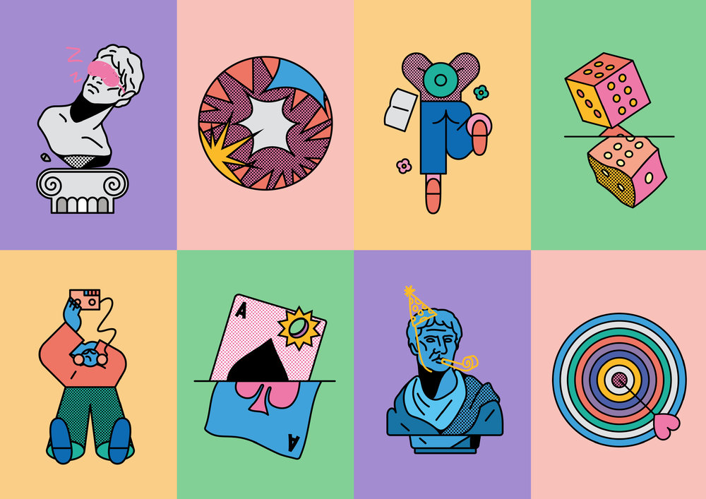
Stepping away from existing category design codes, & SMITH introduced a fresh colour palette and range architecture that clearly differentiates between the four core categories: Fully Charged, Chill Out, Glow and Caff Free.
Each of these four categories reflects the upfront benefits of the tea, aiding selection of the right flavour for the right need – whether that’s a detoxing tea or an enlivening, refreshing flavour. This is further supported by emotive naming within each category to reinforce the core benefit messaging, from ‘Brighten up’ and ‘Spice it up’ to Squeeze me’ and ‘Down time’, followed by details of the specific flavour profile.
On the back, each pack incorporates further information on the caffeine level and flavours, with details of what the tea feels like, for example, ‘Finishing a yoga session’.
A playful look and feel
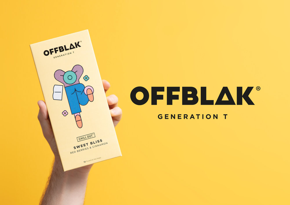
To break the rules of tea, OFFBLAK’s packaging needed to be bold and stand at the intersection of quality and must-have appeal. & SMITH delivered a playful look and feel through a collaboration with illustrator Thomas Hedger, using bright colours and fun illustrations that reference each category’s mood and effect. Each sub-range owns a specific style, such as a circular graphic or figure in different poses, with each flavour profile depicted by a new illustration.
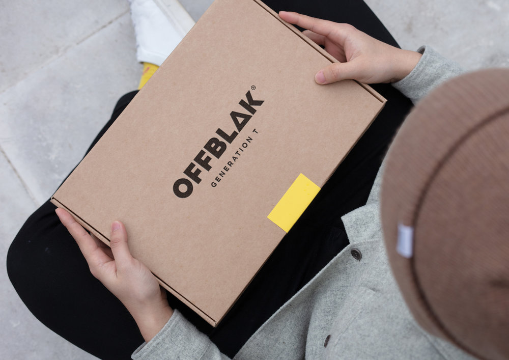
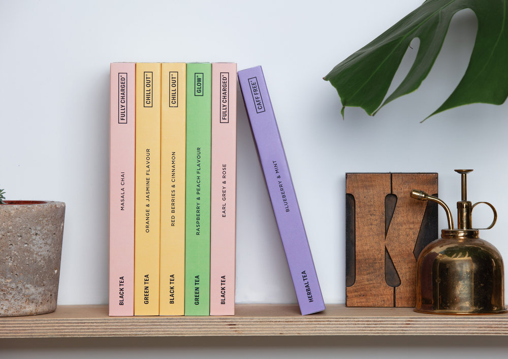
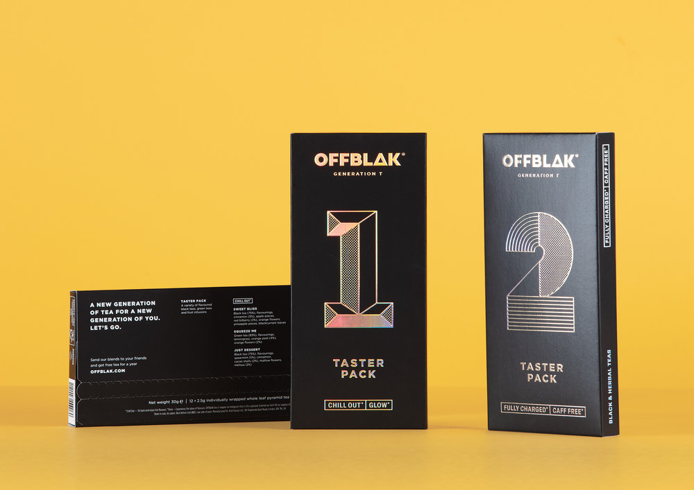
Each slimline box, specifically designed to fit through a letterbox for convenient and smooth delivery, features the range information on the spine. Once lined up, the full collection becomes a library of tea that feels happier on Instagram and on shelf than in the cupboard.
Drink tea like everybody’s watching
Reflecting OFFBLAK’s dedication to delivering premium quality whole leaf tea, each serving comes in a pyramid tea bag for better diffusion of flavour. With quality and taste being a top priority, & SMITH embedded this commitment into OFFBLAK’s logo by creating a distinctly triangular ‘A’ as a nod to the pyramid tea bag design.
To boost the social appeal of OFFBLAK tea, & SMITH created a ‘Don’t buy our tea. Try it’ campaign that sees complimentary OFFBLAK tea samples sent with ASOS and Missguided orders from May 2019 onwards. Via the OFFBLAK website, customers also can send tea samples to friends and potentially win Free Tea for a Year, delivered as a combination of teas in a slick black box with iridescent foil branding.
Dan Bernstein, Creative Partner at & SMITH says: “We looked at tea as we know it, how it is delivered – both visually and physically. We’ve given OFFBLAK the illustrative freedom that craft beer and coffee sectors have owned until now, with the flexibility to grow and develop the range with a truly ownable identity. OFFBLAK has an exciting attitude towards tea with an eye fixed on changing perceptions and standing out from the crowd. That’s right where we like to be.”
Design Agency Name: & SMITH
Organisation/Project Type: Agency, Published Commercial Design
Article Title: & SMITH Re-Defines The Tea Category With New Brand Creation, OFFBLAK
Brand / Project Name: OFFBLAK
Project Type: Consumer Brand Creation
Strategic Deliverables: Consumer Research / Insight, Consumer Brand Strategy, Consumer Product Naming, Consumer Tone of Voice
Design Deliverables: Consumer Branding, Consumer Brand Creation, Consumer Brand Identity, Consumer Graphic Packaging Design, Consumer Retail Brand Design
Location: United Kingdom
Market Country: United Kingdom
Market Region: Europe
Project Category: Beverages
Consumer Packaging Format: Box
Consumer Substrate / Material: Pulp Moulded Fibre
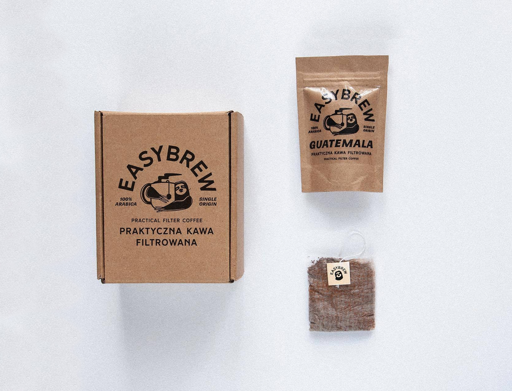

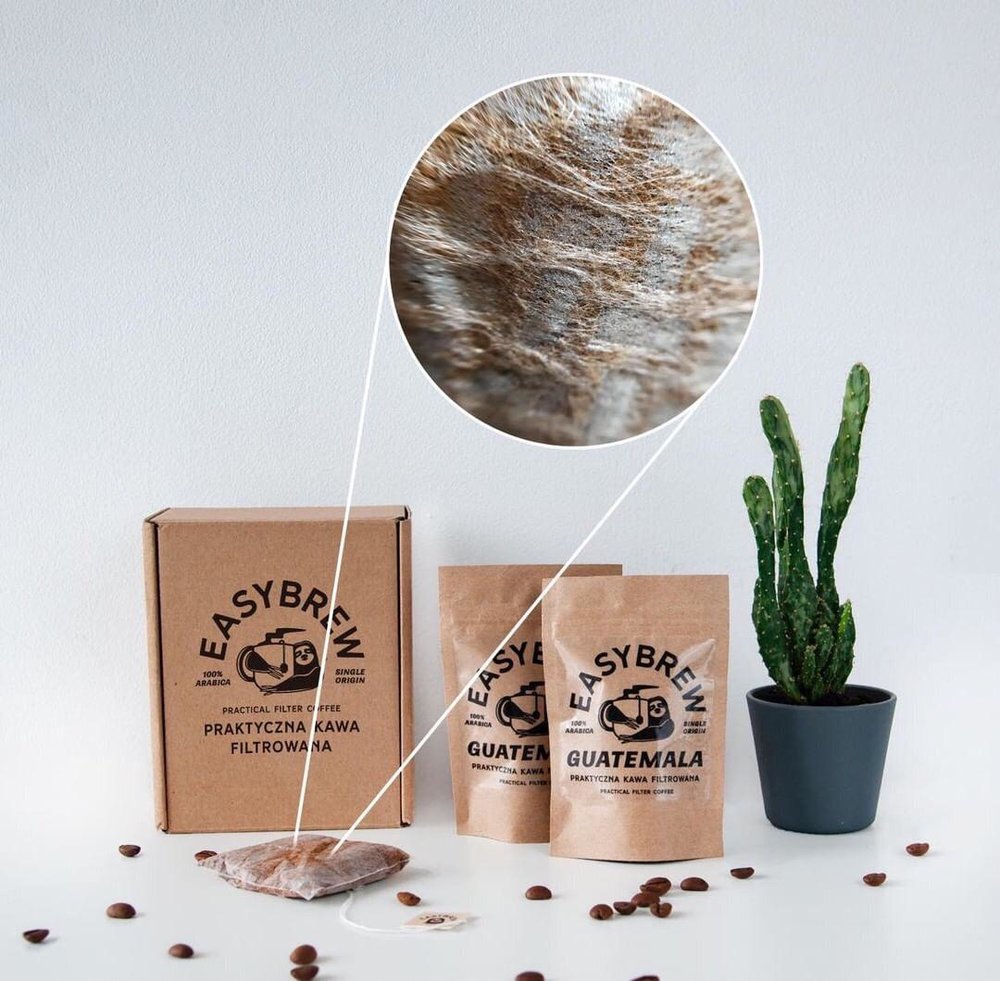
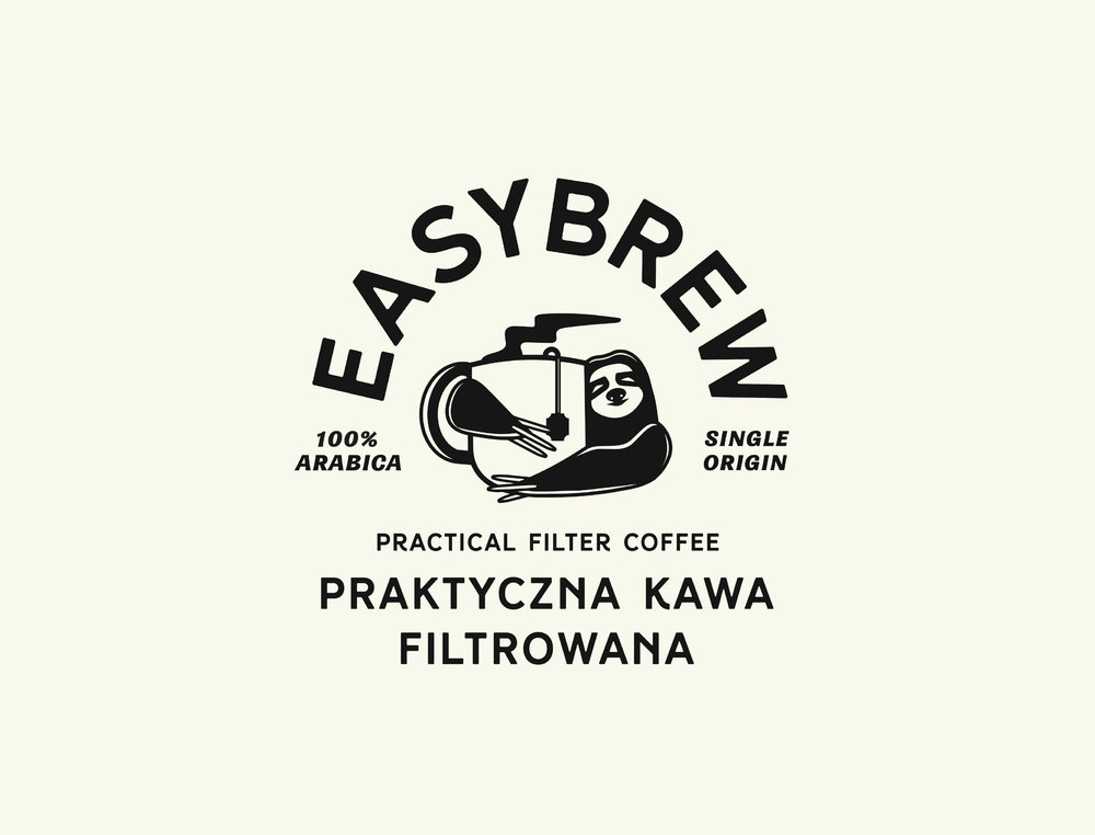
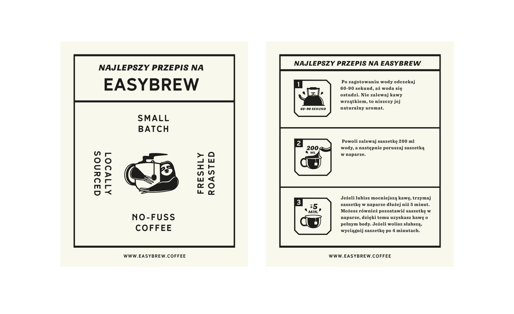
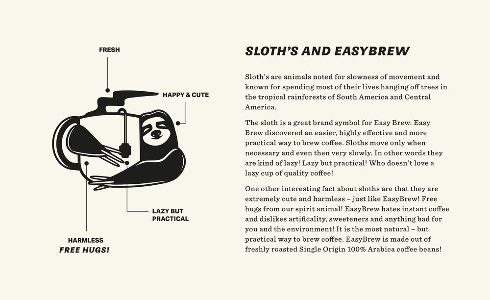
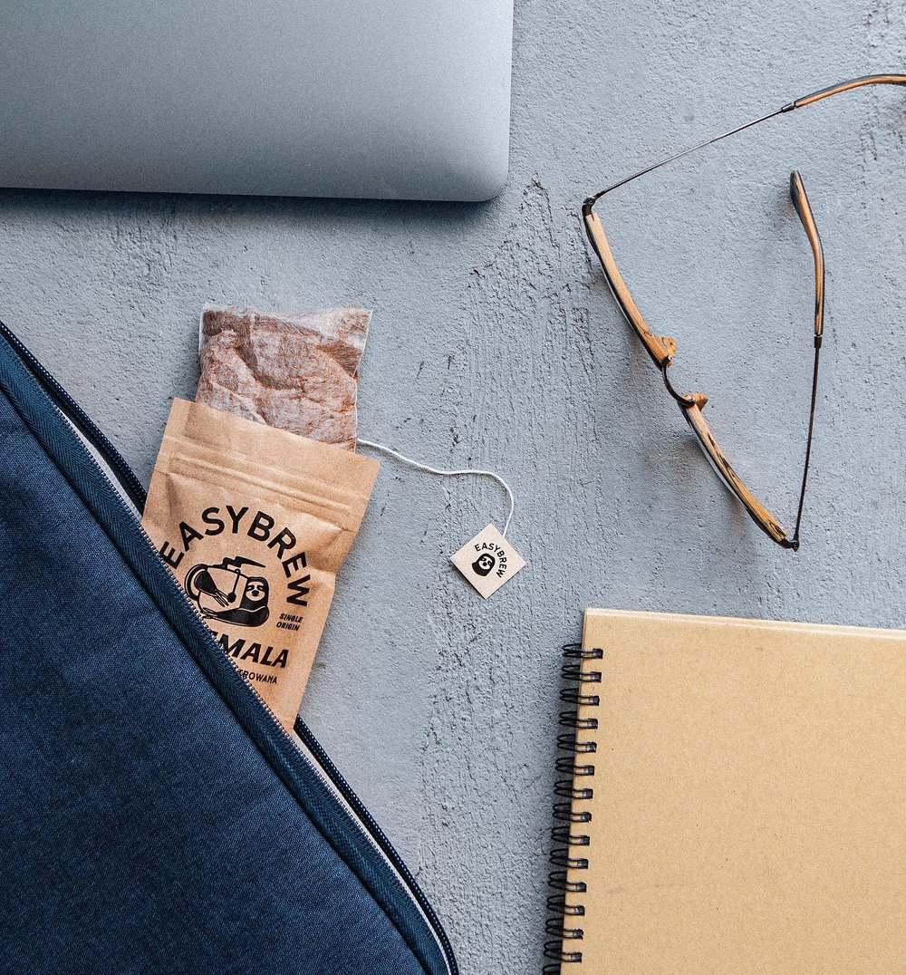
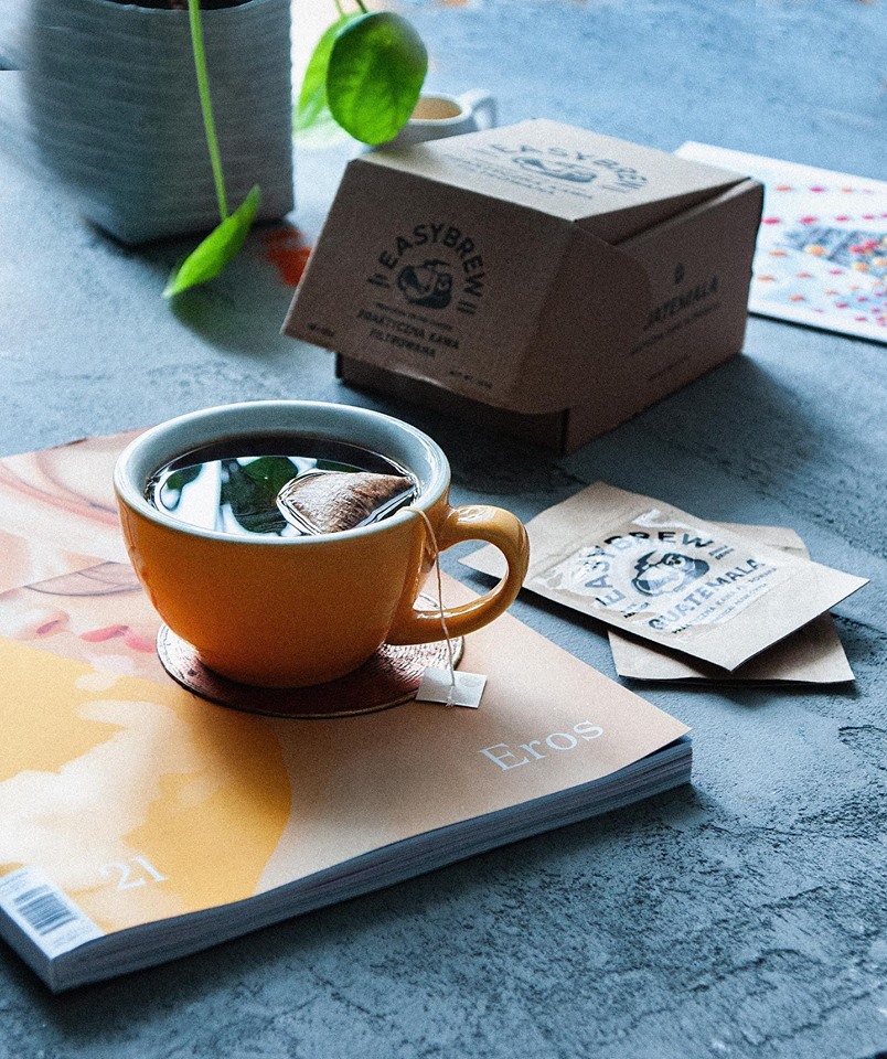
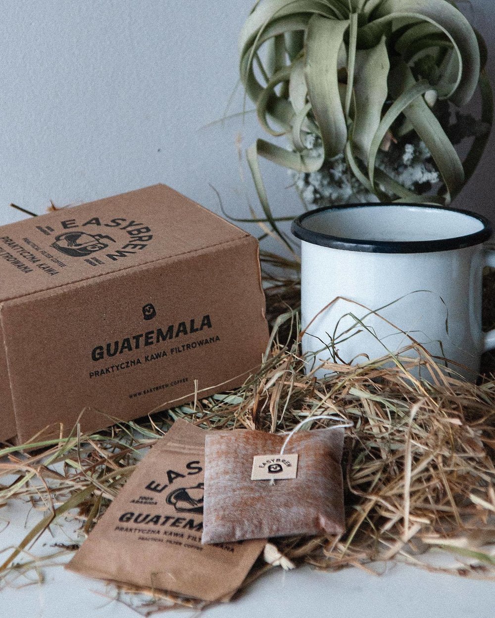
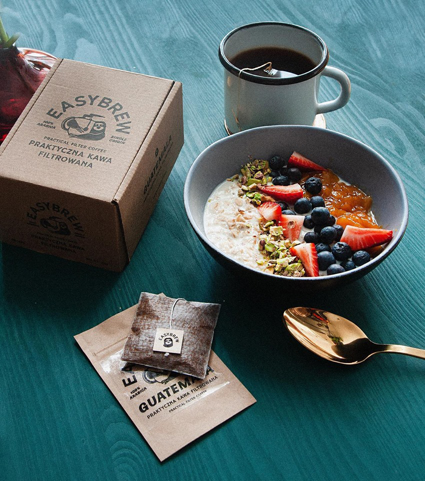
Zeki Michael Design – EasyBrew Coffee
Based in Poland – EasyBrew is a single serve coffee bag service filled with happiness and freshly roasted coffee founded by partners Goksel Yesilkaya and Kamila Śliwińska.
In early 2019 EasyBrew contacted Zeki Michael for the brand and packaging design.

Design Agency Name: Zeki Michael Design
Organisation/Project Type: Freelance, Published Commercial Design
Article Title: Lazy But Practical Filter Coffee: EasyBrew
Brand / Project Name: EasyBrew Coffee
External Design Credits: https://www.easybrew.coffee
Project Type: Consumer Brand Creation
Strategic Deliverables: Consumer Research / Insight, Consumer Brand Strategy, Consumer Tone of Voice
Design Deliverables: Consumer Branding, Consumer Brand Creation, Consumer Brand Identity, Consumer Brand Identity System, Consumer Brand Guidelines, Consumer Graphic Packaging Design
Location: United Kingdom
Market Country: Poland
Market Region: Europe
Project Category: Beverages
Consumer Packaging Format: Box, Tag, Pouch, Sachet
Consumer Substrate / Material: Plastic, Pulp Paper

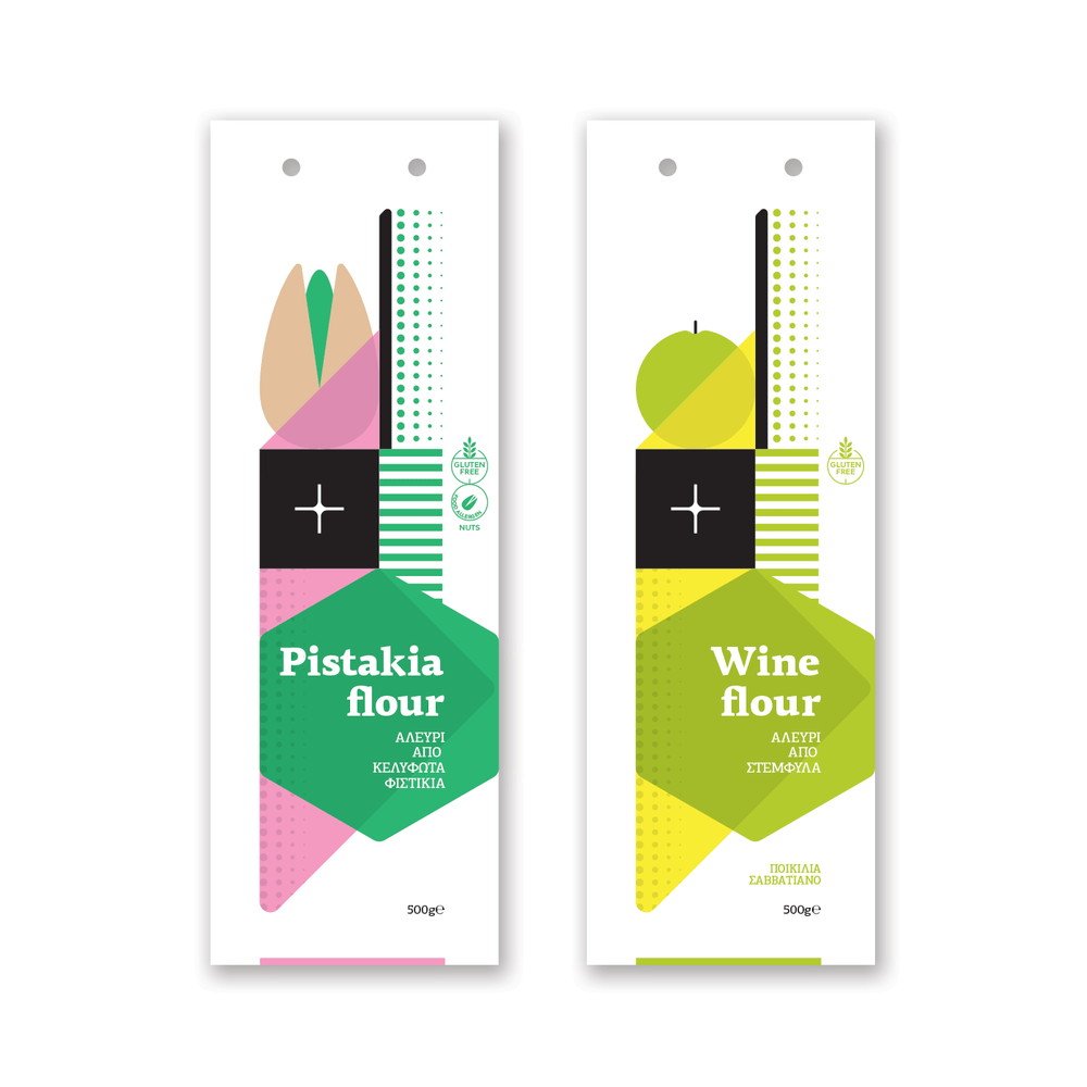
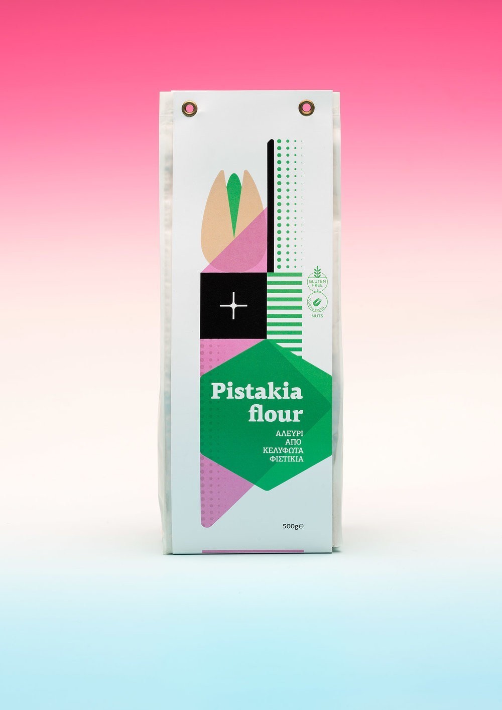
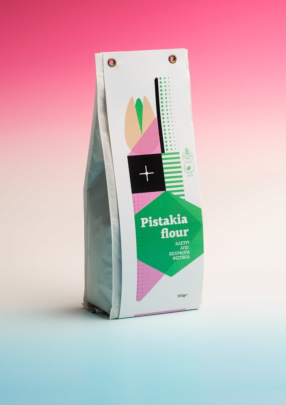
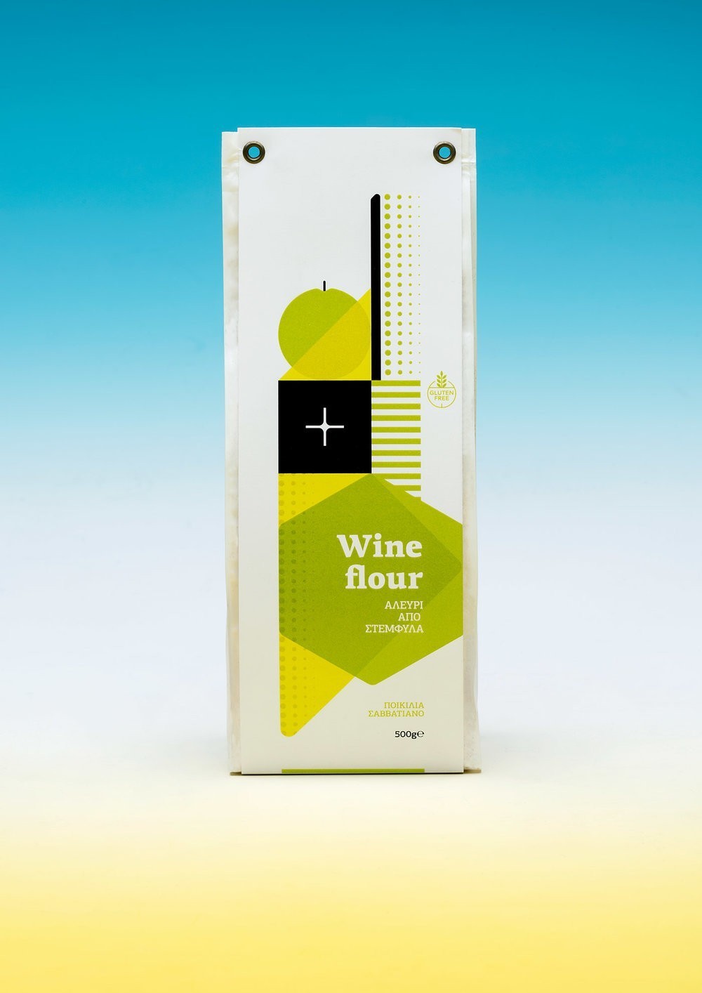
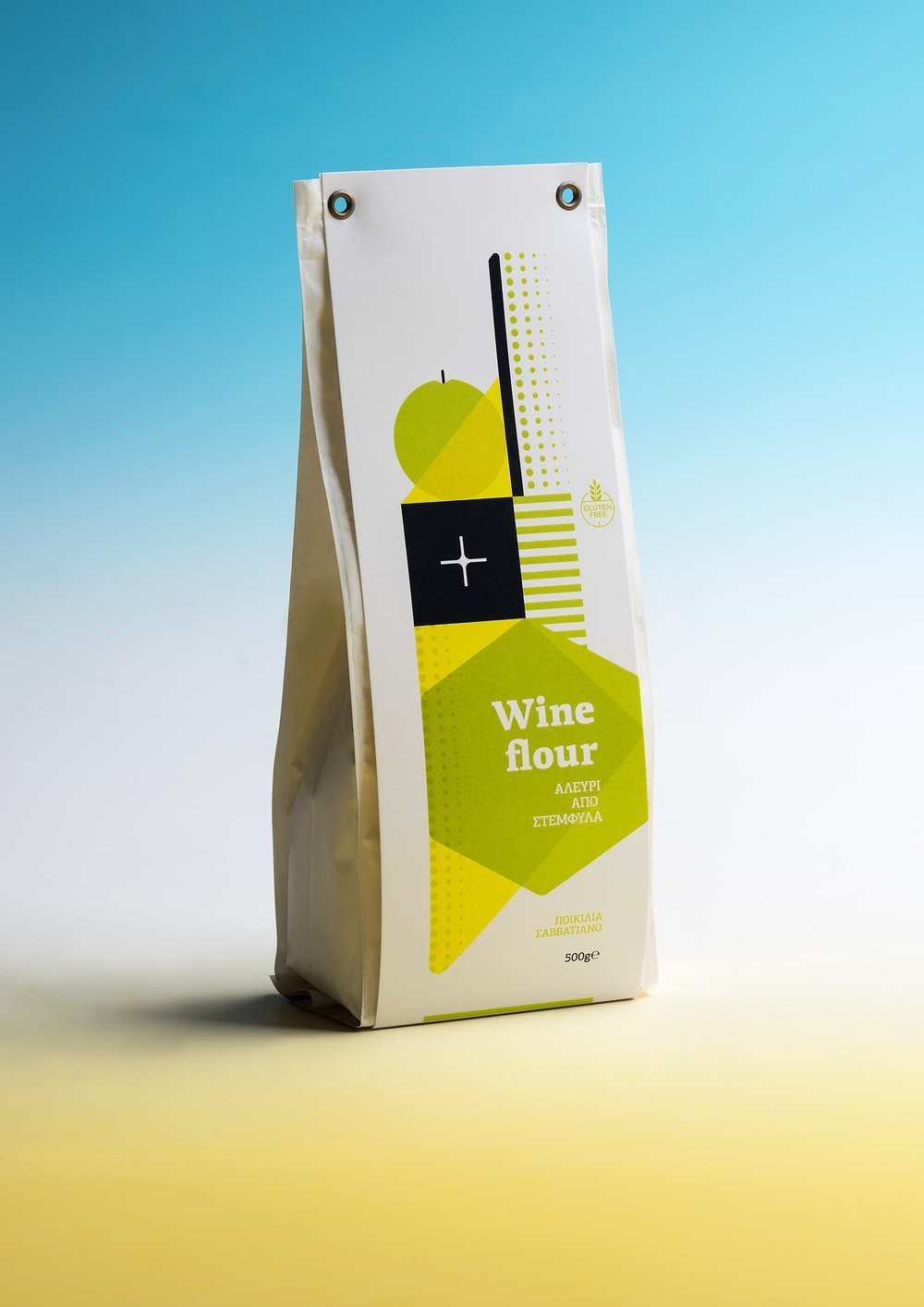
The Comeback Studio – Pistakia and Wine Flour Packaging
Packaging series for flour made of pistachios and grape marc. We used simple geometric shapes and solid intense colors in order to make this packaging series have a strong impact. The final outcome should be significant as the products made and proposed by start-up company “ΕλληνFood” are unique in the market. The newly established enterprise aims at developing innovative products which will exploit untapped resources of the rich Greek flora, within a highly efficient environment that will ensure the satisfaction of the customers and profitability. Τhe proposal won the first prize at the InnovinAgri hosted by the Agricultural University of Athens.
Design Agency Name: The Comeback Studio
Organisation/Project Type: Agency, Published Commercial Design
Article Title: Pistakia and Wine Flour Packaging
Brand / Project Name: Pistakia and Wine Flour Packaging
External Design Credits: Project Photos: Studio Anastassatos
Production Credits : Print: MacArt
Project Type: Consumer Brand Creation
Strategic Deliverables: Consumer Research / Insight, Consumer Brand Strategy, Consumer Brand Naming, Consumer Product Brand Architecture
Design Deliverables: Consumer Graphic Packaging Design
Location: Greece
Market Country: Multiple Countries
Market Region: Global
Project Category: Bakery
Consumer Packaging Format: Bag
Consumer Substrate / Material: Plastic, Pulp Paper
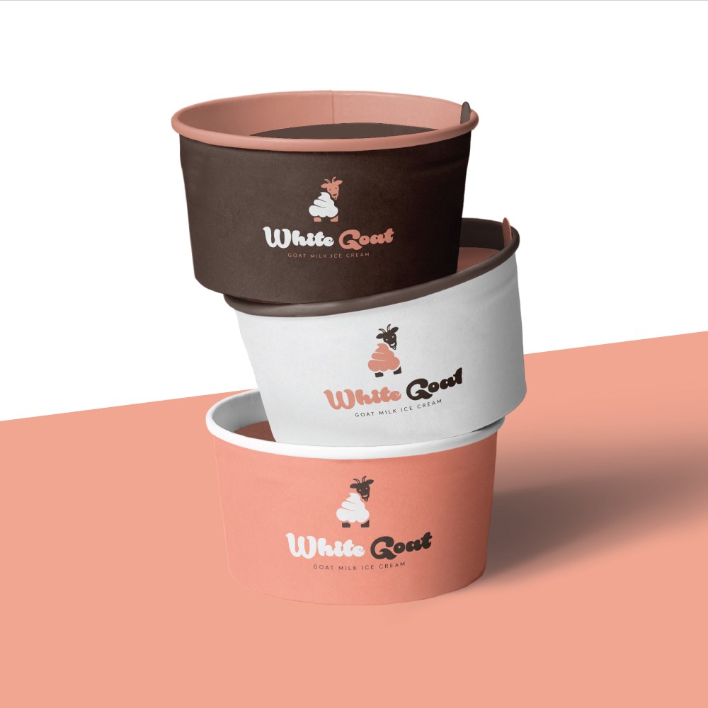

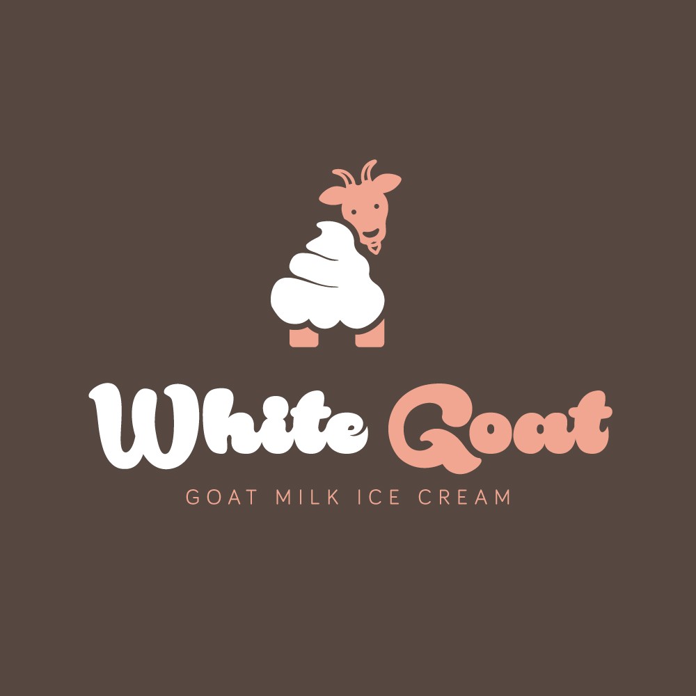
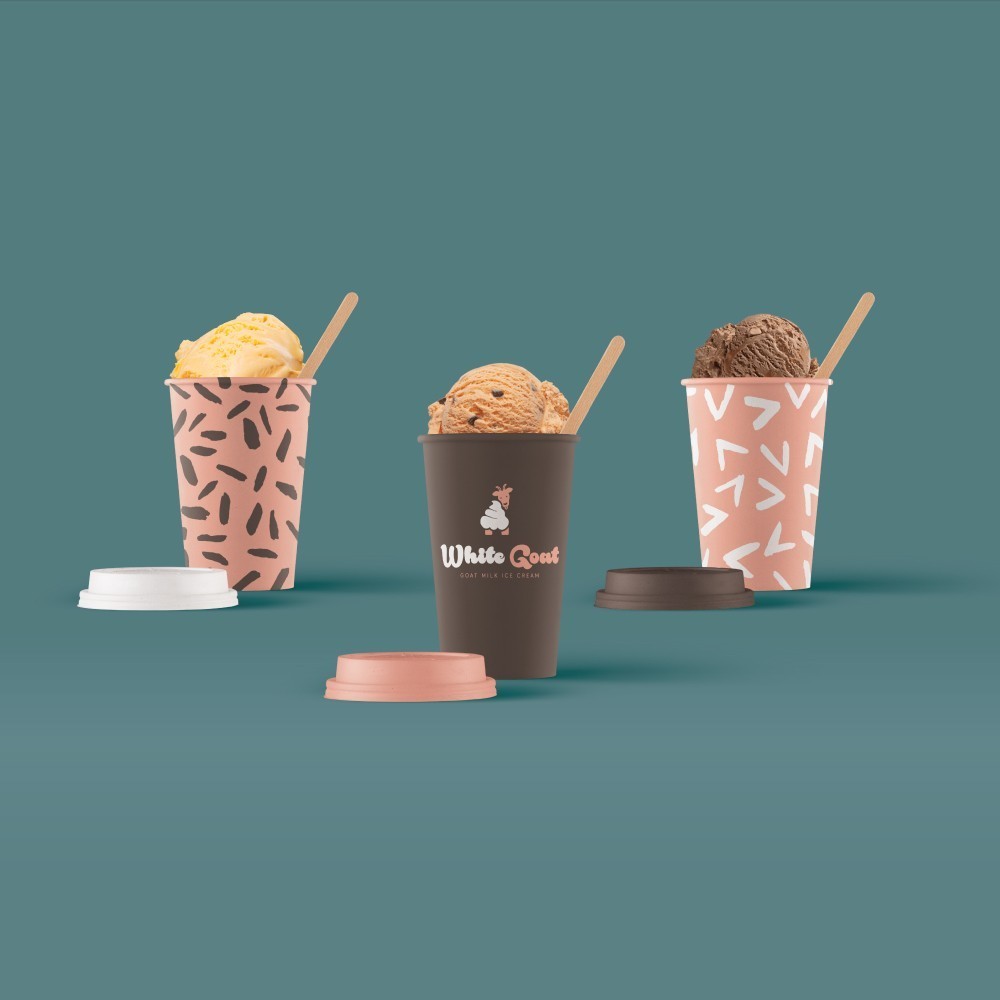
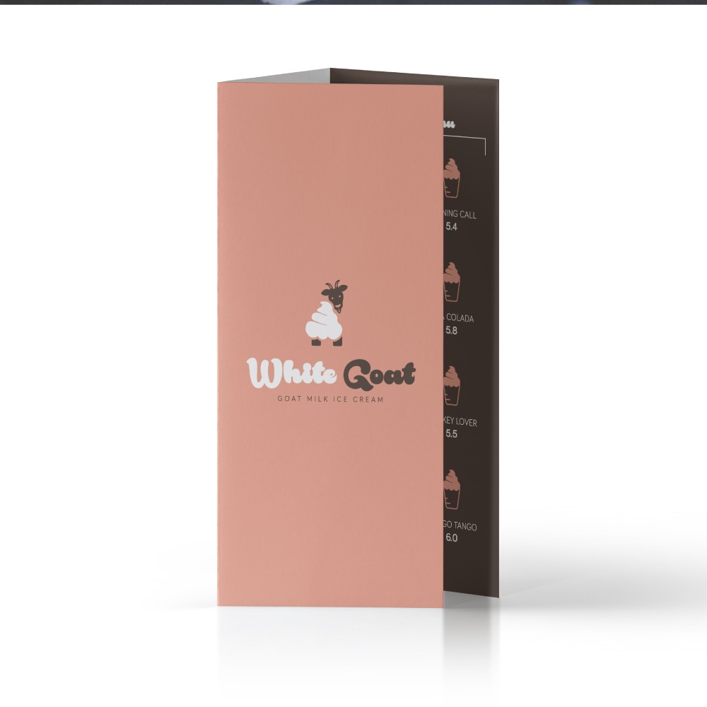
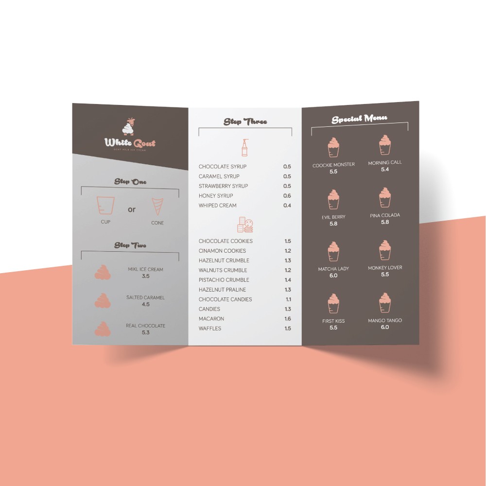
pkandesigner – White Goat – Goat Milk Ice Cream
I have create a brand based on ice cream and goat. i use a foodie font. i have create the logo, packaging for ice cream and menu.

Design Agency Name: pkandesigner
Organisation/Project Type: Freelance, Published Commercial Design
Article Title: White Goat – Goat Milk Ice Cream Branding and Packaging
Brand / Project Name: White Goat – Goat Milk Ice Cream
Project Type: Corporate Brand Creation
Strategic Deliverables: Corporate Research / Insight, Corporate Brand Naming
Design Deliverables: Corporate Branding, Corporate Brand Creation, Corporate Graphic Design
Location: Greece
Market Country: Greece
Market Region: Europe
Project Category: Food/Beverage
Corporate Brand Touchpoints: Brand Identity, Graphic Design, Illustration, Packaging Design
![]()
Gdesign, Gregor Ivanusic – The Coat of Arms And The Logo of The City of Ljubljana
The original idea of the rebranding coat of arms and the logo of Ljubljana City is the transformation of the official coat of arms into a modern graphic design that will be noticeable and more memorable with its simple lines. Nevertheless, the newly-created logo keeps all the content and atributs of the official coat of arms of the city. The main attribute of the coat of arms and the new logo are the castle and the dragon. Dragon is the symbol of the city of Ljubljana. The new logo is designed with simple and clean lines. With a sophisticated design, we get the term dragon and tower from the castle.
The new logo is designed with simple and clean lines. With a sophisticated design, we get the term dragon and tower from the castle.
In accordance with the new logo, a proposal for other visual communications was prepared, which should be noticeable and as clear as possible and simply.
Our initial hypothesis is how to get the attention of the city’s inhabitants through a simple and clear design of visual communications of public institutions (in this case: administration of the city).
After the study case we came to the conclusion: simple lines of logos (official coats of arms are too zakoplicirani for the purposes of today’s marketing), preservation of content and historical facts, adaptation and simplification of other visual communications, sophisticated selection of color and psychological significance of color shades and simple use.
Modern cities (as public institutions) in today’s global world, the flood of marketing campaigns and a huge amount of information need simple visual messaging. This makes it easier to transfer information about the functioning of the city, which is important for the daily lives of the city’s residents.


Design Agency Name: Gdesign, Gregor Ivanusic
Organisation/Project Type: Freelance, Published Commercial Design
Article Title: Rebranding The Coat of Arms And The Logo of The City of Ljubljana
Brand / Project Name: Rebranding The Coat of Arms And The Logo of The City of Ljubljana
Project Type: Corporate Brand Redesign
Strategic Deliverables: Corporate Research / Insight, Corporate Brand Strategy, Corporate Tone of Voice
Design Deliverables: Corporate Brand Identity, Corporate Branding, Corporate Rebranding, Corporate Brand Guidelines
Location: Slovenia
Market Country: Slovenia
Market Region: Europe
Project Category: Public Utility
Corporate Brand Touchpoints: Brand Identity, Graphic Design
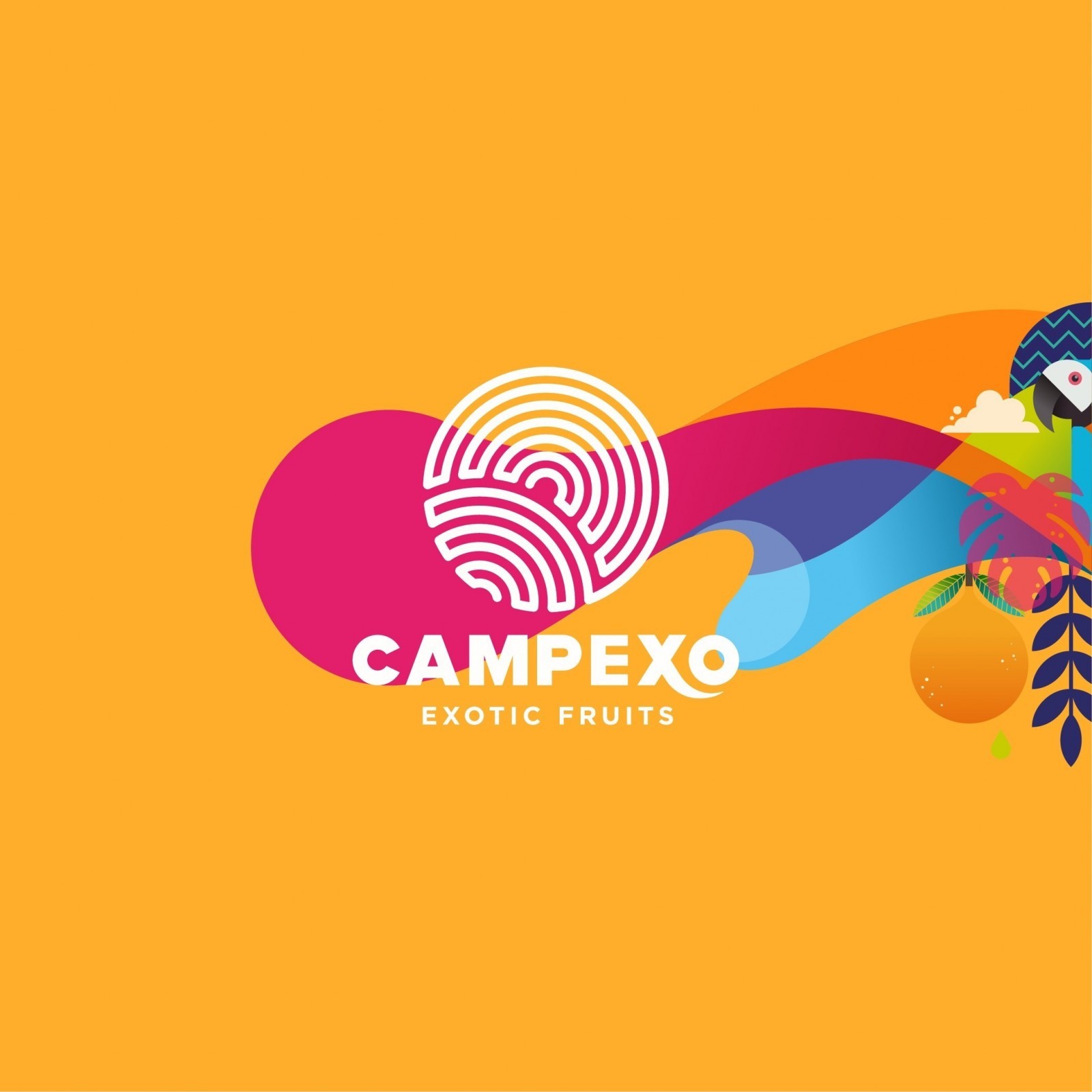
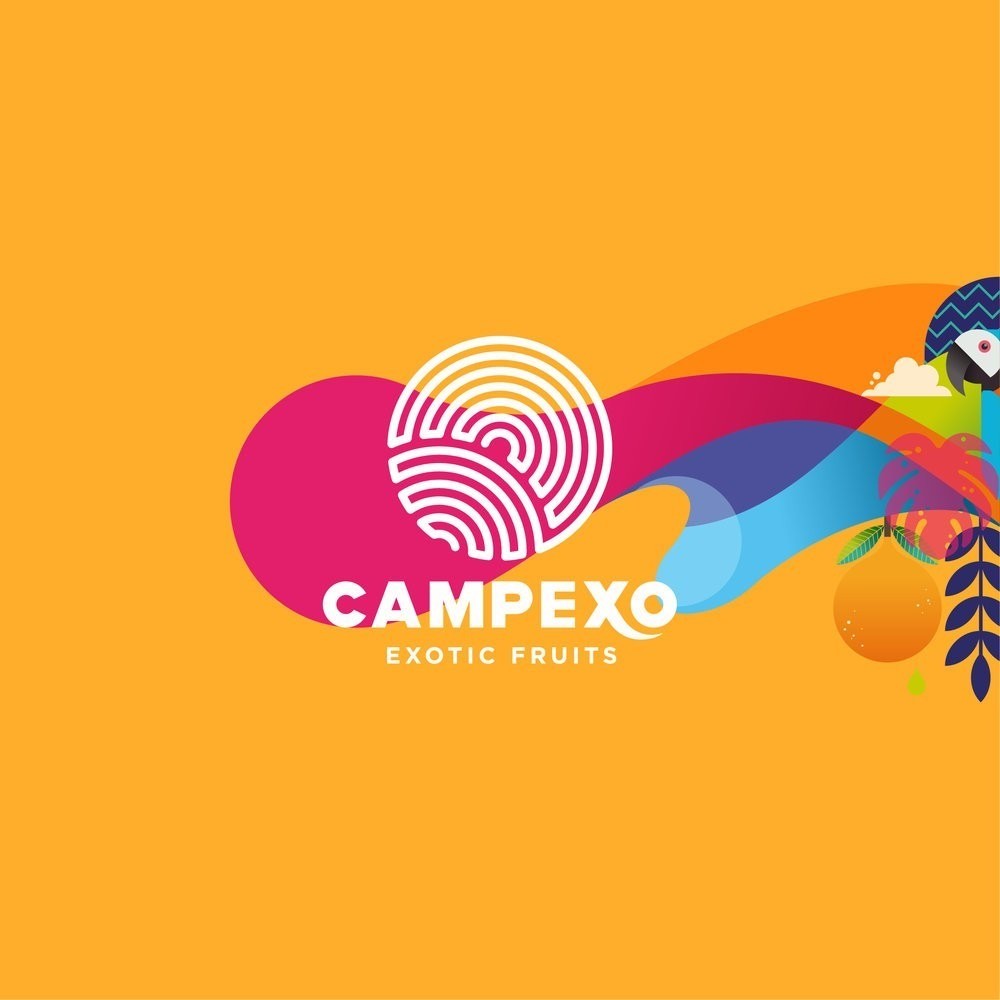
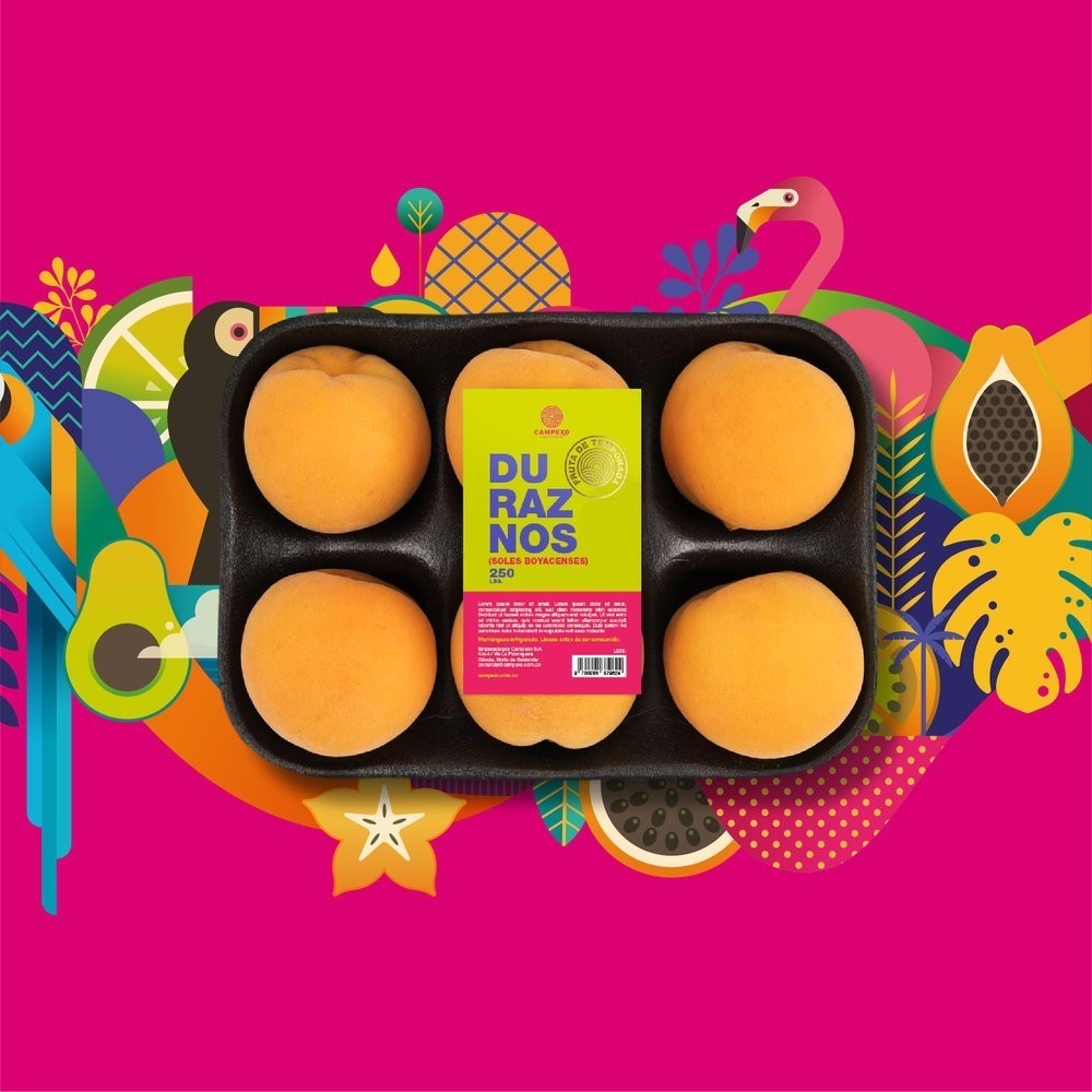
Lebrand Studio – Campexo
Campexo is an exotic fruits brand from Colombia. The brand concept was inspired by the natural diversity and identity of our country.

Design Agency Name: Lebrand Studio
Organisation/Project Type: Agency, Published Commercial Design
Article Title: Colorful Design For Exotic Fruits Brand From Colombia
Brand / Project Name: Campexo
External Design Credits: Kevin Ruda – Illustrator and designer
Project Type: Consumer Brand Creation
Strategic Deliverables: Consumer Brand Strategy, Consumer Brand Naming, Consumer Tone of Voice, Consumer Brand World, Consumer Product Brand Architecture
Design Deliverables: Consumer Brand Identity System
Location: Colombia
Market Country: Multiple Countries
Market Region: Europe
Project Category: Fresh Food
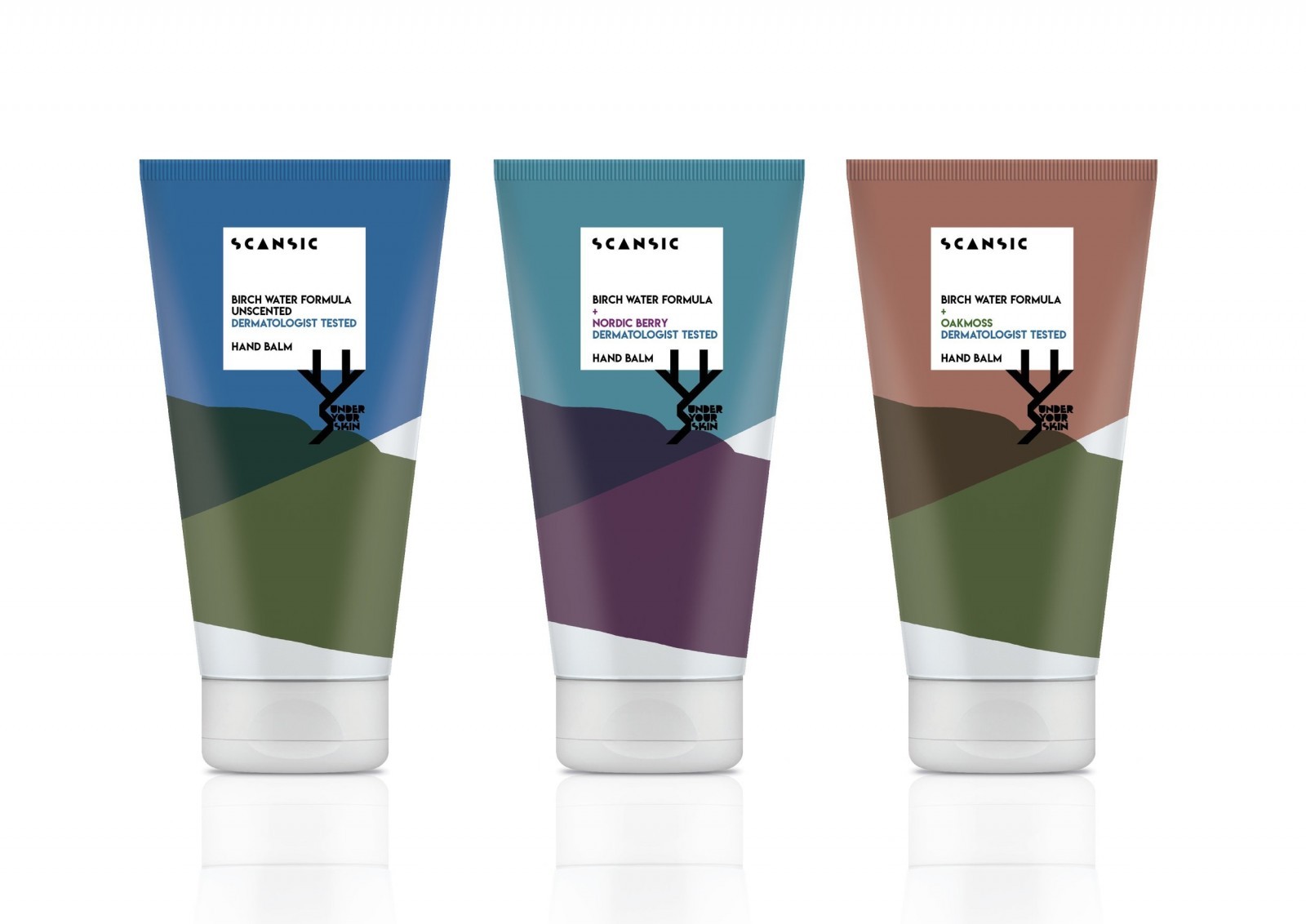
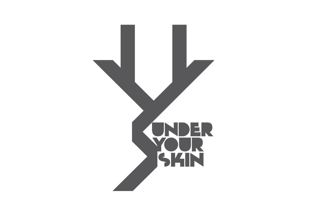
Mister Victor – Scansic
Concept designs for SCANSIC, a range of natural (non-organic) skincare products, for a new Scandinavian brand, Under Your Skin, partly created by a famous retailer. Initial launch; hand cream range, the complete collection to follow. An age-less range, all infused with birch water.

Design Agency Name: Mister Victor
Organisation/Project Type: Freelance, Non Published Concept Design
Article Title: Under Your Skin
Brand / Project Name: Scansic / Skincare Range
Project Type: Consumer Brand Creation
Strategic Deliverables: Consumer Research / Insight, Consumer Brand Naming, Consumer Product Naming, Consumer Tone of Voice, Consumer Brand World, Consumer Product Brand Architecture
Design Deliverables: Consumer Branding, Consumer Brand Identity, Consumer Brand Identity System, Consumer Graphic Packaging Design, Consumer Retail Brand Design
Location: United Kingdom
Market Country: Multiple Countries
Market Region: Global
Project Category: Health and Beauty
Consumer Packaging Format: Jar, Tube, Pot
Consumer Substrate / Material: Ceramic, Glass, Metal, Plastic, Wood, Pulp Board, Pulp Carton, Pulp Paper

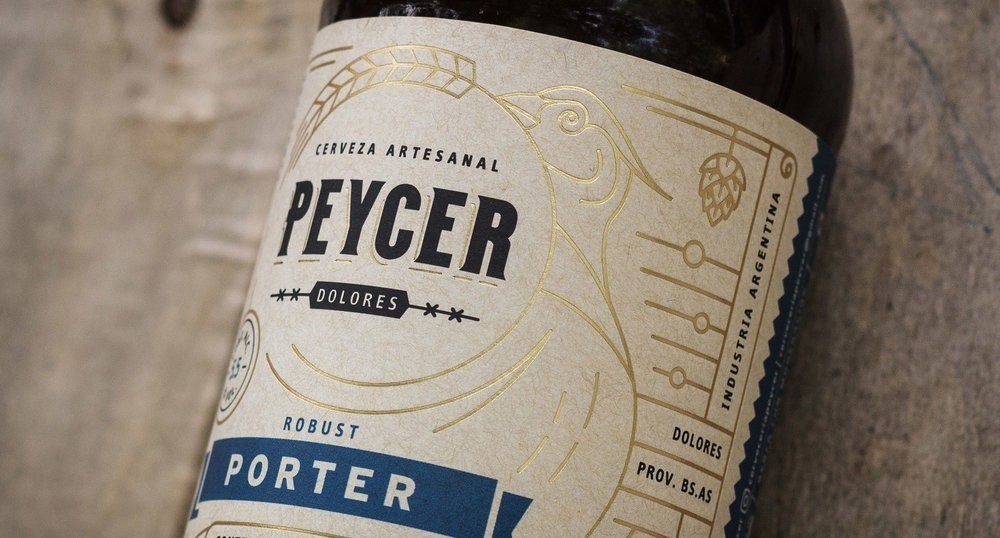
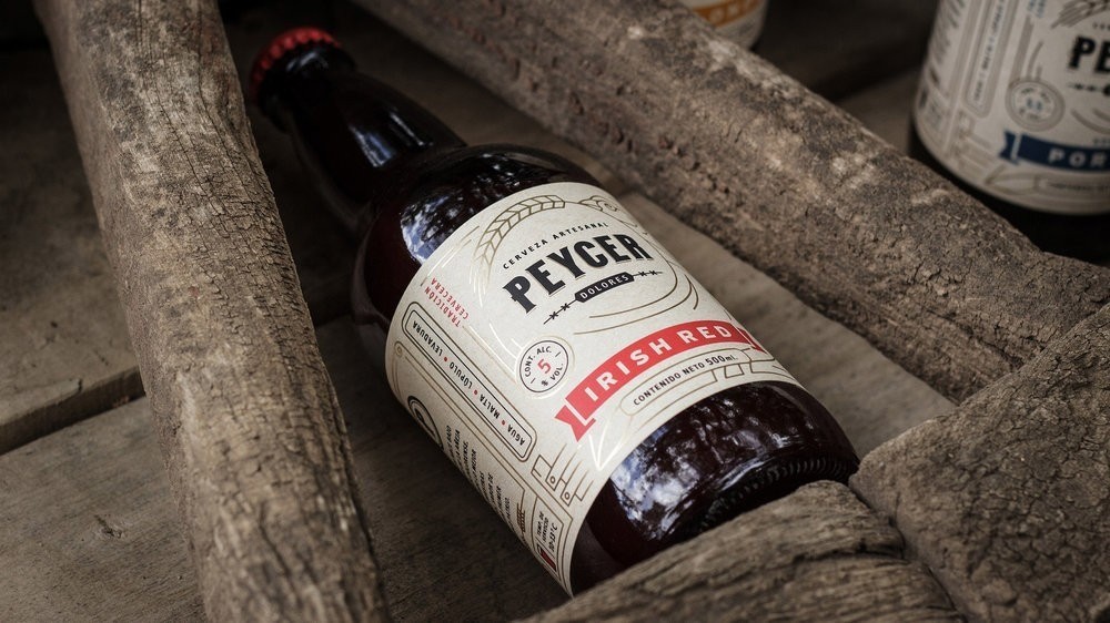
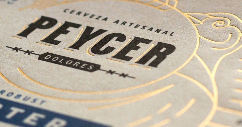
Matias Harina – Paycer Craft Beer
Peycer is a craft brewery located in Dolores city, in Buenos Aires province, Argentina. In this case my job was to design the logotype and labels for their first three styles. The main idea was to transmit the country spirit, traditions and rustic charm of this region.


Design Agency Name: Matias Harina
Organisation/Project Type: Freelance, Published Commercial Design
Article Title: Logo and Label Design for Craft Brewery
Brand / Project Name: Paycer Craft Beer
Project Type: Consumer Brand Creation
Strategic Deliverables: Consumer Tone of Voice
Design Deliverables: Consumer Brand Creation, Consumer Brand Identity, Consumer Graphic Packaging Design
Location: Argentina
Market Country: Argentina
Market Region: South America
Project Category: Beer and Cider
Consumer Packaging Format: Bottle
Consumer Substrate / Material: Pulp Paper
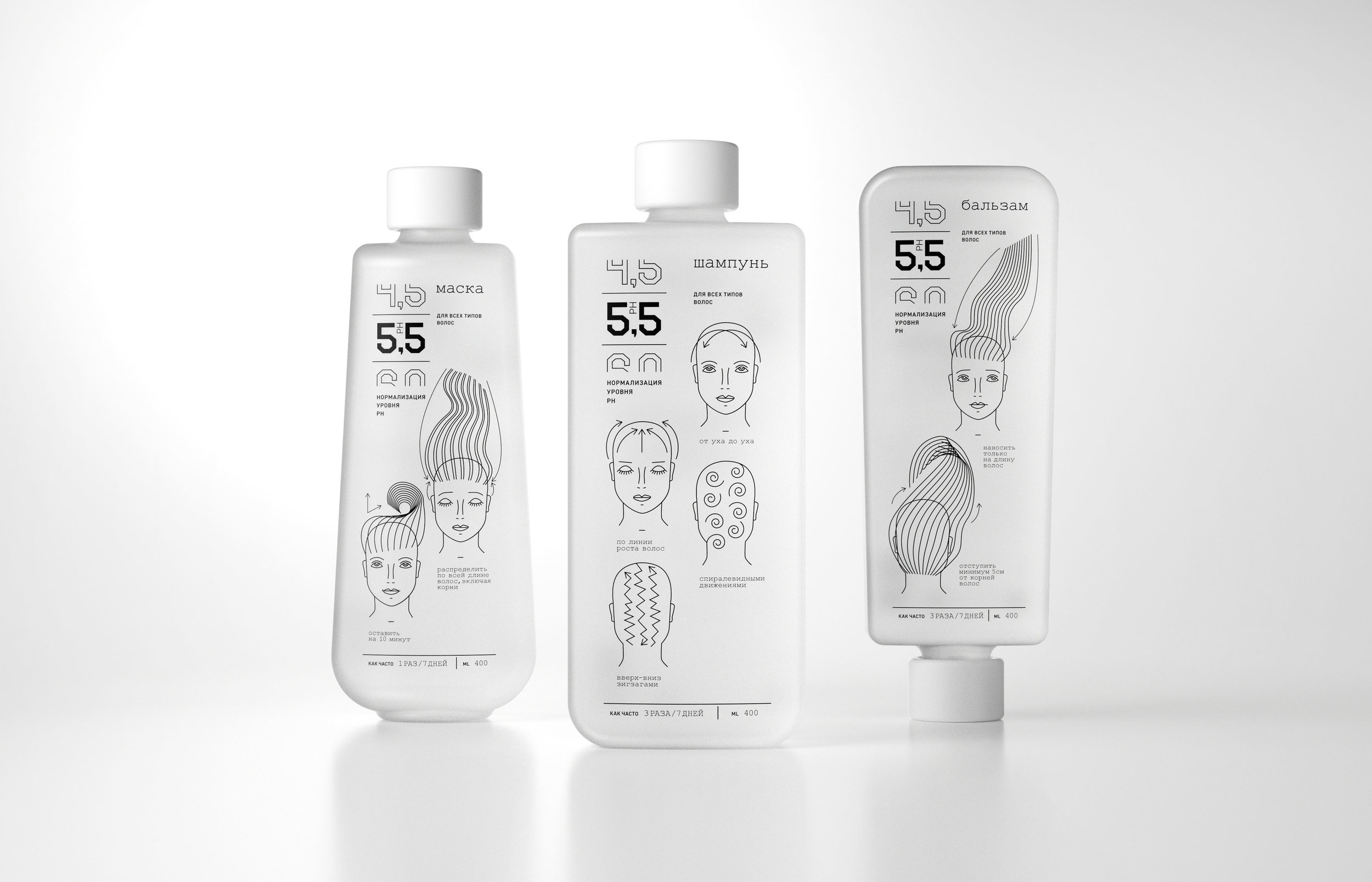

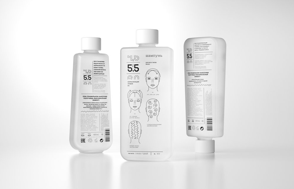
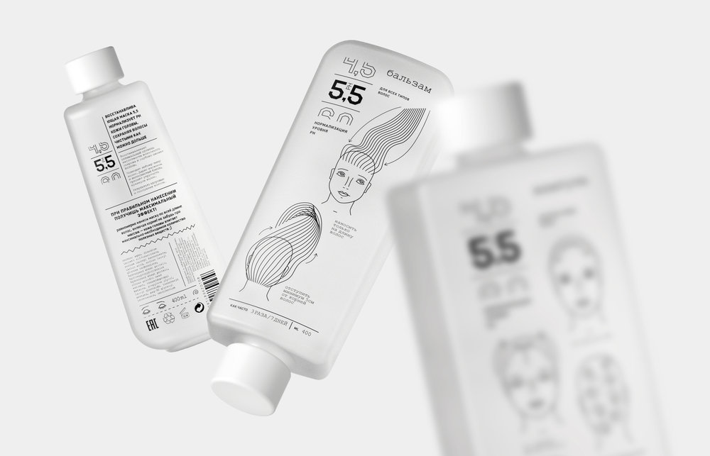
Evgeniya Abramova – 5,5 pH
“5,5 ph” is a line of hair care products. That makes your hair naturally healthн by normalizing your sebaceous glands’ function. These products were created for active and individualistic people. The brand aims active women who lead an active lifestyle, love travelling and prioritizing freedom. It’s created for those who value their time and care about honest and effective natural practices.
Problem:
The basic ingredient of all nowadays shampoos is sodium lauryl sulfate (SLS). It is a surfactant that creates a lot of foam, which helps to wash hair faster. However, the hair gets dirty way faster, and demands washing nearly every day. That brings down its natural defense and makes hair weaker.
Therefore, many people want to use a product that would help them to reduce time they spend on hair care. Customers need a product that would make hair naturally healthy. A product like this would be indispensible for dynamic lifestyle of a young woman, accentuating a unique character of its consumer.
Essentials about “5,5 ph”:
5,5 is a healthy pH level of the hair scalp. That’s makes our product suitable for all hair types.
“5,5 ph” is not only about recovering natural functioning of head’s sebaceous glands. Also promoted the HAIR CARE CULTURE, because improper hair care harms the scalp balance.
The brand demonstrates three hair products with their instructions:
— Shampoo: Apply carefully along hairlines, from temples to ears. It is important to wash temples well (while the majority of people don’t do so). Then continue down the hairlines from the back of the head to the vertex. This kind of massage stimulates scalp’s blood circulation. That helps the maximal amount of nutritional substances reach hair follicles.
— Hair balsam: many customers stay unaware that hair balsam should never be applied on the hair roots. Balsams create a greasy film on a scalp which bridges the pores and ruins the sebaceous glands’ functions. That brutally affects the scalp’s pH level. It is recommended to apply balsam on hair starting from 5-7 cm from the roots.
— Masque : hair masques may be distributed all along the hair length: from the roots till the ends. It should be applied carefully by massaging the product into the scalp.
A common mistake many people make during their hair care rituals is using hot water. It leads to desalinization (or leaching) hair and it also stimulates scalp’s sebaceous glands activity. The optimal temperature for washing your hair is 45C. This helps to dissolute the hair sebum, remove the dirt. In addition to it, this temperature stimulates blood circulation.
“5,5 ph” is about minimalistic design that communicates health and hair care culture.


Design Agency Name: Evgeniya Abramova
Organisation/Project Type: Student, Non Published Concept Design
Article Title: A Line of Hair Care Products
Brand / Project Name: 5,5 pH
External Design Credits: Pavel Gubin 3D Visualizer
Project Type: Consumer Brand Creation
Strategic Deliverables: Consumer Research / Insight
Design Deliverables: Consumer Graphic Packaging Design
Location: Russia
Market Country: Russia
Market Region: Europe
Project Category: Health and Beauty
Consumer Packaging Format: Bottle
Consumer Substrate / Material: Plastic
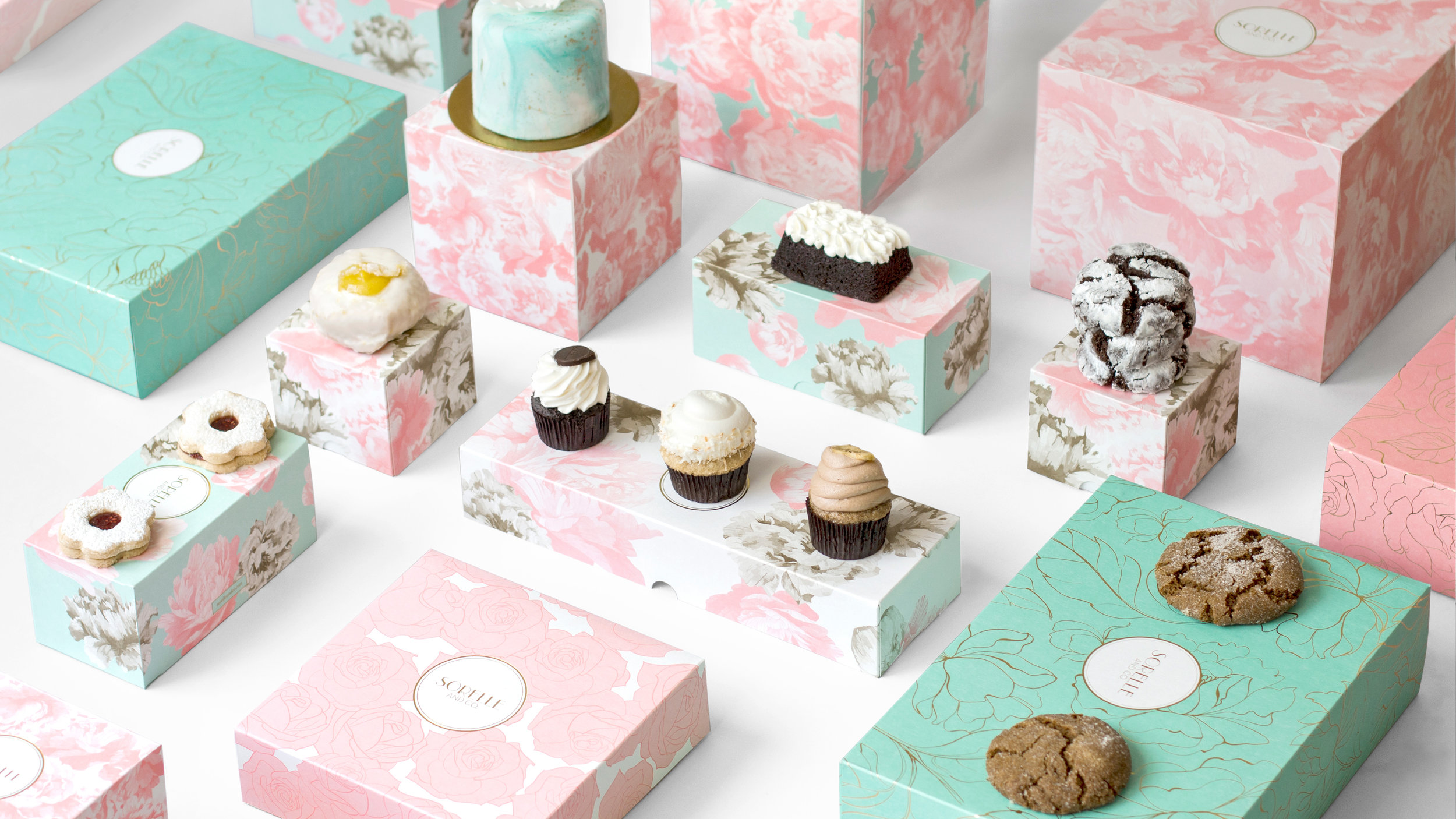

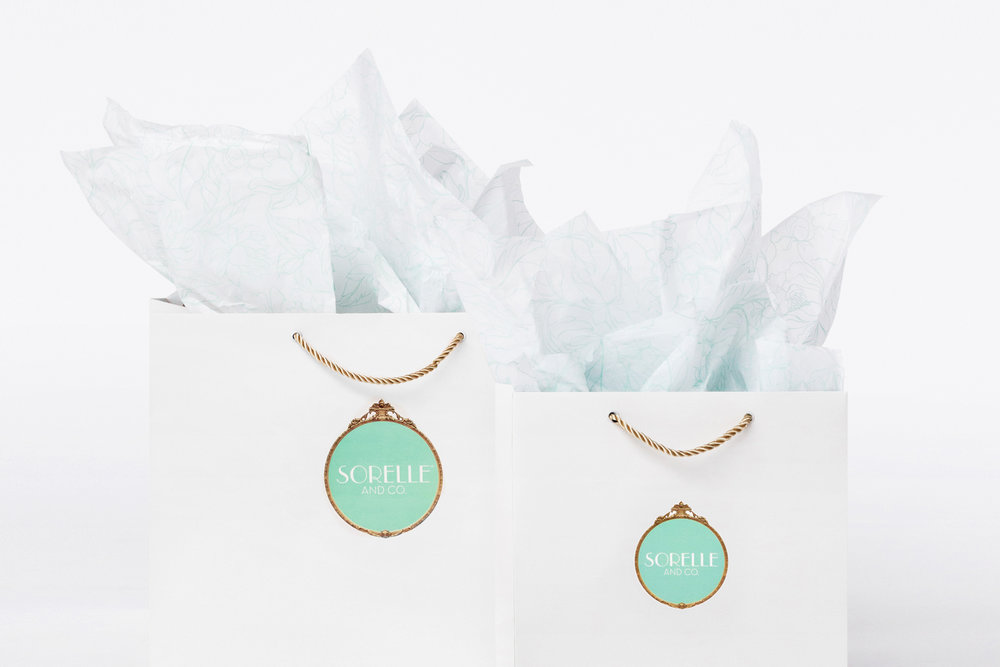
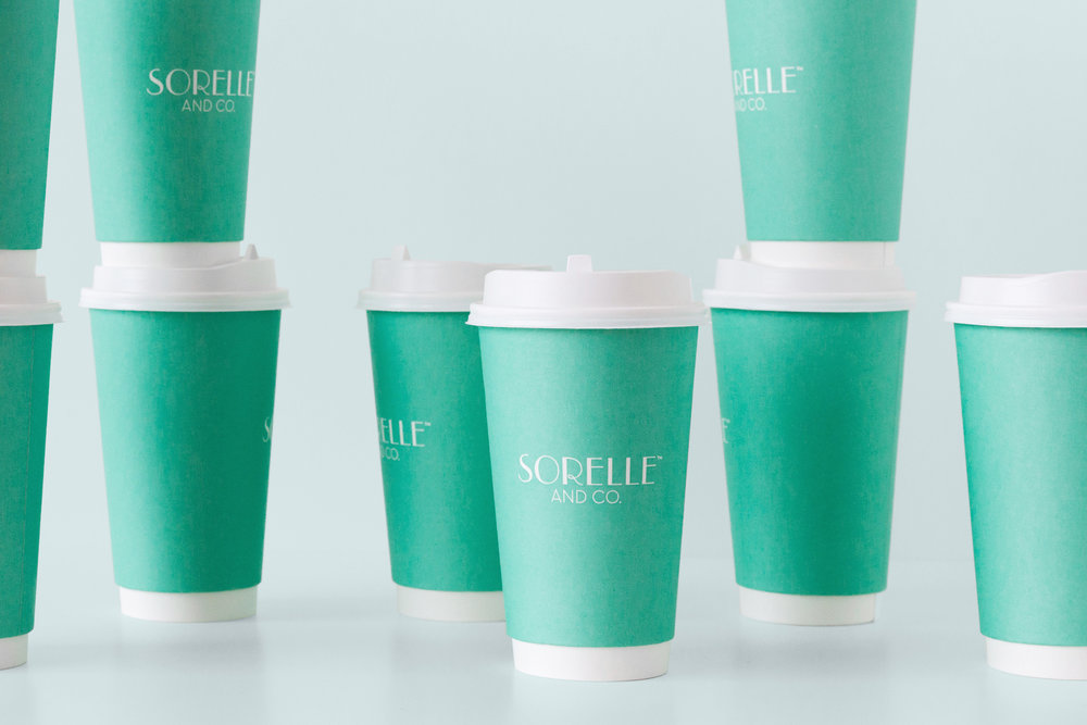
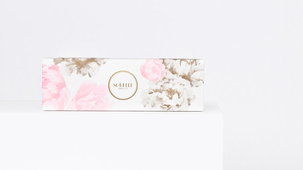
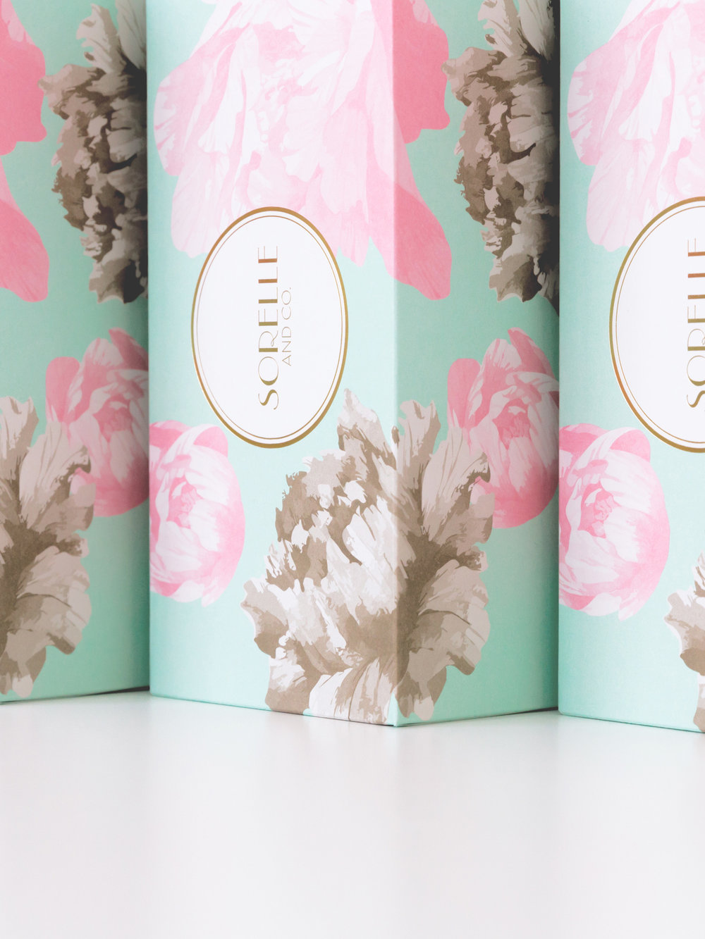
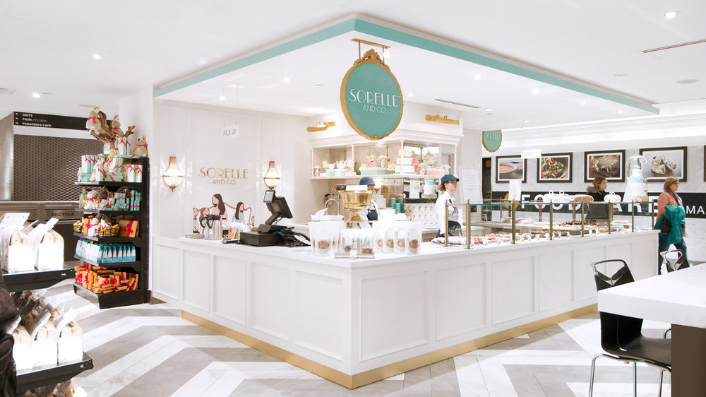
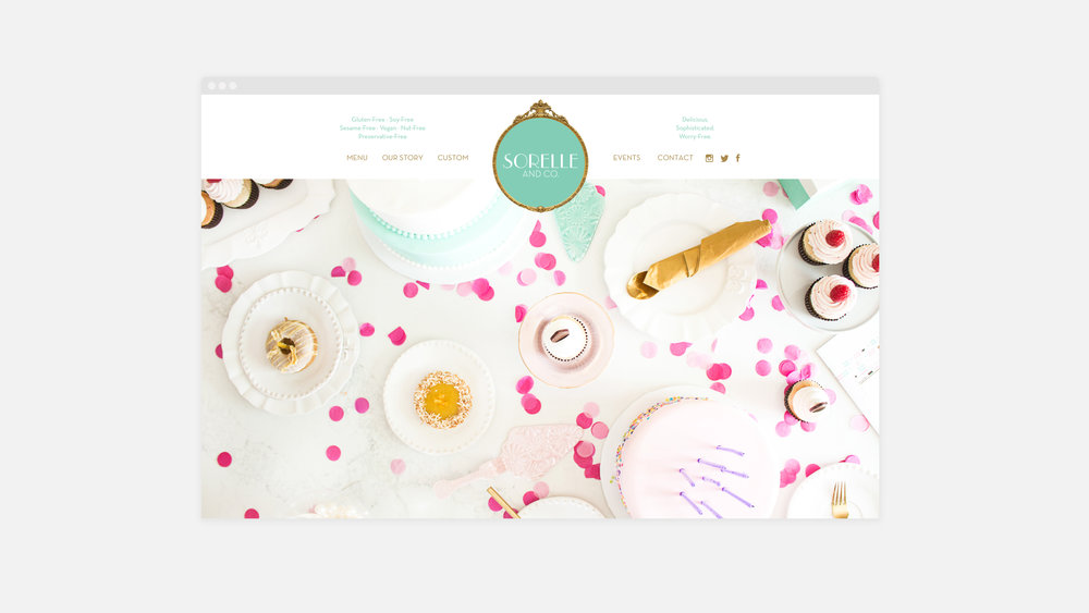
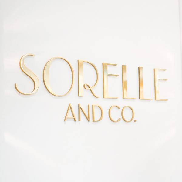
Vanderbrand – Sorelle & Co.
Sorelle and Co. is a family-owned, family-friendly bake shoppe and café.
Motivated by both her daughters’ dietary needs as well as her love for cooking, Sorelle and Co.’s founder set out to create a specialized and sophisticated food destination that everyone could enjoy. All items on Sorelle and Co.’s menu are vegan, gluten, soy, sesame, nut, and preservative-free, meaning that everyone can enjoy their products, especially those with allergies and food sensitivities.
The brand’s concept stemmed from a unique opportunity to create a new space centred on a refined, worry-free experience. Consumers are more educated about food and nutrition, but there was a gap between wholesome foods and the luxury market, and that’s where Sorelle and Co. was built. While Sorelle & Co. is primarily a bake shoppe and café, it is also very much a lifestyle brand, designed to inspire food enthusiasts around the world.
The design programme worked in conjunction with the business strategy to create the ideal elevated and worry-free experience. The goal was to change the perception of worry-free food, and to creatively showcase not only the product but also the experience of visiting Sorelle and Co. Through the art direction, custom photography, illustrations, high-end packaging and signage, a culture emerged.
Influences from French architecture and Parisian café culture were used as a foundation for the design and concept of the overall identity. The brand positioning and elevated confectionery market that has been mastered by French culture also informed the basic fundamentals of the strategy. Bright, pastel colours with metallic accents were selected to create an essence of a wholesome lifestyle experience, while also catering to the luxury space. Using modern, French inspired decorative fonts allowed for the brand’s overarching theme to come to life. Visiting Sorelle and Co. is truly an affair, from walking into the flawlessly designed interiors to unwrapping the packaging, the brand’s the visual language system translated seamlessly over all platforms.

Design Agency Name: Vanderbrand
Organisation/Project Type: Agency, Published Commercial Design
Article Title: Sorelle & Co. — Vanderbrand
Brand / Project Name: Sorelle & Co.
Project Type: Consumer Brand Creation
Strategic Deliverables: Consumer Research / Insight, Consumer Brand Strategy, Consumer Brand Naming, Consumer Tone of Voice, Consumer Brand World, Consumer Product Brand Architecture
Design Deliverables: Consumer Branding, Consumer Brand Creation, Consumer Brand Identity, Consumer Brand Identity System, Consumer Brand Guidelines, Consumer Brand Experience, Consumer Graphic Packaging Design, Consumer Structural Packaging Design, Consumer Retail Brand Design, Consumer Brand Digital Design, Consumer Brand Advertising
Location: Canada
Market Country: Canada
Market Region: Africa
Project Category: Bakery
Consumer Packaging Format: Bag, Box, Clamshell, Cup, Sachet, Wrap
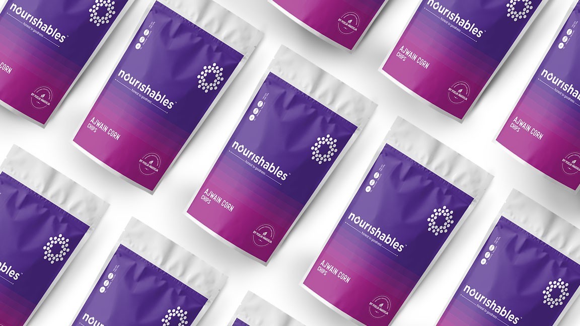

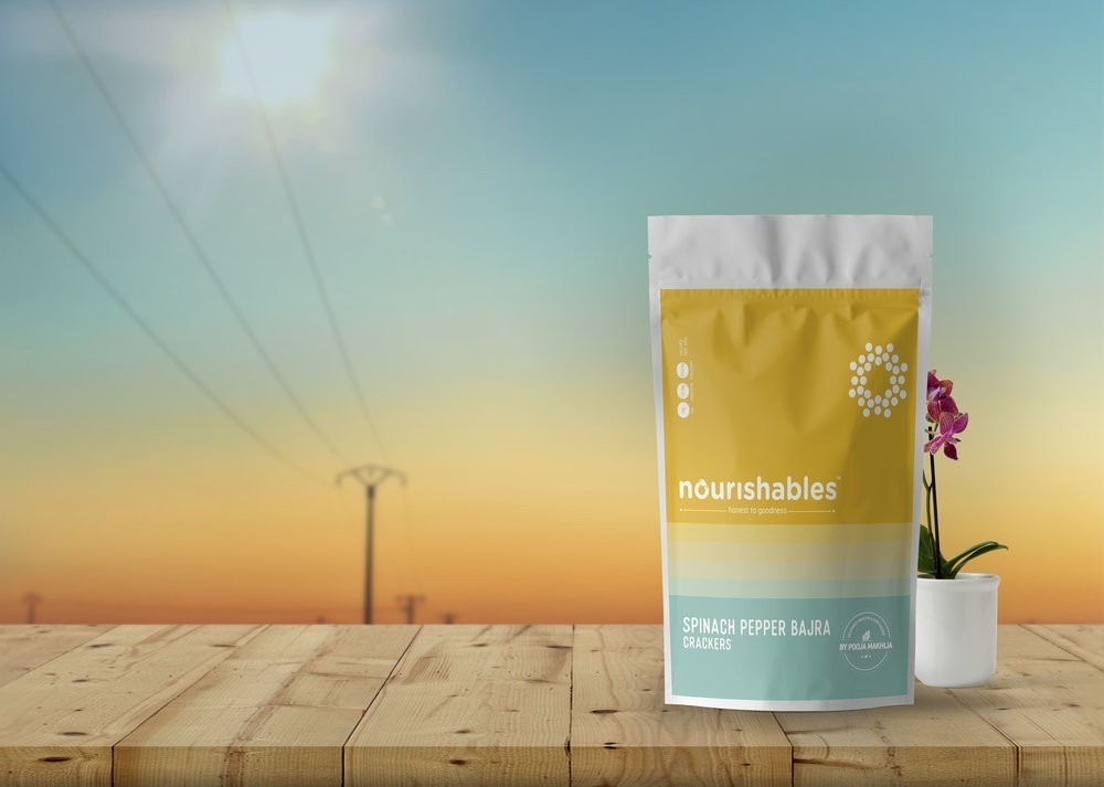
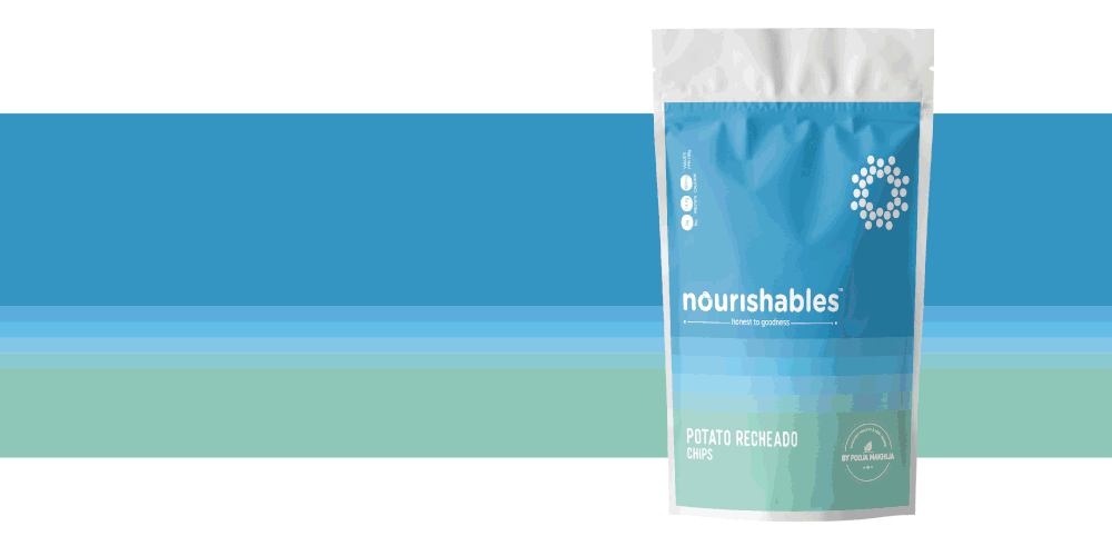
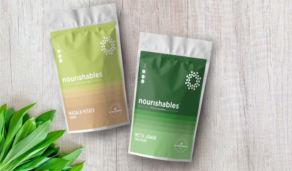
Stratedgy – Nourishables Brand Project
Nourishables:
A venture of healthy snacks by Pooja Makhija, renowned nutritionist in India.
Logo Creation:
We zeroed in on a brand identity that is bold yet the rounded font gives a sense of innocence and freshness.
The logo itself symbolises – healthy, happy and goodness.
Colour Story:
Nature presents to us a colour palette in it’s most natural and high definition form.
Taking inspiration from the various hues in the sky during sunset and sunrise we devised a colour story and divided it into colour patches for each of the variants. The seamless transition from one colour to another shows how nature strikes it’s perfect balance and harmony in colours.
Iconography:
The simple yet informative iconography reasserts the brand values and is used to attract attention to details without it being too wordy for a customer to read through.
Seal of goodness:
Pooja Makhija, the name itself is a brand in the market. Her word has become synonymous to health and goodness amongst the customer, thus a stamp on the packaging was designed to authenticate the ‘honest to goodness’ motto that the brand ‘nourishables’ stands for.
It’s a mark of promise, quality and genuinely healthy product from Pooja Makhija herself.


Design Agency Name: Stratedgy
Organisation/Project Type: Agency, Published Commercial Design
Article Title: Nourishables Packaging Design Healthy Snack Brand
Brand / Project Name: Nourishables Brand Project
External Design Credits: Krupa Kapadia
Project Type: Consumer Brand Creation
Strategic Deliverables: Consumer Research / Insight, Consumer Brand Strategy, Consumer Tone of Voice
Design Deliverables: Consumer Branding, Consumer Brand Creation, Consumer Brand Identity, Consumer Brand Identity System, Consumer Brand Guidelines, Consumer Graphic Packaging Design, Consumer Structural Packaging Design, Consumer Retail Brand Design
Location: India
Market Country: India
Market Region: Asia
Project Category: Cupboard Food
Consumer Packaging Format: Pouch
Consumer Substrate / Material: Plastic
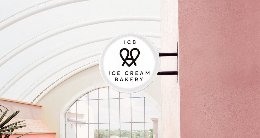
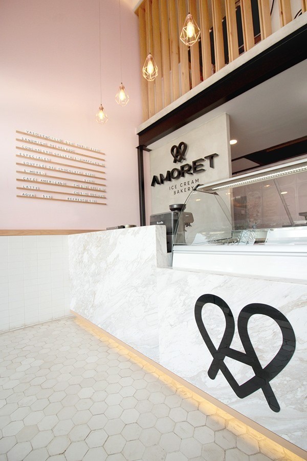
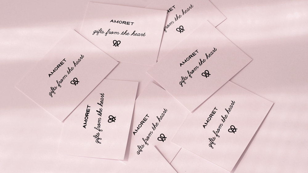
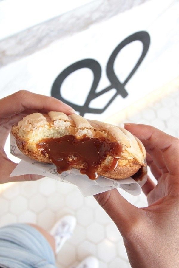
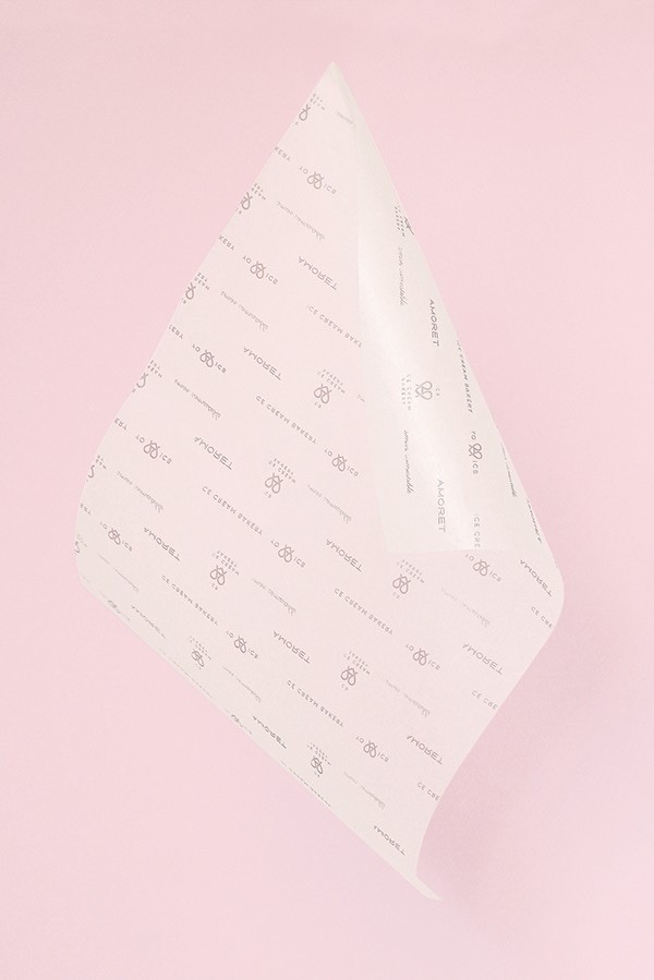
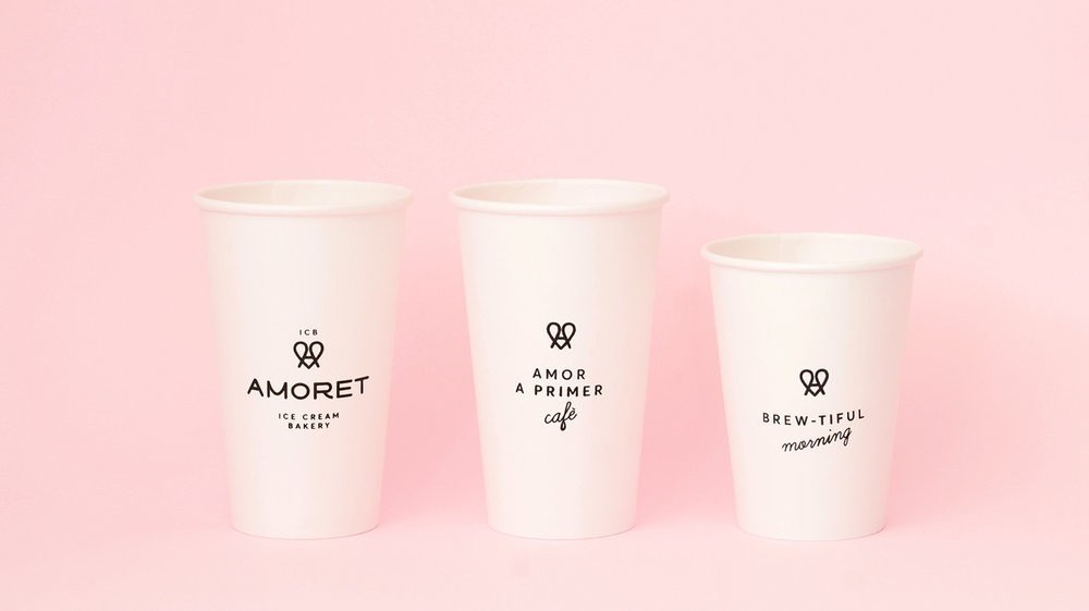
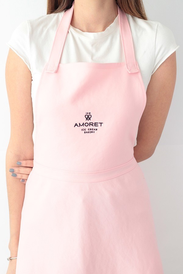
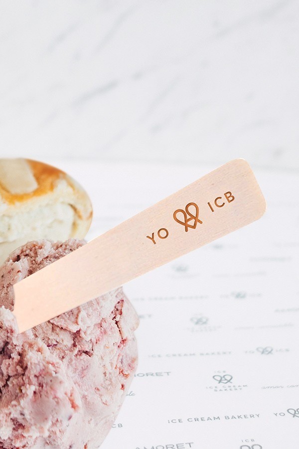
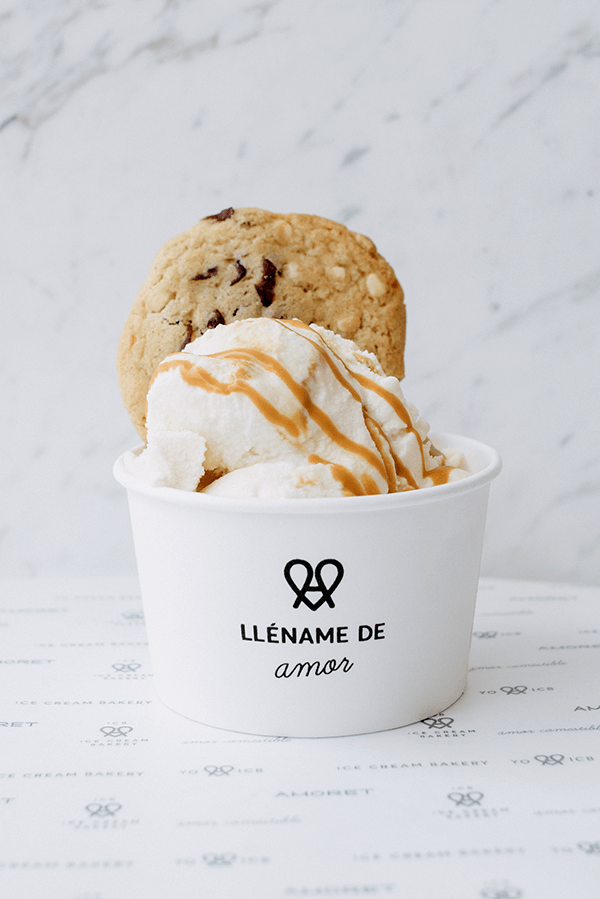
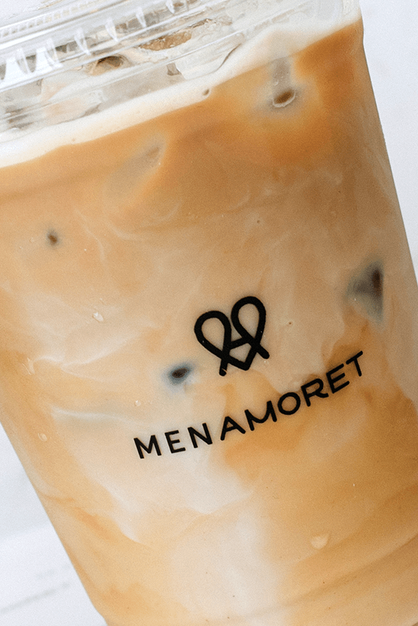
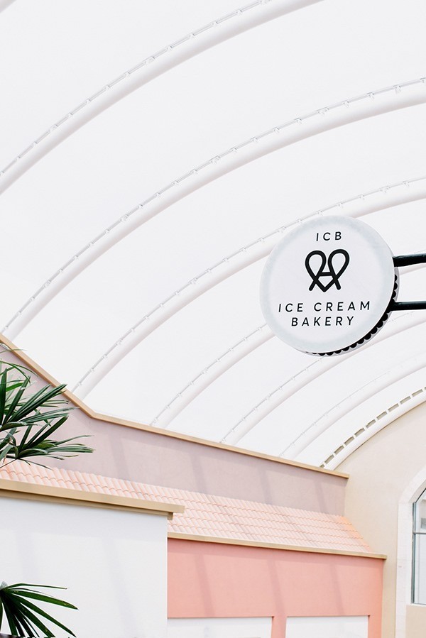
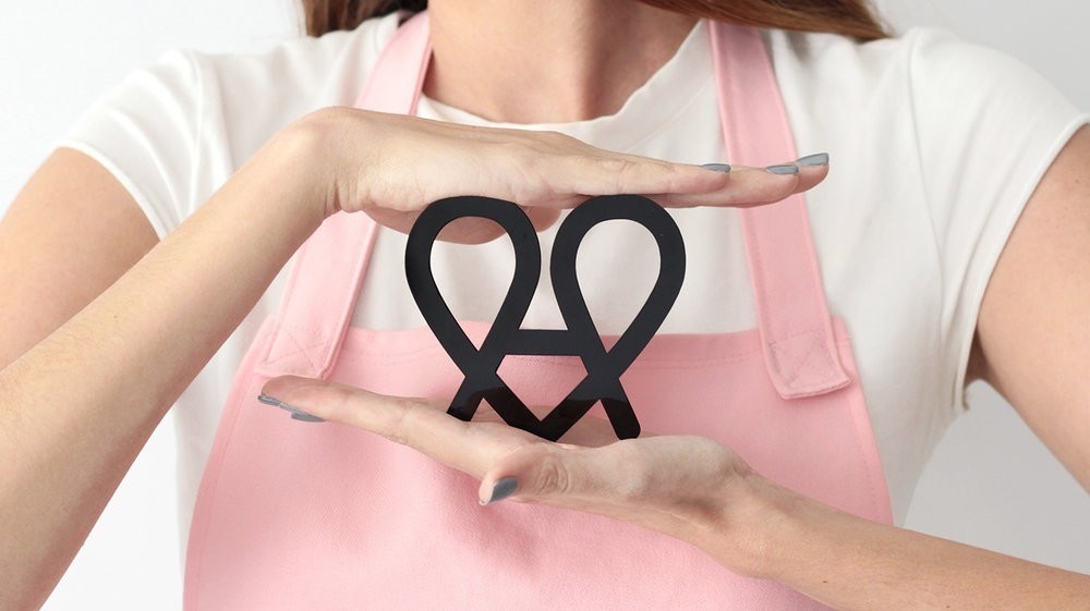
Savia Agencia – Amoret Ice Cream Bakery
Amoret is an ice cream bakery where all desserts are made with the heart. Owned by two Mexican women inspired by a typical pastry called“concha, they’ve created the new versión of an ice cream sandwich filling conchas with ice cream.
It’s brand Identity it’s all about love, the logo is the contraction of a heart and the brand initial letter “A”. All of it’s communication is sensitive and romantic, every piece talks to costumers with beautiful quotes that make them feel loved.
“Amoret,” comes the contraction of the Frech word “îamourette”, diminutive of love. A little love translates into an instant of happiness, that moment when you feel in the clouds, something compared to the moment when your tasting a delicious dessert.


Design Agency Name: Savia Agencia
Organisation/Project Type: Agency, Published Commercial Design
Article Title: Branding for a Mexican Ice Cream Bakery
Brand / Project Name: Amoret Ice Cream Bakery
Project Type: Consumer Brand Creation
Strategic Deliverables: Consumer Brand Strategy, Consumer Brand Naming
Design Deliverables: Consumer Brand Identity
Location: Mexico
Market Country: Mexico
Market Region: North America
Project Category: Bakery
Consumer Packaging Format: Cup
Consumer Substrate / Material: Plastic, Pulp Carton, Pulp Paper

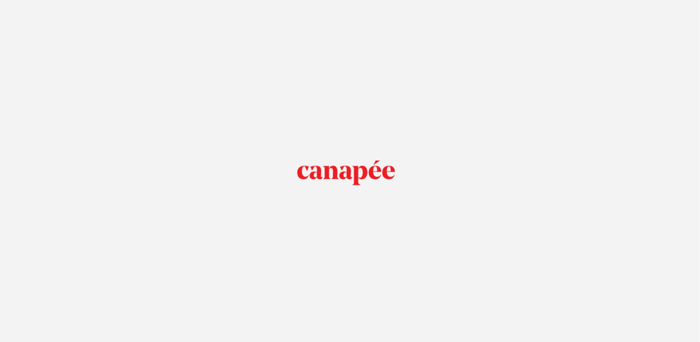
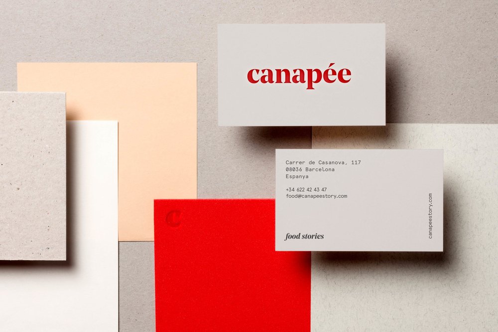
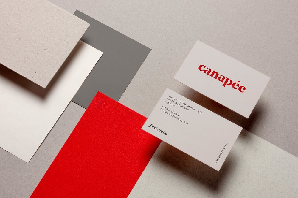
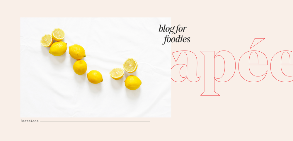
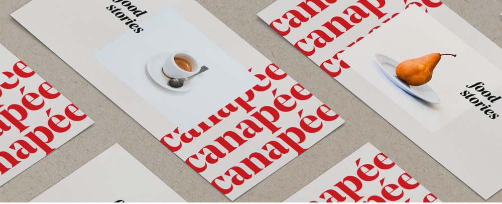
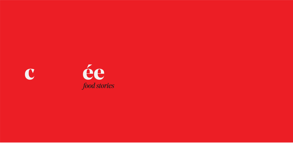
Paréntesis Studio – Canapée Food Blog
A foodie blog from Barcelona. With good and gourmet interest.


Design Agency Name: Paréntesis Studio
Organisation/Project Type: Freelance, Non Published Concept Design
Article Title: Canapée Brand Identity
Brand / Project Name: Canapée Food Blog
Project Type: Corporate Brand Creation
Strategic Deliverables: Corporate Brand Strategy
Design Deliverables: Corporate Brand Identity, Corporate Branding
Location: United States America
Market Country: United States America
Market Region: Caribbean
Project Category: Food/Beverage
Corporate Brand Touchpoints: Brand Identity
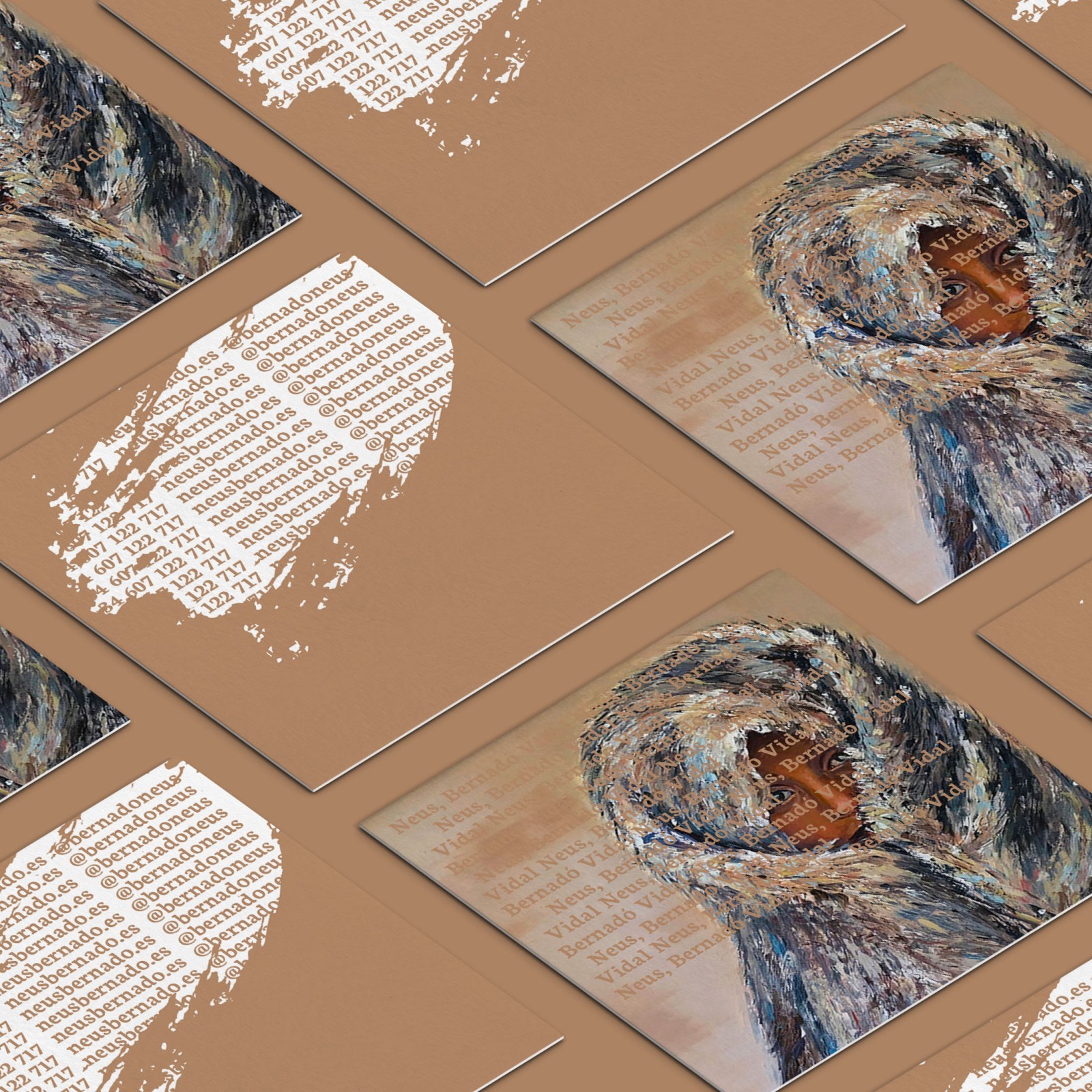

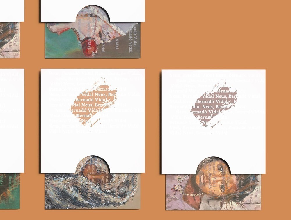
Anna – Neus B
Corporate branding project for Neus B., plastic artist from Barcelona.
Investigate the artist’s style and the best way to achieve his goal. Trying to capture the essence of the painter to translate it into her brand and achieve a powerful identity that atract your customers at first sight. The intention is to investigate the creation of an identity system without the need for a conventional logo that can inform about the profession of the artist without the need to explain it.
Design Agency Name: Anna
Organisation/Project Type: In-house, Published Commercial Design
Article Title: Corporate Branding for Neus B., A Plastic Artist From Barcelona
Brand / Project Name: Neus B.
Project Type: Corporate Brand Creation
Strategic Deliverables: Corporate Research / Insight, Corporate Brand Strategy, Corporate Tone of Voice, Corporate Brand World
Design Deliverables: Corporate Branding, Corporate Brand Creation, Corporate Brand Identity, Corporate Brand Identity System, Corporate Graphic Design, Corporate Retail Brand Design
Location: Spain
Market Country: Spain
Market Region: Europe
Project Category: Retail
Corporate Brand Touchpoints: Retail Design, Brand Identity, Experiential, Graphic Design, Typography, Printed Stationary
Any Additional Corporate Brand Touchpoints: printed art

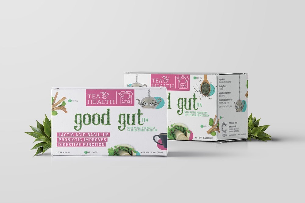
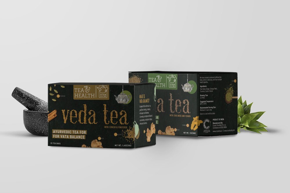
Stratedgy – TRICE Tea and Health
When we were approached by Trice Tea for redesigning their packaging, we were ecstatic! The company offers amazing tea and is a heritage brand, but it was presented merely as a line of stand alone products packaged in a clutter of information and colour.
The brief was simple – to introduce a line of sophisticated packaging that is in sync with modern packaging guidelines and design standards, without compromising on the mandatory information to be placed on the every pack.
The Challenge:
With a large number of more established players in the market, with a much more refined aesthetic, the mission was to portray the heritage brand (Trice was established in 1896!) in a new light. We were to present a melange of expertise and freshness to connect with consumers.
The brief clearly underlined the importance of conveying all information in a simple, and straightforward manner.
With 11 variants, all having a unique and exotic mix of ingredients, we needed to think beyond front and back of pack structures.
The Insight:
Whilst the switch to organic and health-conscious food and beverages is slowly growing, it also comes with apprehensions in the consumer’s mind.
After a lot of research, we resolved to break the universal image about ‘health teas’ through our design. We needed to break the monotony of the regular, on-the-shelf health products by being straightforward with our visuals. We wanted the honesty of it all to speak for the product.
Health teas are recognised by their mix of ingredients, which contributes to their unique USP. But the awareness about these ingredients is sparse and usually limited to just a line on the packaging.
Consumers, though aware of the options in the market, made their buying choices purely on previous preferences. What we needed to do was to feed them all the information visually, and keep it simple so they can make informed buying decisions.
The Idea:
As a brand that is sold and supplied globally, we deduced that a single statement or one visual cue was not enough. We had to expand the surfaces and push the boundaries.
This came about by the looking at the packaging holistically, and not per surface. The fronts and backs mattered no more. The entire package was our canvas. We had a lot more room to show and say.
To keep it organic and original, the type unit of each variant was meticulously created using the hero ingredient. Each ingredient (some picked from around the world) were to be presented in it’s original, raw state representing it’s core health benefit.
We experimented with leaves, powders, grains and seeds to obtain textural variety and depth. Along with other ingredients, colours and text we communicated what’s inside, on the outside.
Our designs embrace and imbibe the story, the qualities and the language of each variant, marrying it in entirety to the legacy and credibility of the parent brand.


Design Agency Name: Stratedgy
Organisation/Project Type: Agency, Published Commercial Design
Article Title: TRICE Tea and Health Packaging Design for a New Tea Brand
Brand / Project Name: TRICE – Tea & Health
External Design Credits: Krupa Kapadia
Project Type: Consumer Brand Creation, Consumer Brand Redesign
Strategic Deliverables: Consumer Research / Insight, Consumer Brand Strategy, Consumer Tone of Voice
Design Deliverables: Consumer Branding, Consumer Rebranding, Consumer Brand Identity, Consumer Brand Identity System, Consumer Brand Guidelines, Consumer Graphic Packaging Design, Consumer Structural Packaging Design, Consumer Retail Brand Design, Consumer Brand Digital Design
Location: India
Market Country: United States America
Market Region: Multiple Regions
Project Category: Beverages
Consumer Packaging Format: Box
Consumer Substrate / Material: Pulp Board

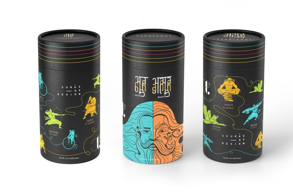
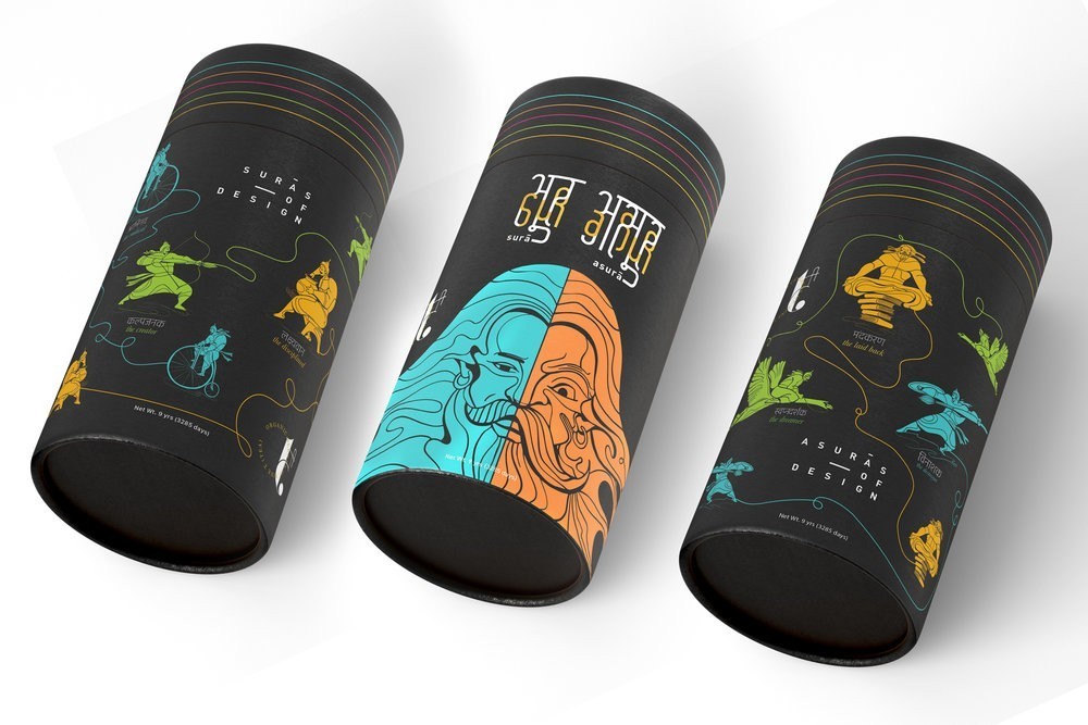
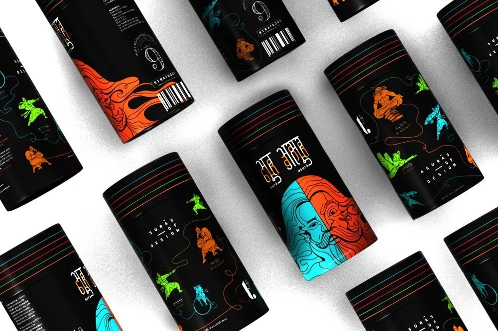
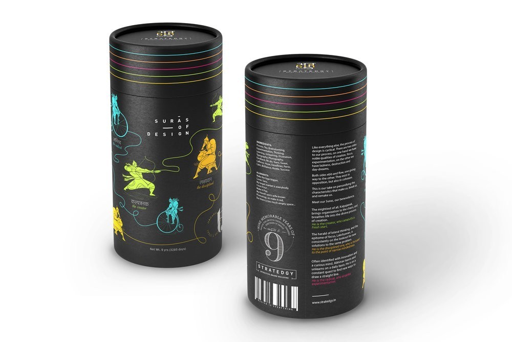
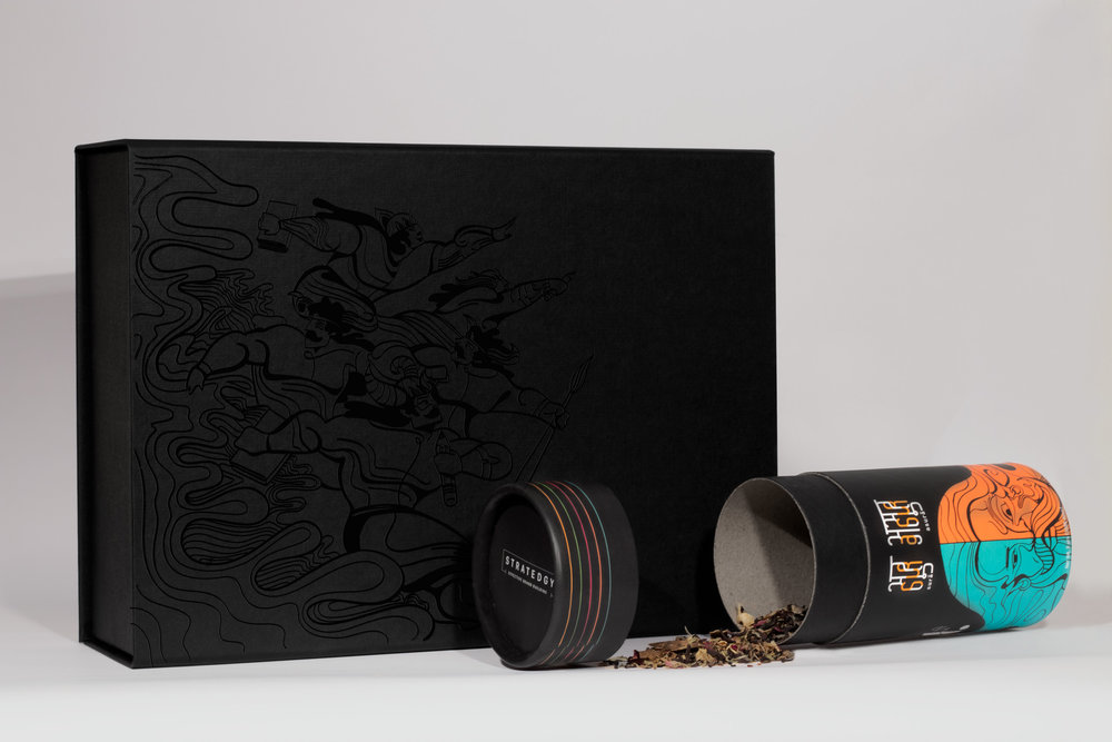
Stratedgy – T – Organic Blends of Fine Tea
On the eve of our 10th year in the design industry, we, at Stratedgy created a self promotion project. We decided to break things down, personify, and provide insights into the what, why and how of who we are.
The Challenge:
We wanted to create something that was unique, memorable, and something very closely related to design. Moreover, as a giveaway, we had a find a product that would add value to the recipient.
The Insight:
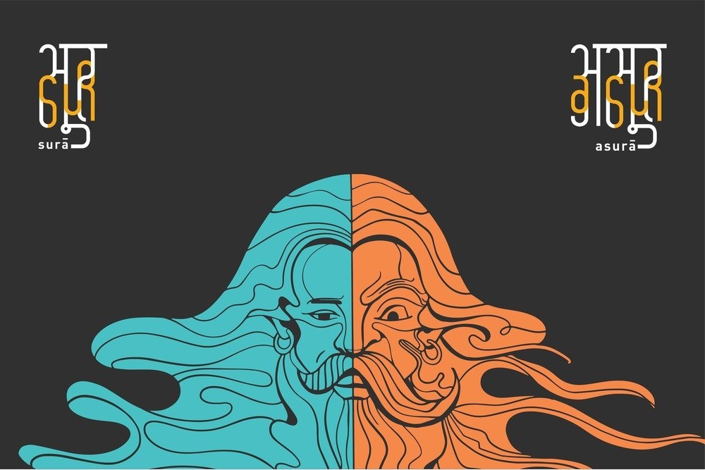
We are an Indian company, talking predominantly to an Indian audience. We decided to go back to our roots. Delving into Indian mythology, one of the concepts that stood out the most was that of cyclical time or the Wheel of Time– called Kalachakra in Sanskrit. It defines time as cyclical – consisting of repeating ages. Our journey led us to draw an analogy with the process of design, leading to the Idea of ‘The Dual Nature of Design’.
The Idea:
Mythology is one of the richest elements of Indian culture, making the art of storytelling our way of life. The fascinating aspect of mythological stories is that they are usually meant to convey subtle facts and rules that guide daily life. Learnings from mythology can be adopted to every aspect of life.
We have built characters rooted in mythology that define the multiple the roles of designers.
In Indian mythology, the Surās are the pure, the divine, the good. The Asurās are the grey areas… They have powers that can be used for good or evil. While Surā means good, Asurā means the opposite of good, but not necessarily bad.
Drawing this parallel, the process of design is a cyclical one. There are two sides to our process, the good: the creation, the focus, the experimentation. However, without opposing factors, the process becomes complacent. This is the dual nature of design. One needs to destroy to create, one needs to step back to focus, and one needs to dream to experiment.
Both sides ebb and flow, one giving way to the other. They exist in opposition, but also in cohesion. This is our take on personifying the characteristics that make us, break us, and remake us.
THE EXECUTION:
To support this idea, we were on the look out for a product that would have a strong cultural relevance at the same time be universally accepted.
After much pondering, we narrowed down on tea.
Tea is a prominent part of Indian culture and lifestyle, and can be made as per the the liking of the drinker. It was a perfect fit.
We took this idea forward by creating custom packaging for a set of fine tea blends. Three cans, one for the Surās, one for the Asurās, and the third one explaining the concept and context.
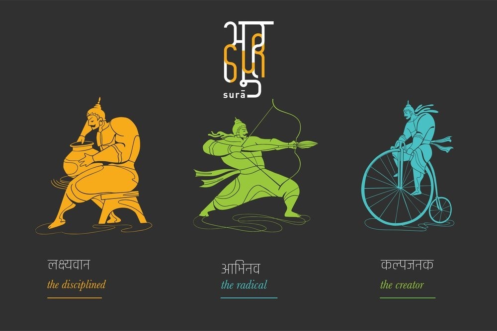
Meet our Suras, our benevolence:
The mightiest of all, Kalpajanak, brings organization to the chaos, and breathes life into the divine process of creation.
He is the creator, who catapults a fresh start.
—
The herald of lateral thinking, and the epitome of focus, Lakshyavan, is consistently on the lookout for new solutions to the same problem.
He is the disciplined one, who is focused to the point of narrow mindedness
—
Often identified with innovation and a curious mind, Abhinav learns and unlearns on a daily basis. He is on a constant quest to find new ways to draw a straight line.
He is the radical, who enables experimentation.
——
Meet our Asuras – our challengers.
Vinashak is on a constant quest to destroy the old, to make place for the new.
He is the destroyer who is the catalyst for a fresh start.
Immersed in his world, Svapnadarshak, often fathoms ideas that are unthinkable.
He is the dreamer who pushes boundaries.
Often identified with laziness, Mandkhand, passive and stationary, constantly works towards uncluttering the mind.
He is the laid back one, who wipes the slate clean.


Design Agency Name: Stratedgy
Organisation/Project Type: Agency, Non Published Concept Design
Article Title: T – Organic Blends of Fine Tea Packaging Design
Brand / Project Name: T – Organic Blends of Fine Tea
External Design Credits: Krupa Kapadia
Project Type: Consumer Brand Creation
Strategic Deliverables: Consumer Research / Insight, Consumer Brand Strategy, Consumer Brand Naming, Consumer Product Naming, Consumer Tone of Voice, Consumer Brand World
Design Deliverables: Consumer Branding, Consumer Brand Creation, Consumer Brand Identity, Consumer Brand Identity System, Consumer Brand Experience, Consumer Graphic Packaging Design, Consumer Structural Packaging Design, Consumer Brand Digital Design
Location: India
Market Country: India
Market Region: Asia
Project Category: Beverages
Consumer Packaging Format: Box
Consumer Substrate / Material: Pulp Board
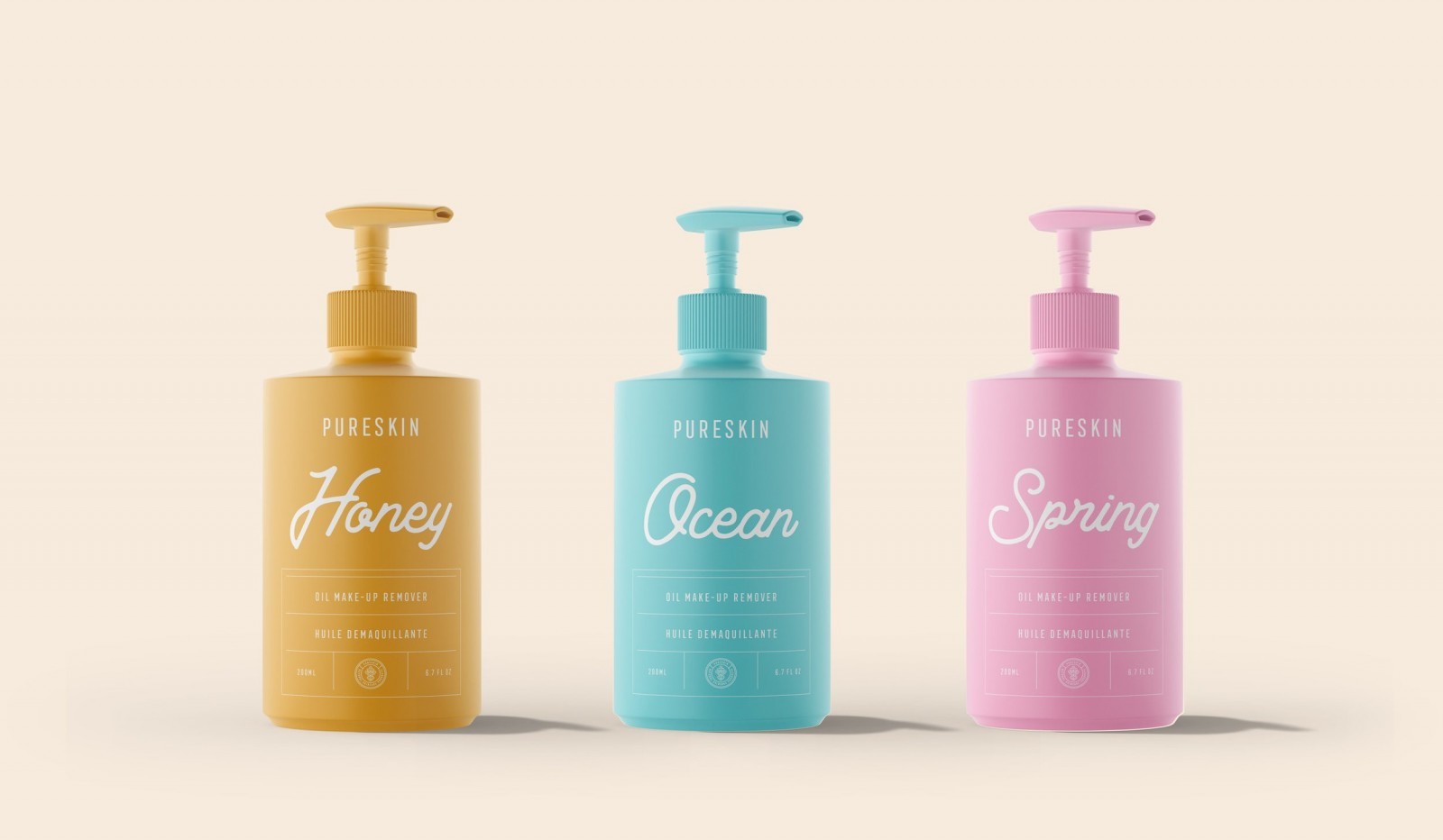
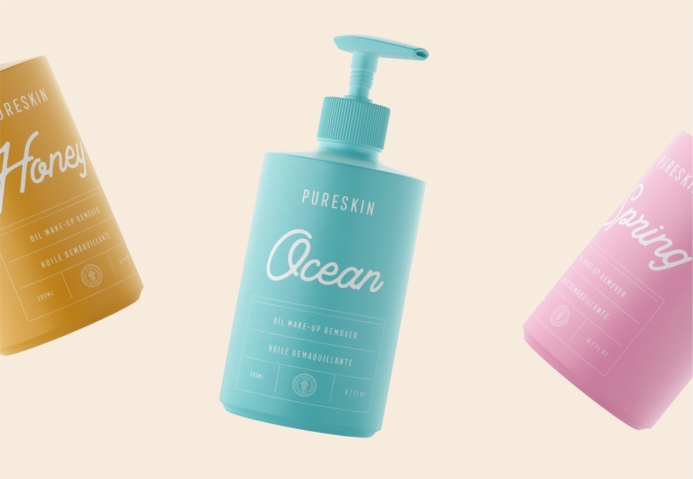
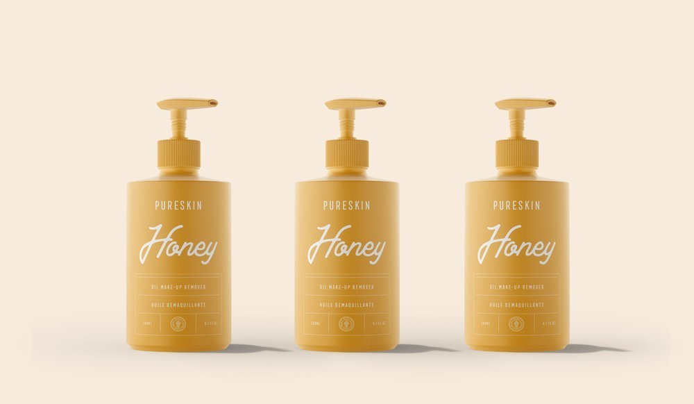
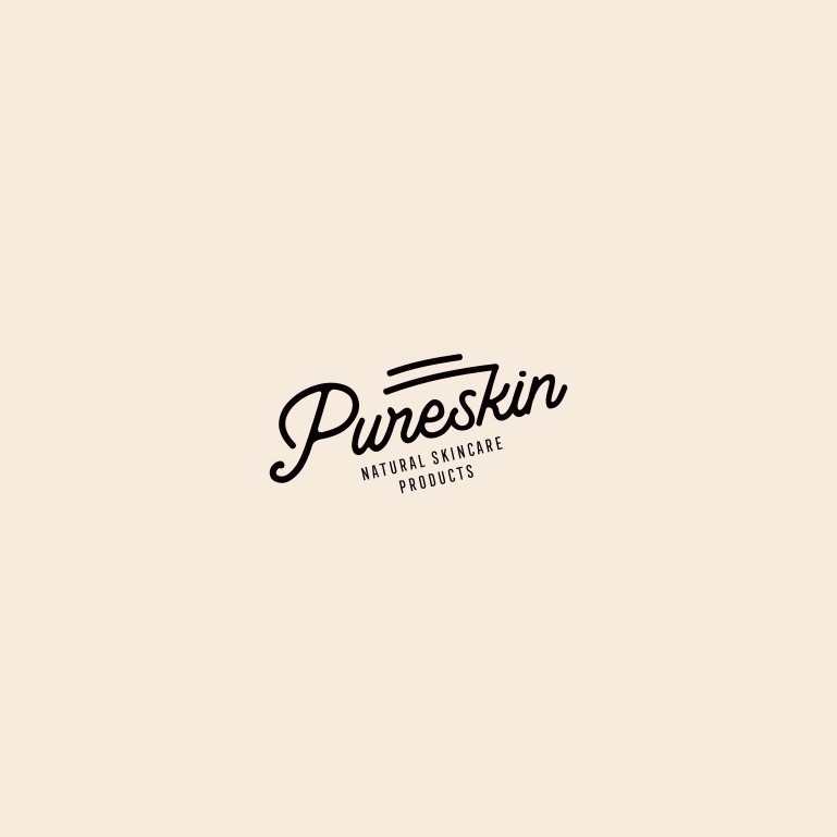
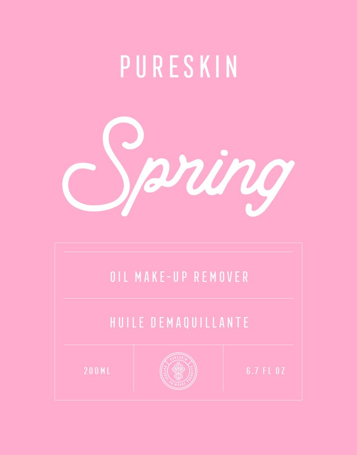
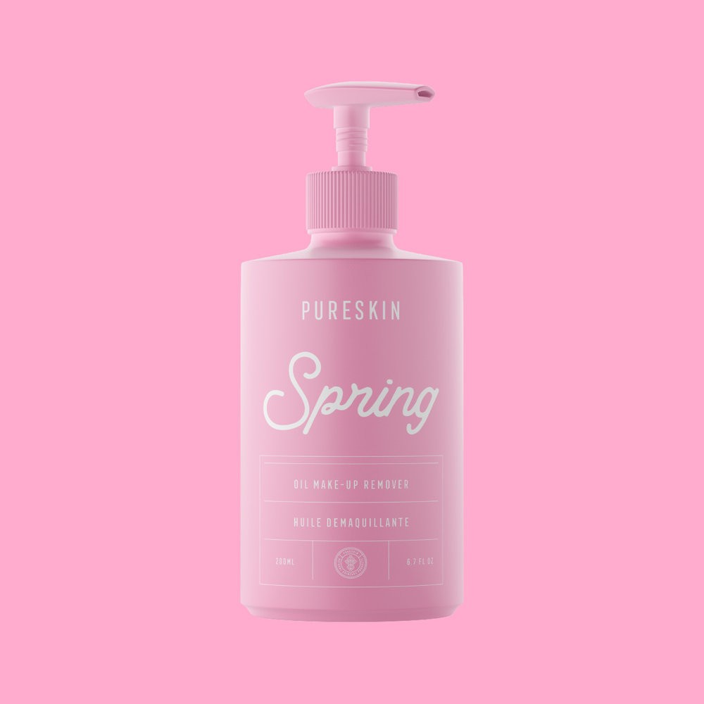
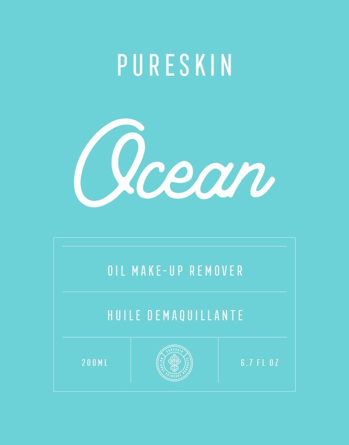
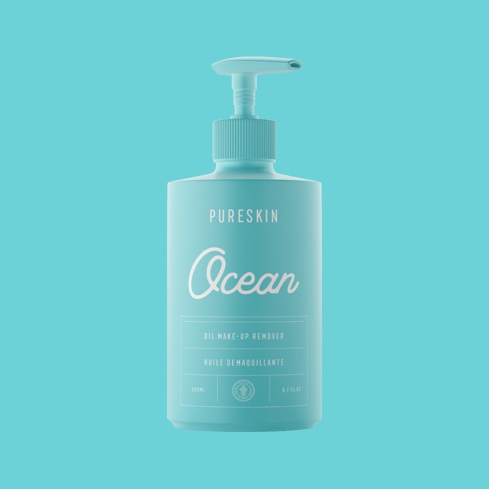
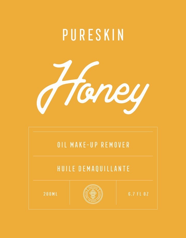
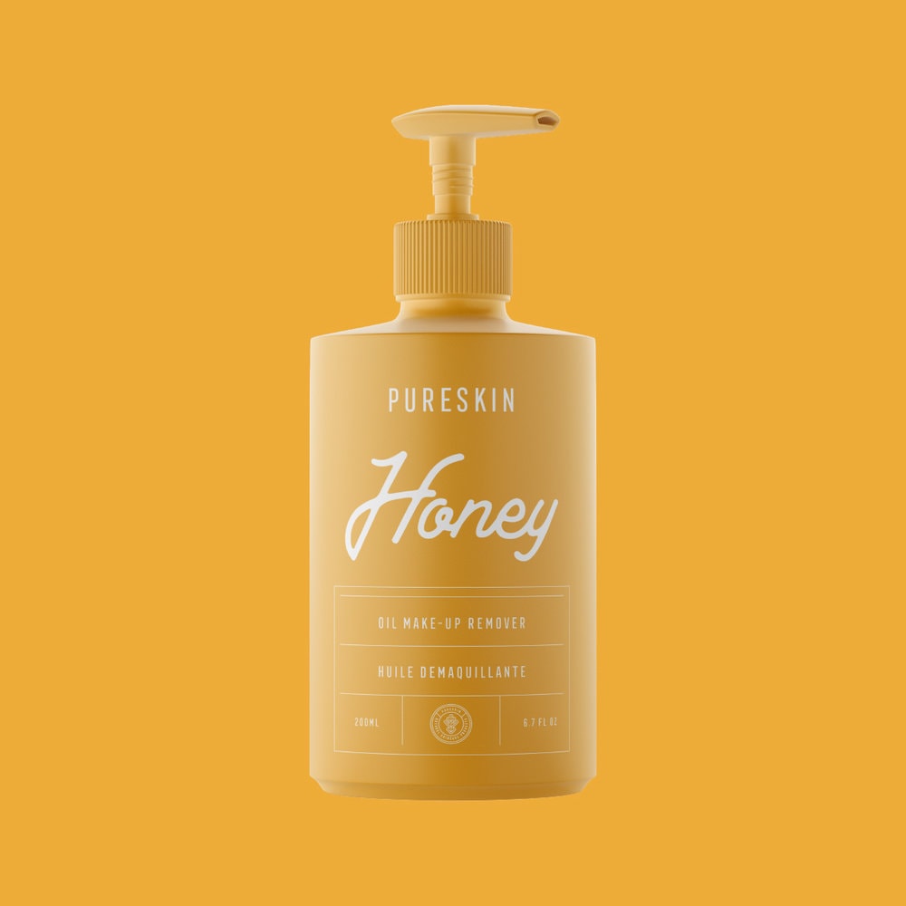
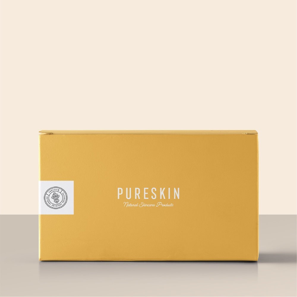
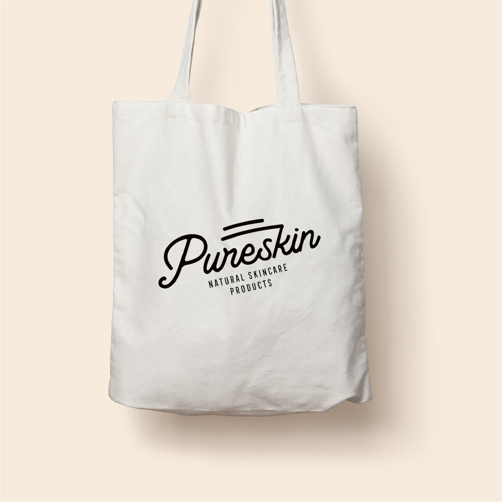
Marka Network Branding Agency – Pureskin Natural Skincare Products
Branding & packaging design for Pureskin Natural Skincare Products


Design Agency Name: Marka Network Branding Agency
Organisation/Project Type: Agency, Published Commercial Design
Article Title: Pureskin Natural Skincare Products
Brand / Project Name: Pureskin Natural Skincare Products
External Design Credits: Creative Director: Mustafa Akülker
Project Type: Consumer Brand Creation
Strategic Deliverables: Consumer Product Naming, Consumer Tone of Voice
Design Deliverables: Consumer Branding, Consumer Brand Identity, Consumer Brand Guidelines,
Consumer Graphic Packaging Design
Location: Turkey
Market Country: Switzerland
Market Region: Europe
Project Category: Health and Beauty
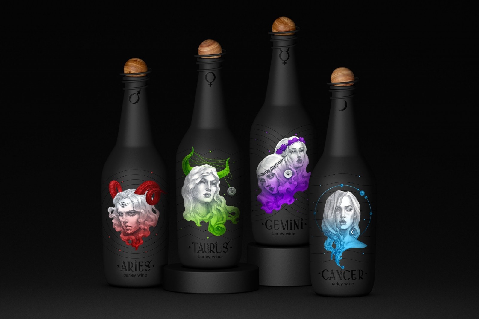

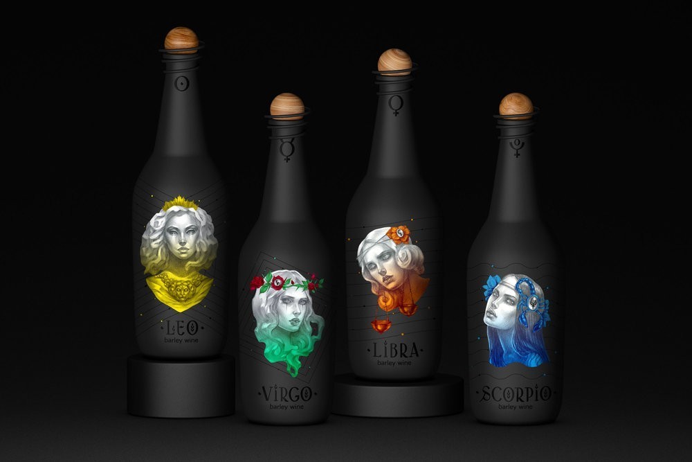
Zernaev Studio – Zodiac Girl
Barley wine is a style of strong ale. We created a design concept for twelve bottles of barley wine, each of which is decorated by a picture of a zodiac girl. On a dark matte bottle there is a planet-cork with a wooden texture and a spiral lock that creates an interesting additional effect of rings around the planet. As a part of this project we also created the elegant antiqua with the elements of barley ears which complements the mood of the illustrations.


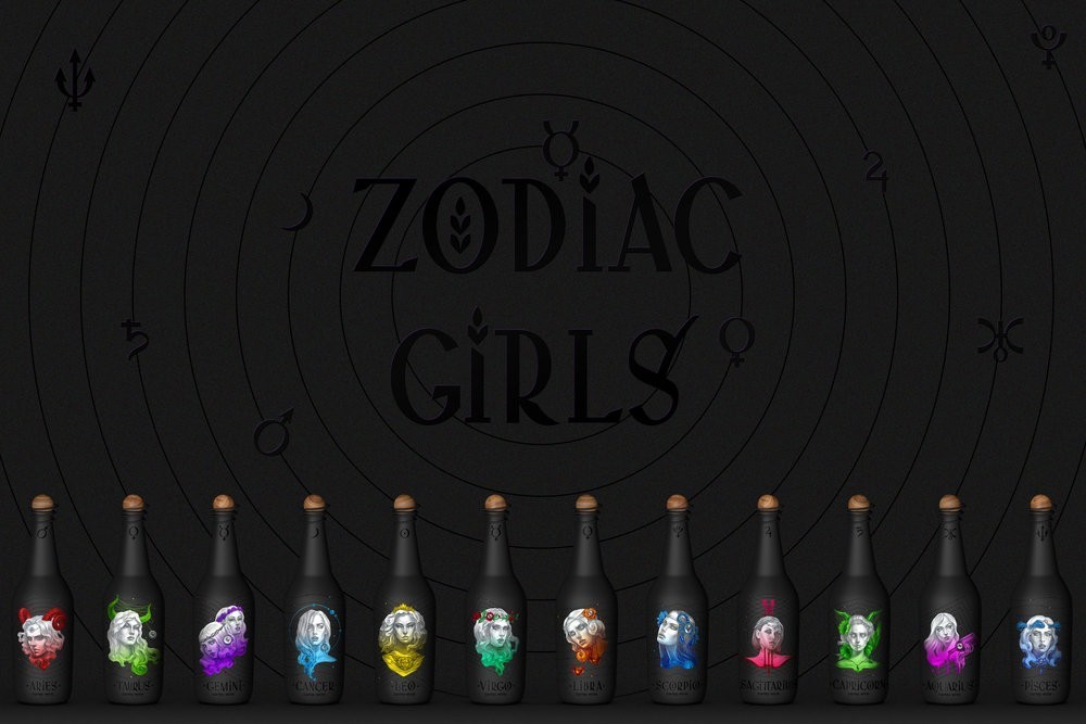
Design Agency Name: Zernaev Studio
Organisation/Project Type: Agency, Non Published Concept Design
Article Title: Barley Wine «Zodiac Girls»
Brand / Project Name: Zodiac Girl
External Design Credits: Design – Konstantin Zernaev. Illustration – Angela Demure
Project Type: Consumer Brand Creation
Strategic Deliverables: Consumer Product Brand Architecture
Design Deliverables: Consumer Graphic Packaging Design
Location: Russia
Market Country: Multiple Countries
Market Region: Global
Project Category: Beer and Cider
Consumer Packaging Format: Bottle
Consumer Substrate / Material: Glass, Wood

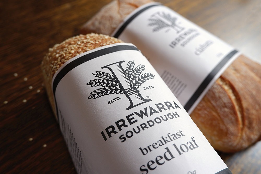
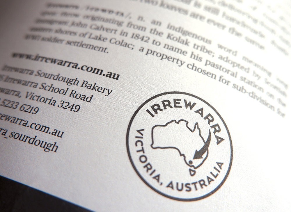
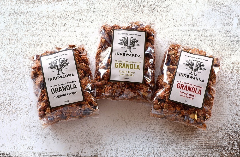
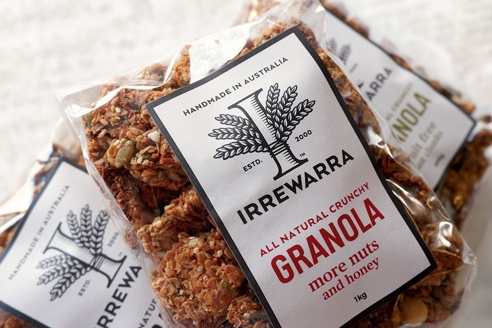
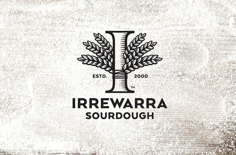
Asprey Creative – Irrewarra Sourdough
Irrewarra is a successful bakery in regional Victoria, Australia with a huge following, genuine heritage and, when they approached us, a clear need for a prouder, more confident brand strategy.
We took a holistic approach to reinventing Irrewarra’s brand and packaging. We improved the brand’s expression by simplifying and modernising messaging across all their touchpoints. We reinterpreted the brand mark without detracting from its heritage, consolidated brand expression across secondary product ranges and refined brand language to tell a more engaging story of quality ingredients and pride of place.
Design Agency Name: Asprey Creative
Organisation/Project Type: Agency, Published Commercial Design
Article Title: Brand and Packaging Design for Bakery
Brand / Project Name: Irrewarra Sourdough
Project Type: Consumer Brand Redesign
Strategic Deliverables: Consumer Tone of Voice
Design Deliverables: Consumer Rebranding, Consumer Brand Identity System, Consumer Graphic Packaging Design, Consumer Structural Packaging Design
Location: Australia
Market Country: Australia
Market Region: Oceania
Project Category: Bakery
Consumer Packaging Format: Bag, Sleeve
Consumer Substrate / Material: Plastic, Pulp Paper