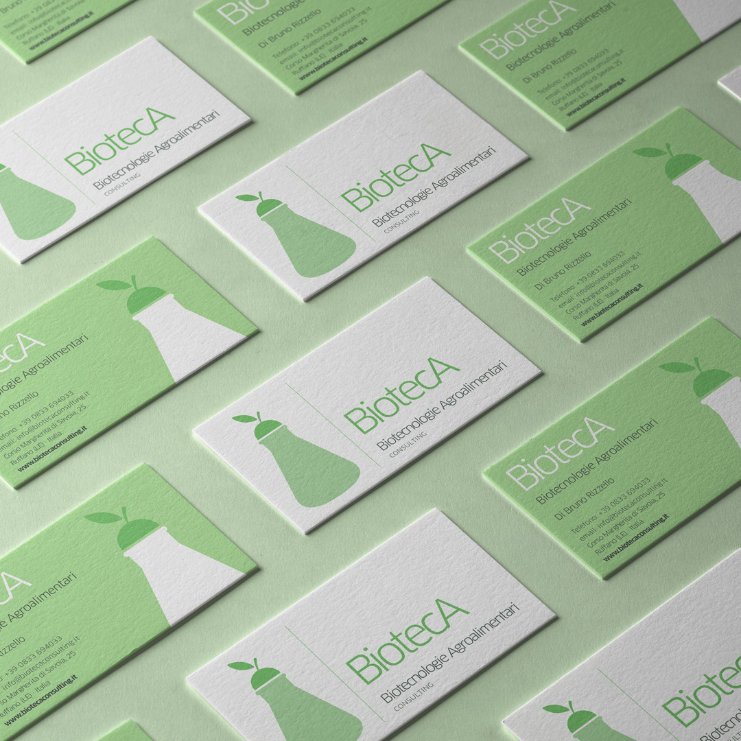
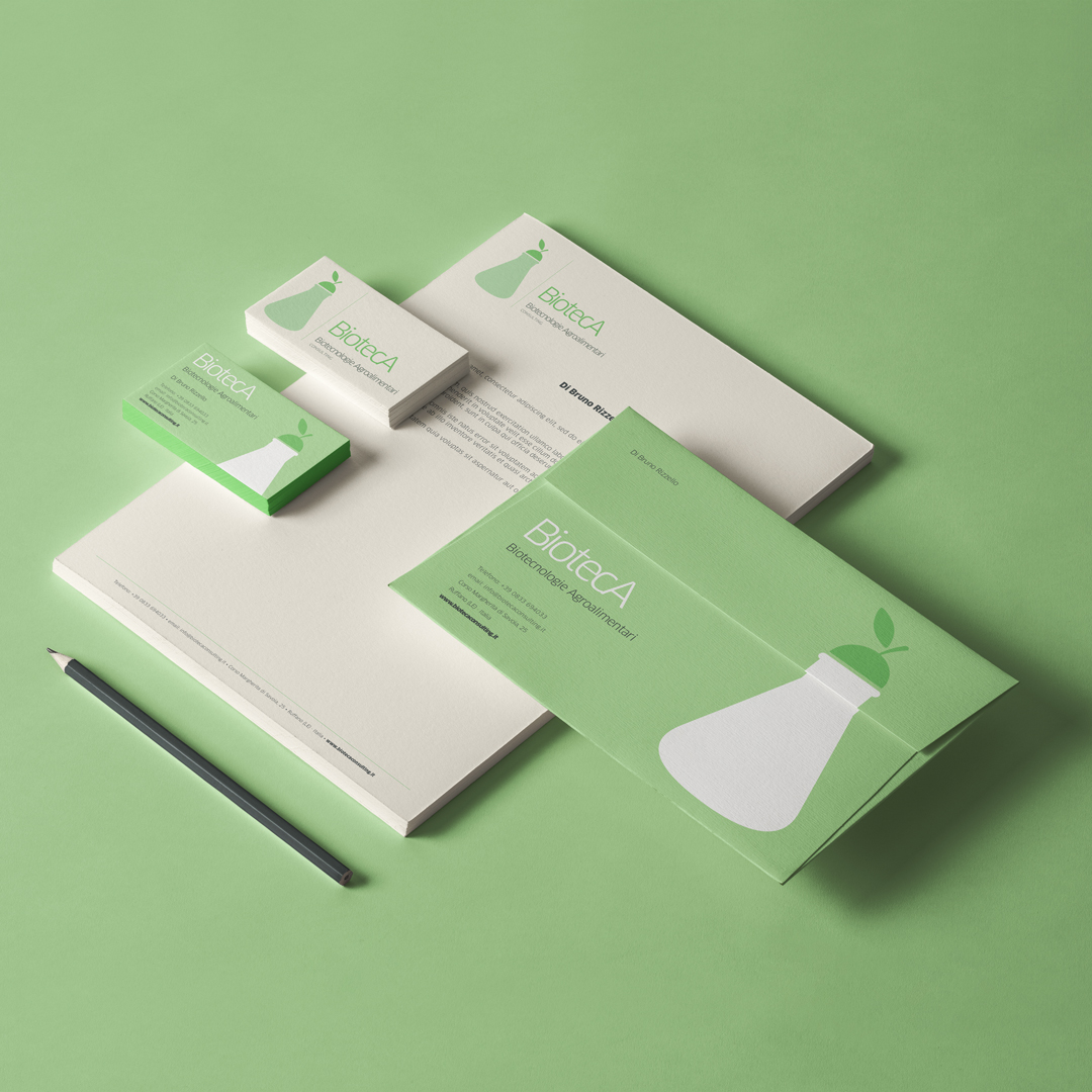
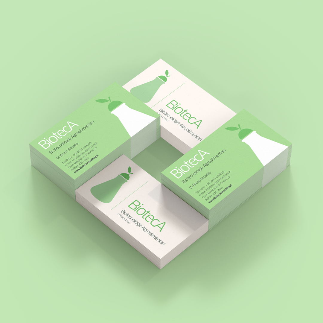
BiotecA stands for “Biotecnologie Agroalimentari”, a food industry accredited testing laboratory specialized in providing food analysis and consulting services. On this occasion we were requested to create and design the name, logo and corporate identity.
The symbol on the logo represents the fusion of a classic Erlenmeyer flask and a fruit: a pear in this particular case.
The end result is a fresh, clear and easy to understand logo.


CREDIT
- Agency/Creative: Mol Design
- Article Title: “BiotecA” Testing Lab for The Food Industry
- Organisation/Entity: Freelance, Published Commercial Design
- Project Type: Identity
- Agency/Creative Country: Italy
- Market Region: Europe
- Project Deliverables: Brand Identity, Brand Naming, Brand World, Graphic Design, Research
- Industry: Chemical
- Keywords: Food industry, laboratory, fruit logo, corporate identity, brand design
FEEDBACK
Relevance: Solution/idea in relation to brand, product or service
Implementation: Attention, detailing and finishing of final solution
Presentation: Text, visualisation and quality of the presentation


