Colorful and spirited, Bing came to us looking for a fresh new perspective on their family of energizing juice beverages. Established in 2006, Bing had already built familiarity in the national market, so we preserved and enhanced key components of their brand to ensure that this brand equity was retained. We used these pieces as the foundation for a refreshed logo and can design with increased legibility, hierarchy, and appeal, ready for a new era.
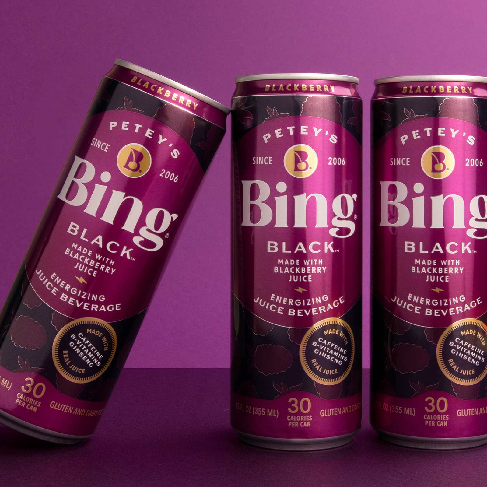
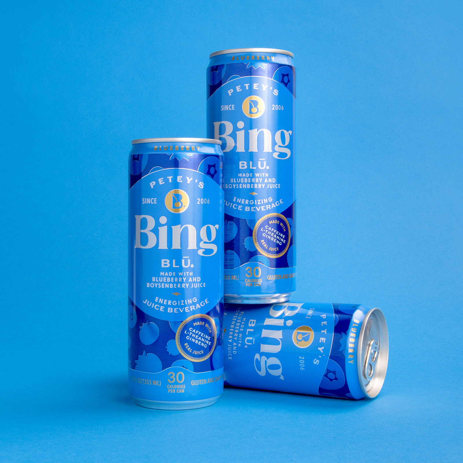
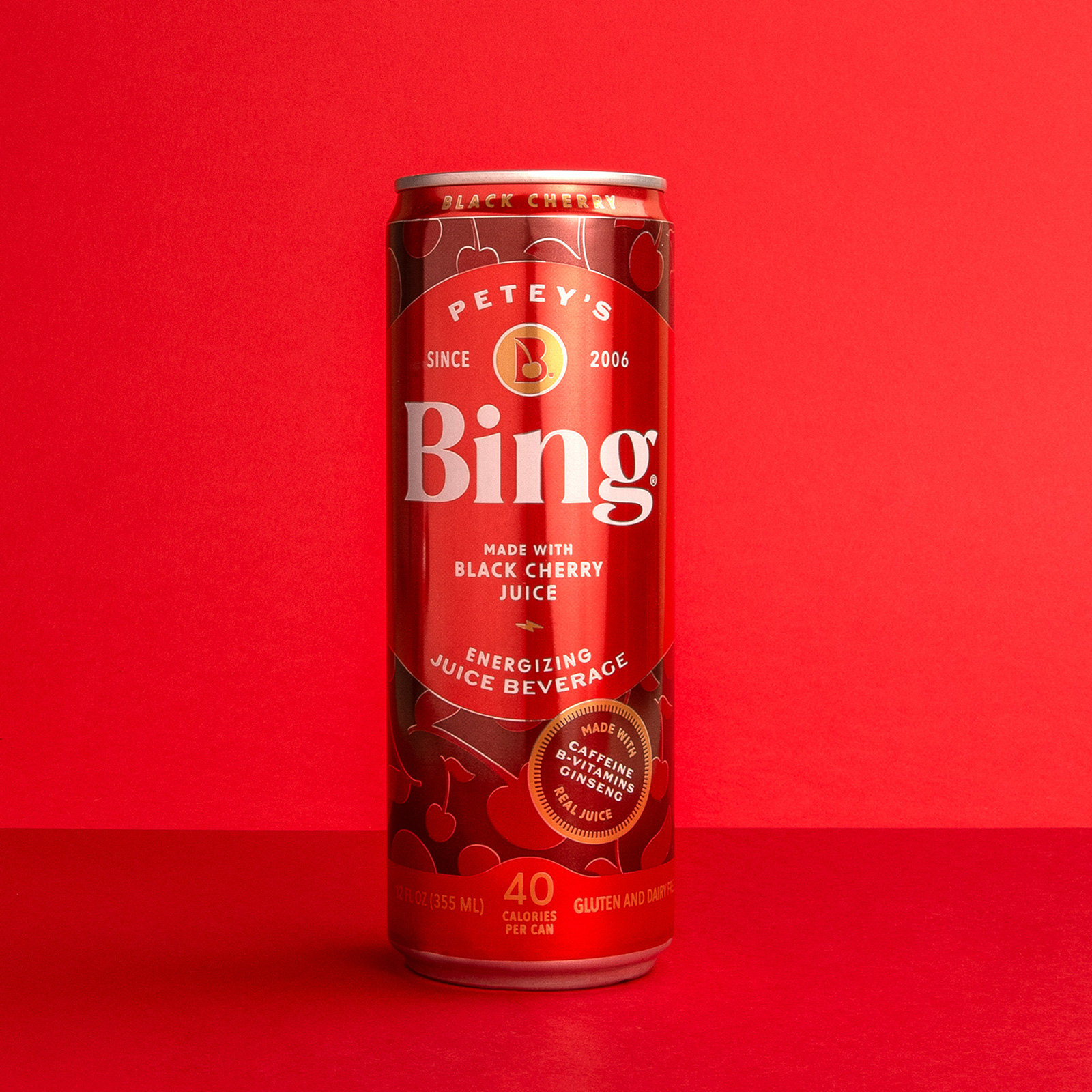
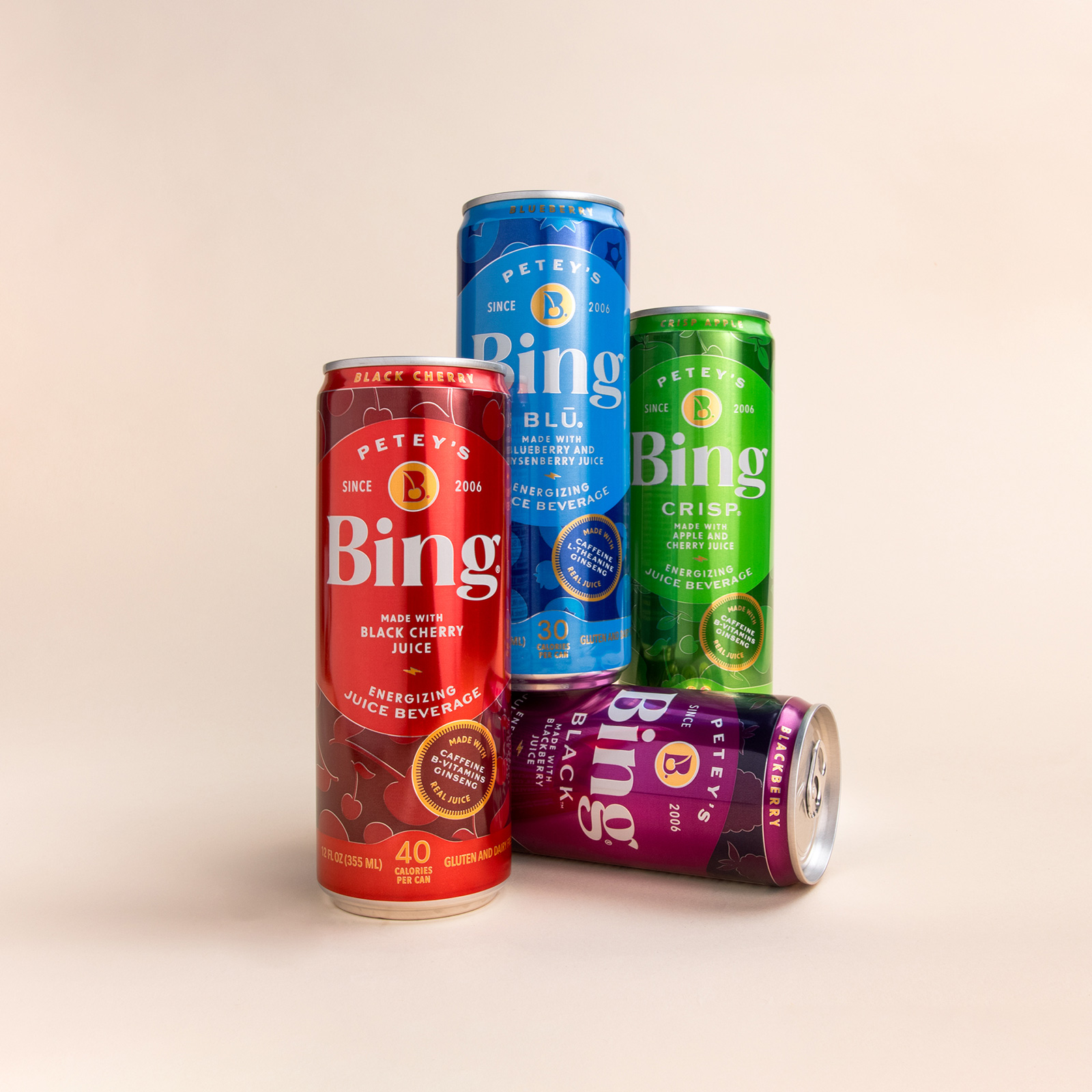
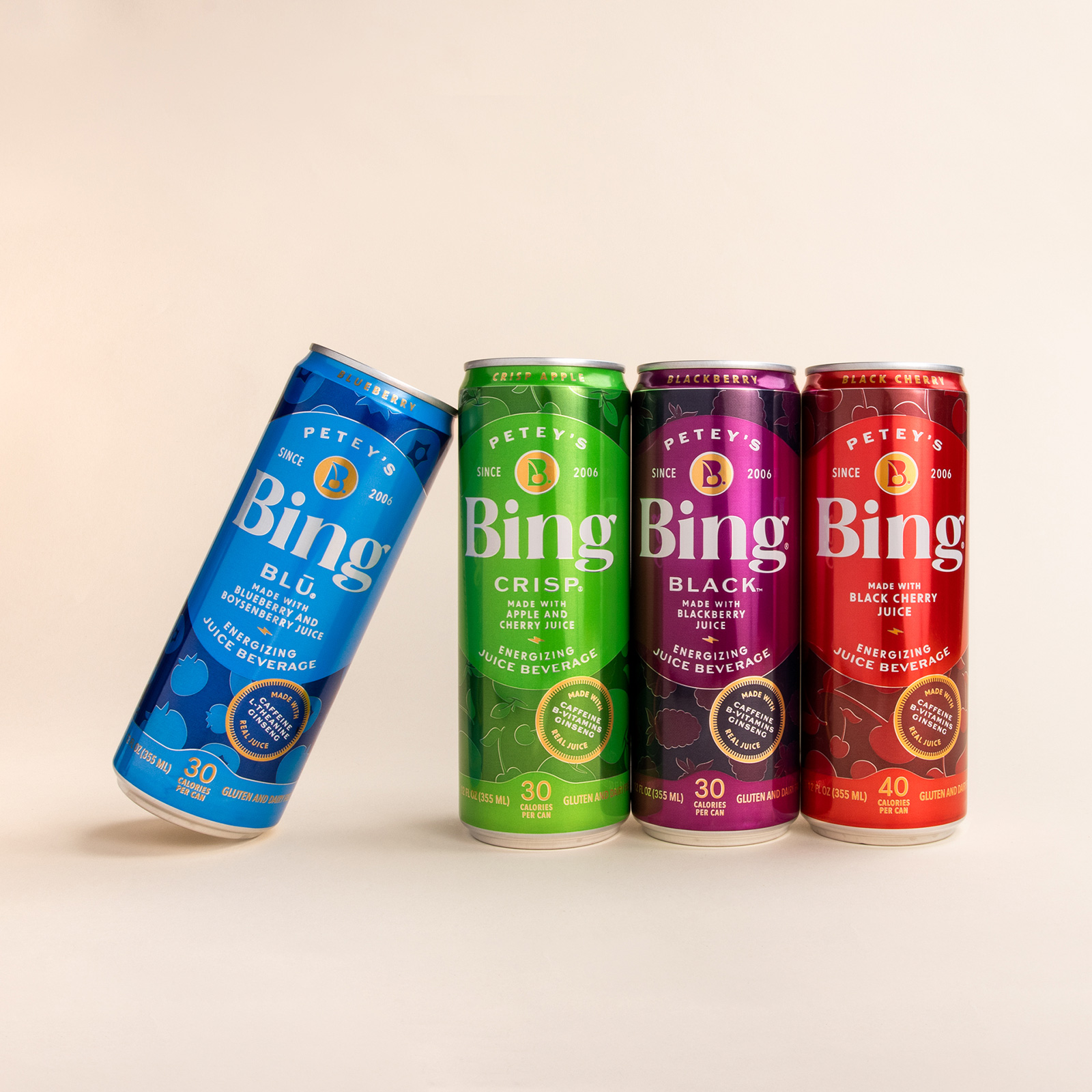
Maintaining a vibrant color palette was important to Bing and good for shelf presence, so we created a monochromatic system for each can that clearly expresses the flavor without being overwhelming. A new two-toned package adds depth and interest, layered with fruit illustrations subtly in the background to reinforce the flavor profile.
White was introduced to the logo and key callouts to add a level of freshness, and aid in legibility on grocery store shelves and points of sale. The image mark within the logo was reduced, increasing the size of the wordmark to be visible from a distance. New, more modern typography was developed for the wordmark to begin achieving the goal of modernization and enticing a younger market.
Functional callouts were redesigned into badges to help with the hierarchy of information across the can, and help make clear what is added to each beverage for the consumer. Gold was used as a highlight color that is uniform across all cans, tying the line together and adding a pop of elegance. A tiny lightening bolt separates the flavor statement and the tagline ‘Energizing Juice Beverage’ to provide a visual cue toward the caffeine content.
The overall design brought a beverage popular with a more mature crowd and introduced it to a younger audience through fresh colors, typography, and design while not alienating existing Bing fans. Once a can that disappeared in the freezer case, you will not miss it now when visiting your produce aisle.
From concepts, production, collateral and tradeshows, to when it hit the grocery store floors, we partnered with Bing to bring the new face of their brand to life.
CREDIT
- Agency/Creative: Watermark Design
- Article Title: Bing Branding and Package Design
- Organisation/Entity: Agency
- Project Type: Packaging
- Project Status: Published
- Agency/Creative Country: United States
- Agency/Creative City: Charlottesville
- Market Region: North America
- Project Deliverables: Art Direction, Brand Design, Brand Redesign, Branding, Creative Direction, Design, Graphic Design, Logo Design, Packaging Design, Product Photography
- Format: Can
- Industry: Food/Beverage
- Keywords: WBDS Agency Design Awards 2023/24
- Keywords: beverage, non-alcoholic, package design, typography, branding, logo design, graphic design, creative direction, art direction, can
-
Credits:
Creative Director: Darcey Lacy, Watermark Design
Brand + Packaging Designer: Rebekah Seiler, Watermark Design


