The main concept
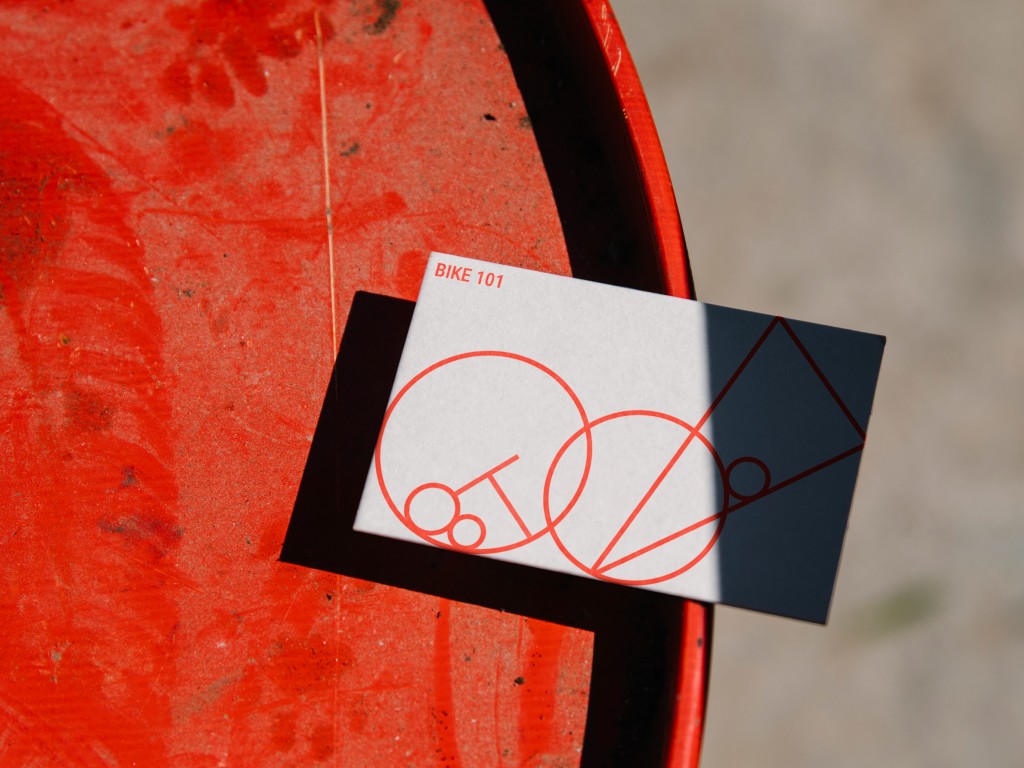
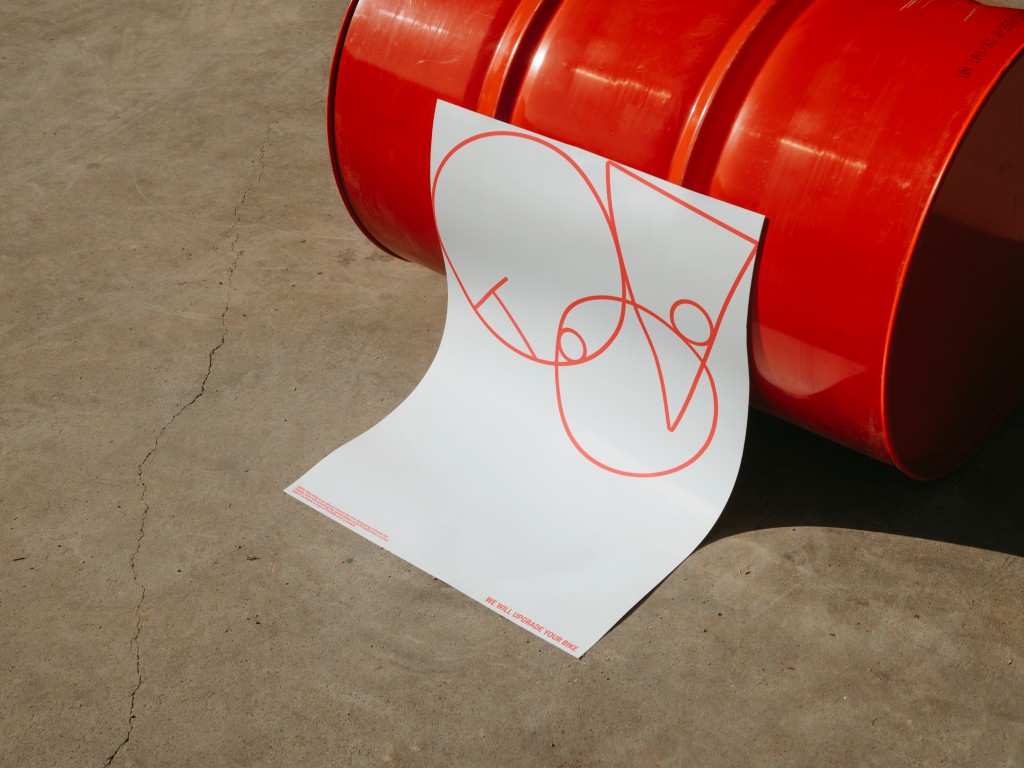
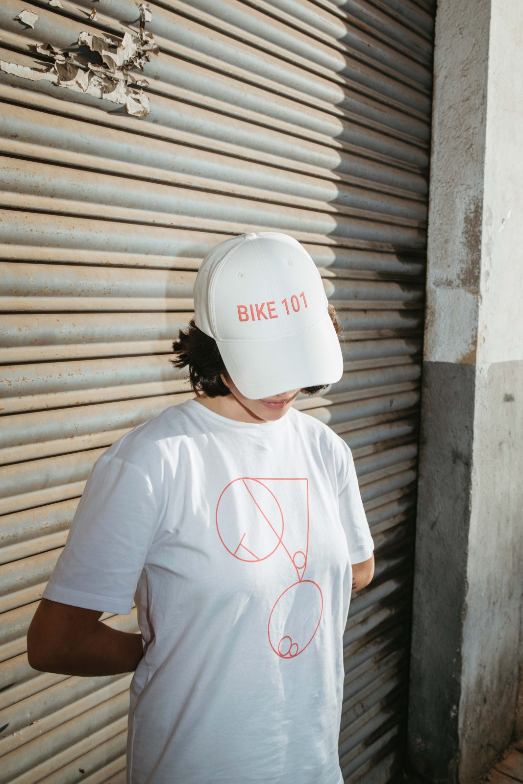
The development of the visual identity for BIKE 101 Shop & Repairs made me realize that bike workshops exist in the intersection of the static and the flexible — what was a bunch of disjointed pieces yesterday turns into a custom bike today. Therefore, the visual language is based on bike parts in their abstract form that are yet to become an actual bike.
The flexible
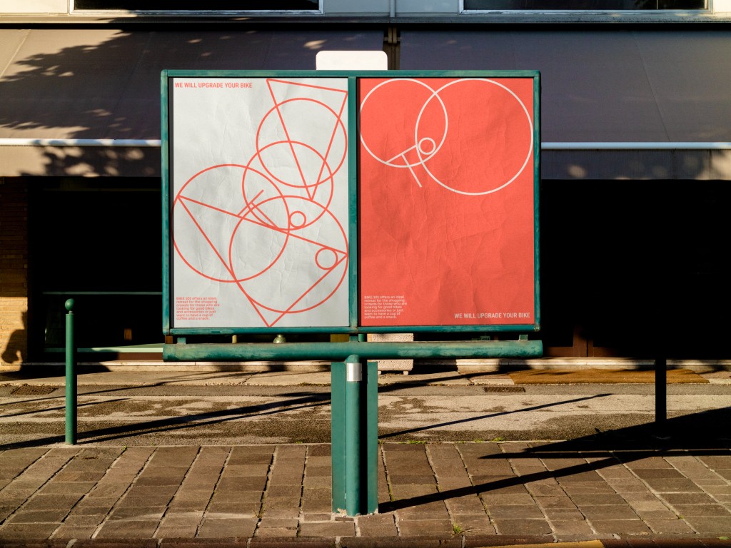
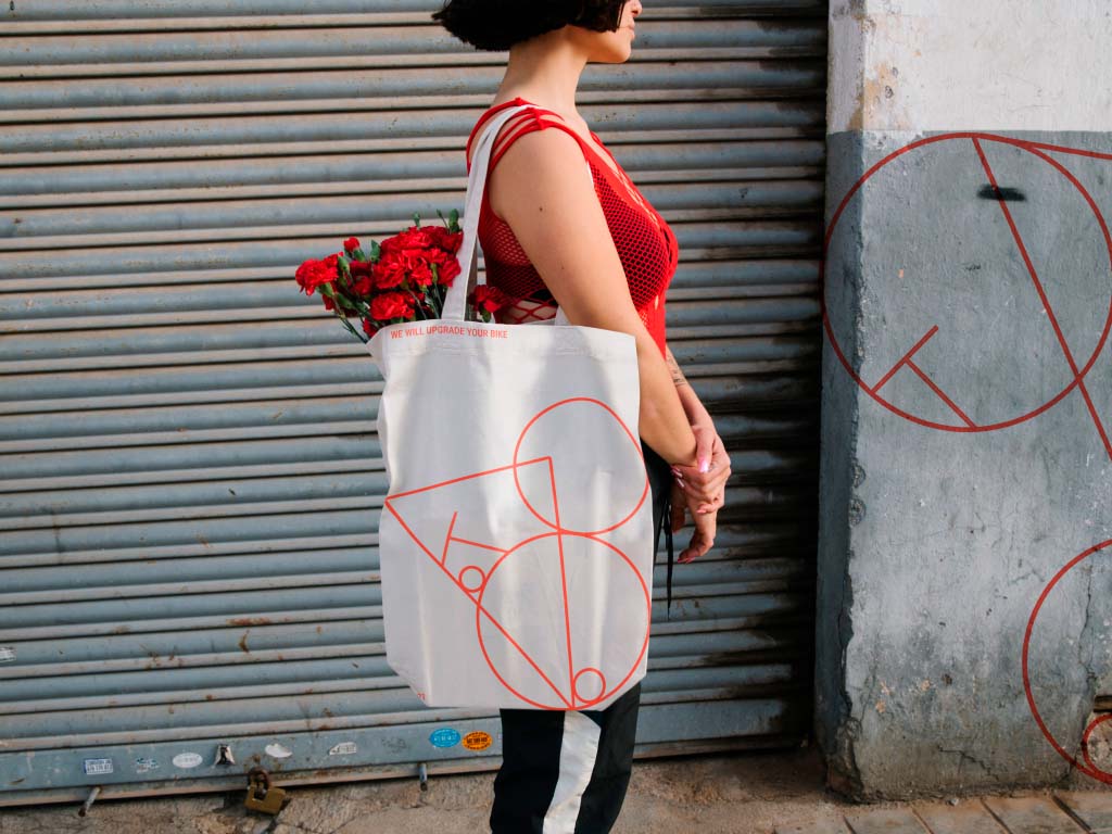
The flexibility of the visual system reveals itself in its adaptability. By adding or subtracting the number of bike spare parts, they can flood a format to convey a bolder message or give a gentler minimalist feel with just a couple of details. The parts can be placed anywhere on the canvas, even on the top, mirroring bikes conquering challenging terrains that can disregard the laws of gravity if only for a fraction of a moment.
The static
Roboto Condensed font and typography represents the static part of the design. Like the bike repairing process is based on strict rules, typography here calms down and structures the visual language. Another reason for using the condensed style is its resemblance to bike lanes markings and signs that are compressed to fit narrow spaces.
Color palette
The only accent in the color scheme is red, as bikeways are often marked with red-colored pavement. The decision to avoid using other accents was made to keep focus on the geometry of the design, just like a bicycle’s function and ergonomics have priority over its color or accessories.
Aesthetic
BIKE 101 Shop & Repairs aims to unite bike enthusiasts and foster a community in the city. The design leans toward understated delicate tones blending into the cityscape rather than an auto repair shop or a sport aesthetic. The atmosphere in BIKE 101 Shop & Repairs should encourage a relaxed vibe where customers can talk about their bike upgrades or the next cycle race over a cup of coffee.
CREDIT
- Agency/Creative: Alexandra Chulkova
- Article Title: BIKE 101: Bike Shop & Repairs Branding by Alexandra Chulkova
- Organisation/Entity: Student
- Project Type: Identity
- Project Status: Non Published
- Agency/Creative Country: Russian Federation
- Agency/Creative City: Moscow
- Project Deliverables: Brand Design
- Industry: Transport
- Keywords: WBDS Student Design Awards 2022/23
-
Credits:
Educational Institution: HSE Art and Design School
Educator's Name: Pavel Borisovsky


