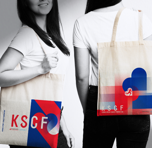
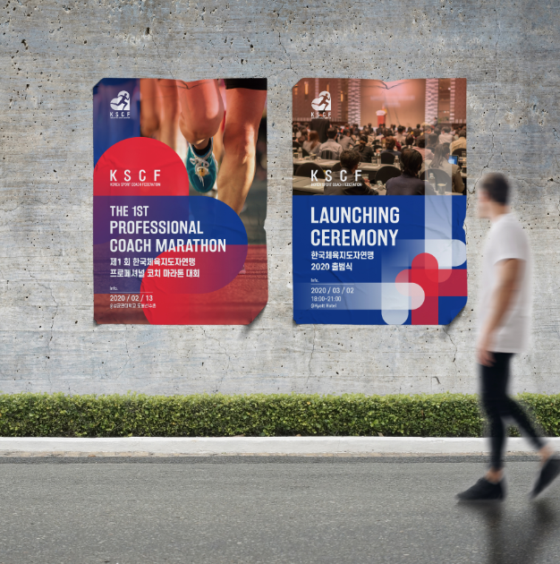
KSCF is a Korea sport division that gathers experts related to sports such as former national team players, active players or coaches, and companies whom own teams. The heart is inspired from X-Y axis that representing moving forward and grows to a high limit. It’s also representing the euphoria and palpitations.The big heart symbol is divided into four puzzles each. The ear shape means listening, the arrow puzzle means the goal and direction, the foot puzzle means ability, and the heart-shape means passion. The red and blue color is derived from Korean ‘Taeguek’ pattern.


https://www.youtube.com/watch?v=eKc0JoJdsbM
CREDIT
- Agency/Creative: B for Brand
- Article Title: B for Brand Creates Korea Sport Coach Federation Branding and VI
- Organisation/Entity: Agency, Published Commercial Design
- Project Type: Identity
- Agency/Creative Country: South Korea
- Market Region: Asia
- Project Deliverables: Brand Architecture, Brand Creation, Brand Guidelines, Brand Identity, Branding, Identity System, Research, Tone of Voice
- Industry: Education
- Keywords: KSCF, Branding, BI, Sports Branding, Sports, KoreaSportCoachFederation, Logo, PE, Physical Education
FEEDBACK
Relevance: Solution/idea in relation to brand, product or service
Implementation: Attention, detailing and finishing of final solution
Presentation: Text, visualisation and quality of the presentation


