Arttra emerged from the vision of a determined couple of architects aiming to transform common spaces into truly exceptional environments. Their clear goal was to offer creative and integrated solutions that exceeded customer expectations. The challenge they set for themselves was to create a visual identity that captured this vision, while also uniting architecture with specific solutions in blinds and awnings.
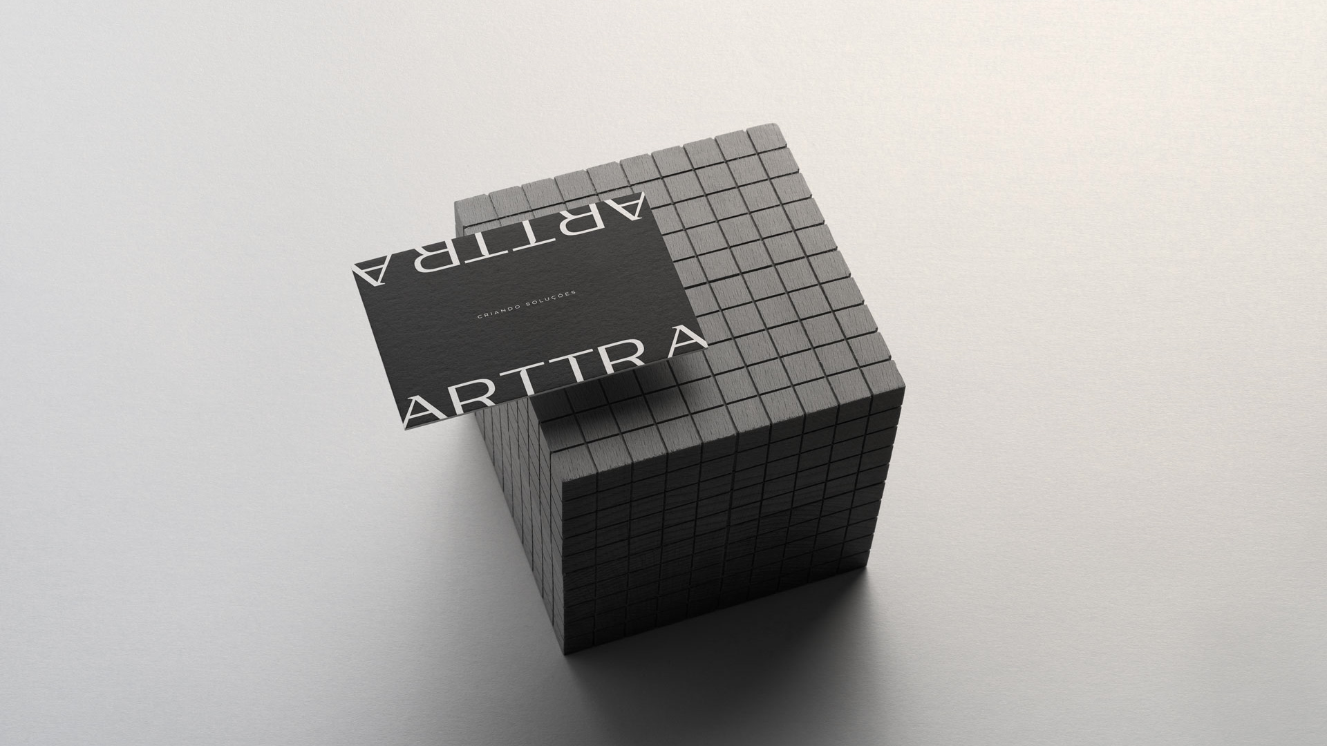
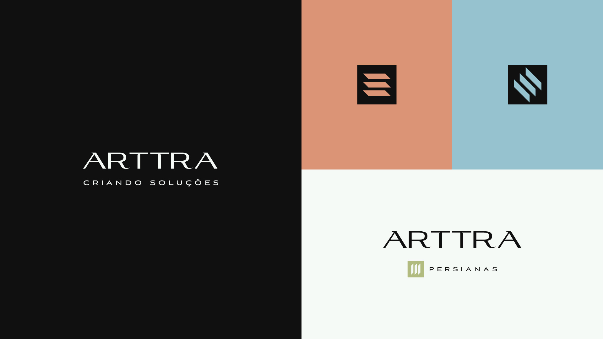
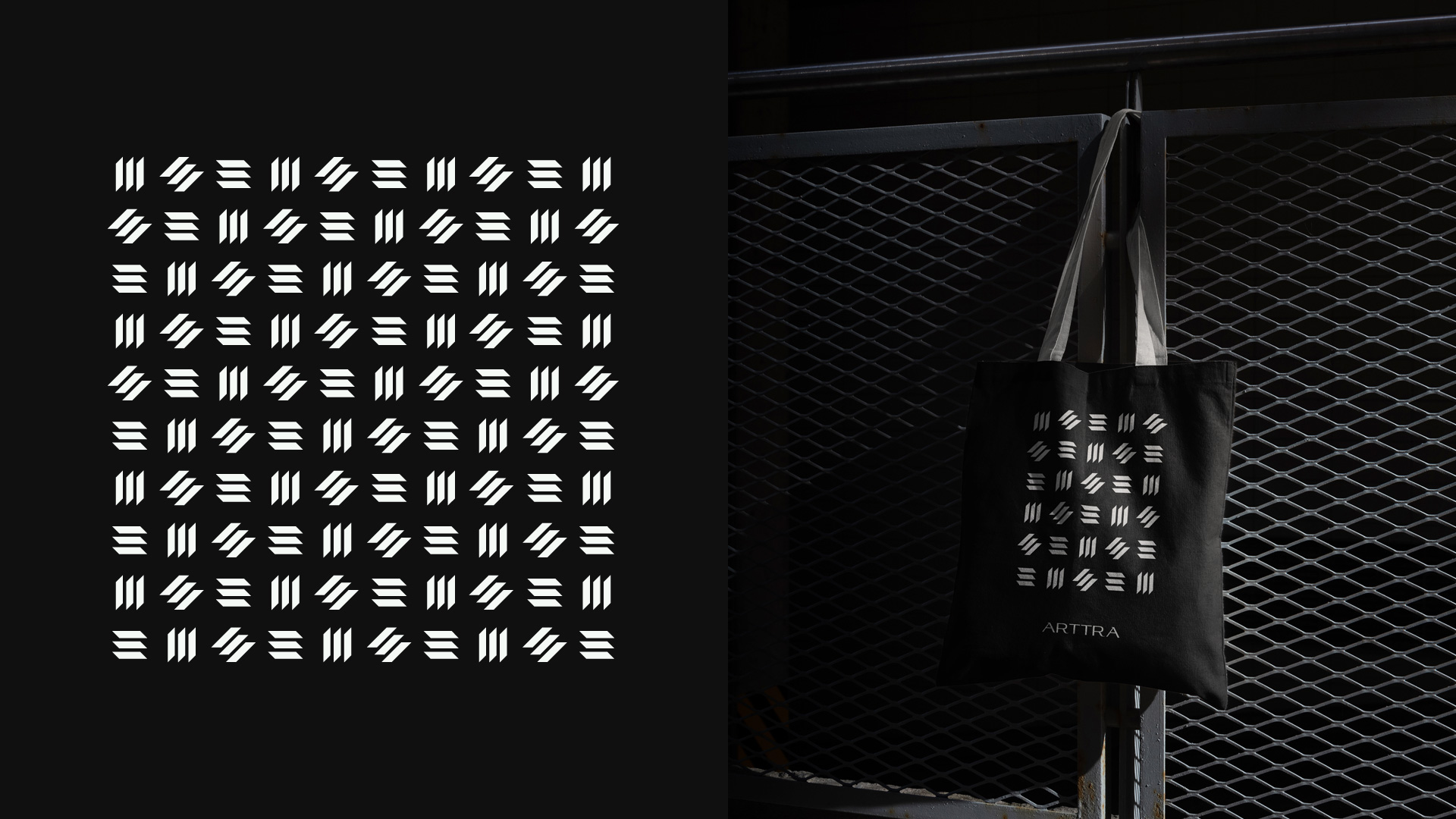
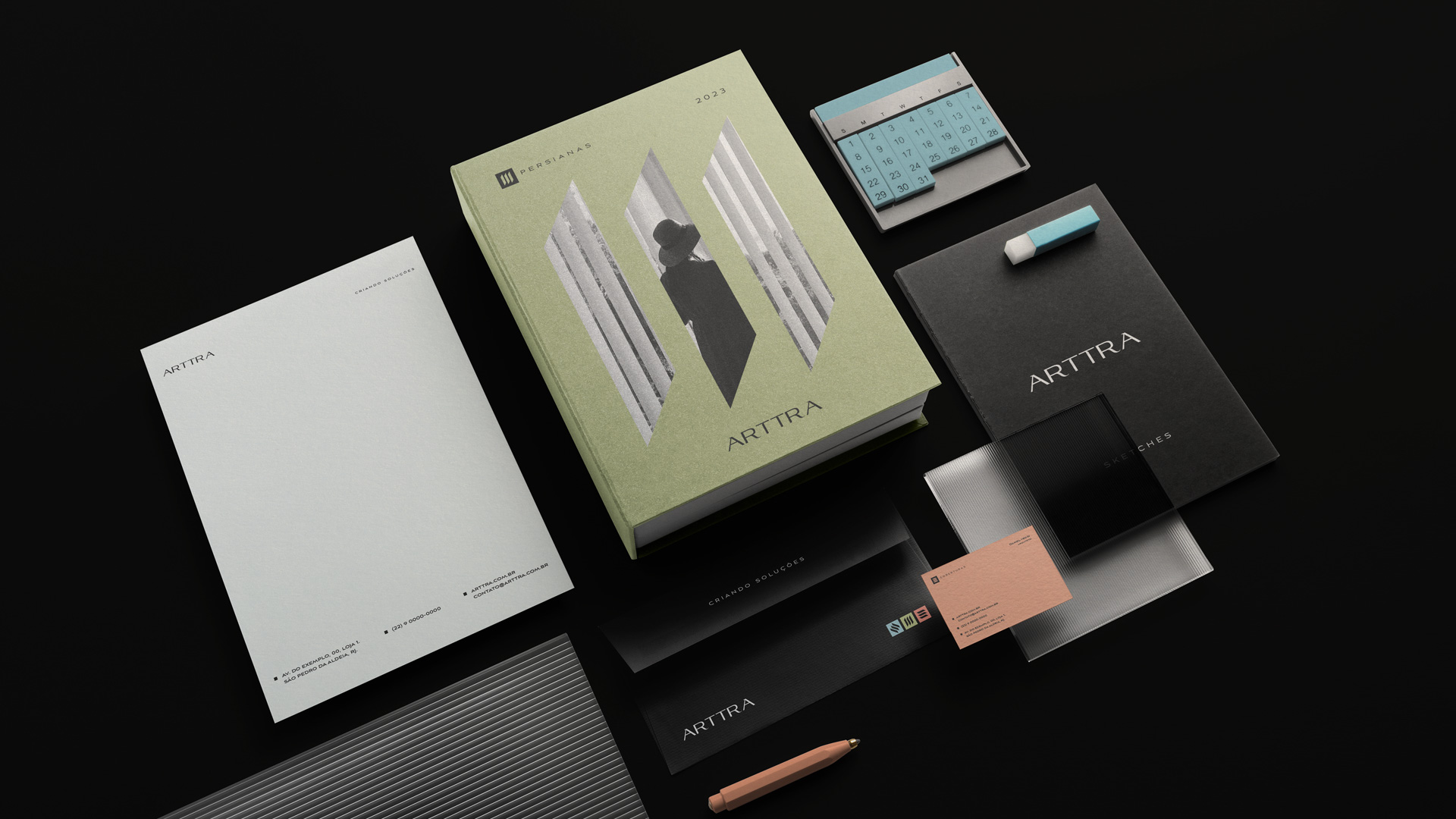
The journey of crafting Arttra’s visual identity began with a deep conceptual process, where key elements were meticulously considered to convey the essence of the company. The central idea was versatility and creativity. Architecture, by its nature, is versatile, and this characteristic needed to be reflected in Arttra’s identity. They chose the square geometric shape as the base, symbolizing the solidity of their technique. This shape was adapted in variations, representing the company’s flexibility to tailor to the specific needs of each project. This representation was essential to differentiate the brand’s symbolism without losing its visual recognition.
Harmony between functionality and aesthetics, vital in architecture, was also a fundamental element of Arttra’s visual identity. Inspired by “cobogós,” architectural elements that allow the passage of light and ventilation while adding beauty to spaces, they sought to incorporate this duality into the brand.
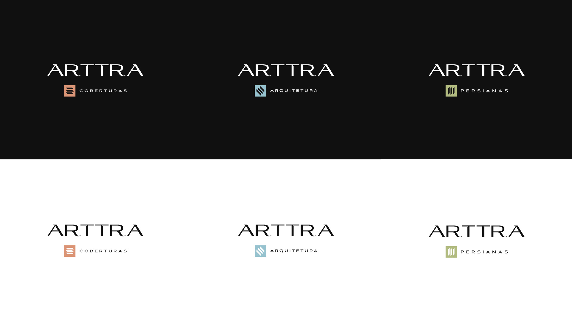
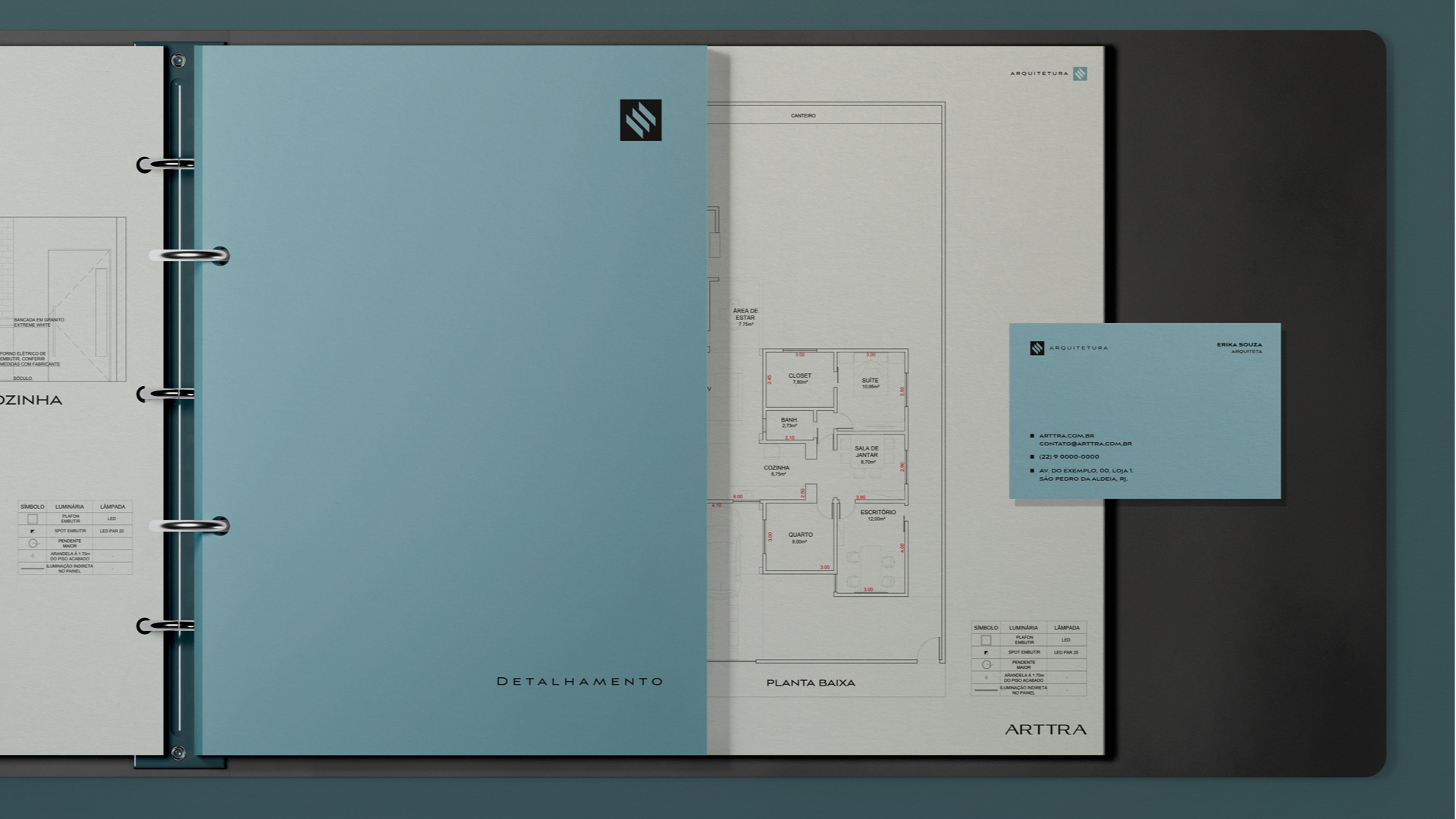
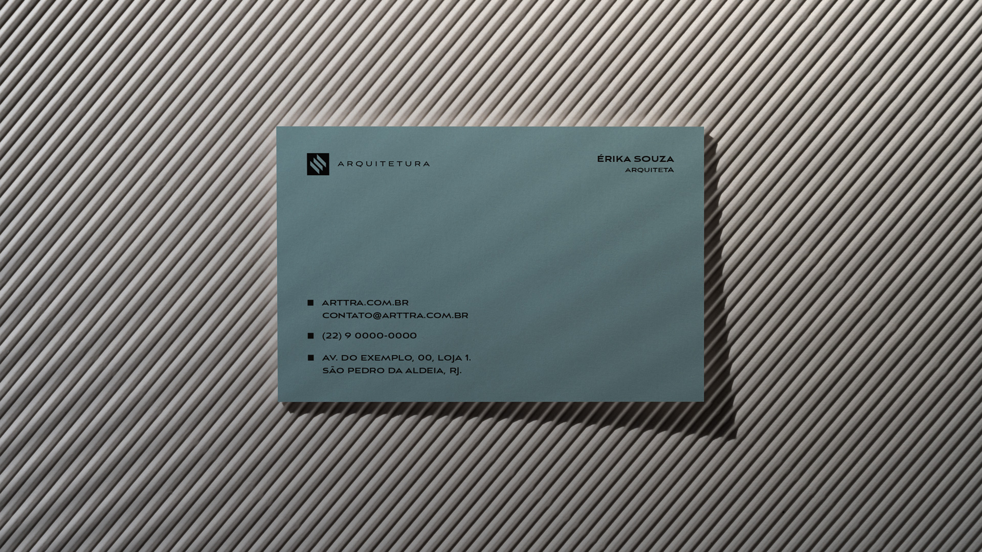
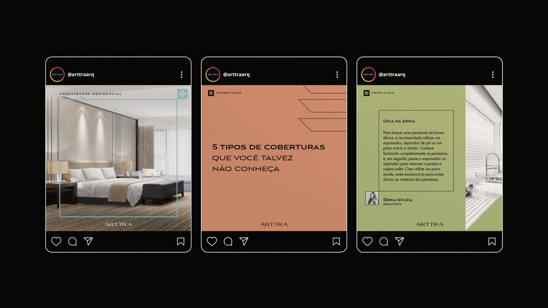
A unique challenge arose when trying to represent Arttra’s three different business segments. To overcome this, they developed an adaptable logo, capable of subtly and recognizably adjusting to each segment, ensuring brand consistency across all areas of operation.
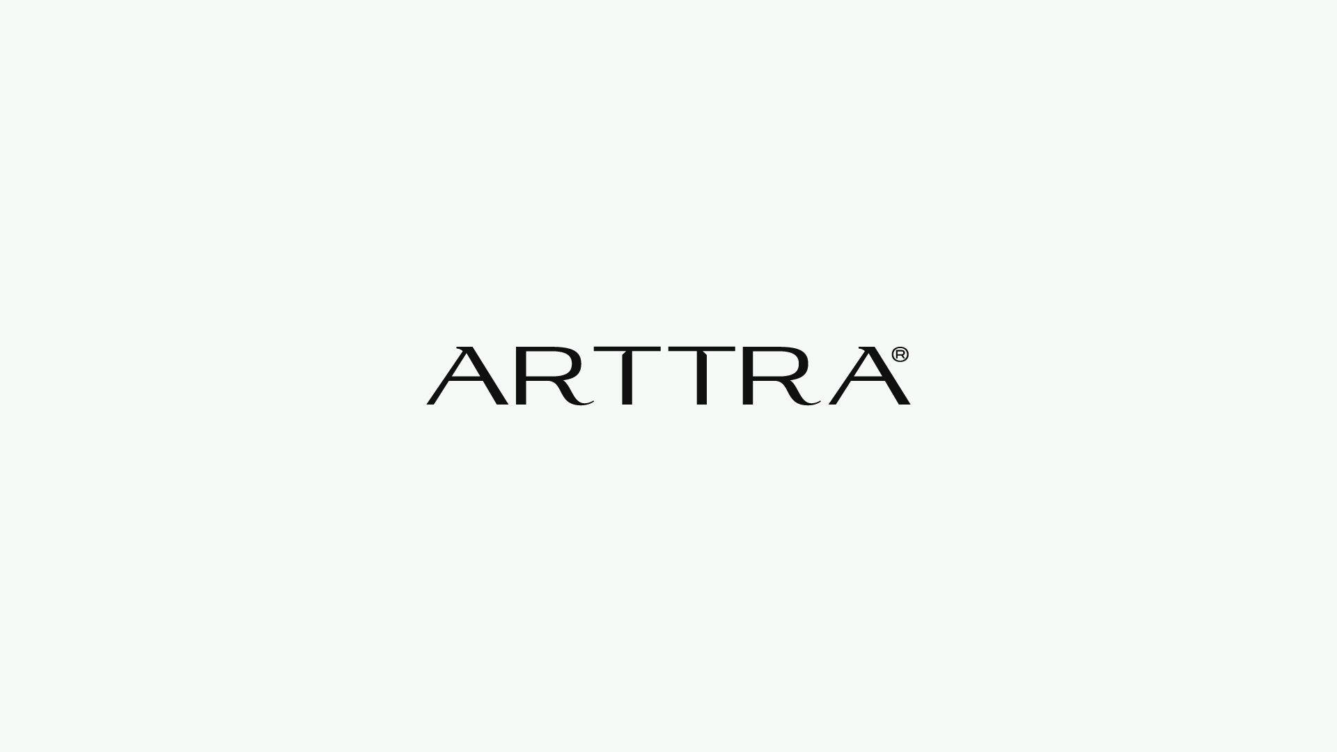
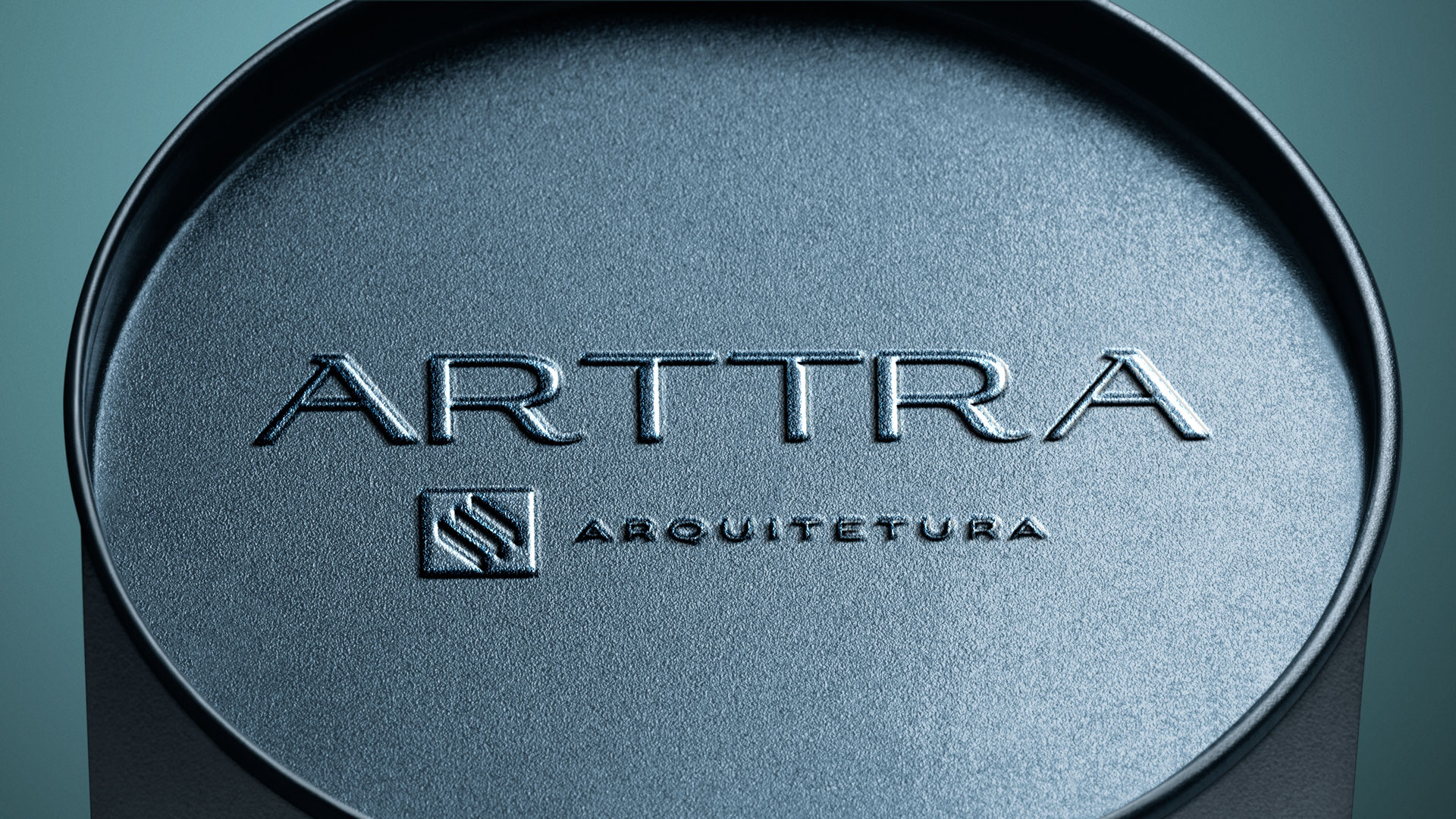
Typography played a crucial role in constructing Arttra’s visual identity. They chose the Aviano Flare font, known for its elegance and authority, as a base but carefully modified it to create a unique textual representation. This approach combined features of both sans-serif and transitional serif fonts, resulting in an approach that conveyed elegance, regularity, and authority, essential characteristics for the company.
The entire creative process involved various practical stages, from initial sketches to the final production. Countless hours of work were dedicated to ensuring that Arttra’s visual identity was perfectly aligned with its vision, values, and market strategy.
Arttra’s visual identity reflects the company’s vision and passion for creating exceptional environments, standing out in the world of architecture and interiors. Arttra is more than just a brand; it is a visual and strategic representation of problem-solving, with the unique challenge of bridging architecture with expertise in blinds and awnings.
CREDIT
- Agency/Creative: Thiago Morais Branding
- Article Title: ARTTRA: Brand Design and Naming
- Organisation/Entity: Freelance
- Project Type: Identity
- Project Status: Published
- Agency/Creative Country: Brazil
- Agency/Creative City: Muriaé, Minas Gerais
- Market Region: South America
- Project Deliverables: Architecture, Brand Design, Brand Identity, Brand Naming, Branding
- Industry: Construction
- Keywords: Architecture, Visual identity, Branding, Design, Logo, Brand,
-
Credits:
Brand Designer: Thiago Morais
Naming: Hannah Assis


