A Distinctive Silhouette: The Birth of a Logo
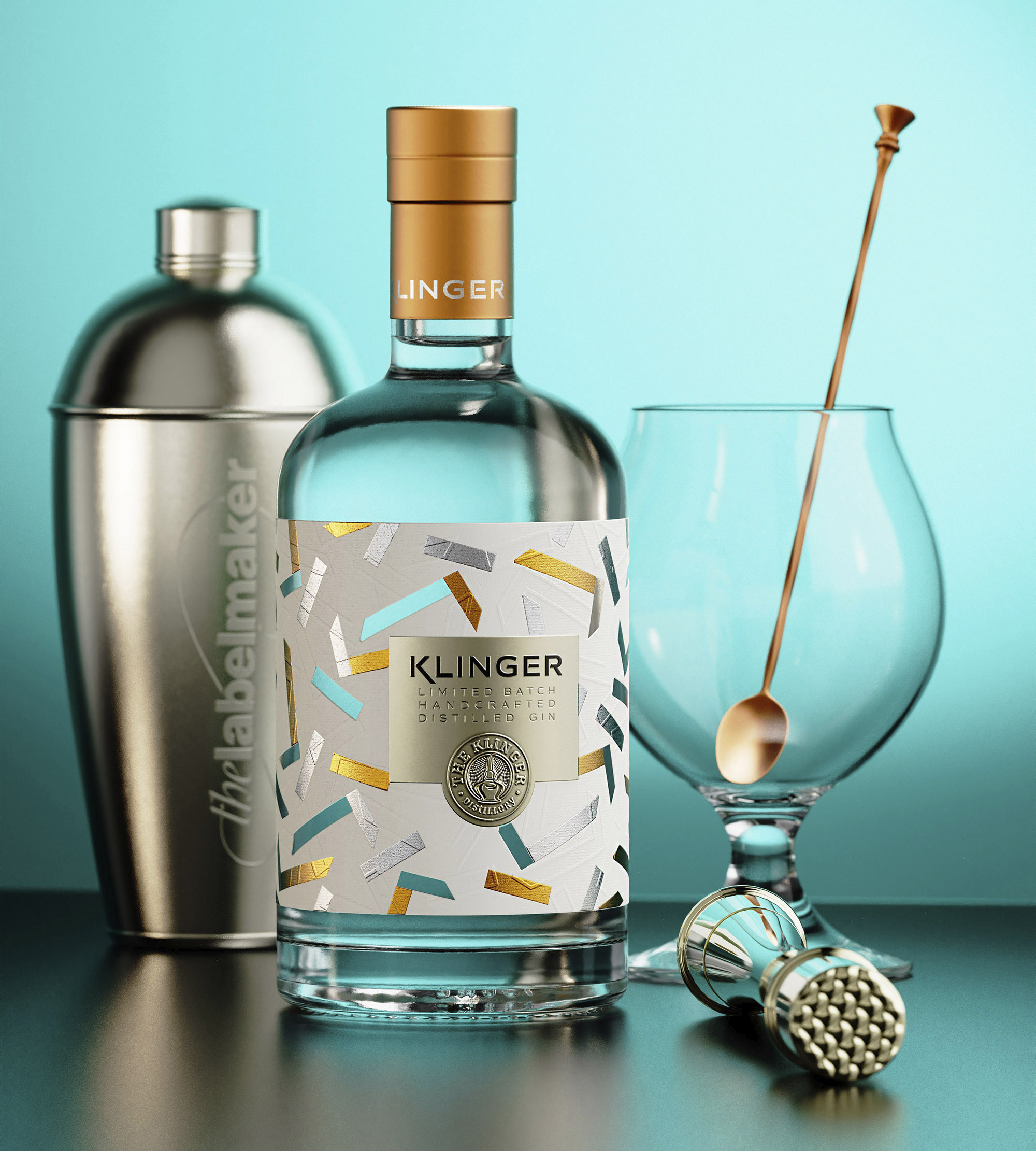
At the core of this venture was the creation of a brand new logo, a homage to The Klinger Distillery’s iconic copper Alembic stills. This modest yet powerful symbol became the heartbeat of the label, embodying the essence of tradition and craftsmanship.
A Bottle of Modern Vintage: The Gin’s Vessel
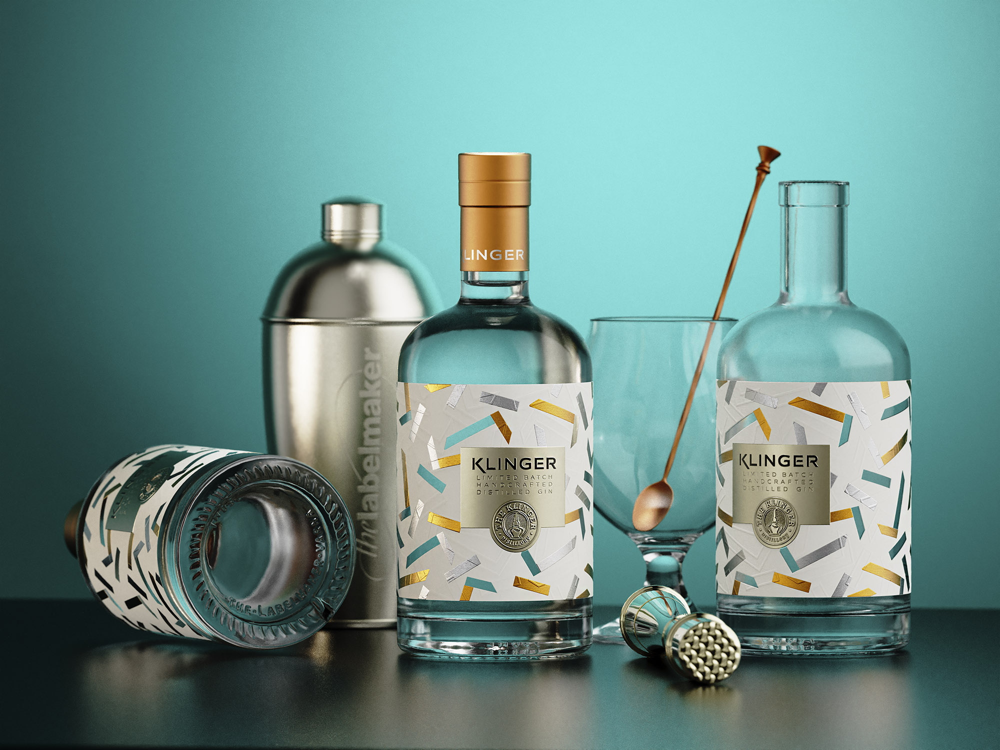
The gin bottle, a marriage of modernity and vintage elegance, became the canvas for this visual story. A vessel that not only holds the spirit within but mirrors the craftsmanship with every glance.
Fused Transparency: A See-Through Delight
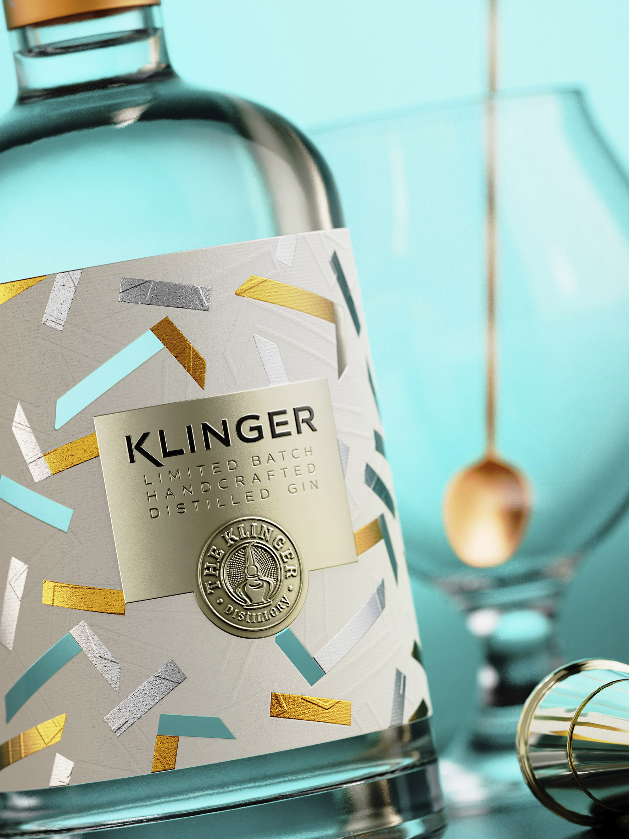
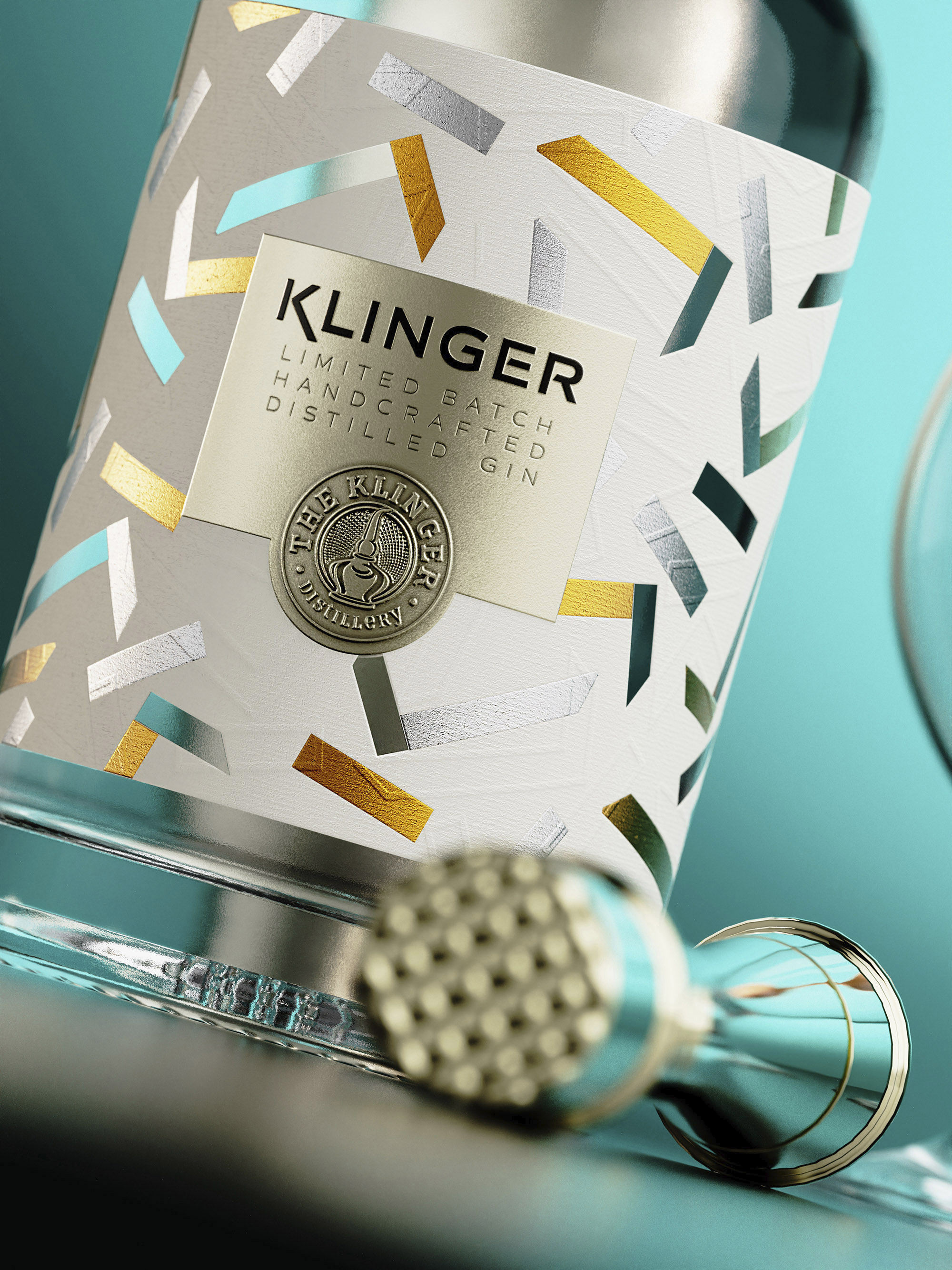
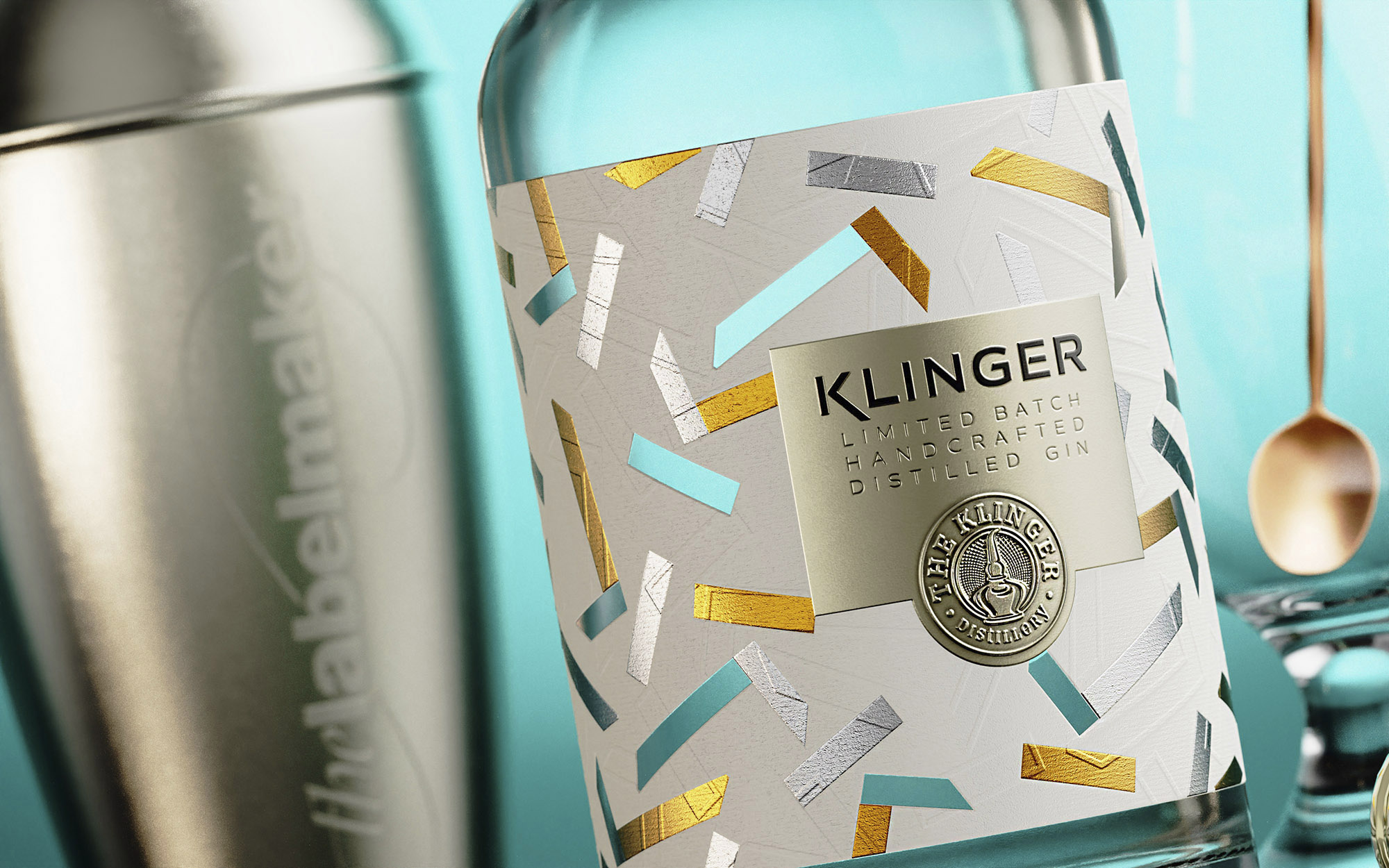
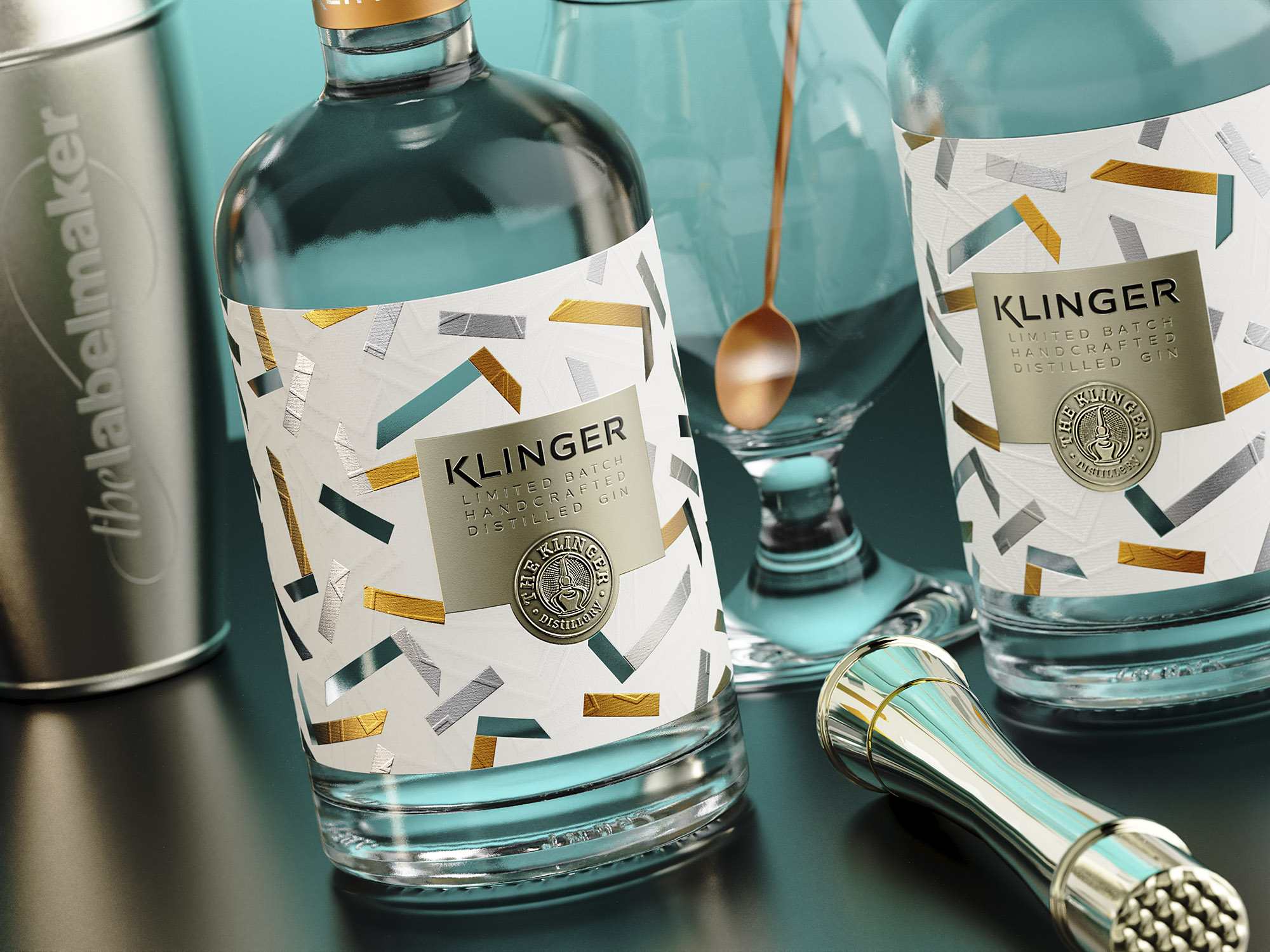
The label takes a daring turn with a fancy, ultra-modern, see-through design. An artistic pattern, derived from randomly scattered ‘K’ letters (representing Klinger), is a joyful twist, allowing glimpses through cuts in the paper, creating an interactive experience with the glass beneath.
Embossed Elegance: A Play of Materials
The label’s surface is adorned with embossed outlined ‘K’ letters, orchestrating an intricate dance with the foiled elements and the strategically placed cutouts. The richness of silver and gold hot foils adds a luxurious shimmer to the pattern of this gin label design.
Material Harmony: A Fusion of Paper and Foil
Choosing heavy stock paper with an elegant linear texture for the bottom layer, and featuring embossed and debossed solid aluminum foil as the top layer, this gin label becomes a fusion of materials. This harmonious blend creates an attractive, tactile design that is both minimalist and modern.
Fancy Minimalism: A Joyful Twist
In the realm of gin label design, this creation embodies a minimalist ethos with a fancy, joyful twist. The label is a celebration of simplicity with an intricate pattern, a visual treat for those who appreciate the marriage of subtlety and flair.
Craftsmanship in Limited Edition: Dagaprint.com’s Imprint
This limited edition gin label design is a product of meticulous craftsmanship, brought to life by Dagaprint.com in a small run, enhancing the exclusivity and uniqueness of each bottle.
Copper Crown: Metallic Matte Capsule
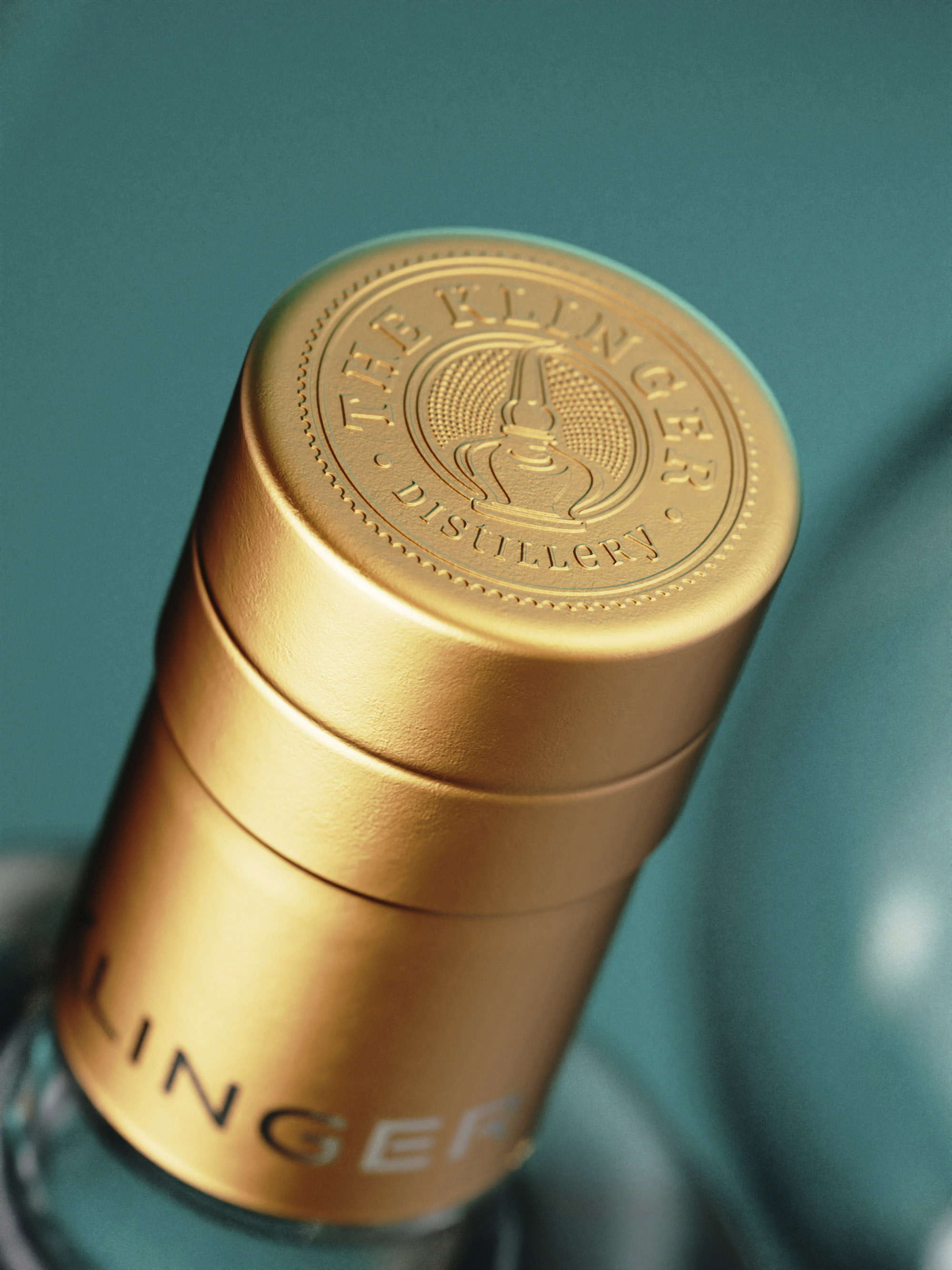
The final touch is the metallic copper matte capsule, proudly bearing an embossed logo. This crowning element adds a premium and bold finish, signifying the exceptional quality within.
CREDIT
- Agency/Creative: the Labelmaker
- Article Title: A Fused See-Through Craft Gin Label Design for Klinger Distillery
- Organisation/Entity: Agency
- Project Type: Packaging
- Project Status: Published
- Agency/Creative Country: Bulgaria
- Agency/Creative City: Sofia
- Market Region: North America
- Project Deliverables: Brand Design, Label Design, Packaging Design
- Format: Bottle
- Industry: Food/Beverage
- Keywords: the labelmaker, dagaprint, packaging design, gin label design, gin art, gin label art, inspirational gin label, embossed gin label, see through label, silver hot foil, metal gin label, label printing, fused label design, gin label printing, debossed gin label, custom gin label, premium gin label, craft gin label, gin label, spirits label design, gin branding, klinger gin label, klinger distillery, klinger gin label design
-
Credits:
Client: The Klinger Distillery
Design & CGI: the Labelmaker


