A Fusion of Tradition and Modernity
Background: Nestled in the countryside of Thracian Valley, Bulgaria, Chateau Bozukoff stands as a testament to the enduring family tradition of winemaking. Here, amidst rolling vineyards, winemaking transcends mere business — it’s a profound expression of love for the land. Each bottle of Chateau Bozukoff wine encapsulates a narrative of ambition, craftsmanship, and an unwavering reverence for terroir.
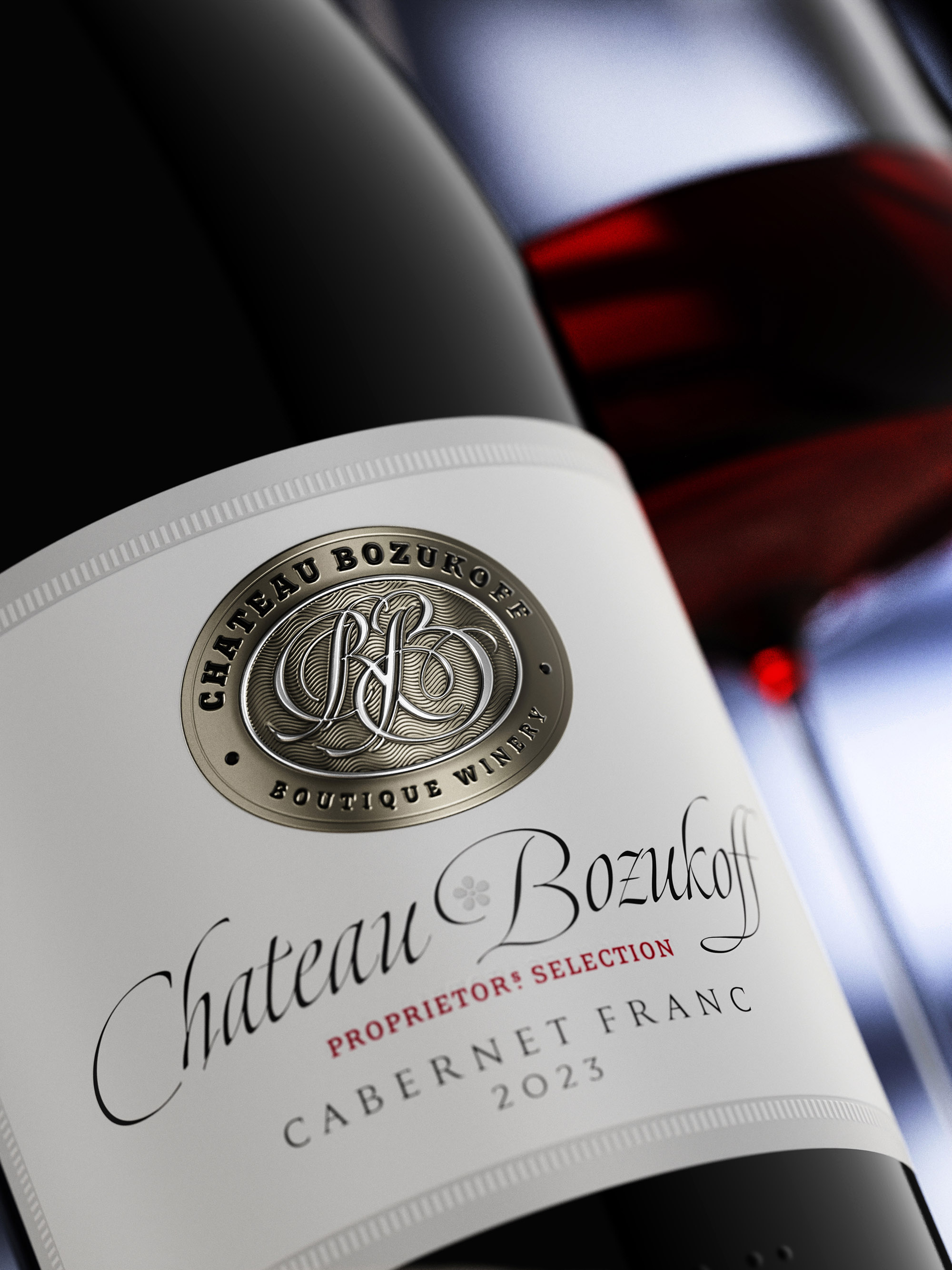
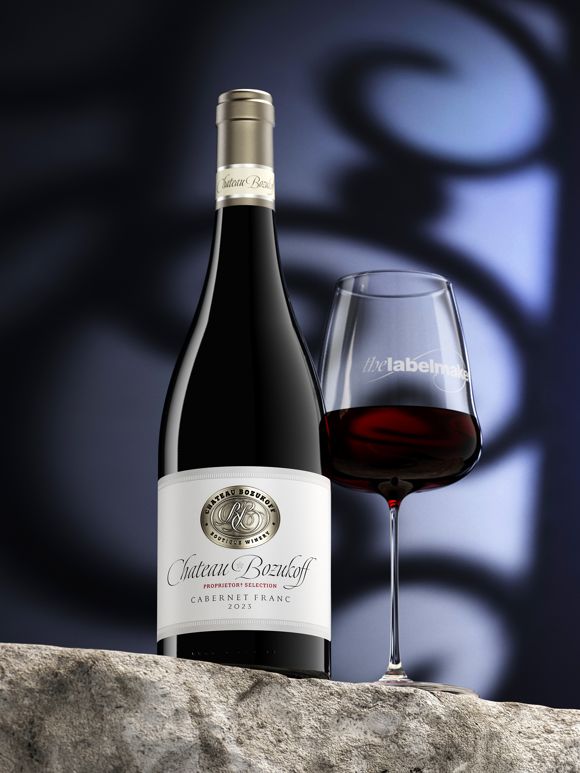
Design Thinking: Drawing inspiration from classic French wine labels, the design ethos of Chateau Bozukoff’s label seamlessly marries tradition with a modern sensibility. Despite being a small boutique winery, the label design exudes timeless elegance with subtle contemporary nuances. Embracing a minimalist approach, the label features rounded corners and a fusion of materials—a paper base layered with a sleek metal label. Eschewing vintage embellishments, the design focuses on subtle details and understated sophistication, reflecting the winery’s commitment to authenticity and craftsmanship.
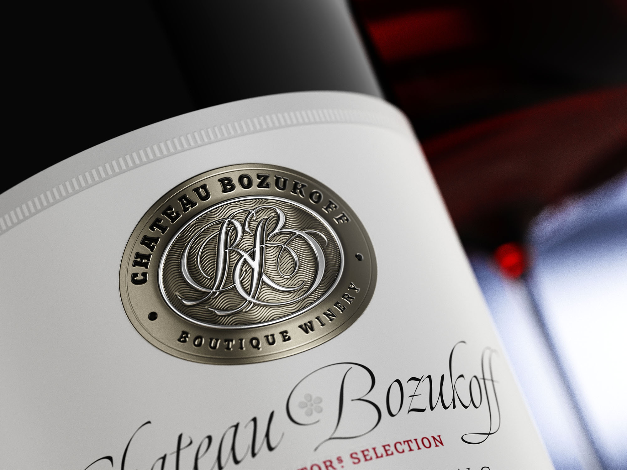
Challenges: Crafting the emblematic logo for Chateau Bozukoff proved to be a formidable challenge, demanding meticulous attention to detail and unwavering dedication. Countless iterations were explored, each offering a unique interpretation of the winery’s identity. After exhaustive deliberation, the RB monogram emerged as the epitome of elegance, seamlessly blending tradition with contemporary flair. Refinement after refinement, the logo evolved into a symbol of timeless sophistication, embodying the essence of Chateau Bozukoff’s legacy.
Favourite Details: Central to the label’s allure is the captivating RB monogram, meticulously crafted to exude elegance and authenticity. Inspired by the intricate patterns of Omega Seamaster watches dials, a subtle wavy motif lends a touch of dynamism to the design, infusing it with a sense of movement and sophistication. The embossed RB monogram serves as the focal point, commanding attention with its intricate detailing and timeless appeal.
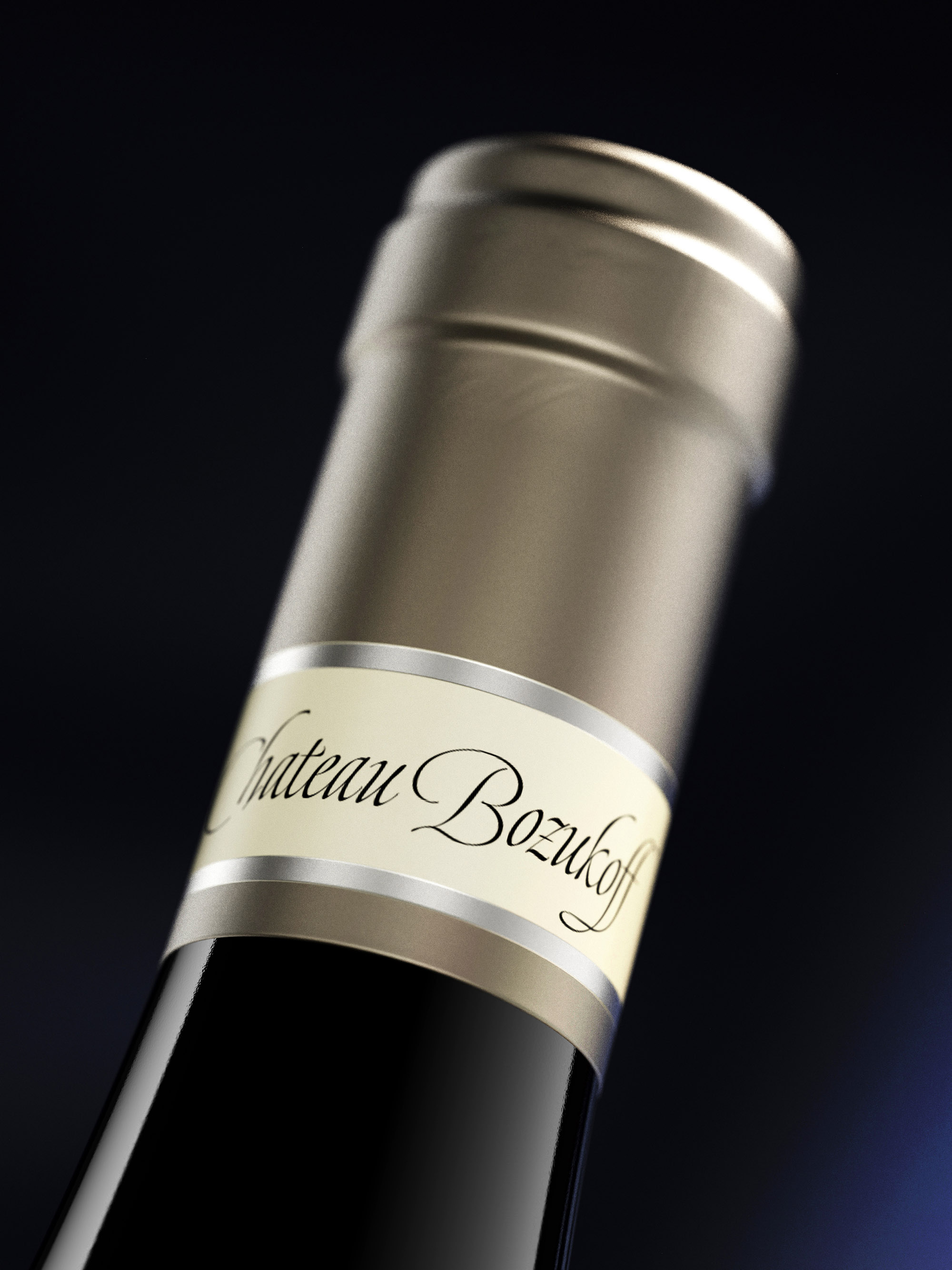
Further enhancing the label’s allure is the elegant debossed frame, adding depth and texture to the label’s surface. The fusion of materials — paper and metal — creates a harmonious juxtaposition, elevating the label to a work of artistry. Complemented by a classic burgundy bottle and a capsule adorned with a tag label, every aspect of the design speaks to Chateau Bozukoff’s unwavering commitment to excellence and refinement.
The label of Chateau Bozukoff encapsulates the essence of its wines — timeless, elegant, and steeped in tradition, yet imbued with a modern sensibility that resonates with discerning connoisseurs.


CREDIT
- Agency/Creative: the Labelmaker
- Article Title: The Labelmaker Transformed Chateau Bozukoff’s Wine Labels with Subtle Sophistication
- Organisation/Entity: Agency
- Project Type: Packaging
- Project Status: Published
- Agency/Creative Country: Bulgaria
- Agency/Creative City: Sofia
- Market Region: Europe
- Project Deliverables: Brand Design, Label Design, Packaging Design
- Format: Bottle
- Industry: Food/Beverage
- Keywords: Chateau Bozukof, fused label, fused label design, label over label, gold foil label, wine label innovation, wine design, wine label art, jordan jelev, thelabelamker, metal wine label, embossed metal label, debossed label, wine label art, wine design
-
Credits:
Design & CGI: the Labelmaker


